Sorry, Everyone Who Said Gray Living Rooms Are Outdated – Bella Hadid Brought This Neutral Back, And Her Look Is Timeless
I was firmly against a 'greige' color palette until I spotted Bella's penthouse – her neutral living room has really stood the test of time


Design expertise in your inbox – from inspiring decorating ideas and beautiful celebrity homes to practical gardening advice and shopping round-ups.
You are now subscribed
Your newsletter sign-up was successful
Want to add more newsletters?
Before dopamine decor burst onto the interior design scene, gray was perhaps the most reliable color in any palette. It was lauded by minimalists and even respected by fans of bolder design schemes thanks to its timelessness and versatility. These days, however, gray can be a risky choice: after so long in the spotlight, it can feel dated.
As a fan of warmer colors myself, I'd begun to think that gray interiors were slipping out of style – but Bella Hadid's former penthouse convinced me otherwise.
While her loft-style SoHo property was, in fact, listed back in 2021, it feels strikingly current to me. Boasting soft gray walls, dove gray cabinets, and a slate-colored rug, the living room is proof that gray really can be timeless.
Article continues belowA post shared by SERHANT. (@serhant)
A photo posted by on
Recreate Bella Hadid's Neutral Living Room
To channel Bella's look, I'd start with a muted gray shade like Sherwin-Williams' Repose Gray or Benjamin Moore's Nimbus. Paired with tactile elements like CB2's Kole charcoal rug and Joon Loloi's brown Glover pillow, these colors create a scheme that feels warm, luxurious, and far more exciting than you might expect.

This dusty gray paint is a brilliant choice if you're looking for a soft neutral shade. It offers warm undertones to ensure that your space feels welcoming and bright.
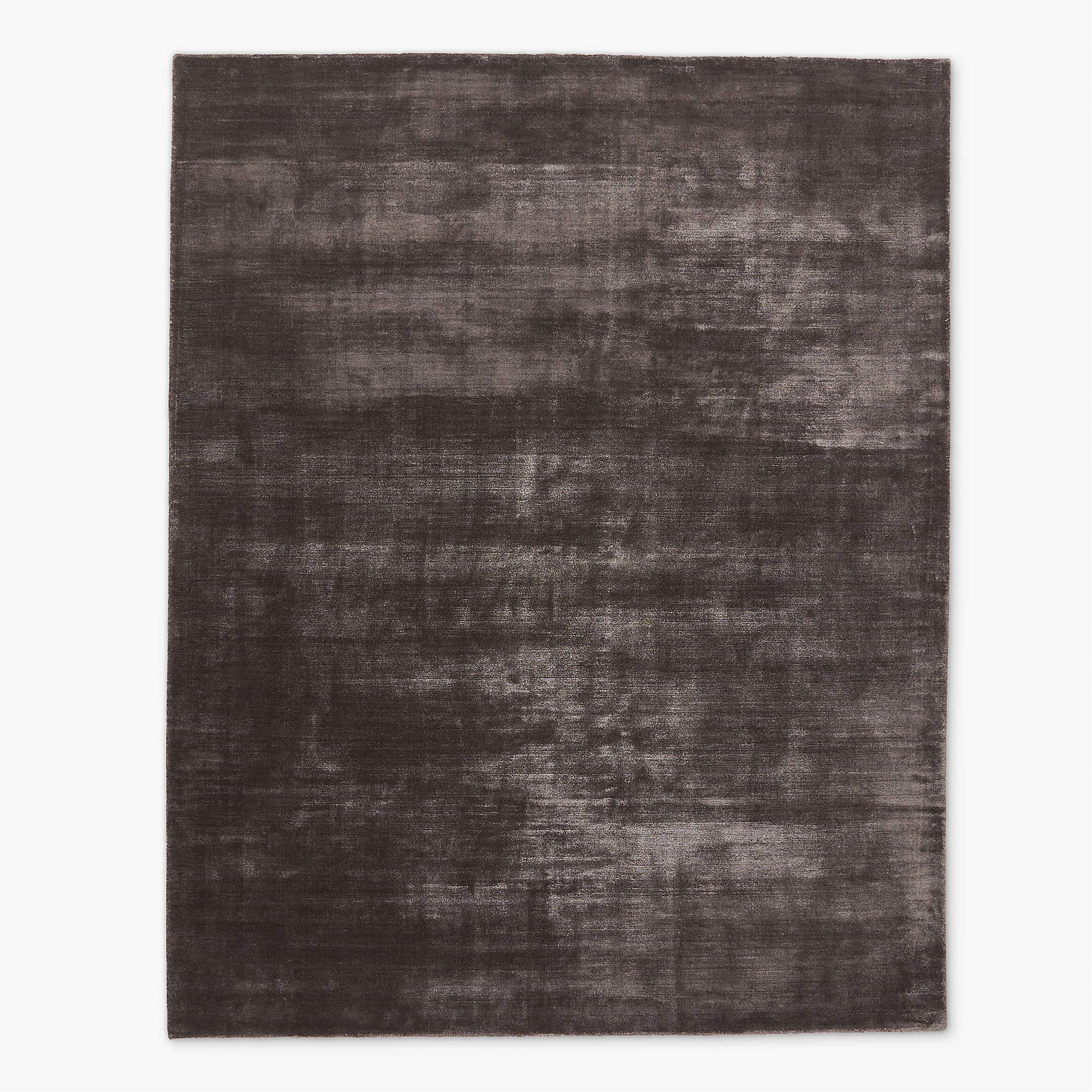
Available in colorways ranging from charcoal to cool gray and even mink brown, I'd say that this nylon rug is the perfect addition to a neutral color scheme. It's stylish and yet ultra-durable.
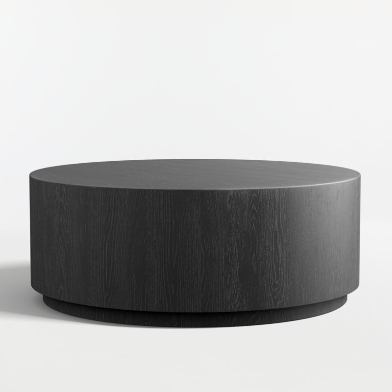
It might be an investment, but this coffee table is a truly timeless piece. With a sleek silhouette and a natural wood grain, it will add instant flair to even the simplest schemes.
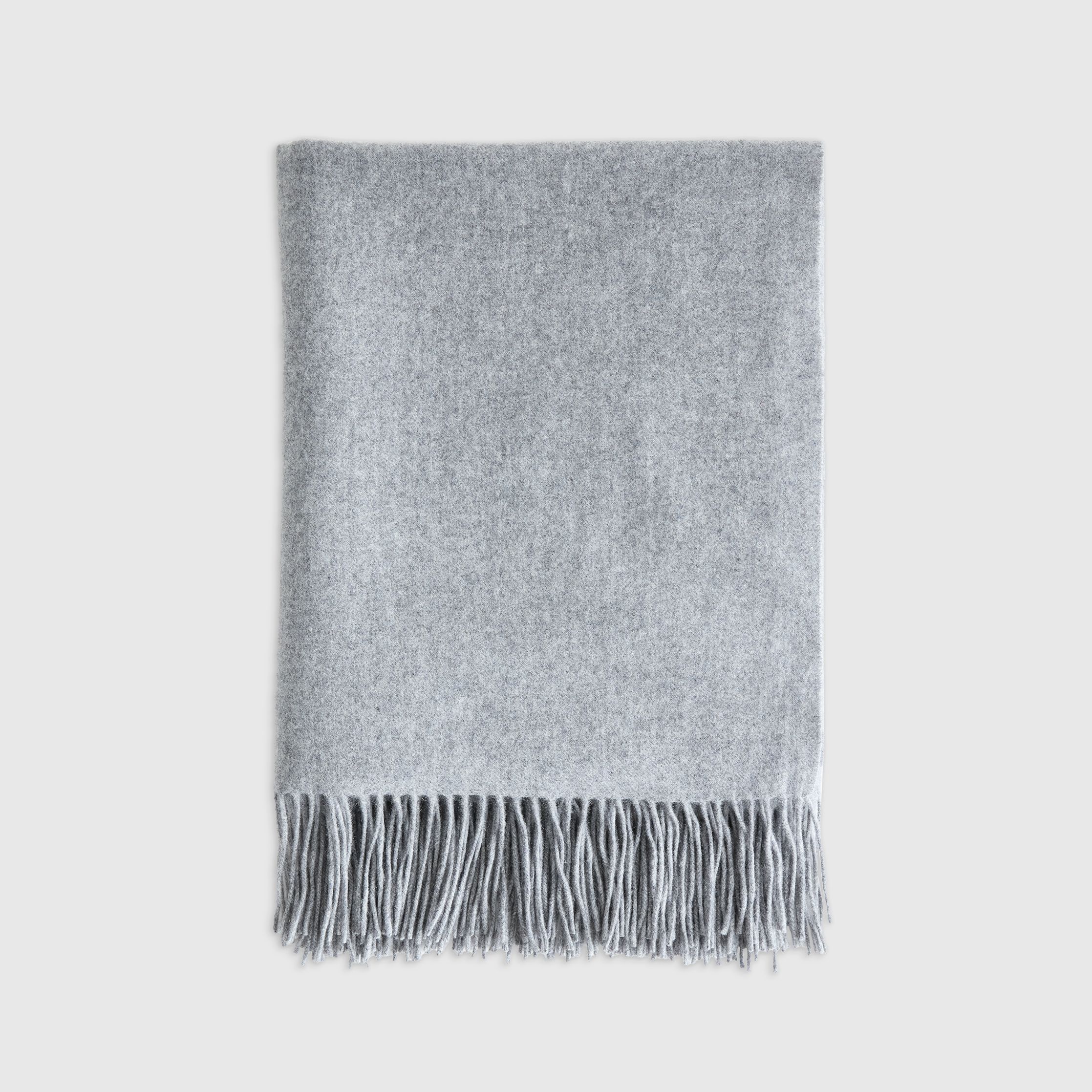
The easiest way to experiment with colors is to add soft furnishings, and this cashmere throw is ideal. It's perfect for layering with bold cushions and even statement seating.
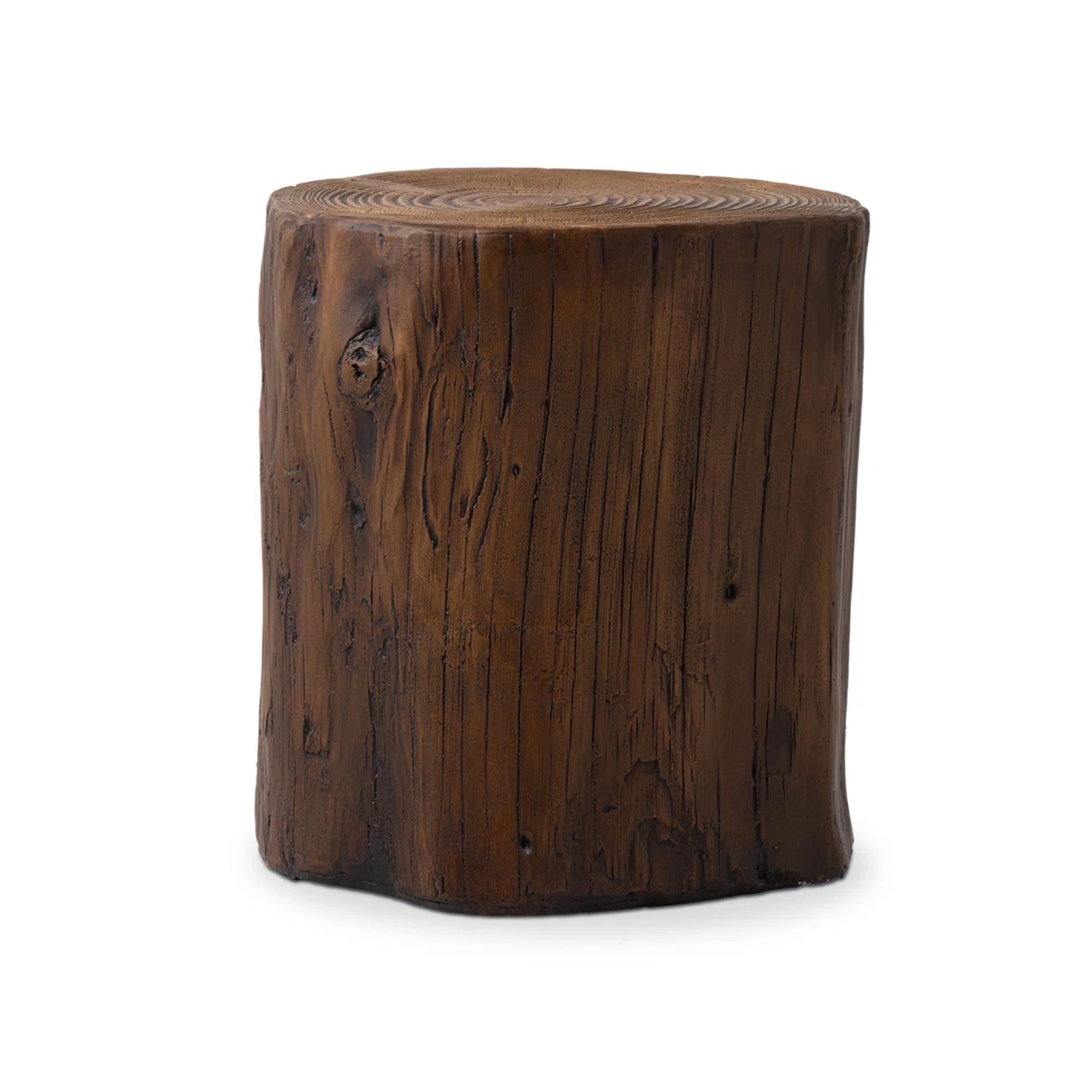
Carefully-chosen textures always bring warmth and interest to pared-back schemes, and Bella uses a side table like this one to help her living room feel grounded.
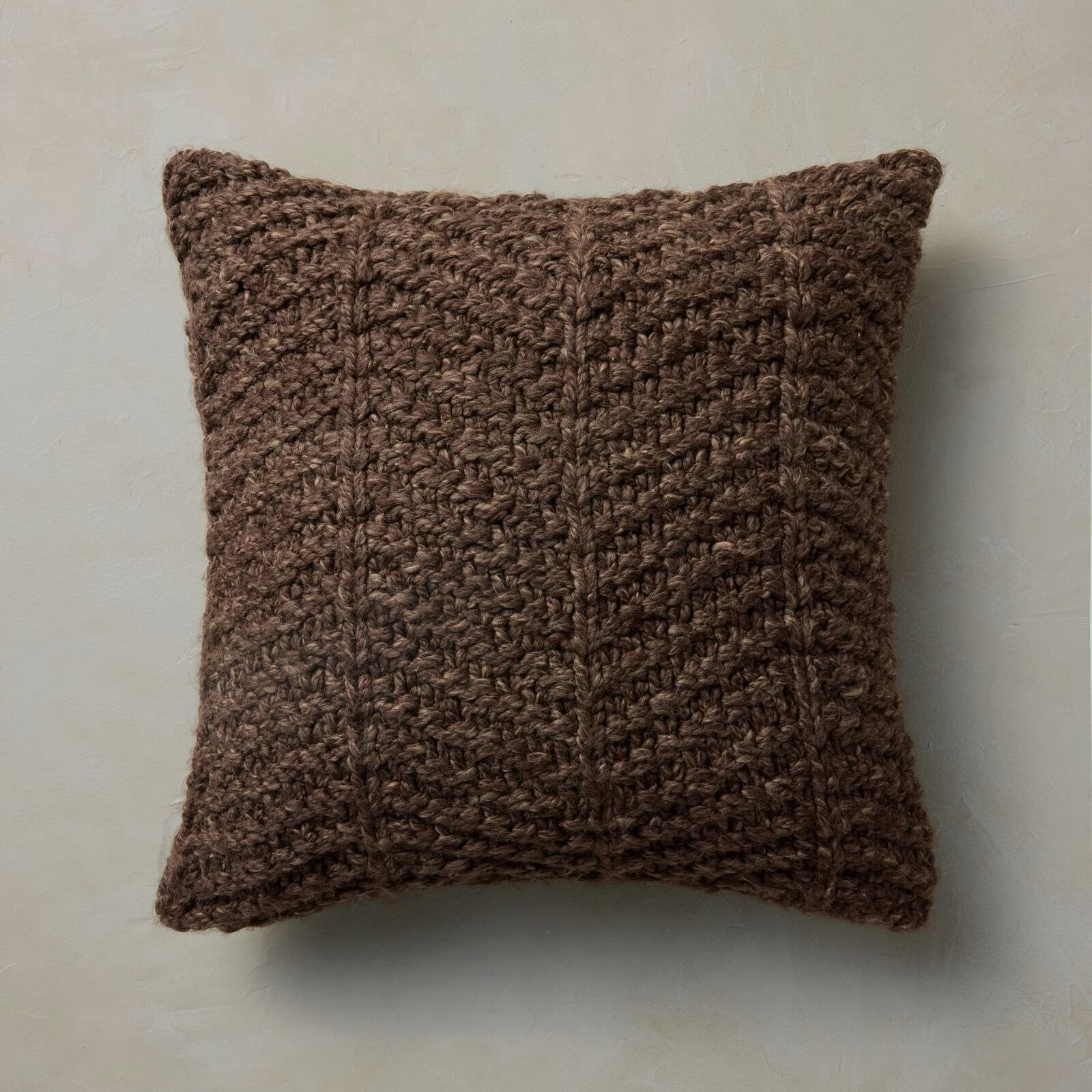
To increase the depth and richness of her neutral space, Bella uses earthy accents like brown pillows. These will provide added texture thanks to their chunky knitted finish.
If, like me, you're wary of a living room that boasts so many gray and beige tones, this one will surprise you. What struck me was a sense of serenity: I've never thought of gray as an uplifting color, but in this space, it feels inviting and restorative.
In fact, thanks to rich, tactile elements like plush cushions, wool throws, and a tufted rug, this room feels anything but sterile. 'Greige' color palettes are often viewed as dull or even lifeless, but Bella proves that careful styling can be totally transformative.
Bella's room is a reminder that, when decorating with gray, it's best to be intentional about the shades and textures you incorporate. Here, pale walls are offset by a wooden media unit finished in a deeper gray hue, and bolder pieces like a black coffee table help to break up the palette.
Design expertise in your inbox – from inspiring decorating ideas and beautiful celebrity homes to practical gardening advice and shopping round-ups.
Naturally, the red brick ceiling is hard to miss, and the space risks feeling rather industrial – but it's clear that it was designed with these elements in mind. A black metal lamp pays homage to the industrial look, while a glass light fixture introduces sweeping curves and glittering accents to draw the eye upwards and create a sense of grandeur.
Bella's living room demonstrates that, although bolder colors have been influencing interior design trends for a while, gray remains a go-to for many designers.
'Gray may feel less prominent, but it continues to be a staple choice, particularly in contemporary settings,' explains James Mellan-Matulewicz, Interior Designer and Creative Director at Bobbi Beck. 'It offers a versatile base that works across many styles and can easily evolve with changing trends.'
So, gray is sticking around – but if you don't want it to dominate your space, try incorporating subtle accents and textural details.
'Thoughtfully-layered tactile elements soften the cooler nature of gray, encouraging a room to feel more relaxed and comfortable,' says James. 'As seen in Bella's space, brown hues work particularly well, bringing a sense of richness and balance. Introducing warmth and variation will prevent a gray color scheme from feeling flat.'
Gone are the days of bleak gray spaces; in Bella's living room, sumptuous textures and brown tones help to banish any coolness. Years on, this home has reminded me why gray is such an enduringly popular neutral.

Martha is a Content Editor on the Gardens team. Her love for lifestyle journalism began when she interned at Time Out Dubai when she was 15 years old; she went on to study English and German at Oxford, before covering property and interior design at Country & Town House magazine. To Martha, living beautifully is all about good food and lots of colorful home decor.