Design house: This cool Californian home makes its mark with clever color choices
It doesn’t have to be a black and white decision – it pays to be a shade braver in your choice of color

Design expertise in your inbox – from inspiring decorating ideas and beautiful celebrity homes to practical gardening advice and shopping round-ups.
You are now subscribed
Your newsletter sign-up was successful
Want to add more newsletters?
It’s tempting to play it safe when it comes to injecting color into your home, but interiors that experiment with bold tones are often the most striking. The key is to do your research, testing contrasting palettes out before decorating, using color and fabric with confidence.
We spoke to Lorri Hicks Cazenave of HICKS CAZENAVE INTERIOR DESIGN about the design project.
'These clients were returning to San Francisco after escaping the city to Marin county for a few years. Funnily enough, their Marin home was the first project I completed with the homeowners. It was during that project that we became fast friends – over a shared love of Scalamandre’s zebra wallpaper.
Article continues below'But, ultimately they never quite assimilated to living in the suburbs and craved walkability, culture, and diversity. When the opportunity arose, they found their way back to San Francisco, scoring a great place near Lake Street that offered them walkability to neighborhood coffee shops and proximity to local parks for the children.
'We incorporated family heirlooms, vintage pieces, and sentimental art and furnishings, while still giving the space the a flourish of color, culture, and humor.
'We shared a heartwarming bond over fabulous flea market and antique website finds. There was even a moment where I presented a chinoiserie vintage lamp for the master bedroom bedside table and then sent an urgent "if you don’t end up purchasing this please let me know, and I will – I can’t bear to know that anyone else would snatch it up!” We still laugh about that moment today. It will be a wonderful heirloom for her young daughter to one day inherit.'
Take the tour below.
Design expertise in your inbox – from inspiring decorating ideas and beautiful celebrity homes to practical gardening advice and shopping round-ups.
Kitchen
Experimenting with color and pattern is a great way to break away from your everyday aesthetic, and that is exactly what the interior designs – and owners – have done in this San Francisco home.
- See: World's best homes – beautiful properties from around the globe
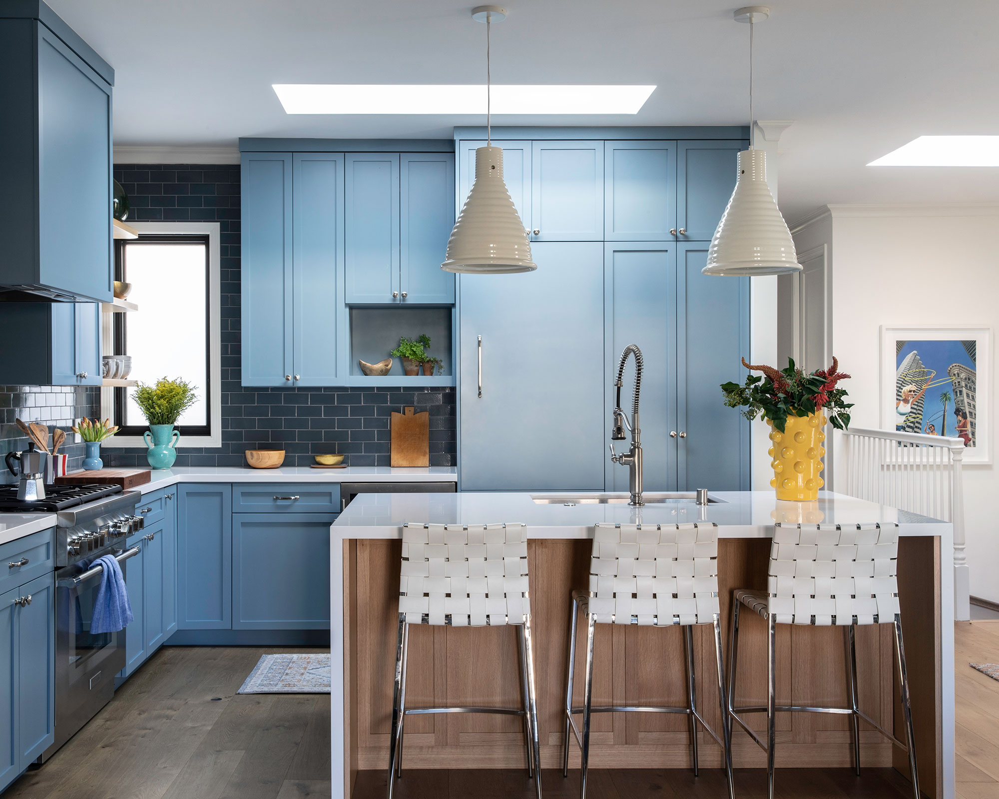
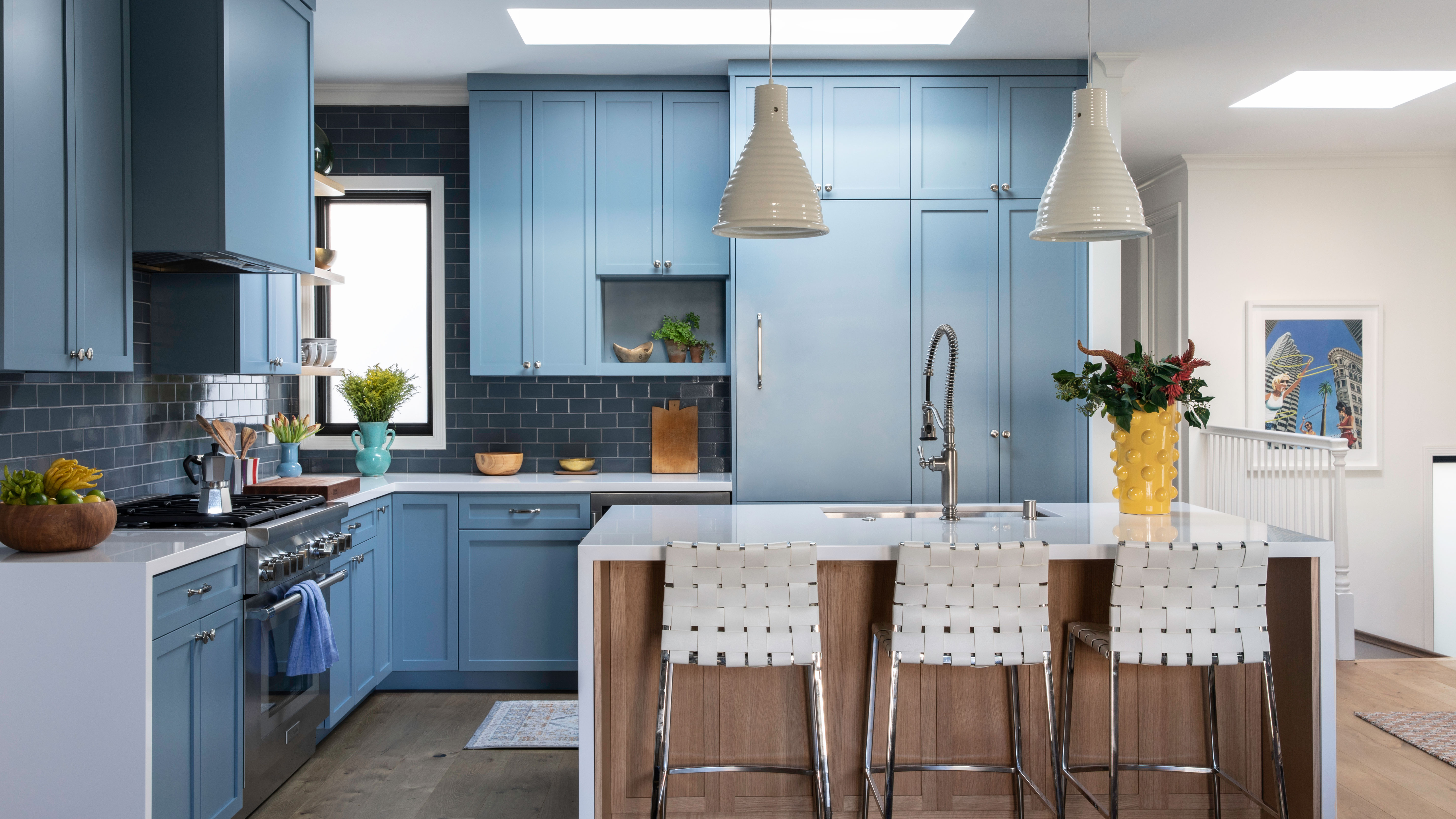
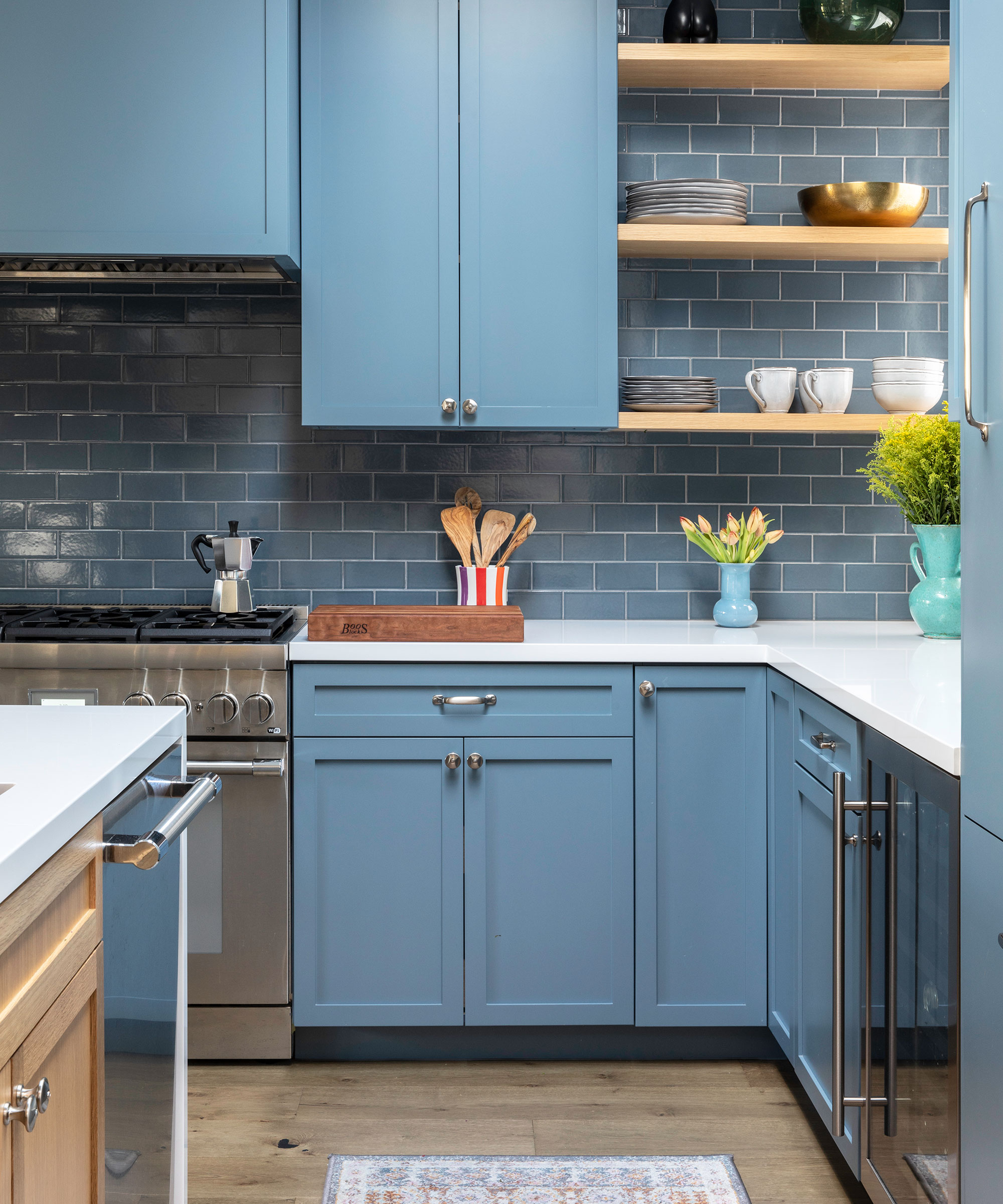
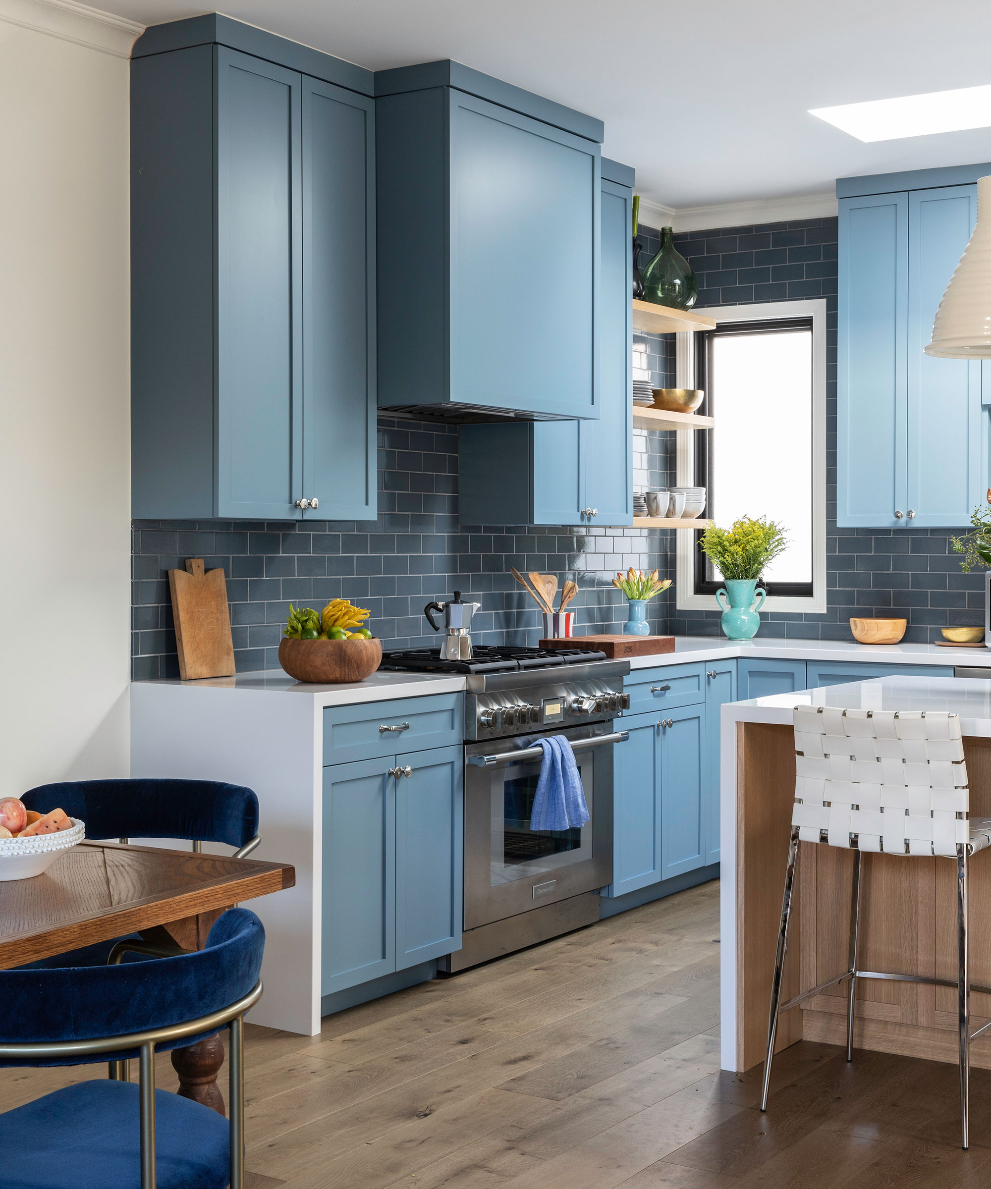
Color is important in all room schemes, and it’s only too easy to forget about color in the kitchen, with the vast choice of timber and white schemes available. This soft blue-on-blue color palette creates a calm and peaceful atmosphere in the kitchen, while quirky touches add an element of fanciful interest.
Living room
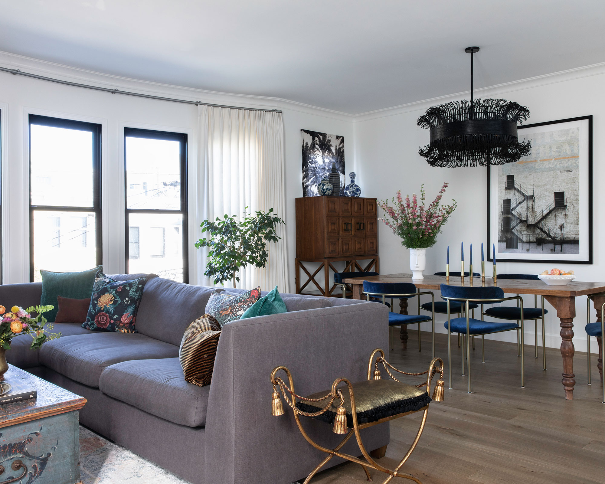
Black and white can completely alter the feel of a room but getting the balance right is key. Here, touches of metal, texture and colorful accents add interest without overpowering the space.
We had to have this sofa hoisted through the window – it was a hard fought battle – as the hall was a little tight. For the fabric, we used an outdoor quality, so as to ensure it was as child proof as possible.
Dining room
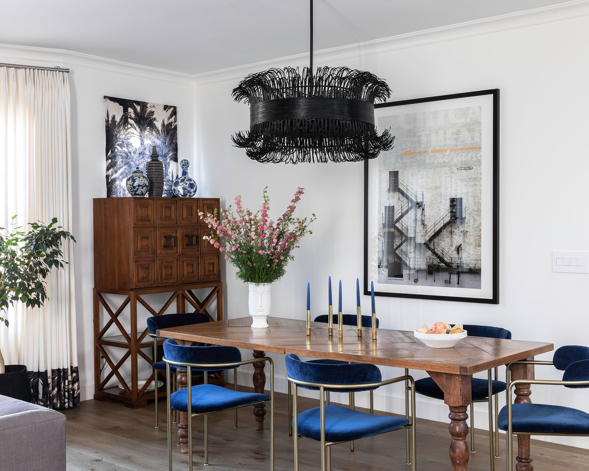
We wanted the chairs to feel unique but also child-friendly – this fabric from Holly Hunt is an outdoor indigo velvet that can be cleaned easily with bleach, and it will still look just as delightful.
The chandelier felt like a charming jewel in the space – just enough flutter with a nod of sophistication to welcome dinner parties back into our world.
Landing
Powder room
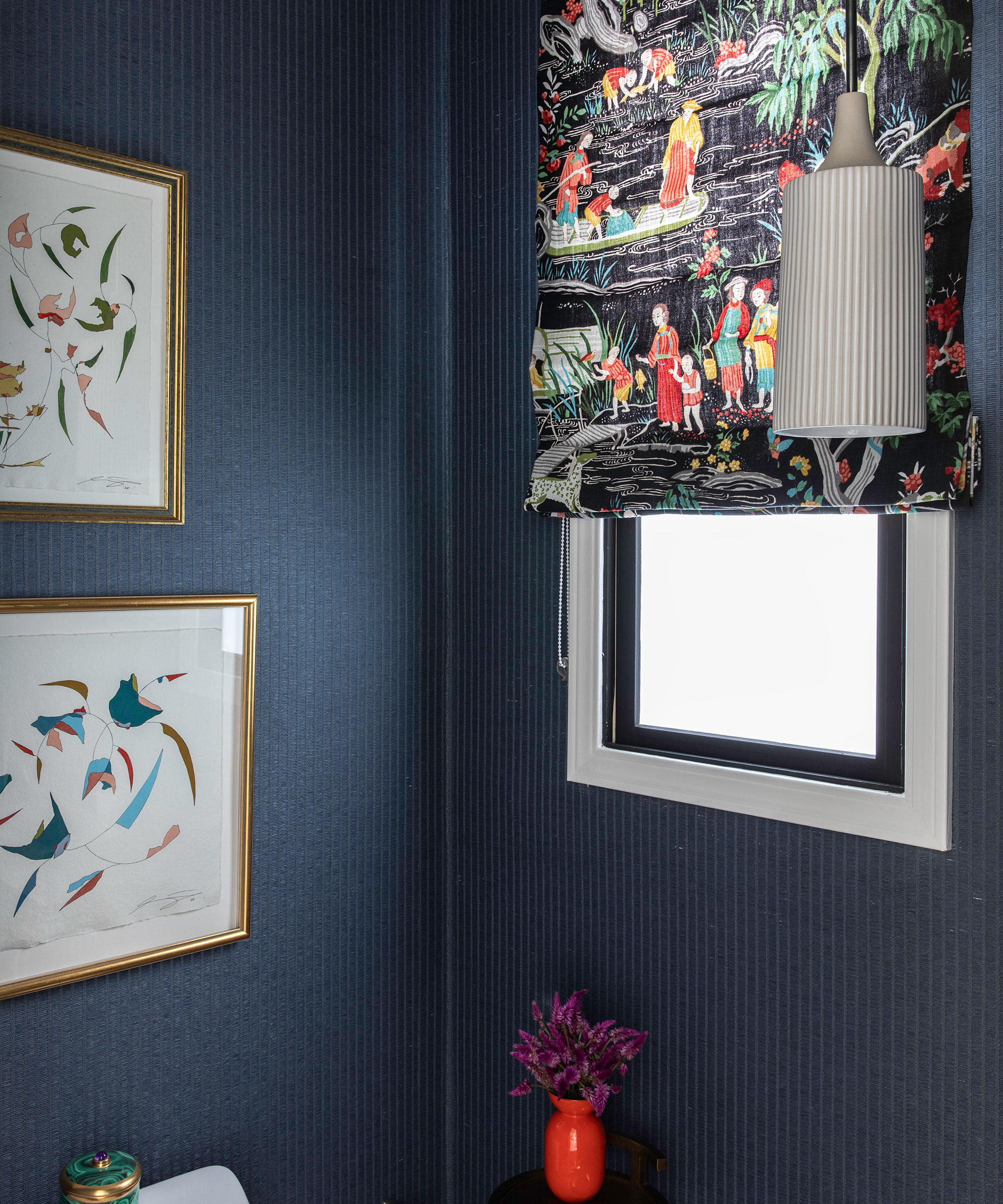
I adore a gorgeous chinoiserie nod, and this fabric felt so dazzling with this art we discovered from artist Lindsey Porter.
Lindsey Porter’s work is exceptional – these pieces are framed in vintage frames, the pieces are called “Punch Drunk Commander I” and “Blossoms in the Valley".
Bedroom
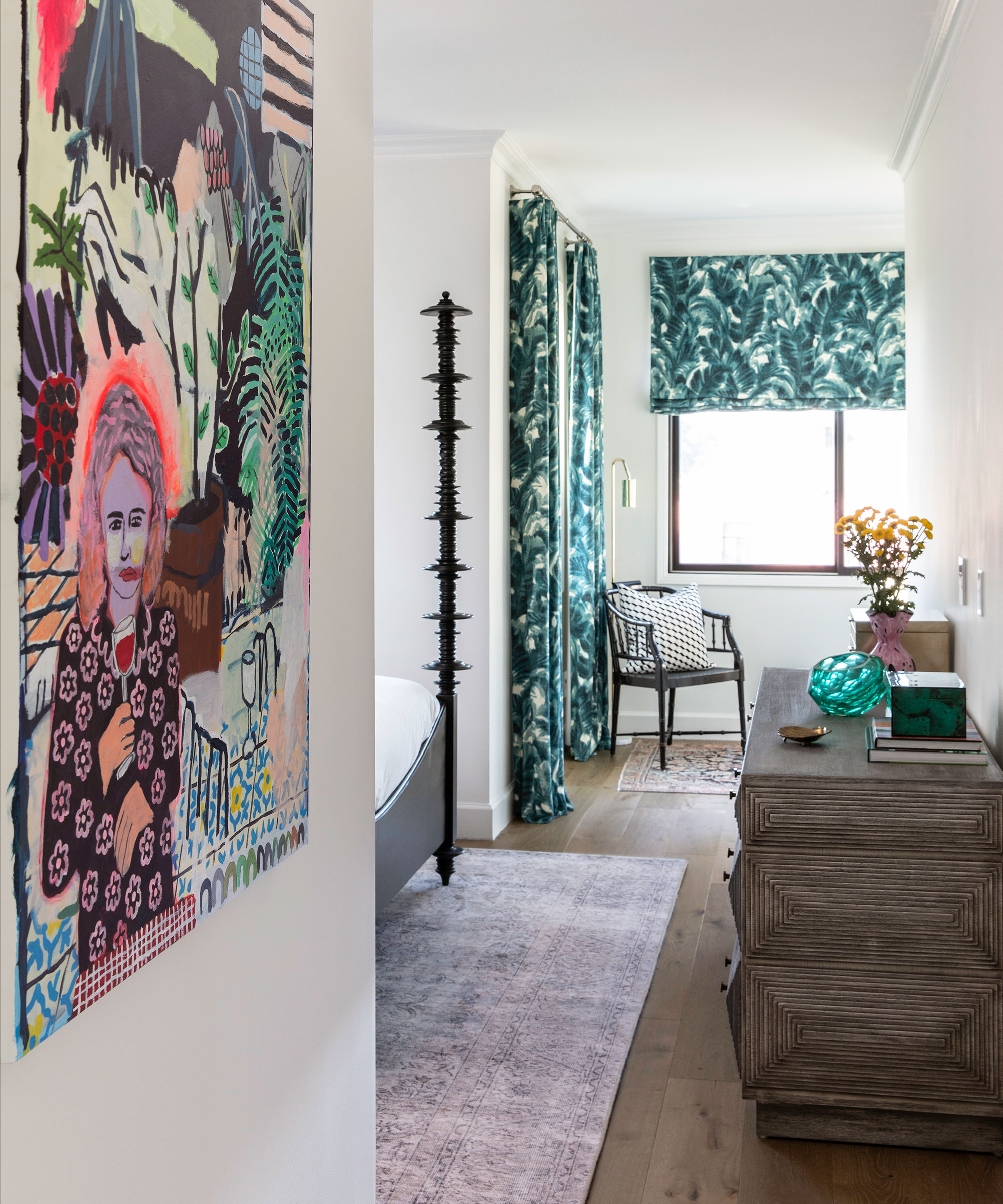
The daughter loves to point out “Mommy” sipping the wine in this commissioned art piece – it gives us a laugh every time! Colin Holloway was a joy to work with on this commission.
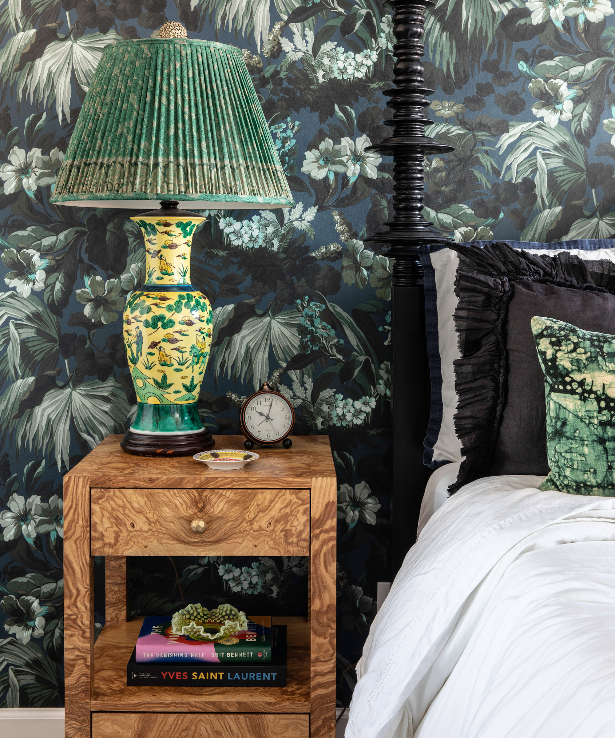
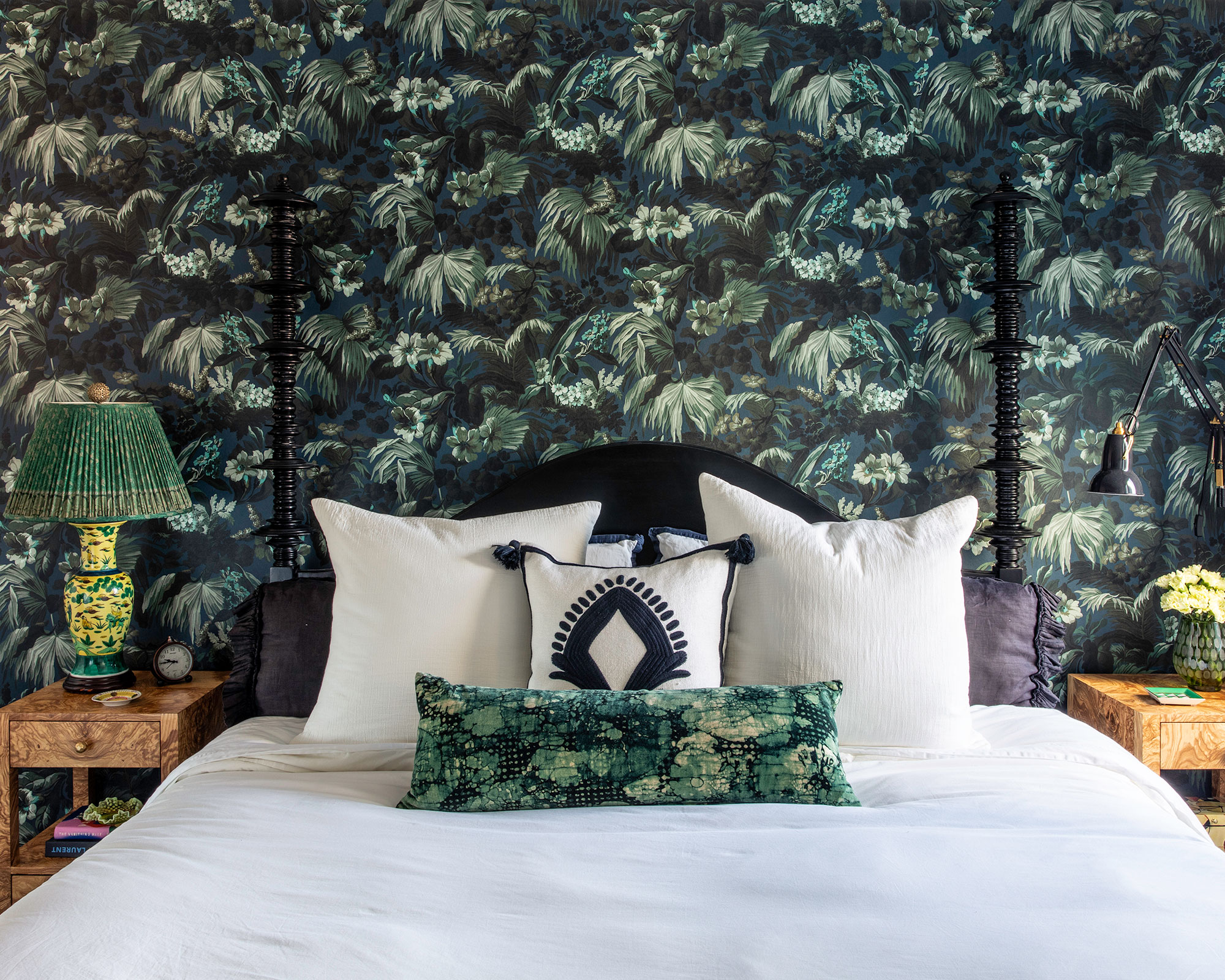
We often joke that this room should be called “work from Bali” – which especially rang true given we installed this just as we were going into the first lockdown.
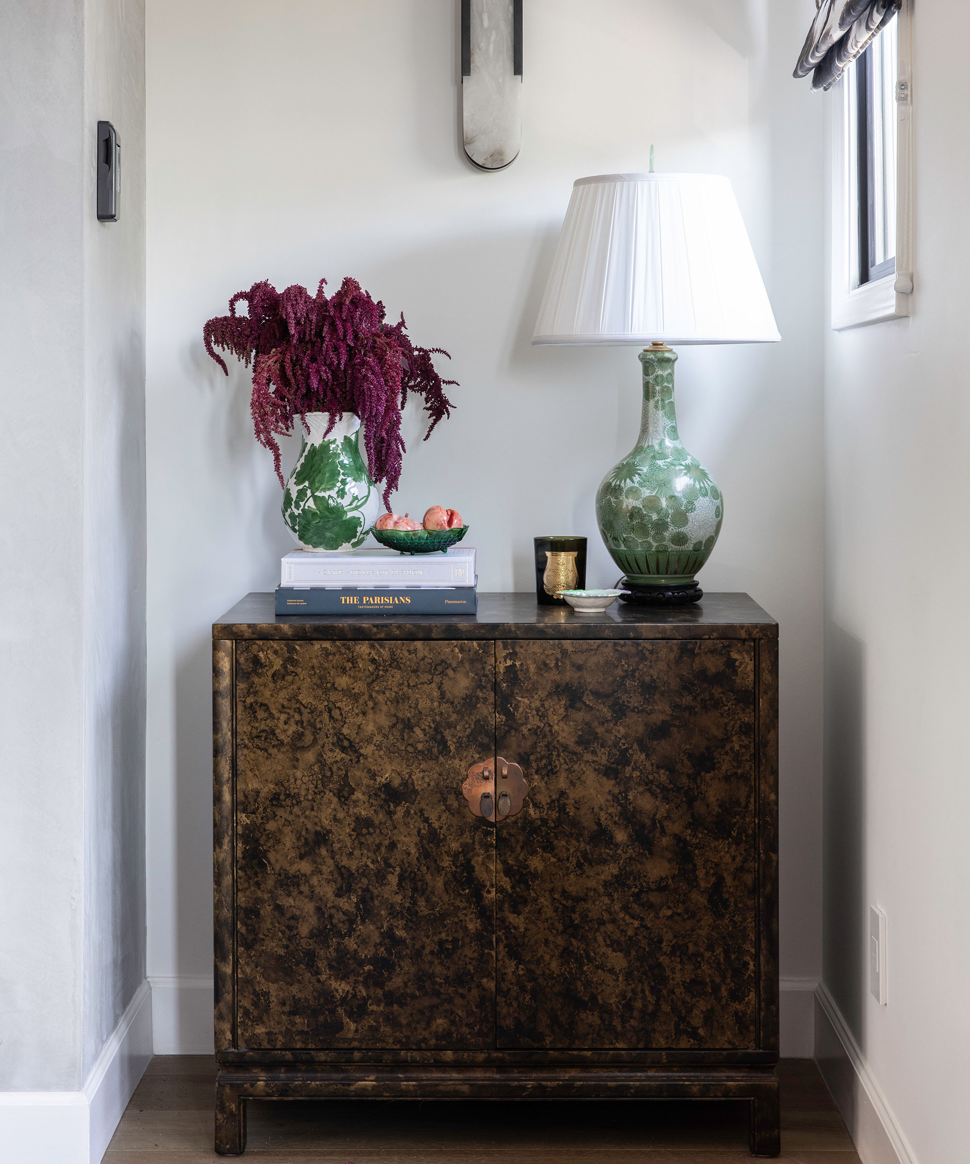
The Japanese Kutani lamp was a lovely reminder of the owners travels to Japan and the lamp that we knew would make this room feel complete and collected.
Dressing area
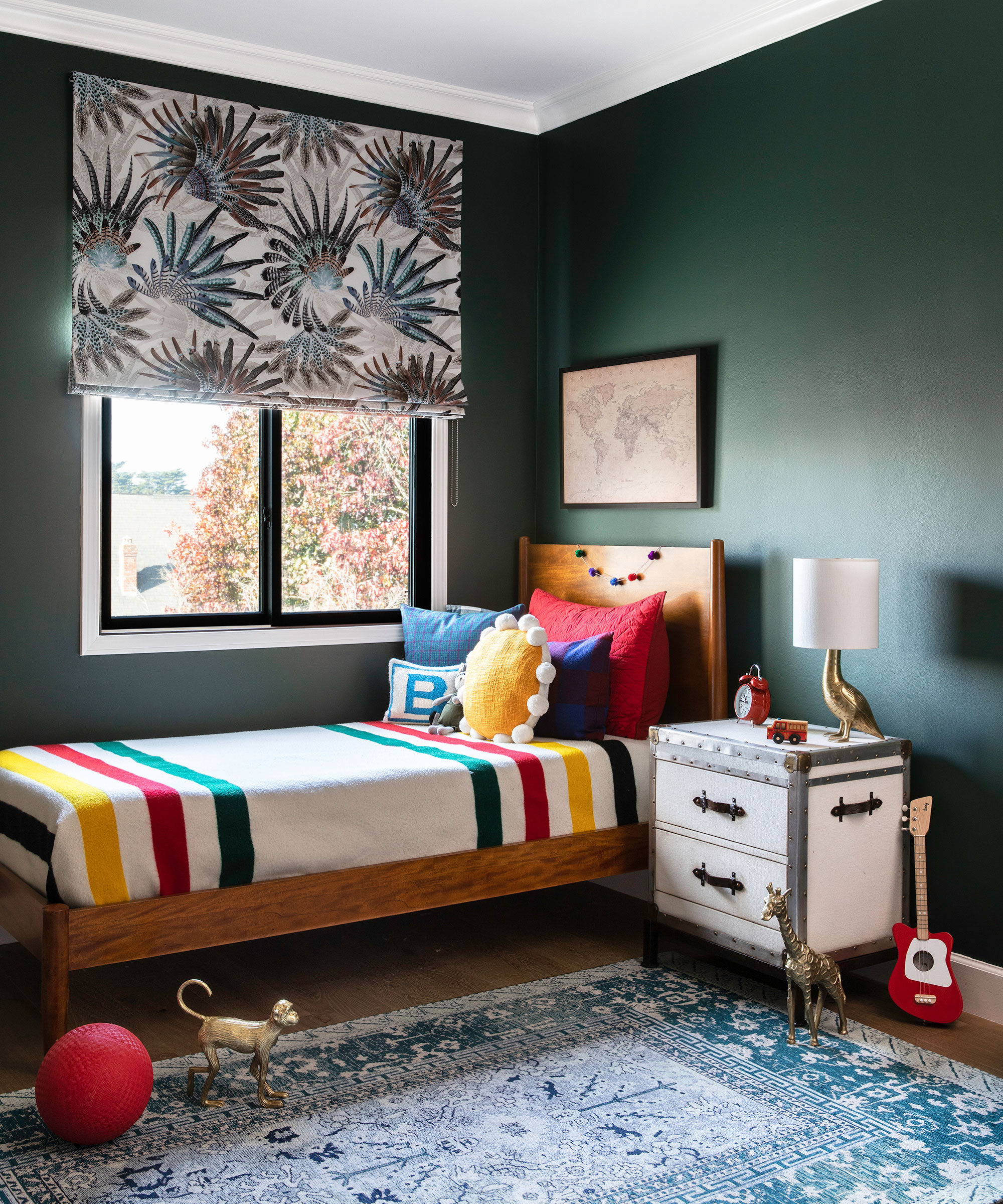
Child's room
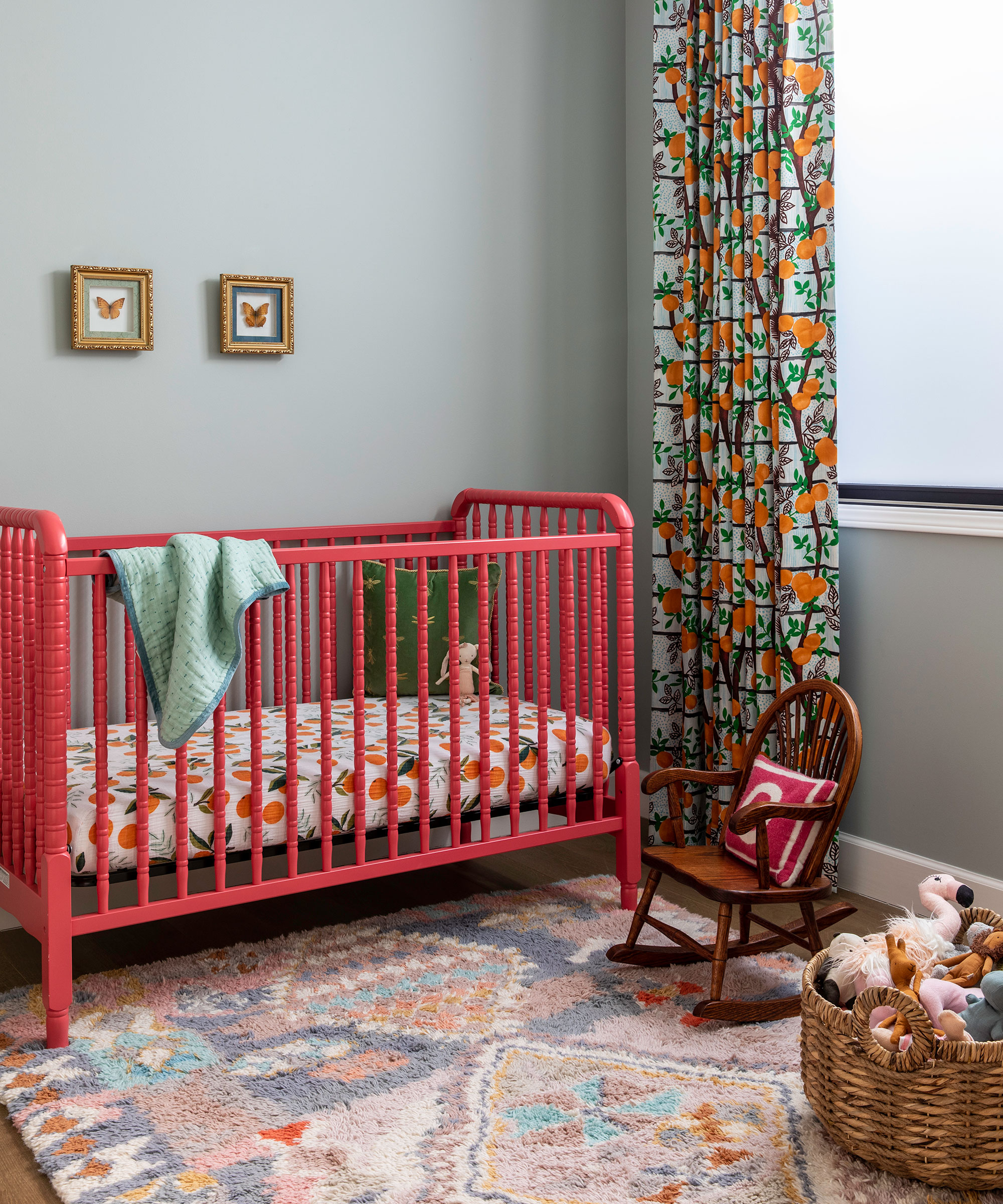
Nursery
Interior design / Lorri Hicks Cazenave at HICKS CAZENAVE INTERIOR DESIGN
Styling / Leila Nichols
Photography / Vivian Johnson

Jennifer is the Digital Editor at Homes & Gardens, bringing years of interiors experience across the US and UK. She has worked with leading publications, blending expertise in PR, marketing, social media, commercial strategy, and e-commerce. Jennifer has covered every corner of the home – curating projects from top interior designers, sourcing celebrity properties, reviewing appliances, and delivering timely news. Now, she channels her digital skills into shaping the world’s leading interiors website.