7 Colorful Rooms From the Recent Pages of Homes & Gardens – and What They Teach Us About Balancing On-Trend Colors With Timeless Design
From a cheerful yellow entryway to a breakfast nook covered in whimsical wallpaper, these 7 spaces prove the versatile power of color

Design expertise in your inbox – from inspiring decorating ideas and beautiful celebrity homes to practical gardening advice and shopping round-ups.
You are now subscribed
Your newsletter sign-up was successful
Want to add more newsletters?
Color is one of the most powerful tools in interior design, and going bold with color is often approached with caution. There's a balancing act between choosing a brave shade and ensuring a room still feels timeless – and these colorful homes from our recent pages strike that balance perfectly.
Yes, color is subjective; what's bold to one person is serene to another, and it's endlessly versatile, too. As these room color ideas show, 'colorful' needn't mean drenching a room in vivid orange (although that would be very in line with this year's biggest color trends). A quiet use of color can make a home feel just as lived-in, cheerful, and deeply personal.
These seven colorful spaces prove that there's more to decorating with color than just brightly painted walls. From living rooms lovingly layered with rich fabrics to a dining room that embraces a spectrum of green tones, these designs prove that color is more than just a way to liven up a space – it can define mood, add depth, and give a home its unique character.
Article continues below1. A Bed Nook That Makes a Case For Pink and Green
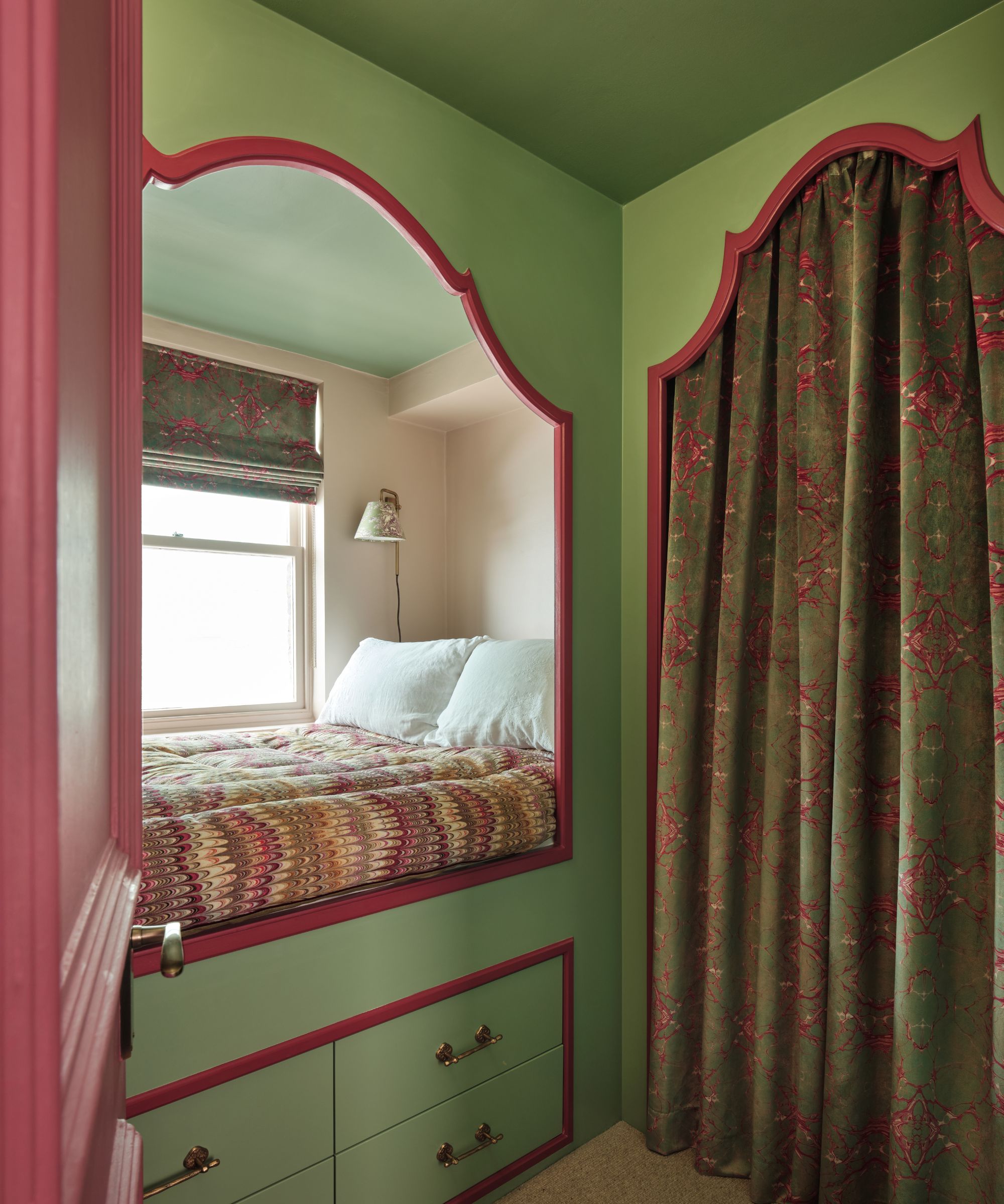
Vibrant green and pink made this bed nook feel even more enchanting. The drapes and blinds made from Susi Bellamy marbled fabric bring a layer of intricacy to counteract the stark tones.
A green and pink color scheme sounds a little bold, but this bed nook, designed by Pandora Taylor, couldn't be more balanced. By committing to the unexpected color combination, the design feels confident rather than overwhelmed.
'Color is usually the first thing I think of when I walk into a room,' explains Pandora. 'Once I know how the client envisages using the space and how they want to feel in it, this starts building a color story that helps create this atmosphere. From there, we look at fabrics and often fall in love with one, which then dictates the particular tone of the other colors we pull in.'
'In this space it all started with the blind and curtain fabric by Susi Bellamy,' she adds. 'The marbled jewel tones of red and green. It being a very small space, it made sense to repeat these colors throughout, but in a slightly lighter tone so it wasn't too oppressive. To lighten things further and to add some depth to the room, we painted the inside of the bed nook a paler pink as a welcome contrast for the darker tones to sit against.'
'Never be afraid to use darker or richer colors, just always think about how you can balance it out so it doesn't overwhelm the entire scheme... unless that cocoon vibe is what you're going for!'
Design expertise in your inbox – from inspiring decorating ideas and beautiful celebrity homes to practical gardening advice and shopping round-ups.
2. A Living Room Layered With Subtle Tones
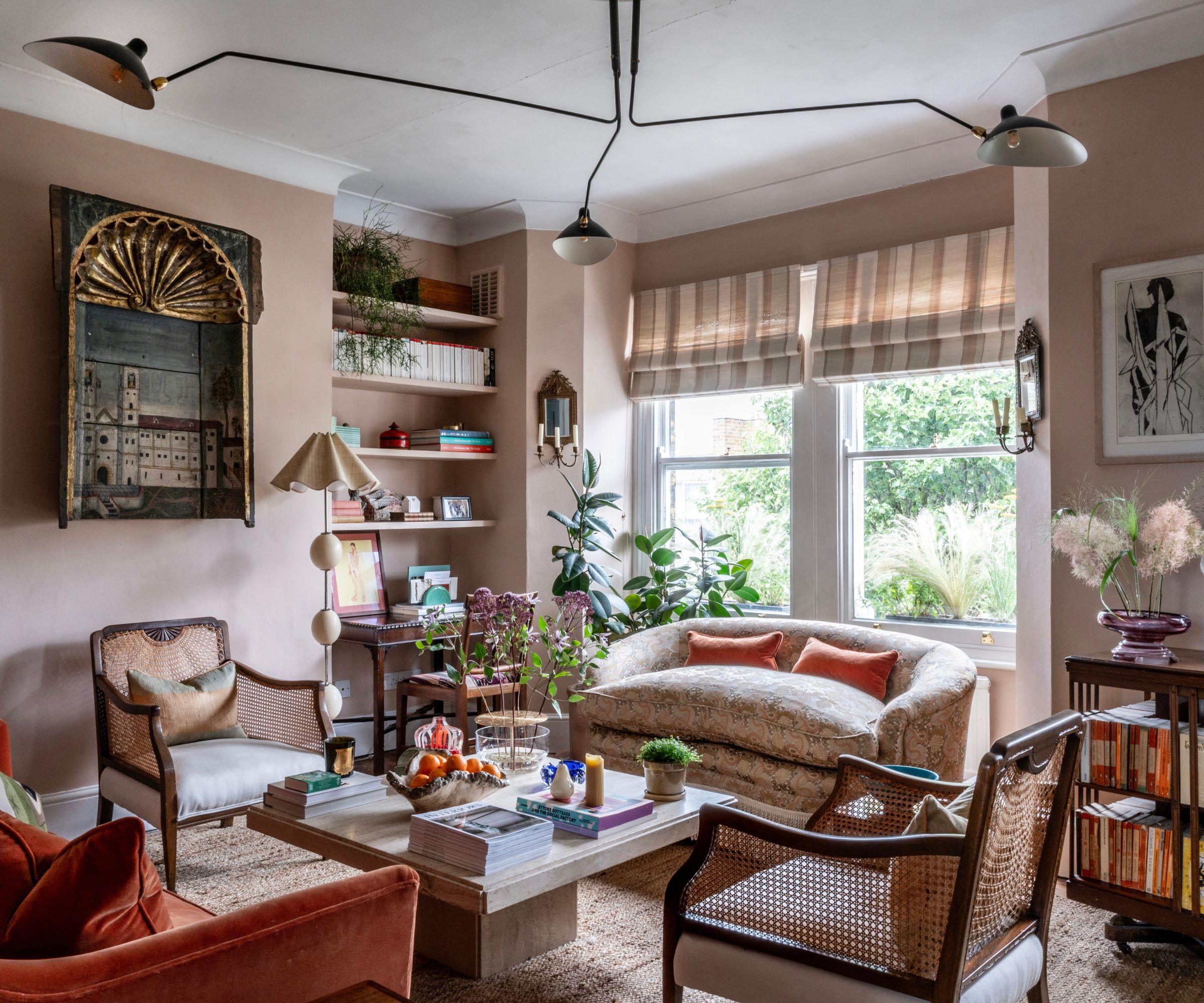
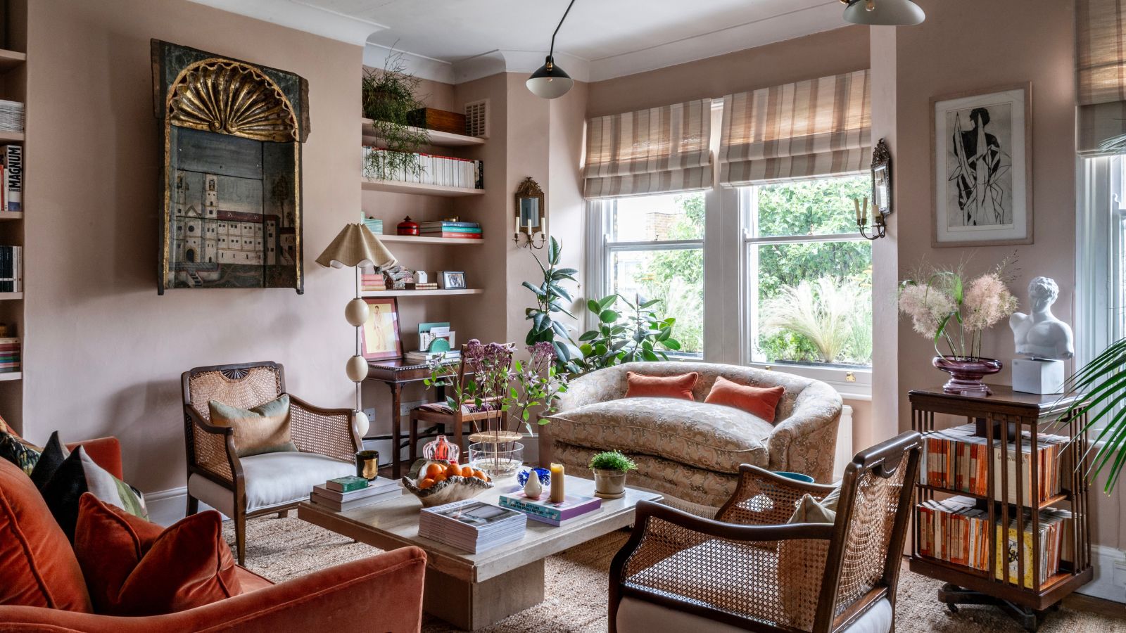
Farrow & Ball's Setting Plaster adorns the walls of this living room. Richer tones are introduced through soft furnishings, like the deep orange pillows, much like the Liam Velvet Pillow from Lulu & Georgia.
While it's easy to believe that decorating with rich colors is best achieved with striking paint colors, this livable design makes a case for layers of deep hues in quieter, more intentional doses.
Designed by Ananth Ramaswamy, founder of Arall Studio, this transitional living room proves that color needn't be in your face; it can quietly sing in even the smallest doses. As he explains, 'I tend to think about color as something that’s layered and lived with, rather than introduced as a single bold gesture. I usually start with a gentle, grounding backdrop and then build color through furniture, textiles, artwork, and objects. It’s less about a rigid scheme and more about allowing colors to sit together naturally, so spaces feel expressive but still calm and comfortable to live in.'
'In this space, the starting point was the soft Setting Plaster tone on the walls, which creates a warm, understated base,' Ananth explains. 'From there, I worked with what we already had in the flat, the oak-framed armchairs, a revolving bookcase, and shelves filled with Penguin books, which already brought their own quiet rhythm of color. The sofa in a tangerine orange became a slightly bolder moment, which then allowed other softer tones to be woven in. A Rubelli jacquard on the window seat introduced pale pinks, golds, greens and peachy notes, which were then echoed in the cushions on the armchairs.'
'The color is quite subtle overall, but it’s present and layered. It isn’t meant to feel overly designed or overly serious, more something that’s been built up intuitively over time. I think the takeaway is that colorful rooms don’t have to be loud or heavily themed, they can emerge gently, through small decisions and lived-in elements, and still feel rich and characterful.'
3. A Breakfast Nook Covered In a Playful Wallpaper
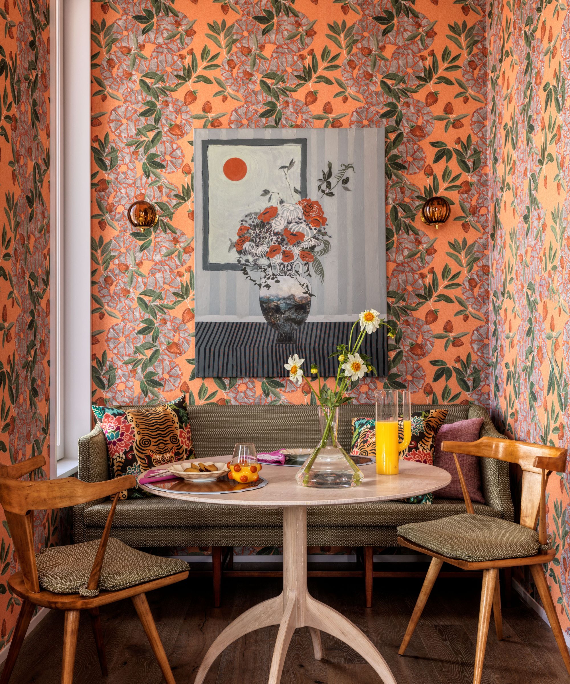
Jennifer Shorto's Eden Wallpaper breathes life into this quaint breakfast nook, evoking a cheerful, playfulness.
This cheerful breakfast nook makes a colorful, whimsical wallpaper the star of the show. A setting that instantly uplifts, the room couldn't be more fitting for starting your day. It proves that color needn't be limited to purely decor or paint; in fact, vibrant wallpaper is sometimes all a room needs to feel enlivened – the rest can follow suit.
Heide Hendricks from Hendricks Churchill, explains, 'Color is our starting point for every interior design project. We first establish a color palette, which is informed or inspired by the unique setting of each project. We consider how this color story will unfold from room to room and how each room's dominant hue will be experienced at the time of time when that room is most in use. It's a fundamental building block, even before foundation pieces are considered.'
Heide adds, 'In this image, the wallpaper came first! We wanted to inject the monochromatic white kitchen with a blast of color on the walls. Jennifer Shorto's Eden Wallpaper offered both a whimsical and cheerful solution. It also provided a palette of cheerful colors to pull out in the surrounding wood tones and textiles. One of the project's kismet moments occurred when we saw the Lizzie Gill painting in a gallery window and realized it looked like it was painted for this nook. Its lush still life is bold enough graphically to layer over the busy wallpaper without getting lost and still holding its own.'
4. A Welcoming Kitchen That Makes Yellow Feel Liveable
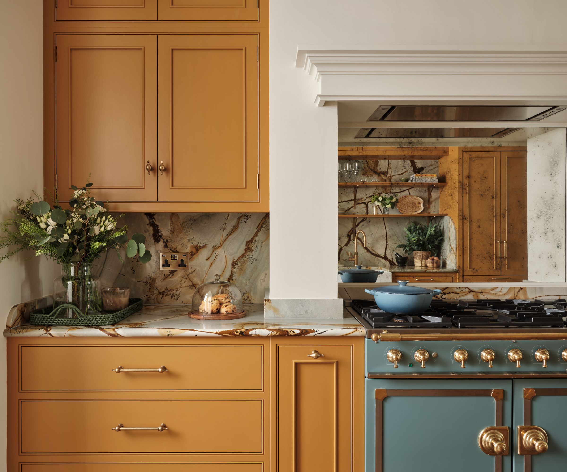
A deep ochre paint creates warmth and richness in this luxurious kitchen designed by Lara et al.
Brought to life with rich yellow paint and a powder blue range, this rather enviable kitchen, designed by Lara Bates, Founder of Lara et al Studio, strikes a perfect balance between warm and vivid.
Lara explains, 'I’m very conscious of saturation. If I’m mixing colors, I ensure they share the same intensity. A dusty pastel pairs beautifully with a muted grey, but would look lost next to a vivid primary red. It’s all about balance. Getting the right shade of paint that evokes the correct emotion at the start is the key, and we can tie all further material and fabrics to build the scheme.'
A rich-toned ochre (much like Benjamin Moore's Ochre) proves that yellow kitchens aren't always striking; in fact, they can feel liveable, inviting, and calming, particularly when balanced with organic materials like marble countertops.
'Imagine the wonderful mood this sunny scheme will set you up in for the day!' Lara continues. 'We’ve all heard the fear people feel about how bold color may be too much in time, but we feel this example brightens your day upon each view. The contrasting blue ‘la cornue’ range breaks the warm sunny ochre tones of the cabinetry, which we feel helps make the scheme pop.'
5. A Dining Room Enriched In Zingy Green Hues
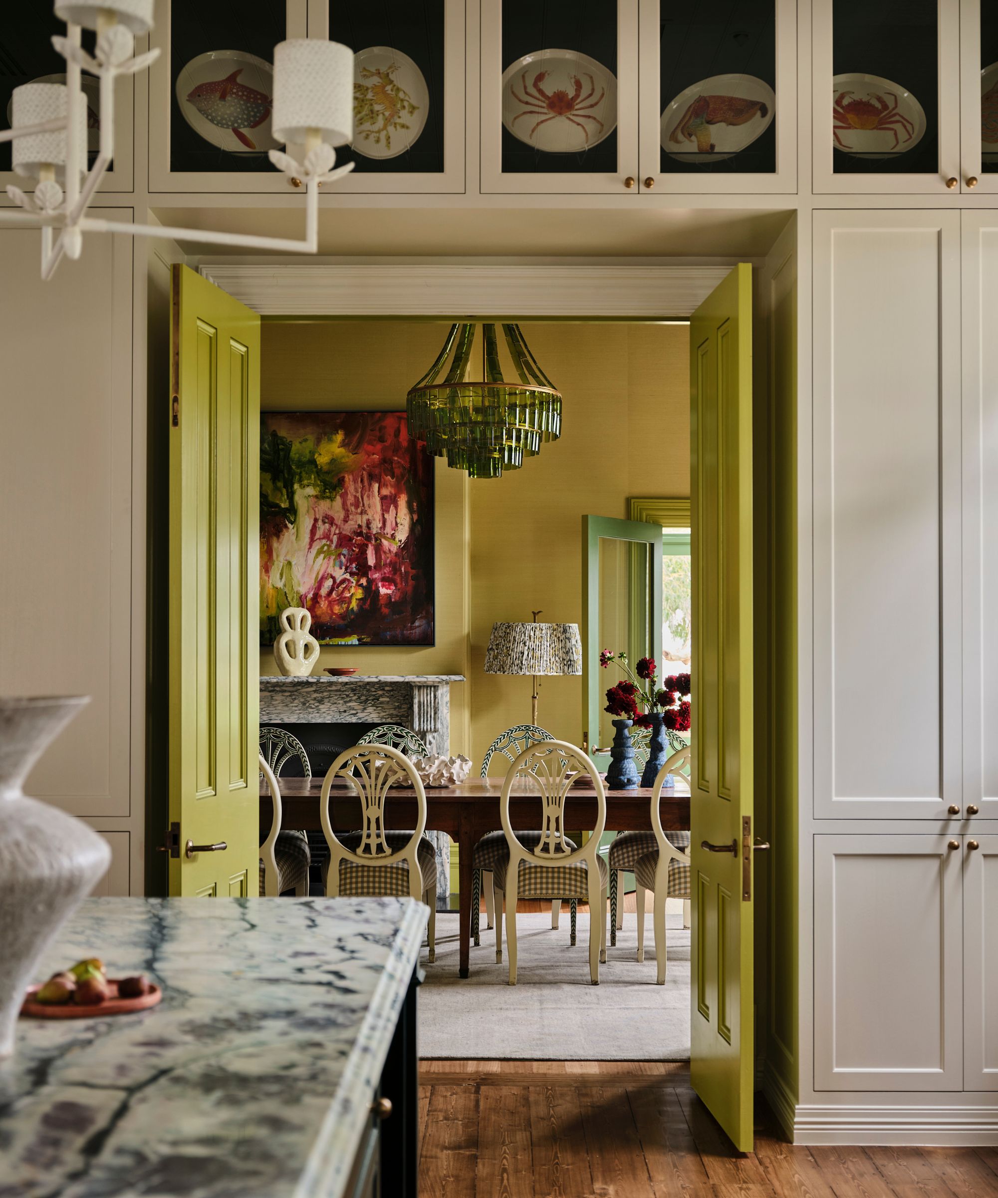
Doors painted in chartreuse paint (much like Farrow & Ball's Citrona) entice you to enter this elegant dining room.
While an entirely lime green color scheme could be a little overwhelming in some scenarios, in the case of this vibrant dining room, it couldn't be farther from the truth.
With a pair of chartreuse doors leading the way, the dining room pays homage to green in all its zingy glory. Its designer, Lucinda Kimpton, explains, 'This room was designed as the moment before the moment – the space where a bride would leave to walk toward the clocktower reception. Many function venues can feel overly safe or restrained, but I wanted this interior to feel uplifting, almost transformative. I imagined a bride in white standing within the room, the photographs she’d take there, and the emotional energy she’d absorb before stepping into one of life’s most memorable evenings.'
'I usually start by reading the room literally and figuratively,' Linda explains. 'I look at the architecture, the landscape outside, the light, and then I turn my attention to the client themselves. Understanding their personality is essential: are they high-energy or more introspective, drawn to classicism or something more expressive? I listen carefully, particularly during relaxed, off-topic conversations, because people often reveal far more about themselves when they’re at ease. Those moments are incredibly informative and help me shape a palette that feels authentic rather than imposed.'
She adds, 'What it teaches us is that color, when used with conviction and context, can do more than decorate a space – it can shape anticipation, emotion, and memory.'
6. An Entryway Painted In a Cheery Yellow
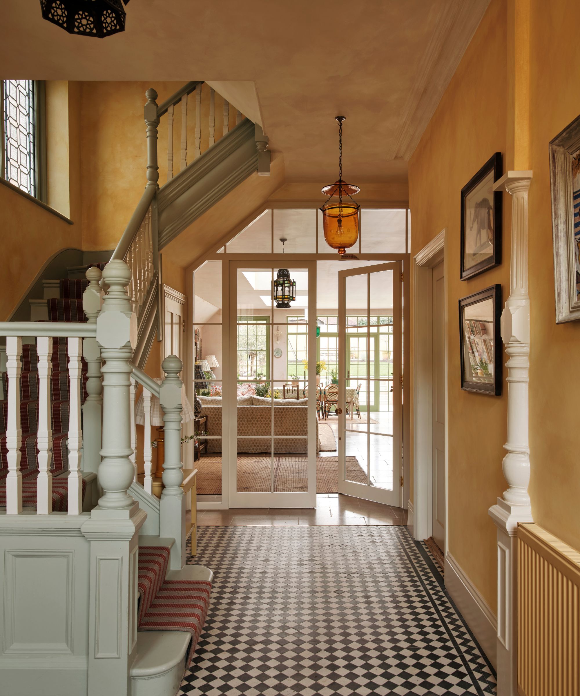
A cheery yellow limewash is a clever choice in this entryway, transforming the room into an inviting place that guests want to linger in. Its lived-in details add to its charm, particularly the vintage Moroccan lantern like this style from 1st Dibs and the framed artwork.
The transitional nature of an entryway can make it easy to forget; however, as the first room in the home, it's a space where first impressions really count. While walls covered in art or a statement rug can make the space feel homely, a cheerful yellow paint like the chosen shade in this characterful hallway designed by Alice Palmer, welcomes and entices you to enter.
Alice explains, 'I love mixing color and pattern to create spaces that feel bold, unique and balanced. I try to incorporate color into all of my designs, drawing inspiration from my travels in India, Morocco and the West Indies. For me, color and pattern can completely transform a home into a layered space, full of personality.'
'I love this yellow lime wash from Francesca’s Paints, it creates an instant sense of warmth and is a great backdrop for layering pattern and color,' she continues. 'The textured finish absorbs the light and changes color throughout the day, creating a unique softness. For gentle contrast, I chose a soft sage green for the staircase, which sits really naturally alongside the yellow walls. I kept the original floor tiles, and I love how its monochrome pattern anchors the space and gives everything a sense of balance.
Alice adds, 'While yellow and green might sound bold against a black and white floor, the muted tones and textured finish keep the look calm and inviting rather than overwhelming.'
7. A Cozy Bedroom Swathed In Colorful Fabrics
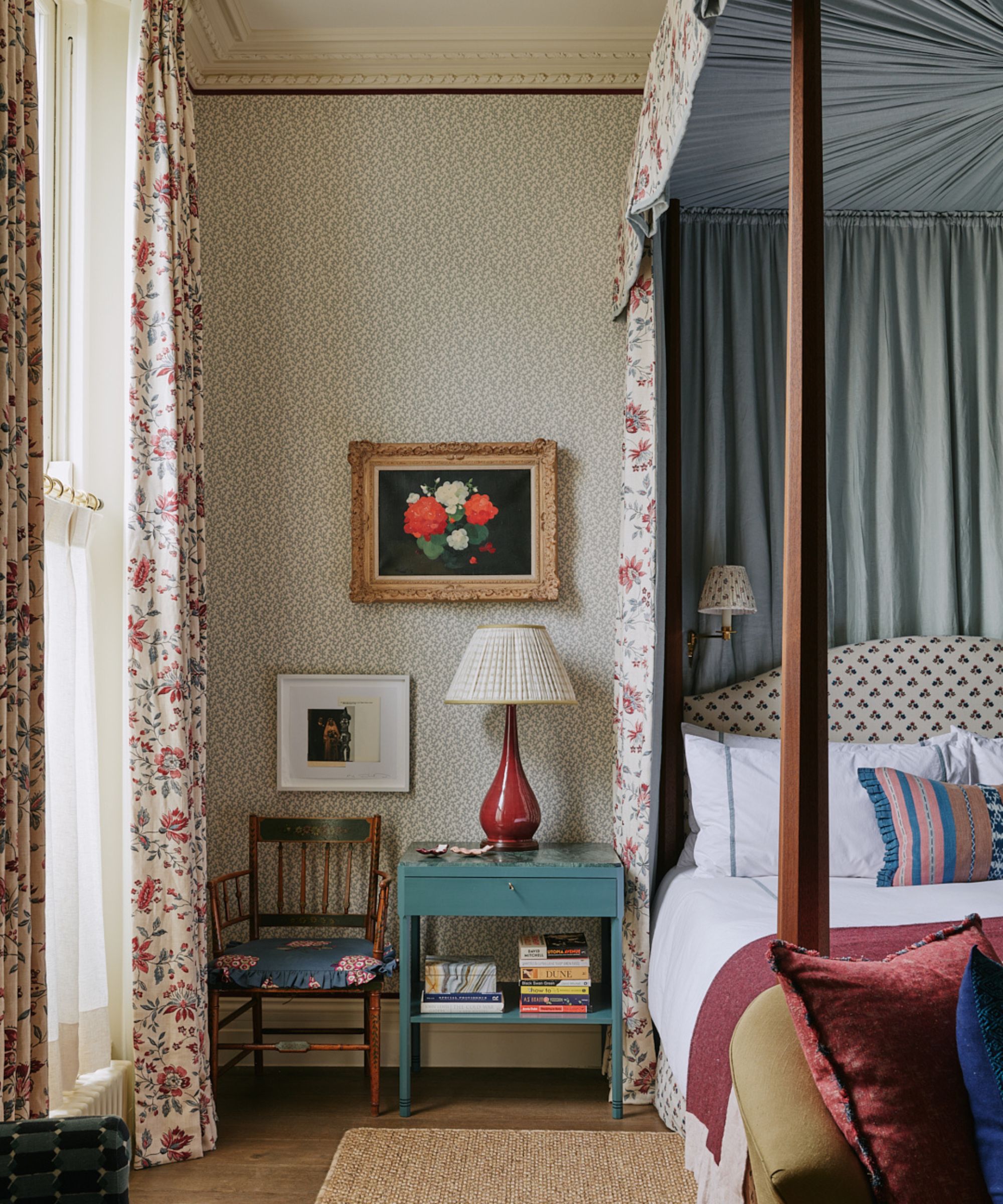
Layers of rich tones add a whimsical feel to this vintage bedroom. From the floral drapes to the shiny lacquer lamp (much like the Addison Ross Cherry Red Bobbin Lamp), which brings a playful edge.
Acknowledging the history behind this traditional bedroom, designers Mary Graham and Nicole Salvesen used color in small, layered doses, using it to bridge the gap between old and new. The bright soft furnishings and decorative accents feel refreshing, yet completely sympathetic to the historic setting.
They explain, 'This room began with the client’s love of art and antique textiles, and a shared willingness to be bold with pattern and color. That passion set the tone for the entire scheme. The palette flows naturally from those influences, with hues layered and echoed throughout the space to create depth and character without ever overwhelming it.'
They continue, 'It’s entirely possible to create a home that feels colorful without it becoming overpowering. For us, color should enhance a room, never dominate it. We often begin a scheme with a hero fabric. That single textile becomes our anchor, and from it we draw a palette that informs everything else in the space. By lifting tones directly from the fabric, we’re able to build a layered scheme that feels cohesive, balanced and effortlessly harmonious.'
They add, 'It’s a lovely reminder not to shy away from color or pattern, when they’re tied together by a considered, cohesive palette, they simply work.'
These colorful rooms prove the endless versatility of color. From an enchanting bed nook to a traditional bedroom layered with vivid fabrics, every design is unique, yet each teaches us that color is a tool we can all use, in even the smallest of doses.
