What color is chartreuse? How to use it in your decor
A vivid, yellow-green shade that instantly commands your attention, we explore the question, what color is chartreuse?

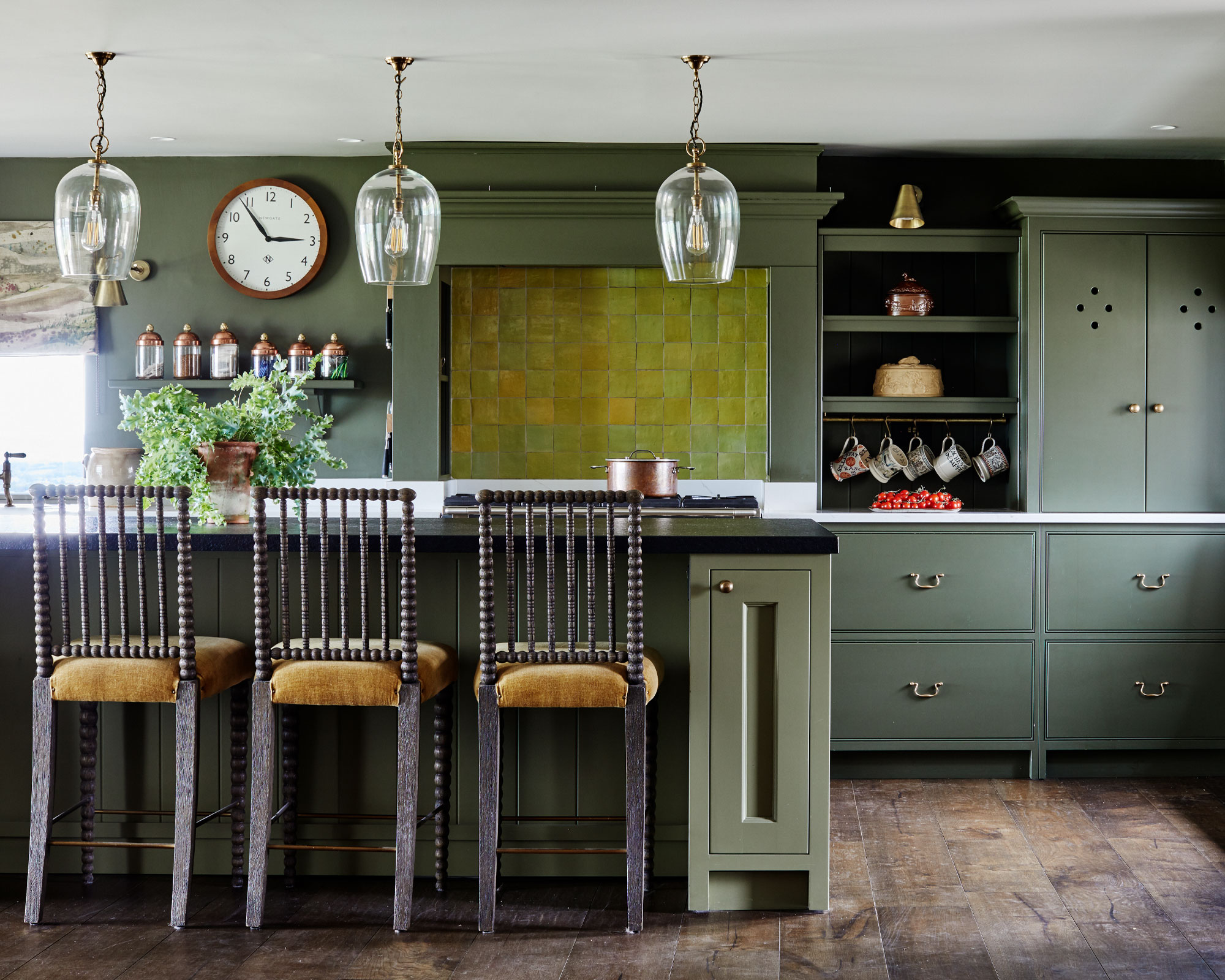
Named chartreuse after its resemblance to the French herbal liqueur, the color chartreuse embodies a distinctive and energetic character that can beautifully uplift and brighten a room. A color that many may not have heard of, chartreuse has been ever-present in the world of design but has not always been at the forefront. Recent color trends for 2022 show that bold, bright colors are having a moment, so we address the question, what color is chartreuse?
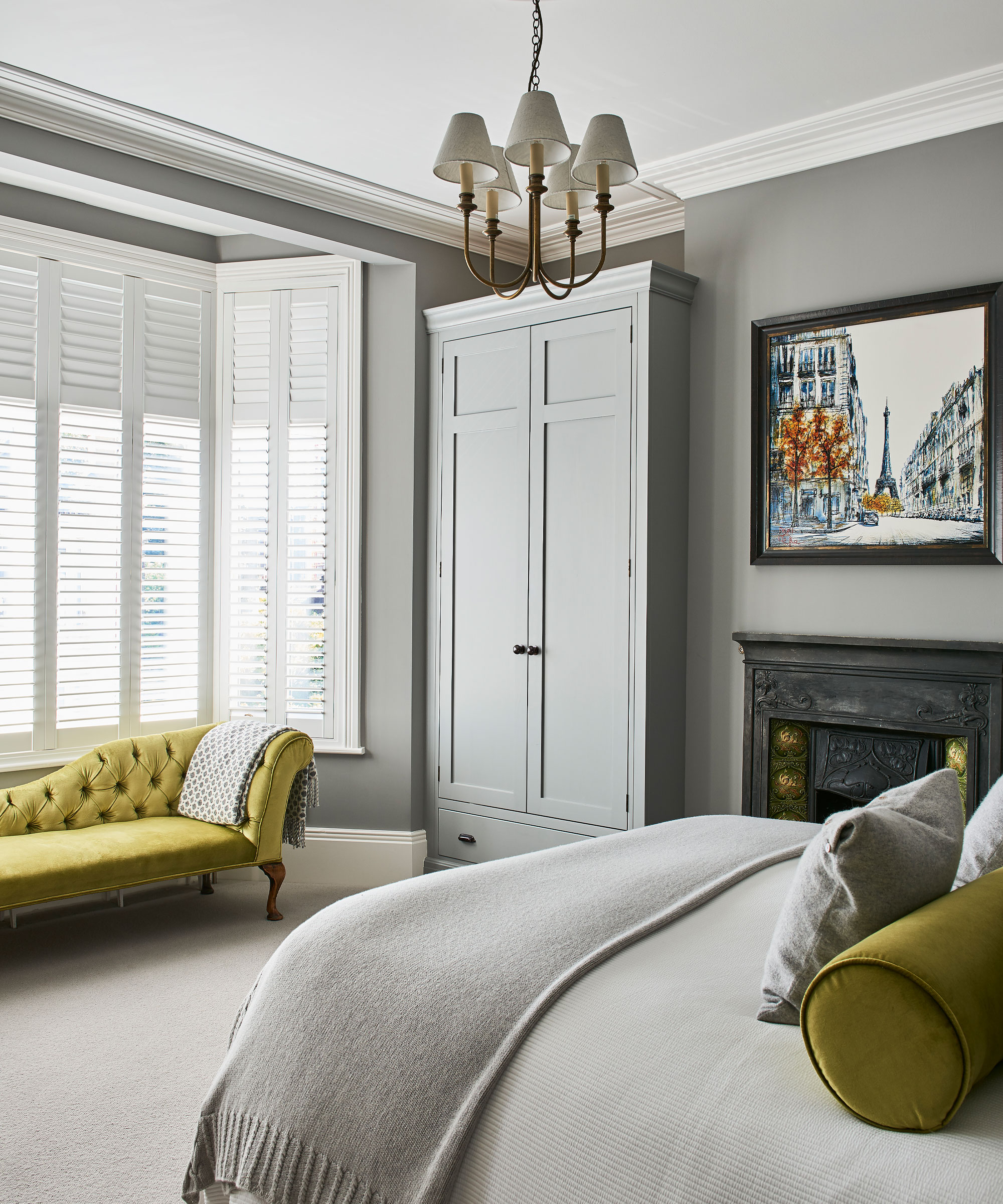
What color is chartreuse?
In the color wheel, chartreuse is made from a mix of yellow and green, sitting halfway between the two colors. As yellow is a primary color and green a secondary color, chartreuse is known as a tertiary color (an equal mix of primary and secondary colors). Due to chartreuse being a mix, there are many different shades available, with some closer to green and some closer to yellow.
If you’re looking for inspiration for room color ideas and decorating with color, chartreuse is guaranteed to make an impact. Using bright shades when decorating with yellow and decorating with green in interior design is renowned to create an upbeat atmosphere full of excitement and fun.
Natasha Bradley, Color Psychologist at Lick Paint states, ‘yellow affects our emotions and is a great choice for kitchens, particularly if there is a lack of natural light. It’s bright and cheerful and brings positivity to the heart of the home’. The citrus, neon-like tones of chartreuse make it a truly unique color, whether you choose to use the color subtly through accessories and soft furnishings or make more of a statement with a painted wall or door. We now address some of the most popular questions asked when researching, what color is chartreuse?
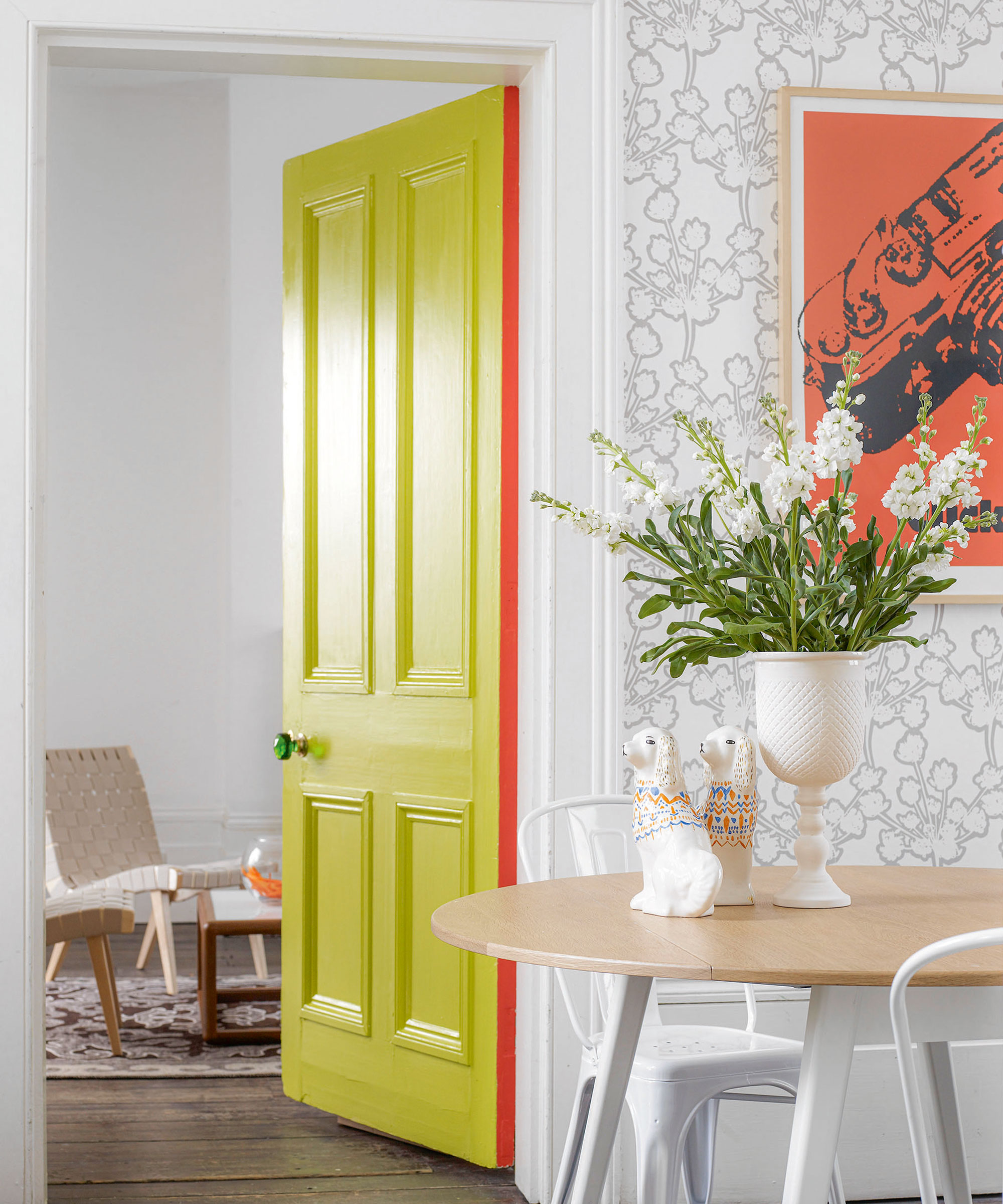
Is chartreuse more yellow or green?
As discussed, on the color wheel chartreuse is made up of an equal amount of yellow and green, and as the color is mixed there are many shades available. There are two types of chartreuse liqueur, chartreuse yellow and chartreuse green, so that can sometimes cause confusion as to what shade chartreuse is meant to be, but technically the color is formed from an equal amount of yellow and green.
What color looks good with chartreuse?
Chartreuse can elevate both traditional and modern interior spaces, whether paired with other bold, bright shades or more neutral, calmer colors. In the color wheel, complementary colors sit opposite each other. Chartreuse sits in the yellow-green section, the opposite, complementary colors would be red-violet for a shade closer to green and blue-violet for a shade closer to yellow.
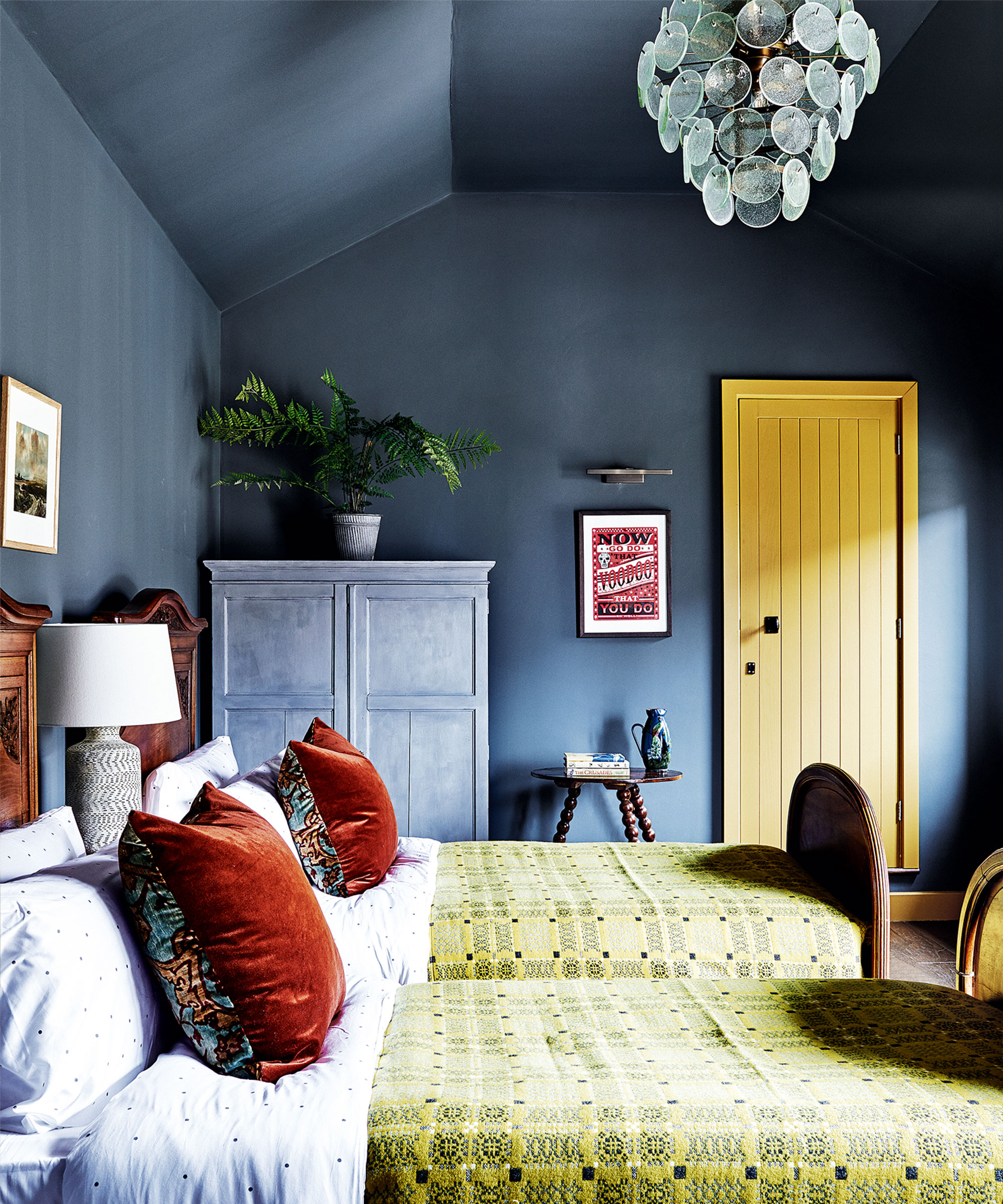
Is chartreuse a warm or cool color?
Depending on how you use your specific chartreuse shade and what other colors you are working with in your scheme, shades closer to green tend to be cooler and shades closer to yellow warmer. Tobie Lewis, Senior Brand Manager at Valspar Paint says ‘fresher, cleaner tones, such as Vintage Chartreuse, encourage maximum light into a space, boosting serotonin and enhancing positive moods, great for kitchens and lively spaces’, ideal for creating a warming, inviting atmosphere in the home.
How can I decorate with chartreuse?
The key to making a chartreuse room look good is choosing exactly the right shade. This is determined by how much natural daylight the room gets and whether that light is cool or warm. Small windows and a north- or east-facing orientation will generally mean the room will be darker, so you need to go for either warm-toned pale chartreuse to make them feel bigger and brighter, or warm-toned mustard yellows for an inviting appeal.
Design expertise in your inbox – from inspiring decorating ideas and beautiful celebrity homes to practical gardening advice and shopping round-ups.

Zara joined Homes & Gardens in February 2022 as a Content Editor. After studying English Literature at University, she worked as an Ecommerce Website Editor, Content Writer and Buying Intern at multiple independent businesses within the luxury retail and lifestyle sectors. Her role at Homes & Gardens unites her love, experience and passion for the world of design and desire to create inspiring written content. She enjoys nothing more than discovering new trends, brands and products, whether that be in fashion, interior design or lifestyle.
