Food-themed color trends are taking over in 2025 – 6 spaces featuring the most delicious palettes, from butter yellow to pistachio green
Butter yellow, pistachio green, tomato red – here's all you need to know about the food-inspired colors dominating the interiors world

Design expertise in your inbox – from inspiring decorating ideas and beautiful celebrity homes to practical gardening advice and shopping round-ups.
You are now subscribed
Your newsletter sign-up was successful
Want to add more newsletters?
Take a look at the latest on-trend colors, and you'll soon notice a pattern – food-inspired shades are everywhere. From chocolate brown, which quickly earned its place as a 'new neutral', to summer's pistachio green, the colors we're turning to most to decorate our homes are seemingly influenced by food.
Among these color trends, which range from colorful and playful to timeless and neutral, there's much inspiration to be had, and for the most part, these colors are proving to be well-loved, rather than quickly passing trends.
Below, we've rounded up a selection of our favorite interior projects that reflect the most prominent food-inspired shades, from a tomato red home bar to a pistachio green sunroom.
Article continues below1. Butter Yellow
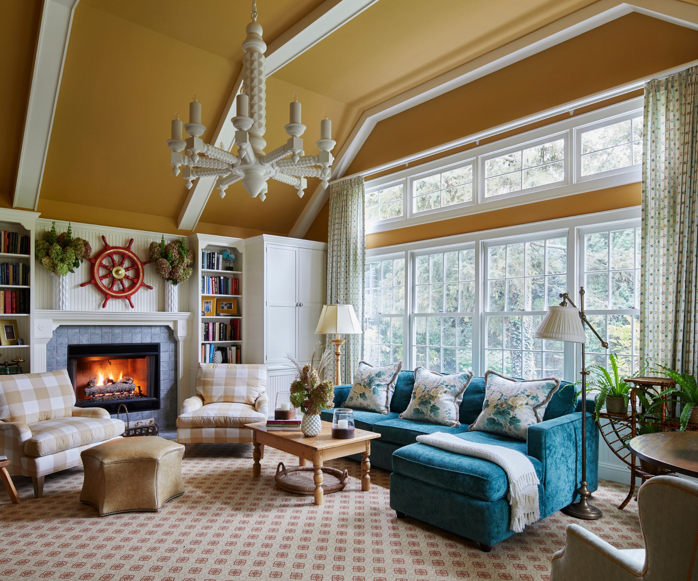
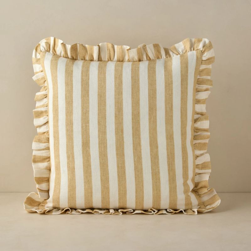
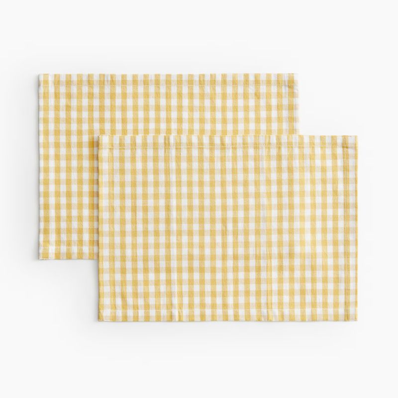
Among this year's most popular food-inspired color trends, butter yellow decor stands out more than most. Soft shades of yellow have been everywhere of late, not only serving as a fun, retro pop of color but paler variations working as neutrals, replacing once-popular cooler tones.
'Butter yellow is one of my favorite shades to work with because it has the softness of a neutral but the personality of a cheerful color,' says designer Daniela Araya of Daniela Araya Color & Interior Design Consultancy.
In this light and airy living room designed by Elizabeth Drake Interiors, Farrow & Ball's India Yellow is used on the walls, a rich and warming buttery yellow.
'I chose this shade of yellow for the drama,' explains interior designer Elizabeth Drake of Elizabeth Drake Interiors. 'It sings with the deep teal sofa, and the high contrast with white draws the eye to enjoy viewing the vaulted ceiling and white chandelier by Paul Ferrante. A lighter shade of yellow would have just drifted away from the design conversation.'
Design expertise in your inbox – from inspiring decorating ideas and beautiful celebrity homes to practical gardening advice and shopping round-ups.
2. Pistachio Green
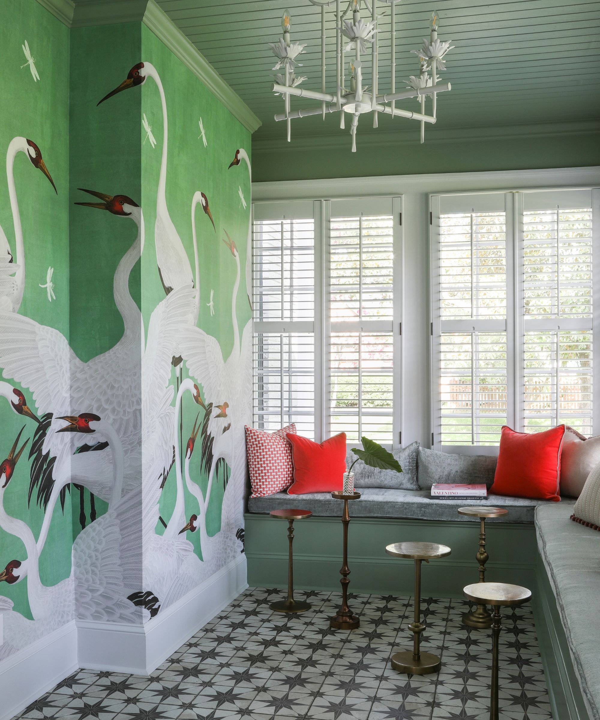
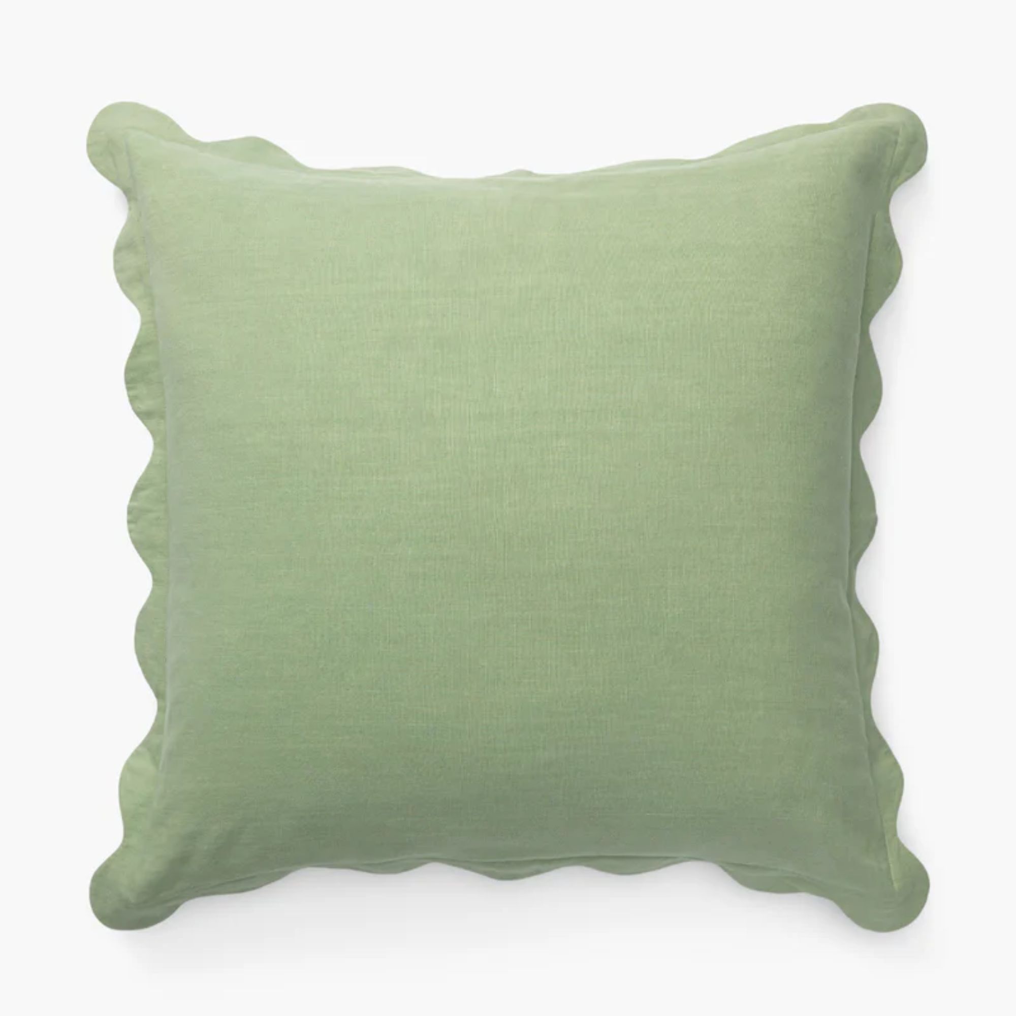
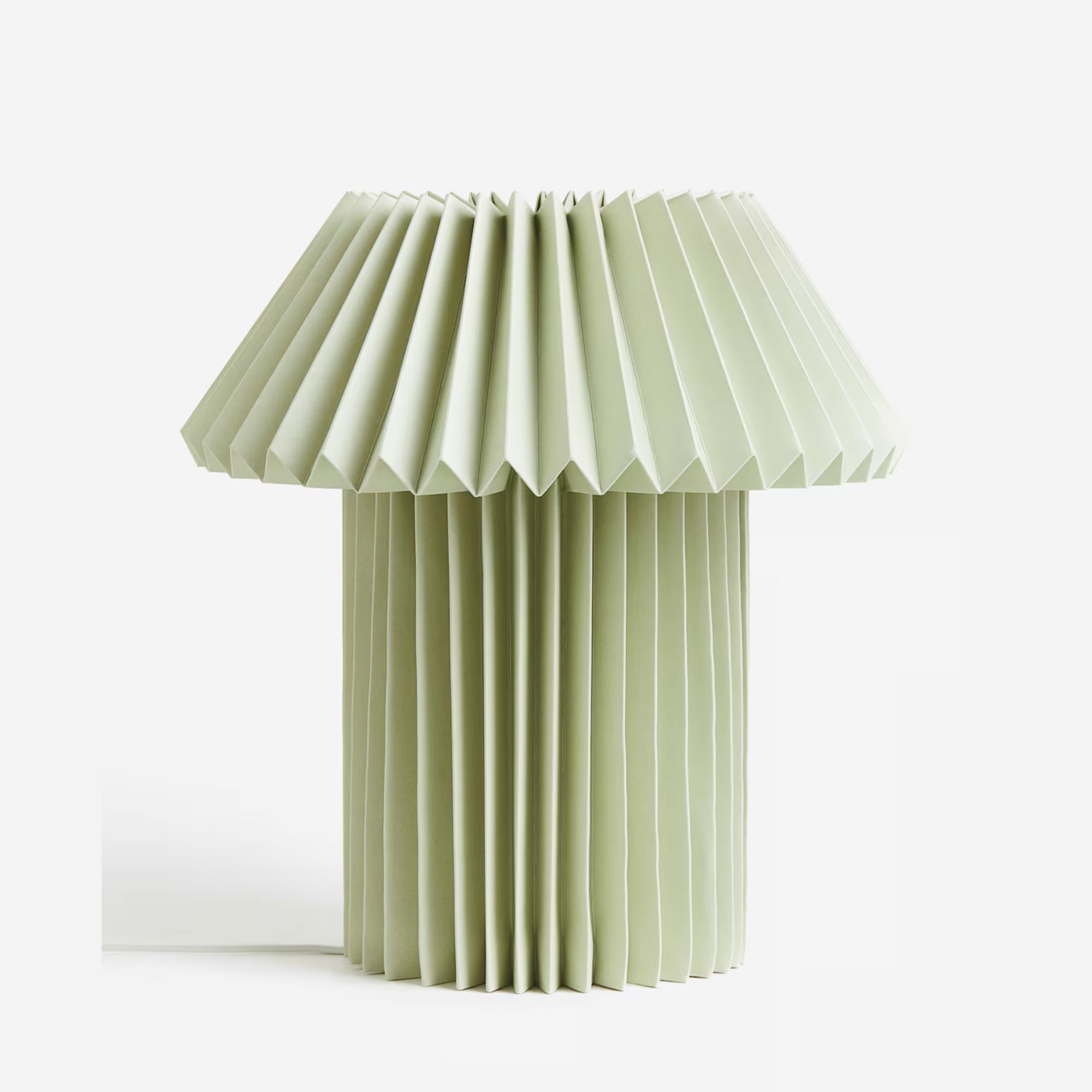
The pistachio green color trend is proving to be stylish, especially for the summer months. An uplifting shade of green that can feel just as suited to traditional decorating ideas as modern decorating ideas, pistachio tones are a great way to add a splash of color to your home while maintaining a calming feel.
'Pistachio green is such a versatile and refreshing color,' says designer Victoria Ymar of Kavina Studio. 'Our tip for decorating with pistachio green is to treat it almost like a neutral – layering it through textiles or accent pieces. It brings in a soft, organic feel without overwhelming the space, and it reflects natural light beautifully, making it perfect for a fresh look.'
In this colorful sunroom designed by Tiek Byday, pistachio green wraps the space, from the paint color (Farrow & Ball's Breakfast Room Green) to the statement wallcovering. 'The combination of wanting something vibrant in the sunroom and the client's love of green directed us to using this shade of pistachio green,' explains Bridget Tiek, principal interior designer. 'We wanted the room to be fully saturated in the color with accents of other colors pulled from the Gucci wallpaper.'
3. Tomato Red
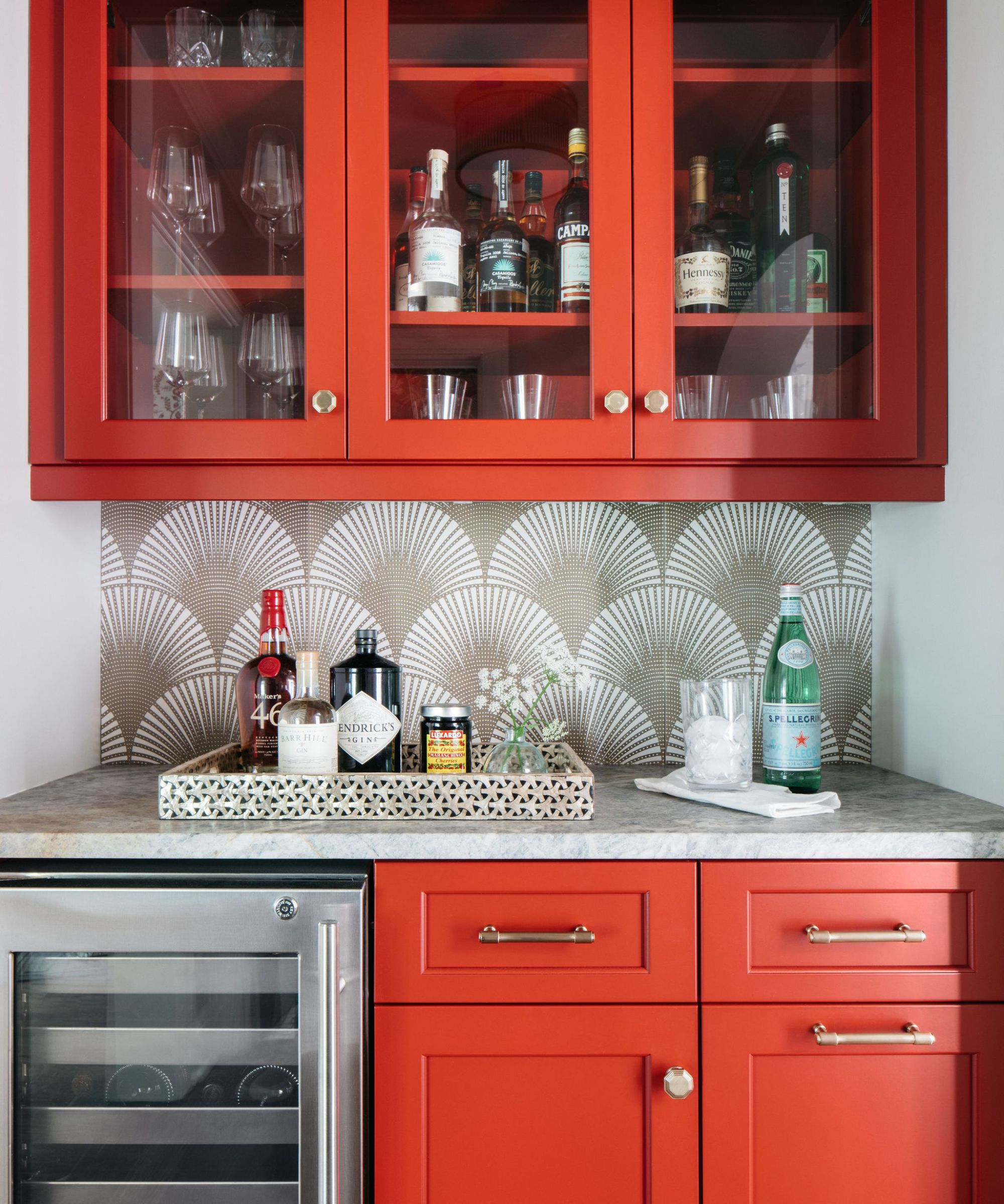
While butter yellow and pistachio offer a soft take on color, bolder and more vibrant tones are also having a moment, such as tomato red. A go-to for making a statement in interiors, tomato red schemes offer warmth and excitement. In this home bar, Sherwin-Williams' Salute SW 7582 was used on the cabinetry to add drama to the home.
'We chose the pop of red for the bar to add energy and excitement to this area,' explains the interior designer Emily Winters for Peabody's Interiors. 'After all, bars should be fun! The bar is situated right off the foyer and just outside of our very pretty dining room, which is wrapped in a white background batik wallpaper with pops of red and medium blue. We felt that a blue bar would be too predictable and that the amazing red added just the right amount of energy.'
While the best red paints won't fail to make a statement, you can channel this daring hue more sparingly through smaller decor items if you're not ready to commit to painting the walls.
4. Berry tones
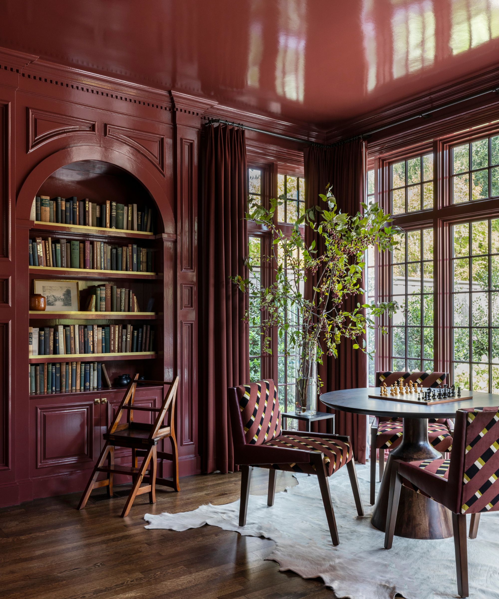
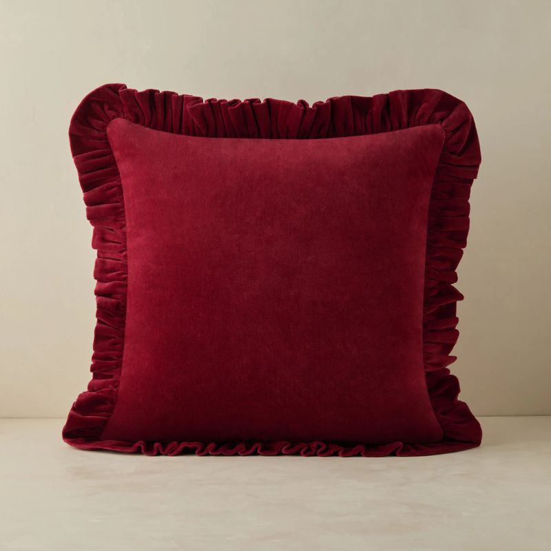
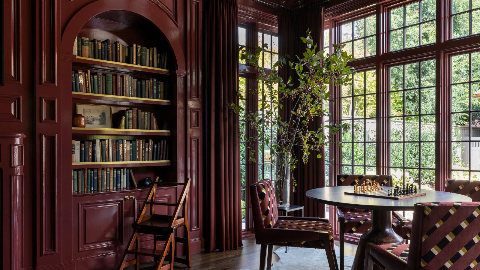
While rich and warming berry tones came to the fore during the winter months, it's a timeless color that we expect to see plenty more of as soon as fall is upon us. As demonstrated in this moody and sophisticated sitting room designed by Marie Flanigan Interiors, berry tones are a wonderful way to add depth and richness to a room.
'I’ve always found myself inspired by the quiet richness of colors found in nature – those muted gemtones that carry depth without overwhelming a space,' says designer Marie Flanigan. 'One of my current favorites is Sherwin-Williams' Carriage Door SW 7594, a deep cherry red that feels rooted, romantic, and endlessly sophisticated.'
'In smaller, more intimate spaces – what I often think of as jewel box rooms – this kind of color wraps the room in warmth and character. It’s bold in a subtle way, evoking the feeling of a moody sunset or aged wine, especially when paired with natural textures like stone, wood, or unlacquered brass. I love how it brings drama and comfort all at once – proof that even the most saturated colors can be timeless when thoughtfully applied,' says Marie.
5. Chocolate Brown
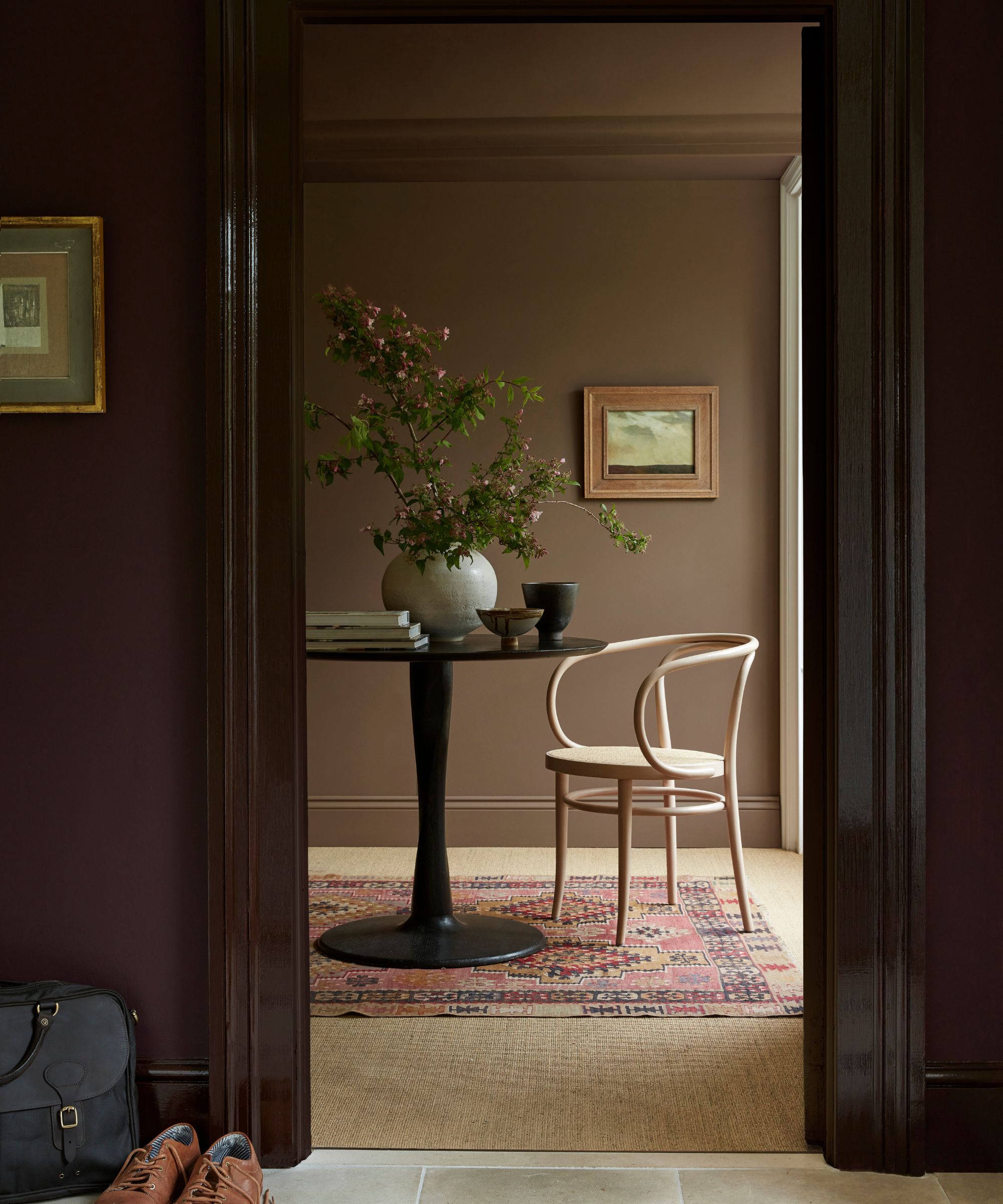
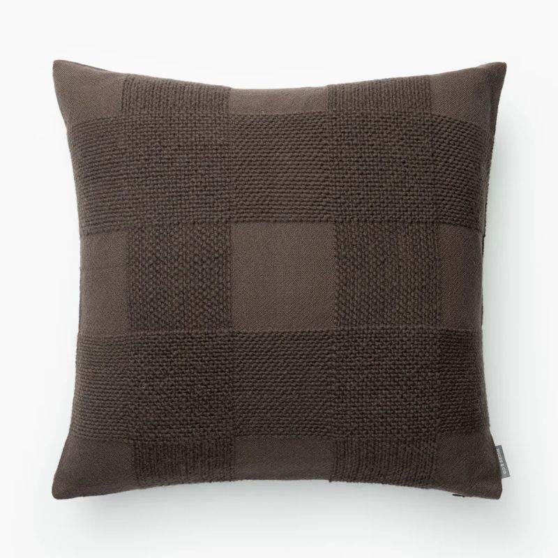
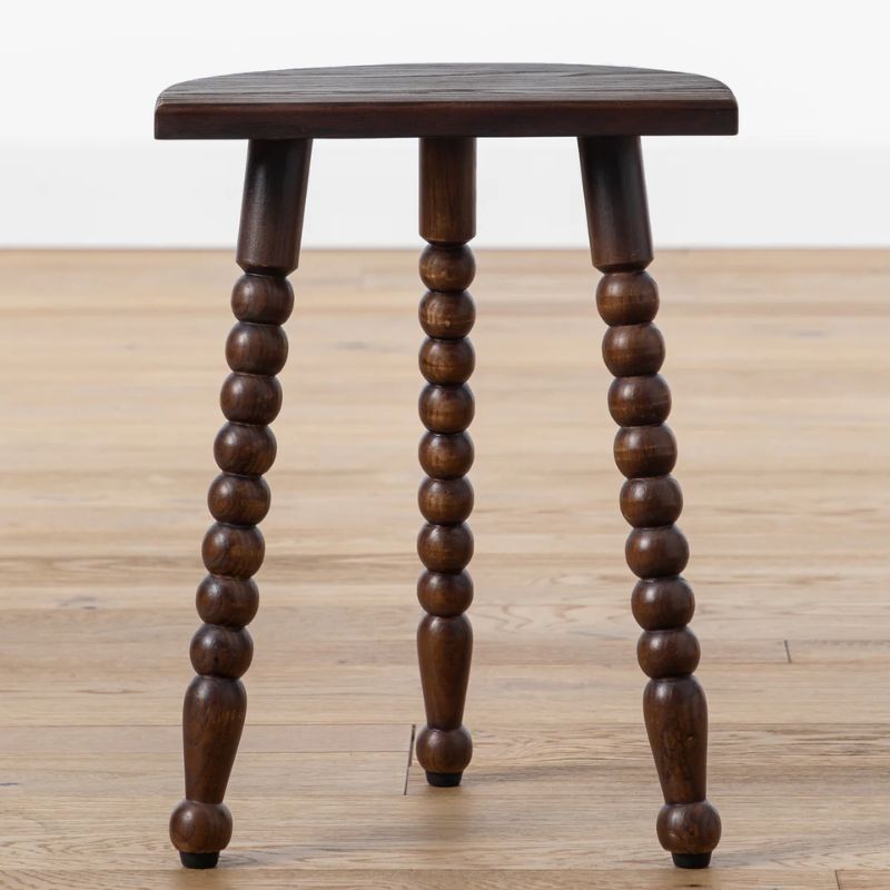
When it comes to neutral colors, chocolate brown adds depth and richness to spaces, and in the past year or so, it's served as a fresh alternative to lighter neutrals such as beige, which can sometimes fail to inspire.
Here, Little Greene's Scullery is used on the far walls and ceiling, a muted brown paint, teamed with Little Greene's Purple Brown in a gloss finish on the entryway's architrave. 'Chocolate brown is really one of the most versatile earth tones there is,' says designer Kathy Kuo.
'It's great for adding depth and sophistication to a space, and it can easily act as a perfect contrast with lighter neutrals like beige, sand, and cream. I like to bring chocolate brown into a space in dark wood chair frames and sofa frames, or wooden coffee tables, or dining tables. It also looks great rendered in rich textures like velvet or boucle,' adds Kathy.
6. Plum
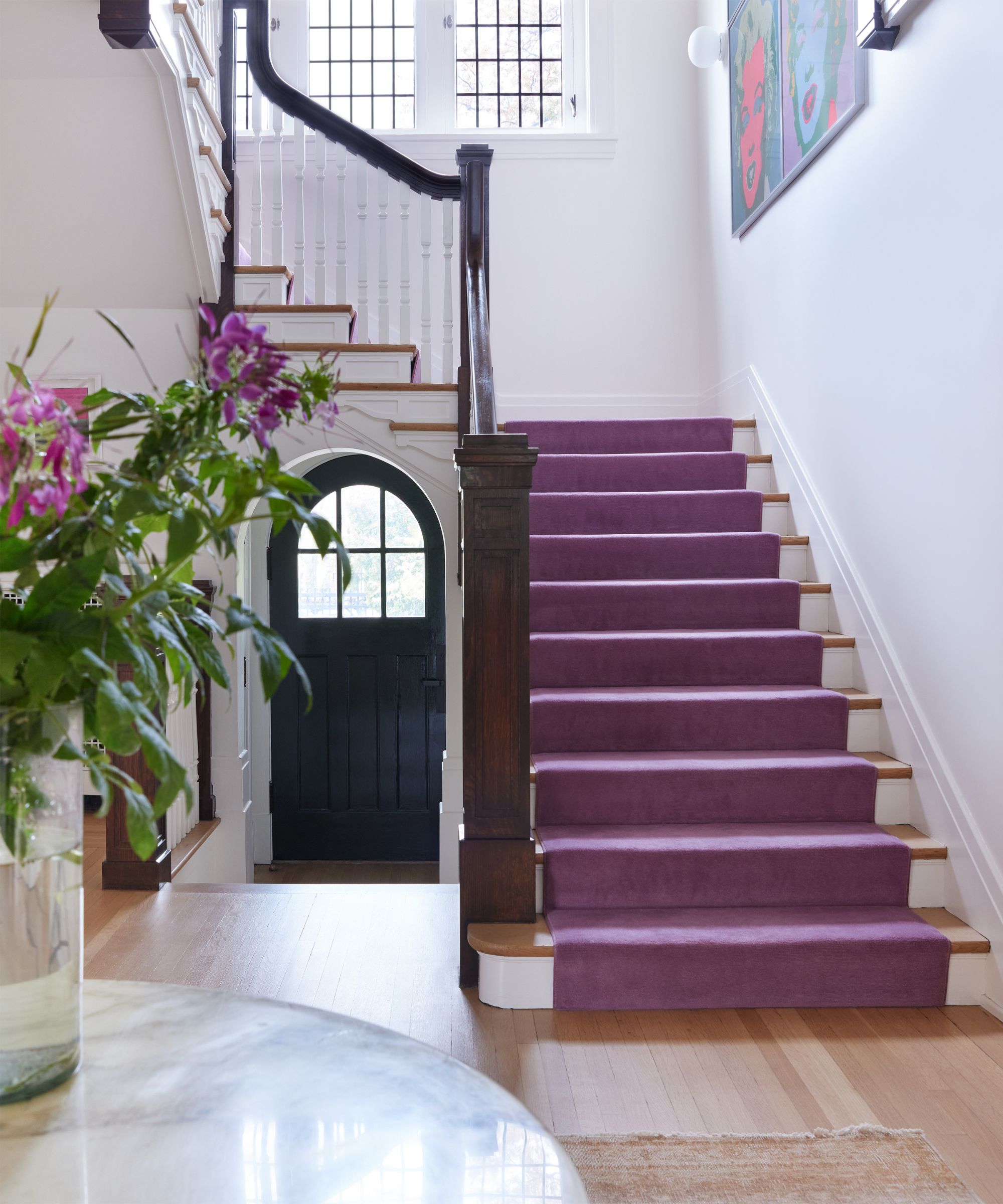
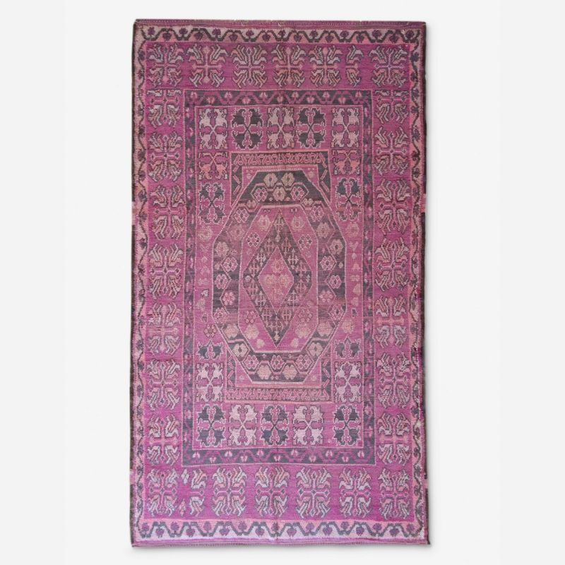
Not forgetting the love for purple that came to the fore last year, decorating with purple sees designers channeling plum tones as a statement color in interiors, much like the stair runner used in this spacious entryway.
'This is a very large entry in an old, traditional home we were renovating. The woodwork is a little dark and heavy here, and I felt like we needed something with some visual gravitas to stand up to it – one strong color fit the bill,' shares the interior designer Colleen Simonds.
'Practically, the runner is wool and a medium to dark color, so it will wear very well and hide a lot of sins in a busy house with three young children. This shade of plum purple has a lot of red in it and feels surprisingly neutral – it's a statement, but it's versatile, and it's unexpected but practical,' says Colleen.
Which of these food-inspired color trends is your favorite? Whether you're drawn to the vibrancy of tomato red and plum tones or prefer a more neutral scheme with rich chocolate browns, food is proving to be a source of inspiration for room color ideas.
If you're looking for more ideas, we've rounded up our favorite summer color trends to give your home a seasonal refresh.
Emily is a freelance interior design writer based in Scotland. Prior to going freelance in the spring of 2025, Emily was Homes & Gardens’ Paint & Color Editor, covering all things color across interiors and home decor for the Homes & Gardens website. Having gained specific expertise in this area, Emily is well-versed in writing about the latest color trends and is passionate about helping homeowners understand the importance of color psychology in home design. Her own interior design style reflects the simplicity of mid-century design and she loves sourcing vintage furniture finds for her tenement flat.
