Designers agree: these are the colors we should ditch by 2026
Goodbye, greige, interior designers say this lackluster shade and others will be ones they're leaving in 2025

Design expertise in your inbox – from inspiring decorating ideas and beautiful celebrity homes to practical gardening advice and shopping round-ups.
You are now subscribed
Your newsletter sign-up was successful
Want to add more newsletters?
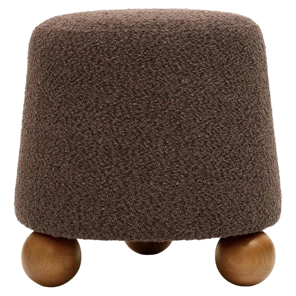
2025 has been a colorful year. The infamous butter yellow had the interior world in a chokehold, cropping up in designers' projects and new launches everywhere. Let's not forget chocolate brown, either. Despite falling on the opposite end of the spectrum, the popular shade proved that dark and rich colors can be just as livable. While these chic shades are ones I hope to see more of, there are some hues that we should leave behind in 2025.
When I asked interior designers what color trends they're sick of seeing, a few familiar faces cropped up time and time again. It came as no surprise to see that overly neutral tones are ones designers won't be using next year, alongside the subdued pastels that nod to interiors of the past.
To ensure your scheme feels 2026-appropriate, you might want to avoid these four shades, as these interior designers will be.
Article continues below1. Millennial blush
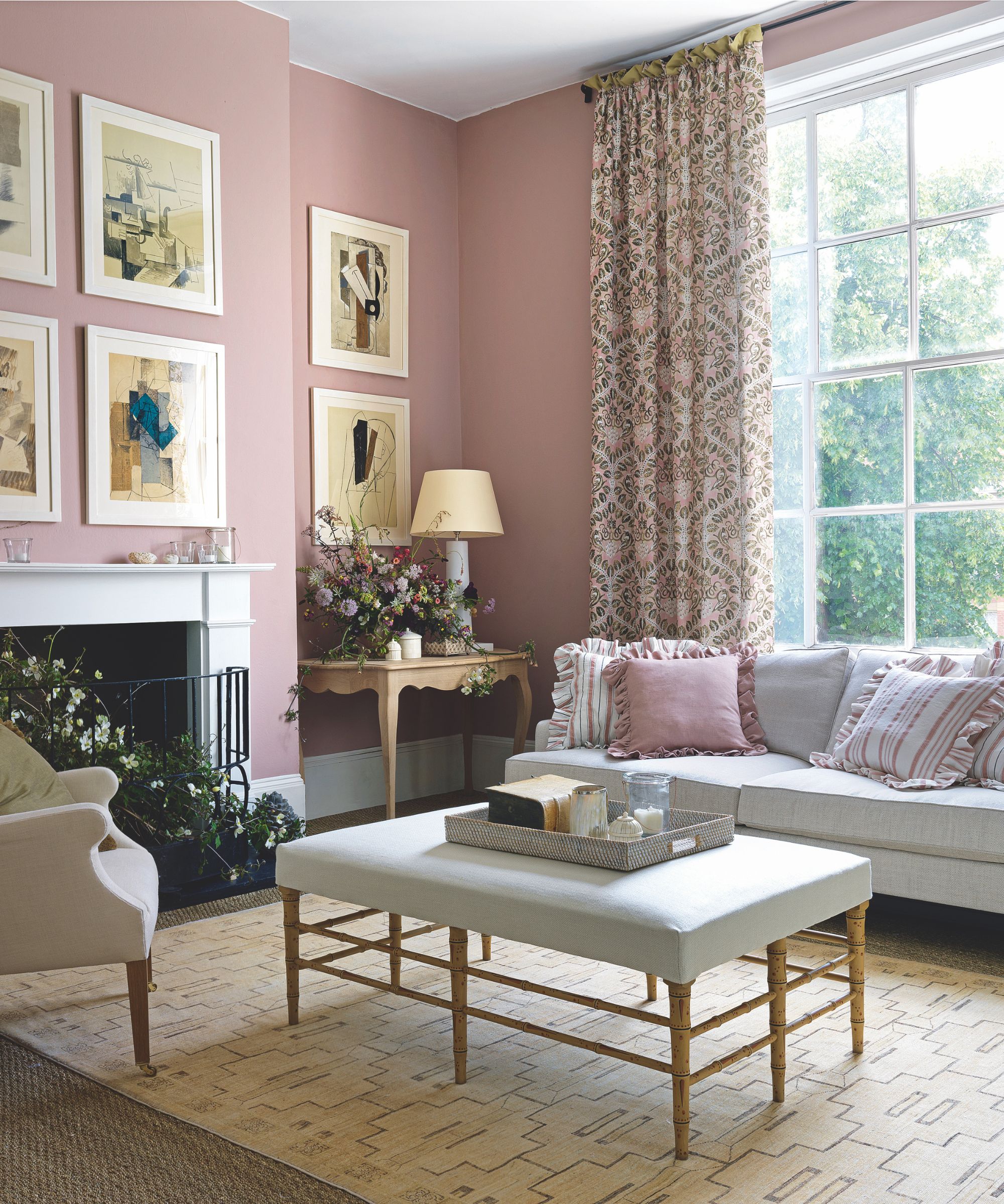
Although decorating with dusky pink can be chic, it's one of those shades that's starting to feel a little overdone. No wonder we asked designers, 'What's replacing blush pink?' and found the answers plentiful.
Lauren Perry, founder of Lauren Perry Interior Design, says, 'One shade I’d be happy to say goodbye to in 2026 is 'millennial blush/pink-beige'. The overly muted, dusty tones that had their moment but now feel tired and flat. While warm neutrals will always have a place, this particular family of pink-taupes tends to dull a space rather than elevate it.'
Lauren adds, 'Design is moving toward layered, intentional palettes that reflect personality and place. Flat trend tones often lack longevity, whereas authentic colors with depth can evolve with a space. Saying goodbye to these “default” shades will make room for a more curated, confident design direction.'
For a refreshing alternative, opt for more terracotta-toned pinks, like Farrow & Ball's infamous Setting Plaster or the warm and rich Terracotta Tile from Benjamin Moore.
Design expertise in your inbox – from inspiring decorating ideas and beautiful celebrity homes to practical gardening advice and shopping round-ups.
2. Stark whites
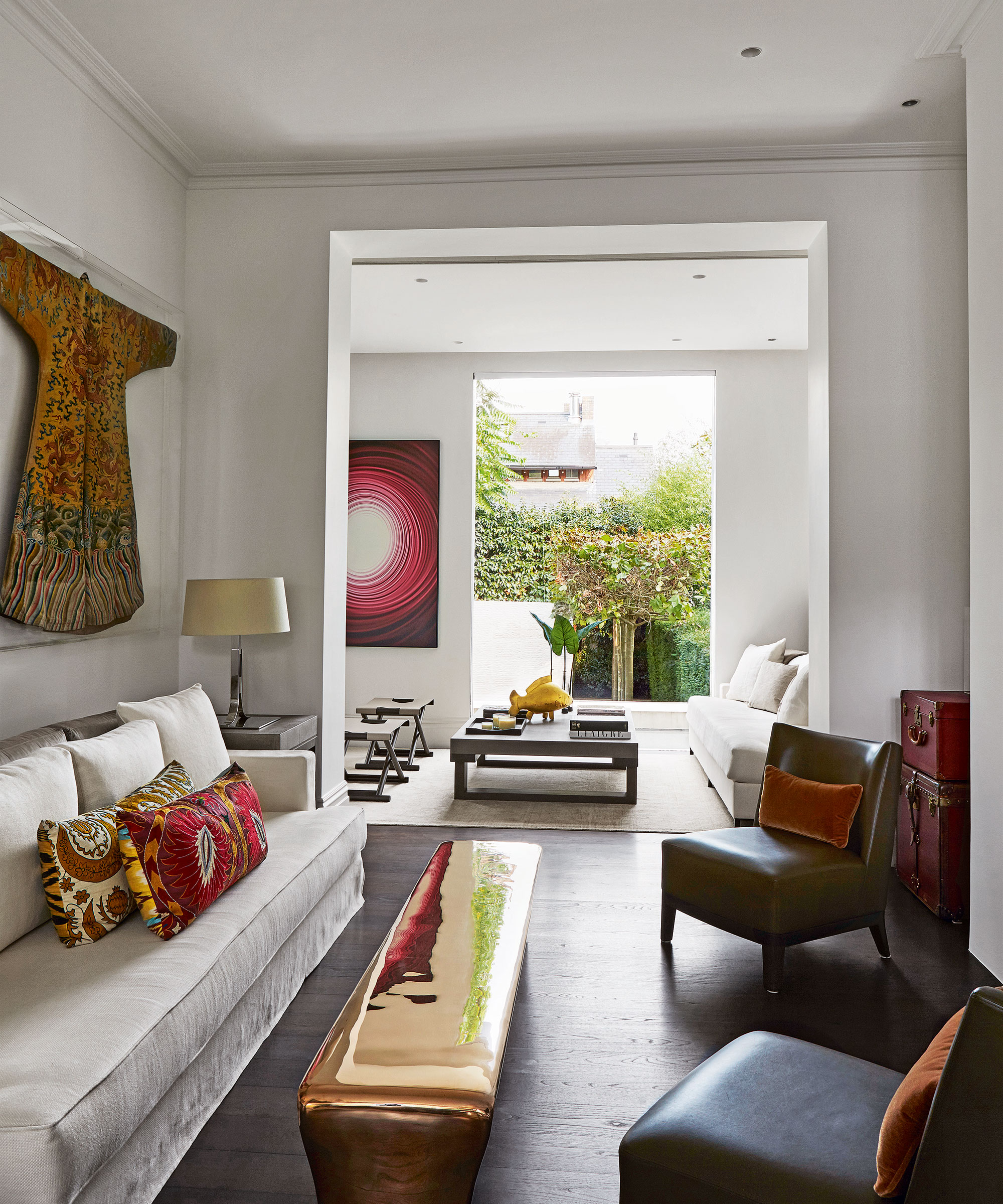
It came as no surprise to hear that decorating with white is no longer trendy going into 2026. Despite its contemporary, minimalist associations, stark whites can make a home feel clinical and cold rather than accomplished and inviting.
Interior designer Nina Long explains, 'I feel like the gray and white, stark look is out. Even if you are designing with whites, I see the gravitation to warmer whites and warmer beige, khaki, cream, and gold undertones, which feel more inviting.'
Nina suggests decorating with earthy colors if you're a neutral lover. 'I'm loving the bold but muted earth tone palettes right now with its warm neutrals, and also really enjoy medium to dark blues and greens. Those colors can go so many different directions, so they are super versatile for kitchen and bathroom cabinets as well as interior walls.'
3. Greige
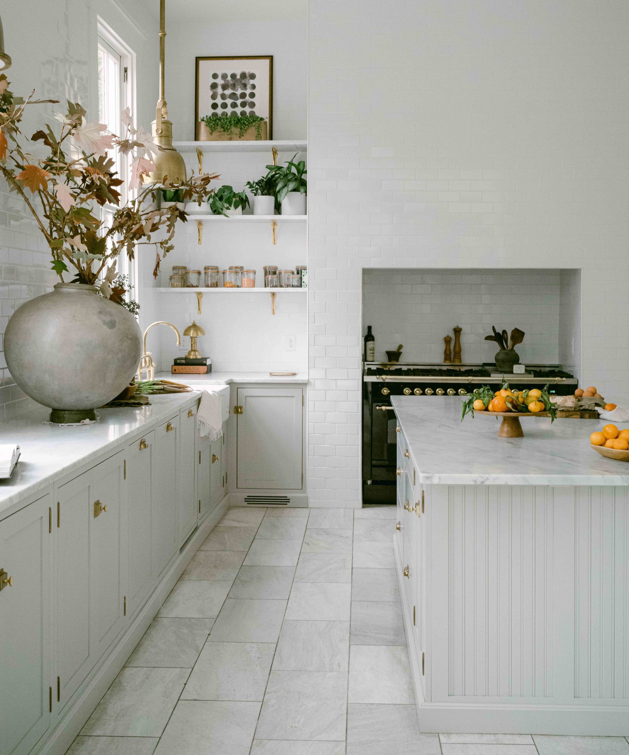
Decorating with greige was once the height of color trends, but now the shade feels a little lackluster compared to the more exciting and striking paint trends.
Lauren explains, 'I’d also retire the overuse of “builder greige”, that safe gray-beige middle ground. It was practical for a time, but in 2025, we’re craving more personality, depth, and richness in our palettes. Clients are gravitating toward grounded, nature-inspired shades (deep greens, clay, rich browns, moody blues) that feel timeless yet fresh.' Instead of opting for a pale greige, try a gray paint with a richer undertone.
Interior designer Nina Lichtenstein agrees that greige is on the way out. 'Flat, cool grays top the list. They had a long run, covering walls, flooring, and cabinetry, but they can leave a room feeling cold and impersonal. Homeowners now want warmth and comfort, so richer neutrals with a hint of beige, clay, or mushroom are replacing icy tones. Bright jewel shades such as deep sapphire and emerald are also receding. They made bold statements in the last decade, but in everyday living, they often feel heavy and dramatic in a way that does not encourage ease.'
If you're a lover of pale gray, Farrow & Ball's Skimming Stone is far warmer than the classic greige and will create far more depth and character.
4. Sage green
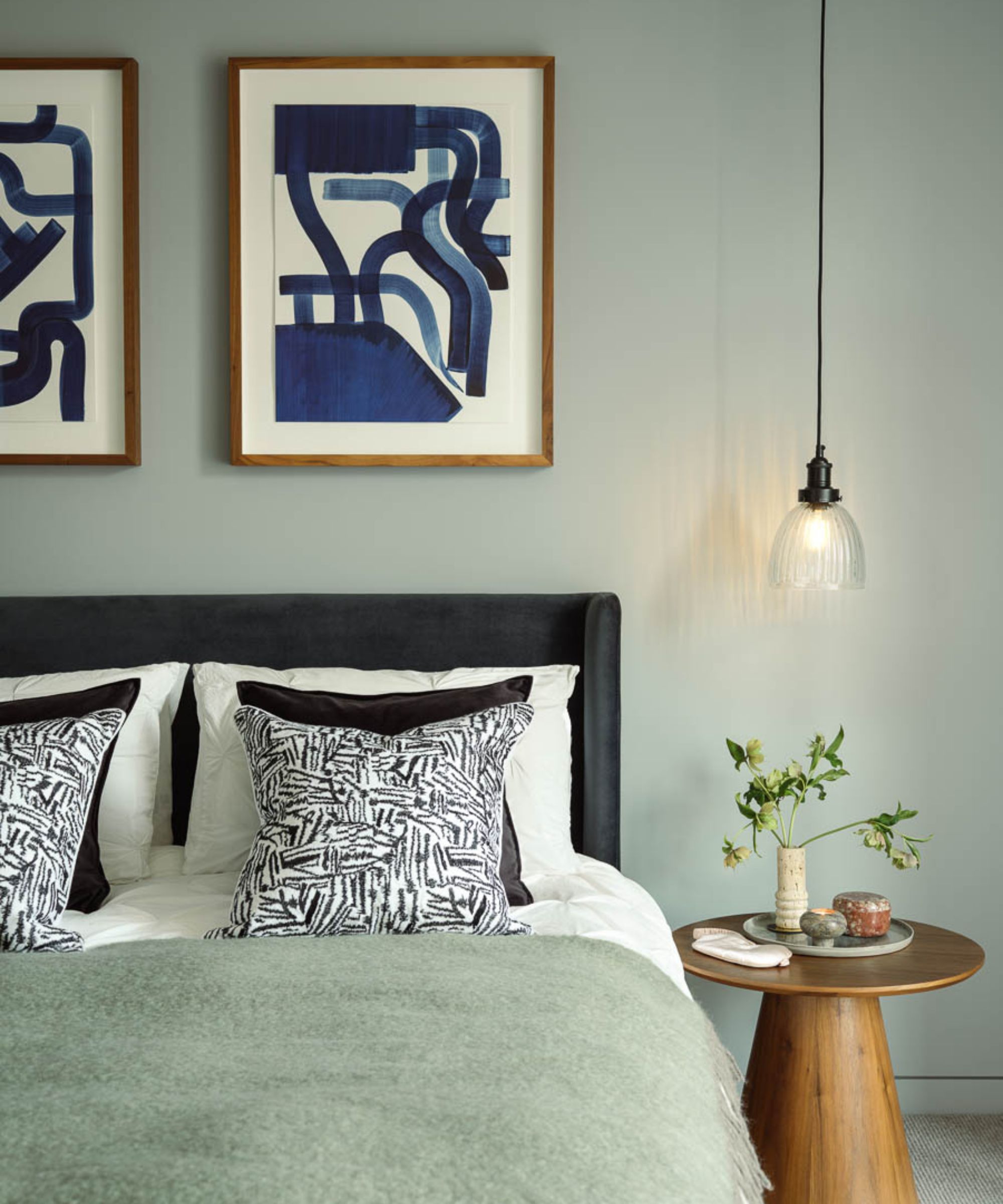
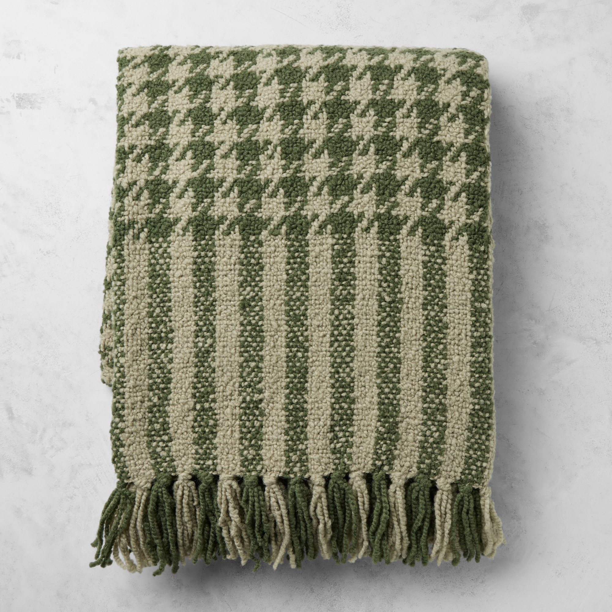
Once upon a time, sage green was the go-to shade for homeowners and interior designers everywhere, cropping up on kitchen cabinets, front doors, and even window treatments. But nowadays, it's starting to feel a little too familiar.
Cathryn Erickson of Cathryn Lindsey Design says, 'There isn’t one single color I’d say absolutely has to stay in 2025. It’s less about the color itself and more about how it’s used and the undertone feeling. For 2026, I’m drawn to shades with a bit of earthiness, muddiness, or a slightly dusty quality.'
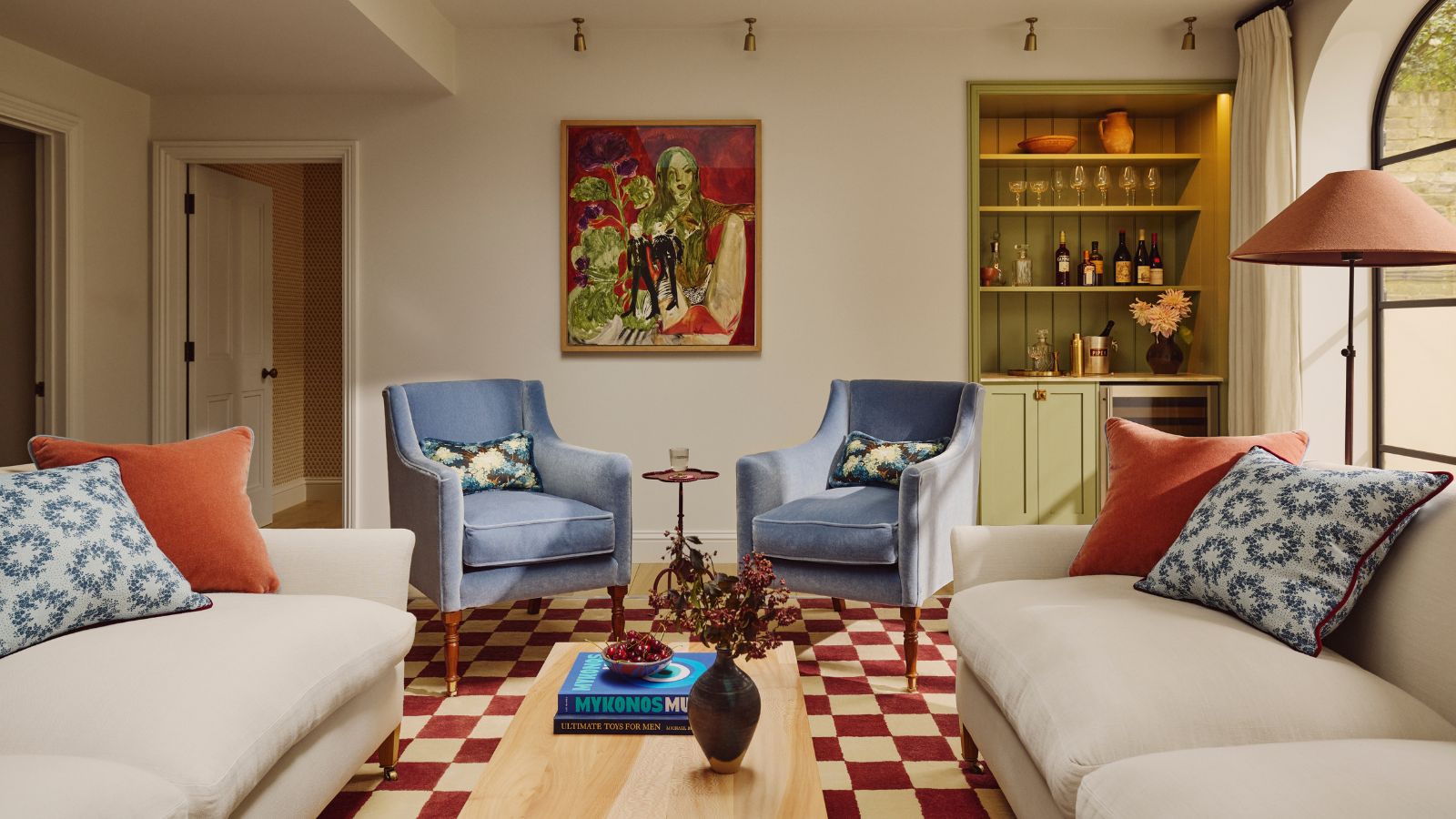
She adds, 'That said, once I heard someone call sage green “the new millennial gray,” I couldn’t unsee it. That specific soft sage/eucalyptus tone has been done, and it’s time to give it a break. Instead, I’d look toward greens with more depth, those that lean into dusty blue-greens or earthy brown-greens feel fresher and more timeless moving forward.'
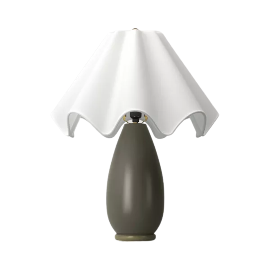
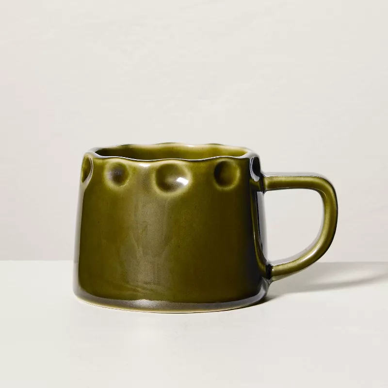
Cathryn says swap out sage green for deeper, earthier tones. What better way to do than with this olive ceramic table lamp? With its delicate scalloped shade and luxurious base, it's a classic accessory that will elevate any surface.
Whether you're embracing living room color trends or looking to revamp your kitchen cabinets, it's worth considering these four shades that designers are leaving behind in 2026. Overly neutral, subdued shades are taking a backseat next year, and designers are opting for far more exciting, striking, and enticing colors that will make 2026 the most colorful year yet.
