The 3 Dated Color Trends Designers Are Leaving Out of Their Schemes in 2026 – and the More On-Trend Alternatives They're Using Instead
2025 has been a year of color, but which color trends that designers think will start to look outdated in the new year?
Design expertise in your inbox – from inspiring decorating ideas and beautiful celebrity homes to practical gardening advice and shopping round-ups.
You are now subscribed
Your newsletter sign-up was successful
Want to add more newsletters?
Color trends are some of the fastest-moving in design. A shade can be all the rage one month and forgotten the next. Even though 2025 was billed as the year of the anti-trend, it felt like more colors than usual had their moment in the spotlight. From cherry reds and burgundies to buttery yellows, chocolate browns, and refreshing teals, certain shades captured our attention – but which ones are starting to feel dated?
We spoke with interior designers and color experts to find out which once-popular color trends are losing their appeal in 2026, and why. While 2025 celebrated bold, vibrant tones, 2026 is shifting toward more muted, nuanced versions of these playful colors, and these outdated color trends definitely reflect that.
1. Overdone Forest Greens
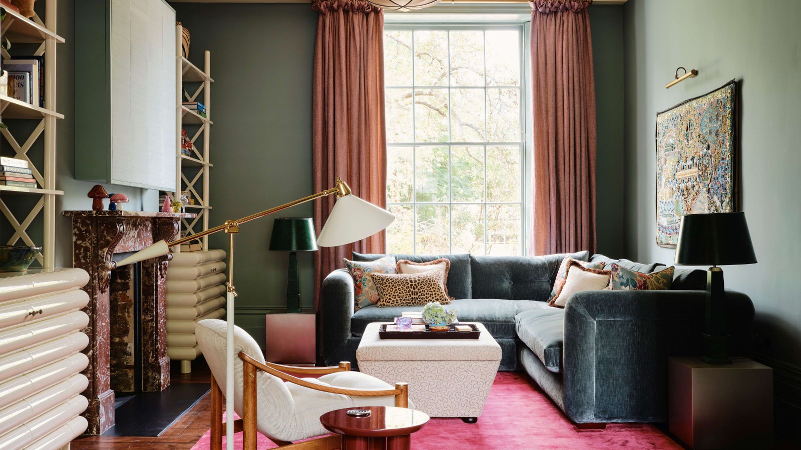
Designers are favoring moody shades of teal, which offer a more nuanced look than previously popular forest green.
Decorating with green has seen plenty of love in recent years, but for 2026, designers predict a shift away from vibrant forest greens. 'Forest green is going out of style for 2026 – it has been done so much,' says the Los Angeles-based designer Jessica Alpert.
Article continues below'The once-beloved pale sage and the deep forest green are shades of green that are overdone,' agrees the interior designer Hannah Goldberg of Hannah Charlotte Interiors, based in Washington D.C. 'People are feeling a bit tired of them.'
To use green in a way that feels more aligned with the current trends, there are two main ways to go. First, we're seeing much more appeal for in-between colors such as teals like Benjamin Moore's Oasis Blue and Behr's Color of the Year for 2026, Hidden Gem. 'If you want something bolder, go for a deep blue with a hint of green,' Jessica suggests. 'It’s rich, modern, and feels way more current.'
Or, you could embrace much earthier and muddier shades of green that tend to feel a bit more sophisticated and timeless. 'Opt for a moodier, softened olive or moss-toned hue to create an enveloping, timeless oasis,' says Hannah. 'These are emerging as the new neutrals. Rooted in nature, they pair effortlessly with wood, stone, and linen, bringing quiet sophistication and longevity to any space.' Try Farrow & Ball's Card Room Green for a paint that manages to balance earthiness with a touch of vibrancy.
2. Saturated Mustard Yellow
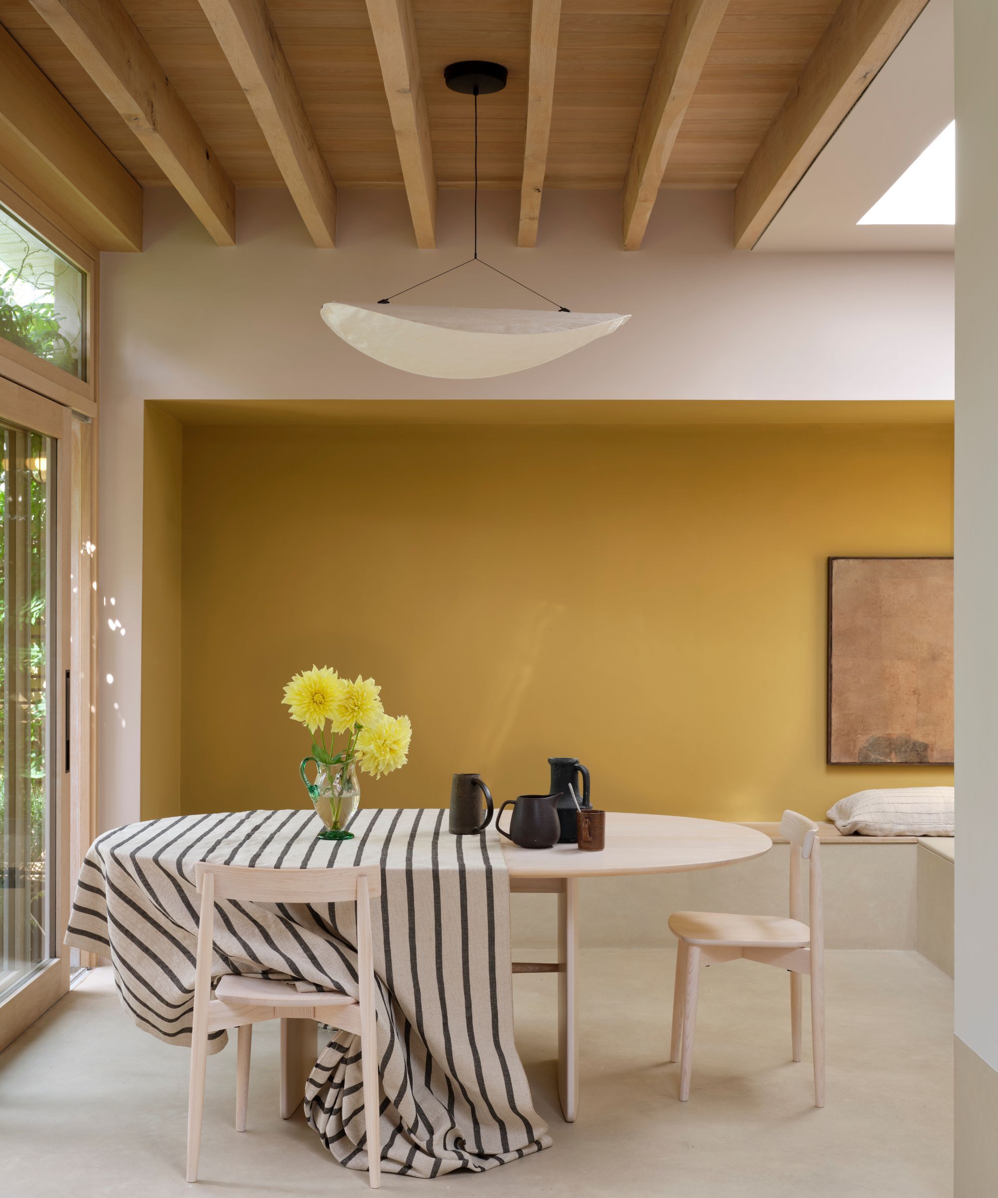
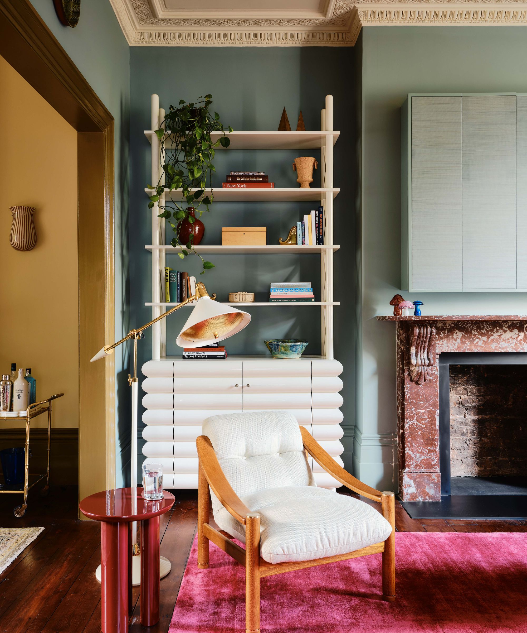
Instead of mustard yellow, designers are favoring rich shades of ochre, such as Farrow & Ball's Duster.
Another once-popular but now outdated color trend that some designers are moving away from in 2026 is mustard yellow. 'It has had its moment,' says the interior designer Kristina Khersonsky of Los Angeles-based STUDIO KEETA.
Design expertise in your inbox – from inspiring decorating ideas and beautiful celebrity homes to practical gardening advice and shopping round-ups.
'It reemerged over the past few years as part of the broader return to vintage (especially ‘70s-inspired design), but it’s now been overused and overproduced,' she says. 'We’ve seen it trickle into everything from mass-market furniture to big-box decor, and the saturation has taken away its freshness.'
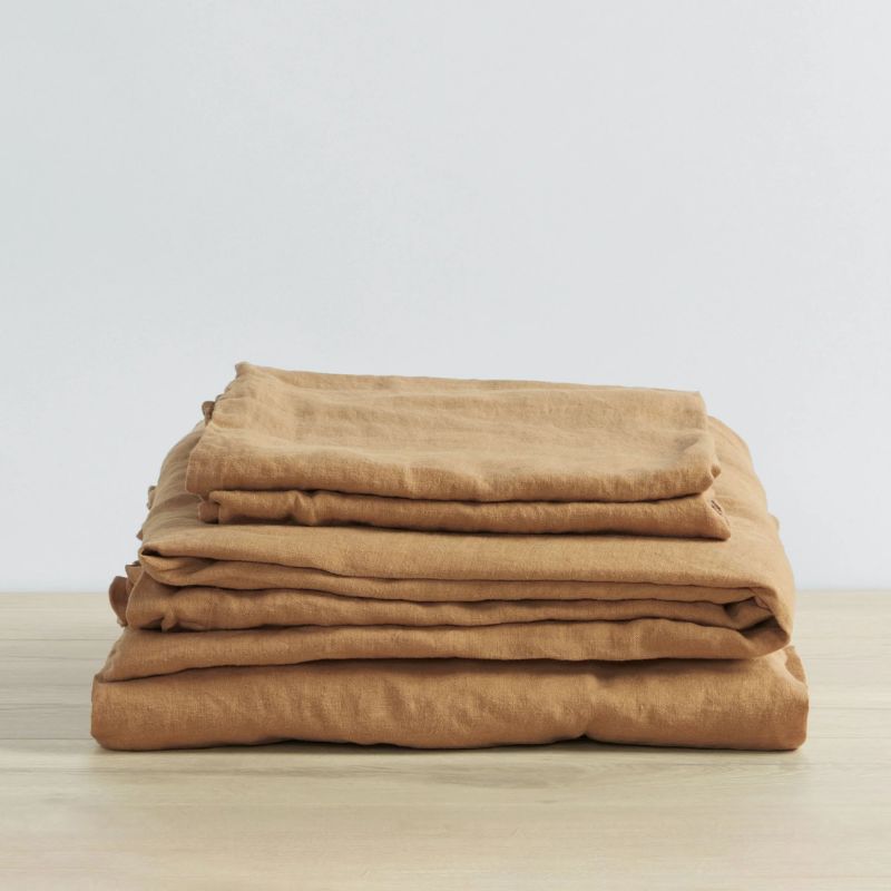
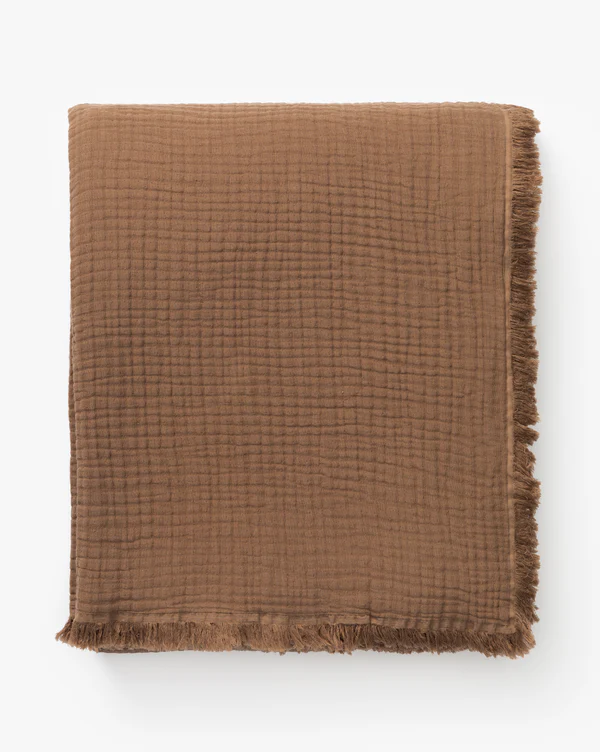
'For 2026, we’re moving toward richer, more nuanced tones that feel grounded and refined,' Kristina adds. 'Think ochre, raw umber, and warm caramel – hues that still nod to that retro sensibility but with more depth and sophistication. These colors bring the warmth people love about mustard, but with an elevated, timeless quality that feels more aligned with where interiors are heading.'
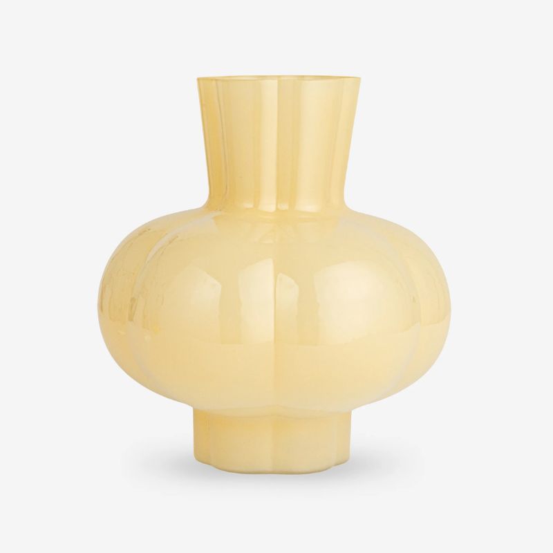
If you prefer light yellow room ideas, go for soft butter yellow. This nostalgic shade is just a step away from neutrals, and it is continuing to see lots of appeal among designers.
3. Artificial Shades
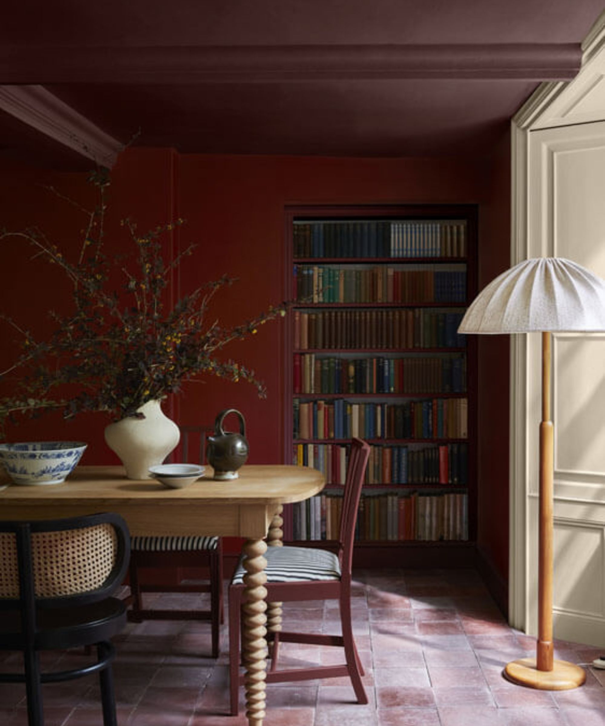
Many designers are favoring muddy colors, which feel sophisticated and moody, such as Little Greene's Adventurer.
'I feel that laboratory and artificial colors are starting to feel out in interiors for 2026,' says fabric designer Bernie de Le Cuona, the founder of de Le Cuona. 'While they made a bold statement in previous years, these shades can feel harsh and fleeting, lacking the timeless quality that many people now seek in their homes.'
From the sugary lilac color trend to saturated tomato reds, there has been a lot of appeal for the liveliest colors, but interior designers agree they may not be here to stay. 'Bright, overly pigmented colors can read as flat or overly graphic in today’s interiors – they lack the subtlety and depth that spaces now crave,' say the designers Mallory Robins and Elizabeth Bennett of Kobel + Co.
Instead of these highly bright and saturated tones, designers are favoring earthy hues that offer a more relaxed look. 'The shift is toward colors with a bit of 'dirt' in them – tones that feel lived-in and nuanced,' say Mallory and Elizabeth. 'These slightly muddied hues still bring color and energy, but with a sophistication and warmth that feels far more current.'
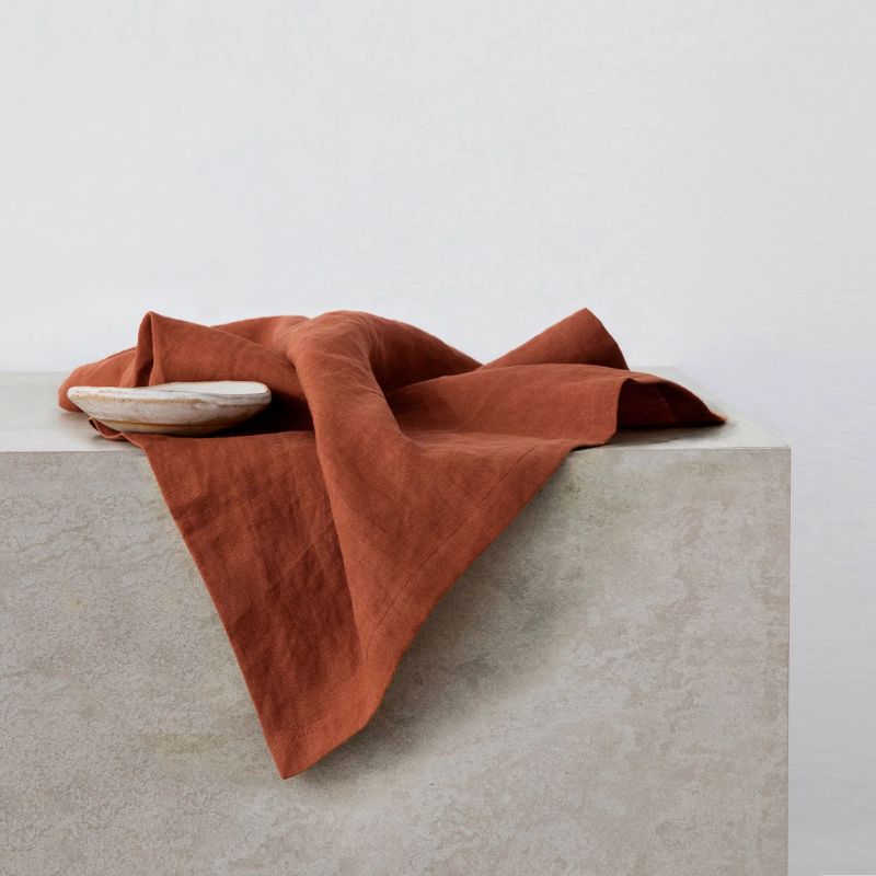
Whether you're planning your next living room color scheme or are on the lookout for stylish bedroom color ideas, these outdated color trends may be best avoided if you want your space to feel current. 2026 trends are moving away from overdone, shades to more nuanced, muddied versions of what was once popular – think earthy greens, rusty oranges, orche yellow,s and deep burgundies.
Emily is a freelance interior design writer based in Scotland. Prior to going freelance in the spring of 2025, Emily was Homes & Gardens’ Paint & Color Editor, covering all things color across interiors and home decor for the Homes & Gardens website. Having gained specific expertise in this area, Emily is well-versed in writing about the latest color trends and is passionate about helping homeowners understand the importance of color psychology in home design. Her own interior design style reflects the simplicity of mid-century design and she loves sourcing vintage furniture finds for her tenement flat.
