This Designer’s Take on a Once-Dated Trend Proves Gallery Walls Aren’t Dead – They are Totally Timeless When Done Right
We swore we’d never do them again – until a $23 million townhouse changed our minds. The project's designer breaks down the gallery wall rules worth ignoring

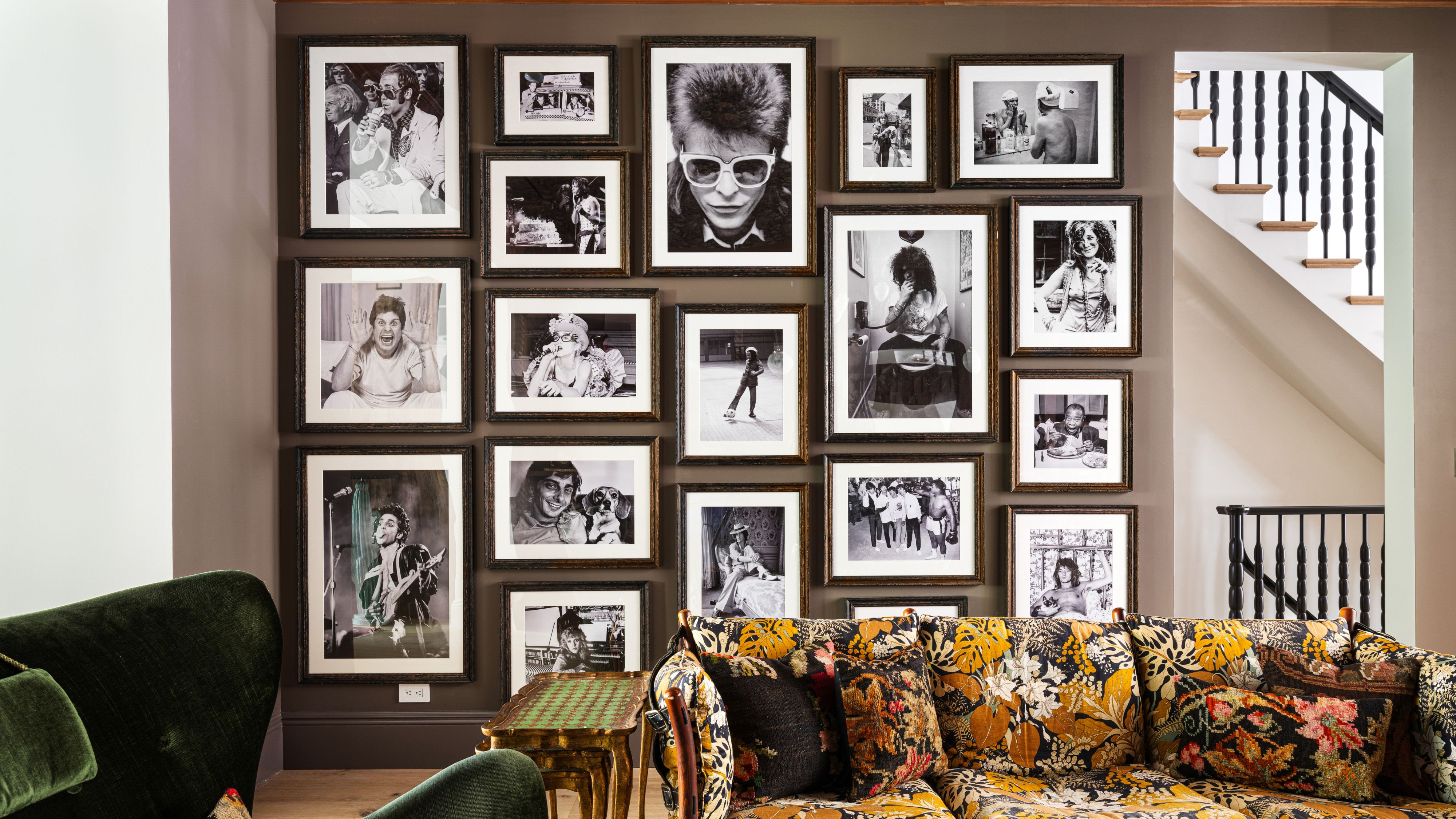
‘They’re too cluttered!’ 'So 2015!' were the smug verdicts handed down on gallery walls as recently as a couple of years ago. Like mint green or chevron, they were banished to the graveyard of millennial decor trends we collectively promised we’d never revisit.
That is, until a brazenly art-packed parlor room, which featured in our recent Design DNA series, crossed our desk. It's tucked inside a $23 million townhouse in New York City’s Greenwich Village, and if a gallery wall can survive that zip code – New Billionaire’s Row, no less – it’s earned a second look.
Ahead, the designer behind the project Sara Simon explains why a gallery wall was the right call here – and why, when done with this much conviction, it’s far more timeless than its recent reputation suggests.
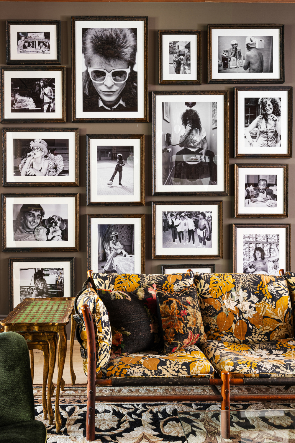
‘I love gallery walls, and I wanted something funky, so I settled on musicians,’ says Sara Simon, referencing the lineup of cultural icons – Janis Joplin, David Bowie, and the like – that populate the wall.
When the rest of the room is already doing some heavy lifting (personality-forward chairs, a pattern-rich rug) the wall decor has to meet that energy head-on. Scale becomes non-negotiable. ‘I also think if you have height on walls, you can use some really large pieces, and it looks even better,’ she explains.
That confidence was paired with planning. ‘I knew I wanted to fill the entire wall,’ Sara continues, ‘so I ordered several large sizes and then some smaller to fill in the gaps.’ The result avoids the overly rigid, gallery-as-spreadsheet effect. Instead, it feels animated, in sync with the vintage furniture and the home’s long history. ‘I am a sucker for a gallery wall, and I drove my carpenter insane hanging these as he wanted them lined up, and I did not,’ she quips.
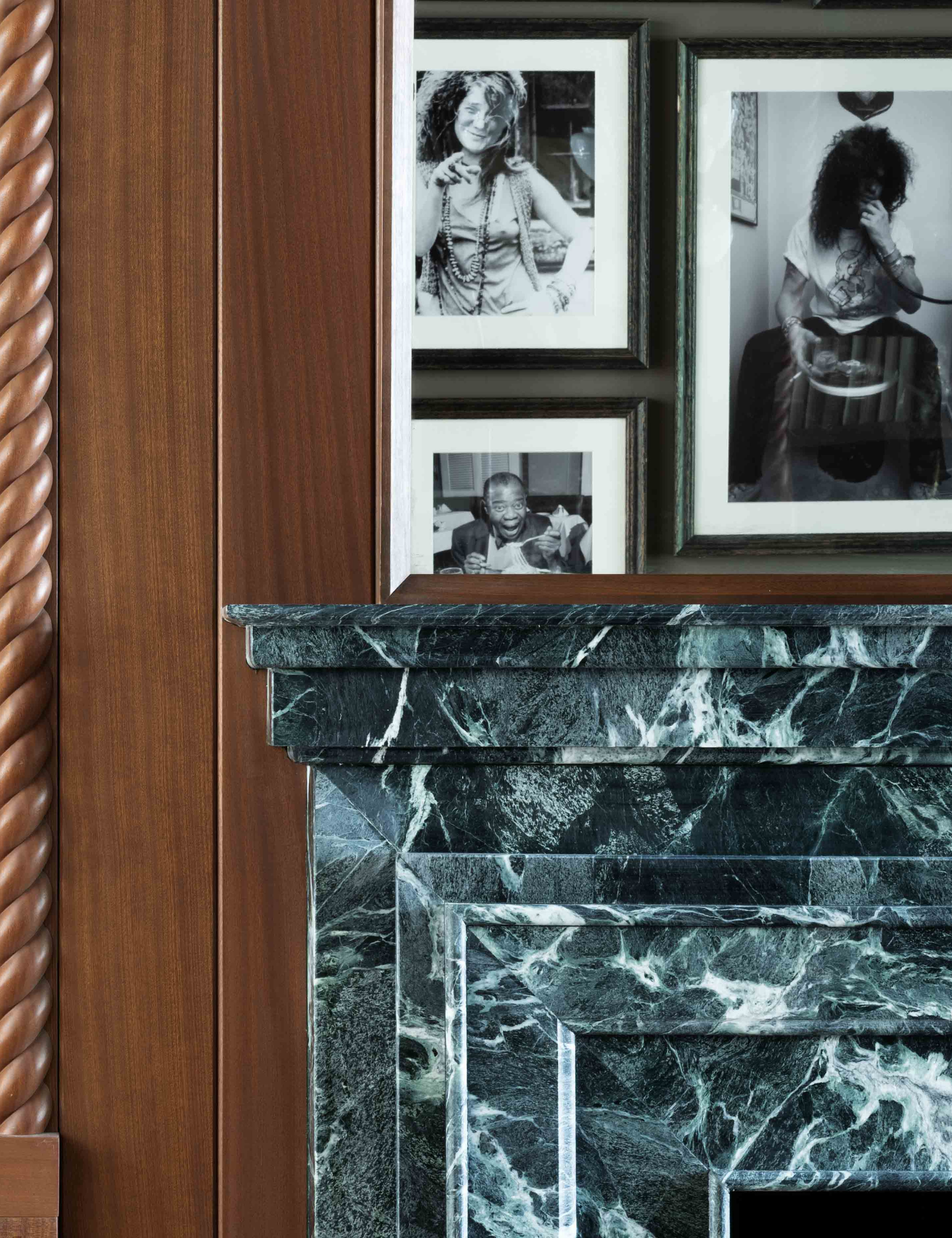
To temper the scale and looseness of the layout, Sara relied on a few threads, one being framing: ‘I felt like that worked best here,’ she says of the consistent wood frames used throughout.
Design expertise in your inbox – from inspiring decorating ideas and beautiful celebrity homes to practical gardening advice and shopping round-ups.
Another was restraint in palette. Choosing black-and-white photography helped anchor the wall’s visual impact. The images – The Beatles meeting Muhammad Ali, Frank Sinatra mid-shave – feel unified not only because of their cultural weight, but because they operate within the same chromatic language.
That choice also blurs time. Black-and-white reads as vintage without anchoring the wall to a specific decade, allowing musicians, athletes, and cultural icons to coexist without feeling themed or overly referential.
It’s a useful trick beyond this room, too. Strip personal photos or family snapshots back to a single chromatic register and suddenly Aunt Kathy’s 2014 Christmas party starts to feel editorial.

That said, Sara is quick to stress that none of these are hard rules – just the right moves for this room. She’s not doctrinaire about materials, color, or medium. Frames don't need to match either. ‘I say it all goes. My own home has a gallery wall that is a mix of photographs, paintings, colored, black and white,’ she explains. What matters is alignment. A gallery wall works when it reflects the person living with it.
If walls could talk, they’d say everything about where you’ve been, what you love, and how you see the world. ‘It’s really an expression of you,’ Sara muses.
In Greenwich Village – long a magnet for artists, collectors, and creative eccentrics – the philosophy feels especially at home. And maybe that’s why this one works so well.
‘I am all here for gallery walls,’ Sara adds. ‘This isn’t my first and won’t be my last.’

Shea McGee, per usual, makes the case for eclecticism feel entirely doable with this pre-curated gallery frame set. Offered in varied shapes and sizes, no two frames are identical – less a mandate than an option, as you’ve already learned. It’s especially well-suited to smaller, less ceremonial spaces, like a hallway, stair landing, or a forgotten corner.
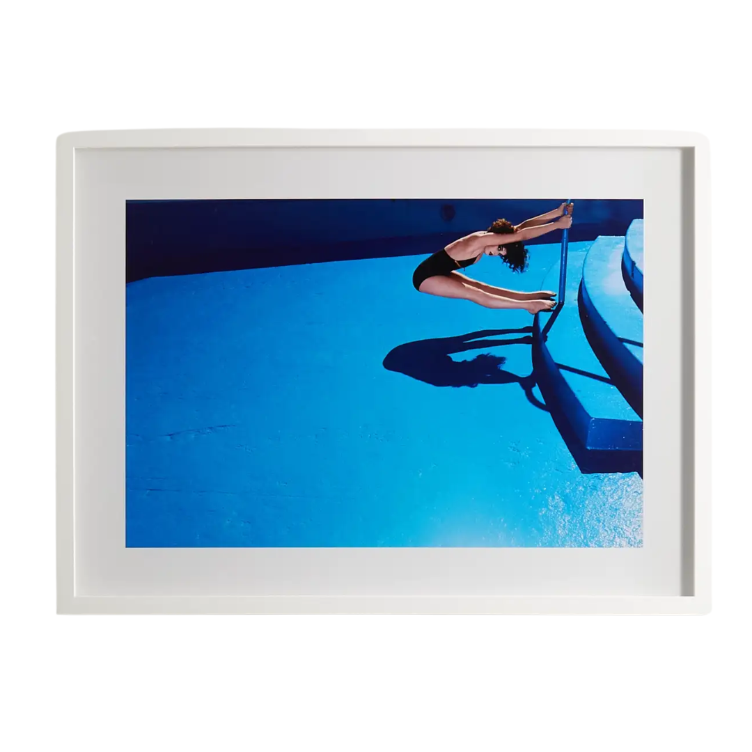
If you’re going to use color, commit to it. It should match the boldness of the subject matter – something Guy Bourdin never needed reminding of. The French fashion photographer behind some of Chanel’s most iconic imagery is also responsible for this untitled poolside photograph, framed here in Italian chestnut wood. The uncanny, suspended moment does all the work, setting the tone for everything that follows.
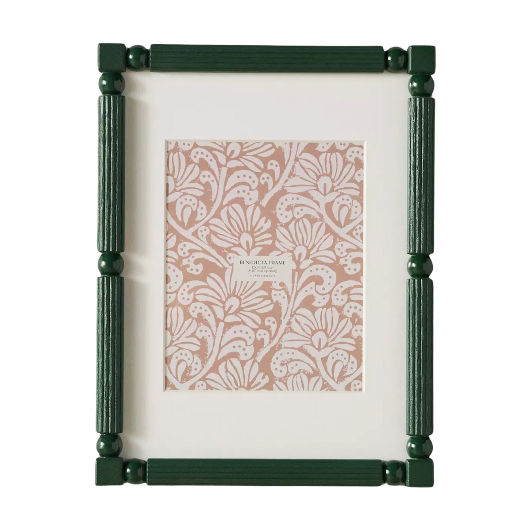
To stay true to the sensibility of this parlor-room gallery, pick one frame and commit. This Anthropologie style makes consistency easy, with geometric detailing and a rich hunter-green finish. It comes in multiple sizes, so you can still play with scale while keeping the look cohesive.

This Mick and Bianca Jagger print could pass for an original from the parlor room itself. From the ’70s swagger to the coordinating clothing, there’s plenty to linger on, even from across the room. Start with a piece like this for the closest read on Sara’s approach.

There aren’t paintings in this particular room (though they appear everywhere else throughout the Greenwich Village townhouse), but Sara notes that paintings are typically fair game in her gallery walls. If you share that instinct, consider leaning into the tiny art trend instead. At just five by five inches, this piece has a barely-there, editorial presence designers are gravitating toward right now.

When the subject matter is already pulling focus, framing doesn’t need to fight for attention. A generous mat does the heavy lifting instead – giving even the most casual snapshots (whether lifted from your camera roll or plucked from Pinterest) a sense of authority and intention.
As it turns out, the art designers are most excited about for 2026 isn’t a painting, a photograph, or even an NFT. It’s woven. Here’s why vintage tapestries are back in rotation – and where designers are sourcing the good ones. Perhaps add one to a gallery wall of your own?

Julia Demer is a New York–based Style Editor at Homes & Gardens with a sharp eye for where fashion meets interiors. Having cut her teeth at L’Officiel USA and The Row before pivoting into homes, she believes great style is universal – whether it’s a perfect outfit, a stunning room, or the ultimate set of sheets. Passionate about art, travel, and pop culture, Julia brings a global, insider perspective to every story.
