Stop Painting Your Small Rooms Light Colors – These Are the 5 More Interesting Shades Designers Say You Need to Try
For decades, light neutral shades have been the go-to in small space, but designers swear that going darker in tiny rooms can have a better pay off
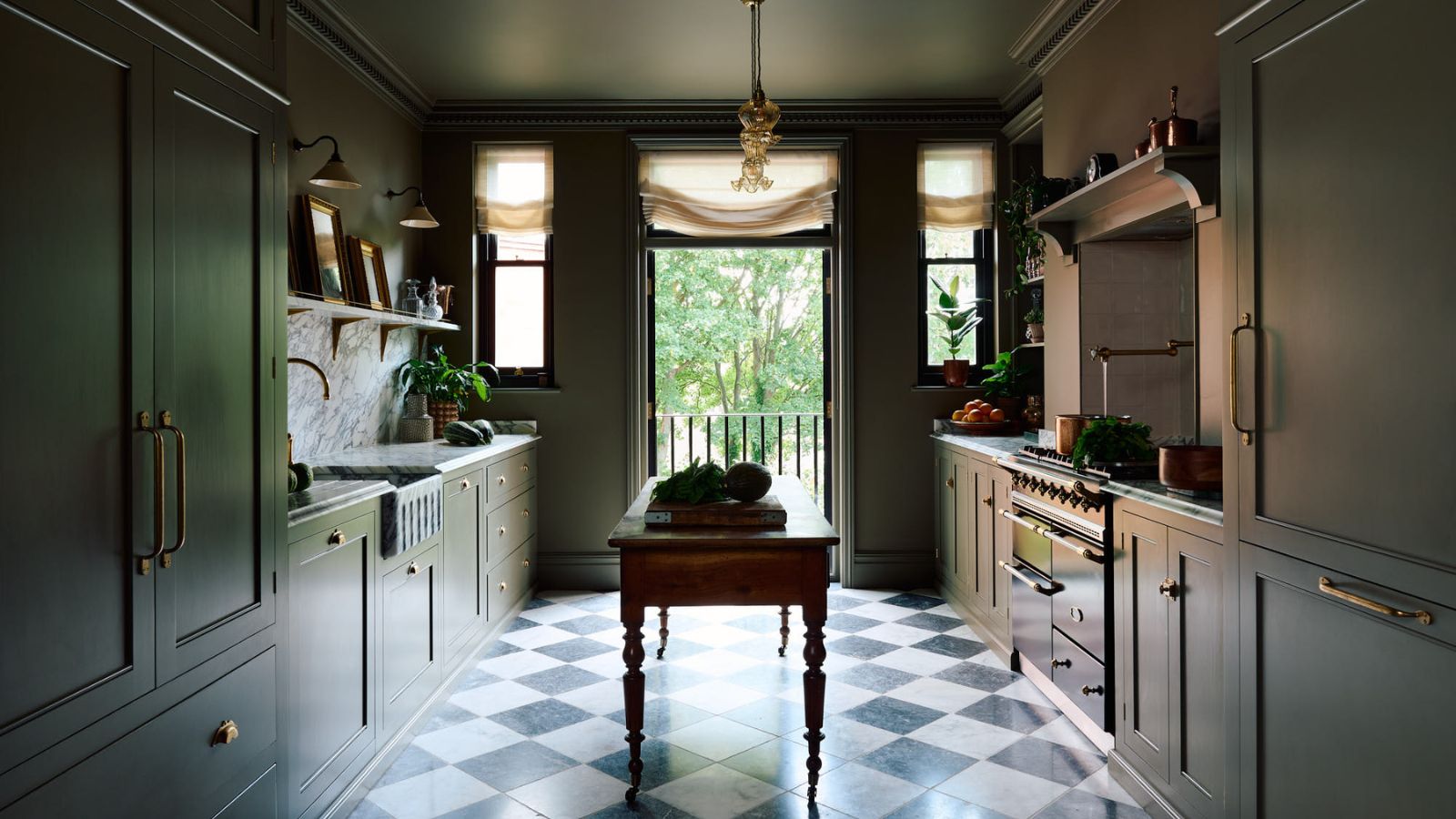
Small rooms can often be the trickiest to design, and a big part of this is getting the right color palette. When dealing with these pocket-sized proportions, we naturally lean towards light colors such as white, pale gray, or a soft beige, assuming these will open up the space.
However, despite light colors traditionally being the default here, it's actually the opposite that tends to ring true. Lighter shades aren't always the best colors to make a small room look bigger. Darker, richer shades can make these compact spaces feel larger and more intentional, along with adding depth and personality to overlooked corners of the home.
It’s worth bearing in mind that not all dark colors are made equal, and some particularly shine in small spaces. From deep caramel brown to rich burgundy and forest green, we asked five color experts for their favorite dark shades and why they work so well in small spaces.
Article continues below1. Rich Burgundy
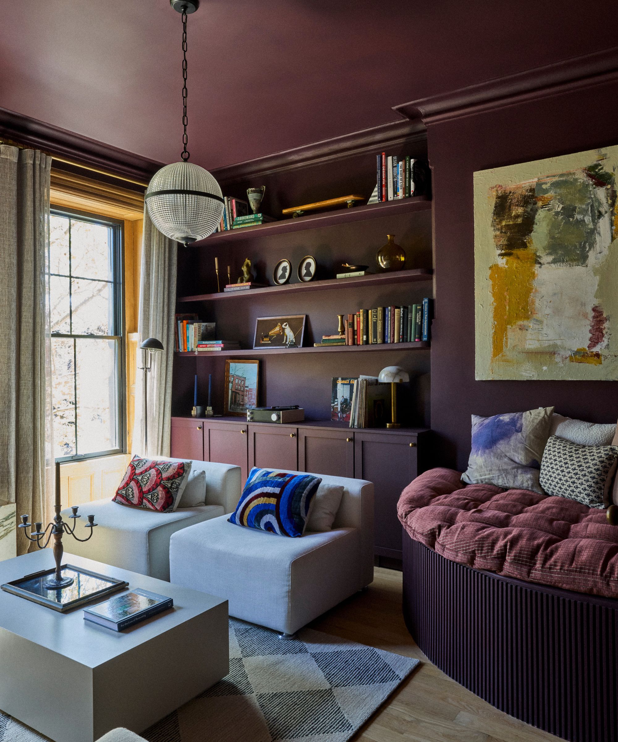
This small living room has been color-drenched in Brinjal by Farrow & Ball
Opting for this dark red, wine-inspired shade is a shortcut for injecting character and depth into a small space. 'The value of these shades is that they can make a space feel bigger than it is, or create a cocooning, intimate and luxurious feel depending on how they are used,' Dominic Myland, CEO of luxury paint company Mylands, explains.
Deep red shades instantly add depth to walls. 'Whilst warmer undertones of orange and magenta can sometimes feel too energetic for smaller spaces, if the overall saturation is muted and soft, then the eye isn’t directly drawn to the walls, making it appear bigger,' Dominic details.
Rich burgundy works particularly well in both home offices and small bathrooms. 'Dark red is a sophisticated choice for an office as it is not distracting to the eye and helps to create a calming environment that allows you to focus,' he points out. Meanwhile, the depth of dark red really suits bathrooms that lack windows or significant light. 'The warm undertones allow you to embrace the reduced sunlight without making it feel confined,' he explains.
When it comes to application, a confident color-drenched approach can make all the difference. 'Flooding the room with a single color creates a unified impression. This decreases visual noise and makes spaces appear larger,' Dominic suggests.
Design expertise in your inbox – from inspiring decorating ideas and beautiful celebrity homes to practical gardening advice and shopping round-ups.
2. Caramel Brown
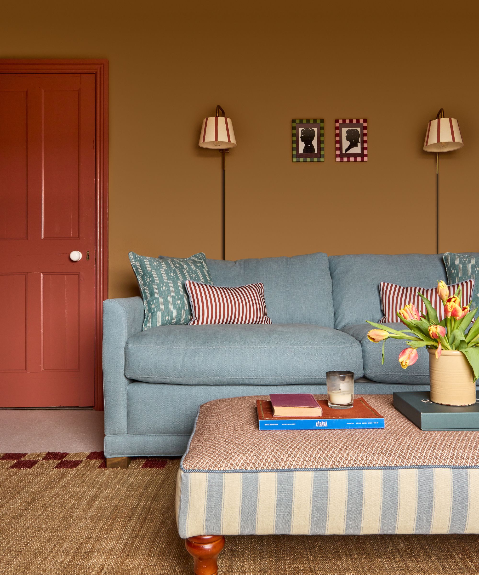
Laura used a warm caramel, ochre-toned brown in this small living room; it's the perfect backdrop to ground the light blue sofa. For a similar paint color, try Farrow & Ball's Duster.
Decorating with brown, specifically a soft caramel brown, is very effective in small spaces because it brings warmth, richness and character without feeling heavy or flat. 'Unlike some darker shades, which can appear overly gray or dull and risk making a room feel enclosed, earthy browns have a natural depth and softness that feels inviting rather than oppressive,' designer Laura Stephens shares.
A deep caramel brown has an elegance and warmth that avoids a cave-like effect. 'Instead, it creates a cocooning atmosphere that feels considered and comforting, adding sophistication and visual interest without overwhelming the space,' she says.
Laura explains how this saturated shade creates a strong sense of depth, which is beneficial in smaller rooms. 'Rather than stopping the eye abruptly, it allows surfaces to recede visually, giving the illusion of greater space. This depth softens boundaries and corners, which can make a room feel more expansive and cohesive.'
Recently challenged by a small home office with awkward angles and a north-facing aspect, Laura turned to using this deep caramel brown. 'The room lacked warmth and energy before, but this earthy brown transformed it. The color grounded the space, added warmth, and made it feel far more inviting and usable,' she notes. Meanwhile, the warm brown actually enhanced difficult architectural features rather than highlighting them.
This deep caramel shade also serves as a beautiful backdrop for other colors, with its depth and saturation allowing brighter hues to really shine, while still feeling balanced and grounded. 'I love pairing it with crisp white details for contrast, or introducing bolder accents such as cobalt blue, grassy green, or even earthy reds, all of which sit harmoniously against it,' Laura recommends.
3. Forest Green
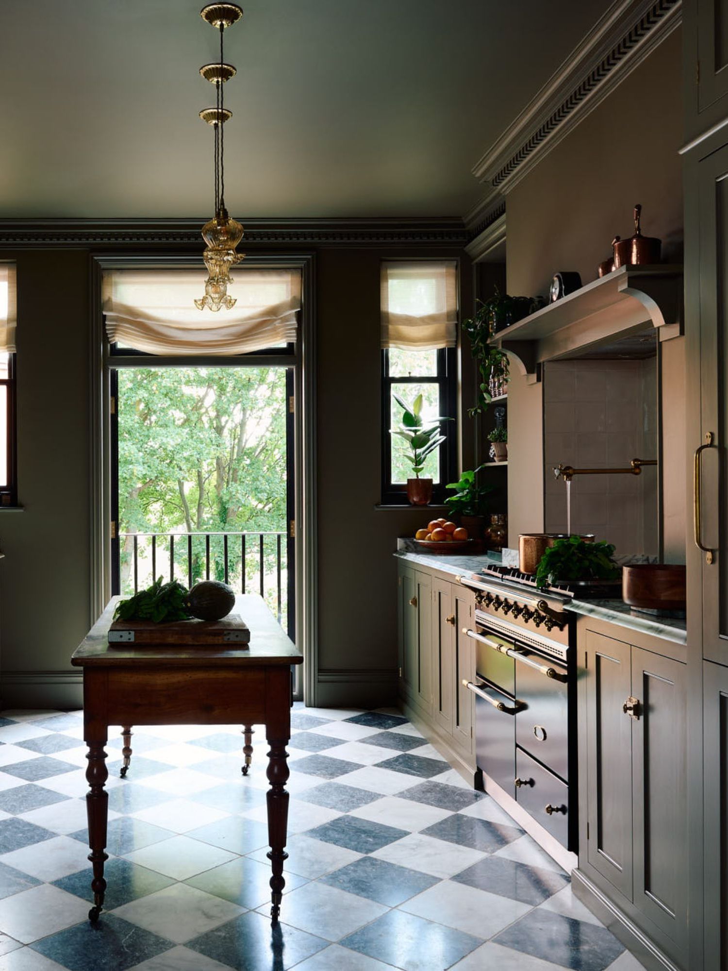
This compact deVOL kitchen has been drenched in a dark green to blur the edges of the room.
This nature-inspired shade succeeds particularly well in small spaces thanks to the complexity of the color. Nina Lichtenstein, a Westchester-based Interior Designer, explains how a flat or overly cool dark color can feel heavy or oppressive, but forest green really sings when a room is on the small side. 'The depth of forest green adds visual richness, its undertone often leans warm or earthy, and its saturation is strong enough to feel intentional without being harsh,' she shares.
These qualities give the color dimension, so it responds well to changes in light throughout the day. 'Morning light might bring out its freshness, while evening light deepens its warmth,' she explains. It can also make spaces feel deeper and more immersive, even if its footprint hasn’t changed. 'A forest green absorbs light and reduces contrast at the edges, allowing walls to visually dissolve,' she continues.
Nina often chooses a forest green in small home offices. A constant reminder of the natural world, it carries an inherent sense of balance and restoration, which is why it works so well in spaces meant for concentration or retreat. 'In a small home office, a forest green reduces visual noise, supports sustained attention, and allows the room to feel purposeful rather than cramped. Instead of the walls calling attention to themselves, they recede, allowing the mind to settle,' Nina says.
4. Soft Black
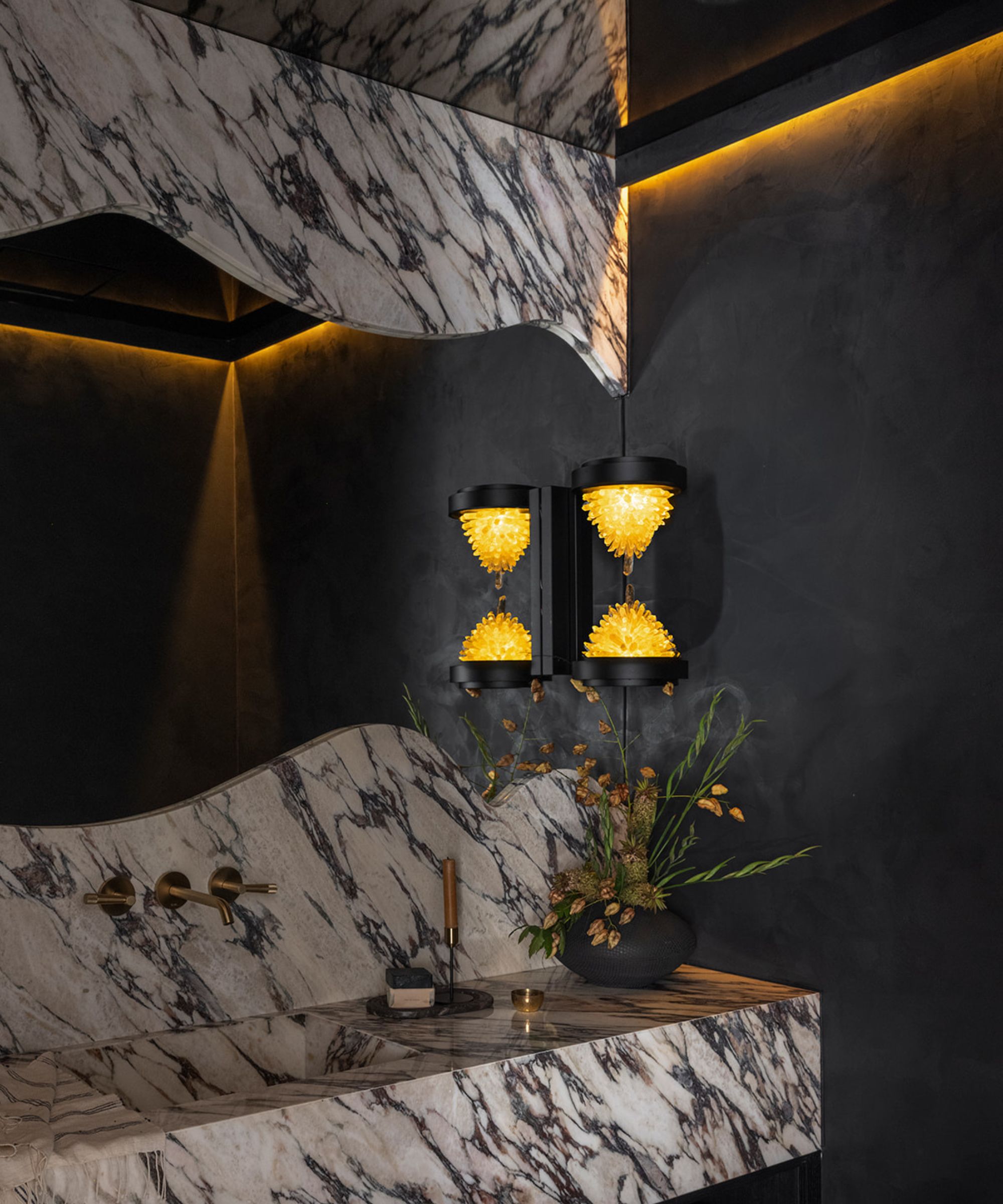
Allison Lind chose a soft charcoal black for this small powder room and gave it a slightly textured finish for extra softness. For a similarly soft, livable black, try Benjamin Moore Soot.
While decorating with black might seem tricky, it can be a rich and dramatic option for a small space. 'A small space is a small space and bright white walls won't make it any larger. I'm all about embracing the darkness, and the right black will envelop you with warmth,' Seattle-based designer Allison Lind explains. Plus, for some, it’s more appealing than a bold color. 'It maintains a neutral palette for the color-averse clients, but still offers depth, dimension and drama,' she adds.
When choosing the right black for a small space, undertones are key. 'I always prefer a black that has warmer undertones as it reads softer to the eye. Think more of a cozy cave than a sterile cavern,' Allison says. This means looking for a black that has brown or red undertones and avoiding those with blue ones.
Allison shares how this warm-undertoned black can work particularly well in spaces where you wish to add a bit of drama or coziness. 'This is a go-to for us in powder bathrooms and even bedrooms,' she says. Color drenching the room, including the ceiling, creates the most effective impact. Meanwhile, using a textured black, perhaps a black tile or stone in a bathroom or a black wallpaper in a small bedroom can really elevate the space.
5. Navy Blue
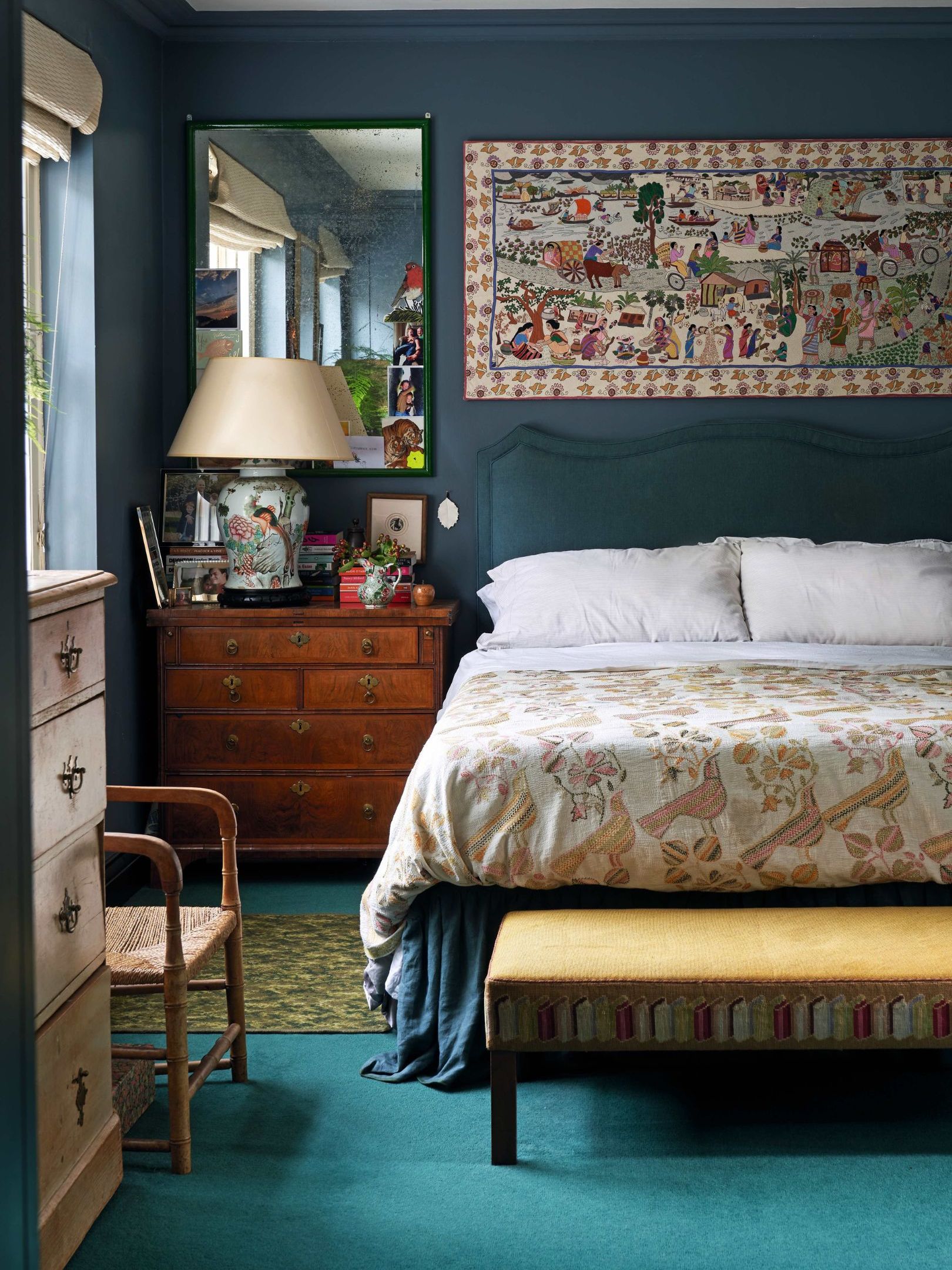
This bedroom uses a navy with slight green undertones, as Mark mentions it gives the room a softer appeal than a cooler navy blue. For a similar shade, try Dark Night by Sherwin-Williams
For a dark color that serves as a sophisticated neutral as opposed to a bold color, navy blue is always an excellent choice for a small space. Mark Schubert, Principal and Founder of Chicago-based M2 Design Lab explains how it has just the right level of depth for a small room with enough weight to ground a space without feeling too heavy.
Within navy, its undertones and saturation levels will impact the end look of your small room. 'A navy with cooler, inky undertones feels architectural and modern, while one with warmer or slightly green undertones can feel more classic and cocooning. Meanwhile, highly saturated navies feel bold and confident, while slightly muted versions feel softer and more atmospheric,' Mark explains. Selecting the right balance of all three ensures the color enhances the space rather than overwhelming it.
Navy is especially effective in small powder rooms, vestibules, home offices, and intimate dining rooms or small bedrooms where you want impact without relying on square footage. 'I often use it in windowless powder rooms, where the lack of natural light actually enhances the richness of the color, as well as in narrow hallways or reading nooks to create a sense of drama and destination rather than treating them as purely transitional spaces,' Mark says.
Mark suggests coloring-drenching an entire small space in a deep hue like dark navy so the boundaries blur and the eye reads the space as larger and more cohesive. 'The result is a room that feels deeper and more immersive,' he shares.
Whether you're giving your home office a fresh update, tackling a tiny bathroom renovation, or perhaps still feeling perplexed with how to make a tiny bedroom feel cozy, it’s time to rethink outdated rules about light and dark colors. Picking a dark hue could be the missing piece in the puzzle and a much-needed solution to create a warm and inviting space that feels more spacious than it actually is.