5 Common Color Clichés That Could Be Holding Back Your Home’s Style – Designers Reveal the Rules to Ignore in 2026
Unsurprisingly, designers have a lot to say about ditching the white paint in 2026 when it comes to these color clichés

Design expertise in your inbox – from inspiring decorating ideas and beautiful celebrity homes to practical gardening advice and shopping round-ups.
You are now subscribed
Your newsletter sign-up was successful
Want to add more newsletters?
Pink and green should never be seen, don't mix warm and cool tones, only use light colors in a small room – the list of color clichés is long, and as designers are keen to point out, often wrong. We've come so far with how we use and combine colors, so these old rules are sounding very restrictive in 2026.
And although color rules can be a useful tool if you're looking to create a well-balanced, calming space, they don't always leave so much room for personality to lead the way. Sometimes, it's better to ditch the color clichés altogether and lean into a much more experimental approach.
And so, in a bid to encourage color-confident homes in 2026, below, interior designers share the common color clichés they recommend avoiding, along with their advice on what to do instead for stylish and soulful homes.
Article continues below1. White Makes Rooms Feel Larger
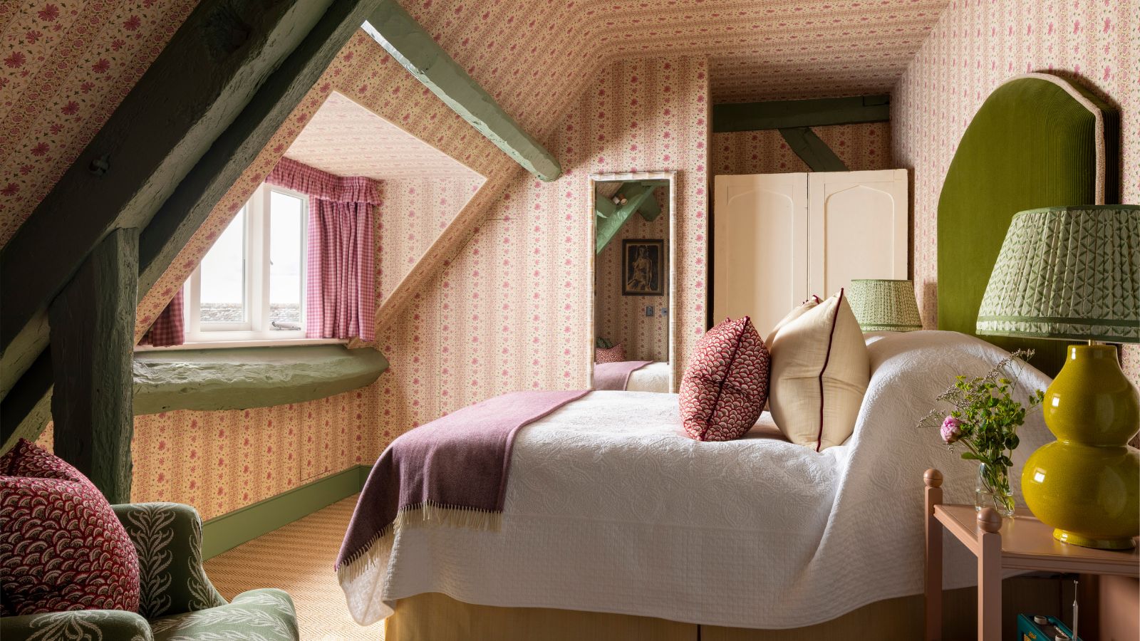
Don't be afraid of going bolder with your color palettes, even in smaller rooms. While white can fail to add interest, richer colors can elevate any room with design flair.
'One common cliché is that white makes everything look bigger, but we tend to think that white just makes everything look boring,' says designer Linda Eyles.
While decorating with white is so often favored in an attempt to make a space feel bigger, it's not always the best route to take. Especially in light-lacking rooms, white can appear dull and deprived of any real interest. 'Rather than going bland, we love a bold space that is rich with unexpected colors,' Linda adds. 'It's the perfect way to introduce guests to your home.'
The designer Justine Wolman also sees the overuse of white as a color cliché to avoid, especially in smaller spaces. 'I think the mindset of making small spaces light and white is really limiting,' she says. 'Small rooms are actually the perfect place to take risks – I love color drenching in a deeper or more saturated tone to make the space feel intentional, cozy, and well designed.'
'Instead of trying to make the room feel larger by defaulting to white, think about making it feel memorable,' says Justine. 'Powder rooms, pantries, mudrooms, and home offices can handle more personality, and those spaces often end up becoming a favorite moment in the home.'
Design expertise in your inbox – from inspiring decorating ideas and beautiful celebrity homes to practical gardening advice and shopping round-ups.
2. Ceilings and Trim Should Always Be Painted White
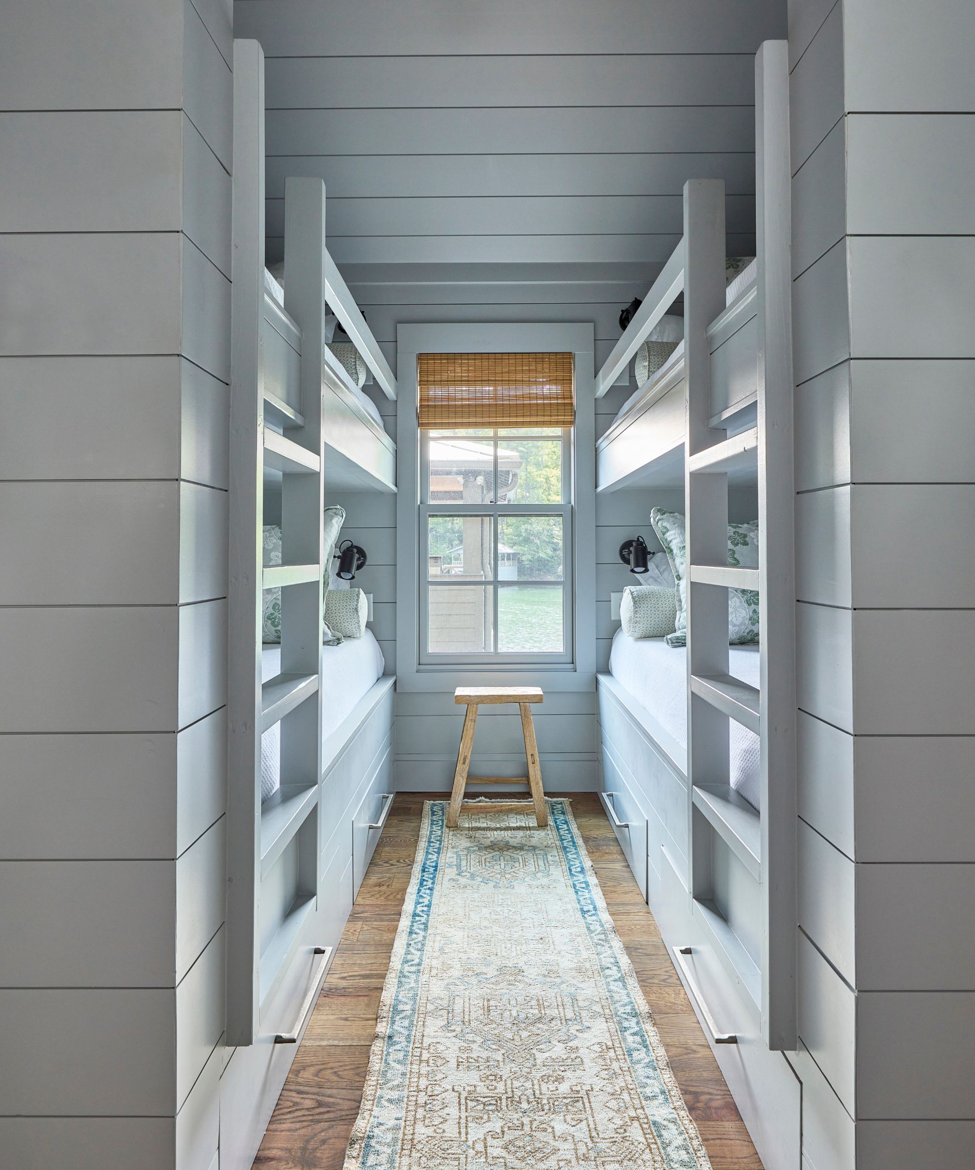
Think beyond white ceilings and trim in 2026, by either color-drenching the whole space, or going for a paint that's a few shades lighter than your walls.
There's an old notion that ceilings and trim must be painted white, but designers are dubbing this a color cliché to avoid. 'They don’t always have to be painted white,' says designer Grace Brackman of Maggie Griffin Design. 'Gone are the days of bright white trim.'
Lauren Conner is equally happy to say goodbye to this color cliché. Referencing white ceilings, she says: 'It’s one of the most unimaginative conventions in decorating, and one I avoid whenever possible. Often called the “fifth wall”, the ceiling is an opportunity to introduce color, sheen, texture, or even wallpaper to transform a room from ordinary to memorable.'
Instead of white trim and ceilings, designers often embrace a more colorful approach that avoids such harsh contrast. When painting a ceiling, Lauren favors matching the wall color but with less intensity. 'I often recommend using a diluted version of the wall or trim color to create a more seamless transition upward,' she says. 'If the walls are a color and you don’t want a colored ceiling, I recommend using a rich vanilla white, rather than paper white. And if a plain white ceiling is unavoidable, at least reconsider the sheen. Satin, gloss, or even lacquer finishes can add depth and intention where flat paint falls short.'
For trim, 'try using the same wall color, but in a different sheen', recommends Grace. 'For a more dramatic look, opt for a dark, moody color and drench the whole room: walls, ceiling, and trim.'
3. Every Room Needs a 'Pop' of Color
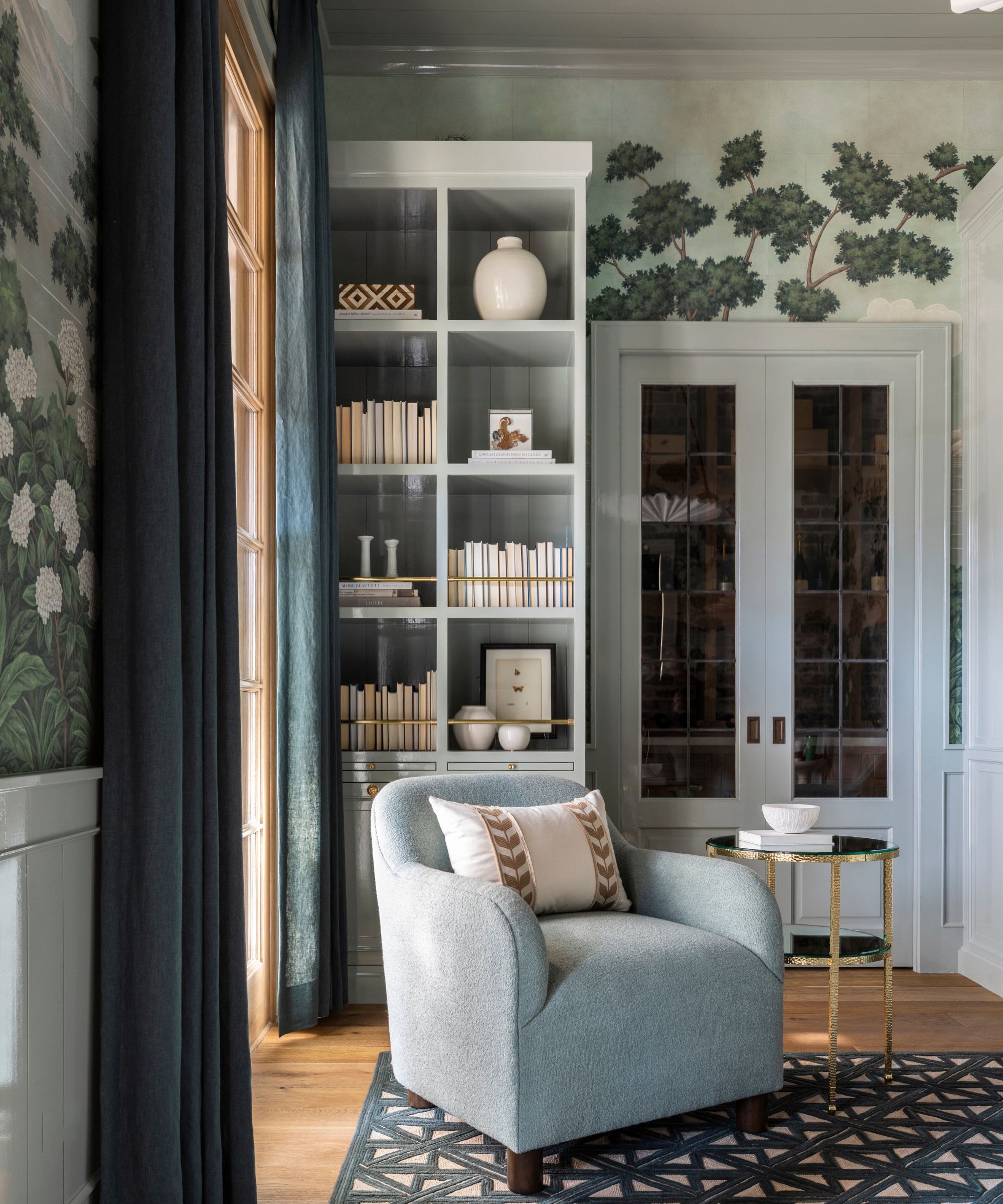
While adding a playful pop of color can add interest, you don't need to get hung up on this idea for every room. Sometimes, keeping it more subtle is more effective.
Many of the biggest interior design trends of late have been all about throwing something slightly surprising into a room to boost design appeal. Most famously, the unexpected red theory encouraged homeowners to add this bold color to all sorts of color schemes. And while there's certainly something to be said for its success, it doesn't mean that every single room should follow this rule.
'The old rule that every room needs a pop of color can make spaces feel disjointed, like the color was added at the end instead of thoughtfully considered from the start,' says designer Marie Flanigan.
'Instead, I love allowing color to feel integrated – woven through textiles, artwork, natural materials, architectural details, and even florals, so it tells a quiet, cohesive story,' Marie adds. 'When color grows from the home’s mood and light rather than being “popped”, it feels timeless instead of trendy. The result is a layered palette that invites you in and reveals itself slowly, rather than shouting for attention.'
4. Your Home Needs to Follow a Strict Color Scheme
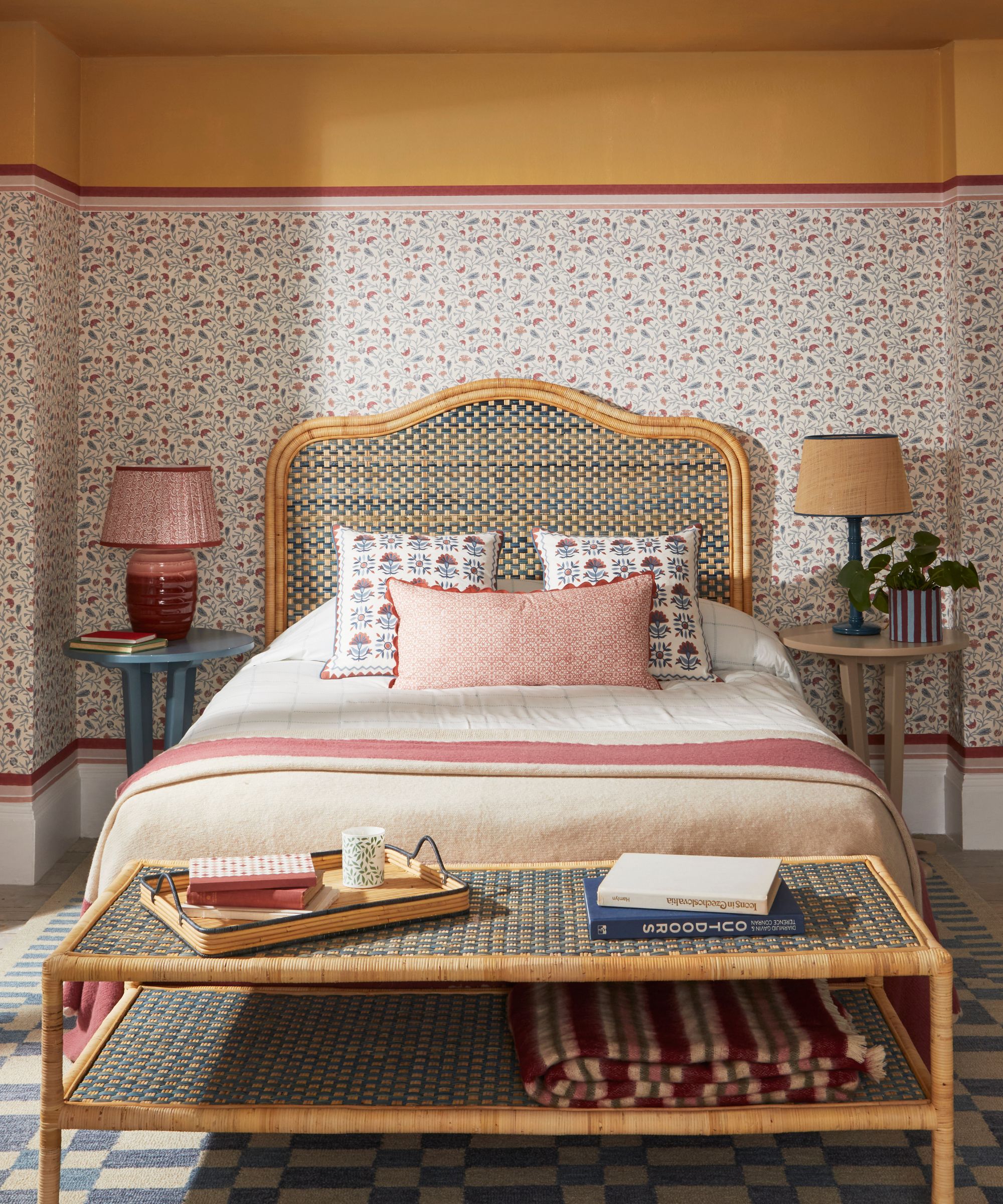
Limiting yourself to a strict color scheme can end up being more difficult. While a general idea of your favorite colors is useful, you should allow each room to have its own color moment.
While clearly defined color schemes can be a useful way to keep your space feeling cohesive, color trends are shifting towards a more experimental approach that skips the need to have a mapped-out scheme for each room.
'There used to be a belief that your home needed to have an overall color scheme,' says Leslie Kramer of Lighthouse Home & Design. 'I think that concept is out the window with more and more people choosing to let each room have its own purpose and personality and be its own moment.'
'I see dark green color-drenched living rooms that step right into a creamy white and walnut traditional kitchen, or a classic white and marble bath in the same home as a bold, painted-pink powder bath filled ceiling to floor with dozens of pieces of art,' says Leslie.
5. All-Neutral Rooms Are a 'Safe' Choice
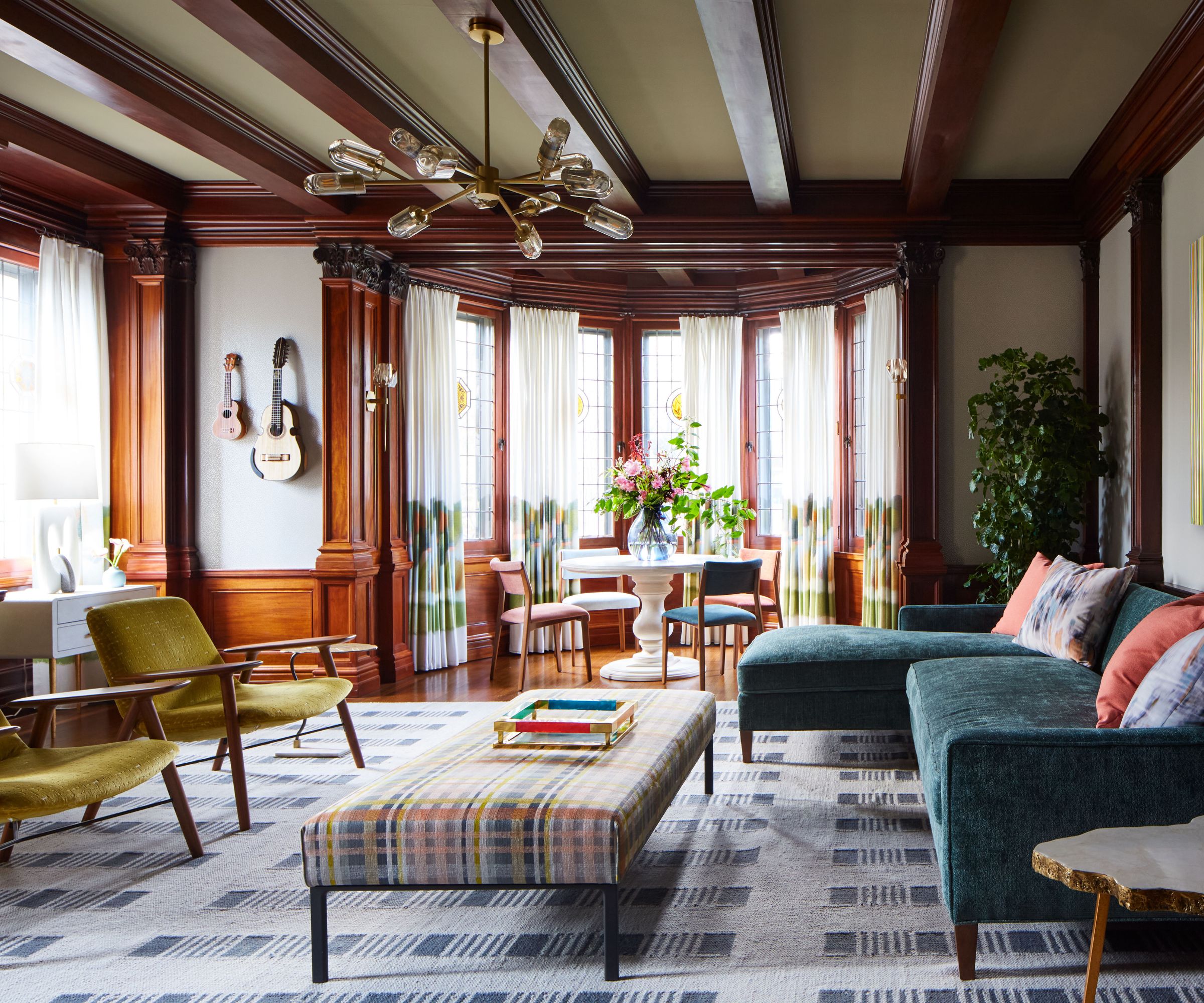
Neutrals can feel like a safe bet, but if you're looking to add personality and interest, they're rarely the best choice. It doesn't have to be over the top; a few additions of richer colors can be incredibly effective.
'Many of the most limiting color “rules” were created to prevent mistakes, not to inspire great design – and today they often do the opposite,' says designer Jessica Whitley. 'The idea that neutrals are always the safest choice has led to homes that feel polite but forgettable.'
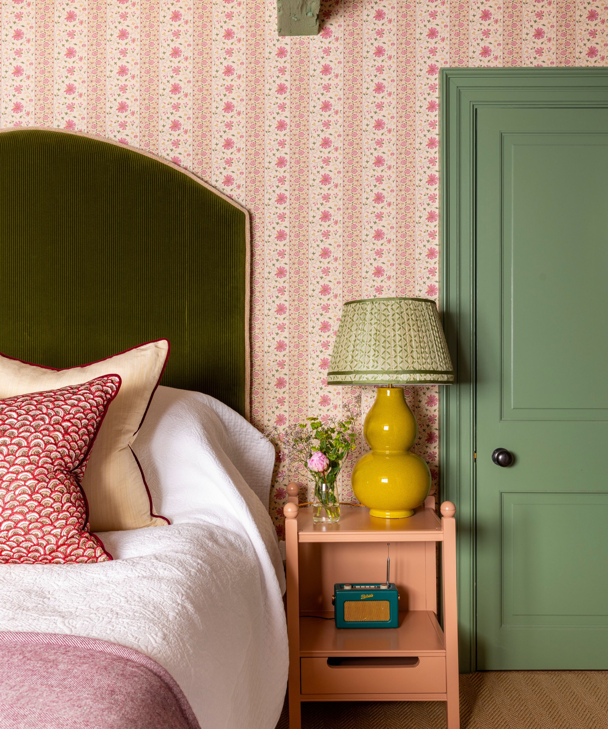
From white-washed walls to beige everything, there are plenty of hangups in the world of interiors that favor a restrained palette of neutrals, but as Jessica says, it rarely accounts for the most interesting spaces. Designer Betsy Wentz agrees. 'Ditching the all-neutral color scheme can be a game-changer for adding personality to your space,' she says. 'Neutral colors are safe, but they can also be boring. I like to add some excitement by playing with patterns. Try mixing in some stripes and florals with solid colors to create visual hierarchy.'
'I encourage clients to treat certain colors – soft olive, clay, tobacco, smoky blue – as functional neutrals that add depth without overwhelming a space,' adds Jessica.
While color rules or clichés can be useful in ensuring cohesion and balance in a room, they're rarely the inspiration for personality-led homes that offer real excitement. And so, if your color schemes seem to be falling flat and are failing to inspire, consider thinking outside the box and ditching the traditional clichés for a home that truly sings.

Emily is a freelance interior design writer based in Scotland. Prior to going freelance in the spring of 2025, Emily was Homes & Gardens’ Paint & Color Editor, covering all things color across interiors and home decor for the Homes & Gardens website. Having gained specific expertise in this area, Emily is well-versed in writing about the latest color trends and is passionate about helping homeowners understand the importance of color psychology in home design. Her own interior design style reflects the simplicity of mid-century design and she loves sourcing vintage furniture finds for her tenement flat.