Design DNA: An East Coast Townhouse with West Coast Sensibilities – Tour the $23 Million NYC Parlor Room That Refuses to Play It Safe
In a townhouse parlor room with serious architectural lineage, Sven and Sara Simon show how far instinct, art, and a little irreverence can take a historic space


For $23 million, you can now claim a townhouse on Greenwich Village’s so-called ‘New Billionaire’s Row’ – a designation that feels almost ironic given the neighborhood’s long history of bohemian mischief, artists, and rule-breakers. That creative lineage isn’t erased here. Instead, the home’s recent renovation by husband-and-wife hoteliers and designers Sven and Sara Simon treats it as something to be preserved, not polished away.
Originally built in 1841 and later expanded by I.M. Pei – yes, that I.M. Pei, of Louvre Pyramid fame – the former home of Emmy-winning actress Ellen Barkin now carries a relaxed West Coast sensibility following the couple’s move from Los Angeles.
Spanning three floors, the townhouse balances history with ease, but it’s the parlor room – parts salon, gallery, and conversation pit – where old-world provenance and modern irreverence meet most convincingly. Ahead, Sara unpacks the thinking behind the room’s rule-bending Design DNA, and how to apply it at home.
Unconventional Pattern Pairings
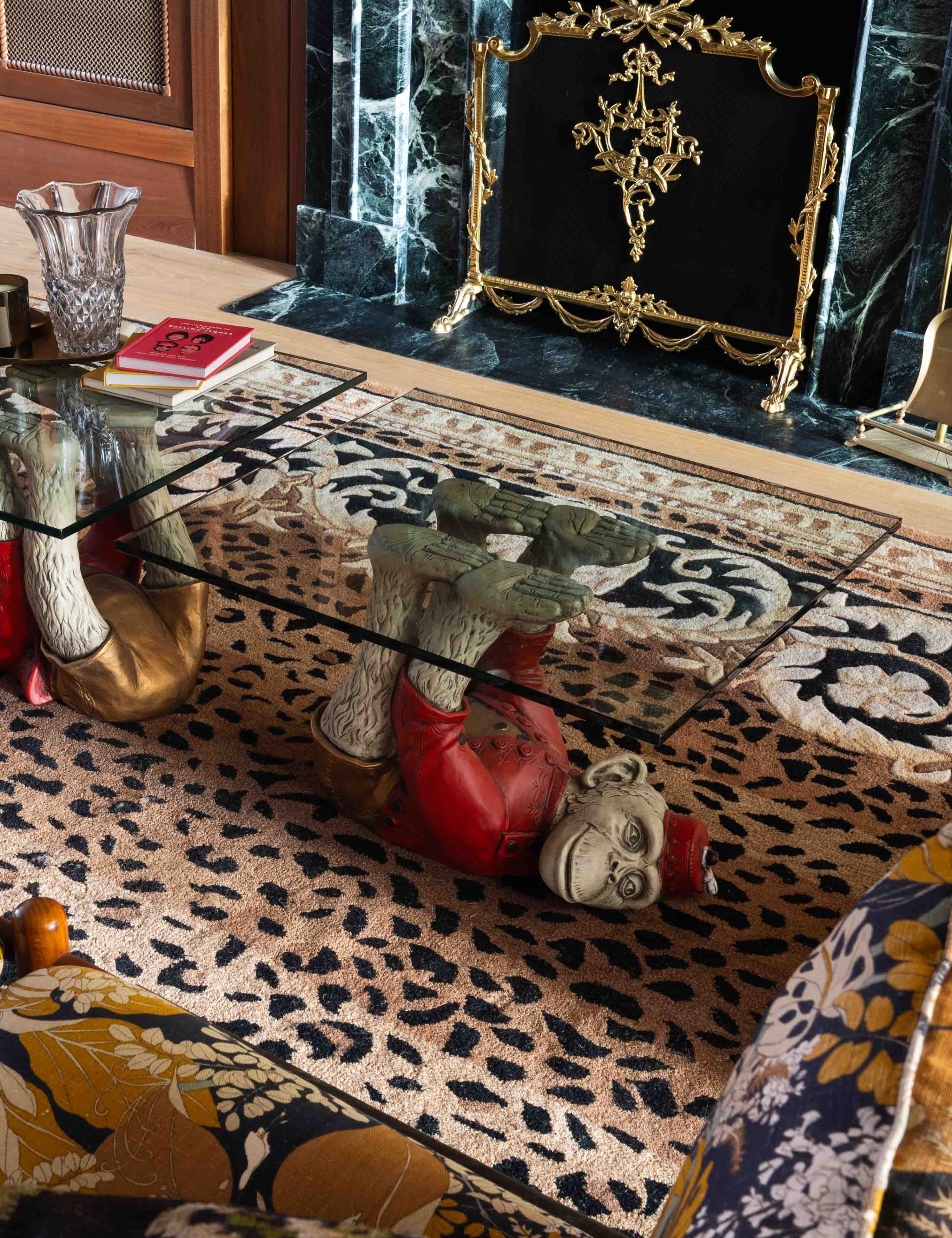
This parlor room isn’t shy about decorating with pattern – something Sara credits to her West Coast roots.
‘You can take the girl out of Cali, but can’t take Cali out of the girl,’ she says. ‘The LA style is definitely the bold color and pattern choices. I find that East Coast design tends to be a bit more muted. LA is a bit more walk on the wild side. I definitely stayed true to my Cali swag while adding an East Coast twist.’
That bicoastal mindset may be the real key to successful pattern drenching. Beyond varying color and scale, this room leans into contrast of sensibility. Beneath the glass-topped coffee table sits a leopard-print rug (pure LA rock ’n’ roll), while the Round Top–sourced floral sofa above reads distinctly East Coast, like it could have lived here for generations.
Whether you're tackling a layered living room or a parlor room of your own, don't just mix patterns. Mix eras, places, and attitudes.
'Original' Warm Woods
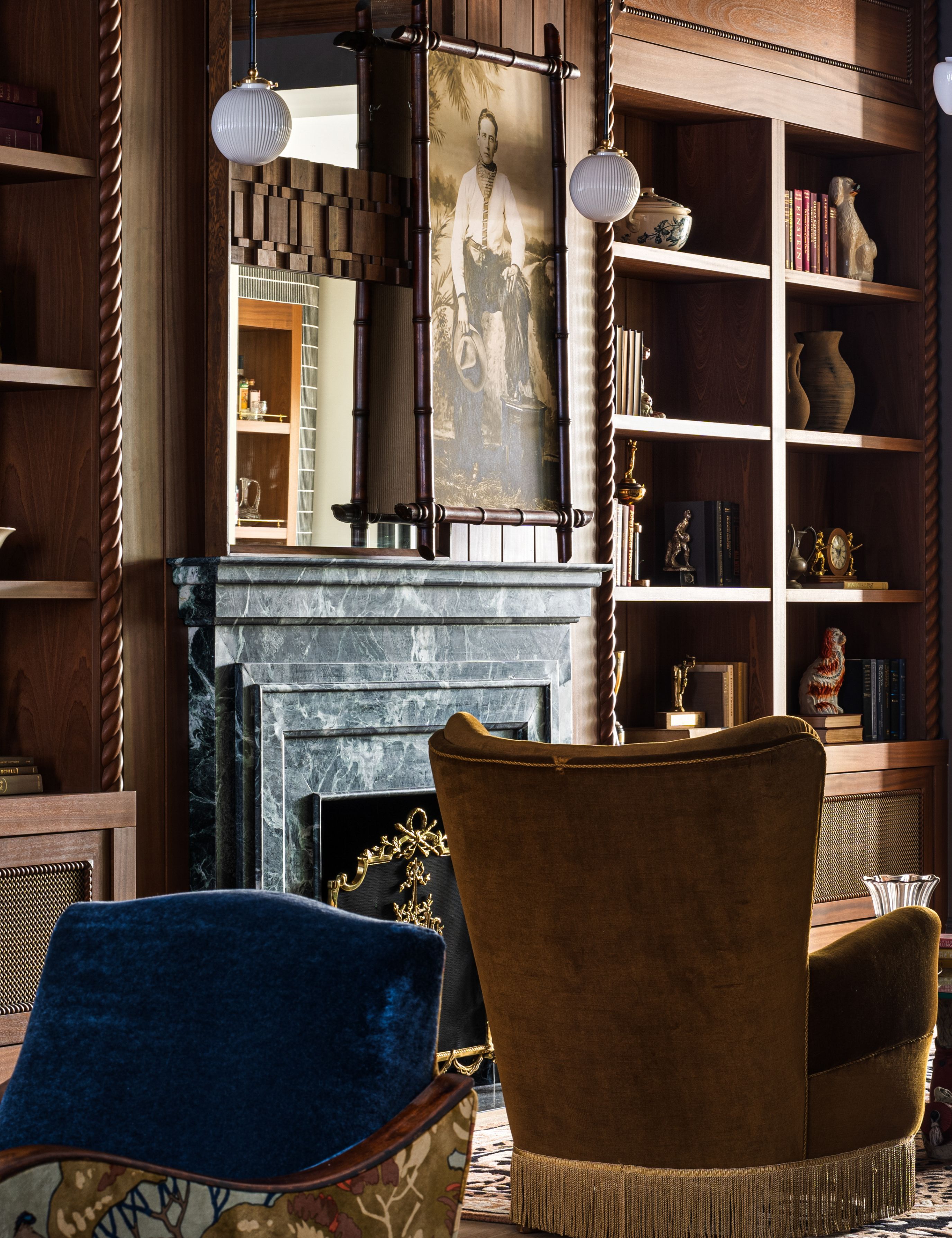
The warm woods wrapping the walls and spiraling through the bookcases feel convincingly original – which is exactly the illusion Sara was after. In reality, none of it is.
‘All the millwork is brand new. No part of the previous millwork was kept,’ she reveals. ‘This is where the East Coast brownstone design met the Cali design. We knew that we wanted to stay classic and true to a brownstone and not make it a modern box. We wanted to give it that old-world feel and bring warmth and character into the space. The goal was to make it feel lived in.’
Instead of leaning into lighter, beach-coded woods or textured plaster finishes typical of a West Coast renovation, Sara chose sapele – a mahogany alternative known for its ribboned grain and depth of color.
It’s a useful reminder for historic spaces (or those aspiring to feel like one): get the bones right first. When the foundational materials carry weight and warmth, the more experimental layers have somewhere to land.
‘You can take the girl out of Cali, but can’t take Cali out of the girl. The LA style is definitely the bold color and pattern choices. I find that East Coast design tends to be a bit more muted. LA is a bit more walk on the wild side.’
Sara Simon, co-founder of real estate development and design firm dasCasa
Vintage Collectibles
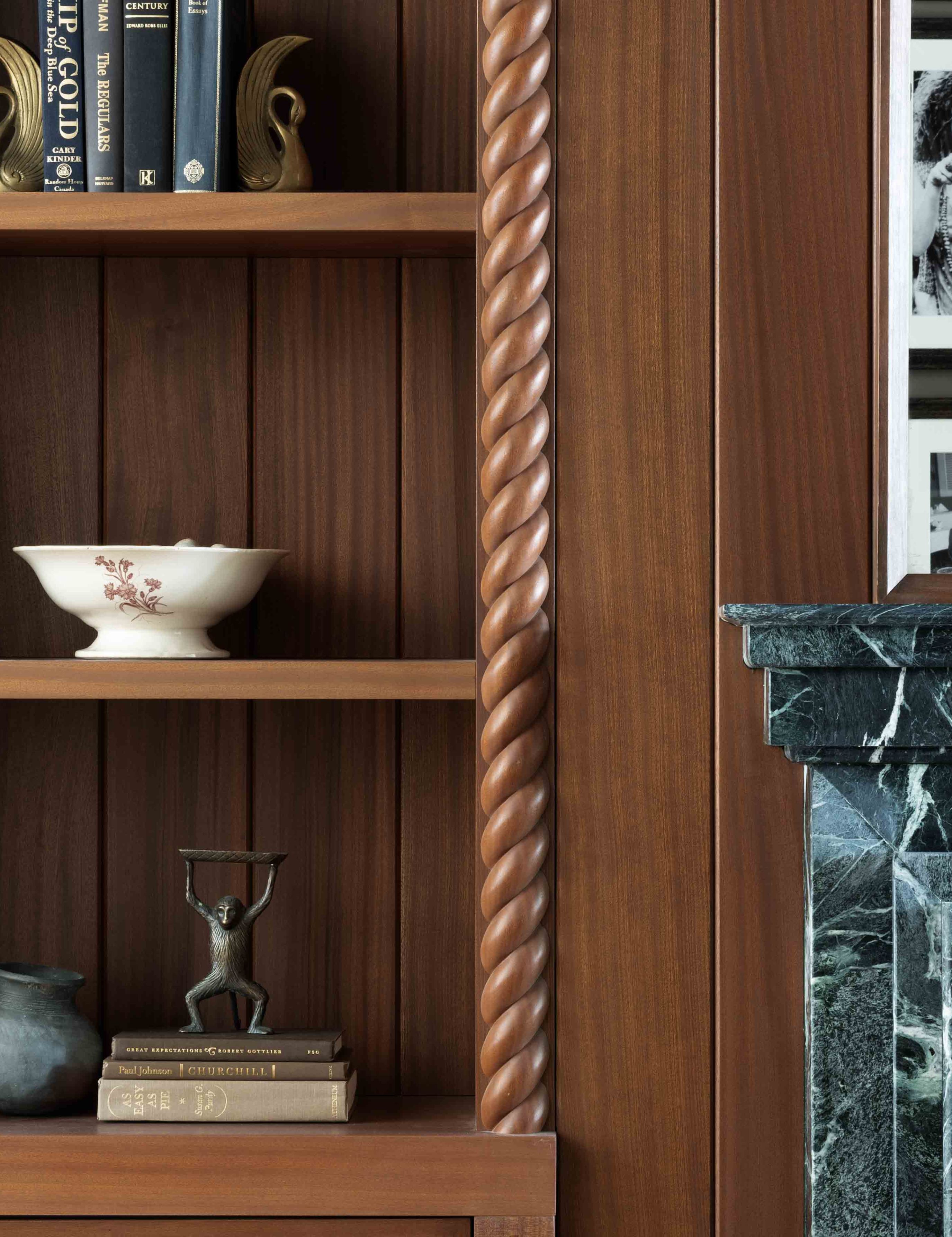
From bronze monkeys to swan-shaped bookends, the shelving in this parlor room is deliberately populated – not crowded – with objects that lend credibility to the home’s East Coast bones, even as the sensibility leans West.
‘I wanted the space to feel lived in, so I collected pieces such as trophies, vintage bowls, vases, and bookends to fill up the space. And I always like using old books to warm it up,’ says Sara.
The lesson here isn’t just what you collect, but how you place it. Sara leaves generous pockets of negative space between objects and groupings, a move borrowed more from galleries than curio cabinets. This way, even a $5 thrifted vase can feel authoritative – without a $23 million home-worthy curation budget.
‘It’s so hard to explain my design process because there is no real method to my madness. I like leopard, so I buy the leopard chairs. I love monkeys holding glass as a coffee table, so I buy the monkeys.’
Sara Simon, co-founder of real estate development and design firm dasCasa
A Gallery Wall
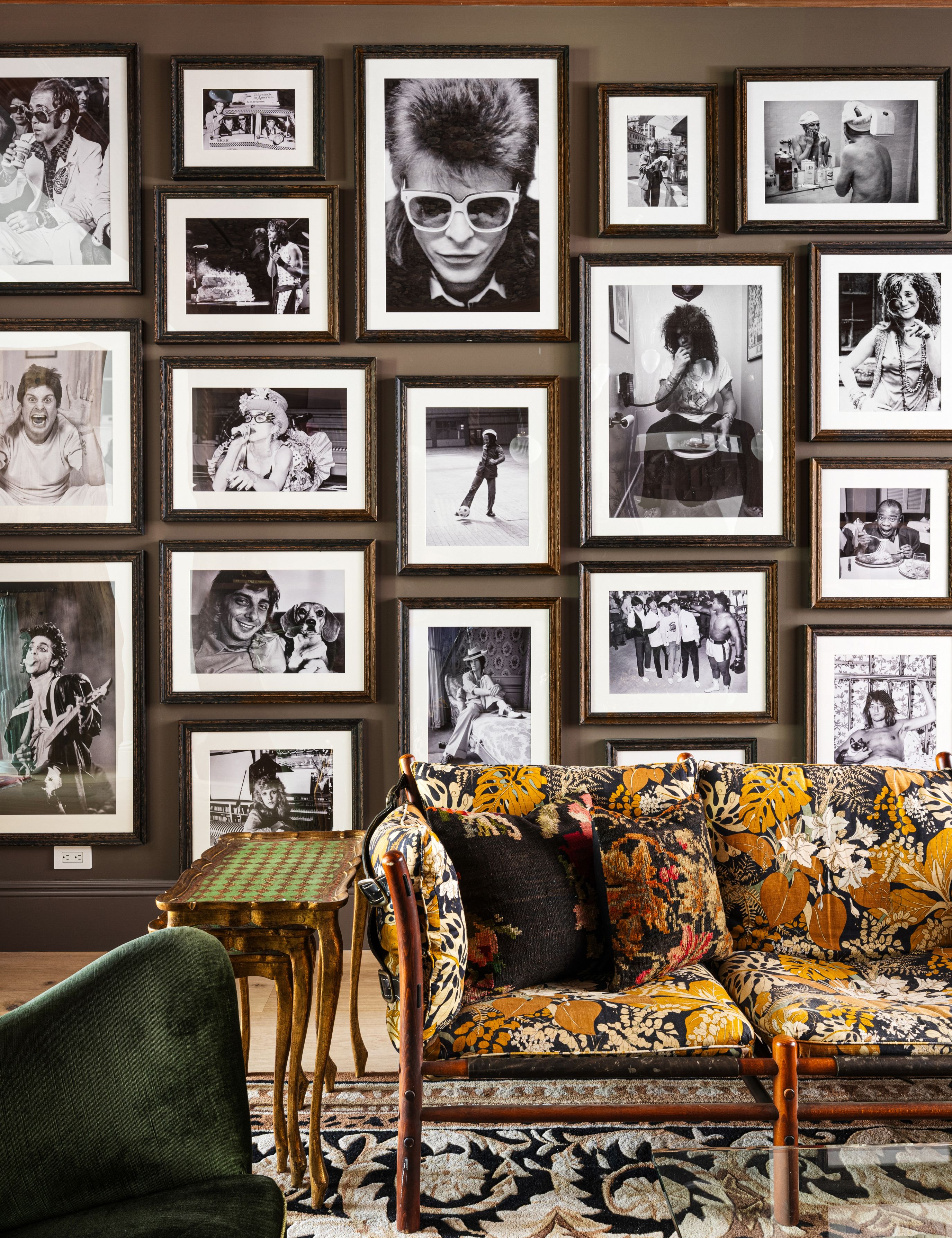
Gallery walls have cycled in and out of favor, but this parlor room makes a convincing case for permanence. Spanning the better part of an already expansive wall, the arrangement works precisely because it resists perfection.
‘I am a sucker for a gallery wall, and I drove my carpenter insane hanging these as he wanted them lined up, and I did not,’ Sara says of abandoning the grid. Like the millwork, she explains, ‘gallery walls give the room character.’ To keep the display from competing with the room’s color story, she kept the images monochrome. ‘I didn’t want them to compete with the color on the couch, so I did the wall in black-and-white photos’ – a choice that underscores a familiar paradox in decorating: contrast, not coordination, is often what reads most intentional.
Her advice is simple: plan, but don’t over-plan. ‘If you want to do a gallery wall, lay it out or draw it up first, but be ok to be flexible.’ The magic, she suggests, tends to happen somewhere in the in-between.
Non-Matching Pops of Color

The color moments in this parlor room feel seamless because Sara and Sven kept them in the family. Jewel tones surface slowly, unified less by exact match than by shared depth.
‘I don’t do matchy-matchy and love patterns and colors,’ Sara says, pointing to the pair of Danish high-back chairs sourced from Denmark. One olive, one ochre, they're different shades that hit the same register.
The emerald marble fireplace operates similarly, as do the walls: Farrow & Ball’s London Clay – subtly tinged with magenta – absorbs and reflects the saturation elsewhere, keeping the palette cohesive.
The takeaway here is that colors don’t need to match. They just need to speak the same language.
The Edit

Add a note of intrigue to your shelves with these Deco-inspired swan bookends, which are a close match to the graceful duo sourced by Sara and Sven. Style them with a light hand: a few favorite reads and plenty of breathing room on either side so the shelf reads more like a gallery.
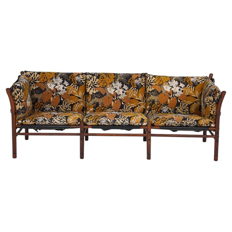
‘The couch is definitely a statement piece in the room,’ says Sara. ‘I bought it at Round Top not specifically for this project, but because I had to have it. It just sat in storage for well over a year, and it fit perfect in the space, so this is her big debut.’ We’re just as smitten – and, fortunately, have tracked down the exact piece.
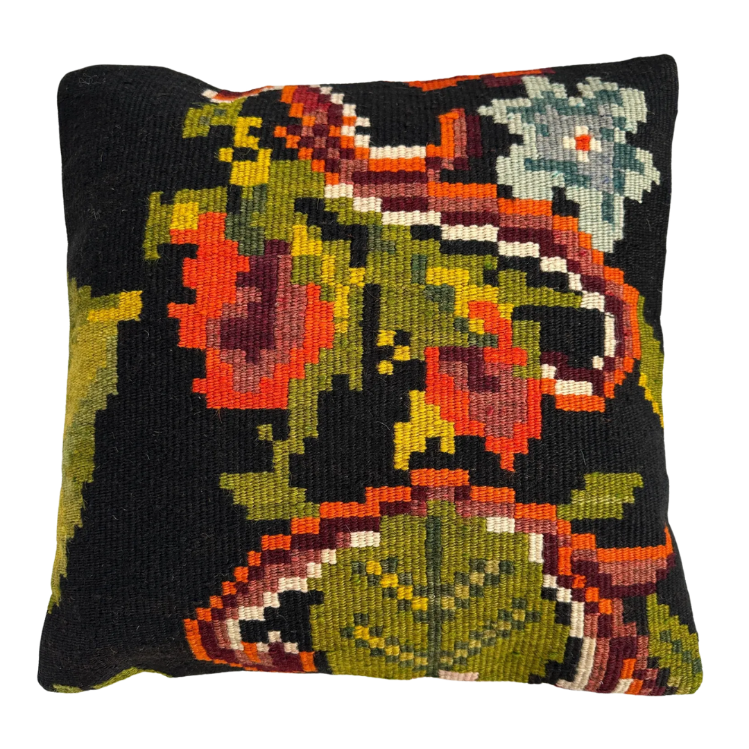
There’s a lot to love about the sofa’s florals, but we can’t forget about the pattern-on-pattern moment happening on top. This throw pillow cover closely mirrors the zoomed-in florals of the multicolored Turkish tapestry cushions perched against the back – a calculated clash that amplifies the smaller-scale florals in the upholstery.
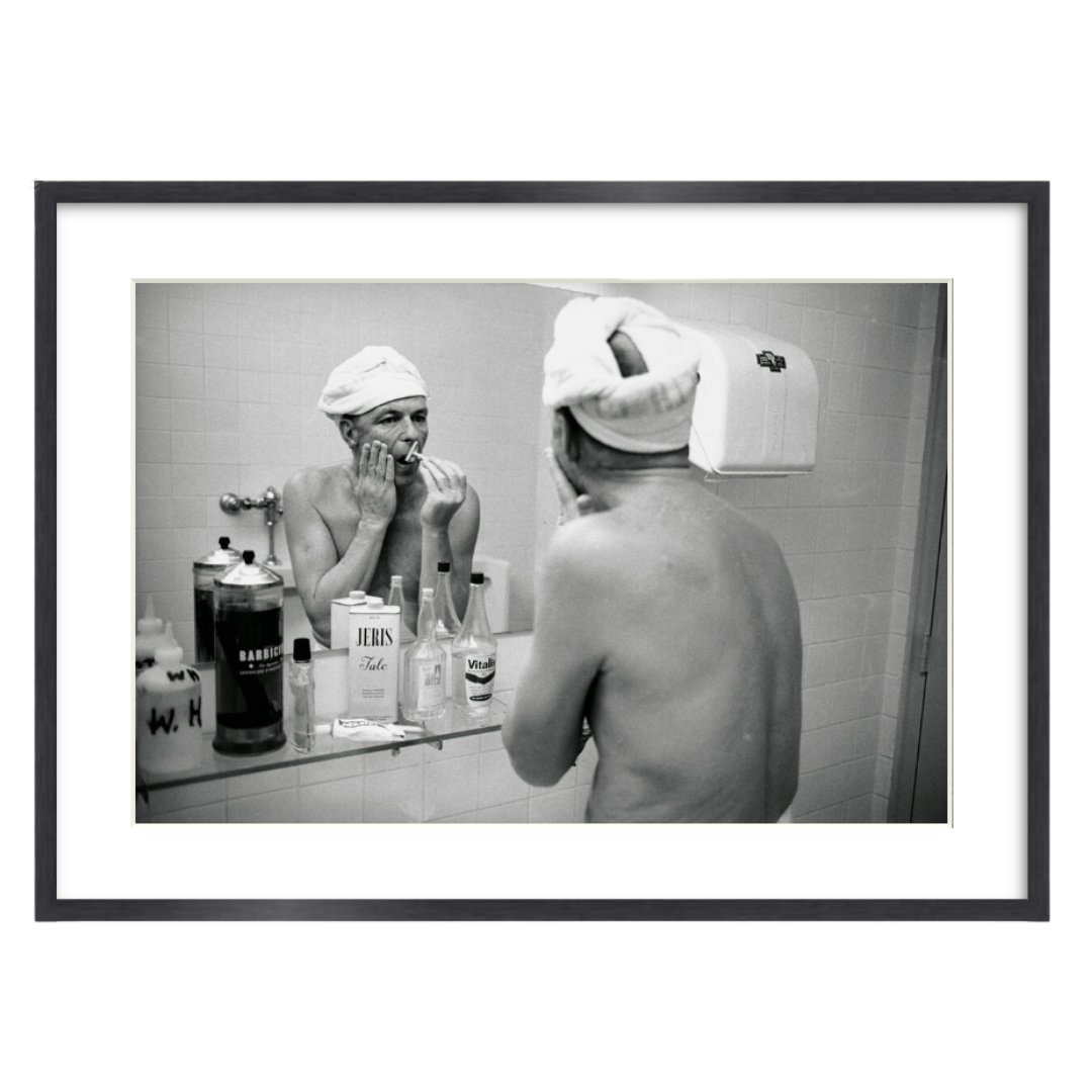
Pop-cultural references of a bygone era abound on this parlor room gallery wall. While icons like David Bowie or Janis Joplin were tempting, we went classic with Frank Sinatra. Buy the print framed or on its own, then commit to a single frame style as you build out the rest of your black-and-white lineup.
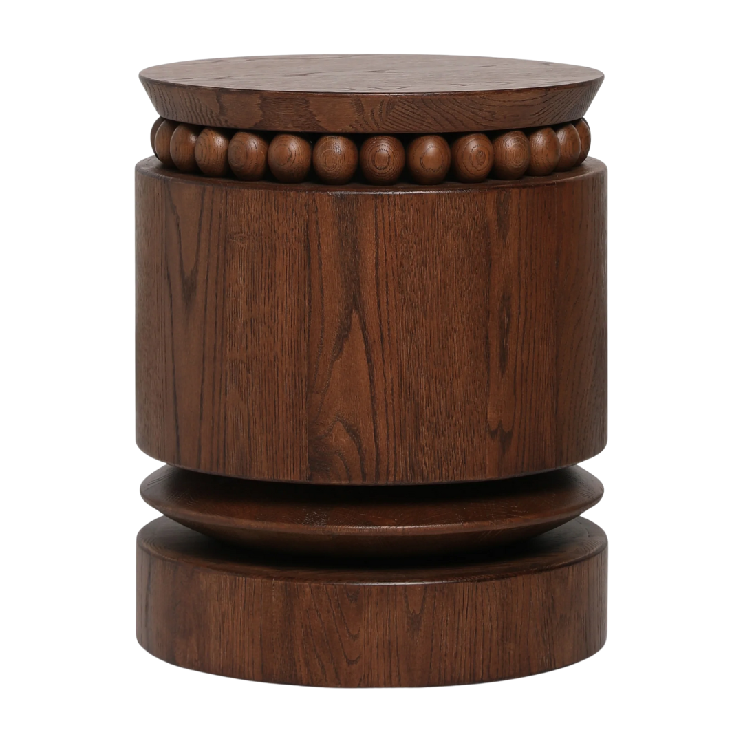
Sitting alongside that glorious Swedish sofa circa 1970 is a newer design by Carly Cushnie for Lulu and Georgia. The designer’s fashion background is obvious in the table’s sculptural silhouette and jewelry-like wood bead detailing, serving as an ideal stage for elevating everyday objects.
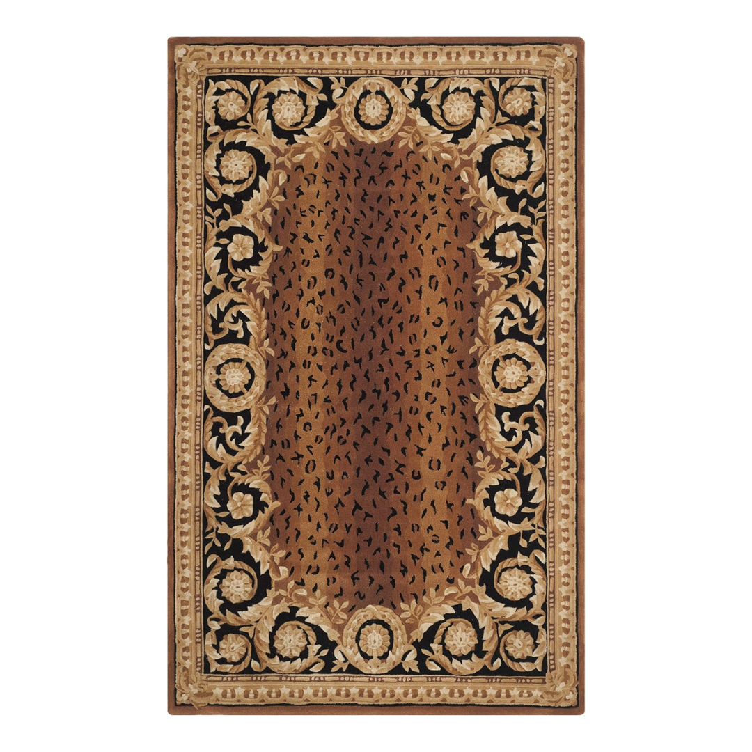
‘I have a not-so-secret obsession with leopard, so it lives throughout the home,’ Sara laughs – including underfoot. This handmade wool rug from Safavieh delivers the same graphic swagger as the original. Available in nearly every size imaginable, it’s a relatively low-lift way to take a walk on the wild side, commitment level entirely up to you.
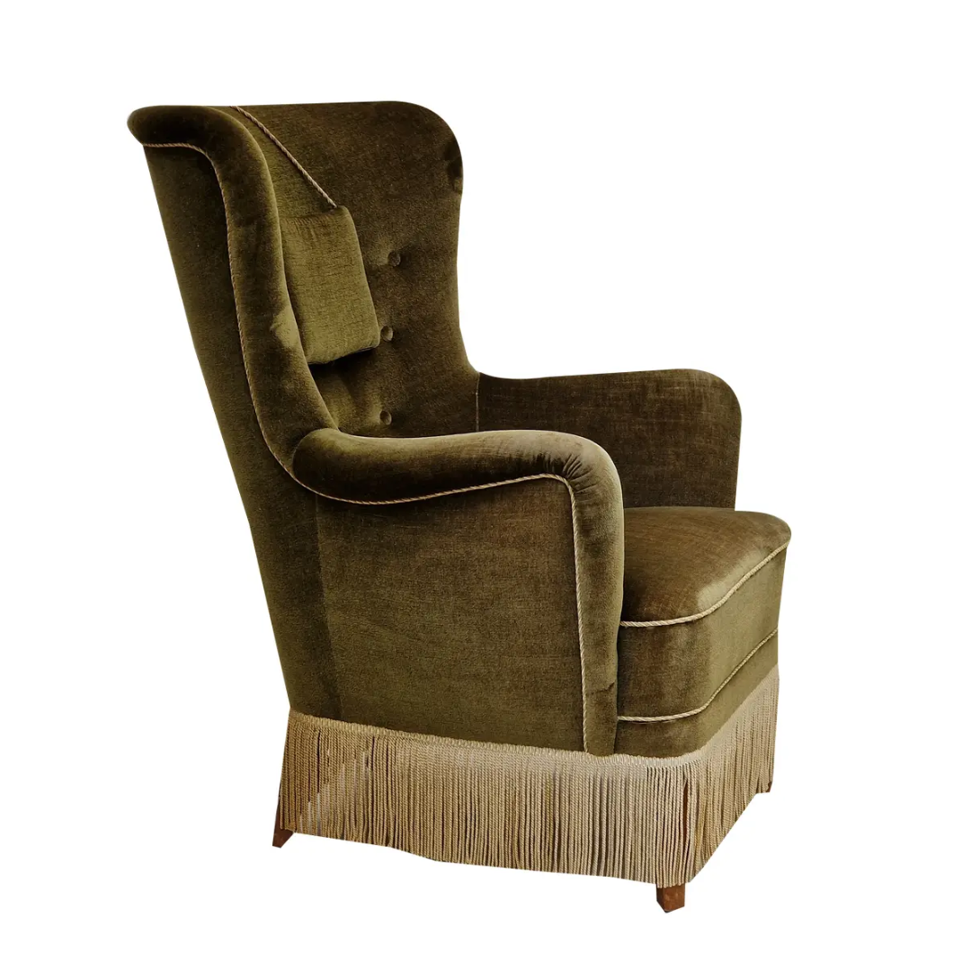
Fringe may be enjoying renewed relevance, but this Danish highback chair proves it’s never really left. This vintage design leans fully into the drama, pairing the theatrical trim with a silhouette bold enough to keep up. Resist finding its twin (Sara’s firm on avoiding anything too matchy). Instead, let it stand alone, or offset it with another vintage seat in navy or ochre for contrast.

Unemployable might be the story of the three Australian brothers behind Globe International – one of the world’s most influential skate, surf, and street brands – but that same unruly spirit feels right at home on Billionaire’s Row. The gritty table read is an unexpected homage to California culture, slipping a subversive West Coast note (and a welcome flash of red) into an otherwise impeccably composed parlor room.

Suspended beneath a glass top and dressed like a bellhop, this plaster monkey was made to spark conversation. The figure does the heavy lifting in terms of personality, while the table’s glass surface keeps the silhouette light, preventing the piece from overwhelming any already pattern-rich rug below.
What Are the Key Elements of a Well-Designed Parlor Room?
A parlor room may be the jewel box of a home, but it shouldn’t feel untouchable; it should invite lingering.
‘You want it to be a place that you want to be. Design in a way that makes you feel something,’ Sara explains. That emotional pull, she notes, often comes from the details people are tempted to edit out – the personal, slightly eccentric pieces that feel too bold for more 'practical' rooms.
Rather than anchoring the space to a single palette or style, Sara treats the parlor as a reflection of lived experience. ‘I design based on my latest inspiration from my travels,’ she explains. ‘The colors, patterns, textures, it all stems from things that have caught my eye and have inspired me and have stuck.’
When instinct leads, design tends to follow.
How Do You Create a Balanced Parlor Room?
Balance, for Sara and Sven, meant refusing to let any single plane do all the work. In a room where the millwork and art already command attention from the walls, the ceiling couldn’t be an afterthought.
‘The ceiling, I thought, was way too boring to be white or a solid color,’ Sara says. ‘I wanted the room to stay warm and moody and have some flavor, so I settled on this floral wallpaper.’ She paired it with a 1920s French Art Deco ceiling light sourced from Belgium. ‘I loved the palms on it and the shape. It gave a hip old-world vibe.’
By treating the ceiling with the same reverence as the walls and furnishings, this parlor room avoids hierarchy altogether. Had the ceiling been left plain – or the fixture felt too new – the parlor might have lost its balance. Instead, the space pulls together as a fully realized, cross-generational world.
What Design Choices Make This Room Timeless?
The timelessness of this parlor room – or any room, for that matter – comes from elements that naturally span eras rather than belong to just one.
Always-on materials like warm woods and veined marble anchor the space, while black-and-white photography avoids timestamping it to a specific moment. Even the more expressive gestures – the leopard rug, for instance – read less as accents and more as part of a broader ‘wild side’ narrative that lets old and new coexist.
‘There is a lot going on, but it all feels very cohesive,’ says Sara.
What Should Every Parlor Room Include?
Every parlor room needs a conversation starter. For Sara, that role belongs to the glass-topped coffee table held aloft by two monkeys.
‘I’ll be honest, I saw it and had to have it. It’s just too good. And it’s definitely a conversation piece that has everyone talking about it,’ she quips.
That instinct-first mindset runs through Sara’s work more broadly. ‘It’s so hard to explain my design process because there is no real method to my madness,’ the designer tells H&G. ‘I like leopard, so I buy the leopard chairs. I love monkeys holding glass as a coffee table, so I buy the monkeys. I love unique one-of-a-kind pieces, and I love the hunt.'
When torn between the sensible option and the parlor room piece that makes your pulse jump, Sara suggests choosing the latter. ‘My advice is to always trust your gut and go for it.’
This parlor room’s DNA isn’t rooted in rules or movements, but instinct. Blend references freely. Buy with conviction. Let pieces coexist even when they don’t neatly agree. The rooms that read the most confident are the ones that resist resolving into a single idea.
Design DNA is the Homes & Gardens series that breaks down beautiful rooms into their essential elements. Each installment dissects one interior and shows readers exactly what makes it work, from the anchor furniture and layout choices to color, lighting, and styling details.

Julia Demer is a New York–based Style Editor at Homes & Gardens with a sharp eye for where fashion meets interiors. Having cut her teeth at L’Officiel USA and The Row before pivoting into homes, she believes great style is universal – whether it’s a perfect outfit, a stunning room, or the ultimate set of sheets. Passionate about art, travel, and pop culture, Julia brings a global, insider perspective to every story.