You Would Never Guess This Whimsical Oregon Cottage Was Once A Cold, Characterless Home Built In 2010
Even the most un-charming of sleek white boxes can be given personality and depth, as designer Molly Kidd shows with her masterful renovation

Design expertise in your inbox – from inspiring decorating ideas and beautiful celebrity homes to practical gardening advice and shopping round-ups.
You are now subscribed
Your newsletter sign-up was successful
Want to add more newsletters?
Interior designer and Homes & Gardens contributing editor Molly Kidd has a unique way of kicking off each project. Before any fabric samples come out – before even a visual moodboard is started – the former florist creates a posy of flowers, which helps set the tone, mood, and aesthetic direction in a way that makes perfect sense to her.
‘Each bouquet is more than decoration; it becomes the emotional anchor of the home to come,’ Molly says. ‘Living and expressive, it captures the spirit of the space before a single decision is made, quietly setting the direction for the color palette, mood, and aesthetic that will guide every choice that follows.’
So what arrangement did she create for the remodel of this modern home in Willamette Valley, Oregon?
‘The original bouquet was a bit more whimsical than normal,’ she says. ‘It was just tulips, all in cream, with a lot of greenery mixed in, so it was really pretty. The home design originally felt so stark, so heavy – very chunky, with thick black windows and builder-grade materials – so my job was to pull it back, add in that softness, and make it more traditional.’
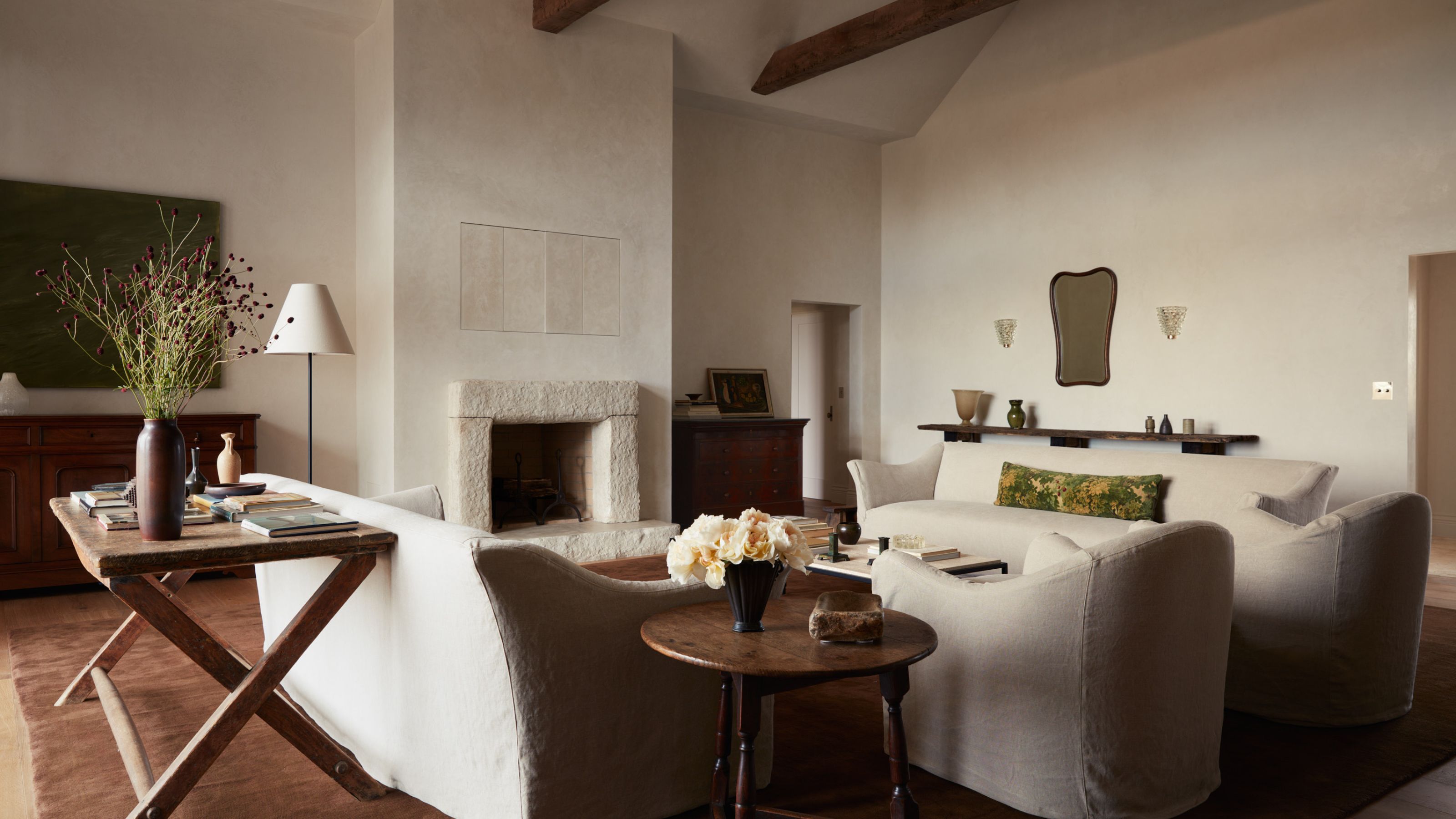
It's now hard to believe that this romantic cottage was actually built in 2010 and was, in Molly's words, ‘very bland and boring.’ Today, it is textbook Molly Kidd: soft around the edges with an equally soft center, all dreamy off-whites, subtle textures, and a European flavor.
‘It's now so luxe and comforting,’ Molly says, proving that even the most characterless spaces can have character bestowed upon them.
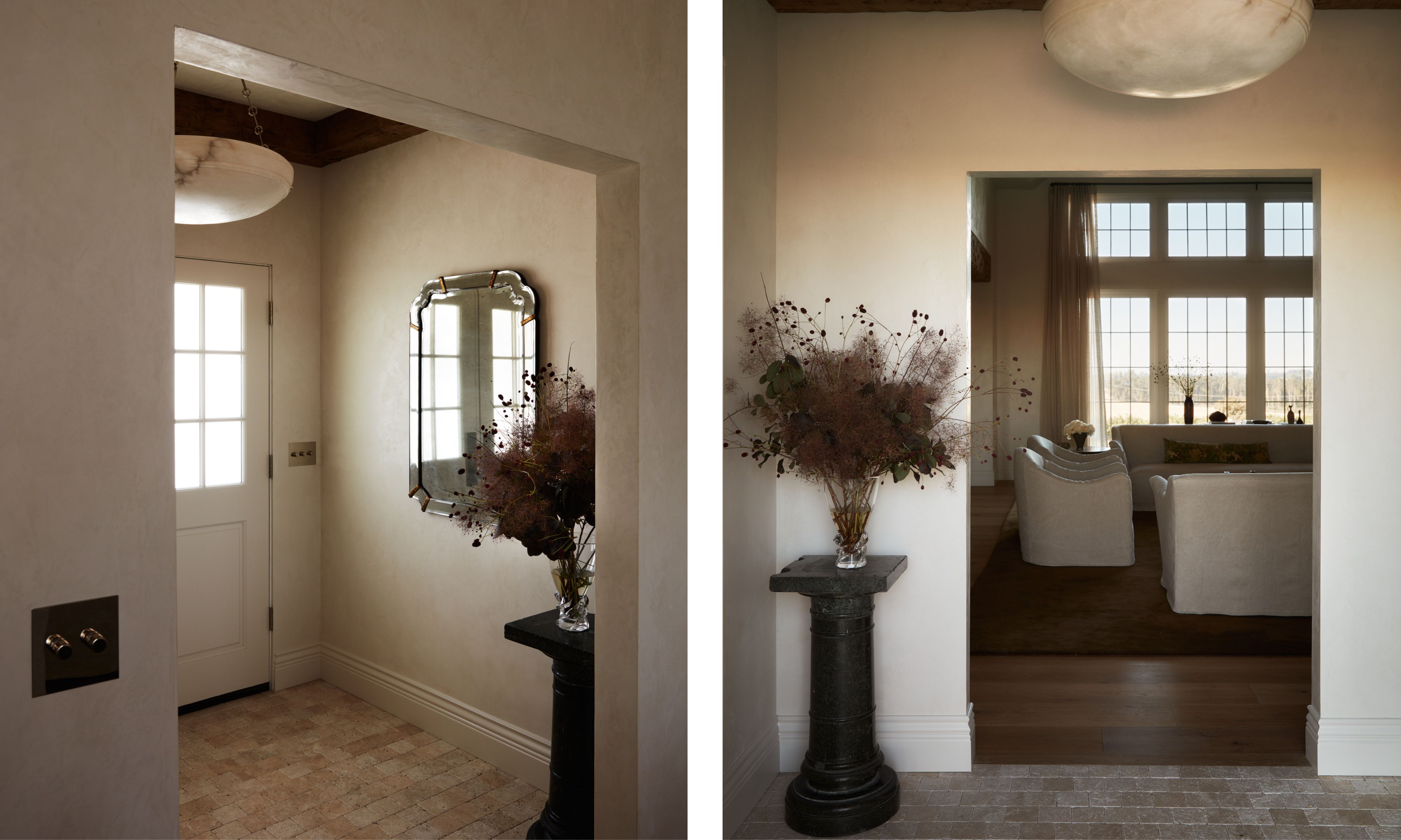
Despite the grand proportions seen elsewhere in this home, the entryway is surprisingly sweet, almost humble – a gentle welcome that merely hints at what is to come.
Design expertise in your inbox – from inspiring decorating ideas and beautiful celebrity homes to practical gardening advice and shopping round-ups.
‘The house didn't have a defined entryway originally, but I felt it was crucial to add one,’ Molly says. ‘I knew it could only be small, but I framed the door with drywall to create an 8' by 8' space. It's humble, yes, but from this little space you can see into the grand living room – and when you look up, the vintage light is next level! Plus, I have that mirror I sourced from a trip to London and a vintage marble pedestal…’
So, perhaps nowhere near as humble as it first appears.
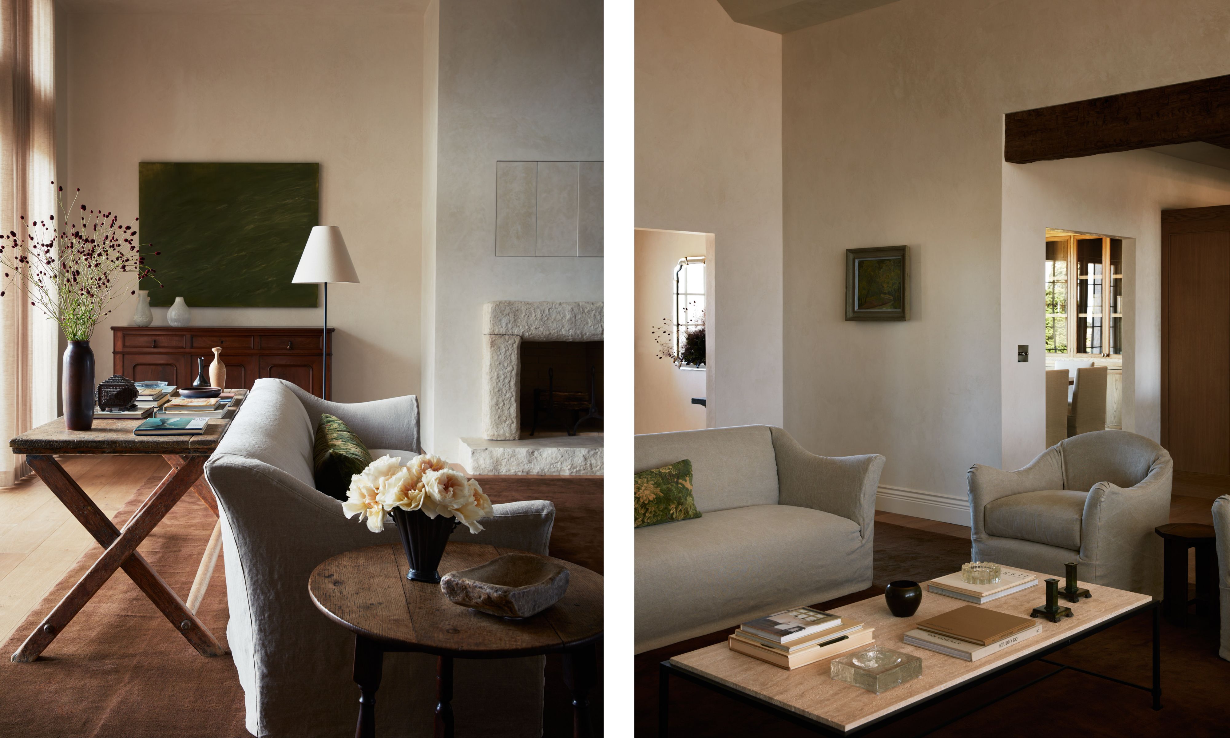
Sofa and Amrchair, both custom designed from The Expert. Wrought Iron and Travertine Coffee Table by Design Frères, 1stDibs
‘I look at a house in layers, starting with the wall material,’ Molly says of her design process, which is very evident in the vaulted living room. ‘We did all the walls in plaster, and that creamy texture and movement that it has adds so much depth and richness.’
Being such a big space, Molly says she had to find ways to make it more cozy. ‘The living room is so grand, and it needed warmth and softness,’ she says. ‘So we added the colonial-style grids to the windows, as they were black and cold before – not only did this give it a more European and historic look, but it also diffused the light a little and made it easier on the eye.’
Her final flourish was in the choice of the sofas, each with a little up-flick at the end of the arm. ‘Having furniture with a little bit of a rounded profile instead of 90-degree angles really helps to add in that softness,’ Molly says.
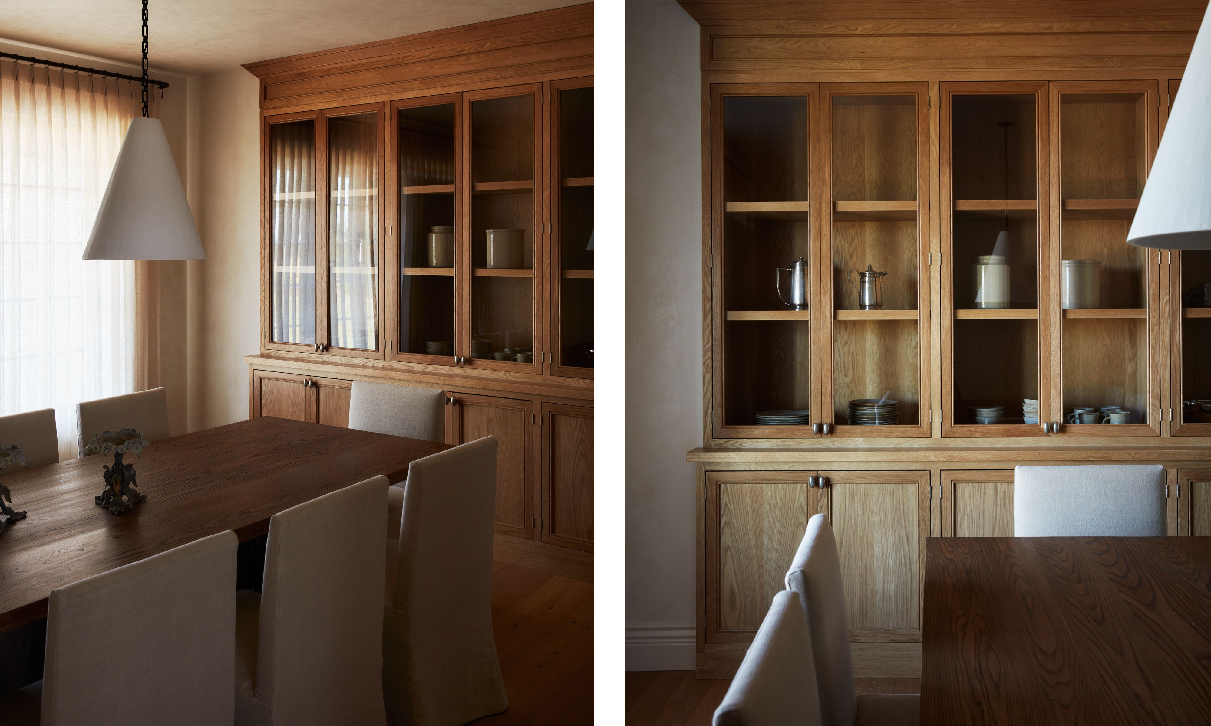
Ceiling light, Rose Uniacke. Table and chairs, The Expert
One of the tricks Molly loves to use is playing with different wood tones – a tool that, under her watchful eye, always results in added warmth and even a sense of familiarity. That’s evident in the dining room, where a dark farmhouse table contrasts with bespoke oak joinery.
‘It's important when mixing wood tones that they don’t feel matchy-matchy, or like you've tried to get them to match and failed,’ Molly says. ‘But they should all have the same tone. Here, you have white oak on the cabinetry, a slightly warmer wood floor, and a chocolate oak table – all differing variations on the same theme.’
The custom joinery has been left purposefully sparse, a styling decision Molly hopes the owners will continue with. ‘A lot of times, less really is more,’ she says of her luxuriously empty shelves. ‘People can collect things over time and add to it, but when styling those shelves it felt like it needed to be held back for the overall serenity of the space.’
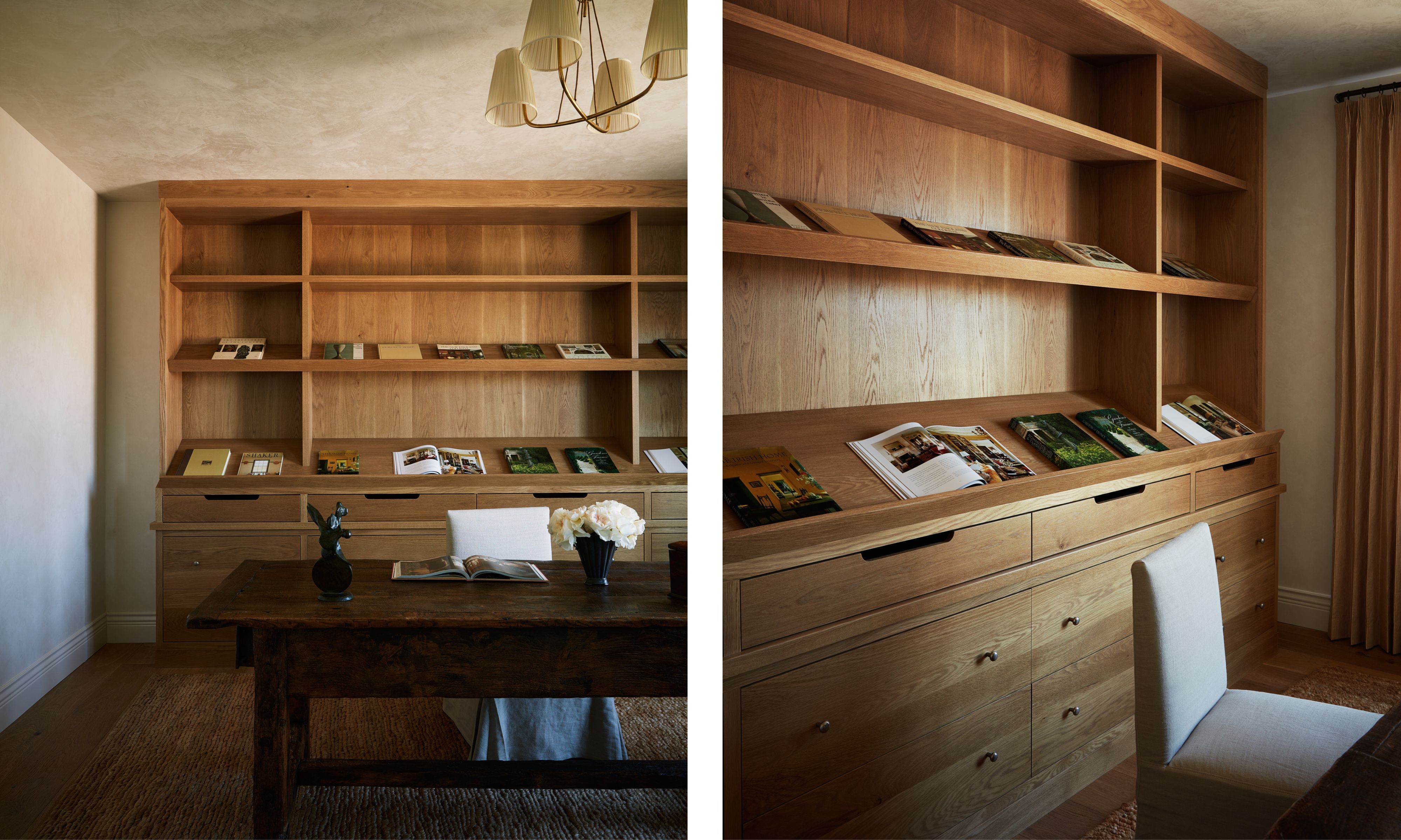
Rustic Folk Art 19th Century French Table, and vintage Chandelier from J. T. Kalmar, both 1stDibs. Rug, Armadillo. Chair, The Expert
Following on from the decor of the dining room, the joinery in this soothingly calm home office is also white oak.
‘I work with a local woodworker, and he uses all sustainable materials from Oregon,’ Molly says. ‘I love working with local, sustainable makers, and he does great work, creating beautiful built-ins that can also double as display.’
Because of the open shelving above the cupboards, the books in use become like artworks, as if hung on a gallery wall. ‘We did the angled shelves so the client could display their books and have them ready at hand for inspiration and projects,’ Molly says. ‘The large farmhouse-style table was positioned there so you can look out the window and dream in one direction – and look into the entry and see what's going on in the other.’
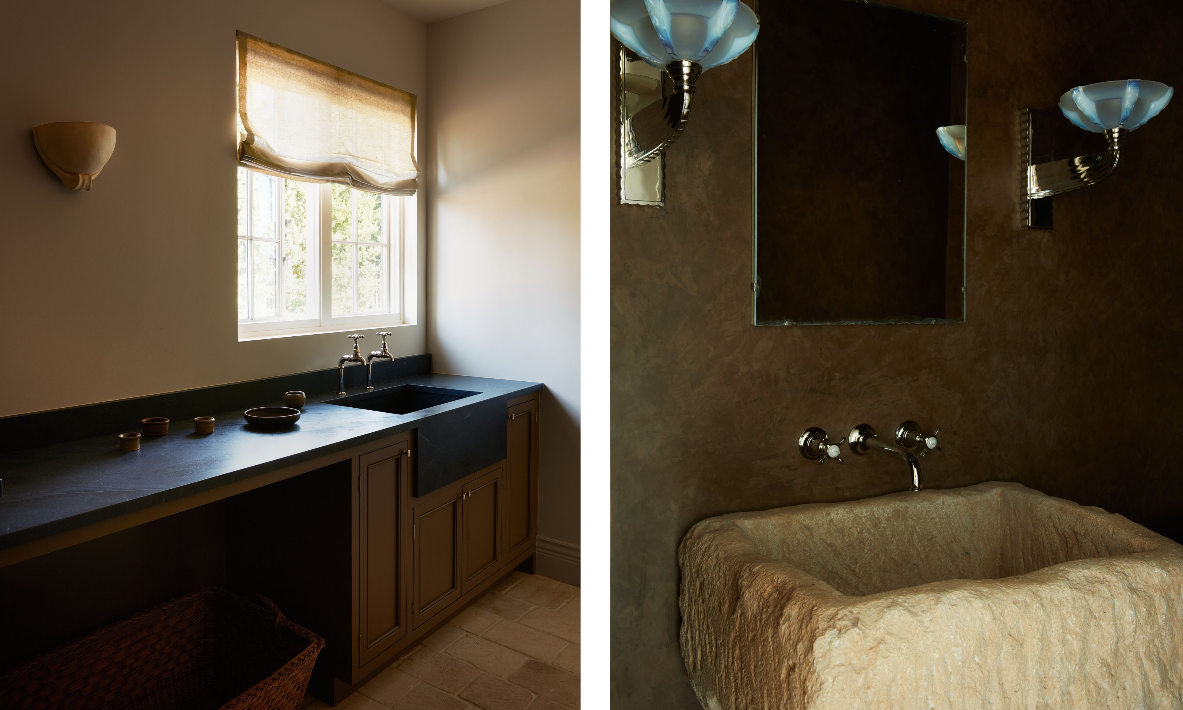
Even in the more functional spaces, Molly has found ways to breathe character and charm, while calling back to decisions made elsewhere in the property.
For the utility room (above left), Molly chose a dark soapstone for the counter, which contrasted with the limestone floor. ‘I wanted the space to feel very functional but very cohesive,’ she says. ‘Utilities often get overlooked, but people spend so much time in there, so it’s important to make it beautiful. The smoothness of the surfaces here works really well with the texture of the plaster, which is the same wall finish as we used elsewhere.’
Meanwhile, for the powder room, the black of the utility counter shows up again, but as a wall finish, with the stone of the living room fireplace echoed in that of the vintage basin. ‘I love using vintage stone sinks in a powder room – they’re so dramatic,’ Molly says. ‘Placing that stone with the Art Deco sconces is a really unique combination, but it carries the signature Molly Kidd Studio approach of infusing the room with warm tones and a European aesthetic.’
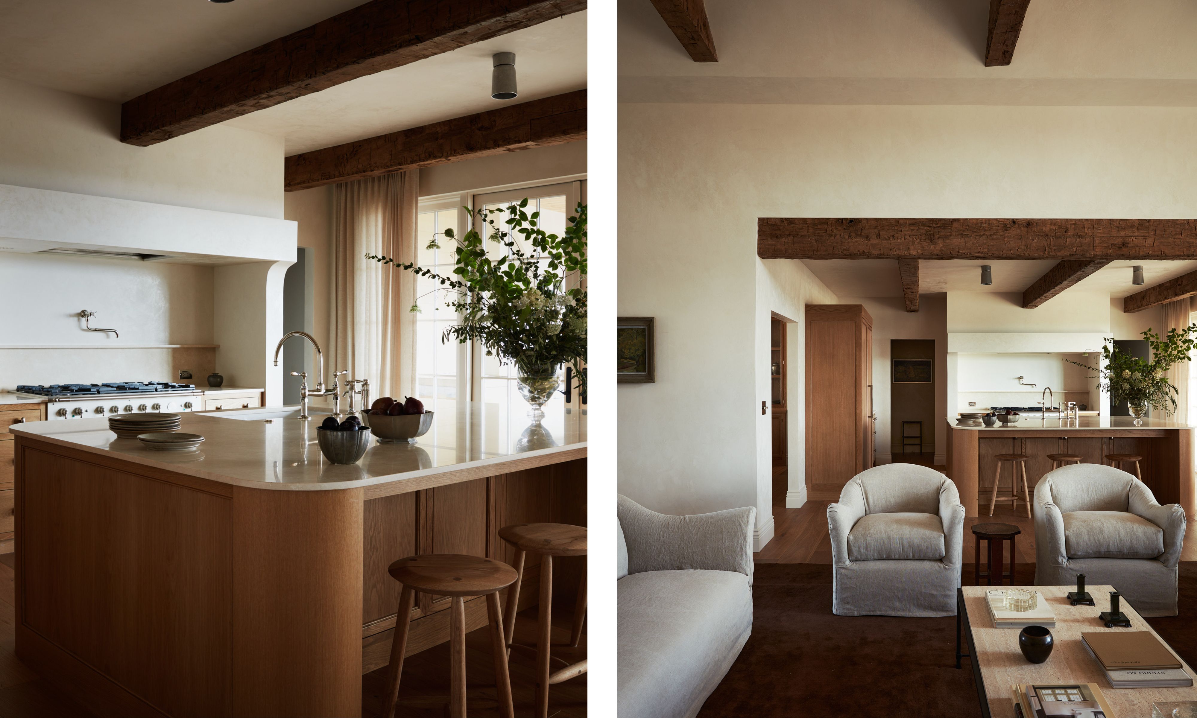
Beachcomber Counter Stools, 1stDibs
At the back of the open-plan living room is the very serene and minimalist kitchen Molly designed, with its rounded wood island and slender marble countertop.
‘The client didn’t originally want a marble that had a lot of movement and veining, but I found this stone in San Francisco, and it had such a beautiful creamy color,’ Molly says. ‘The kitchen reminds me of a cross between European and Australian design because of its simplicity and edge of modernity.’
The protruding shape of the hood above the range cooker was a detail Molly is particularly proud of. ‘Its profile is another thing that brings a more traditional – and less functional – look,’ she says. ‘Without it, this space would have a totally different identity and would be just a touch too sleek.’
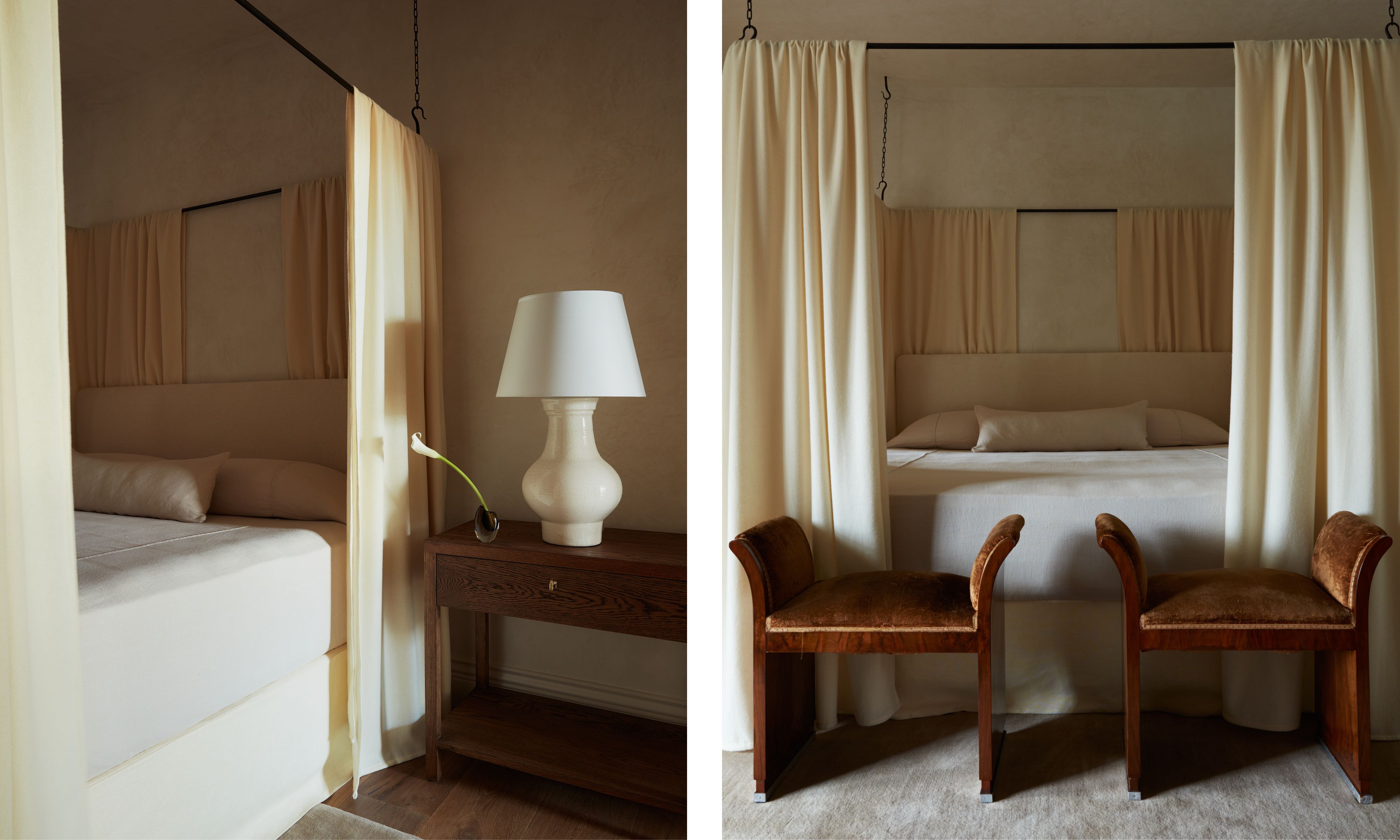
Bed, Rose Uniacke. 1930s Italian Art Deco Stools in Walnut and Velvet, 1stDibs. Nightstands, The Expert. Lamp, Rose Tarlow
There is an element of symmetry in the main bedroom that Molly hasn’t employed in other spaces: matching twin nightstands, matching twin lamps, even matching twin vintage stools at the end of the bed.
‘I just always want every bedroom to have a feeling of peace and retreat, and the natural order of symmetry really does help achieve that,’ Molly says. The stools were a vintage find. ‘I happened to stumble upon them and didn’t even reupholster them,’ Molly says. ‘That beautiful deep-gold velvet was already on them and was just perfect to make this bedroom seem sumptuous as well as calm.’
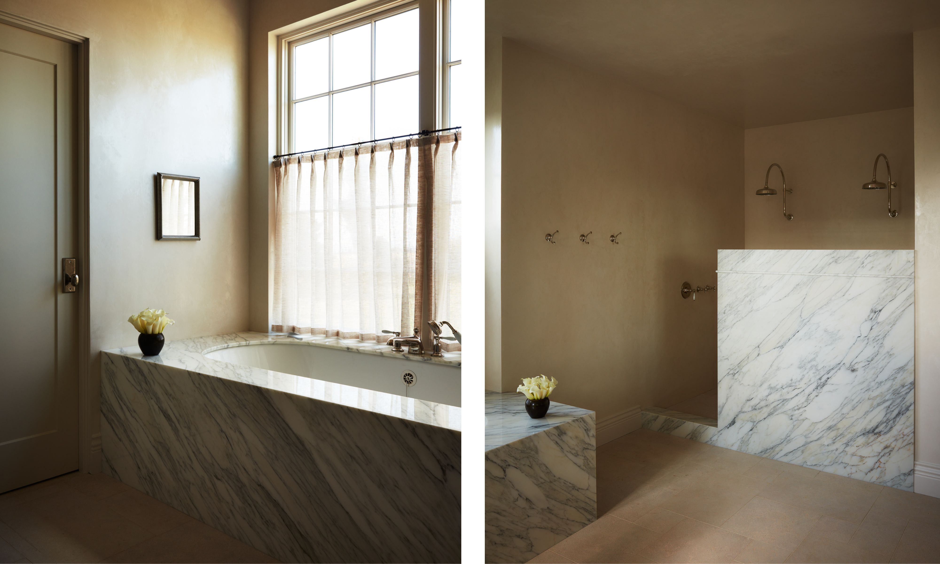
The dramatic veining of the marble seems to have a life of its own, giving movement and depth to this perfectly serene, purposefully still, and contemplative bathroom.
‘The marble really was the design, and finding the perfect stone was key,’ Molly says. She eventually found this stone in San Francisco, along with the marble used in the kitchen.
‘With stone, it’s important you find exactly what you're looking for, as if you don't get just the right hint of warmth, then a bathroom in particular can feel really cold,’ Molly says.
The way Molly has taken a house built in 2010, with all the shine and slick finishes of the era, and turned it into this softly quiet and beautiful home is masterful. It’s more than just the plaster on the walls providing texture, more than the minimal styling, more than the rounded edges of the seating and the natural character that comes with including antiques. It’s the sum of all these things, brought together by Molly in the way that only she knows how – harking back to the simplicity of that original bunch of white tulips, but with so much more depth and charm added along the way.
Pip Rich is an interiors journalist and editor with 20 years' experience, having written for all of the UK's biggest titles. Most recently, he was the Global Editor in Chief of our sister brand, Livingetc, where he now continues in a consulting role as Executive Editor. Before that, he was acting editor of Homes & Gardens, and has held staff positions at Sunday Times Style, ELLE Decoration, Red and Grazia. He has written three books – his most recent, A New Leaf, looked at the homes of architects who had decorated with house plants. Over his career, he has interviewed pretty much every interior designer working today, soaking up their knowledge and wisdom so as to become an expert himself.
