Inside a Small Coastal Kitchen That Rewrites the Rules – Here’s Why the Designers Used an Unexpected Buttery Hue to Go Against Outdated Color Clichés
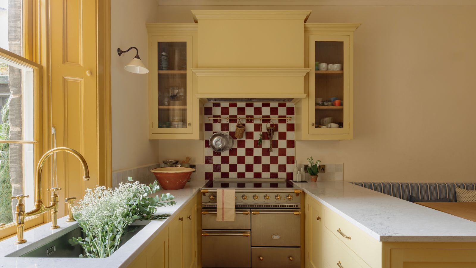
Think coastal kitchens have to be blue and white? This home rewrites the rules with sunshine yellows, smart storage, and a hardworking horseshoe layout

Design expertise in your inbox – from inspiring decorating ideas and beautiful celebrity homes to practical gardening advice and shopping round-ups.
You are now subscribed
Your newsletter sign-up was successful
Want to add more newsletters?
There’s a common instinct to tone colors down in small kitchens, and to default to predictable blue-and-white nautical tropes in coastal kitchens – yet this palette-pushing design shows why neither approach is necessary.
In this period home just steps from Portobello Beach in Edinburgh, British designer Ailsa MacConnell, founder of Studio Mac, proves that confident color choices and clever layout decisions can transform a deceptively small kitchen into the warm heart of a family home. Designed for a young family who love to cook, the brief was clear: make it practical, sociable, and cozy for children – while ensuring the space flows seamlessly into the adjacent living room.
The result is a masterclass in family-first functionality and playful palette use. Here’s why it works – and what you can borrow for your own kitchen, whether you live by the sea or not.
Article continues belowPair Warm Tones With Cooler Counterpoints
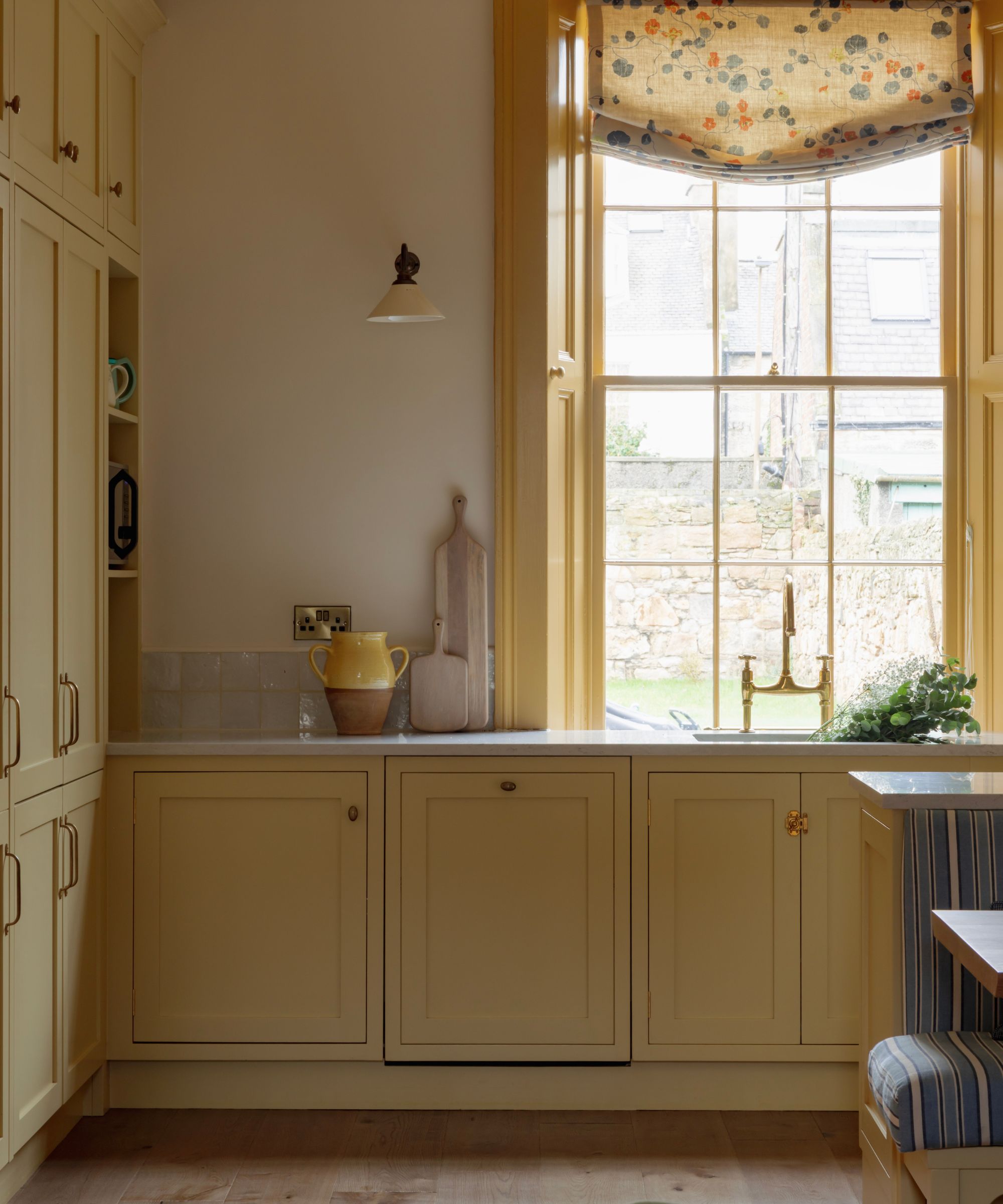
These color choices soak up the natural light from the tall Georgian sash window, dressed in a relaxed Roman blind in Lake August’s Nasturtium fabric and painted in Farrow & Ball’s India Yellow, which gives the kitchen its unmistakable warmth.
Avoiding obvious coastal blues, Studio Mac brightened the room in Farrow & Ball’s Hay, a joyful, buttery yellow that feels like sunlight bouncing off sand. It sits alongside Paint & Paper Library's Paper II on the walls, ceiling, and cornicing, with Paper III in a slightly darker hue on the woodwork to add depth and texture – a subtle color-drenching technique that makes the room feel cocooning rather than stark.
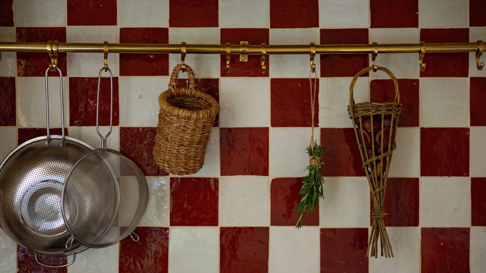
The red-and-white checkerboard backsplash – in handmade Bert & May zellige tiles – introduces pattern and personality while building on the kitchen’s warmth. Cleverly, the same tiles appear in a striped formation in the upstairs bathroom, reinforcing cohesion throughout the home.
The kitchen countertops play an essential, harmonizing role. The scratch-resistant Silestone surfaces by Cosentino have a soft, grey-blue undertone that could read cool in another context. Here, they counterbalance the warmth of the yellow cabinetry and subtly echo the blue tones used elsewhere.
Turn a Corner Into a Sociable Dining Nook
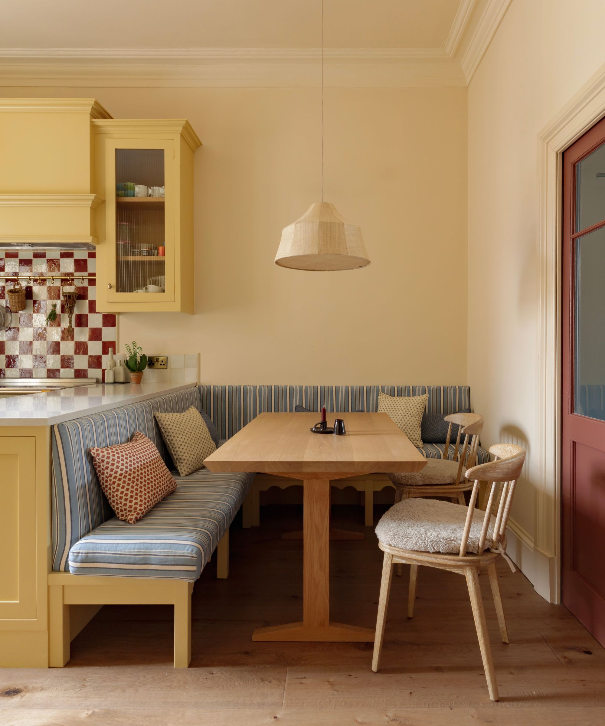
In compact kitchens, built-in seating can replace square footage with sociability, creating a dining space that feels immersive rather than peripheral.
Incorporating a built-in banquette seating was a considered move that allows the kitchen to double effortlessly as a dining space. Custom designed by Studio Mac, it wraps the corner in layered blue stripes which lean coastal without tipping into cliché – the seat cushions in Firle Stripe by Jane Churchill are paired with scatter cushions in organic cotton from The Cloth Shop and a traditional ticking stripe from Howe at 36 Bourne Street. Crucially, the main cushion has been stain-treated, is removable and washable – a non-negotiable for a household with children.
The narrow bespoke refectory table by Konk ensures easy access, with extension leaves for entertaining. Opposite, dining chairs from Loaf add softness with shearling tie-on seat cushions, bringing texture and informality. Above, a Pinch Soren pendant light provides gentle overhead illumination, complemented by deVOL wall lights on separate circuits. Everything is dimmable, allowing the kitchen to shift from bright daytime workspace to warm evening glow.
Make a Horseshoe Layout Work Harder
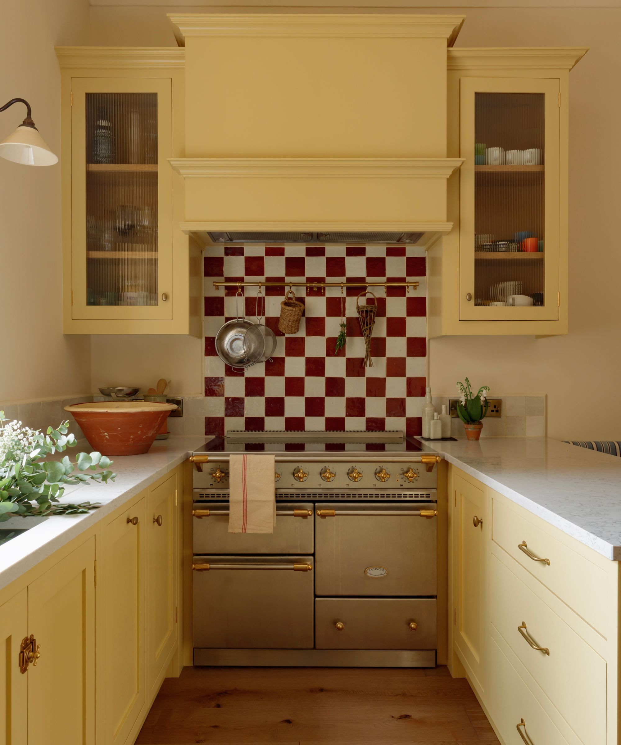
The horseshoe layout maximizes prep space, creating a kitchen that feels far larger than its footprint suggests.
Narrow cooking spaces are often pushed toward a simple galley kitchen plan, but this project proves that wrapping cabinetry around three sides can unlock far more function if carefully calibrated.
By embracing a horseshoe configuration, Studio Mac reimagined the space with a bespoke Shaker kitchen in collaboration with Peden & Pringle, whose in-house joiners crafted cabinetry that’s entirely in keeping with the house’s period architecture. This created generous prep surfaces anchored by the Lacanche range cooker, while maintaining comfortable circulation. Because only one person would typically cook at a time, the workflow could be efficient rather than expansive.
Integrate Kitchen Appliances Into Storage
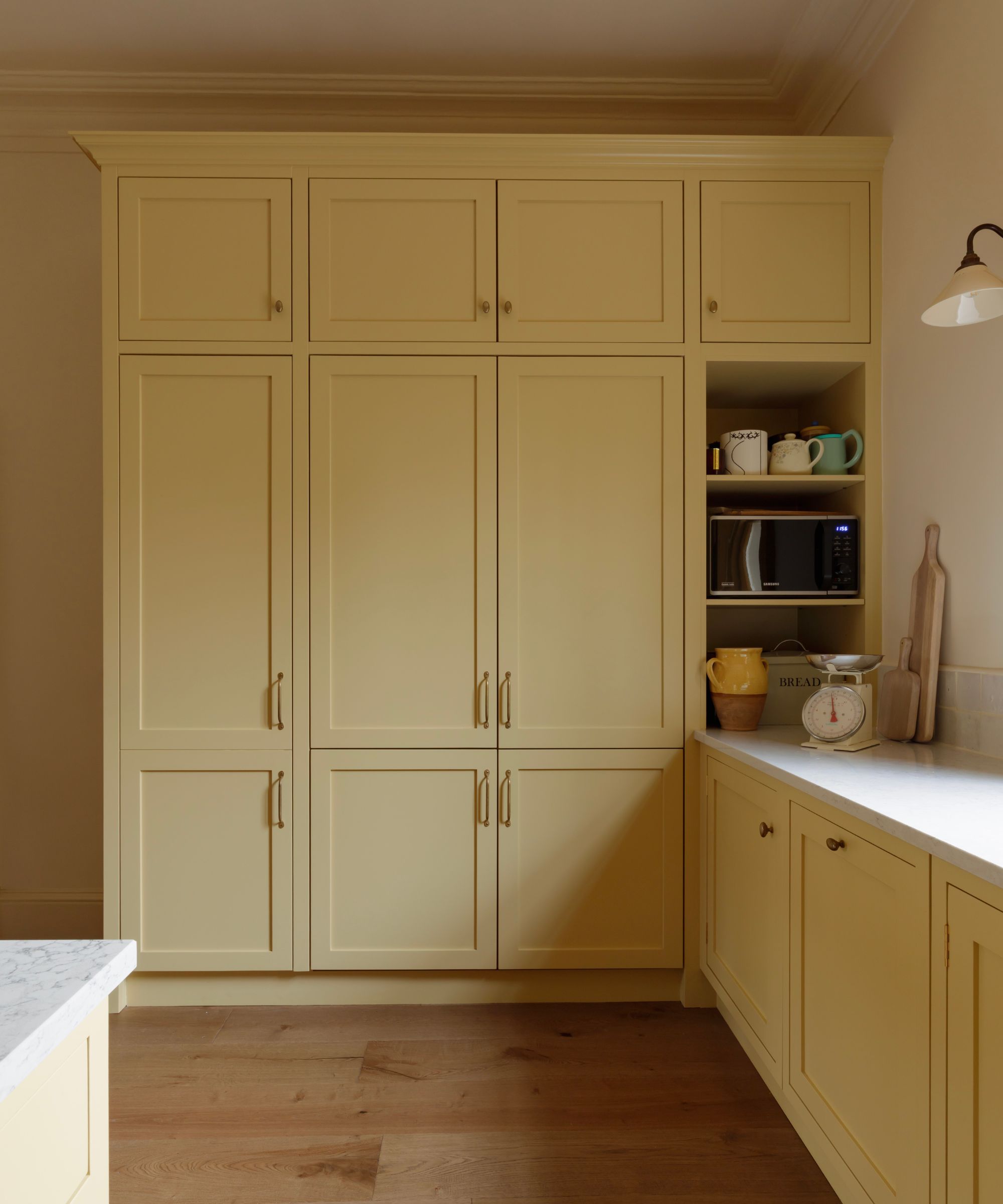
Tall larder units and a microwave niche make essentials accessible without interrupting the Shaker aesthetic.
Family kitchens demand serious kitchen storage, but visible clutter can quickly undermine a carefully considered scheme. Here, tall larder cabinets absorb the bulk of food storage, housing double fridge-freezers and a pantry while allowing lower cabinetry to remain streamlined. Reeded glass fronts in a semi-transparent glazing above the cooker add lightness while keeping contents discreetly on display – an elegant compromise between open shelving and solid doors.
One particularly thoughtful decision was leaving the microwave in an open niche rather than concealing it behind cabinetry, as requested by the homeowner for ease. It’s accessible while being hidden in plain sight.
The deVOL aged brass hanging rail (in the same material as the butler sink taps and cabinetry hardware) above the cooker adds another layer of functional and visually pleasing storage, keeping everyday utensils within reach while freeing up drawer space.
Bridge Rooms With Color-Smart Pocket Doors
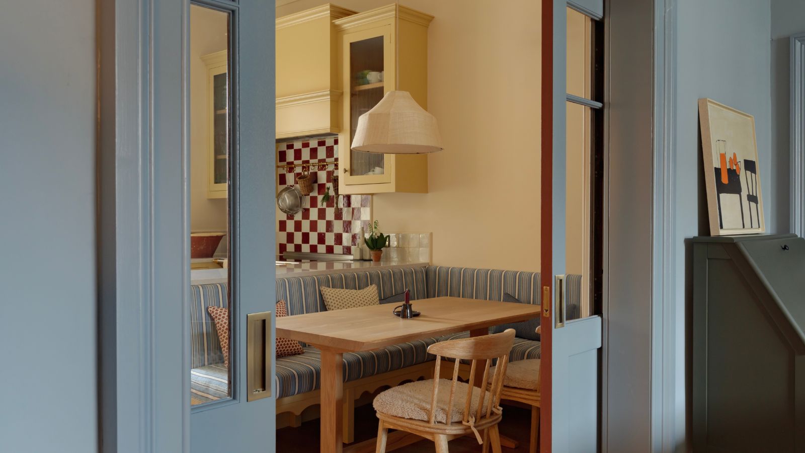
By aligning paint finishes with the adjoining spaces, the doors read as architectural extensions rather than interruptions, creating a ground floor that’s fluid, not fragmented.
Pocket doors are often purely practical, but here they become a vibrant design device. Bespoke glazed doors connect the kitchen to the living room while allowing the family to open or close the space as needed. Each side is painted to belong to the room it faces: Farrow & Ball’s Etruscan Red within the kitchen and Edward Bulmer’s Cerullian Blue in the living room. The shift in color softens the threshold, so the transition feels layered rather than abrupt. This unconventional choice enhances cohesion and positions the kitchen as part of a larger whole.
Quick Tips
- Balance warmth with cooler counterpoints when color scheming.
- Integrate storage seamlessly while ensuring daily-use items stay close at hand.
- Add a banquette to make the kitchen linger-worthy without sacrificing space.
- Make doorways part of the design story for visual continuity.
If you’ve ever hesitated to introduce bold color into a small kitchen – or felt confined by coastal clichés – this Portobello project is proof that thoughtful layout, layered materials, and design decisions that prioritize real life, can make even the most compact kitchen feel expansive, connected, and full of personality.
At Homes & Gardens, we believe a kitchen should work as beautifully as it looks. That’s the philosophy behind Dream Kitchens, our new series exploring the world’s most inspiring cook spaces. From clever layouts to the 'it' materials of 2026, we’re uncovering the design lessons tucked inside every home. Join us for an intimate look at the spaces that define modern living – and find the blueprints for your next big project.

Chloe Frost-Smith is a freelance travel and interiors writer, with a home that reads like a passport of the places she loves most. She’s forever meeting artisans, scouring flea markets, and collecting one-of-a-kind objects on her travels – Romanian ceramics for her kitchen plate wall, Swedish textiles to layer with French linens, basketry from Botswana – resulting in a style as eclectic as her itineraries. A maximalist at heart, she’s constantly finding ways to make her space cosier for her hound, Humphrey (who is largely responsible for her expanding sheepskin-throw collection).