Inspired by a Love of Fantasy Worlds, This Pennsylvania Home Is a Charming Celebration of Pattern, Color, and Art
Here's how the interior designer Michelle Gage designed every room of this family home to pay homage to its owners' personalities and interests

Design expertise in your inbox – from inspiring decorating ideas and beautiful celebrity homes to practical gardening advice and shopping round-ups.
You are now subscribed
Your newsletter sign-up was successful
Want to add more newsletters?
In a world filled with quickly passing trends, homes that go against the grain with truly personal and soulful design seem to stand out more than ever. That is certainly the case with this 1900s house design by Michelle Gage – a celebration of color and pattern that feels uniquely joyful and charming.
Located in Pittsburgh, Pennsylvania's Squirrel Hill neighborhood, the home is bursting with creativity and was dubbed the "forest house" by the homeowners, in keeping with its various nods to their love for mythical and fantasy worlds – not least the dining room's whimsical forest scene wallcovering.
And while playful design details and an all-out approach to color lead the way, it is, first and foremost, a functional family home. 'The clients are the most lovely young family,' says Michelle. 'They are creative, intelligent, funny, and trusting. They wanted a home that reflected their style and values. It had to be functional for their young kids but also not too precious.'
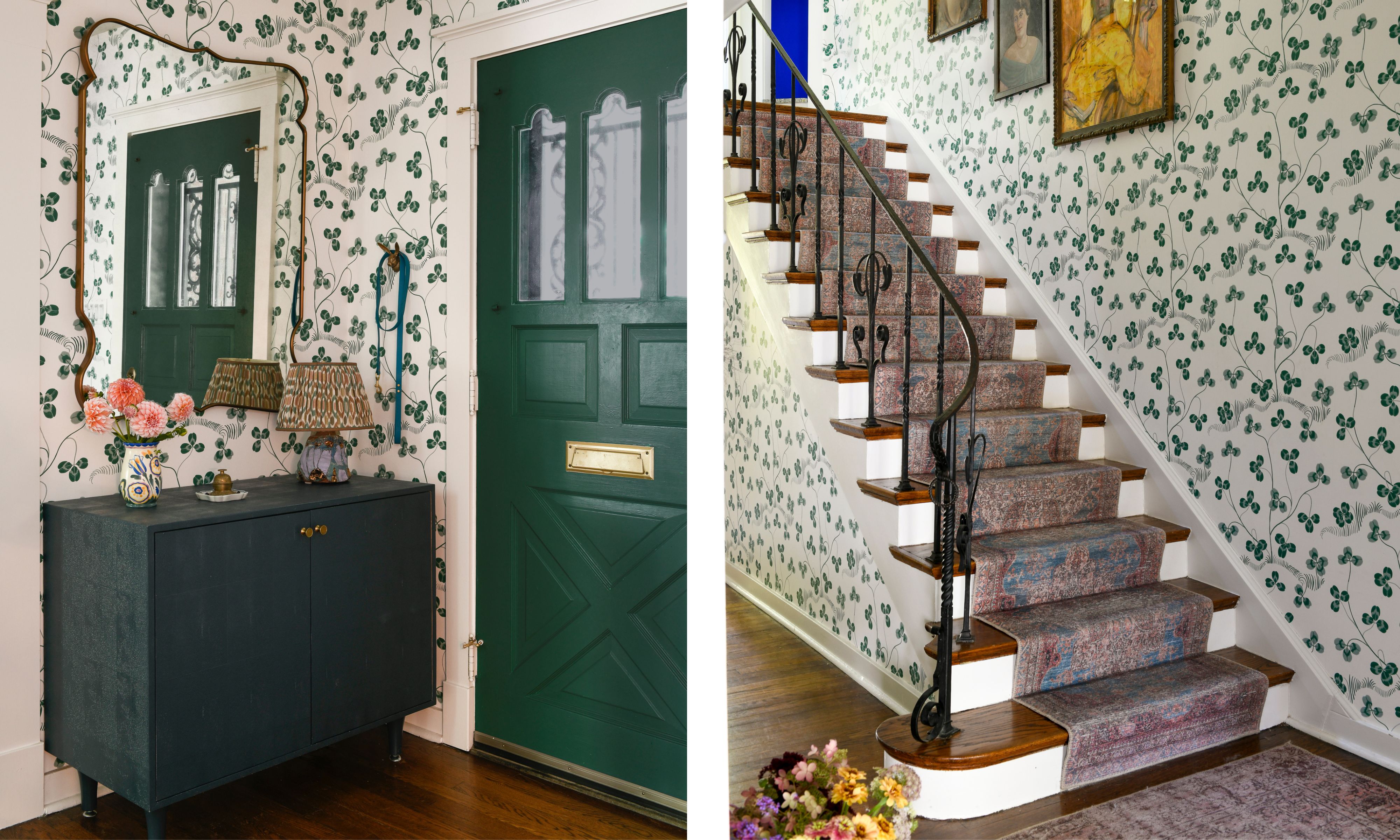
Entryway: Front Door: Benjamin Moore Steamed Spinach 643, Trim and Casing: Benjamin Moore Oxford White 869, Wallpaper: Klöverblad, Svenskt Tenn, Cabinet: Made Goods, Mirror: Julian Chichester.
'The home was truly a blank canvas,' says Michelle. 'The family living here has such vibrant personalities, and we needed to infuse that flair into the home. The wife is a self-professed “linen snob", so we knew we had to bring in not only amazing upholstery but also wonderful window treatments.'
Decorating with art is another common theme that gives this home its unique flair, and it includes a mix of the homeowners' existing pieces and 14 originals sourced by Michelle on a trip to Paris. 'The project was wrapping up, but some walls were still bare. I asked the homeowners if they would be comfortable with me selecting everything they needed, and they were totally game! At this point, we had been working together for a couple of years, so not only was extreme trust there, but I really understood their style.'
The entryway sets the tone for a pattern-and-art-filled home, with a green clover leaf wallpaper designed by Josef Frank in the 1940s lining the walls, and a collection of artwork displayed above the staircase.
The accent paint colors of dark green and white ensure cohesion. 'I wanted to create an artistic, welcoming color palette for the home, while still keeping it cozy,' says Michelle.
Design expertise in your inbox – from inspiring decorating ideas and beautiful celebrity homes to practical gardening advice and shopping round-ups.
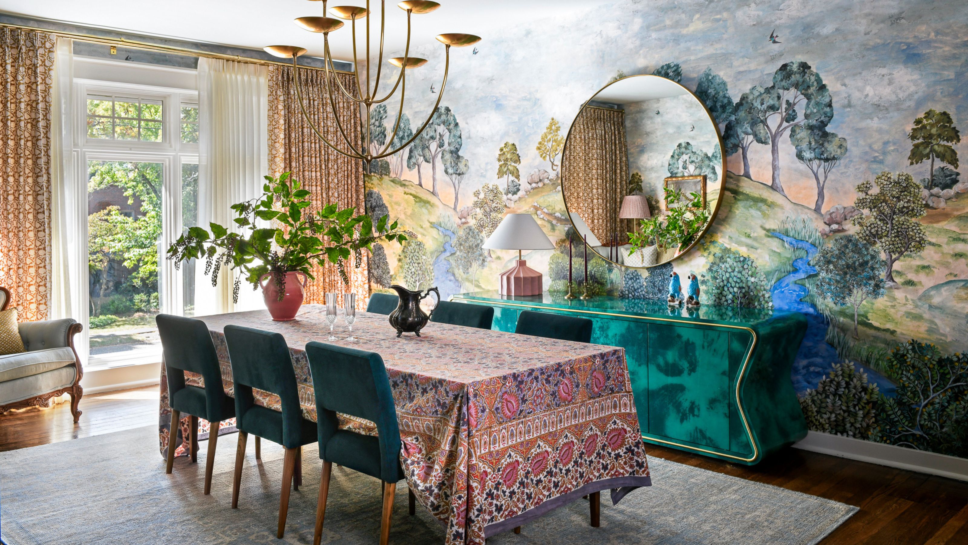
Dining Room: Wallpaper: Bandipur Sky, Designers Guild, Trim and Casing: Benjamin Moore Light Pewter 1464, Ceiling: Benjamin Moore Santorini Blue 1634, Patterned Window Treatments: Walter G, Chandelier: Visual Comfort, Dining Chairs: Four Hands, Buffet: Julian Chichester.
'The inspiration was truly kicked off with the wallpaper,' Michelle says about the dining room. 'We knew we wanted to do a lush landscape scene. And we knew that the dining room was such a big draw off of the entryway that we really wanted it to pull you in.'
The Designers Guild wallpaper was an instant success among the clients, being 'the only wallpaper that we showed them for the space. They absolutely loved it, and it feels very real in person.'
The rest of the dining room color scheme is based on the wallpaper, including the various shades of blue – the chairs, rug, and ceiling. 'It was also a great color palette to be adjacent to the pink kitchen, which is a huge focal point on the first floor,' Michelle says.

Kitchen: Cabinets: Benjamin Moore Monticello Rose HC-63, Walls, Trim, Doors, and Ceiling: Benjamin Moore Lacey Pearl 2108-70, Wallpaper: Heather (Pink), Ferrick Mason, Backsplash Tiles: Portmore Glazed Ceramic Tile 4x4, GST, Window Treatment: Radish Moon, Breakfast Nook Light: Hudson Valley Lighting.
Recounting the client discussions regarding the kitchen color scheme, Michelle talks about a mutual draw to pink. 'We both, without hesitation, knew the kitchen needed to be a beautiful shade of blush pink. From there, the creative vision continued to unfold.'
The pink kitchen manages to feel playful and grown up at the same time. 'It was just kind of begging for this really muddy blush pink,' Michelle says. 'It's not too harsh a color, but it's not too sweet a color either.'
Aside from the focal pink kitchen cabinets, the breakfast nook brings pattern to the space. 'We have really fun wallpaper on the walls and then these really great radishes in the window treatments. It feels like you're in a cafe.'
And, staying true to the common theme of the home, artwork also features in the kitchen. 'Above the banquette is one of the pieces that I sourced in Paris. It is a trio of kittens playing with a ball of yarn.'
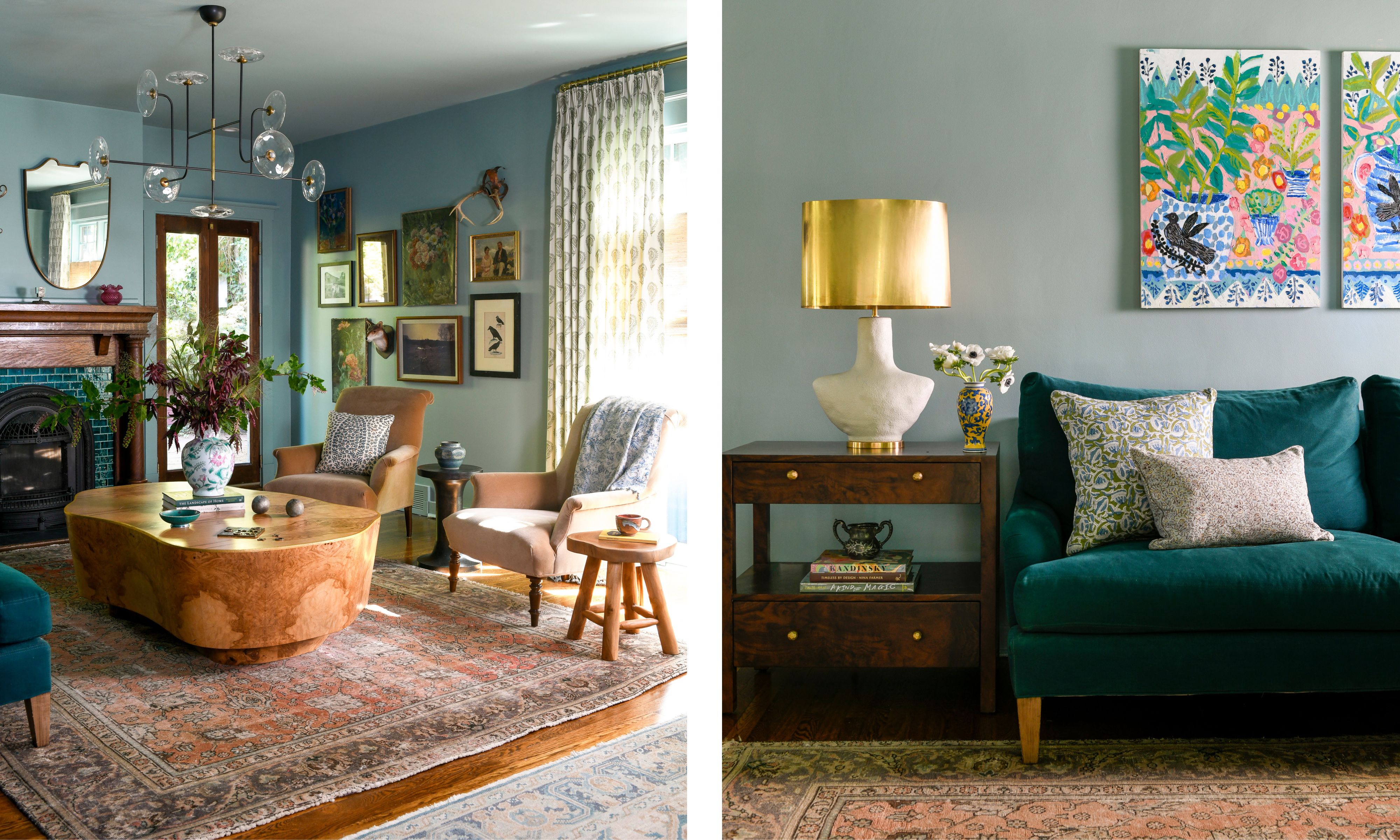
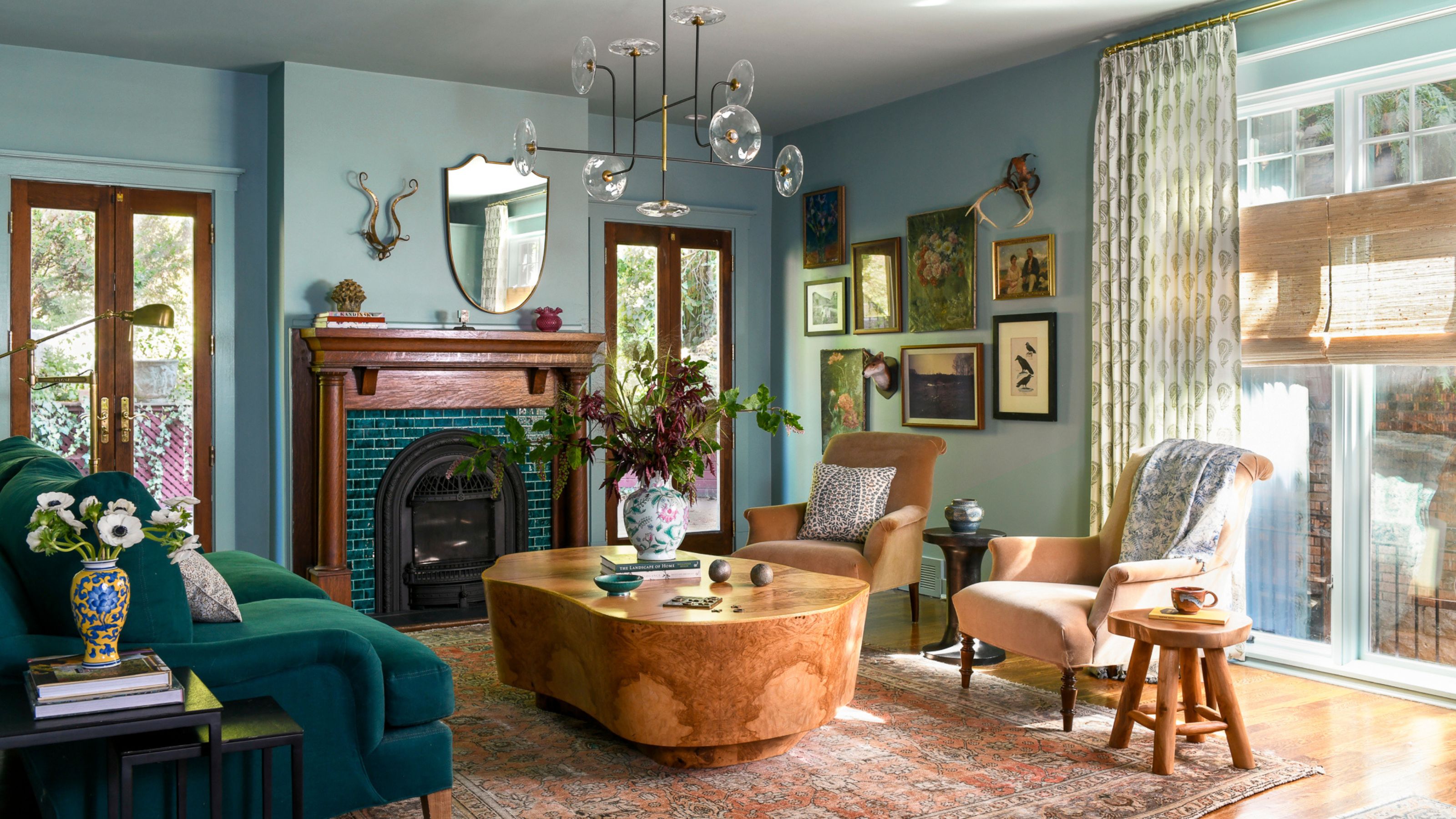
Living Room: Walls, Trim, and Ceiling: Benjamin Moore Atmospheric AF-500, Sofa: Client's, End Table: Made Goods, Lamp: Visual Comfort, Accent Chairs: Highland House, Coffee Table: Made Goods, Rug: Client's, Chandelier: Visual Comfort.
Various shades of green – from the fireplace tiles and sofa – were already in place when this room was imagined, and so 'the rest of the room was designed around that' – including the color-drenched Benjamin Moore Atmospheric AF-500 walls that fall somewhere between blue and green.
'It's an interesting space because there are two large living rooms within this one long living room,' says Michelle. 'The fireplace side has a really fantastic seating situation around it, and the coffee table was selected. It's a very sturdy olive wood burl piece.'
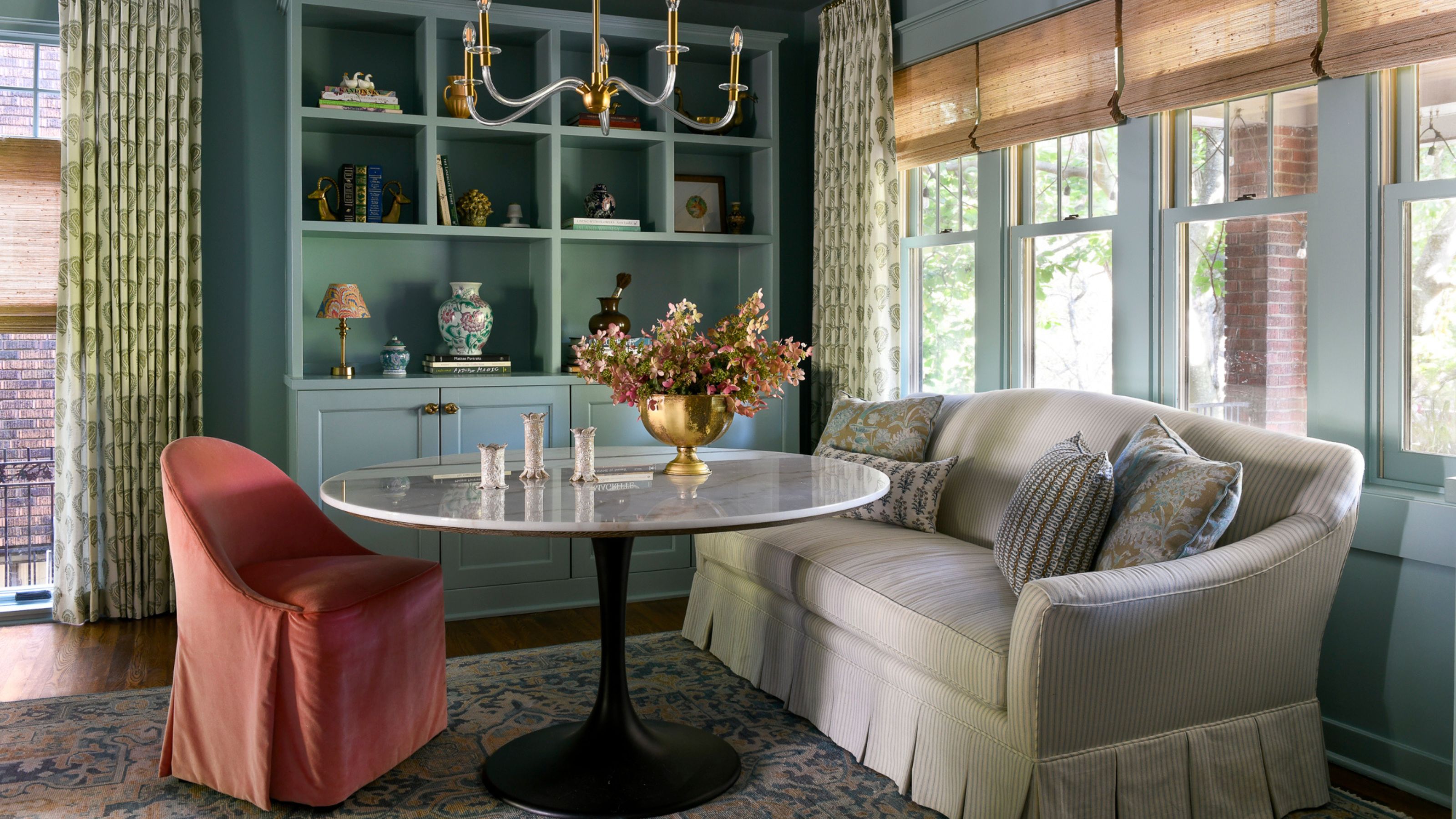
Game Table: Sofa and Chairs: Highland House, Table: Four Hands, Chandelier: Visual Comfort, Built-ins: Benjamin Moore Atmospheric AF-500.
At the other end of the living room, there is a games table. 'They like to play games and do puzzles as a family, so we gave them this really beautiful ticking stripe sofa with a box pleat,' Michelle says.
'The window treatments in this room were a mix of a really fantastic ZAK+FOX linen, and then a rattan style that really brings some natural elements into the room.'
'We also have a really great gallery wall in the living room that features not only the homeowner's existing pieces, but also some of the new pieces that I picked up in Paris.'

Primary Bedroom: Wallpaper: Japanese Cornflowers (Aubergine), Schumacher, Bed: Custom, Nightstands: Made Goods, Pendants: Visual Comfort.
Colors take on a moodier feel in the bedroom, not least with the eggplant tones of the large-scale Japanese cornflower wallpaper. 'The bedroom needed something a little more cozy but still in keeping with the fantasy theme,' Michelle says. 'It is an exaggerated print, and it absolutely makes a statement.'
The bed is a custom design, and since it was requested fairly late in the design process, it required some thought to imagine one that worked alongside the many already-chosen pieces in this room. 'It was really hard to come up with a great bed that matched the statement that the wallpaper was making in the room, but also was soft and cozy. We designed it with a maker in Philadelphia.'
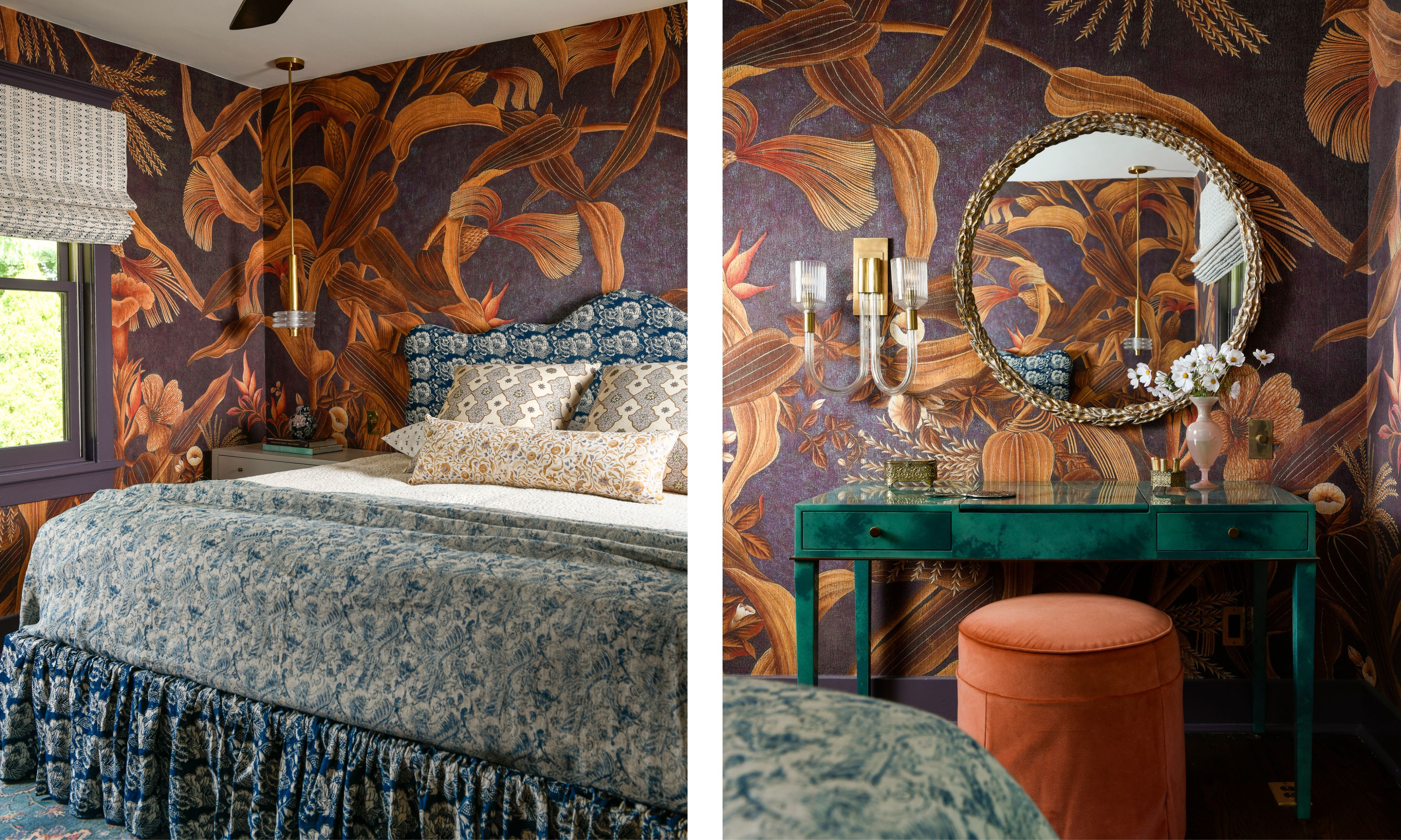
Primary Bedroom: Trim and Casing: Benjamin Moore Cabernet 2116-30, Ceiling: Benjamin Moore Mayonnaise OC-85, Vanity: Julian Chichester (recovered client's).
Alongside the warm-toned hues of the wallpaper and the dark blue bed, the emerald green vanity adds another unexpected color into the mix. 'We absolutely love the vanity in this room,' Michelle says. 'It makes a statement all on its own. It really contrasts with the wallpaper that is there.'
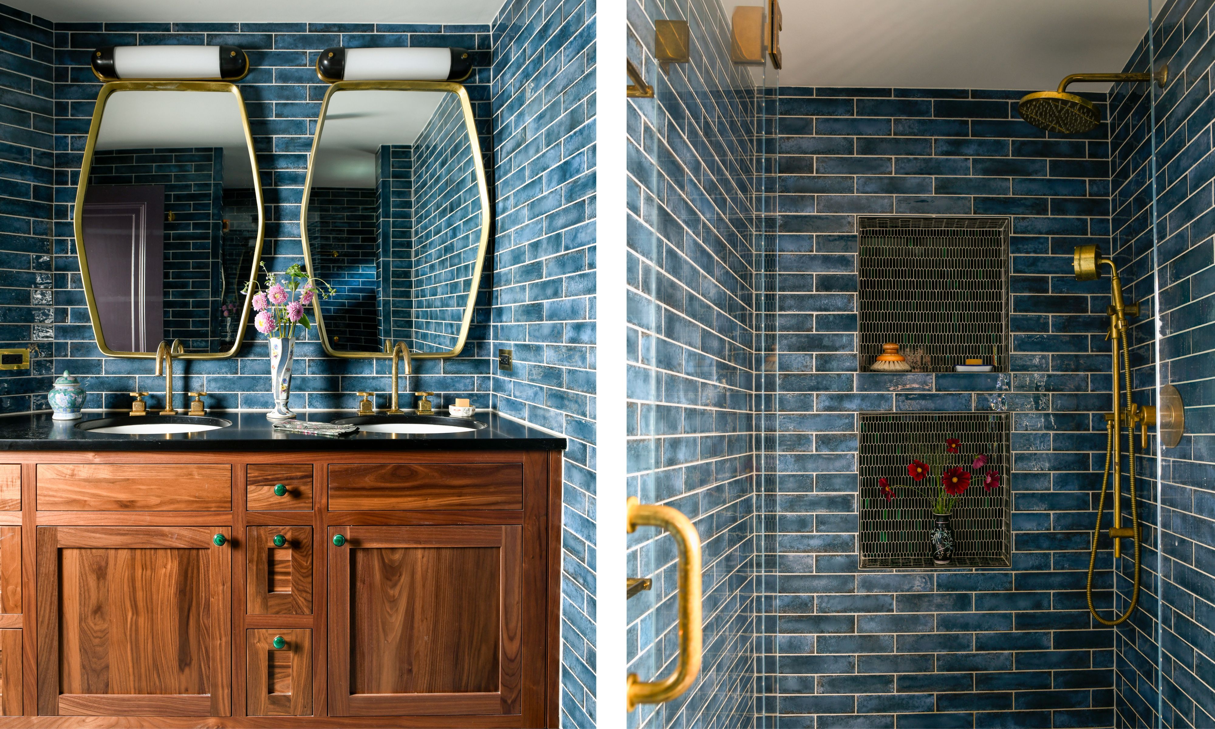
Bathroom: Wall Tiles: Anthem Blue, GST, Shower Niches: Tuxedo Park, Artistic Tile, Door and Trim: Benjamin Moore Nightfall 1596, Ceiling: Benjamin Moore Paper White OC-55.
It makes sense that a bold approach to color continues into the bathroom. Dark blue wall tiles contrast with smaller-scale green tiles in the shower niche (also on the shower floor) – a color combination that is repeated elsewhere in the home, like the living room.
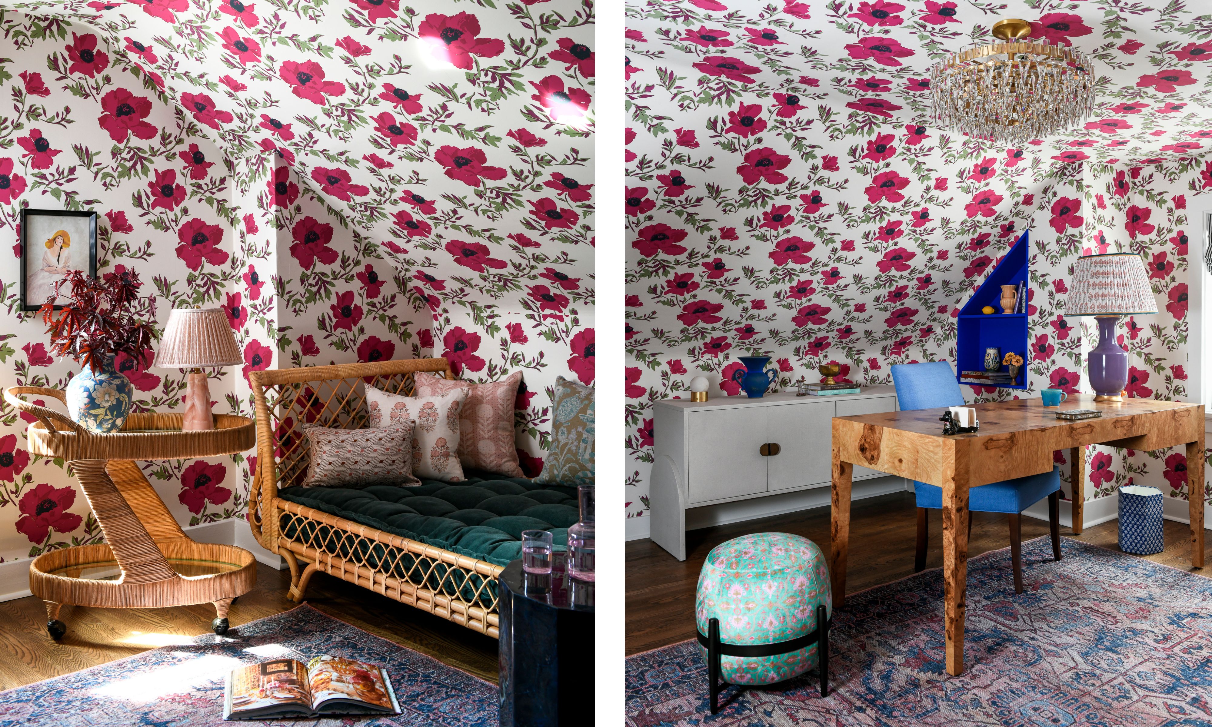
Office: Wallpaper: Matilija | Bloom, Lake August, Desk: Made Goods, Daybed: Serena & Lily, Chandelier: Visual Comfort, Trim: Benjamin Moore Oxford White 869.
'In the upstairs office, we have really fantastic Lake August wallpaper that has a beautiful heliotrope pink hue to it,' says Michelle. 'That was a client request: she said she wanted a wallpaper that matched the color of her lipstick. I actually owned the lipstick as well, so I knew what she was talking about. I immediately thought of this wallpaper, and it was a perfect match.'
'The wallpaper was selected to kind of wrap the awkward angles that are often present in a third-floor room.'
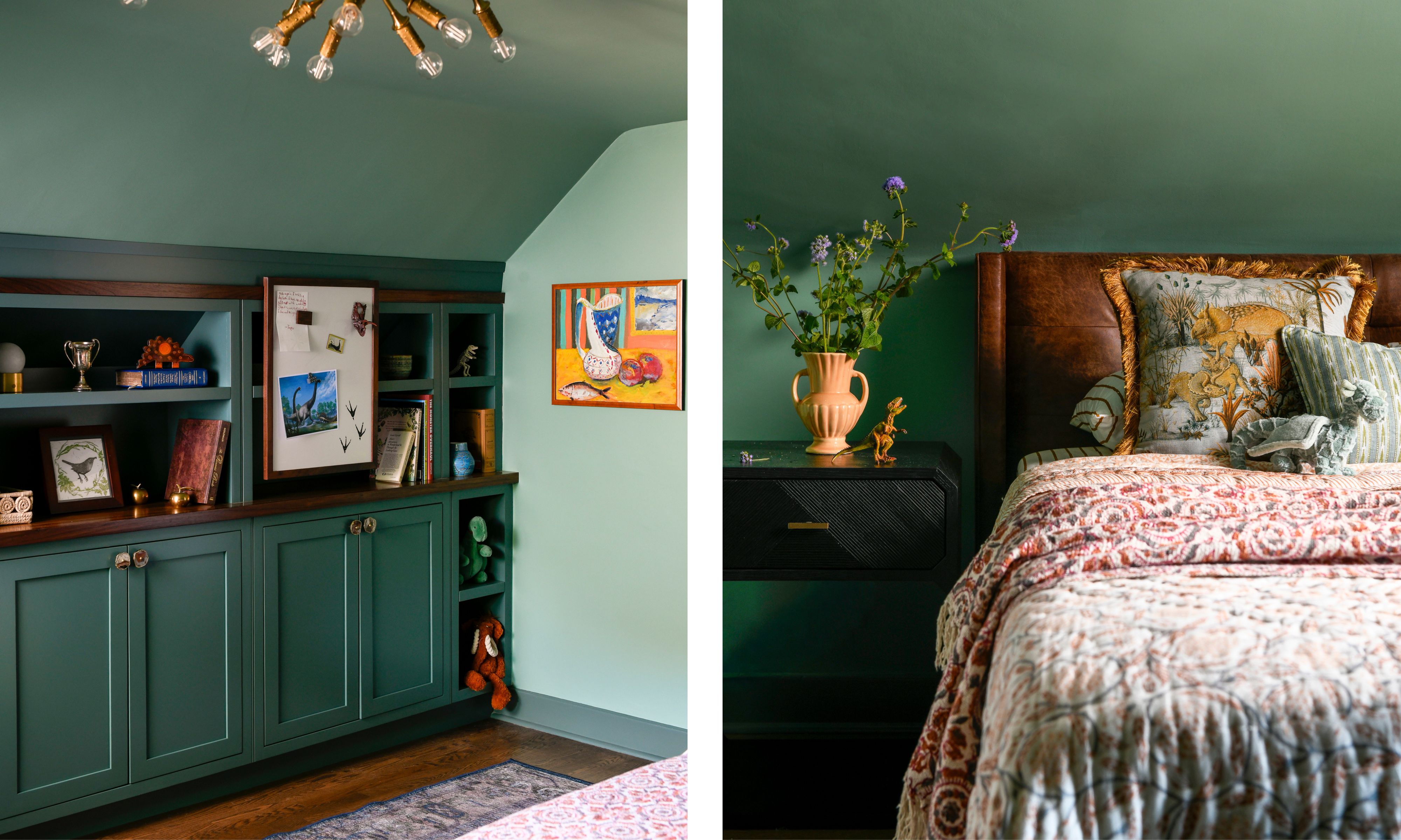
Second Office and Guest Room: Walls and Ceiling: Benjamin Moore Harrisburg Green HC-132, Trim and Door: Benjamin Moore Jack Pine 692, Bookcase: Custom.
In another of the home offices, which also doubles as a guest bedroom, green is the standout color, lending a calming and cocooning feel. 'The home’s architecture just feels cozy,' says Michelle, and color schemes like this one cleverly enhance that.

Basement: Wallpaper: Sagan (Night Blue), Maison C, Paint: Benjamin Moore Deep Royal 2061-10, Sofa: Rowe, Coffee Tables: Four Hands.
The wallpaper in the basement – which is used on the walls and ceiling – takes inspiration from night skies and transforms the room into the perfect movie-watching spot. 'They're really big into mythical worlds and fantasy films and sci-fi, so we thought that this great star wallpaper would wrap the room beautifully,' Michelle says. 'It's also very cozy in its navy hue.'
'We knew we had to do something exciting,' Michelle says when recounting choosing the multicolored sofa. 'It bounces off the wallpaper quite nicely and is a great cozy spot for the family to unwind.'
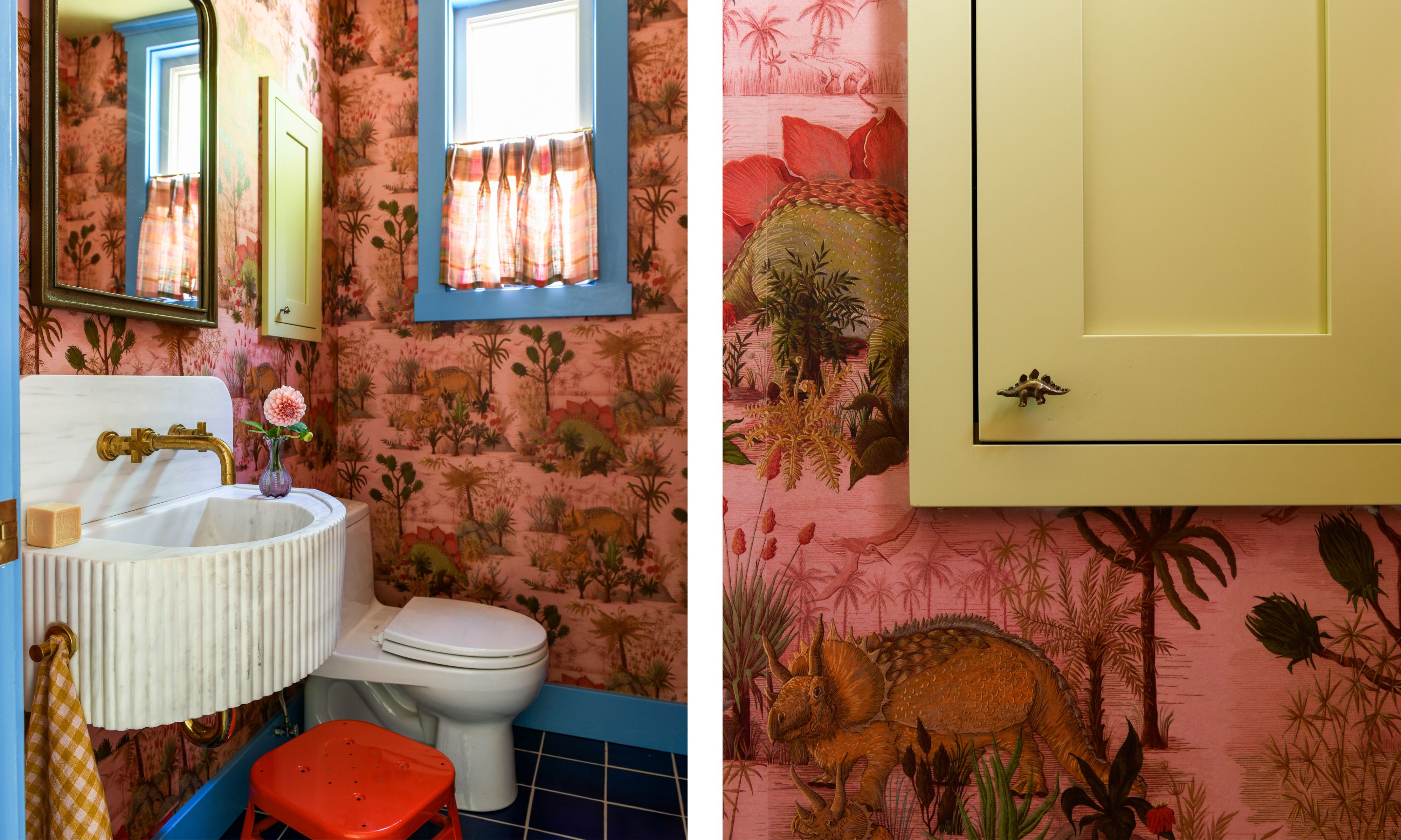
Powder Room: Wallpaper: Dinosauria (Plaster), House of Hackney, Cabinet and Ceiling: Farrow & Ball Churlish Green, Door, Trim, and Casing: Benjamin Moore Nova Scotia Blue 796.
'The husband is a big fan of dinosaurs, so we wanted to create a playful powder room, and we knew when we saw this wallpaper that it was absolutely it,' says Michelle. 'The wife loves pink, the husband loves dinosaurs, so it was just a perfect match, especially for their two young kids.'
While there are so many wonderful wallpapers in this home, Michelle says that this one could be her favorite. 'It’s the perfect dose of playful and features such wonderful colors.'
'We designed this custom fluted marble sink,' Michelle says. 'It's super functional for the kids, and it's also a really beautiful piece for the adults.'
Although a small room, the colors are just as exciting here: chalky blue and chartreuse paintwork, and Yves Klein Blue flooring. 'It's a really great swirl of a bunch of different colors.'
Though colors and patterns are used liberally throughout this home, it feels incredibly livable and calming. Each room is bursting with personality, and it is clear that the homeowners' interests, hobbies, and values have shaped its design. 'The dining room is being used for crafts and homework; the kitchen for baking; the breakfast nook for after-school snacks,' says Michelle. 'It’s wonderful to see!'
While each room boasts endless design inspiration, it is the kitchen that Michelle is the most proud of. 'It’s small but mighty, and everything just works so well in that room. The wife is a big baker, and to have her tell us how perfectly functional it is is music to our ears.'

Emily is a freelance interior design writer based in Scotland. Prior to going freelance in the spring of 2025, Emily was Homes & Gardens’ Paint & Color Editor, covering all things color across interiors and home decor for the Homes & Gardens website. Having gained specific expertise in this area, Emily is well-versed in writing about the latest color trends and is passionate about helping homeowners understand the importance of color psychology in home design. Her own interior design style reflects the simplicity of mid-century design and she loves sourcing vintage furniture finds for her tenement flat.