'Cut the Lighting Budget and Triple the Wallpaper' – Inside a Texas Home Where Pattern Clashing and Color Drenching Is Perfectly Curated to Stay on Just the Right Side of Bold
Designer Sara Malek Barney's job was to temper the tastes of her client to make this color drenched home feel inviting not overwhelming

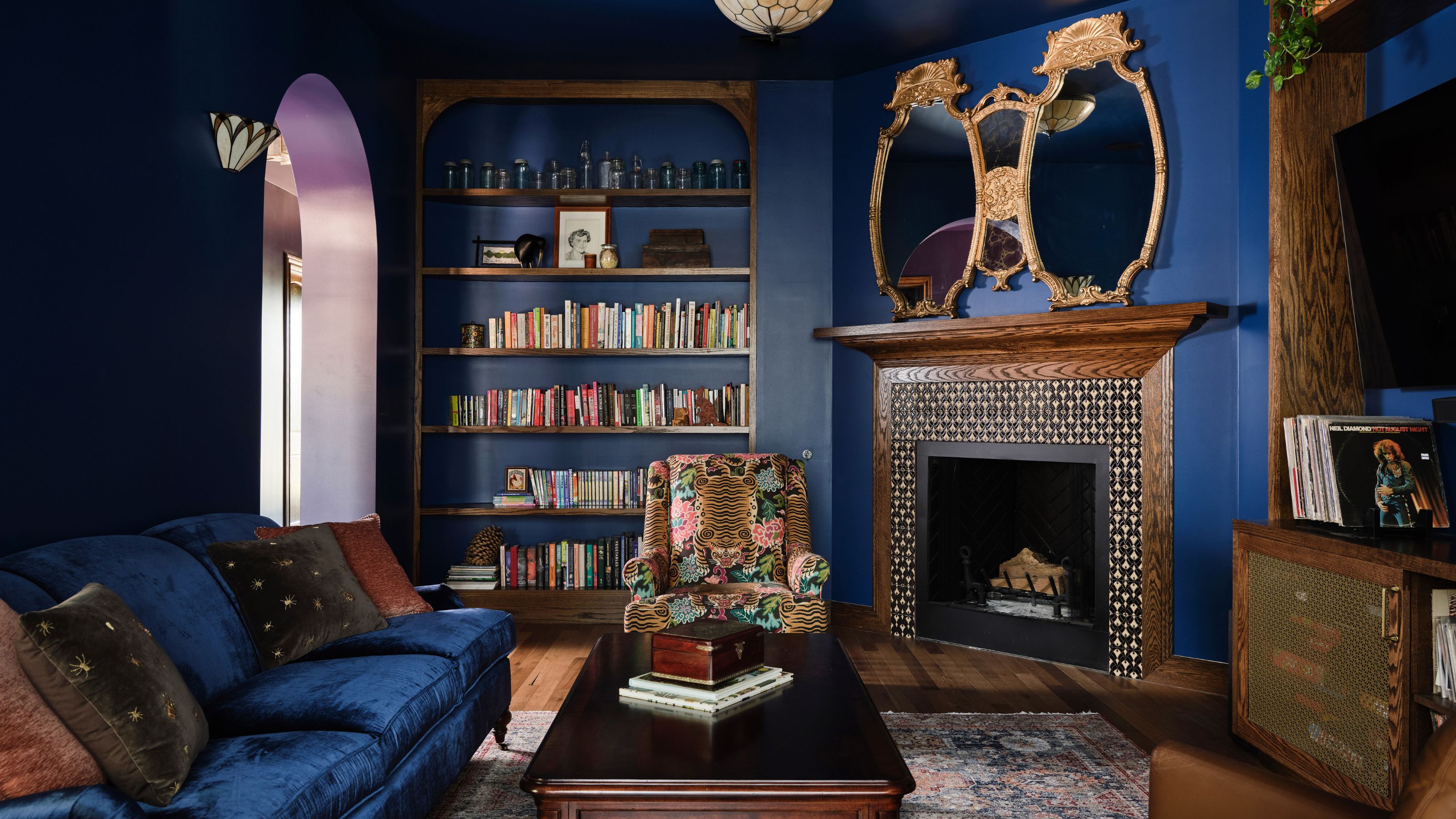
What do you get if you cross Old World/New Orleans-inspired influences with a new build home in Austin, TX, an owner who is totally fearless about using as much deeply pigmented color as possible and an LA-based interior designer who is known for her neutral, pared-back palettes? In this instance, you get a house that is color-drenched in purples, dark blues, patterned wallpaper, and unexpected decor twists.
'The owner knew she needed to be reigned in a little, to have someone take all her brilliant ideas and edit them into a scheme that felt curated,' says Sara Malek Barney, founder of BANDD/DESIGN. 'You know, I don't like "stuff", I'm far from a maximalist, so my job was to make the space seem cleaner and clearer than perhaps it would otherwise.'
Despite this being the reigned-in version, the final scheme is bold. Deep hues zone spaces, creating an overall effect, Sara says, of 'a really warm, inviting space.' It's not often you find dark purple leading into dark blue, but thanks to Sara's careful hand, the home shows what happens when you allow color bravery into a project. And yes, the finished palette is unusual, but it could have been so much more out there than this. 'You have no idea of the conversations we had where I was like "you really can't do that!"' Sara says.
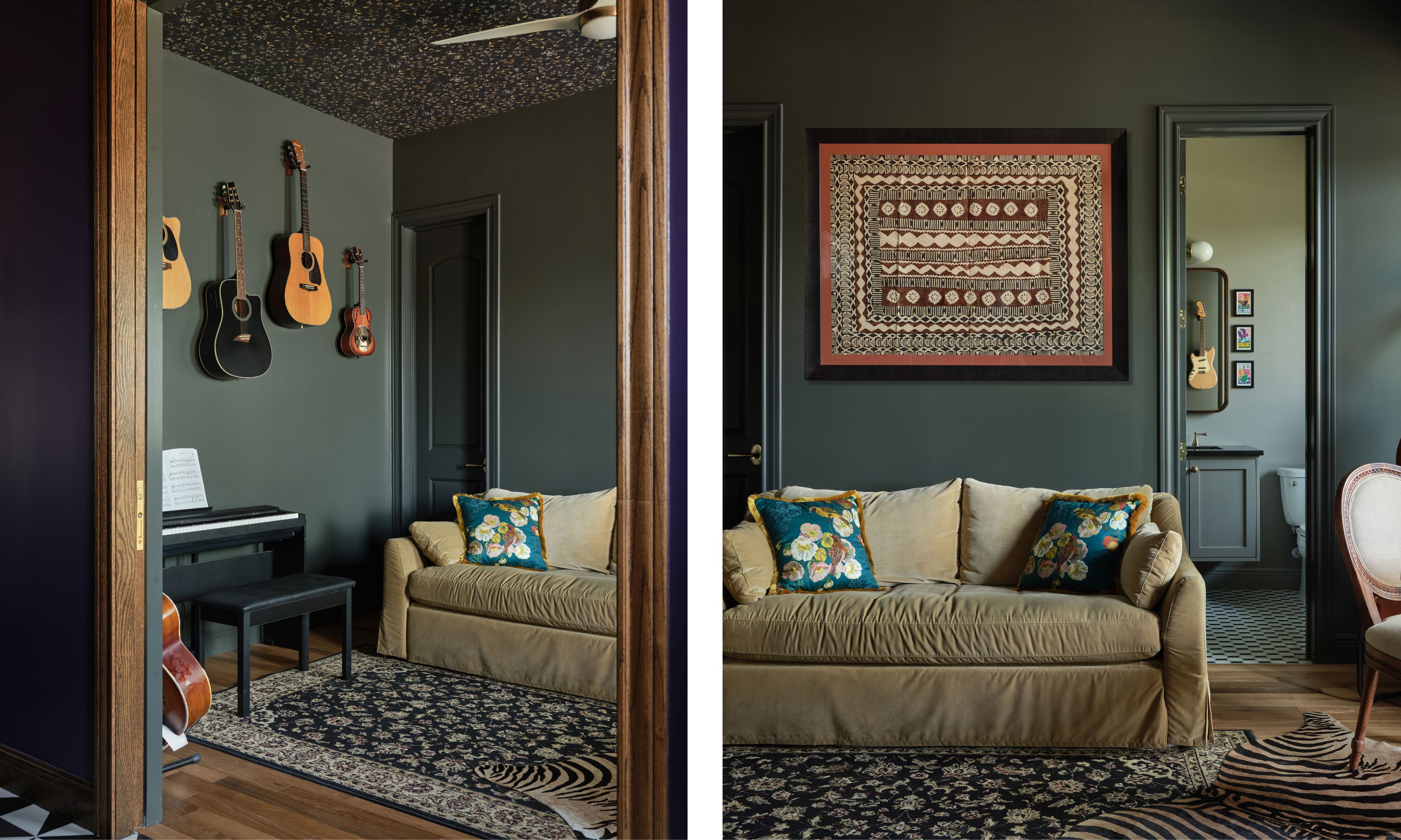
Walls in Midsummer Night 2134-20, Benjamin Moore. All other pieces, client's own.
The first room you see when you enter the home has become the family's music room – more traditionally, it could have been a den.
'Because it's the first room you see, we needed to give it maximum impact,' Sara says of her choice of bold color on the walls and paper up above. 'In fact, the owners told me to cut the lighting budget and triple the wallpaper budget, so that gave me license to paper the ceiling with this cute, floral pattern.'
Most of the rest of the house is drenched in color, so it's unusual that Sara didn't take the paint up over the ceiling or the wallpaper down over the walls. 'It's actually intended that this room will double as a guest room,' Sara says. 'And the sofa turns into a bed. But that means that while it is mainly used as a music room for now, its main use may evolve over time – it meant I couldn't get a real commitment to wallpaper in case the decor had to be adapted quickly.'
By keeping the pattern only on the ceiling, if the room does need to become another bedroom in due course it will be much, much quicker to change.
Design expertise in your inbox – from inspiring decorating ideas and beautiful celebrity homes to practical gardening advice and shopping round-ups.
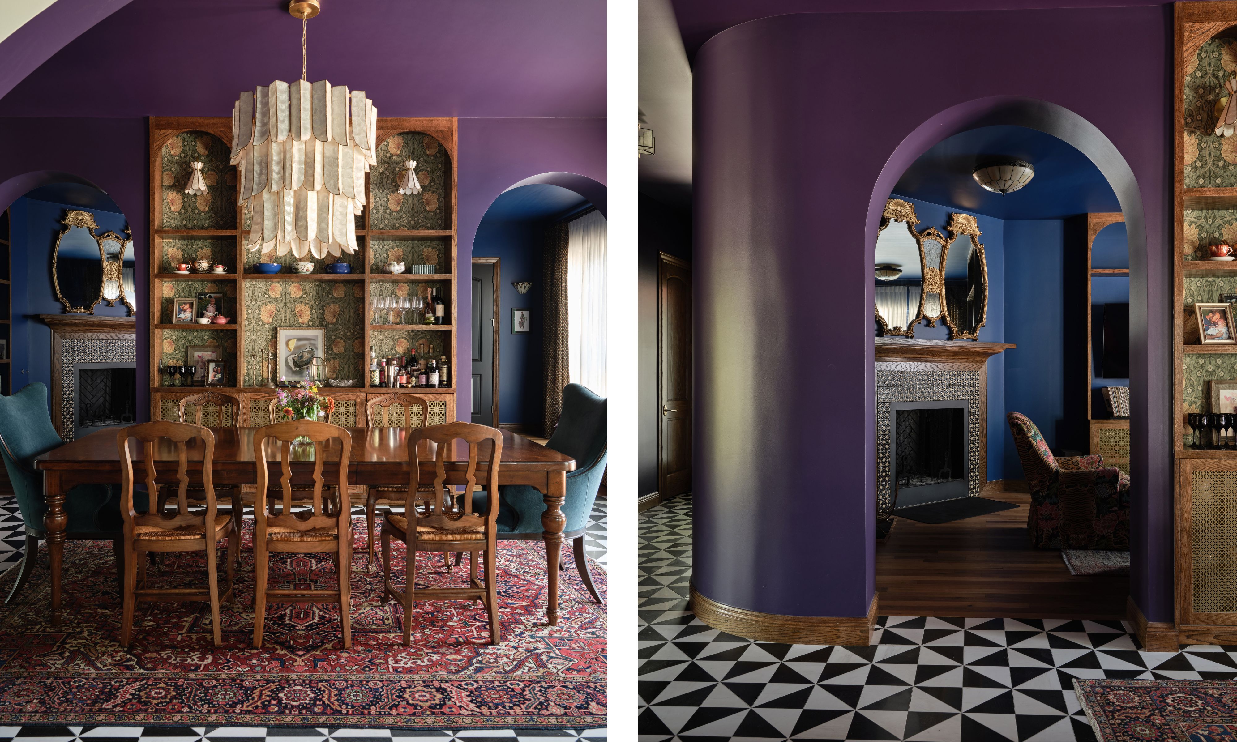
Walls in Exotic Purple, Benjamin Moore. Pimpernel Wallpaper (inside shelves), William Morris. Cartagena Chandelier, Hudson Valley Lighting.
'The dining room was one of the last colors we picked, and we wanted something that was bold and moody and really gave a depth to the space,' Sara says. She was working with some impressive architecture – curves and arches that guided the eye through the room, and felt that she owed it to the build of the house to go bold. 'Yes, the purple is moody and dramatic, but it's theatrical and provides so much warmth,' she says. 'The perfect dining room vibe.'
The color wraps the space, with Sara having drenched the walls and ceiling too. 'I refuse to do an accent wall, they’re lame and lazy,' Sara says. 'If you're going to go for a big color, you've got to do it big. I'm all for color drenching – in some ways it makes the loud hue a little quieter, as it's not contrasting with, say, a white ceiling, and envelops you instead.'
Even with arched doorways and look-throughs, the home is open, and the rooms branch off each other, so Sara had to think about the sightline between the purple dining room and the blue living room beyond. 'They flow together,' Sara says. 'Both as bold as each other.'
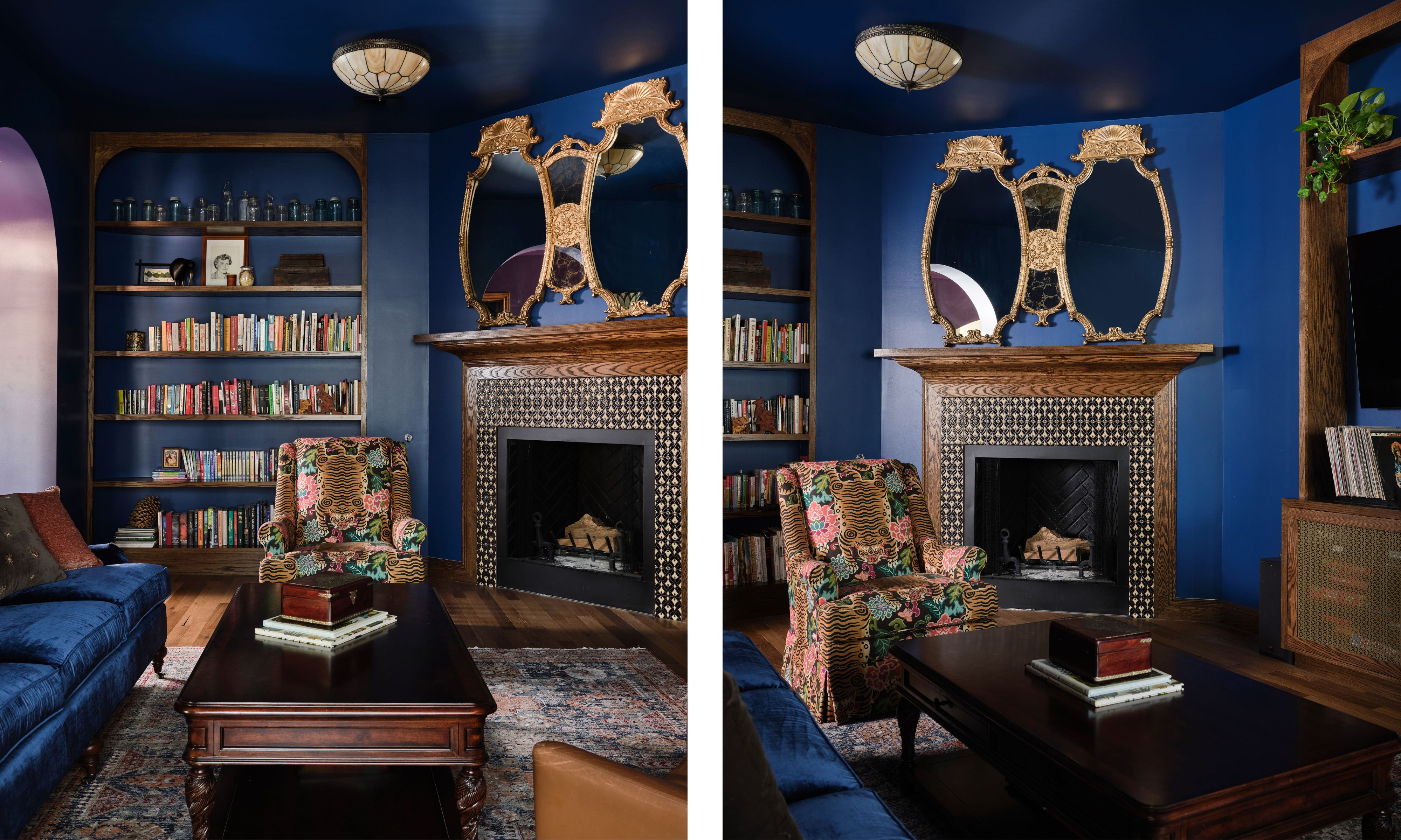
Vincent Honeycomb Flush Mount Light, Smashing Stained Glass. Walls in Downpour Blue, Benjamin Moore. All other pieces, client's own.
Head straight through into the equally drenched dark blue living room, which at first glance looks like it has a lot going on, but is actually edited back to just two main colors. There is the blue of the walls, ceiling, and sofa, and the brown of the wood joinery, leather armchair, and fireplace.
'We could have gone extreme in here, and had lots of pattern and colors, but I wanted to show restraint,' Sara says. 'So that meant finding ways to make things match, which has the overall effect of the space seeming more pared back.'
Even darker than the dining room, this is intended as a space that holds you – that looks after you, in which you can unwind. 'Honestly, it feels so fun to be in here,' Sara says. 'I picture people using it to listen to records, to have a whisky. It's a grown-up, nighttime kind of space.'
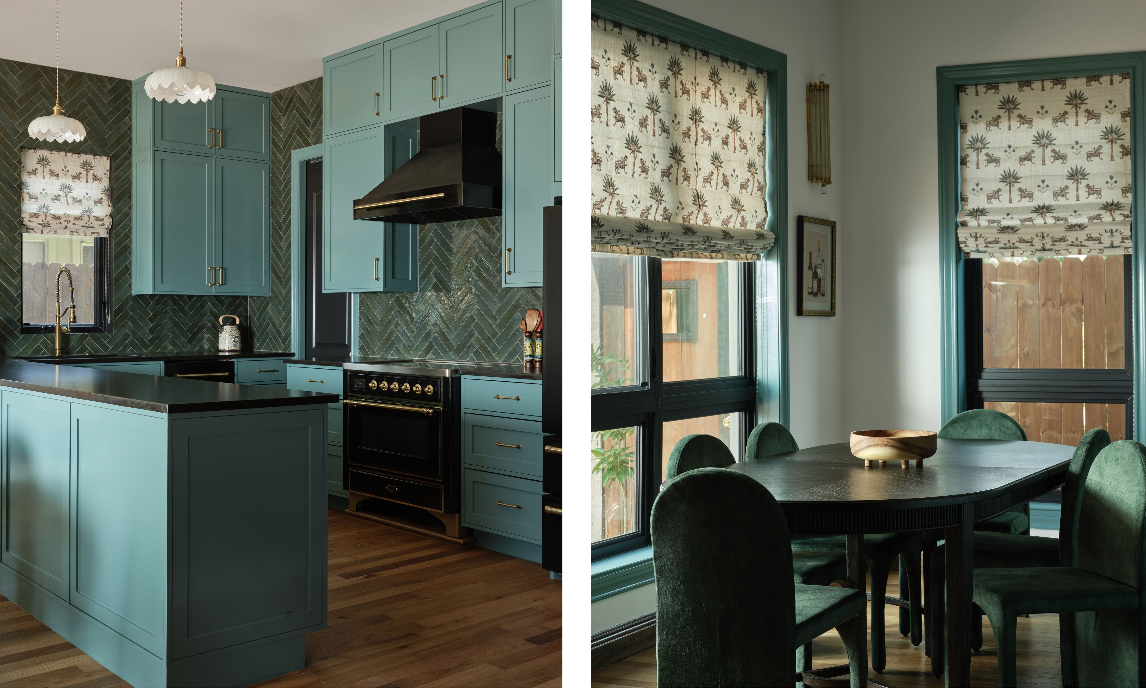
Cabinets in Fort Pierce Green, Benjamin Moore. Vintage Scalloped Glass Flower Pendant Light, Amazon. Soho Emerald Brick 2x10, Rondine Ceramica. Blinds made from Tiger Palm fabric, Schumacher.
The kitchen is where Sara really wanted to bring in some of the Old World references in the original brief, to soften the functional areas and make it feel more characterful overall.
'We wanted to bring in some Victorian elements like the herringbone tiles and scalloped edges of the lampshades,' Sara says. 'They make the hard edges of the cabinets seem a little more in keeping with the vibe of the rest of the home.'
In the corner of the kitchen is a breakfast nook, where green, lozenge-shaped chairs sit around a lozenge-shaped table – more curves to contrast those sharp corners elsewhere. 'I wanted this to be a little less dramatic than the cooking end,' Sara says of her choice to round off all the edges.'
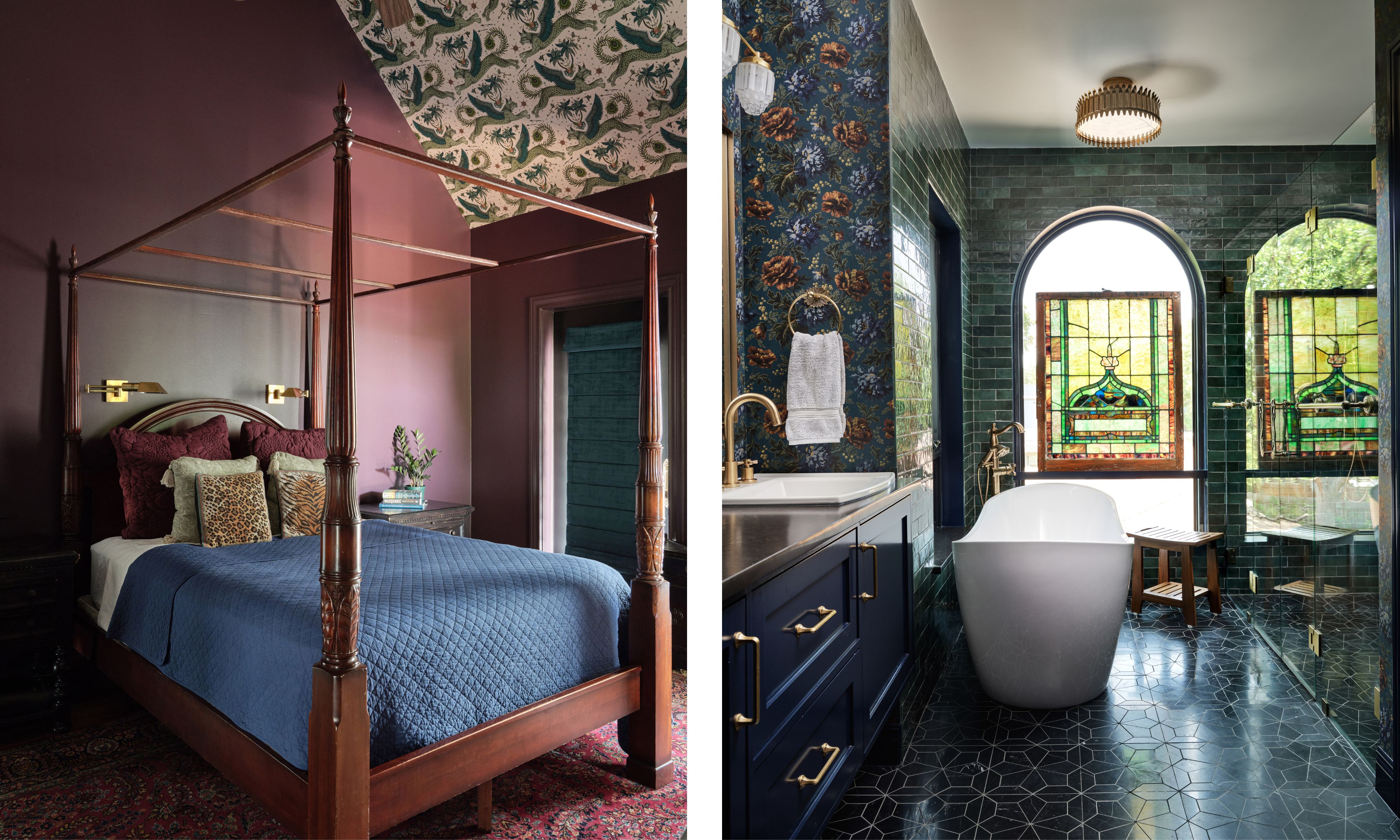
Bedroom: Walls in Lobby Scene, Backdrop. Ceiling in Lynx Wallpaper, Emma Shipley. Bathroom: Walls in OPIA Wallpaper, House of Hackney. Blomma Honed Marble Mosaic Tile in Nero, Bedrosians. Leslie 16" Semi-Flush. Visual Comfort.
A brown-toned red actually feels pretty subdued in the main bedroom after the purples and blues downstairs. But with vast vaulted ceilings and an owner who had tripled the wallpaper budget, Sara knew she could have fun here. 'The client was insistent on wallpapering the ceiling, and I just knew she'd go for this one with lions in it,' Sara says. 'It was just wacky enough to appeal to her taste.'
Sara says it works because it has the element of surprise. 'You really have to look up to see it, it's not in your sightline. It's a moment of unexpected delight.'
Another unexpected delight, the stained glass window in the main bathroom – a feature you don't often see in new builds. And it's here not as an architectural detail but because Sara added it for practicality. 'The stained glass is actually a privacy screen,' Sara says of her choice that is far more modern and appealing than, say, net curtains. 'This bathroom is so fun, all the design choices really pack a punch.'
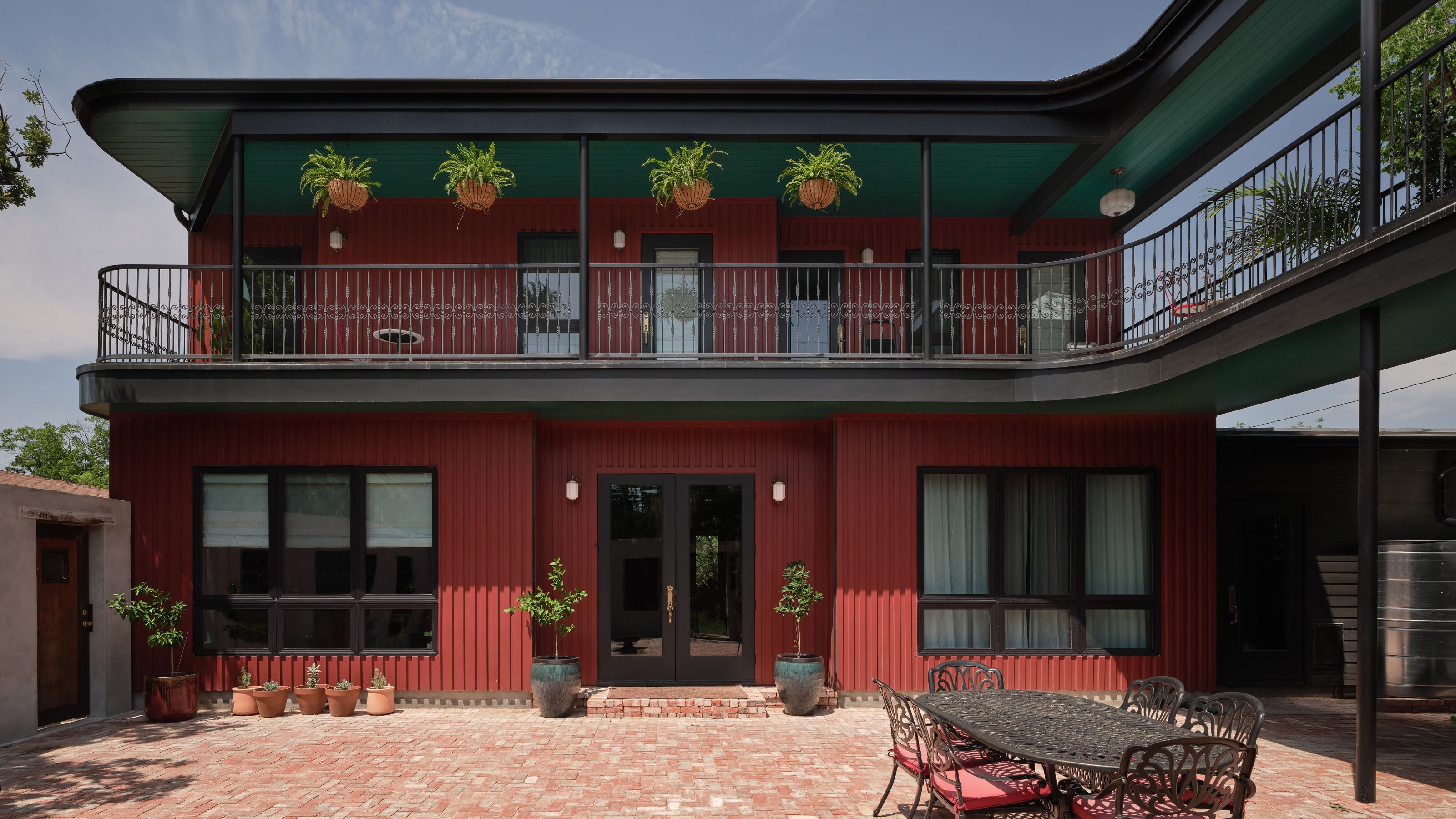
You get a sense of the size and scale Sara was dealing with when you see the exterior, a curved L-shape of a home that fills its entire lot. Clad in red hardboard siding, and with curves that match the arches inside, it's a bold statement that sets out the tone for what you'll find inside.
'The architect wanted stucco, but we knew we had to be brave here,' Sara says. 'It's not often you get a client who will go for three different colors on the outside of their home, and this just felt in keeping with the rest of the decor.'
Yes, this house is bold, and yes, Sara used strong colors in ways that even she isn't used to, but she has shown that when you want to make a statement you have to have the courage of your convictions. The impact would have been nowhere near as impressive if Sara hadn't drenched rooms in all-over color, if she'd stopped at ceiling lines or statement walls. This is a home for a person who doesn't do things by halves, and as a result, its sum is even greater than its whole.
Pip Rich is an interiors journalist and editor with 20 years' experience, having written for all of the UK's biggest titles. Most recently, he was the Global Editor in Chief of our sister brand, Livingetc, where he now continues in a consulting role as Executive Editor. Before that, he was acting editor of Homes & Gardens, and has held staff positions at Sunday Times Style, ELLE Decoration, Red and Grazia. He has written three books – his most recent, A New Leaf, looked at the homes of architects who had decorated with house plants. Over his career, he has interviewed pretty much every interior designer working today, soaking up their knowledge and wisdom so as to become an expert himself.
