'We Made Choices That Weren’t Necessarily Trendy or of the Moment, but Could Last and Grow With Us' – See How Neutral Backdrops and Playful Pops of Color Make This Elegant London Home Both Timeless and On Trend
Once two apartments, this Georgian home in London has been brought back to its former glory, and the elegant and light-filled interiors created by the designer Christian Bense honors the past and the present

Design expertise in your inbox – from inspiring decorating ideas and beautiful celebrity homes to practical gardening advice and shopping round-ups.
You are now subscribed
Your newsletter sign-up was successful
Want to add more newsletters?
Two into one does go, as award-winning interior designer Christian Bense discovered when he helped transform a five-storey Georgian terrace in Maida Vale from two flats back into a generous family home.
The clients, a family of five, had been living in a flat on the two lower floors until the opportunity arose to buy the upper levels. ‘We wanted a designer who had experience in London house design but also understood how to maximize function within these architectural spaces,’ explains the client. ‘We wanted to ensure every room was going to be practical, could function well as our children grew older, and not necessarily just for show or display. Our goal was to make sure how we designed it would have durability and longevity, a certain timelessness to it, so we made choices that weren’t necessarily trendy or of the moment, but could last and grow with us.’
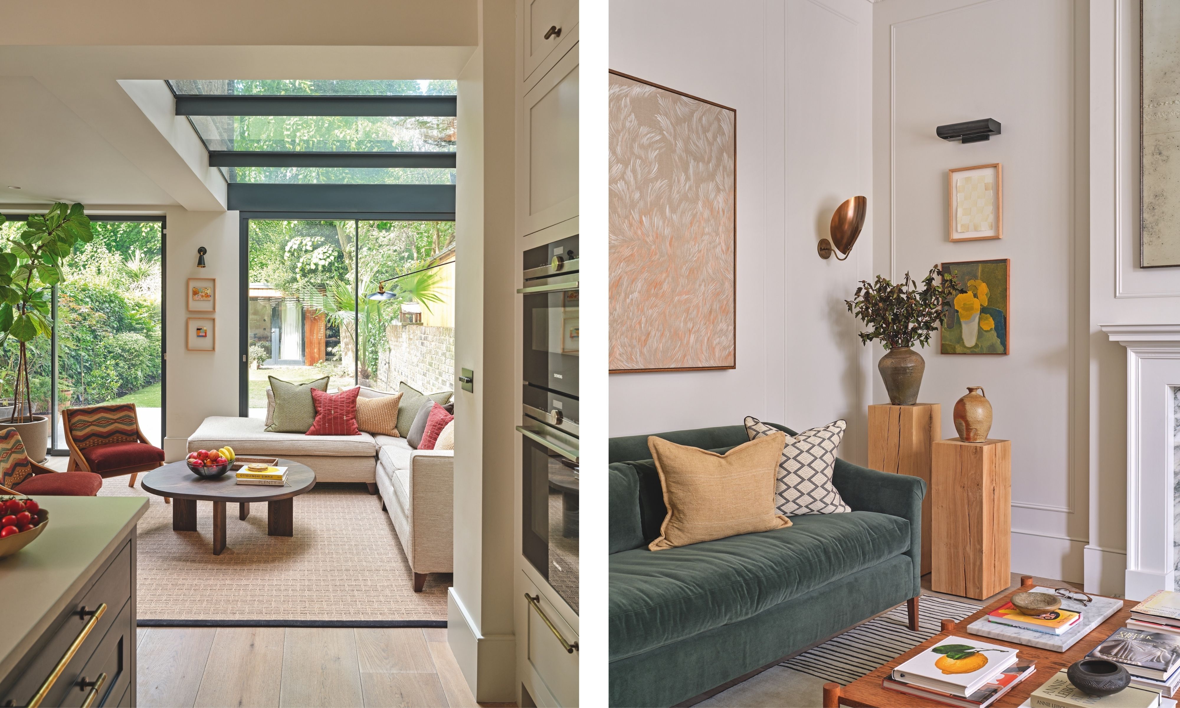
Garden Room (left): The linen modular sofa introduces texture and provides generous seating overlooking the garden. Pops of color are injected with cushions and eye-catching chairs. Client’s existing sofa reupholstered in fabric by Zimmer + Rohde. Cushions, from a selection at Romo, Oka, and Toast. Armchairs, vintage. Coffee table, Ferm Living. Sitting Room (right): Sofa, Pinch. Bespoke coffee table, Konk. Artworks: large piece over green sofa by Lisa-Marie Price; still life by Jay Harper; chequered board piece by Mimi Zouch.
Christian and Lexi Strang, the lead designer on this project, are masters at working with period properties. ‘Our ethos is, where possible, to try and work back to what was original and take the house back to its former glory,’ explains Christian.
‘Given this house’s great proportions, it lent itself to going back to the initial footprint. The challenge was designing a layout that would bring the home together while minimizing build costs. Through thoughtful space planning, we were able to keep replumbing to a minimum and, where possible, worked with existing joinery in order to reduce costs. We wanted to ensure the house was utilized to its fullest potential, and therefore, each of the five floors serves a distinct purpose. The top floor is dedicated to the children, which allowed us to make the ground floor a sophisticated space.’
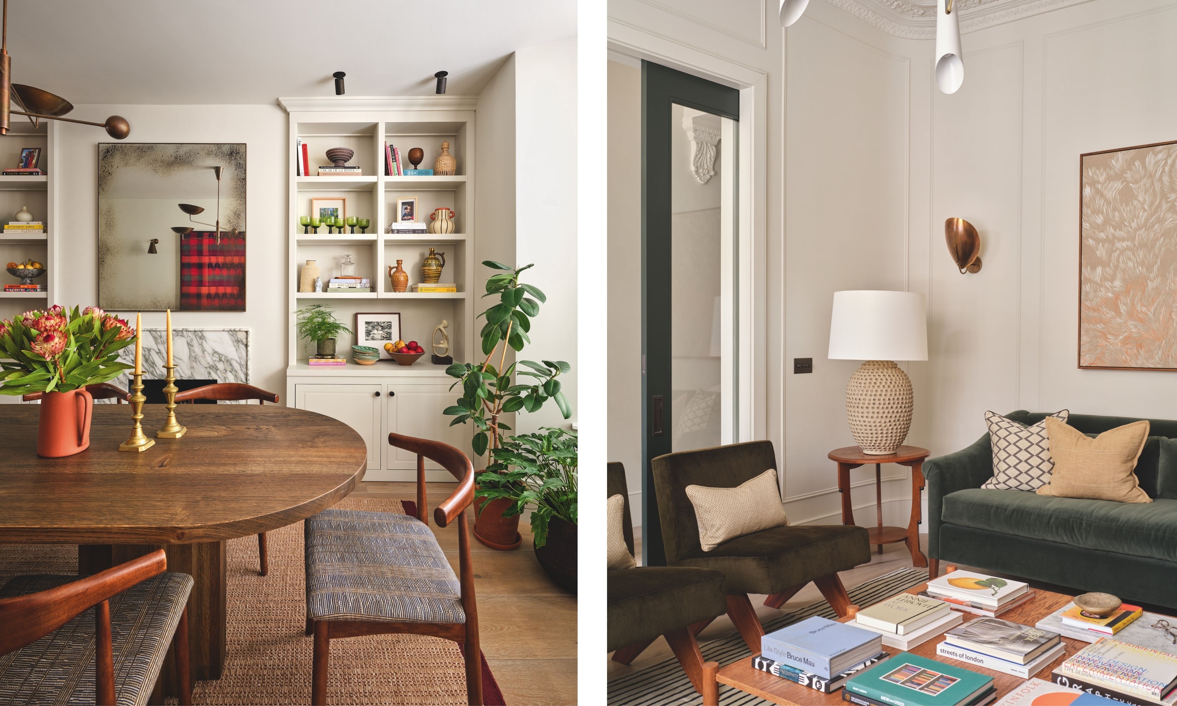
Dining Room (left): The joinery was existing but was edited by Christian so that the two elevations matched. The curves of the dining table and chairs temper the lines of the joinery. Bespoke table, Heerenhuis. Chairs, Cult Furniture. Joinery in Slate II, Paint & Paper Library. Ceiling light, Etsy.
In addition, a priority was the reinstatement of period architectural features that had been lost over time, including recreating cornices and molding details and installing cast-iron radiators throughout.
At the forefront of the project was not just how the rooms were to be used, but also the design narrative. ‘We considered what the journey was for a guest coming to the front door, what they see and what they navigate, making sure there’s a consistency, and also from the client’s perspective, who is navigating the house top down, not front door up, so it was a case of finding these two paths through the house,’ explains Christian.
‘The house was so light, bright, and airy, and also vast, we had to rely on creating a really neutral backdrop that we could then punctuate with interesting contrasts and artwork. A lot of our classic house projects are very much a shades-of-neutral backdrop, so that when you inject color, even the subtlest of contrasts, things feel more dynamic and colors seem quite punchy.'
Design expertise in your inbox – from inspiring decorating ideas and beautiful celebrity homes to practical gardening advice and shopping round-ups.

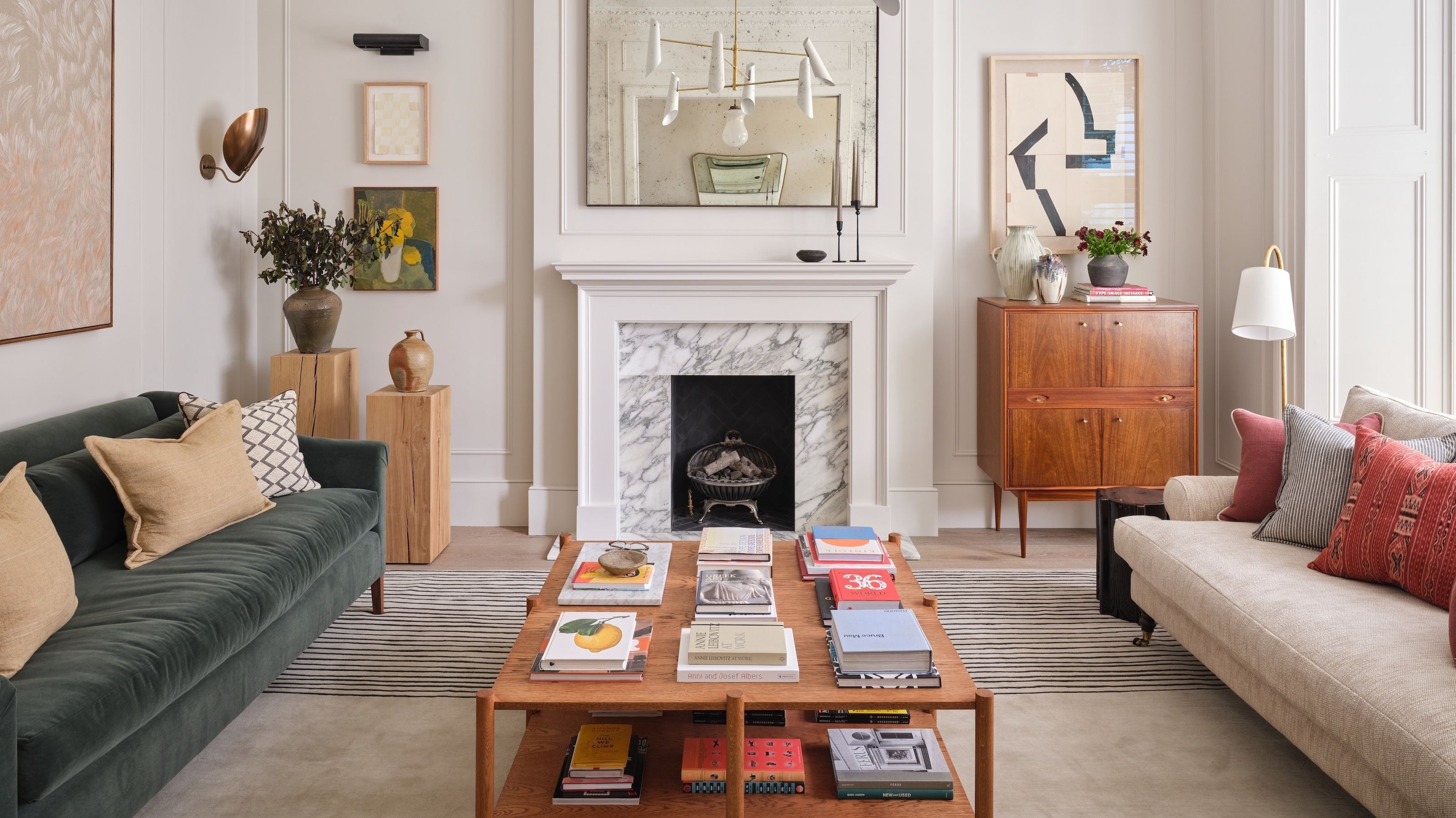
Sitting room: Originally the main bedroom when the property was divided into apartments, the space has been transformed into an elegant and convivial room.
Embodying this is the light and bright bay windowed living space where a bold green sofa injects a pop of color, balancing the view outside, while semi-glazed pocket doors with complementary green frames coax light in from the hall too. ‘Christian’s classic is light walls, dark doors,’ observes Lexi.
Meanwhile, in contrast, the snug leans into a dark, moodier, and more intimate aesthetic, with textural grasscloth walls. ‘It’s formal but informal, and there’s a natural element to it,’ says Christian. The interior has been carefully considered to evoke a lived-in, curated, layered look.
Inspiration was taken from many styles, although there is an emphasis on mid-century, clean-lined pieces and lighting. ‘The client is a graphic designer, and she preferred cleaner lines. Because of her profession, she looked at the design language of each element,’ says Lexi.
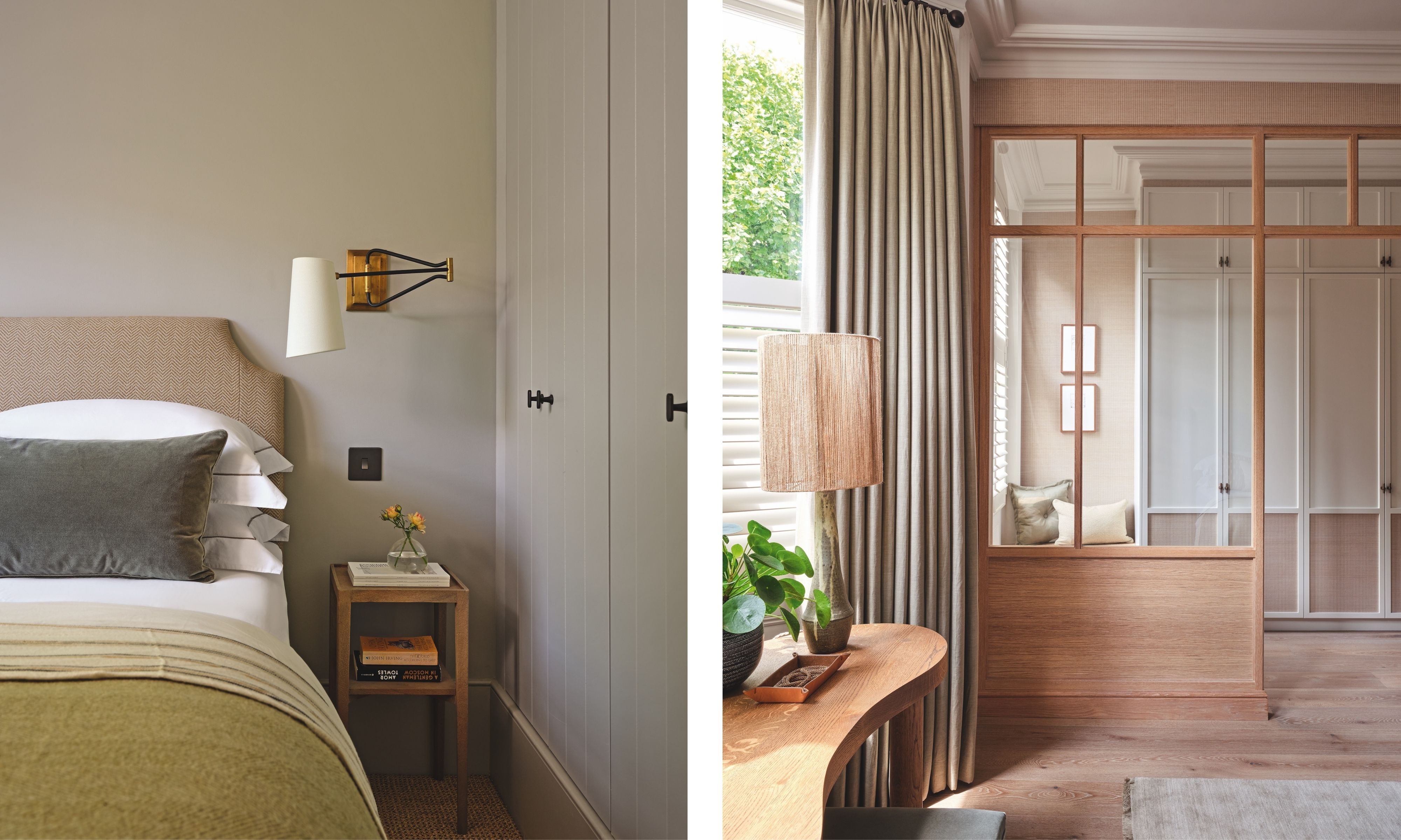
Bedroom (left): The neutral scheme is enlivened with a soft green throw. Walls in Purbeck Stone, Farrow & Ball. Headboard, Dormy House; in Hutte Silex, Métaphores. Throws, TBCo, and Zara Home. Dressing room (right): Japandi-style glazed partitioning separates the dressing area from the main bedroom. The kidney-shaped dressing table was a must-have for Christian. ‘It offsets some of the vertical, harder architectural lines,’ he explains. Bespoke partitioning designed by Christian Bense. Dressing table made by Konk.
Upstairs, the first floor was completely reconfigured ‘to create a serene hotel-like suite that felt like a retreat from the rest of the house,’ says Christian.
‘We designed a timber-glazed divider that differentiates the bedroom from the walk-through dressing room. We wanted this divider to feel contemporary, so we designed it with a slim timber frame. Visually, you get this enormous space that is light-filled.’
The generous bed with its cosseting winged headboard was then orientated on the fireplace wall, creating a serene and opulent focal point.
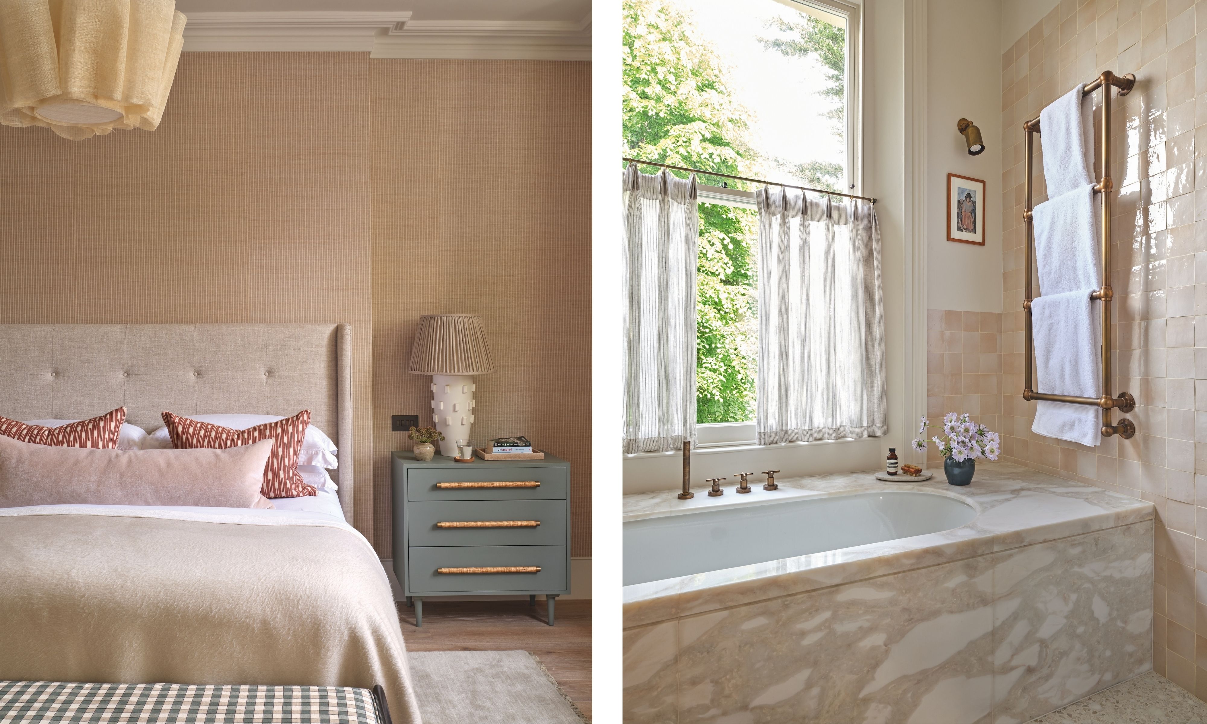
Main bedroom (left): Sculptural lighting delivers a modern touch. Polo Grounds wallpaper, Tatiana Tafur. Pendant, Pinch. Bedside chest, Chelsea Textiles. Lamp, Vaughan. Bench, Robert Langford. Main bathroom (right): Nuanced marble evokes an understated opulent feel, with a blocky marble bath the focal point. Alba Chiara marble, MGLW. Zellige tiles, Mosaic Factory. Brassware, Porter. Undermounted bath, Bette.
With the design focusing on how the clients want to live in the house, the schemes have also been designed to last. As Christian sums up, ‘The design strikes that balance between being tailor-made, but also timeless.’

Interiors have always been Vivienne's passion – from bold and bright to Scandi white. After studying at Leeds University, she worked at the Financial Times, before moving to Radio Times. She did an interior design course and then worked for Homes & Gardens, Country Living and House Beautiful. Vivienne’s always enjoyed reader homes and loves to spot a house she knows is perfect for a magazine (she has even knocked on the doors of houses with curb appeal!), so she became a houses editor, commissioning reader homes, writing features and styling and art directing photo shoots. She worked on Country Homes & Interiors for 15 years, before returning to Homes & Gardens as houses editor four years ago.