'It’s the Juxtaposition That Feels Thrilling’ – Step Inside an 1800s London Home Where Classic Features Collide With Colorful, Contemporary Styling
Interior designer Suzy Hoodless honored the artistic roots of this Victorian London home by focusing on craftsmanship, color, lines, and shapes. The resulting schemes are creative triumphs

Design expertise in your inbox – from inspiring decorating ideas and beautiful celebrity homes to practical gardening advice and shopping round-ups.
You are now subscribed
Your newsletter sign-up was successful
Want to add more newsletters?
If the Arts and Crafts movement stood for ideals of individuality, artisan production, and the beauty of everyday objects, then this renovated London home surely embodies them in abundance.
Filled with graphic patterns, modernist shapes, and contemporary artwork, this house design is a novel take on the Arts and Crafts set of principles, from its gently reworked architecture to the handcrafted cement tiles in the entrance hall.
‘It felt intuitive to channel that concept,’ says interior designer Suzy Hoodless, who reimagined these schemes. ‘The building had great bones, and we wanted to honor its heritage, albeit in a fresh way. The aim was to create bold, unique spaces that were also deeply functional.'
Article continues below 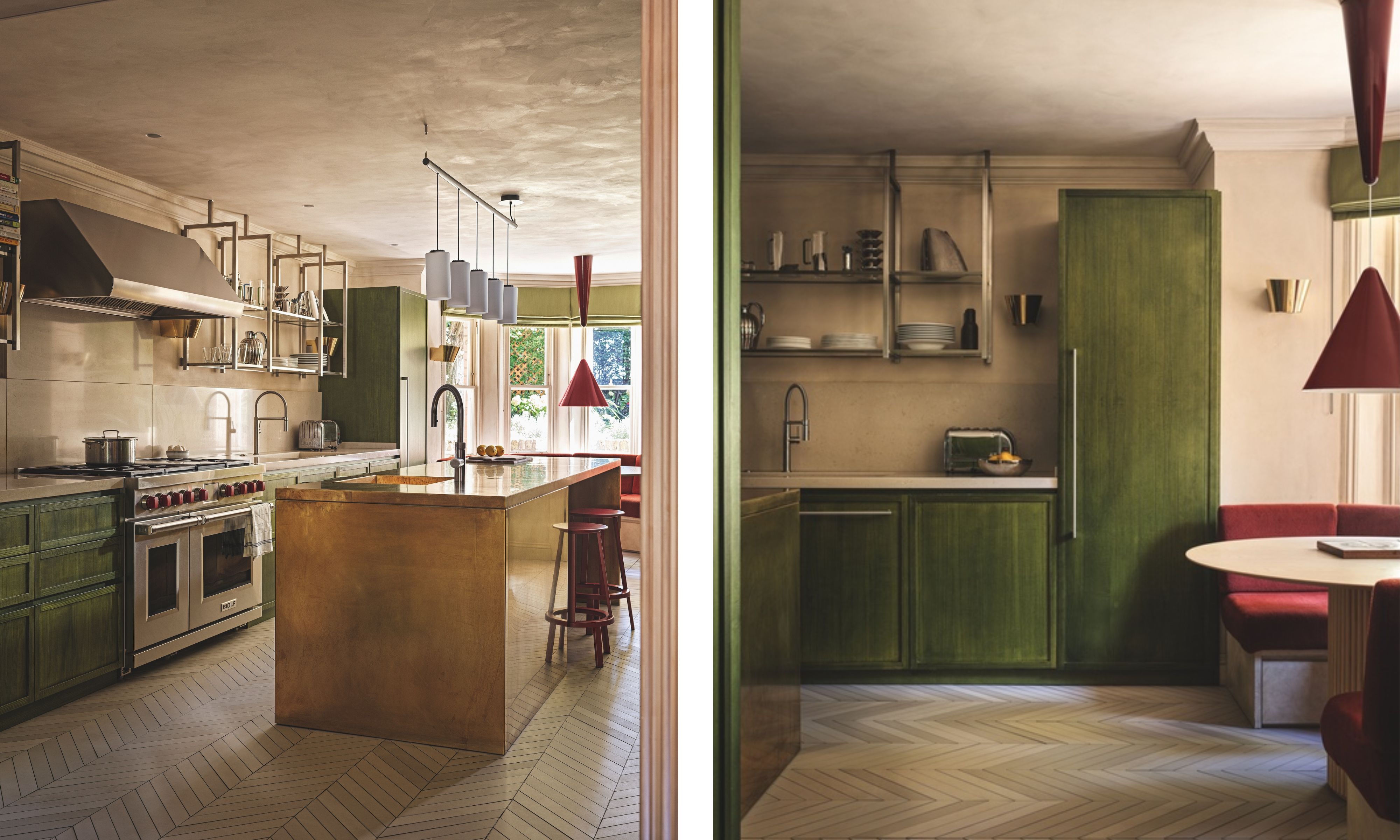
Kitchen (left): Confidence with color and materials has paid dividends in this space, which includes an island wrapped in brass. Units in Dyed Green Tulip 26 timber veneer, Capital Crispin Veneer; made by Costa Interiors. Dekton worktops in Nacre, Cosentino. Cirio Lineal pendant, Antoni Arola for Santa & Cole. Revolver stools, Leon Ransmeier for Hay. Kitchen Dining Area (Right): The classic column base of the table contrasts with the modernist-style light. Walls in White Fox; ceiling in Amsterdam, Bauwerk Colour. Diabolo pendant in Cherry Red, Achille Castiglioni for Flos. Mews Chevron floor tiles in DTME 02, Domus. 9464 wall lights, Paavo Tynell for Gubi.
Built in 1874 by architect J.M. Brydon, the house features several nods to the Arts and Crafts period, including stained-glass windows, a tall hipped roof, and a terracotta plaque above the porch featuring sunflowers in a vase.
For the couple who took on the listed building a few years ago, returning to that sense of homeliness was key. Although structurally sound, it needed a gentle reconfiguration to suit the needs of a family comprising two young boys, as well as a return to its original appreciation of the decorative arts.
Passionate about contemporary design, the owners – one of whom is Italian – were keen to introduce a European sensibility, too, expressed through art and mid-century shapes. Happily, their architect, Giancarlo Alhadeff, also has Italian roots, and together with Suzy, known for her devotion to textiles, modernist furniture, and confident color, he reworked the layout to allow the original free-spiritedness of this home to emerge.
The basement was rationalized to create a kitchen and dining room (plus a bedroom and a laundry), allowing for a relaxed family room and a more formal living room on the ground floor.
Design expertise in your inbox – from inspiring decorating ideas and beautiful celebrity homes to practical gardening advice and shopping round-ups.
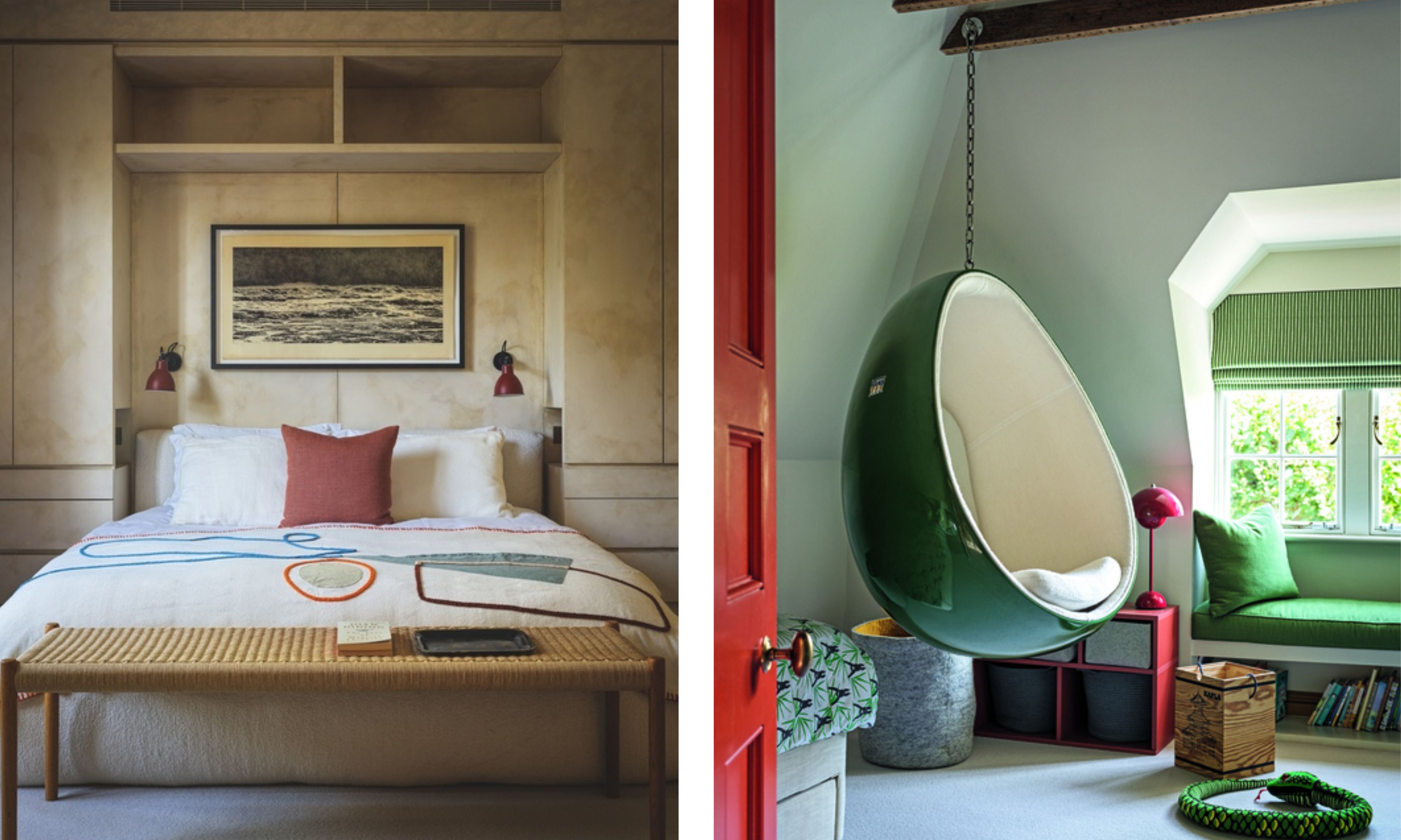
Bedroom (left): Suzy made the most of the layout by adding built-in storage that blends in with the walls. Storage in Seed, Bauwerk Colour. Carpet, Wool Classics London. Arbaz throw, Lrnce. Artwork by Trevor Price. Child's Bedroom (Right): The egg chair delivers a playful element. Suspension Ele chair, MyFaktory. Window seat in Linara in Thyme, Romo. Flowerpot VP3 lamp in Vermilion Red, Verner Panton for &Tradition. Carpet, Wool Classics London
Upstairs, a guest room was sacrificed to create a dressing room with a bath, leading to an en-suite bedroom, plus a study, so that the parents could have a self-contained floor, while the eaves space was reworked for the boys.
‘Listed properties always require some imaginative thinking,’ says Giancarlo, ‘but in this case, small yet meaningful tweaks, such as turning a spare bedroom into a multipurpose space, unlocked the layout for us.’
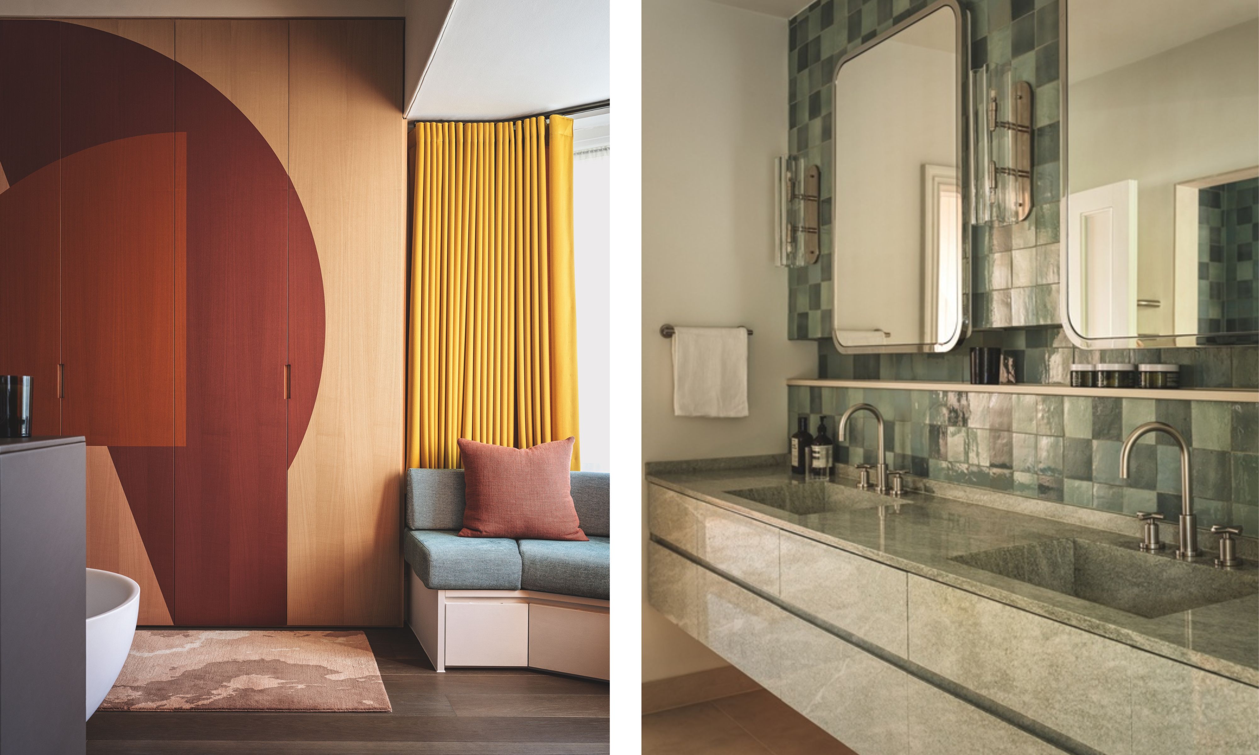
Dressing Room (Left): Built-in window seating and handle-less joinery in a bold abstract design meld form and function. Cupboards by Suzy Hoodless Studio; made by Costa Interiors. Long board flooring in Linen, Schotten & Hansen. Rug by Suzy Hoodless Studio. Curtains in Aplomb, Dedar. En suite (right): seamless granite vanity is offset by tiles in restful blues and greens. Dual wall lights in Brushed Nickel, Suzy Hoodless for Drummonds. Zellige tiles, Mosaic Factory. Tara basin mixer taps in Platinum Matt, Dornbracht. Mirrors and vanity in Beola Verde granite by Heat Architecture; made by Costa Interiors.
Key to the impact of these schemes is color. ‘We chose an unusual palette that I hadn’t majored in before,’ says Suzy, of these ‘unique and atypical schemes’, which feature various combinations, from vivid blue and soft green to terracotta and knocked-back reds. Much of that vivacity is tempered by limewashed walls.
‘They introduce softness and elegance,’ says Suzy. ‘The house has amazing light, and I felt it would be nice to suggest movement through those painterly brushstrokes.’
Clever touches include the contemporary tiles in the entrance hall, which both riff on traditional encaustic shapes and nod to a modern Italian sensibility. The kitchen units were painted tulip green and the island wrapped in brass ‘because the owners wanted to avoid a huge lump of stone’ and, summoning mid-century retro cool, the dressing room joinery features a multicolored abstract whose tones are picked up in a banquette.
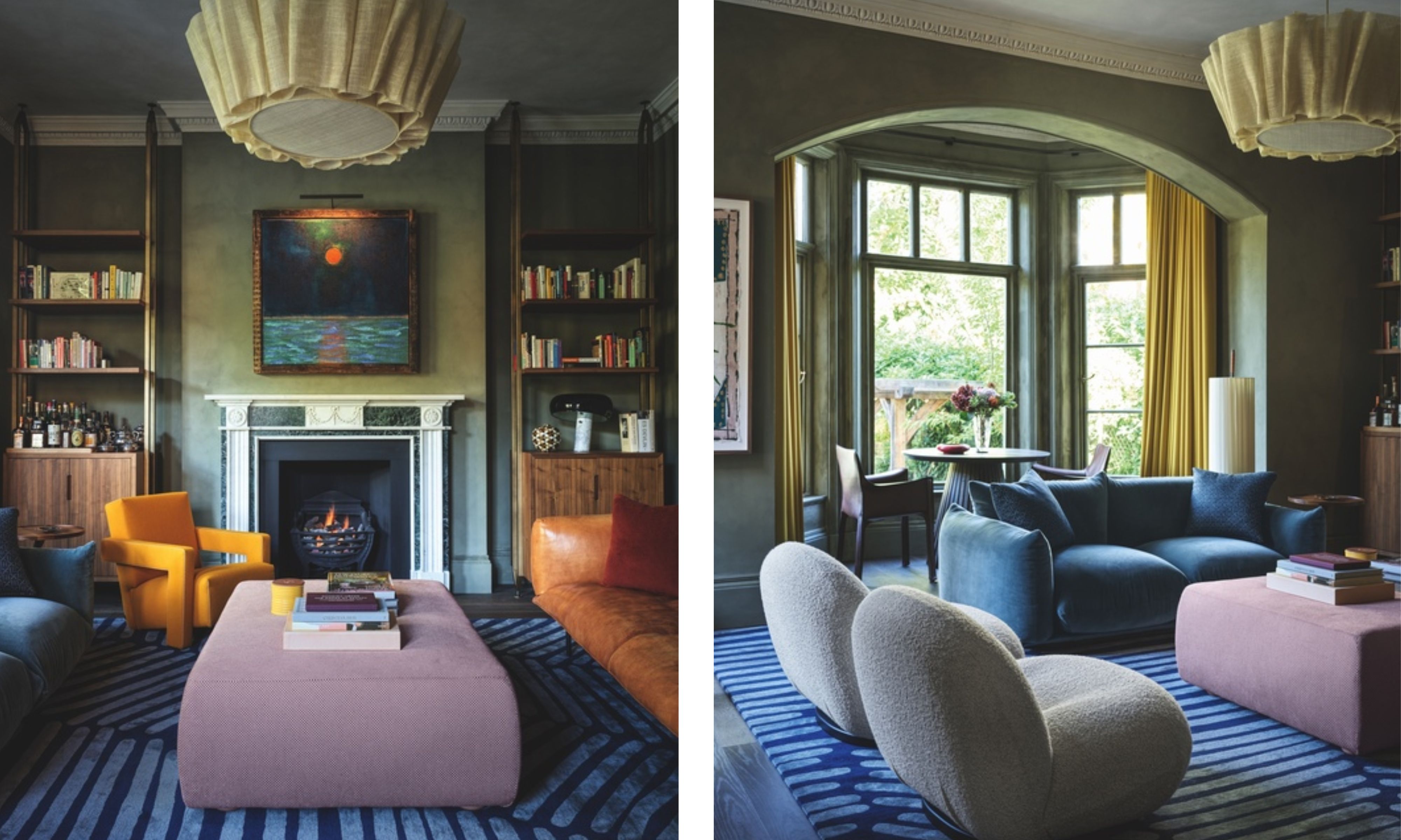
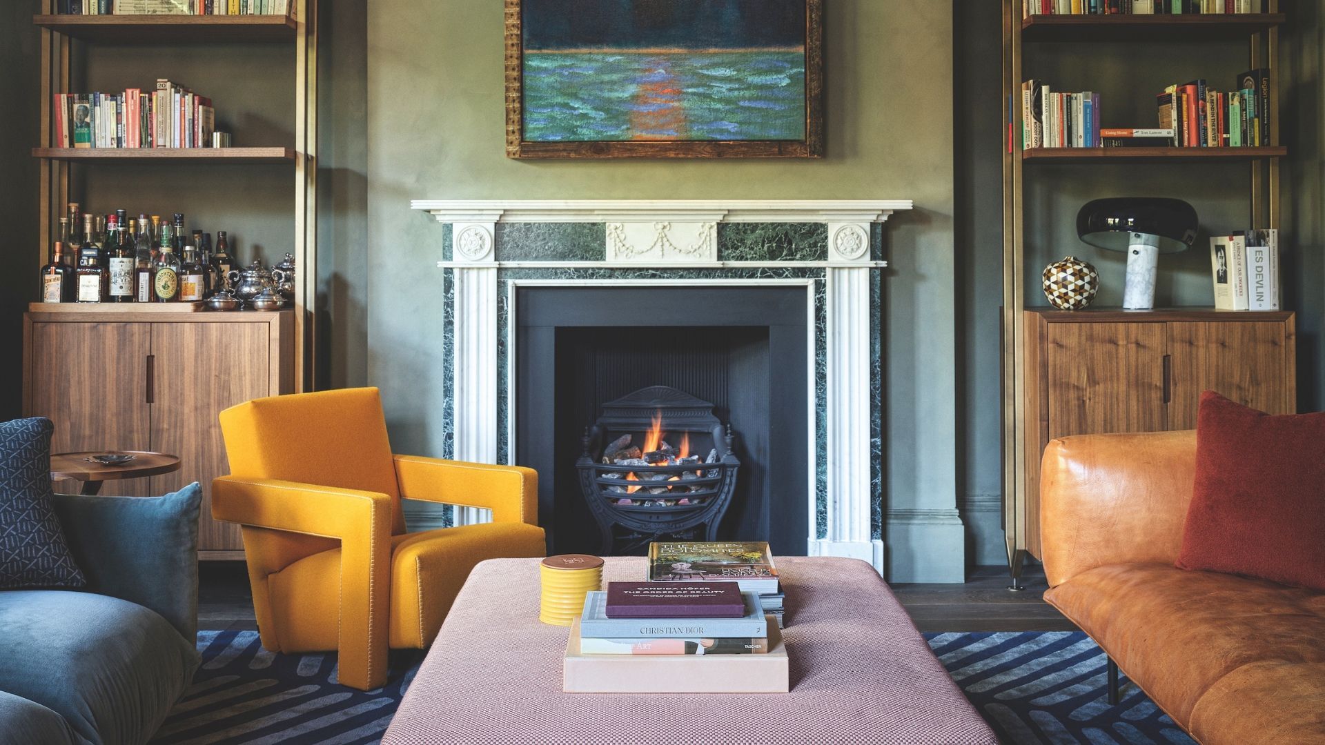
Sitting Room (above): Limewashed walls provide a mellow foil for sleek yet bold shapes. Walls in Olive; ceiling in Amsterdam, Bauwerk Colour. Joinery by Heat Architecture and Suzy Hoodless Studio; made by Costa Interiors. Utrecht chair in Lincoln in Zafferano, Cassina. Anders pendant, Pinch. Art by Alvaro Barrington. Marenco sofa (left), Twentytwentyone. Ottoman, Dudgeon Sofas.
‘It feels contemporary, yet it honors those Arts and Crafts roots,’ says Suzy. ‘After all, the movement was about eschewing mass production in favor of simple, joyful artistry – principles we fully embraced.’
For a home with an artistic history, given that former inhabitants include a 1920s-heyday jazz musician and latterly a beloved British actor, it feels fitting that these schemes give off a quietly rebellious energy. Alongside the owners’ existing pieces, Suzy mixed designs by B&B Italia and Gio Ponti with modern classics by Pinch and Hay. ‘It’s the juxtaposition that feels thrilling,’ says Suzy. ‘It results in a kind of third dimension which really shows off the personalities of the owners.’
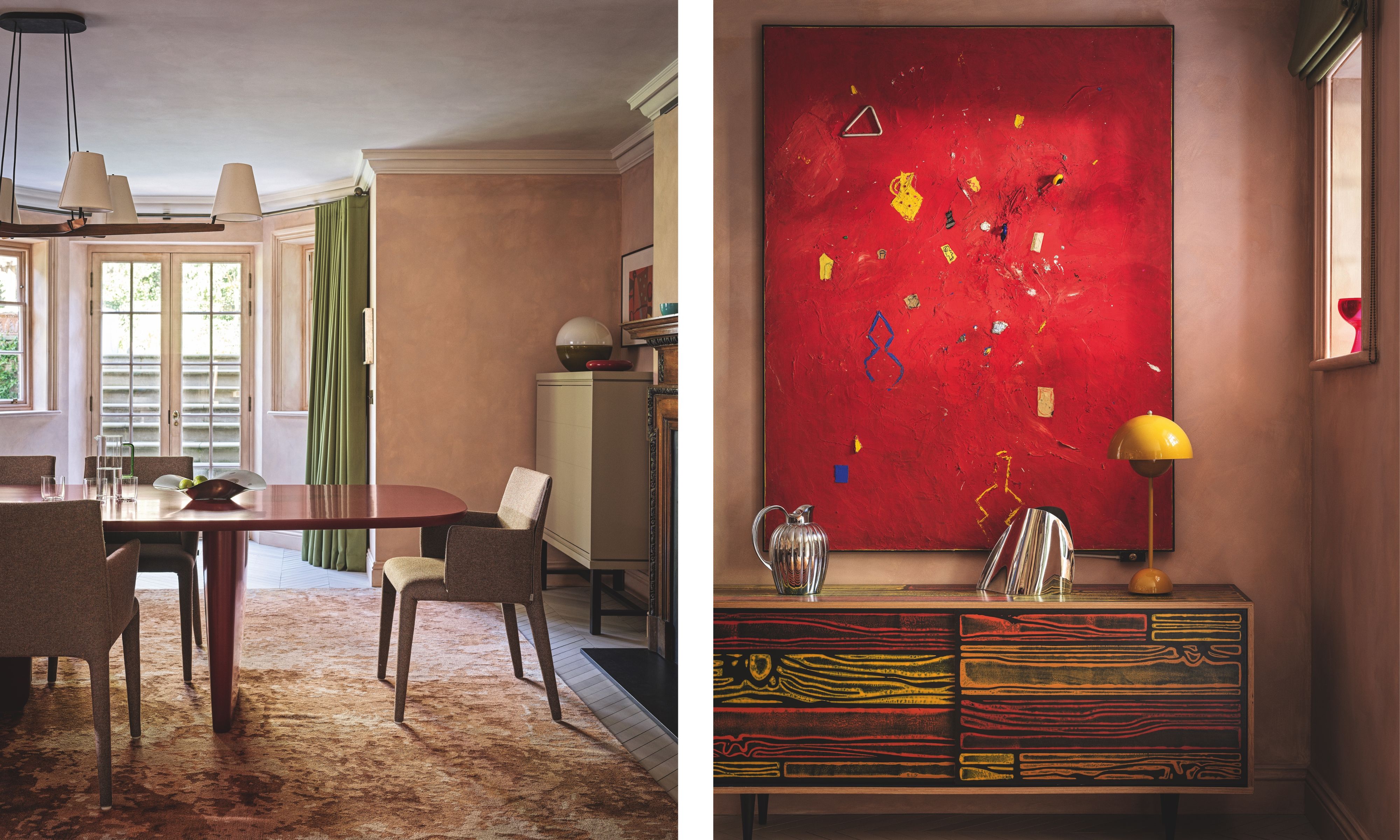
Dining Room (left): In the alcoves, the owners’ existing cabinets make a sleek, streamlined contrast to the Victorian fireplace, while textural, matt walls cement the dialogue between old and new. Walls in Rye; ceiling in Amsterdam, both Bauwerk Colour. Dining Room (Right): An unexpected inclusion of primary colors adds vibrancy to the soft-toned scheme. Flowerpot VP3 table lamp in Mustard, Verner Panton for &Tradition. Wrongwoods cabinet, Established & Sons. Painting by Roger Selden.
Two years after the project began, this home is in full swing. ‘You know you’ve done a good job when you are invited back for dinner,’ smiles Giancarlo, recalling the evening when everybody gathered to celebrate the building’s new era. ‘The owners didn’t want a showcase, but something that felt both vivacious and practical. Hopefully, that’s just what we’ve achieved.’

Emma writes across interiors, design, lifestyle, and travel for a number of titles, from The Times Magazine to Living Etc. A born and bred Londoner, she has written two books that celebrate her passion for architecture and design in the capital, including London Shopfronts and London Interiors.