Inside a Color-Rich San Francisco Queen Anne Home Where Painted Ceilings Take Center Stage
Studio Munroe balances historic elegance with joyful, family-proof design in this vibrant 1896 home

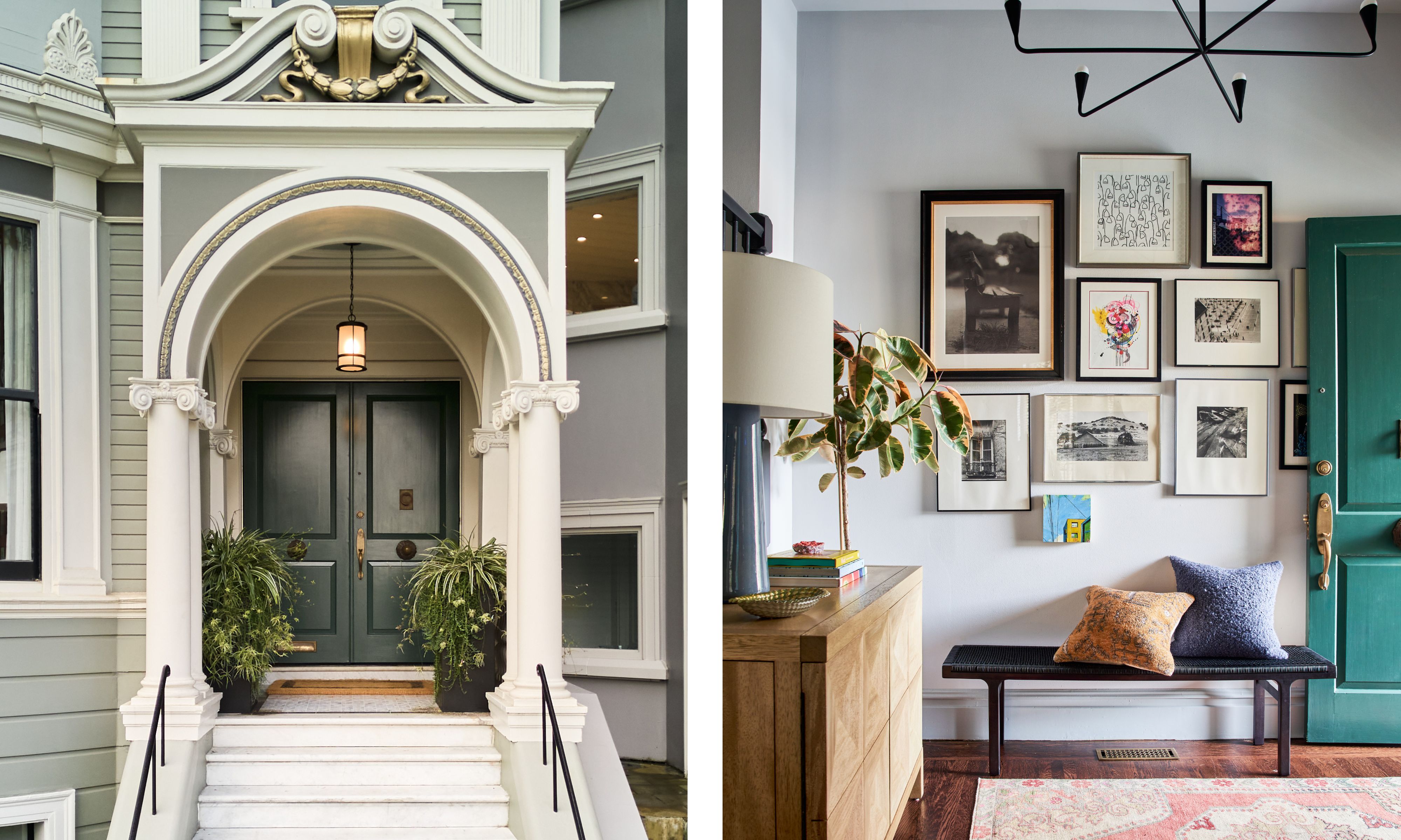
Set behind a gracious Queen Anne facade in San Francisco, this 1896 home offers little indication of the joyful color story within. Reimagined by the team at Studio Munroe, the historic house has been thoughtfully updated for modern family life, balancing period elegance with a relaxed, welcoming tone.
Inside, color takes the reins. Painted ceilings, playful decor, and some rather unexpected color combinations are the red thread that moves from room to room, guided by the home’s original architecture and a desire to create spaces that feel lived-in, not precious.
Designed for a busy creative family, the nearly 7,000-square-foot home embraces warmth, creativity, and practicality in equal measure. Each room of this grand house design has its own personality, is bursting with fun, and yet totally comfortable and cohesive.
Emilie Munroe, founder of Studio Munroe, explains how she was introduced to homeowner Maggie, director of brand outreach at Benefit Cosmetics, and her husband by previous clients.
'I was introduced to Maggie and her husband by a prior client who had children attending the same preschool,' Emilie explains. 'We had attended several years of their annual holiday parties together as guests, first catching each other’s eye because Maggie and I are both 6 ft tall.'
'When the time came to purchase their dream family home, Maggie reached out for support on both the construction,' completed by dream team David Armour Architecture and Peter Downey Construction, 'and interior design. Our shared history and social circle were the ideal foundation for a trustful and inspired collaboration, which meant our team could dive straight into the design process. This immediate trust created an efficient, joyful, and easy design experience for all involved – a treasured foundation.'
From the outset, Emilie set out to create what she describes as 'a warm, colorful, joyful interior space, with furnishings that feel as though they’ve been collected over the course of years.'
It was equally important, she adds, that the home never felt precious. And that sense of fun is felt immediately upon entry. Designed for a family of five, every space needed to be welcoming, functional, and robust enough to be enjoyed by everyone – from toddlers to grandparents.
'It was critical the client’s personality and personal effects were present in each space, radiating a natural and authentic feeling,' Emilie explains. 'The home had to be functional for their busy family, while also being authentic to their personal style, and never too precious or delicate. They wanted to be sure no room – or furniture piece – was off limits, that every space was welcome and able to be utilized by any and all guests, ages 1 to 101.'
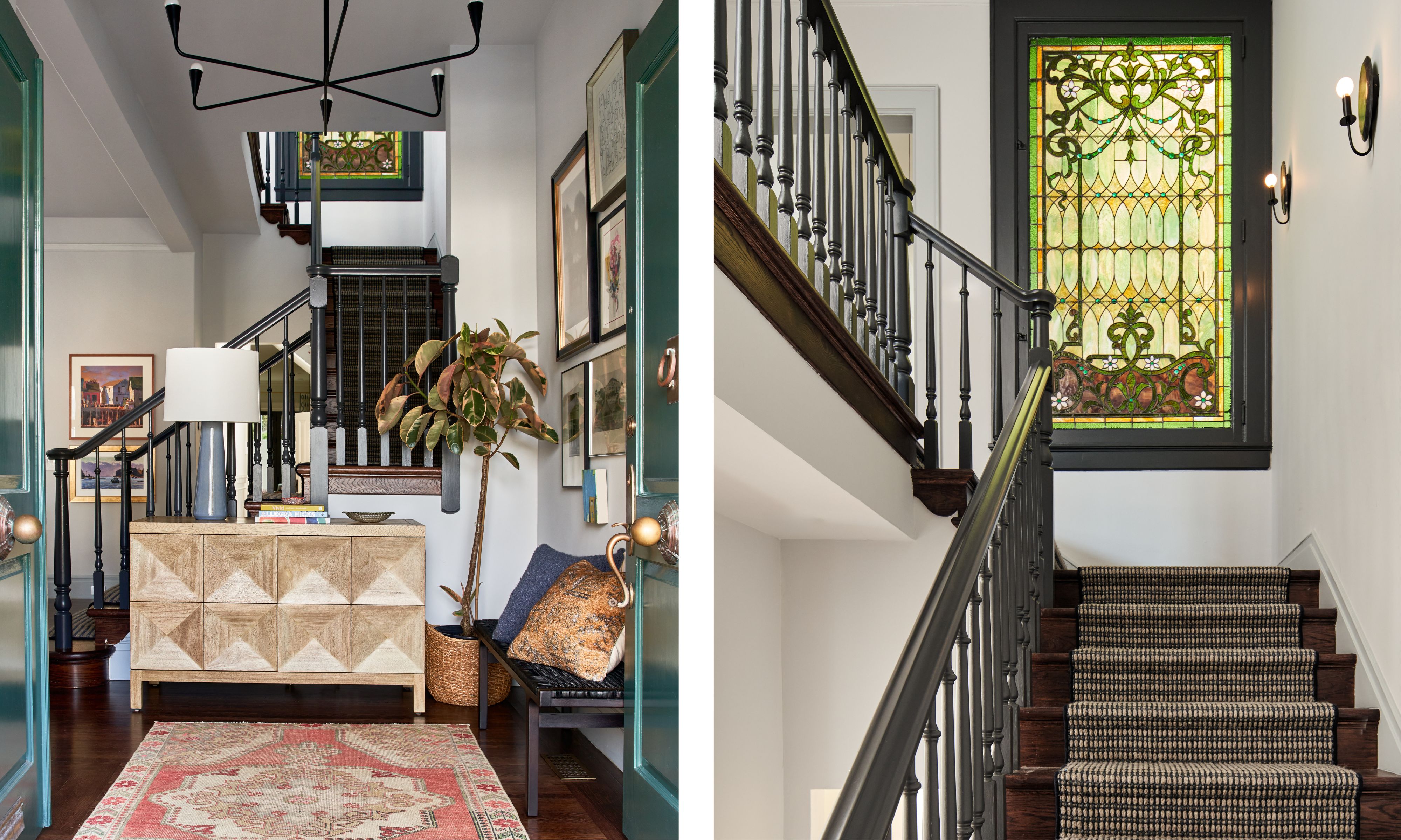
At the heart of the home is an entry with a secret atop the landing – a preserved stained-glass window dating back to the home's Queen Anne origins.
Both designer and client were immediately drawn to the piece, with Emilie noting that the emerald tones within the glass became 'the perfect jumping-off point for accent paint and accessories throughout the house.' From that moment on, shades of green began to weave their way through the interiors, acting as a connective 'red thread' that ties the home together across multiple floors.
'The task of modernizing the home’s interior to represent its young, energized inhabitants, while also honoring the elegance of the original architecture, was no small feat,' Emilie continues. 'One connective element was the various shades of green utilized throughout the redesign that tied back to the original Queen Anne style-stained glass fixed panel window located at the 1st landing of the staircase.'
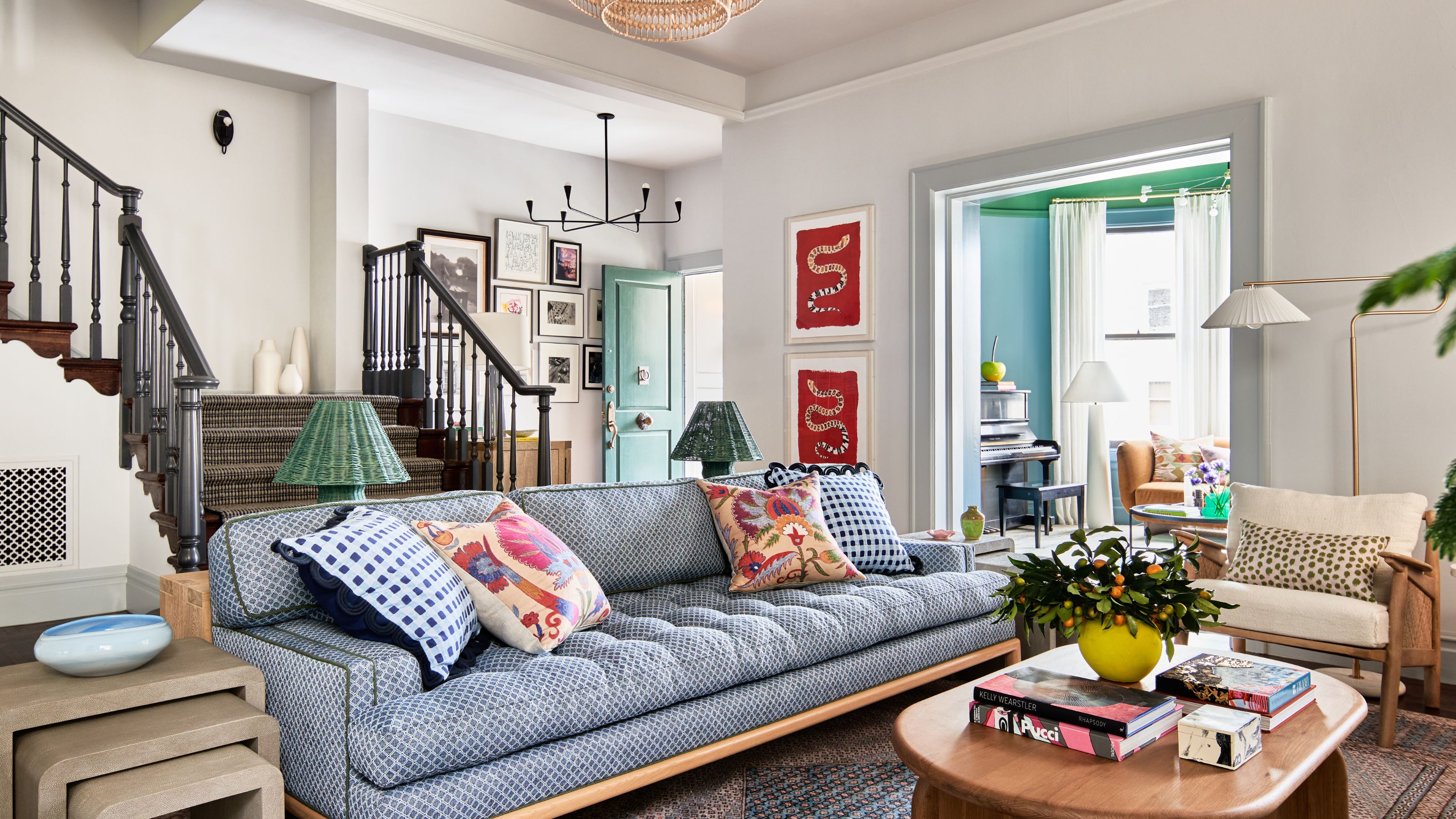
The staircase itself reflects Studio Munroe’s ability to balance heritage with modern maximalism. Dark-painted balustrades lend contrast, grounding the space, while a woven runner allows the stained glass to remain the focal point.
'First off, we wanted all construction designs to work for family members of growing ages and stages in life,' Emilie continues. 'Every aesthetic element needed to embody their dynamic, joyful spirit, while also standing the test of time.'
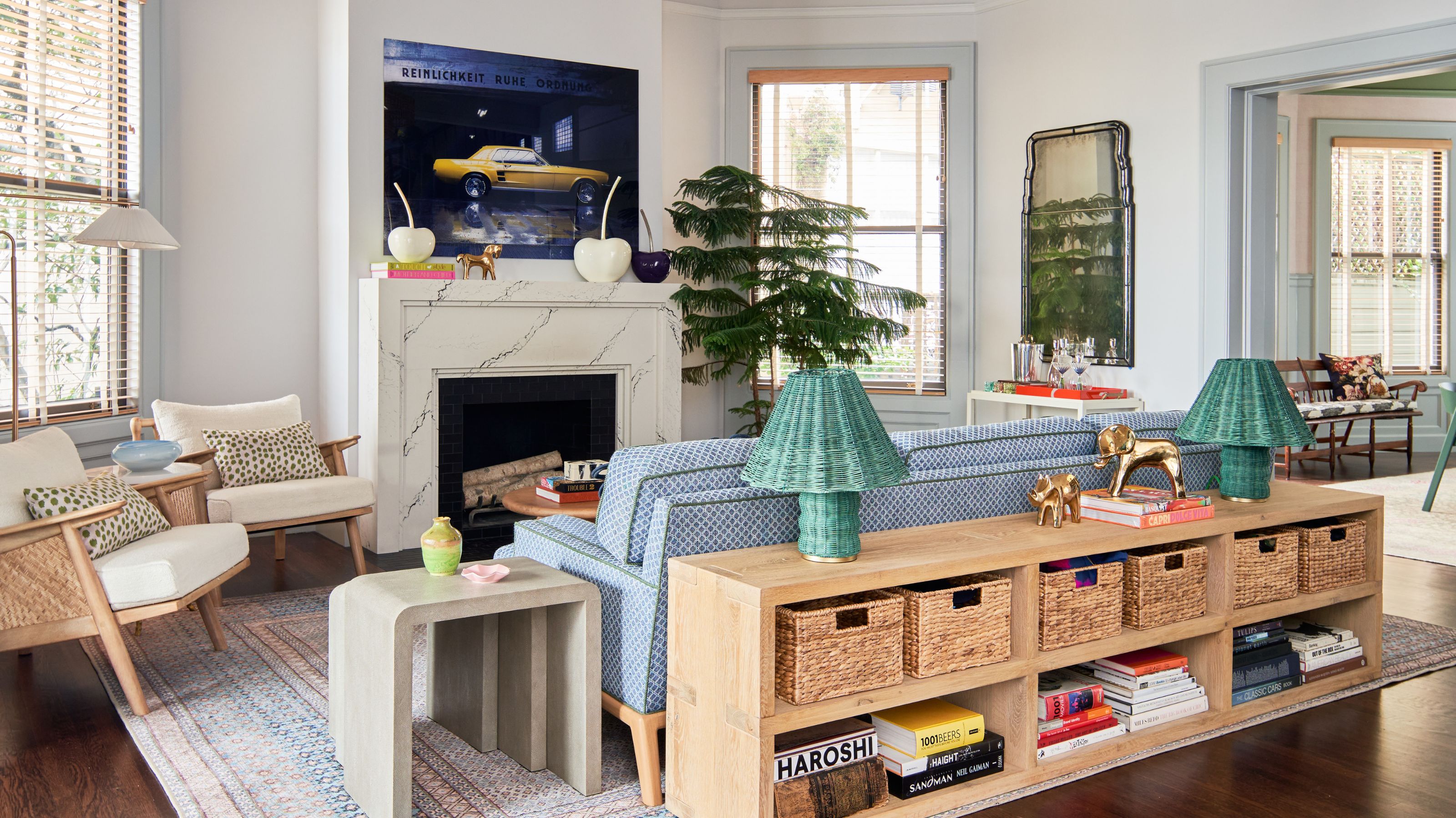
Rather than introducing color all at once, Emilie explains that the approach was about letting it unfold gradually, ensuring each room felt distinct yet connected. In this light and airy sitting area, Emilie gently wove those green and blue tones in to quietly introduce the home's color scheme.
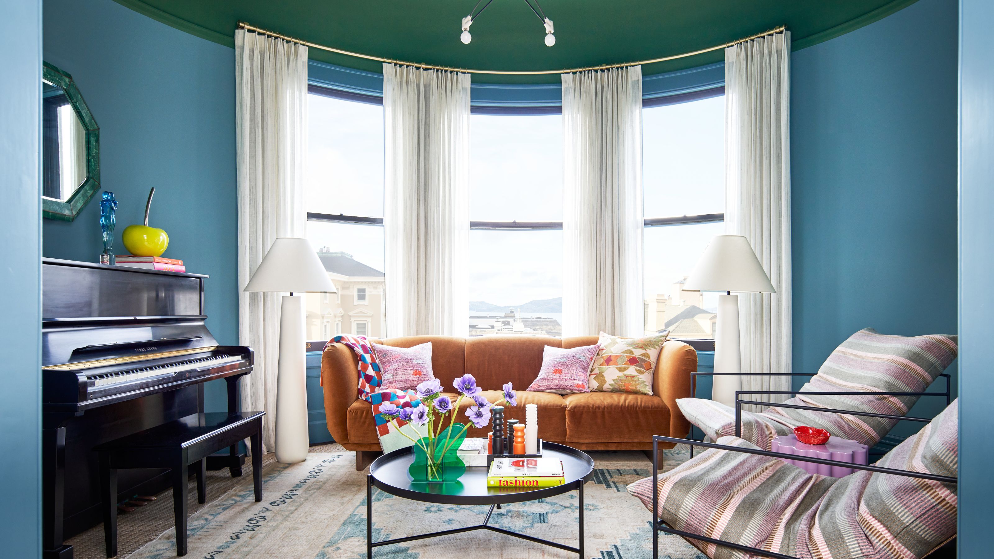
Flanking the living room at the front of the property, the 'Piano Room' offered Studio Munroe the opportunity to fully embrace their confident color combination of blue and green.
While nearby rooms were intentionally kept more restrained, this space was designed to feel cocooning. 'The Piano Room flanks the living room and lies directly across from the dining room, Emilie explains.
'We chose to keep the living room paint scheme a serene sliver grey so that the color-blocked paint scheme of the adjacent piano and dining rooms felt bold and eye-catching but not over-the-top,' she continues.
'In the Piano Room, the saturated jewel-like blue and green paint tones highlight the unique oval shape of the room to a cozy library-like feel.' Rather than fighting the unusual shape, color was used to celebrate it, allowing the walls and ceiling to work together instead of providing harsh contrasts with a typical all-white ceiling.

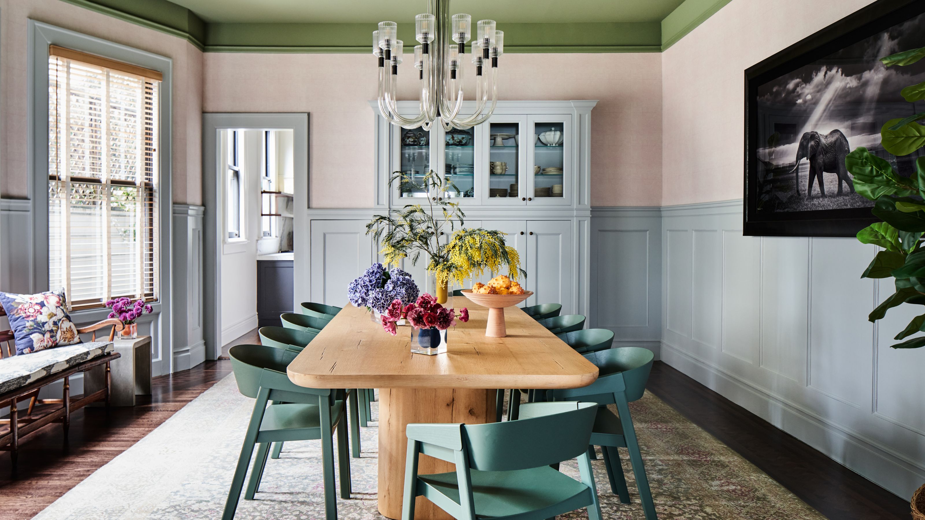
The dining room was designed to make a statement without overwhelming the flow of the house.
Here, a soft green accent ceiling becomes the room’s defining feature, drawing the eye upward and adding a playfulness to the space. Below, original paneling wraps the walls, lending an antique look yet refreshed in a serene silver-grey tone. Soft blush-toned walls bridge the transition between the two hues, adding warmth and softness.
'In the dining room, the silver-grey wainscot (previously stain-grade) enlarged the space and added a contemporary feel while maintaining a grounded elegance beneath the sage green ceiling,' Emilie explains.
Across these interconnected ground-floor spaces, Studio Munroe’s approach to color becomes less about individual 'main character' moments and more about movement. The palette evolves gradually, allowing each room to feel distinct while remaining part of a cohesive scheme. It’s a careful balance – bold where it counts, restrained where it’s needed – that gives the home its sense of flow.
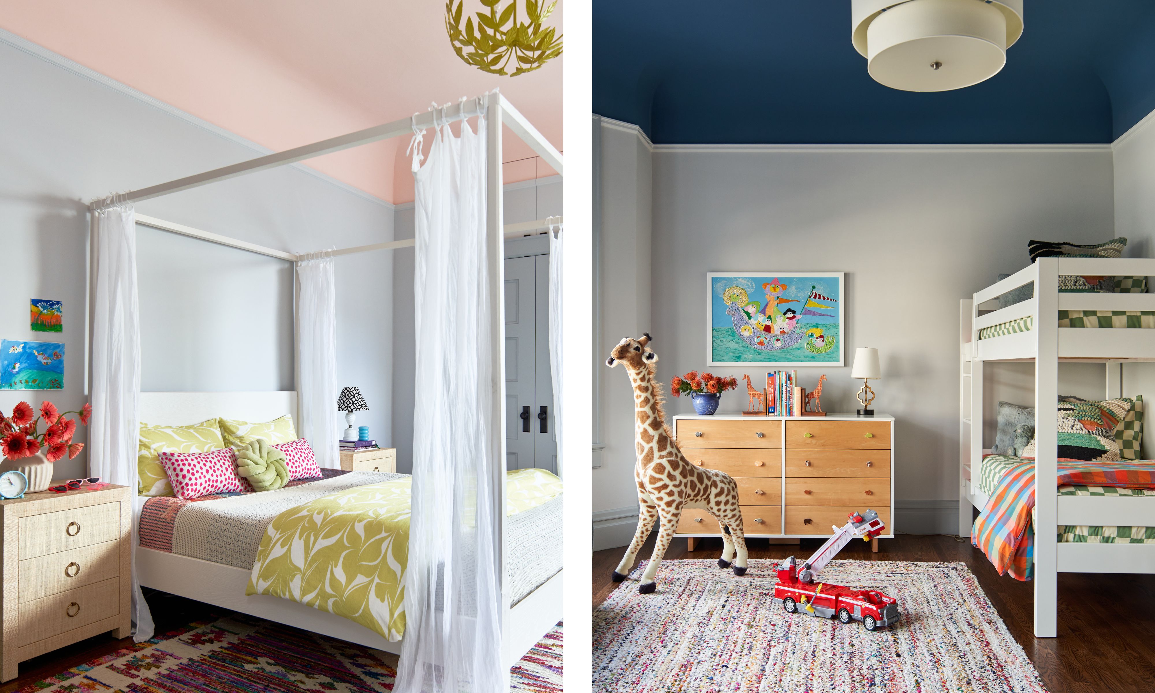
But that's not where the painted ceilings end. For Emilie, the fifth wall is never an afterthought. 'We always treat the ceiling as the fifth wall in a room, so accent ceiling colors are our norm,' she says. 'A complementary ceiling color will draw the eye upwards and nicely balance the visual weight of a colorful floor covering.'
Upstairs in the children’s bedrooms, color becomes a tool for imagination. Painted accent ceilings play a starring role again, introducing saturated blue and blush tones overhead while keeping the walls themselves light and adaptable to growing kids.
Below, neutral furnishings and cheerful textiles, rugs, and playful accessories keep the rooms flexible, ready to evolve as tastes change.
'Colored ceilings also affect the light quality in a room, with warm tones bringing a bright energy and cool tones creating a cozy, refined feeling,' Emilie adds.
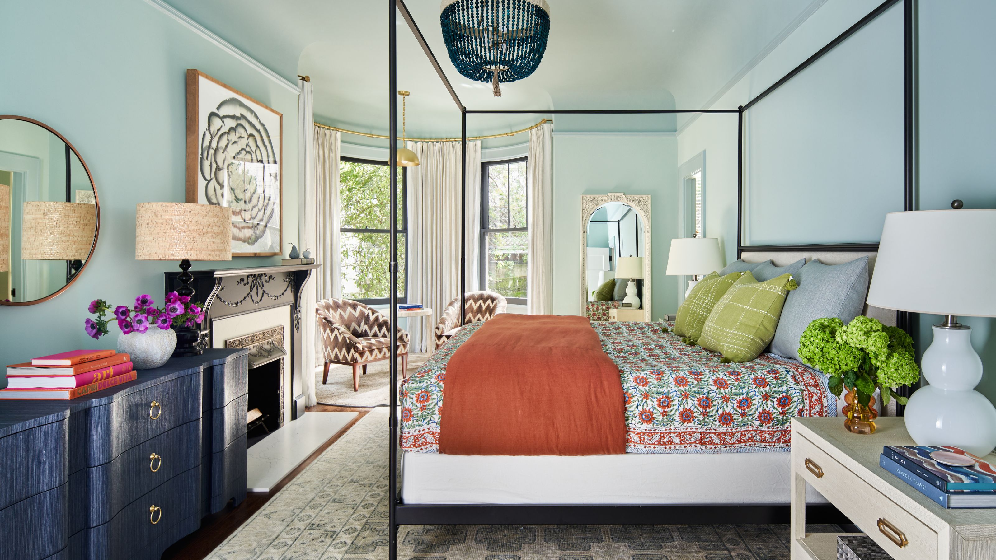
The primary suite offers a quieter interpretation of the home's palette. After the boldness of the entertaining spaces, the scheme here becomes gentler, designed to promote rest.
Soft blue-green walls envelop the bedroom, wrapping around the uniquely shaped room and original features, to create an atmosphere that feels both restorative yet color confident. The hue is bold enough to register, yet gentle enough to function as a neutral backdrop for a relaxing bedroom.
Rather than relying on contrast here, the room’s depth comes from layering – patterned textiles, a few deeper tones, and statement furniture pieces keep the palette from feeling flat without taking away from the architecture's character. A four-poster bed anchors the space, adding a sense of structure and elegance, while allowing the color-drenched walls to take center stage.
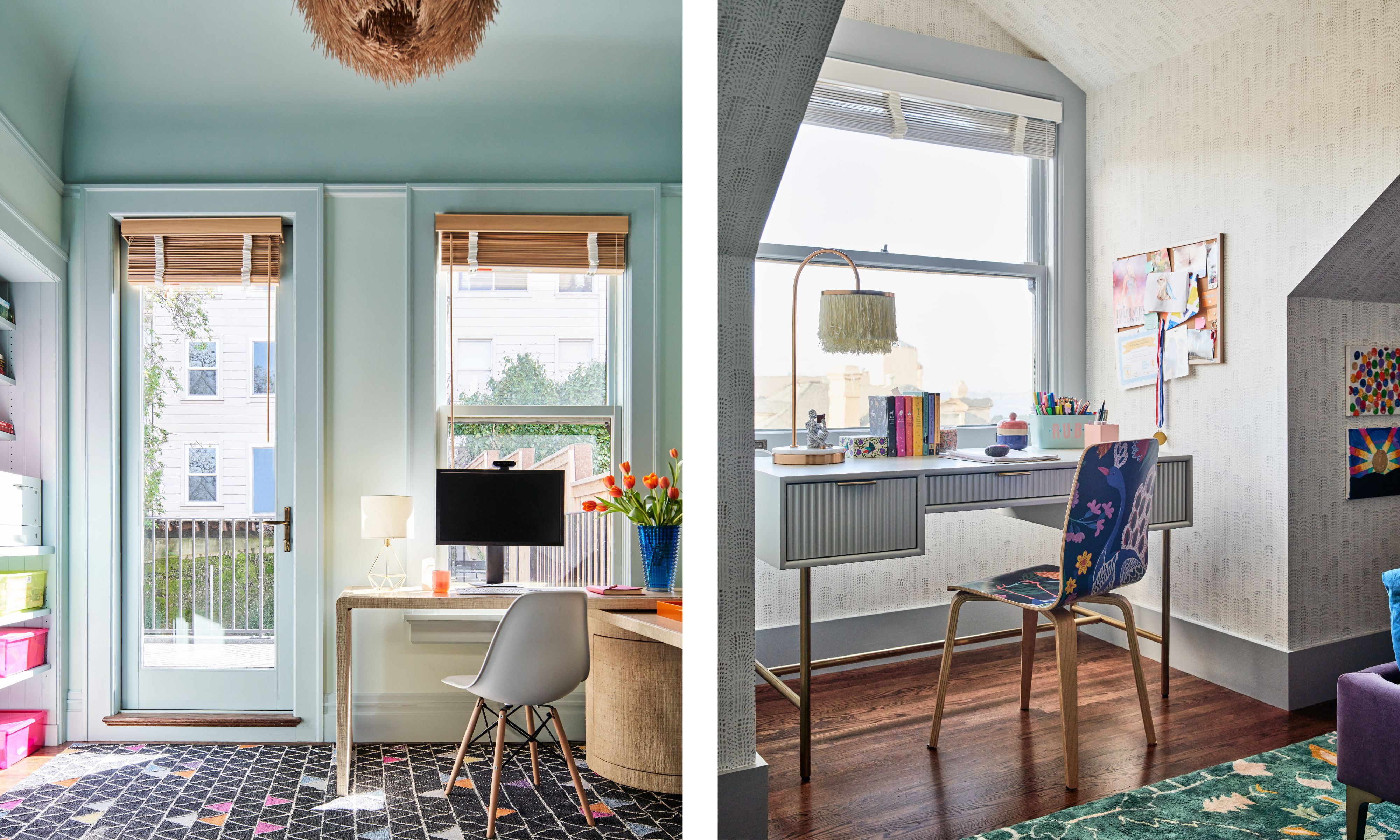
'Both Maggie and her husband work from home, so their home office designs were key,' Emilie continues.
Maggie’s office, in particular, required a careful balance between creativity and functionality. 'Maggie films video content from her office, so special care was taken to align the color scheme and room layout to company branding and media needs.'
In contrast, the second home office takes on a more subdued character. While still cohesive with the home’s overall palette, the scheme here leans quieter and just a touch more masculine, offering a space for focus and separation from the busier family areas.
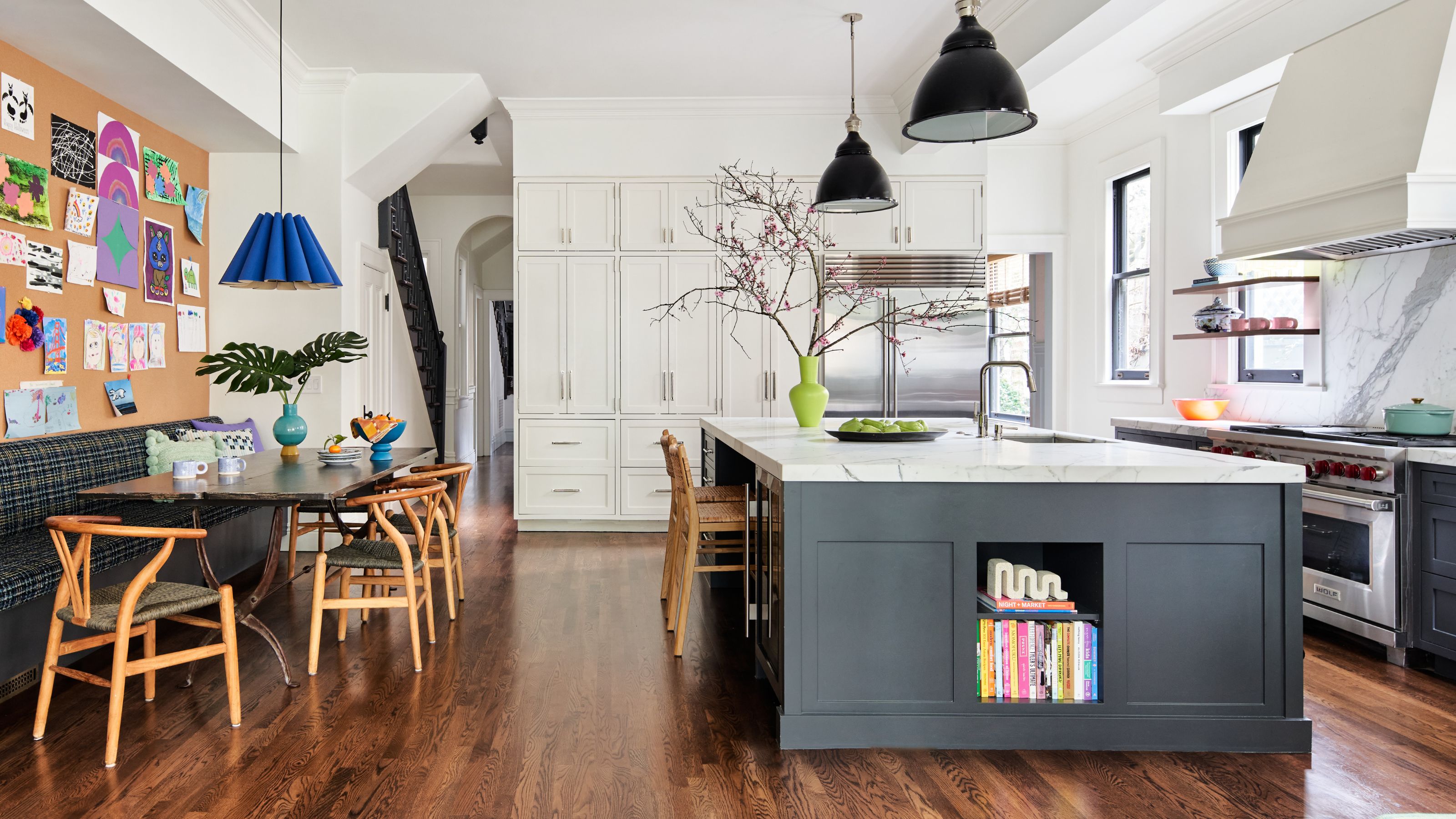
Of course, one of the most important spaces in any family home – but particularly a family who loves to host – is the kitchen.
'The family entertains regularly, so creating a sense of indoor/outdoor living in the open-plan kitchen, breakfast, and family room areas was critical in expanding their entertainment space,' Emilie explains.
In here, she's continued yet softened the palette, using color to energize rather than dominate the white and gray kitchen. Subtle tonal shifts, plenty of clean white marble, and thoughtful detailing bring depth to the space while keeping it functional.
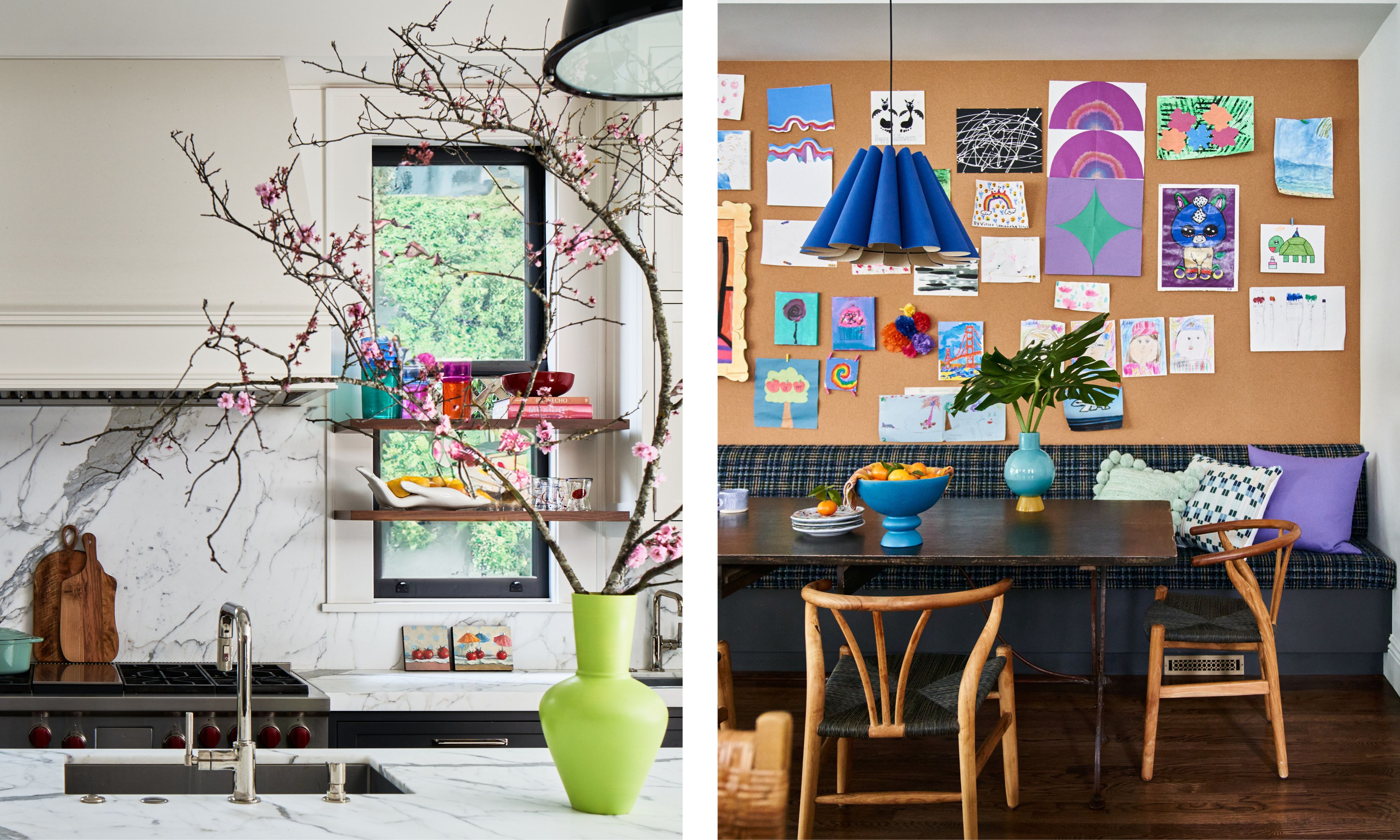
The breakfast nook, in particular, makes a lovely spot for gathering, with color used to define the zone without closing it off. The back wall, clad in cork, makes for a living, breathing gallery wall for children's artwork, invitations, and to-do lists.
The result is a family-friendly space that adapts easily from weekday mornings to long, casual weekend dinners.
'As with any dual-working family with three young kids who are looking to create a forever home, there were many logistics top of mind when we began to design,' says Emilie. 'We wanted all construction and design to work for family members of growing ages and stages in life. Every aesthetic element needed to embody their dynamic, joyful spirit, while also standing the test of time.'
With its confident yet thoughtful use of color and playful approach to design, this San Francisco Queen Anne feels less like a finished "design project" and more like a lived-in family home. Studio Munroe's work proves that a limited color palette can be used with boldness and whimsy, while still maintaining a feeling of comfort and relaxation. Each space has its own personality and purpose, yet remains tied to a common energy that suits such a vibrant family.

Charlotte is the style and trends editor at Homes and Gardens and has been with the team since Christmas 2023. Following a 5 year career in Fashion, she has worked at many women's glossy magazines including Grazia, Stylist, and Hello!, and as Interiors Editor for British heritage department store Liberty. Her role at H&G fuses her love of style with her passion for interior design, and she is currently undergoing her second home renovation - you can follow her journey over on @olbyhome