7 Best Colors Designers Say You Should Use to Make Your Home Feel Fresh, Light and Spring-Ready
From airy sky blues to uplifting lilacs, these are the colors to bring freshness to your home post-holidays

Design expertise in your inbox – from inspiring decorating ideas and beautiful celebrity homes to practical gardening advice and shopping round-ups.
You are now subscribed
Your newsletter sign-up was successful
Want to add more newsletters?
If you're anything like me, as soon as the holidays are over, festive decor has to go quickly. Not only does that mean that holiday decorations are boxed up for another year, but the rich color palettes of the festivities soon feel out of place: I'm all about a fresh home that feels calming and uncluttered for the year ahead.
And while you probably aren't looking to totally reinvent your home's color schemes, it's about the smaller decor swaps that can reset your space and bring new life to each room. Intrigued by what designers have to say on the best colors to make a home feel fresher for 2026, I asked them for their favorites, which you can explore below to inspire your room color ideas.
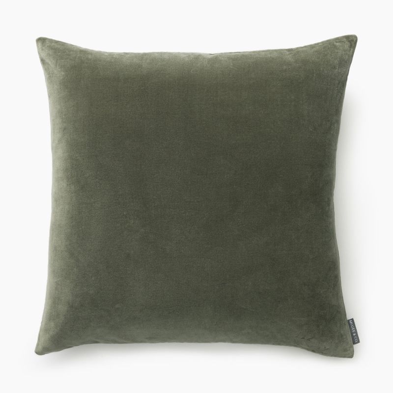
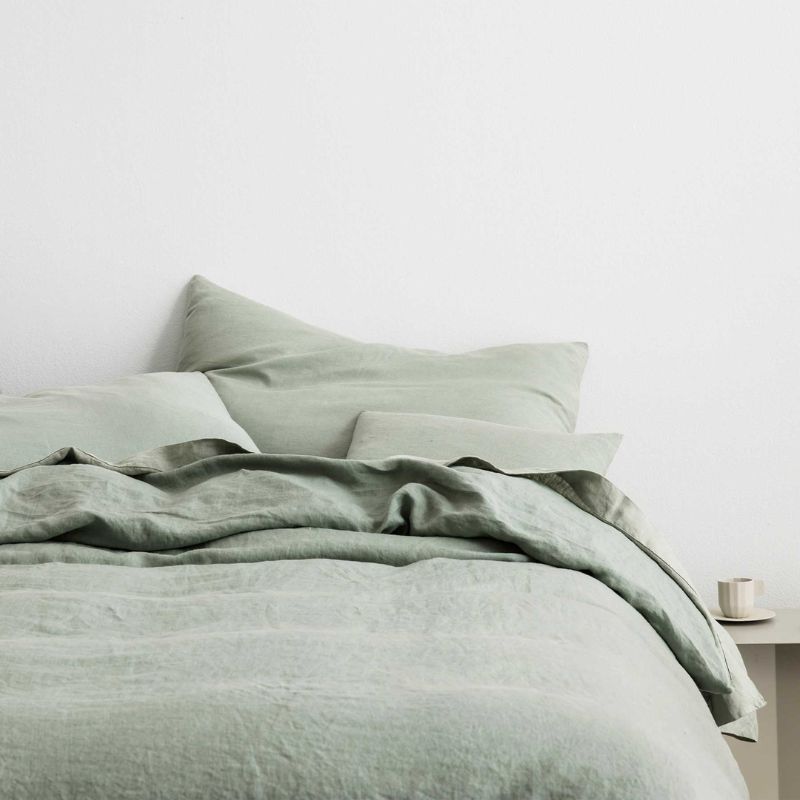
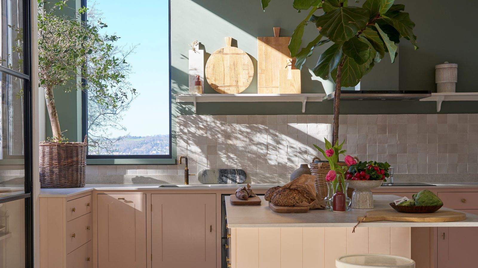
1. Soothing Greens
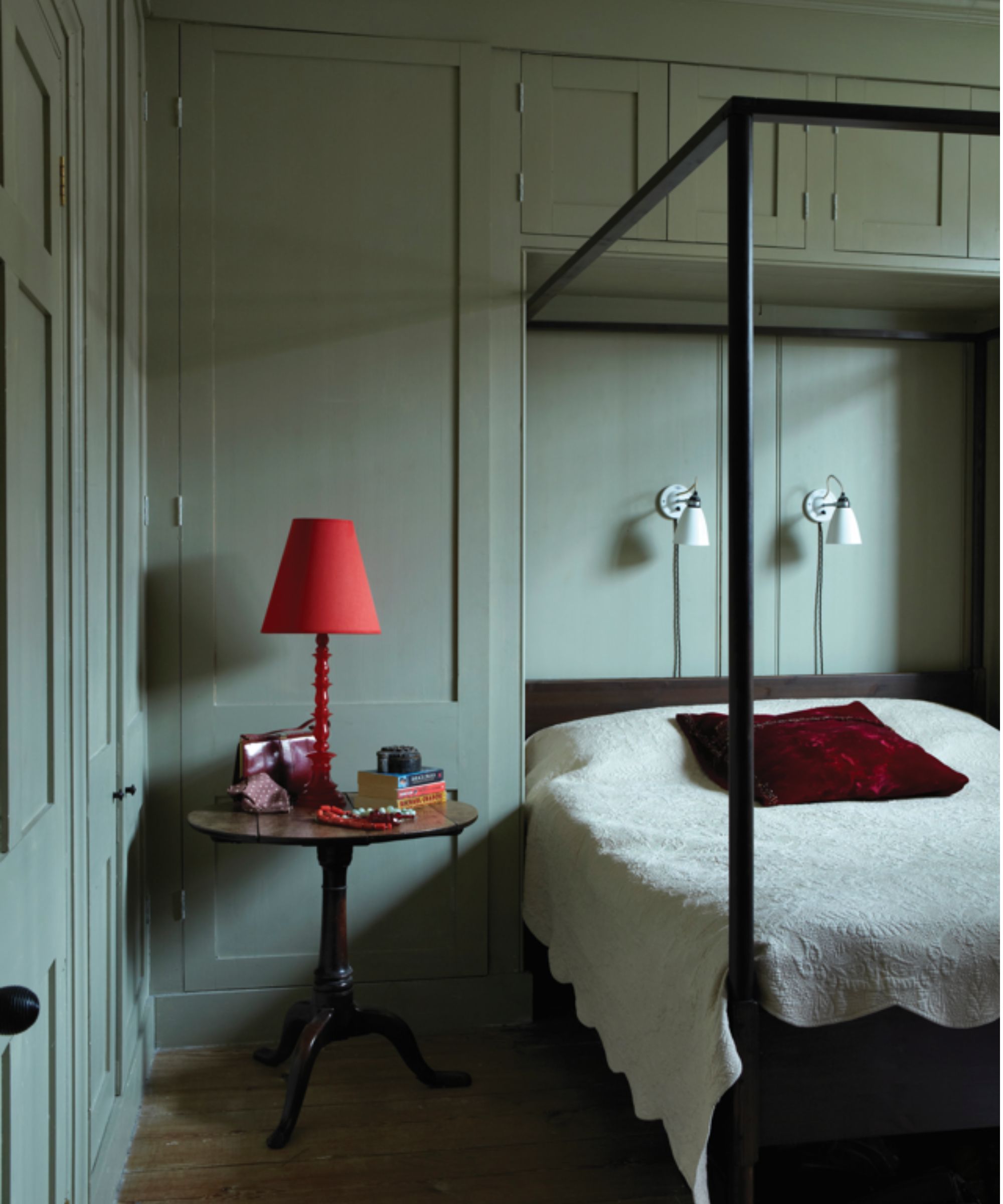
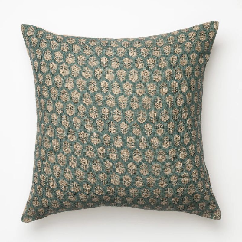
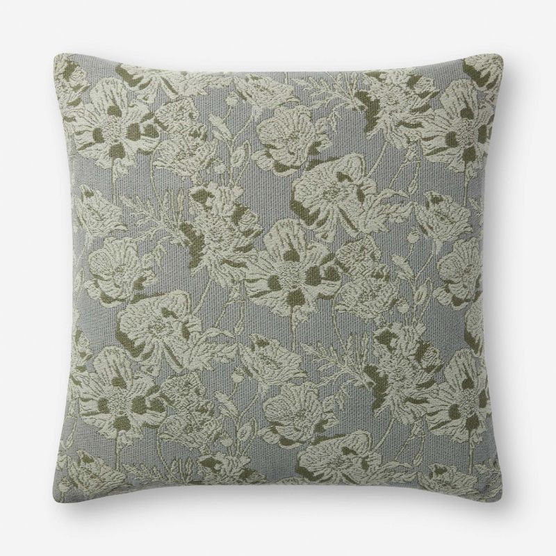
Green room ideas offer appeal year-round, but certain shades feel extra fresh for the start of the new year. 'For 2026, a soft mineral green with a gray undertone delivers an instant sense of freshness after months of heavy holiday reds, browns, and metallics,' says interior designer Lauren Saab. 'This color is perfect for reflecting natural light and provides a constant, even energy in a room without being cold or washed out.'
Article continues belowGray-green is also a favorite color choice for Kristina Khersonsky of STUDIO KEETA. 'A cool, muted green-gray, something that sits just adjacent to a pastel without fully becoming one, feels especially fresh right now. It brings in lightness and clarity, but still has depth and presence.'
When it comes to decorating with paint, some of Kristina's favorites are Farrow & Ball's French Gray and Vert de Terre, and Backdrop's Road to Todos Santos. Or, if you're adding this soothing hue through smaller decor pieces, complete the look with light colors and natural materials. 'Warm white, light wood, limestone, and unlacquered metal are some great options to pair with soft mineral green,' says Lauren.
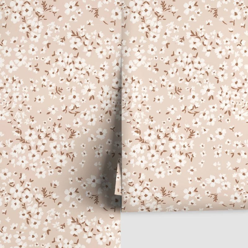
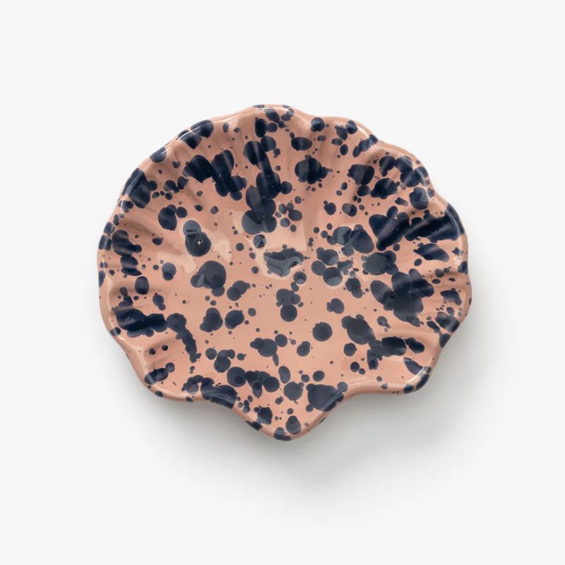
2. Dusty Pinks
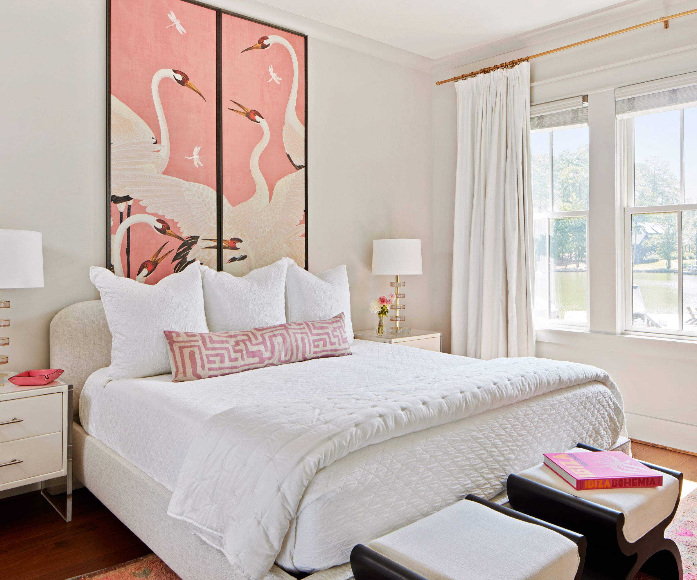
Designers are favoring pink as a fresh color choice for 2026. While richer warm tones – think wine reds and velvety purples – can feel aligned with the festivities, a dusty pink offers timelessness. 'Not the sugary baby girl pink that we all think of for nurseries, but the moody, muddier pink that you see on the walls of British country houses, or the sophisticated pink that is shown in this Gucci wallpaper,' says designer Lauren Conner.
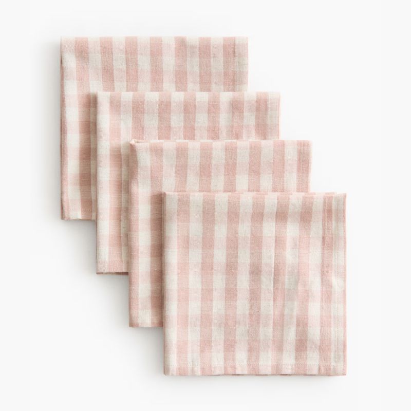
Andrea Goldman is also championing pink. 'A great paint selection to freshen up your space is Benjamin Moore's Morristown Cream, which is the perfect dusty, soft pink that still feels like a neutral. You can also layer in a mix of muted pinks and warm brown tones with textiles. It's a super simple refresh that makes your home feel luxe and cozy heading into 2026.'
Design expertise in your inbox – from inspiring decorating ideas and beautiful celebrity homes to practical gardening advice and shopping round-ups.
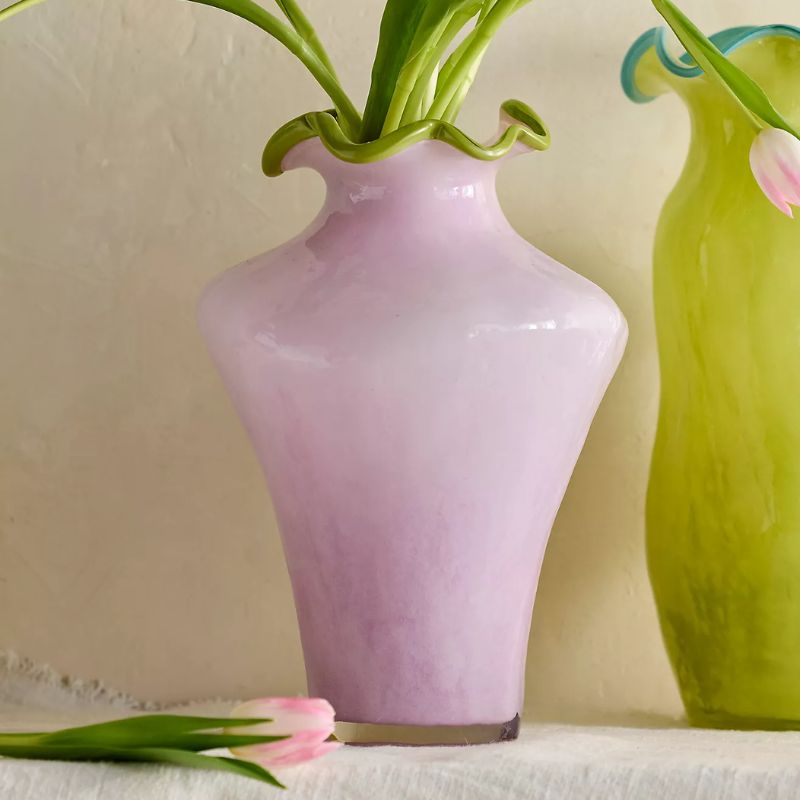
3. Soft Lilacs
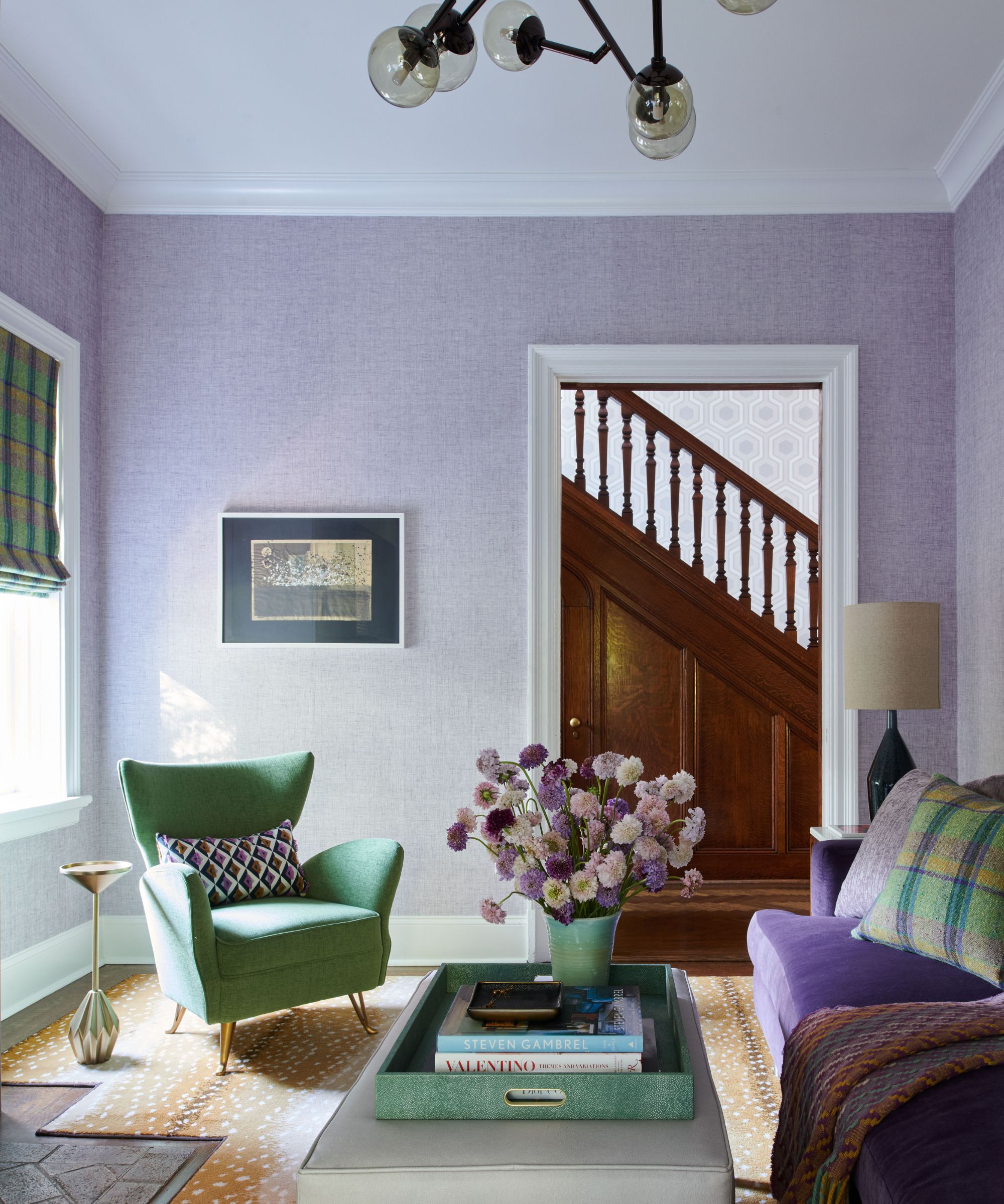
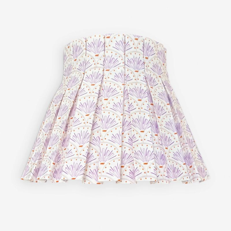
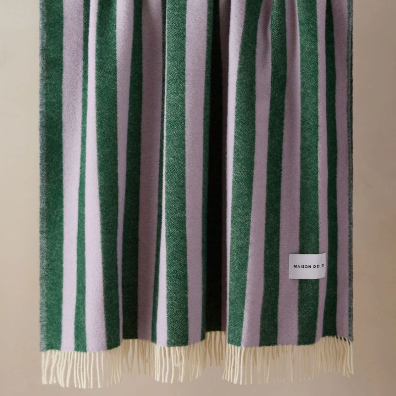
Lilac feels like a fresher take on the purple color trend. 'If you're looking to refresh your space for 2026, consider painting your study, bedroom, or living room a soft purple like Benjamin Moore's Peace and Happiness or Touch of Gray,' recommends designer Betsy Wentz. 'It can add a touch of sophistication and calmness to your room, creating a soothing atmosphere perfect for relaxation. Plus, it's a versatile hue that pairs well with neutrals, woods, and pops of green, giving you endless options for furniture and decor.'
Another designer-approved lavender paint is Farrow & Ball's Calluna, which has a darkened quality so it's not too vibrant. 'Calluna brings freshness to a space while still offering depth – an ideal reset after heavier seasonal palettes,' says Jennifer Nichols of Fairfax Dorn Projects. 'In natural light, it shifts gently throughout the day: sometimes cooler, sometimes warmer, adding quiet movement to a room.'
When decorating with a soft lilac on the walls, Jennifer recommends avoiding harsh contrast. 'Layer in creamy whites and warm linens rather than stark contrast. Use natural woods, rattan, and ceramics to enhance the color’s organic quality.'
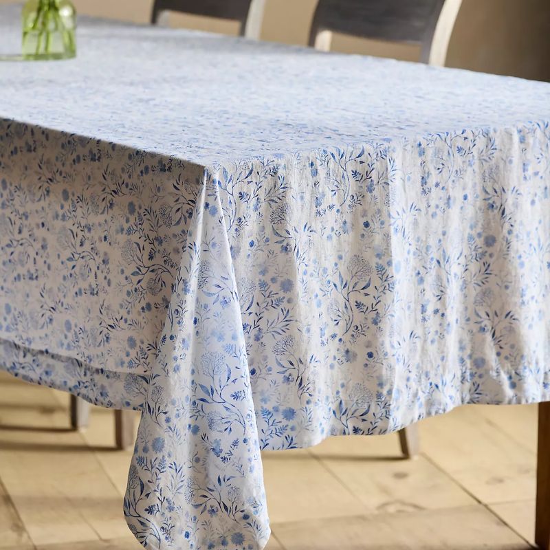
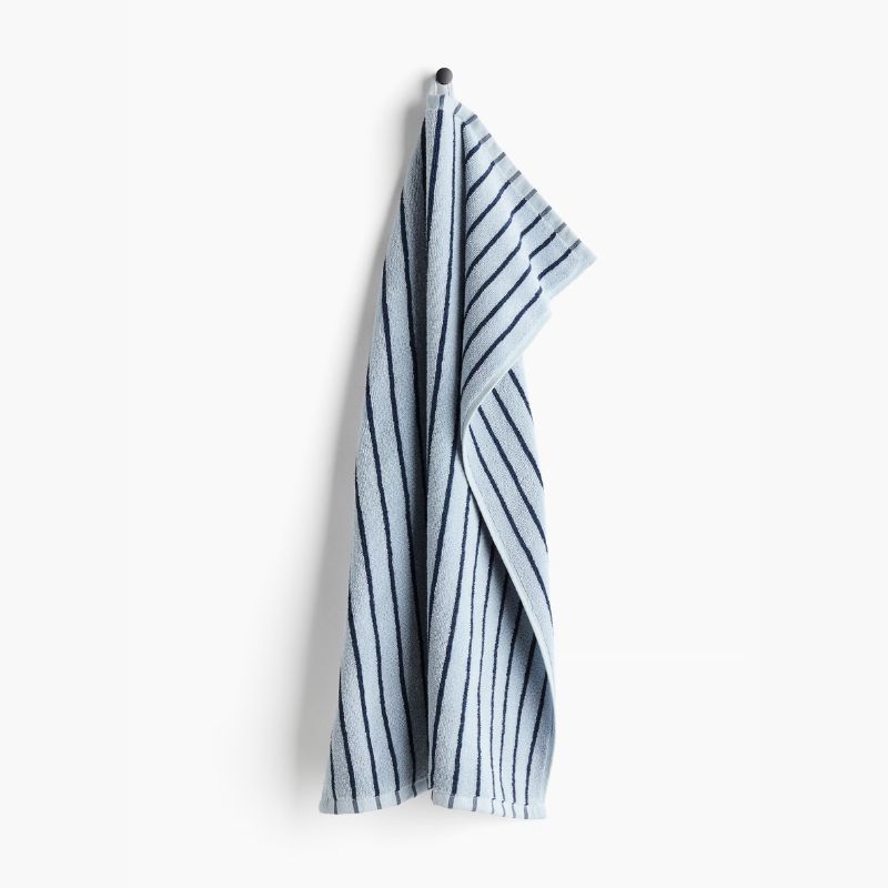
4. Light Sky Blues
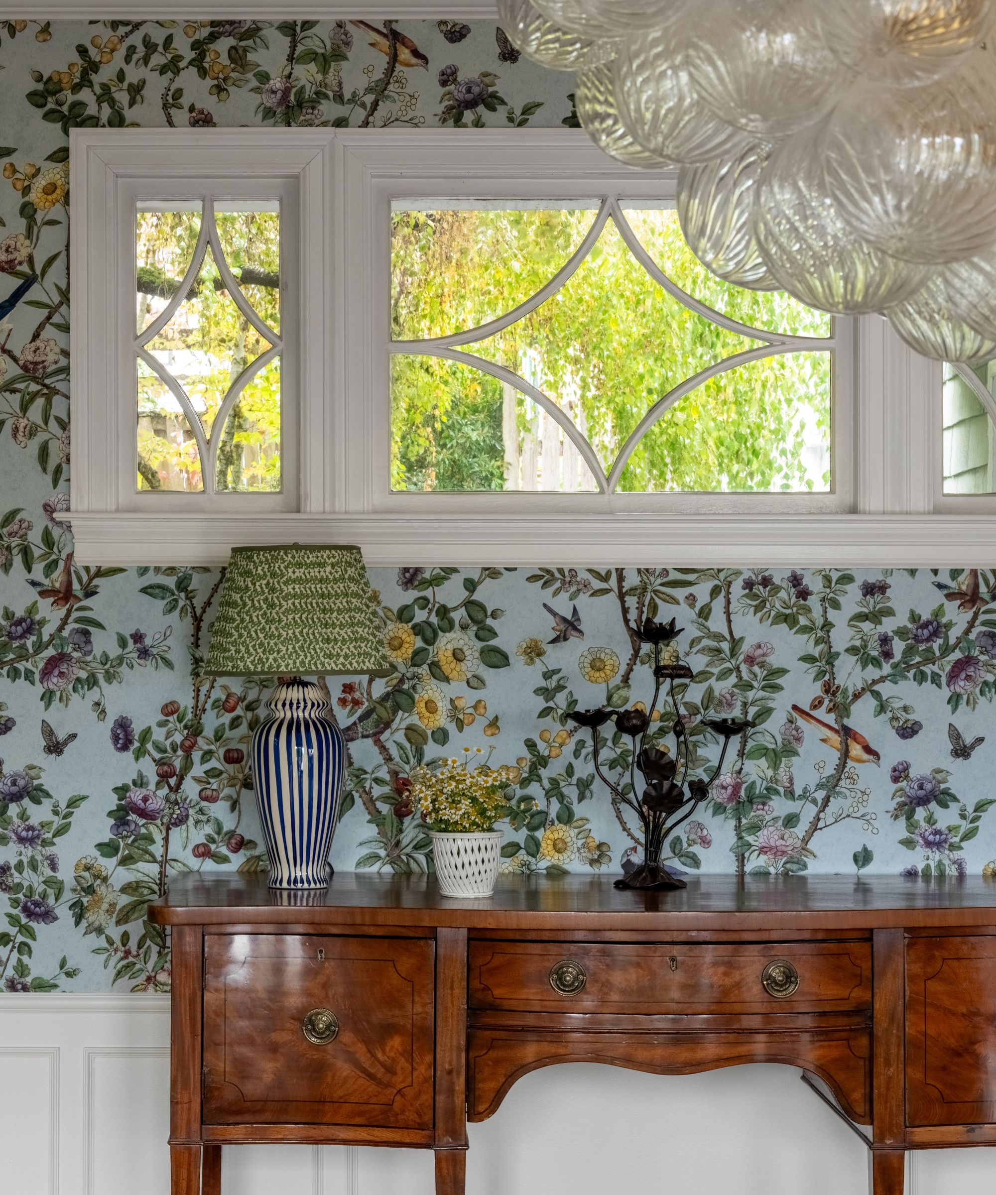
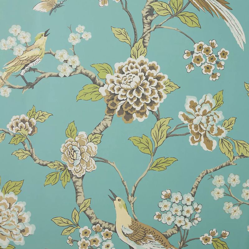
Blue room ideas are one of the first to come to mind when thinking of fresh color schemes. Instead of rich navy blues, go for gentle light blues, which feel serene and crisp. 'For 2026, I recommend a fresh sky blue – the kind you see in nature every day: clear blue sky, coastal water, winter light,' says designer Stephanie Kraus. 'After a season of rich holiday tones, it instantly resets a home and makes everything feel cleaner, fresher, and more breathable.'
'Pair it with warm materials so it feels elevated,' Stephanie adds. 'My favorite combinations are sky blue with white oak, natural stone, linen, and soft ivories, and I would add touches of unlacquered brass.'
Soft blue is also a favorite for designer Carly Gray, who used this hue in wallpaper here. 'Bringing in colors from nature can enhance natural light and help us feel grounded,' she says. 'These shades offer a refreshing balance, evoking calmness while adding interest and depth to a space.'
5. Teal
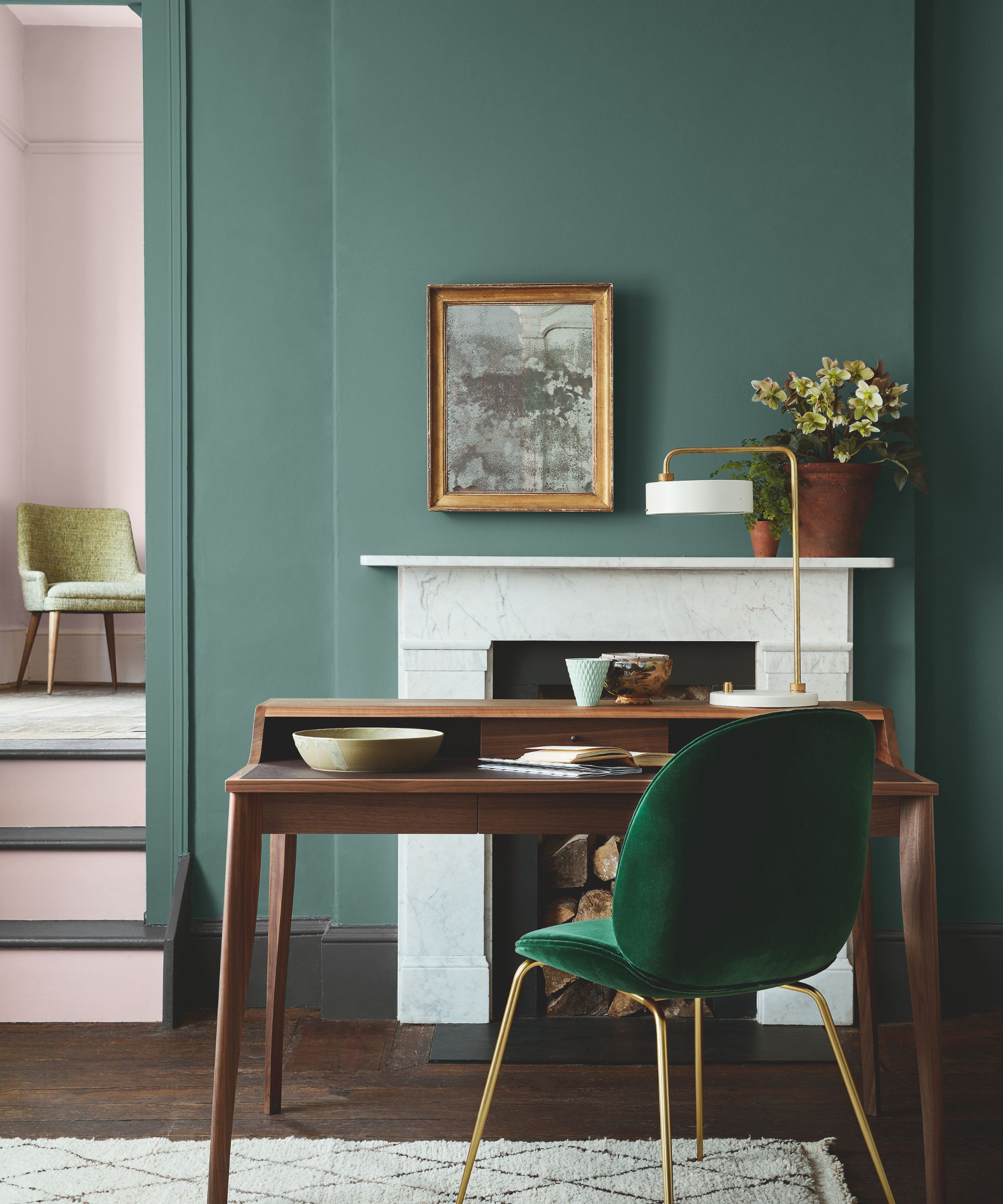
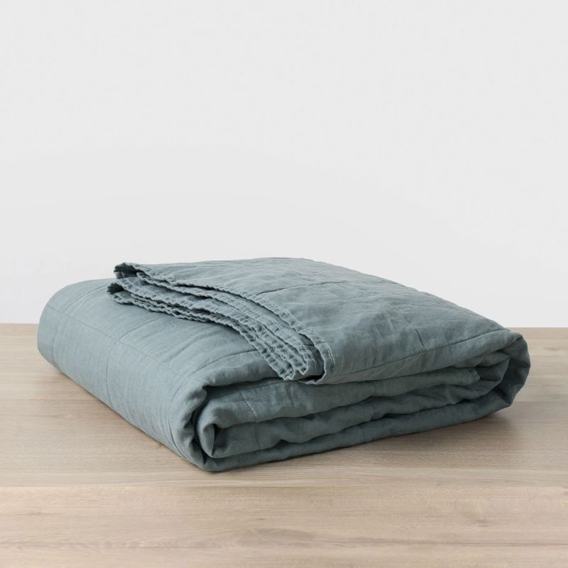
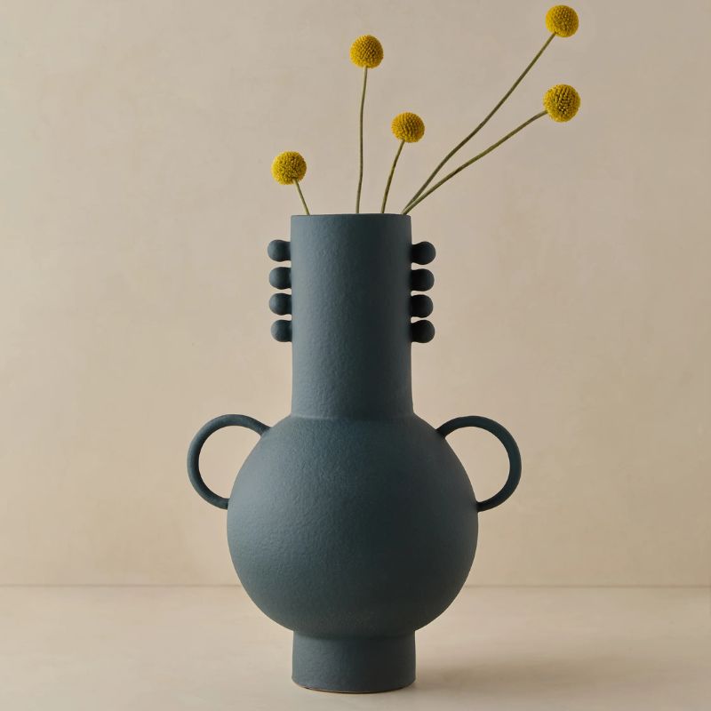
Teal has been a trending color of late, working as an in-between color that combines the calming appeal of blue and green. But it's not just jewel tone interpretations of this hue that designers are loving, but softer, muted tones that lend a refreshing quality for the new year.
For interior designer Jessica Whitley, Benjamin Moore's Knoxville Gray is a favorite paint color. 'It’s ideal for dining rooms, libraries, living rooms, and primary bedrooms where you want a cocooning, restorative atmosphere,' she says. 'I used this color in my own formal living room and layered it with a Moroccan rug featuring chocolate, toasted chestnut, and warm ivory tones.'
But it's not just paint ideas to consider when decorating with teal. Smaller additions of this natural world-inspired hue are a great way to add color and freshness to a space, especially in neutral rooms.
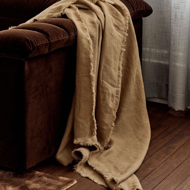
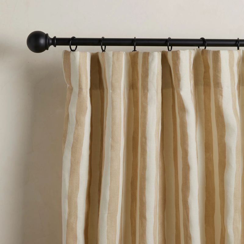
6. Warm Beige
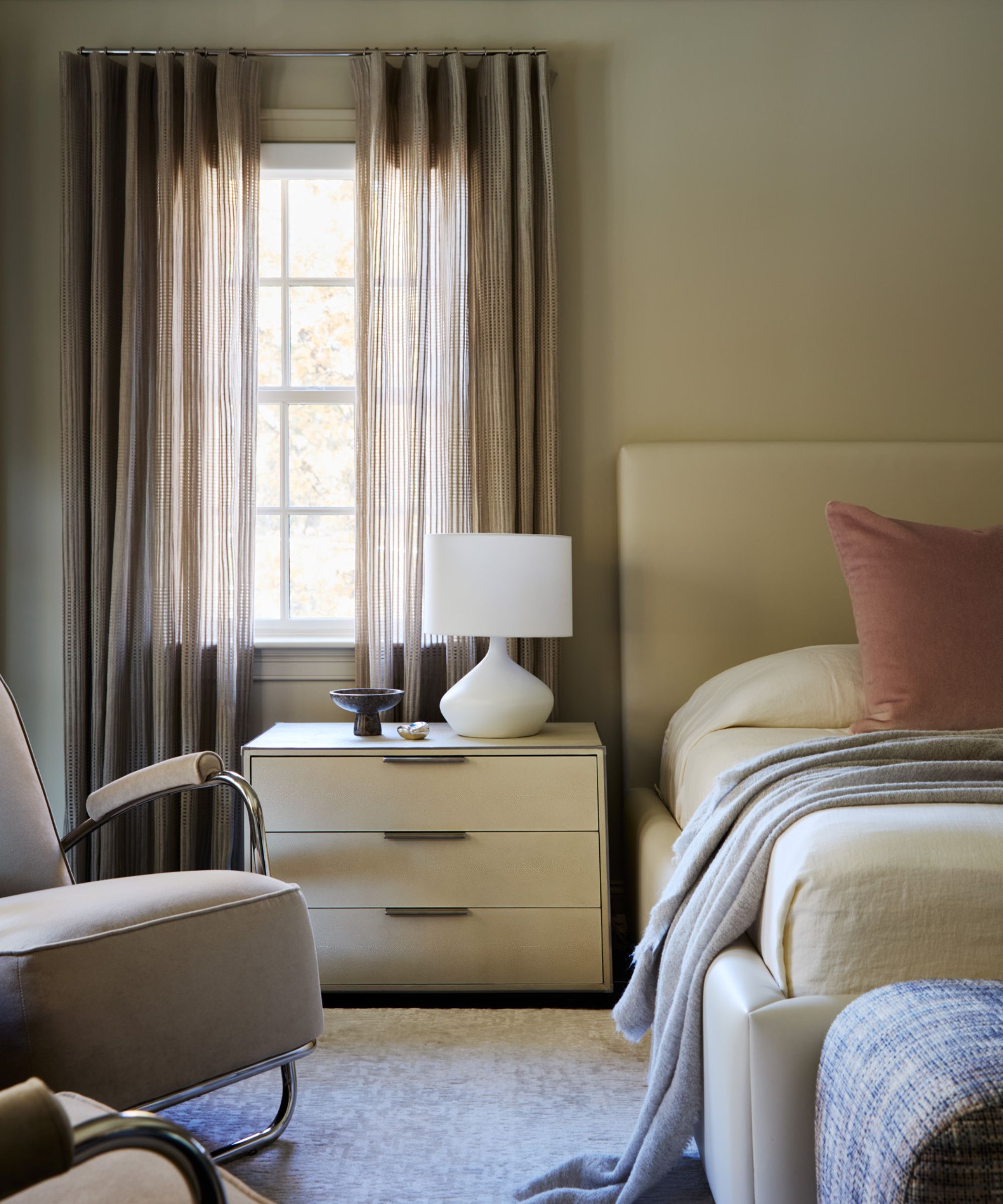
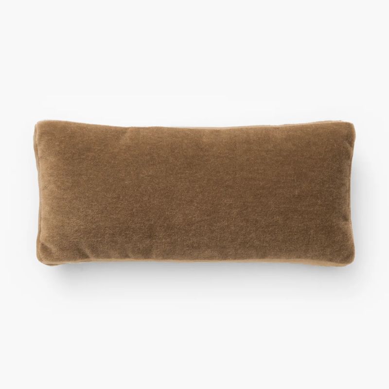
Don't rule out decorating with neutrals when adding freshness to your home. For designer Nicole Hirsch, a palette of warm beige is a go-to. 'This soft, neutral foundation creates a zen-like atmosphere that promotes clarity and calm as you step into the new year,' she says.
To add this timeless shade to your home to add freshness, Nicole recommends layering textiles. 'Luxurious, plush materials such as velvet and textured mohair work beautifully in pillows or drapery, adding warmth and a soothing, layered feel. To introduce subtle color without the boldness of holiday tones, pair these neutrals with blush accents for a gentle, sophisticated touch.'
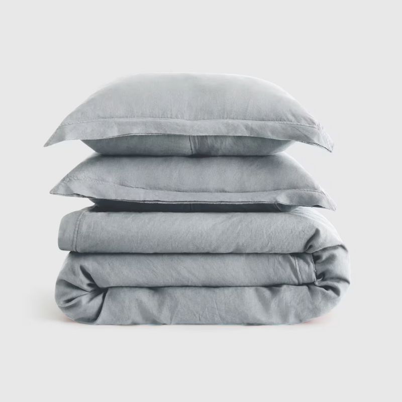
7. Gray, With a Hint of Blue
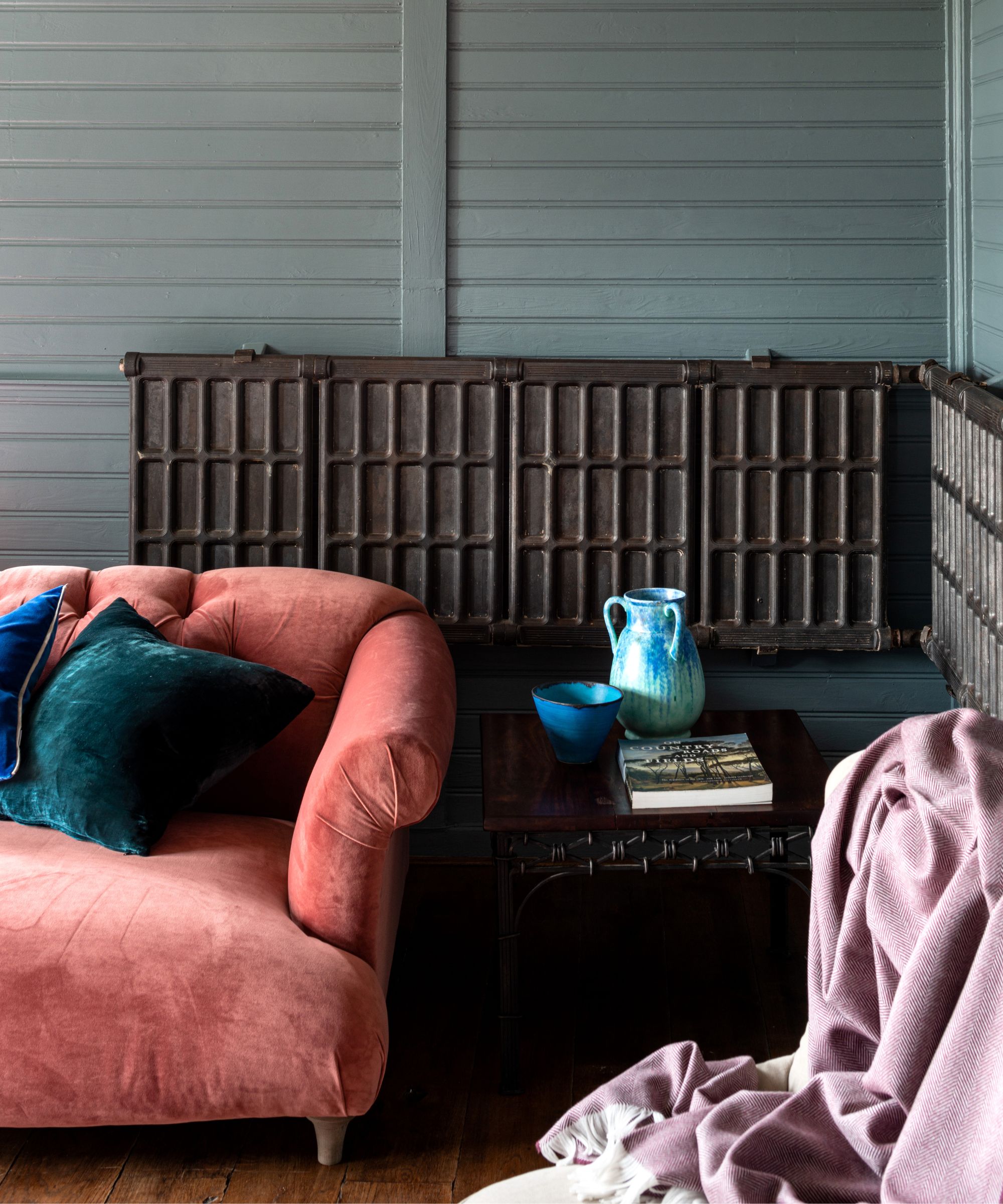
Gray room ideas have somewhat fallen out of favor in recent years, ever since they were branded as cold and drab. However, a nuanced gray is a wonderful way to maintain a neutral scheme, yet without veering into bland territory.
'I would recommend Benjamin Moore's Brewster Gray for 2026 – it’s a beautiful blue-gray that feels soft, uplifting, and fresh without leaning cold,' says designer Justine Wolman. 'It has just enough color to feel like a shift from neutral, while still remaining completely timeless.'
'I recently used Brewster Gray in a project where we painted all the trim in this color and paired it with Benjamin Moore's Swiss Coffee on the walls and ceiling,' says Justine. 'The combination is such a breath of fresh air and creates a balance of charm and modernity. It feels crisp and clean, yet warm and inviting – which I think is exactly what people are looking for in 2026 as they reset their homes after the holiday season.'
Your home doesn't need a full makeover to feel fresh for the new year. To add these shades timelessly, start with your existing color schemes – which rooms could benefit from a textile or decor refresh, without needing to reinvent the whole space?
That said, if you are embarking on a redecoration project, there are plenty of stylish paint shades here to try – just make sure it's a color you'll love for years to come.

Emily is a freelance interior design writer based in Scotland. Prior to going freelance in the spring of 2025, Emily was Homes & Gardens’ Paint & Color Editor, covering all things color across interiors and home decor for the Homes & Gardens website. Having gained specific expertise in this area, Emily is well-versed in writing about the latest color trends and is passionate about helping homeowners understand the importance of color psychology in home design. Her own interior design style reflects the simplicity of mid-century design and she loves sourcing vintage furniture finds for her tenement flat.
