7 Mood-Boosting Kitchen Colors That Will Instantly Make Your Cooking Space Happier, Cozier, and Full of Joy in 2026
Colors can have a huge impact on your mood, so in a room where you spend so much time, it’s worth filling it with the happiest of hues

Hebe Hatton
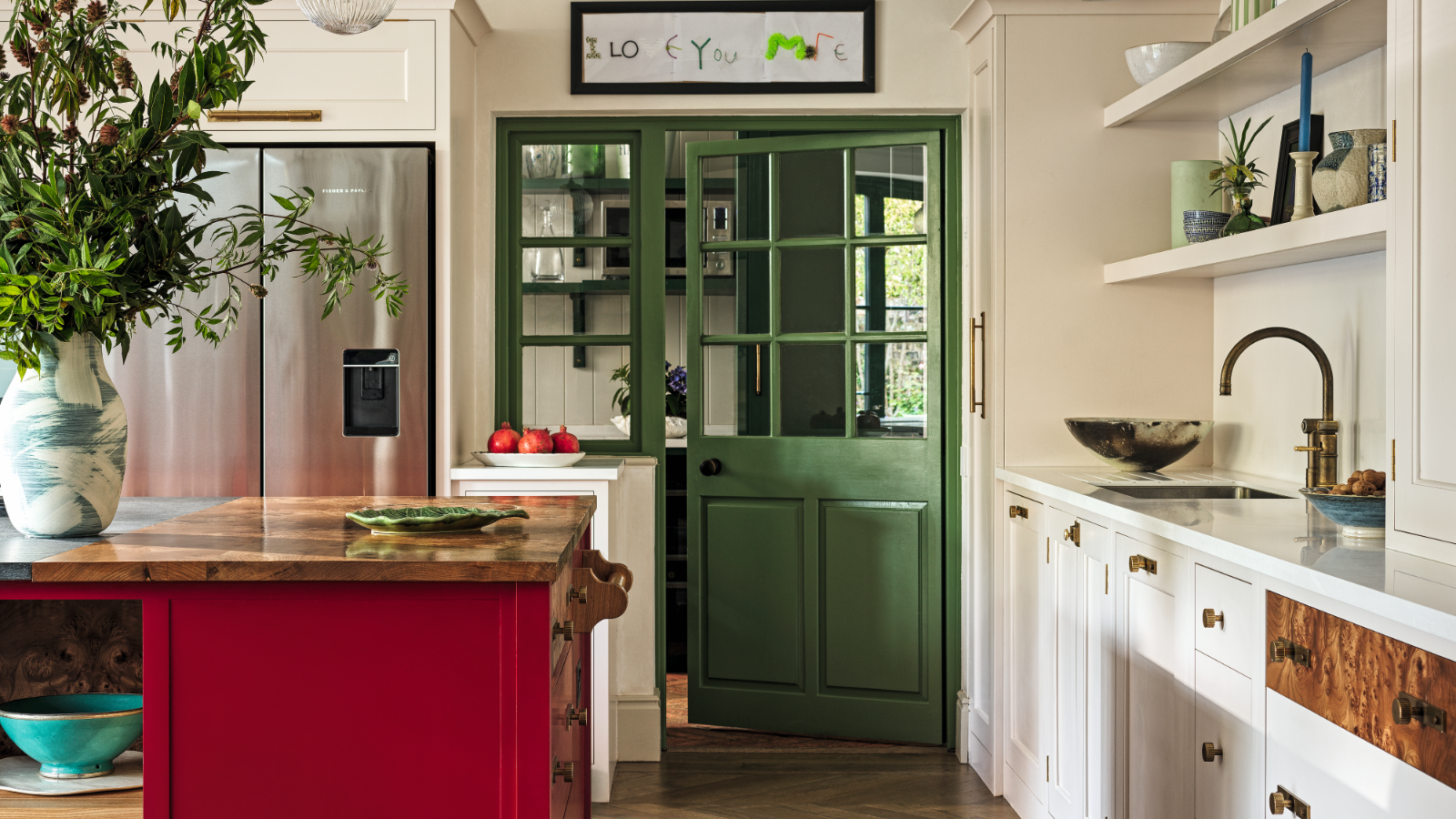
We all know how much color can affect our mood. A clear blue sky can lift your spirits in an instant, spotting someone in a bold outfit can make you smile, or even wearing a brighter shade yourself can give your day a little boost.
The same principle, of course, applies to the kitchen color ideas you choose in your home. For years, interior trends have leaned heavily on gray and neutral shades, meaning many of us have played it safe when it comes to our walls and kitchens. But recently, that’s beginning to change. We’re slowly moving away from subtle, understated tones and embracing happy colors that are, quite simply, more joyful. Pink and green kitchens, in particular, are replacing the predictable grays and whites, and we are all for it. After all, the kitchen is one of the most used rooms in the home, so it makes perfect sense that its colors can shape how we feel every day.
To help you bring a little joy into your cooking space, we spoke with interior designers and color experts about the best shades to try if you want a kitchen that truly lifts your mood.
Article continues belowWhat Are The Best Colors To Make Your Kitchen Feel Happy?
Choosing the happiest color for your kitchen ultimately comes down to the shades that lift your mood – and what works for one person won’t necessarily work for another.
'Happy kitchen colors are deeply personal,' explains interior designer Jennifer Davis. 'Some people feel joy in serene pastel blues, reminiscent of clear skies and calm waters, creating a tranquil cooking environment. Others are drawn to vibrant yellows that flood the space with sunny cheerfulness, instantly evoking warmth and positivity.'
'There is no one-size-fits-all solution!' agrees Cathy Dean, founder of Studio Dean. 'A good place to start is your wardrobe – what colors are you naturally drawn to? If neutrals and browns make you feel comfortable, these are your happy colors. If you love primary colors and bright hues, let them inspire your kitchen palette. The key is to stick to a shared undertone so all the colors work together harmoniously.'
1. Warm Reds
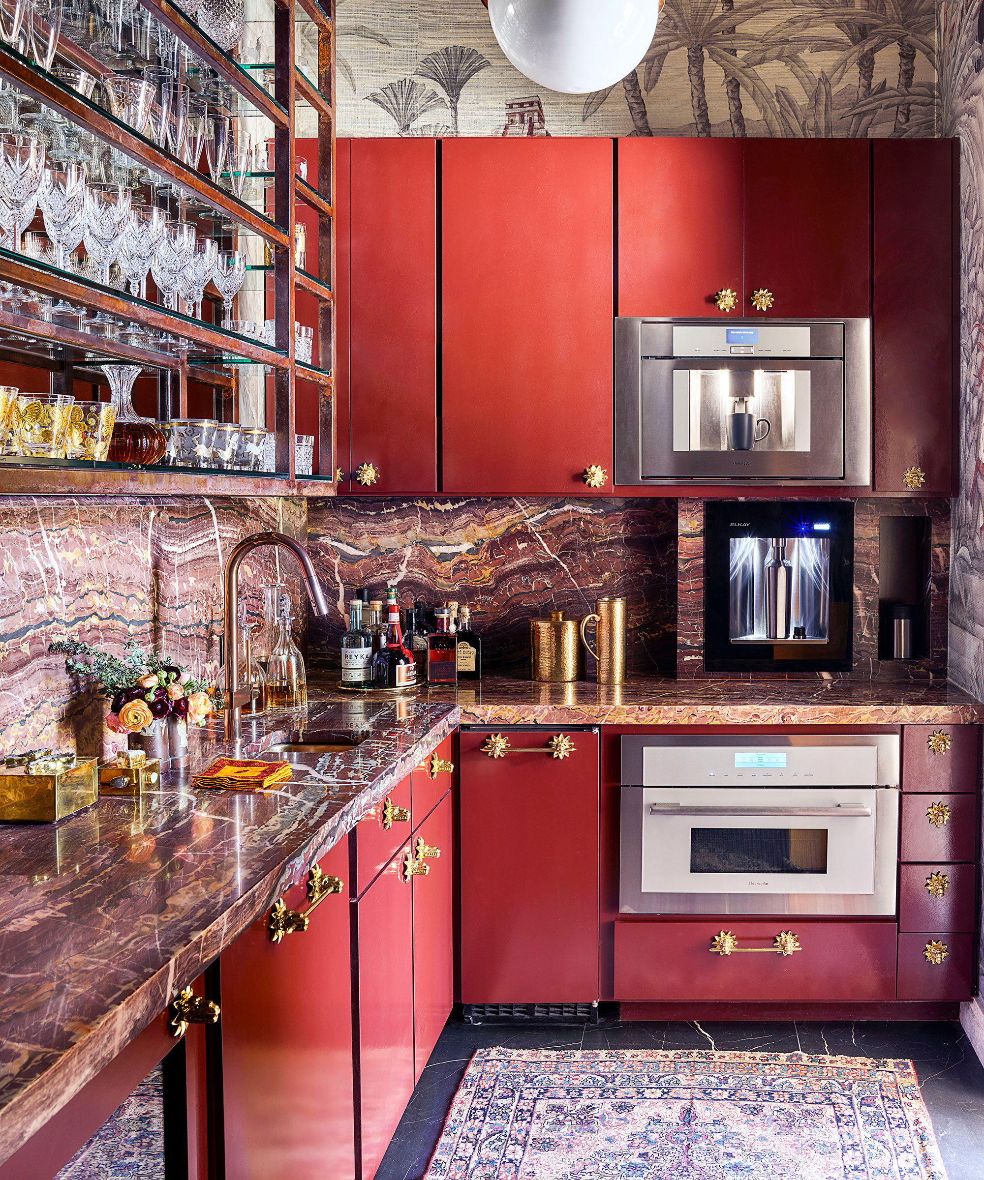
When you think of colors to avoid in a kitchen, red probably comes to mind first. And yes, it can feel bold – but it’s also one of the most passionate and life-enhancing colors you can use in a decorating scheme. Red offers a luxurious bank of positive energy and, depending on how you use it, can transform a kitchen from refined to playful. Whether you add it in small doses through accessories or go full-on with walls or cabinets, it can genuinely lift the mood of the space.
Design expertise in your inbox – from inspiring decorating ideas and beautiful celebrity homes to practical gardening advice and shopping round-ups.
'I always find that warm earth tones – terracotta, russet, sienna, and coral – are natural fits for kitchen design and just naturally exude a happy feel,' says Interior Designer Kathy Kuo. 'These cheerful neutrals are easy to mix and match, and they pair beautifully with common kitchen materials like copper, wood, ceramics, and cast iron.'
'For a happy kitchen, don’t be afraid to go bold with your cabinets,' adds Tash Bradley, Director of Interior Design and Color Psychologist at Lick. 'We’re seeing more people embrace red kitchens right now – especially earthy reds with pink and brown undertones. Pair them with neutral walls so the space feels balanced, rather than overwhelming.'
And balance is key with any punchy shade. As Tash explains, 'When decorating with bright, happy colors, it’s all about proportions and tone. A whole room in a vivid yellow, for example, can backfire – it can feel irritating instead of mood-boosting.'
With the right shades and careful balancing, even bold, cheerful reds can transform a kitchen into a space that feels lively, joyful, and full of energy.
2. Pale Pink
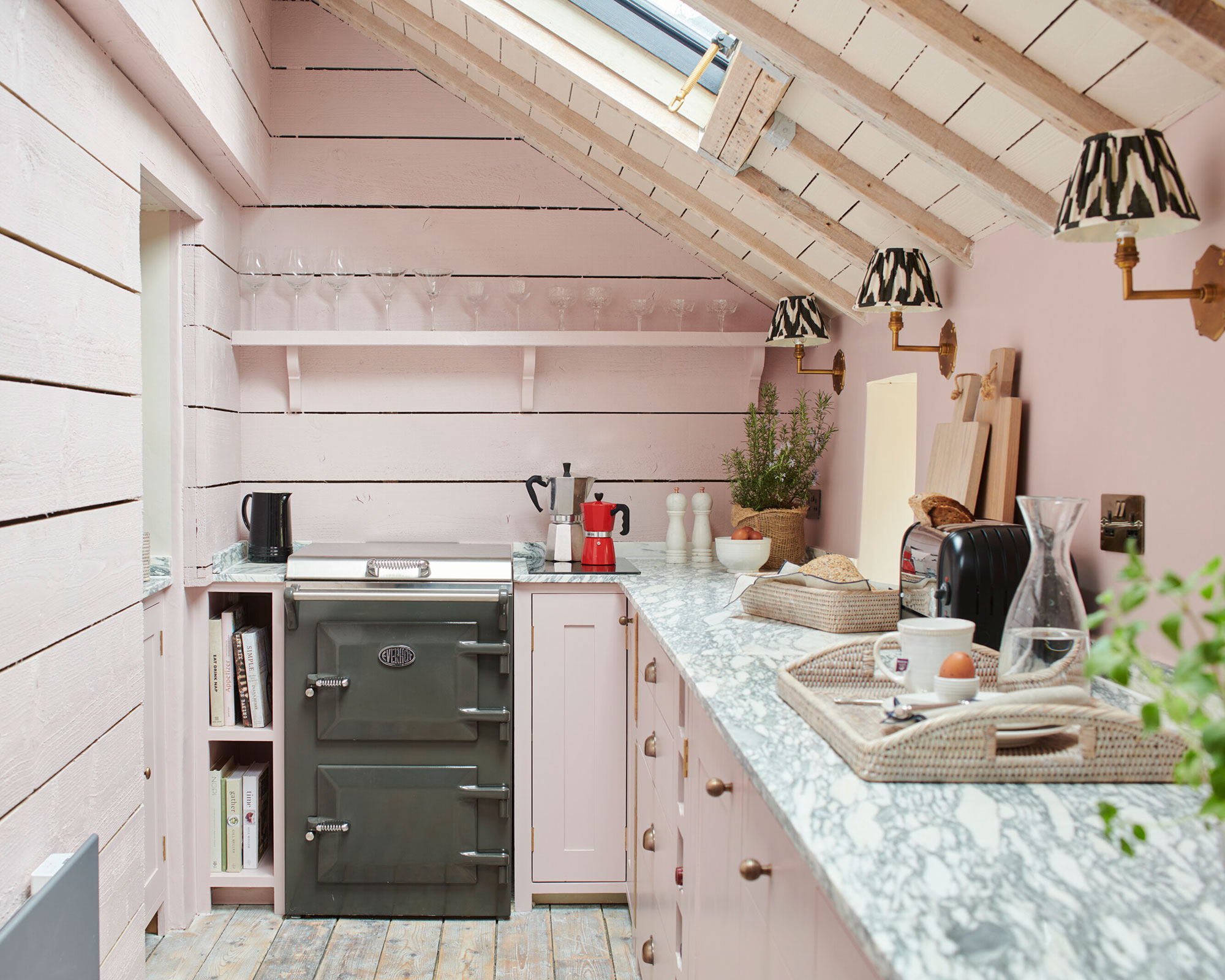
The effervescent pink kitchen is a true mood-lifter, echoing some of the same warming, joyful qualities we’ve just discussed with red. Just stepping into these playful spaces fills you with energy and happiness. A few years ago, we might have hesitated to recommend a fully pink cook space, worried it could be a passing kitchen trend. But pink has proven its staying power and is now firmly established as a classic choice for kitchen cabinets.
Pink also sits at the heart of dopamine decor – playful, uplifting, and instantly mood-boosting. For a version that feels both fun and timeless, opt for pale, plaster-hued pinks. These softer shades feel sophisticated rather than saccharine and can be beautifully grounded with deeper accents, such as charcoal, as seen in this pink-and-charcoal kitchen.
'Pastel shades such as soft pinks can create a slightly whimsical feel in the kitchen, fostering a playful aesthetic,' explains Anna Hill, color consultant at Fenwick & Tilbrook. 'These colors are soothing to the eye and cultivate a light-hearted, joyful ambiance, making them especially suitable for kitchens where friends and family gather.'
3. Butter Yellow
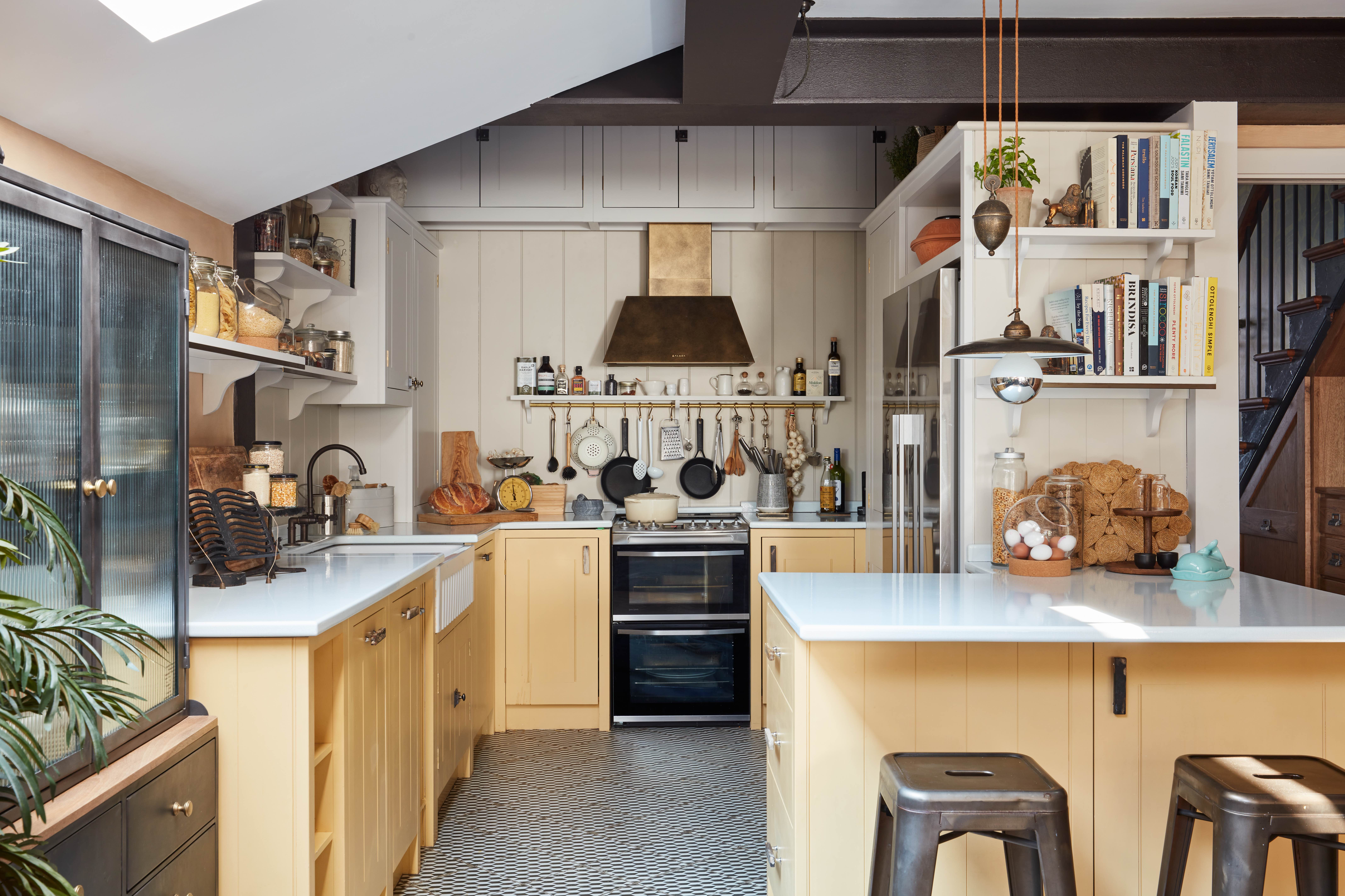
‘We think the key to a happy kitchen is to have fun with color – whether that’s painting the units in an uplifting shade or introducing colorful, textured accessories. We simply adore color, so we knew we wanted to make a bold choice in this yellow kitchen,’ explains Anna Burles, Creative Director of Run for the Hills. ‘The palette is a mix of several colors: Earthborn’s Donkey Ride on the matchboard paneling, Tom’s Bakery on the upper units and shelves, Humpty Dumpty Yellow on the lower kitchen units, and Trilby on the ceiling and walls above the cabinetry. The yellow is a triumph and instantly lifts the space.’
‘The kitchen doesn’t have much natural light, so a bold color was the perfect way to ensure it felt happy and joyful, even during the darkest months of the year,’ she adds. ‘I think the best colors for kitchens are tones inspired by nature. The fresh, buttery tone of Humpty Dumpty feels like pure sunshine – warm, uplifting, and never overpowering. Mother Nature is never wrong.’
Helen Parker, Creative Director of deVOL, agrees that yellow is a super uplifting choice for a kitchen. ‘The Shakers would use yellow to brighten a dark corner and bring a feeling of sunlight into a space. Mustard and butter yellows are wonderful for transforming a room with their cheerful, warm, and mood-boosting tones.’
When working with any bolder shade, a touch of caution is key. Sunny hues can overwhelm a space if used without balance. Designer Anna Elkington explains, ‘When we think of happiness, most of us immediately imagine yellow, but it can be a bold choice in a kitchen. Pairing yellow cupboards with darker accents – dark grey countertops, for example – keeps the energy positive without letting the color dominate the room.’
With butter yellow firmly on-trend for 2026, this cheerful, versatile shade is proving that happiness in the kitchen can be both timeless and contemporary.
4. Olive and Sage Green
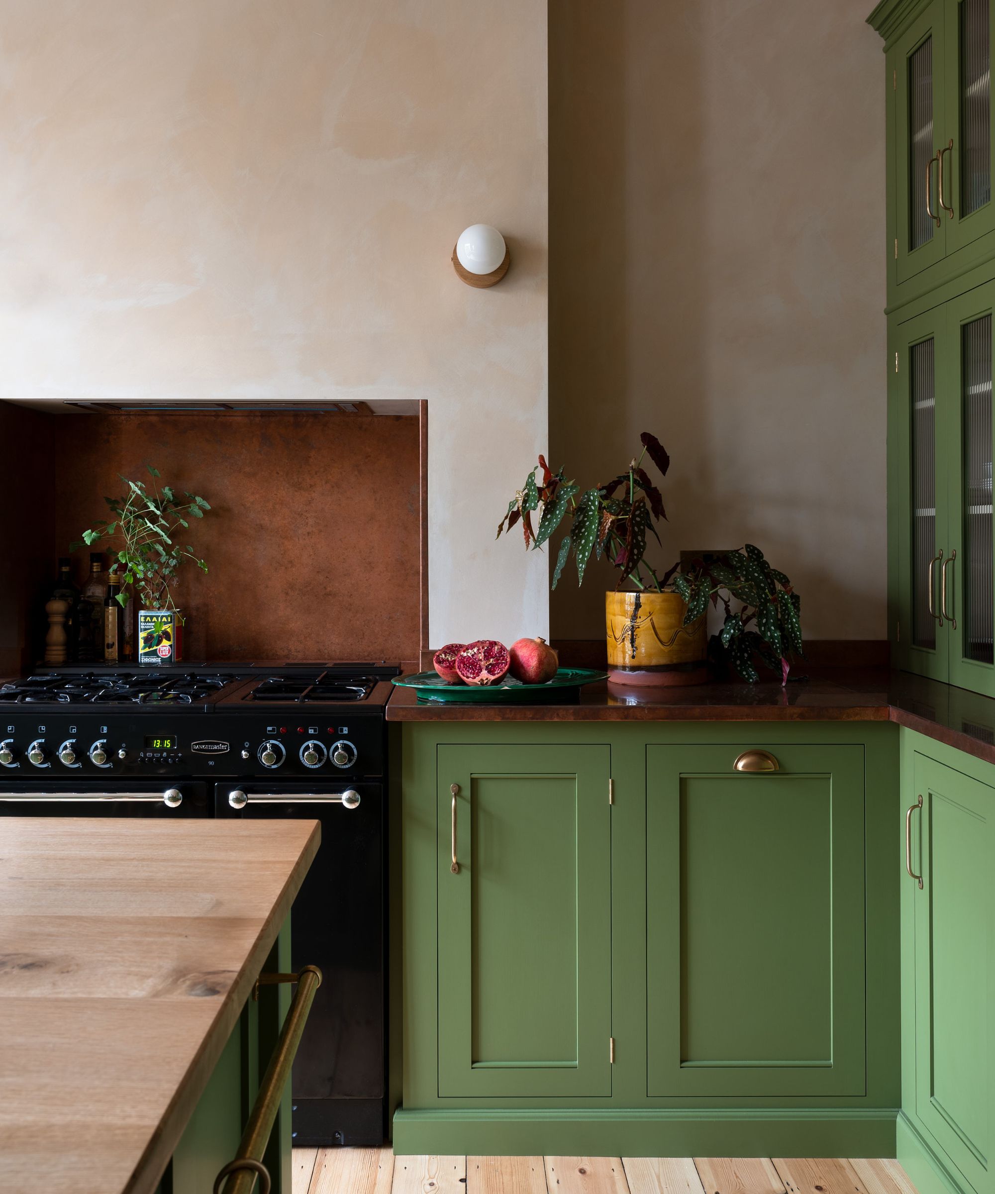
Green kitchens have long been celebrated for their calming, restorative qualities – a staple of dopamine-driven design. Evoking nature, growth, and fresh beginnings, green is a color that quietly lifts the mood every time you step into the room.
After a brief hiatus in favor of lime and acidic greens, olive and sage tones are back in style, signaling a shift toward comfort, longevity, and timeless appeal rather than passing trends. The palest, sage-toned greens can act almost like a neutral, no more dominant than gray, while richer, jewel-like olives bring warmth and depth.
Kitchen designer Richard Davonport explains: 'Color has the power to transform a room, and green represents nature – sloping hills, or, with a blue undertone, rolling seas. There are so many variations, from the deep richness of emerald to the soothing calm of sage, each evoking a different feeling when you enter the room.'
'Green also works exceptionally well in monochromatic schemes, using various shades of the same color to create a striking, cohesive look. It’s perfect for both larger and smaller kitchens – especially small kitchens, where tonal variations can make a room appear bigger than it actually is.'
'As using green is about bringing nature indoors, incorporating similar materials helps reinforce the theme. Warm wooden floors or a reclaimed wooden table add both visual and tactile texture, creating a kitchen that is inviting, layered, and full of life,' he adds.
5. Sky Blue
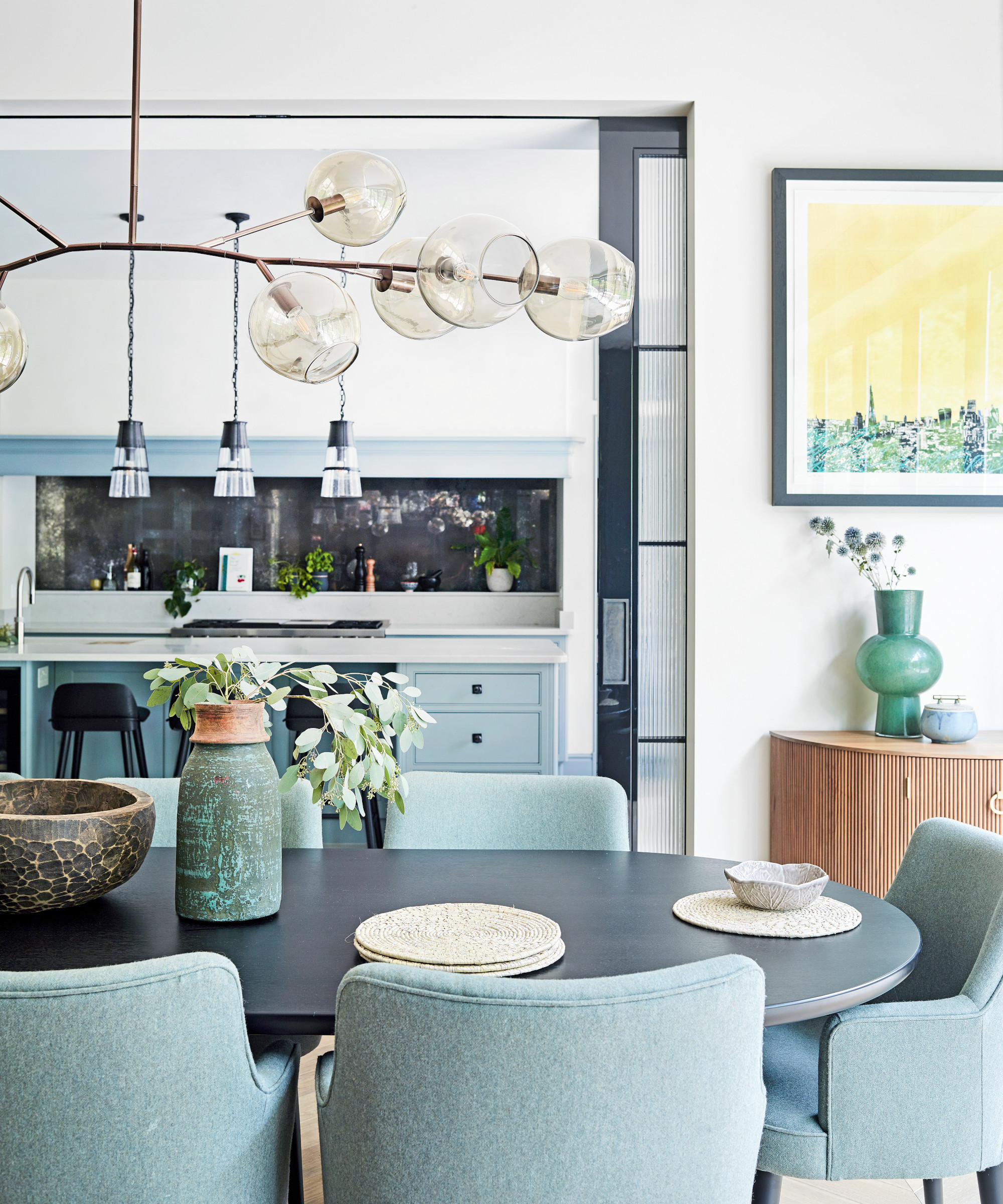
Step into a blue kitchen, and you’ll feel an instant lift in your mood. Much like green, blue is a color deeply rooted in nature, evoking calm skies and serene waters, making it inherently soothing to the eye.
Blue is also incredibly versatile. With countless shades and tones to choose from, it pairs beautifully with almost any other color, allowing you to adapt it to your space with ease. The happiest – and most liveable – blues tend to be soft, pale sky blues, which instantly make a kitchen feel lighter and more airy.
And let’s be clear: sky blue is no longer just the color du jour for little boys’ rooms. In kitchens, it’s proving to be a sophisticated, grown-up choice that feels fresh and contemporary. To prevent it from feeling too cool or steely, pair sky blue with a warm neutral – soft cream or a gentle warm tone works beautifully – and complement it with brass, copper, or gold hardware for a subtle touch of luxury.
6. Orange
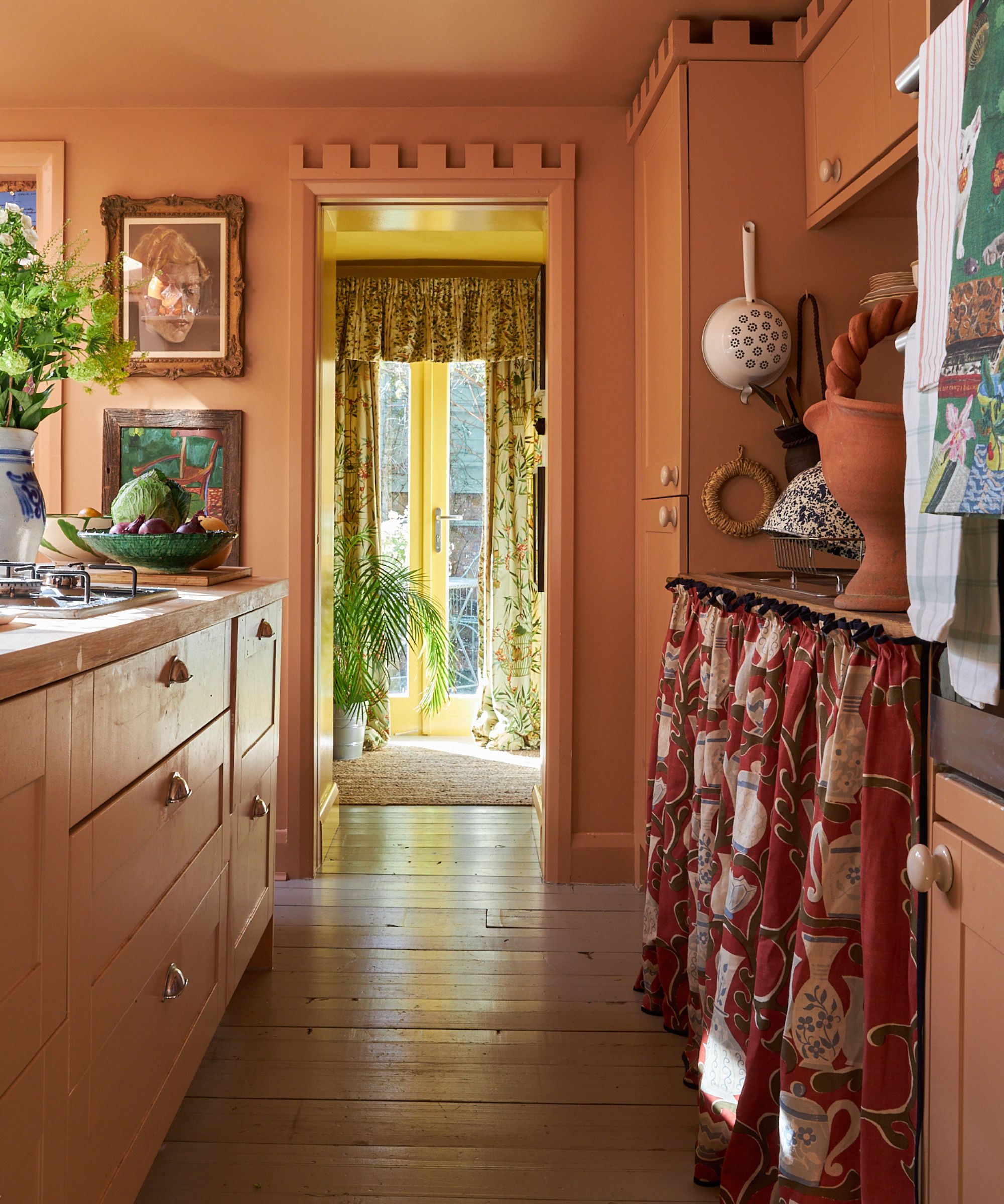
Bold yet surprisingly sophisticated, burnt orange is one of the standout kitchen color trends for 2026. A fiery hue with hints of red and brown, it brings energy, warmth, and a sense of calm to one of the most used rooms in the home. ‘Orange is a bold choice but also has heritage appeal,’ says Edward Bulmer, interior designer and founder of Edward Bulmer Natural Paint. ‘It’s a grown-up color that adds personality while feeling timeless.’
‘Burnt orange is wonderfully optimistic, but not for the cautious,’ adds Helen Sanderson, creative director of fabric company Ian Sanderson. ‘It works beautifully with teal or subtle blush accents and instantly lifts the mood of a kitchen.’
For those not ready to commit to orange cabinetry, incorporating the shade on an island, open shelving, or even the walls can create a playful yet sophisticated focal point. Personally, I’m even considering painting my walls in a warm burnt orange – there’s something about the color that feels joyful, cozy, and full of personality, perfect for a kitchen that’s at the heart of the home.
Whether used in small doses or boldly across walls and units, burnt orange kitchens feel both vibrant and inviting – a color trend that promises to make 2026 kitchens unforgettable.
7. Warm Neutrals
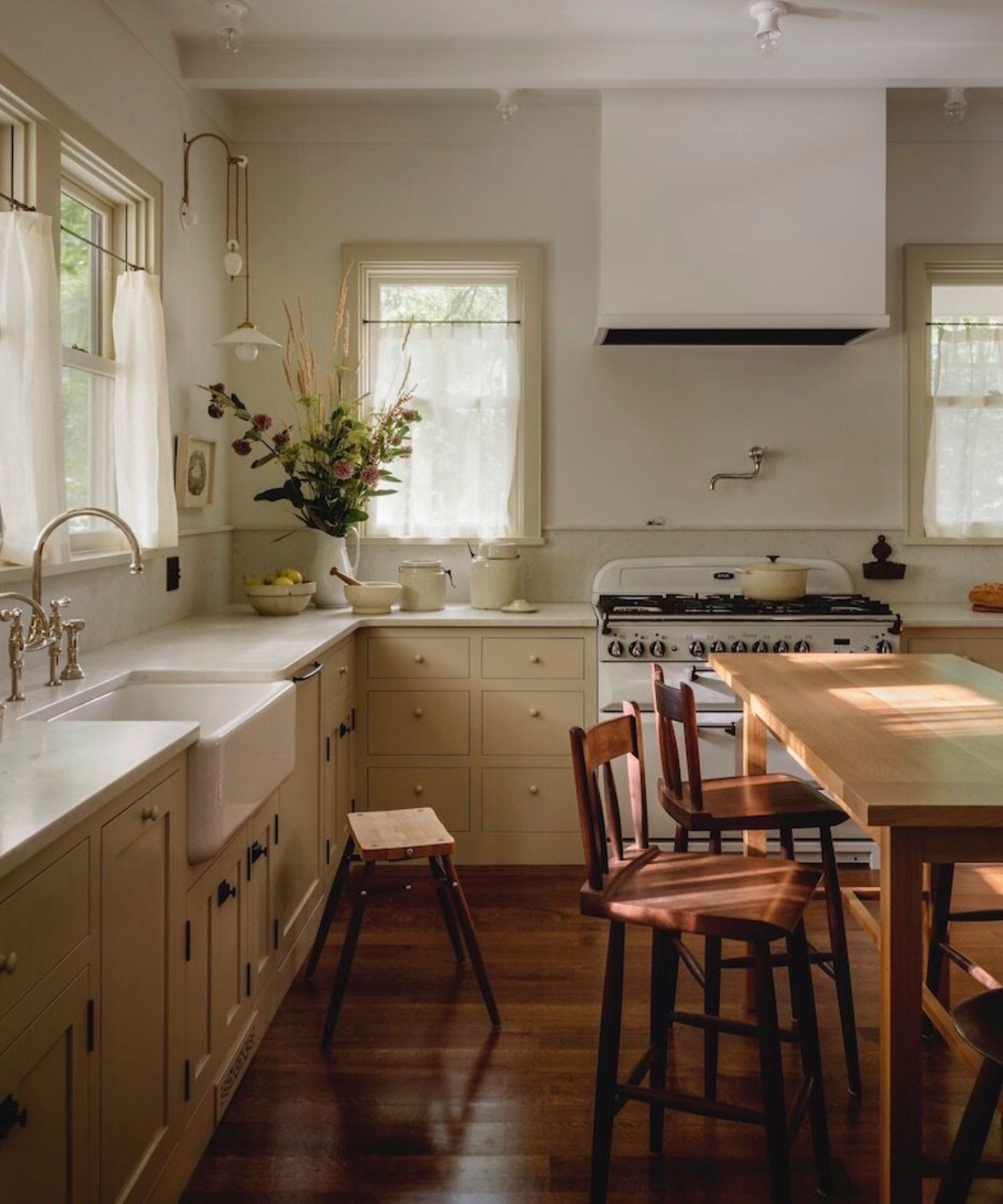
Warm neutrals have been quietly taking over modern kitchens for some time, with many homeowners choosing to strip their spaces back to basics. Shades such as mushroom, taupe, oat, clay, and soft beige perfectly capture the essence of warm minimalism and quiet luxury, creating a sophisticated yet inviting foundation that feels both timeless and contemporary.
These tones bring warmth and depth without overwhelming a space, making them ideal for kitchens where functionality meets style. They also offer incredible versatility, allowing for layered textures, natural materials like wood or stone, and carefully considered accents to create a kitchen that feels thoughtfully designed. Splashes of color through accessories, hardware, or soft furnishings can instantly lift a neutral palette, adding personality and visual interest without compromising its calm, understated elegance.
For 2026, warm neutral kitchens are proving that less truly can be more. By combining the enduring appeal of soft, earthy tones with subtle, mood-boosting details, these kitchens achieve a balance of comfort, style, and timeless sophistication – making them a reliable choice for anyone looking to create a space that is both elegant and welcoming.
Ultimately, the key to a joyful kitchen is letting color guide your choices. Whether you’re drawn to bold reds, cheerful yellows, soothing blues, earthy greens, playful pinks, vibrant oranges, or timeless warm neutrals, the shades you select have the power to shape not only the look of the space but also how it makes you feel.
By choosing colors that lift your mood and reflect your personality, you can create a kitchen that is as inspiring as it is functional – a space that welcomes you every day and brings happiness to everyone who steps inside.

Jennifer is the Digital Editor at Homes & Gardens, bringing years of interiors experience across the US and UK. She has worked with leading publications, blending expertise in PR, marketing, social media, commercial strategy, and e-commerce. Jennifer has covered every corner of the home – curating projects from top interior designers, sourcing celebrity properties, reviewing appliances, and delivering timely news. Now, she channels her digital skills into shaping the world’s leading interiors website.
- Hebe HattonHead of Interiors