Kitchen color ideas – 26 stylish schemes for the heart of the home
From pared-back neutrals to bold hues, this gallery covers a whole host of the best kitchen color ideas

Emily Moorman
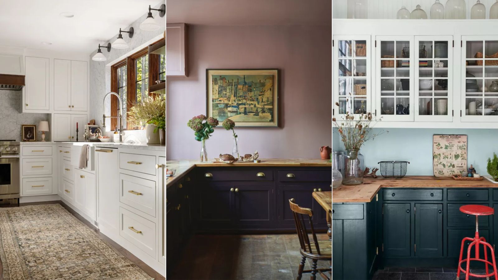
- 1. Go for a classic blue and white color combination
- 2. Go for green-on-green
- 3. Warm up with brown
- 4. Go bold with yellow
- 5. Make your island pop
- 6. Opt for a calming gray
- 7. Color block horizontally
- 8. Keep it classic with white
- 9. Black too stark? Try navy
- 10. Have one statement wall
- 11. Join the dark side
- 12. Go for a mint green in your kitchen
- 13. Add color with tiles
- 14. Paint in a pink palette
- 15. Create contrast with color
- 16. Be brave with a daring color scheme
- 17. Be cocooned in an emerald green kitchen
- 18. Introduce shimmer and shine
- 19. Blend bold with cozy with a wine red
- 20. Stick to a pure white scheme
- 21. Channel two colors for a playful look
- 22. Go for on-trend light blue
- 23. Choose dark cabinets and neutral walls
- 24. Set a welcoming look with warm white
- 25. Create a natural look with wood tones
- 26. Use color to create a cozy kitchen
Design expertise in your inbox – from inspiring decorating ideas and beautiful celebrity homes to practical gardening advice and shopping round-ups.
You are now subscribed
Your newsletter sign-up was successful
Want to add more newsletters?
If you've ever embarked on a kitchen remodel, you'll have probably spent much time deliberating on its color scheme. After all, your kitchen color ideas need to strike the perfect balance between stylish and practical, since redecorating this hardworking room is a long and often costly exercise.
Otherwise known as the heart of the home, kitchens are increasingly where we spend most of our time at home, from gathering around the dining table to entertaining guests. And so, we think that kitchen color schemes should bring joy, whether that's through bold hues or timeless neutrals.
To help you on your way with settling on the right color scheme for your kitchen, we've rounded up a whole host of our favorite ideas below. From the most colorful kitchens to those that celebrate understated hues, these ideas cater to all decorating styles.
Article continues belowUnlike most rooms in the home, the kitchen presents a number of ways in which you can introduce color. Beyond painted kitchen walls, you can channel your kitchen colors through cabinetry, the kitchen island, or even appliances, to name a few. Whichever you go for, these kitchen room color ideas are favorites among designers.
Kitchen color ideas
For a classic, timeless kitchen idea, we sometimes err on the side of safety and choose a completely neutral scheme, forgetting that a little lift of color can cheer up a room immensely. Painted finishes work well for timeless schemes, and of course, can be updated at a later stage if you’re confident enough with a paintbrush.
Our curated collection of the best kitchen color ideas and painted schemes will inspire you to give your kitchen a bold new look.
1. Go for a classic blue and white color combination
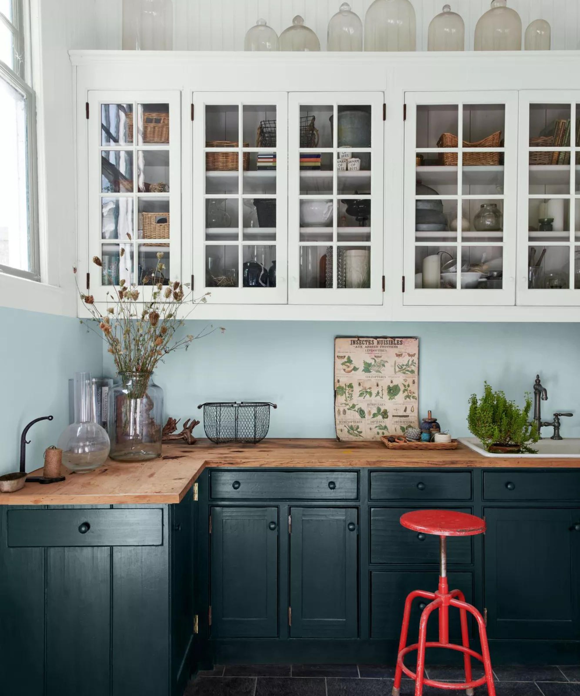
Blue kitchen ideas are a tried-and-tested color pairing that works beautifully in both country and modern kitchens.
Design expertise in your inbox – from inspiring decorating ideas and beautiful celebrity homes to practical gardening advice and shopping round-ups.
Blue room ideas are perfectly suited to kitchens. It may be bold but this deep blue tone is timeless and simple to use. This shade sits happily with other hues of the color for a harmonious, layered look and is beautifully offset with pale tones and warm neutrals, as well as stark white or black.
Think about incorporating rough, touch finishes, too. Schemes with intense, solid color demand texture, like raw wood, battered metal, distressed paintwork, and linen to introduce a laid-back element.
2. Go for green-on-green
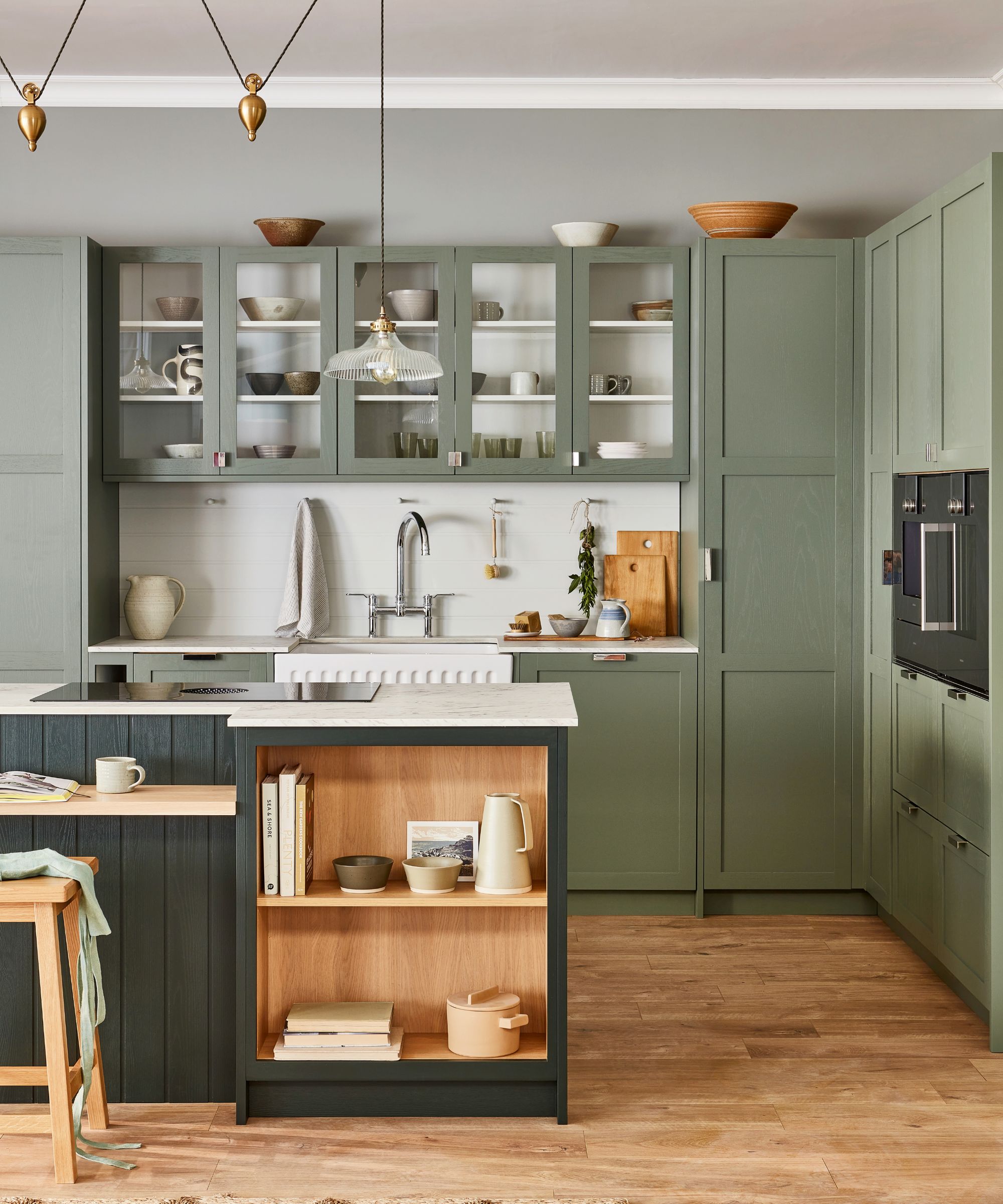
Inspired by the natural world, green kitchen ideas and dark green kitchen ideas are restful with a touch of heritage. Strong yet soothing, it brings an enveloping feel but can also sit quietly and allow bold kitchen furniture to shine.
'Mixing different shades of olive green works surprisingly well,' says Charu Gandhi, founder and director at Elicyon. 'I personally love painting a combination of wall and woodwork in olive green, or using a green tiled backsplash in a kitchen.'
3. Warm up with brown
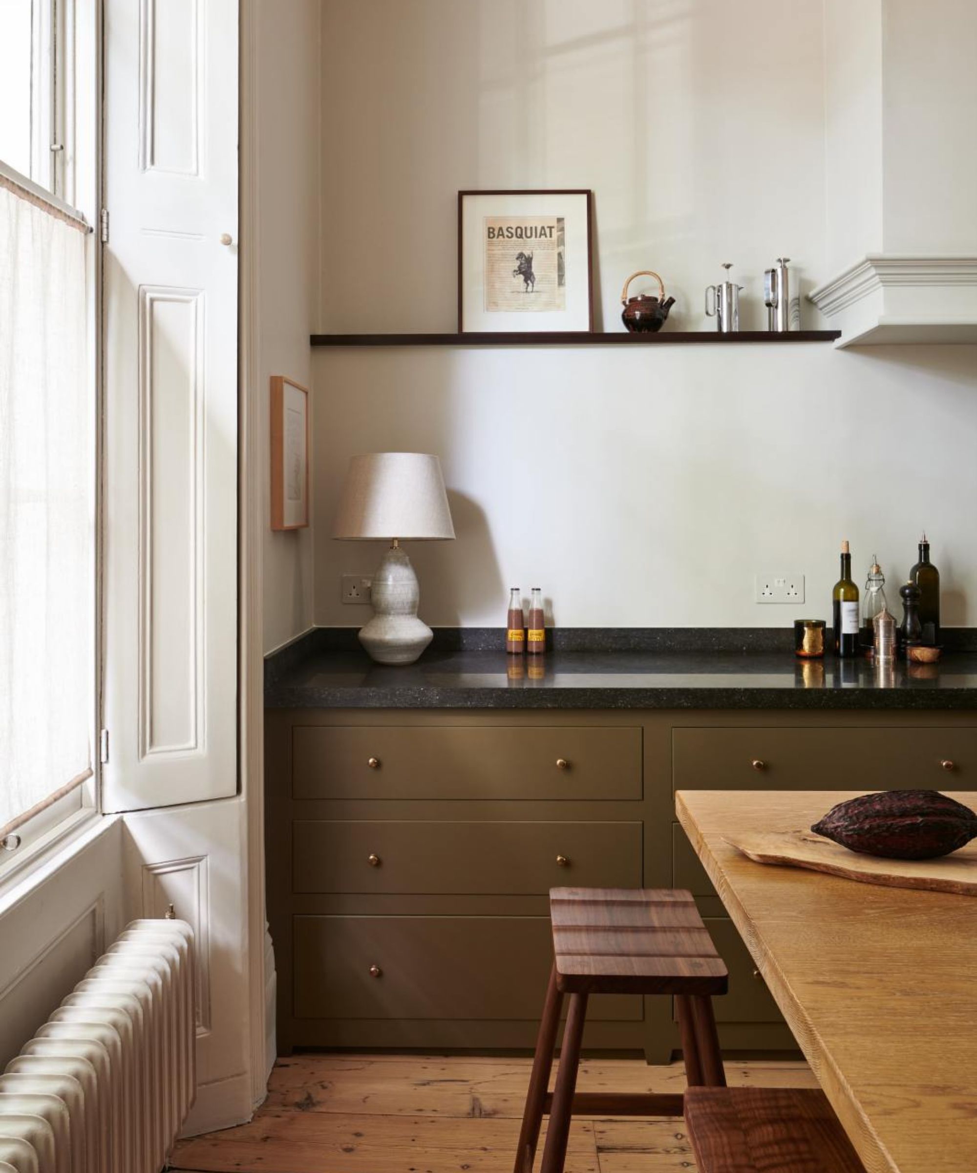
Decorating with brown is no longer the detested color it once was. While rich caramel hues definitely belong to the neutral color family, they are anything but plain – there is a luxuriousness to them that is at once refined but also bold.
‘We feel this tone is perfect for domestic spaces, such as kitchens and pantries, where you don’t want the color to be a protagonist,' says Bruce Hodgson, founder of Artichoke. 'A client chose it for a recent project and it works really well in rooms that don’t benefit from lots of natural light, as it manages to be warm and welcoming without overpowering.’
In this brown room, a warm tan, saturated with caramel tones, this hue manages to be neither too bright nor too overpowering.
4. Go bold with yellow
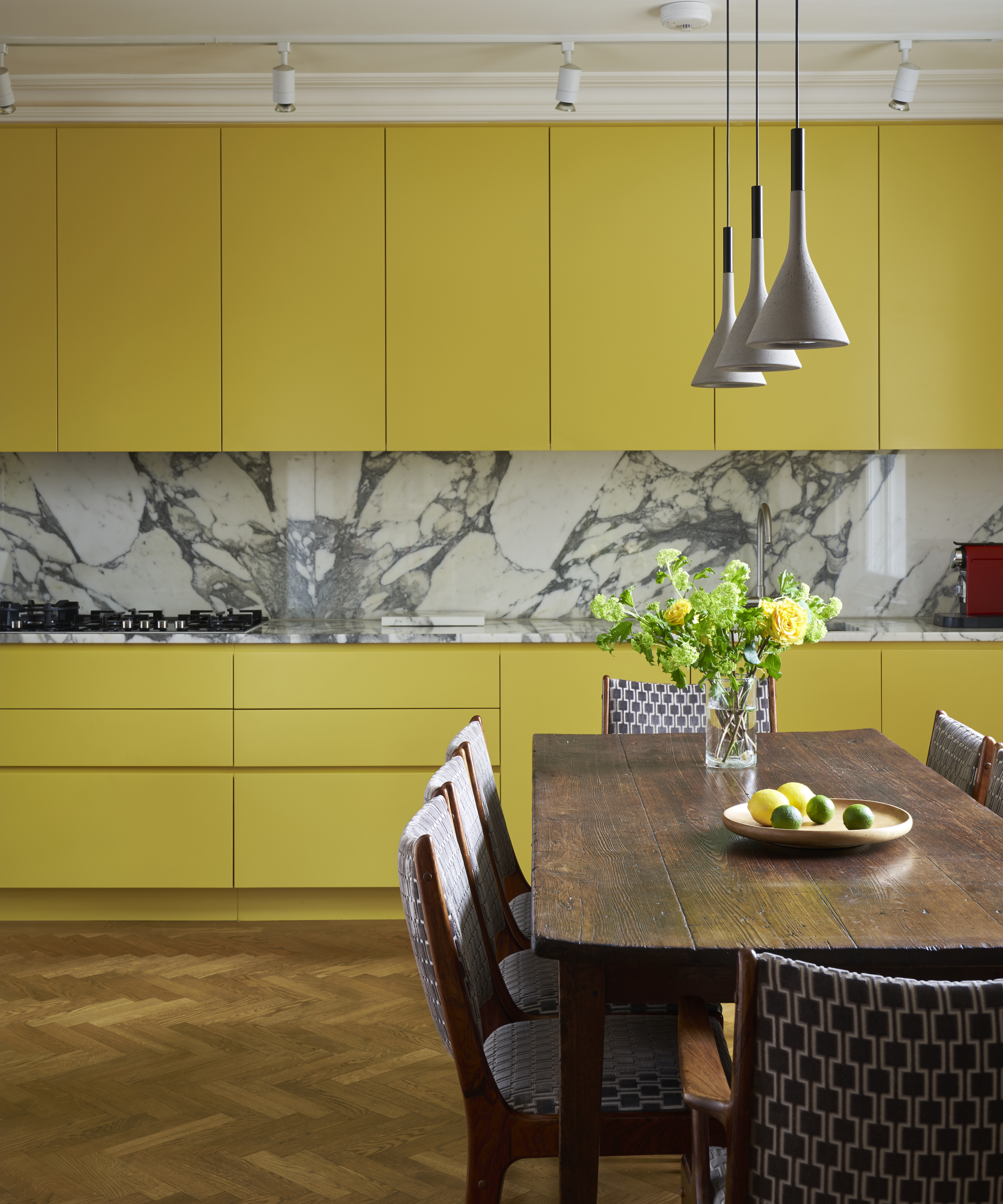
'Known as the "heart of the home", the kitchen is the space in our homes where many of us tend to spend most of our time. It’s a place to cook, snack, and perch.
'It’s also one of the main rooms where the design and style can affect your property’s value. Therefore we often suggest opting for colors that offer a more playful and punchy tone for the kitchen to bring about energy,' says home interior expert Natasha Bradley from Lick.
'Yellow affects our emotions and is a great choice for kitchens, particularly if there is a lack of natural light. It’s bright and cheerful and brings positivity to the heart of the home.'
These vibrant kitchen cabinet ideas guarantee to give an instant pick-me-up every time a person walks into the room. Alternatively, opt for two-tone kitchen ideas for double the design impact.
5. Make your island pop
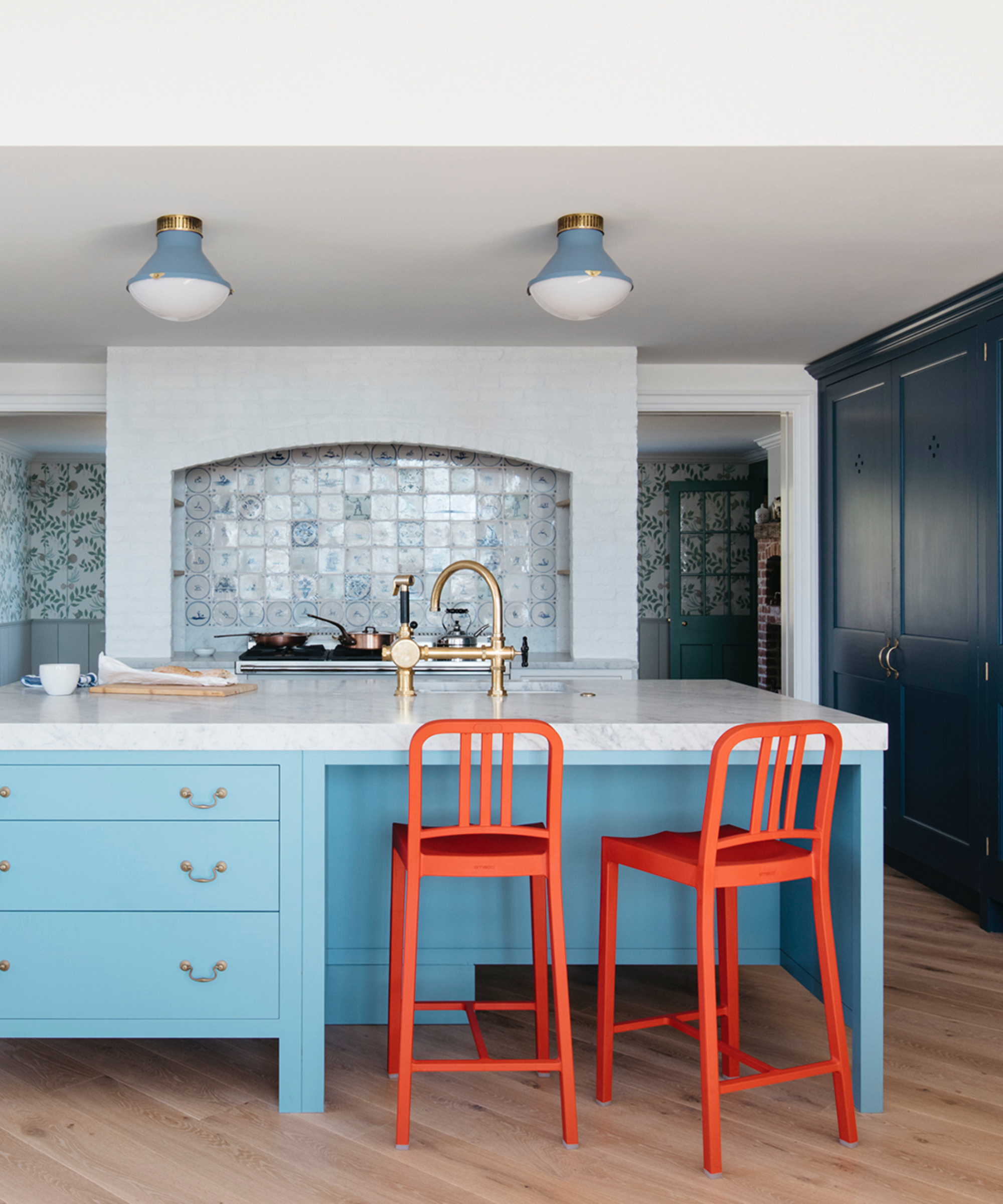
Natasha adds, 'Another recommendation which works extremely well if you've got an island is to change the color.'
This could either be with a totally different color, or by going for a brighter or darker version of a shade that's been used in the rest of the room. This is just one of many kitchen island ideas you can play about with.
The beauty of this trick is that it injects color but still gives you a light and breezy feel.
6. Opt for a calming gray
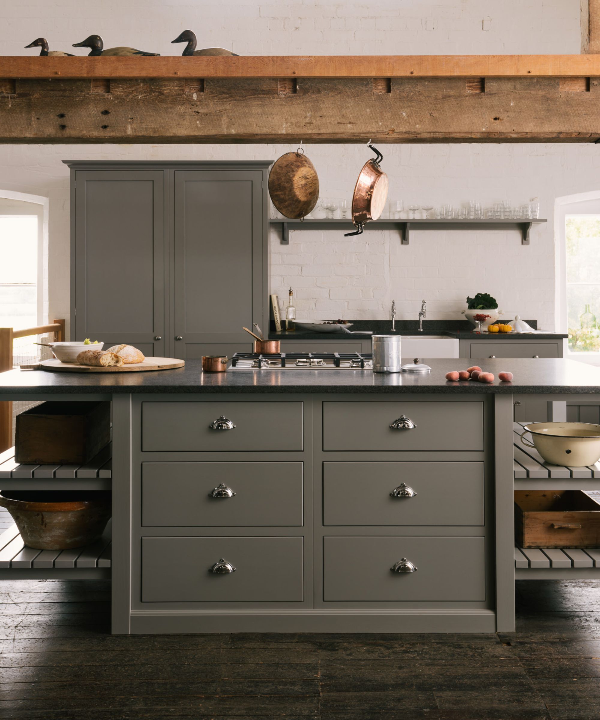
'When it comes to gray in the kitchen, it’s a classic color, very timeless and safe. We often feel very secure in gray because it doesn't ask anything from us. If you are quite a hectic person, and you want your kitchen to blend into the background and be very elegant and subtle, it’s a lovely option,' explains Natasha.
She adds that one of the brand's most popular greys is Grey 07 – perhaps unexpectedly it's the darkest one – and the green undertone works very well with white walls.
7. Color block horizontally
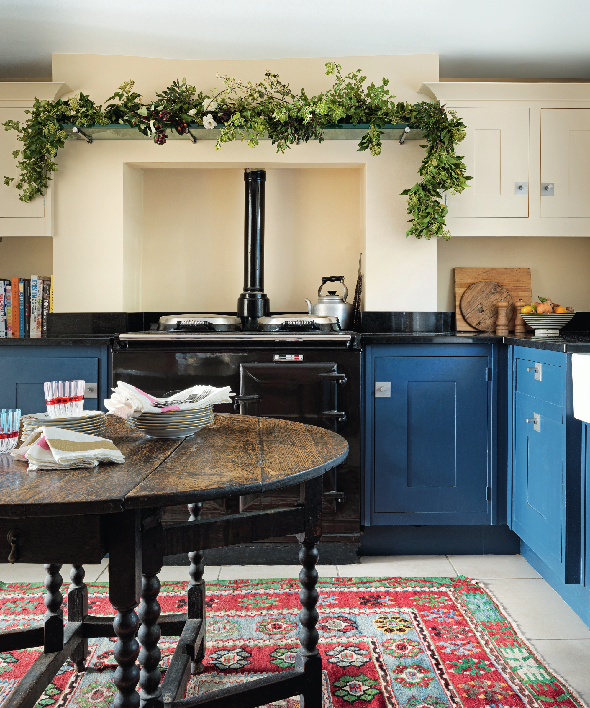
Color blocking is the pairing of two or three different colors to give a totally unique look, and is a great way to give a contemporary edge to more traditional kitchens.
The blocking effect gives this cottage kitchen a modern twist, with the coolest of the blue and warmth of the cream paired to perfection.
8. Keep it classic with white
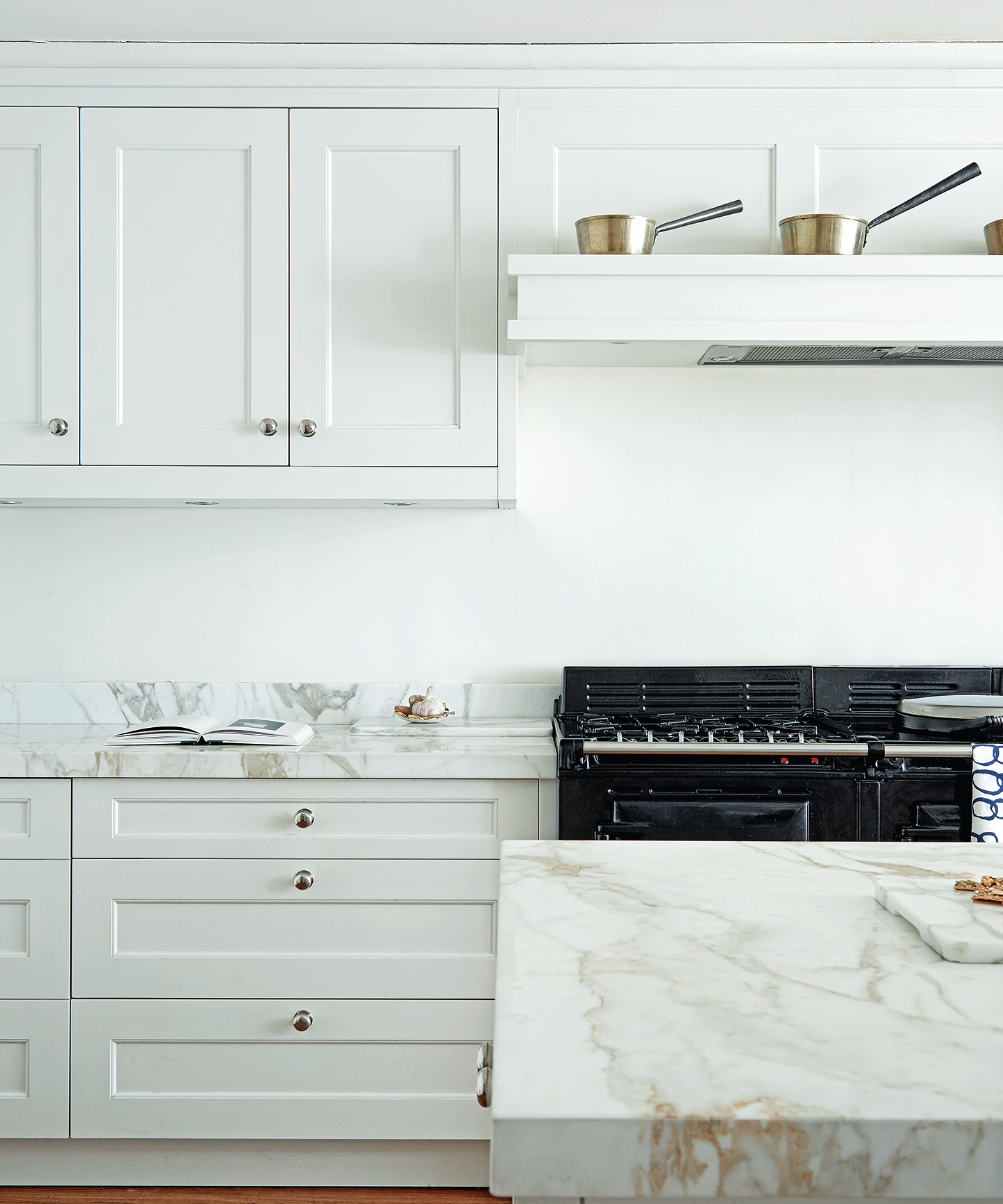
Natasha, from Lick, says: 'Classic for a reason, white paint is known for its light-reflecting properties, making your walls "recede" and opening up small spaces.'
'Our top picks include the creamy White 03 – a soft white with yellow undertones that can open up your kitchen while keeping those warm, cozy vibes. If you want the ultimate in-light reflection, White 01 is a brilliant white but with gray undertones that can boost the energy levels of any small kitchen ideas.
'White creates a feeling of calmness. When used in a kitchen, it can make the space feel clean, sophisticated, and elegant.' There's so much scope when it comes to white kitchen ideas, with endless options to choose from.
9. Black too stark? Try navy
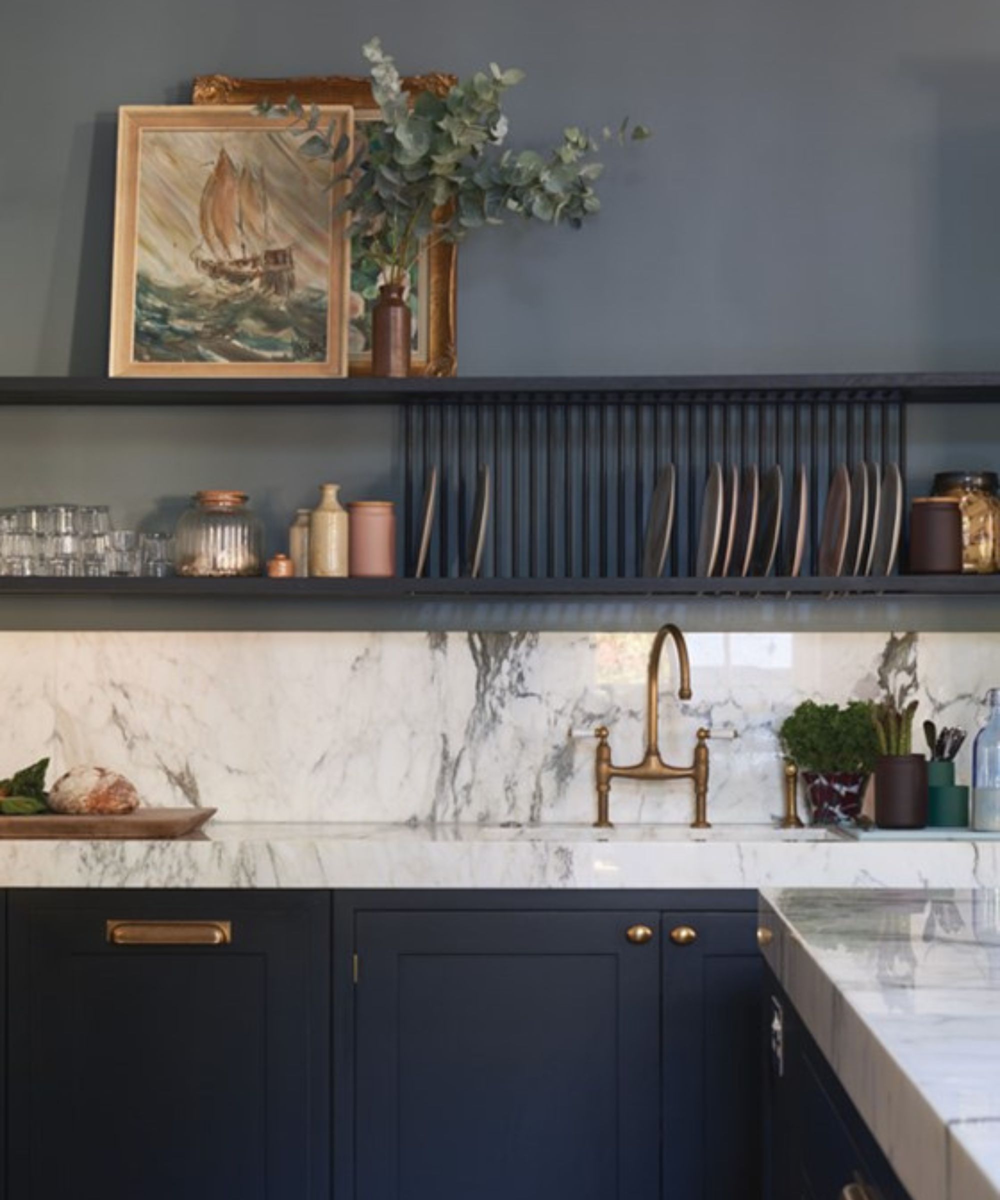
Blue kitchens are perennially fashionable, and darker shades can give a dramatic edge. To ensure your kitchen always feels welcoming, despite the darker color palette, be sure to pick a blue that has a softness to it. Something like Farrow & Ball's Railings, which is an iconic almost black blue.
If you want to strike a balance, team it with a lighter worktop and a light wood floor to add a bit more brightness.
10. Have one statement wall

If you want to start experimenting with bold kitchen colors, a good way to do it is through a statement wall. This will give a splash of excitement, but won't overwhelm the entire room.
This modern kitchen idea keeps contemporary cabinets white, letting the feature wall speak for itself.
11. Join the dark side
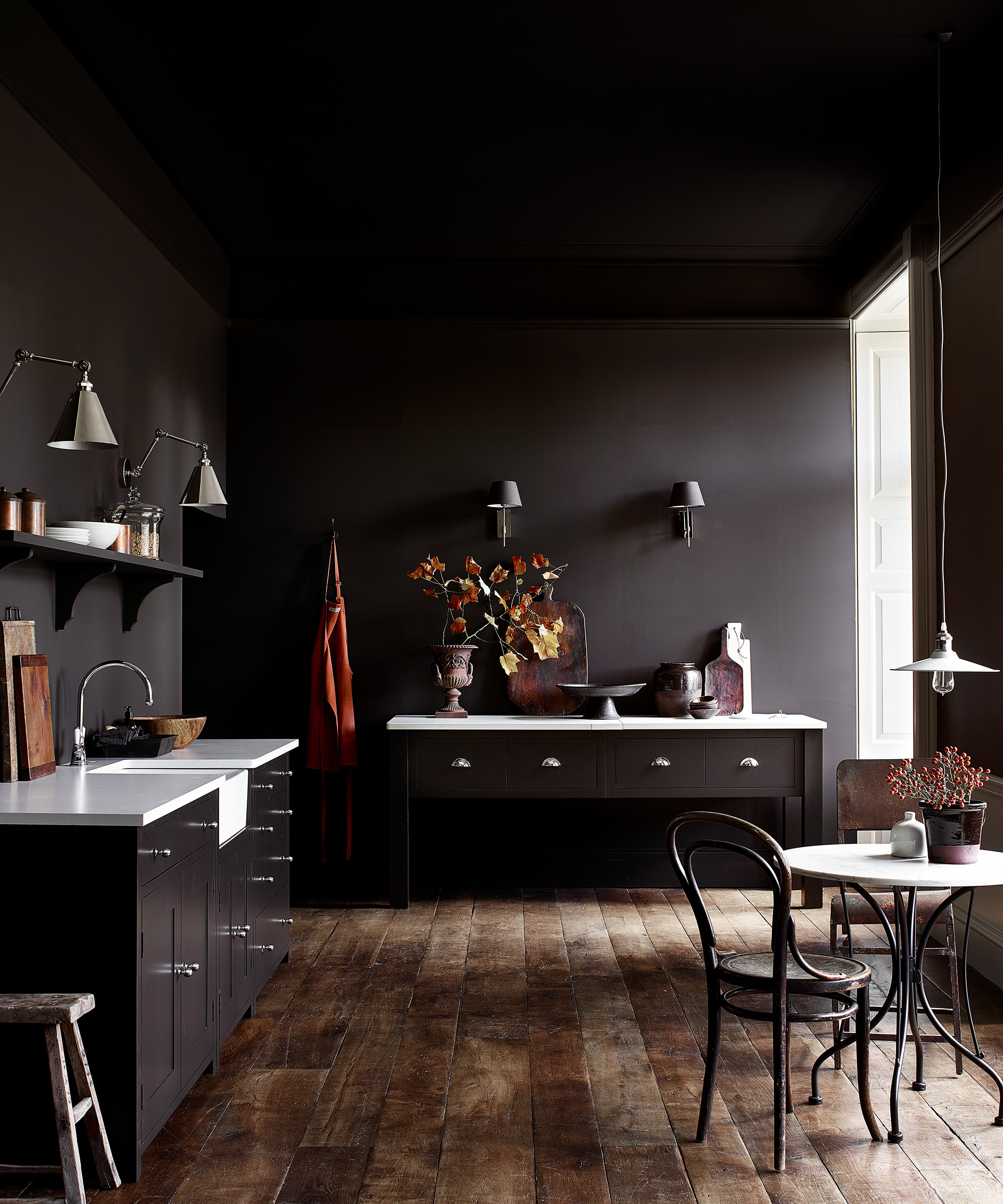
Practicality and beauty go hand in hand in this kitchen from Neptune, whose colors and mood are evocative of old Dutch paintings.
Simple kitchen shelving ideas and a freestanding dresser, rather than wall-hung cabinets, offset the rich chocolate palette for an open, relaxed feel.
The dark walls work to absorb imperfections and even out textures, but there are still some tactile elements. Brooding, dark colors often work best when used dramatically and uncompromisingly. Painted kitchens with a rich brown-black on both walls and cabinetry create a bold statement that feels as historic as it does chic.
12. Go for a mint green in your kitchen
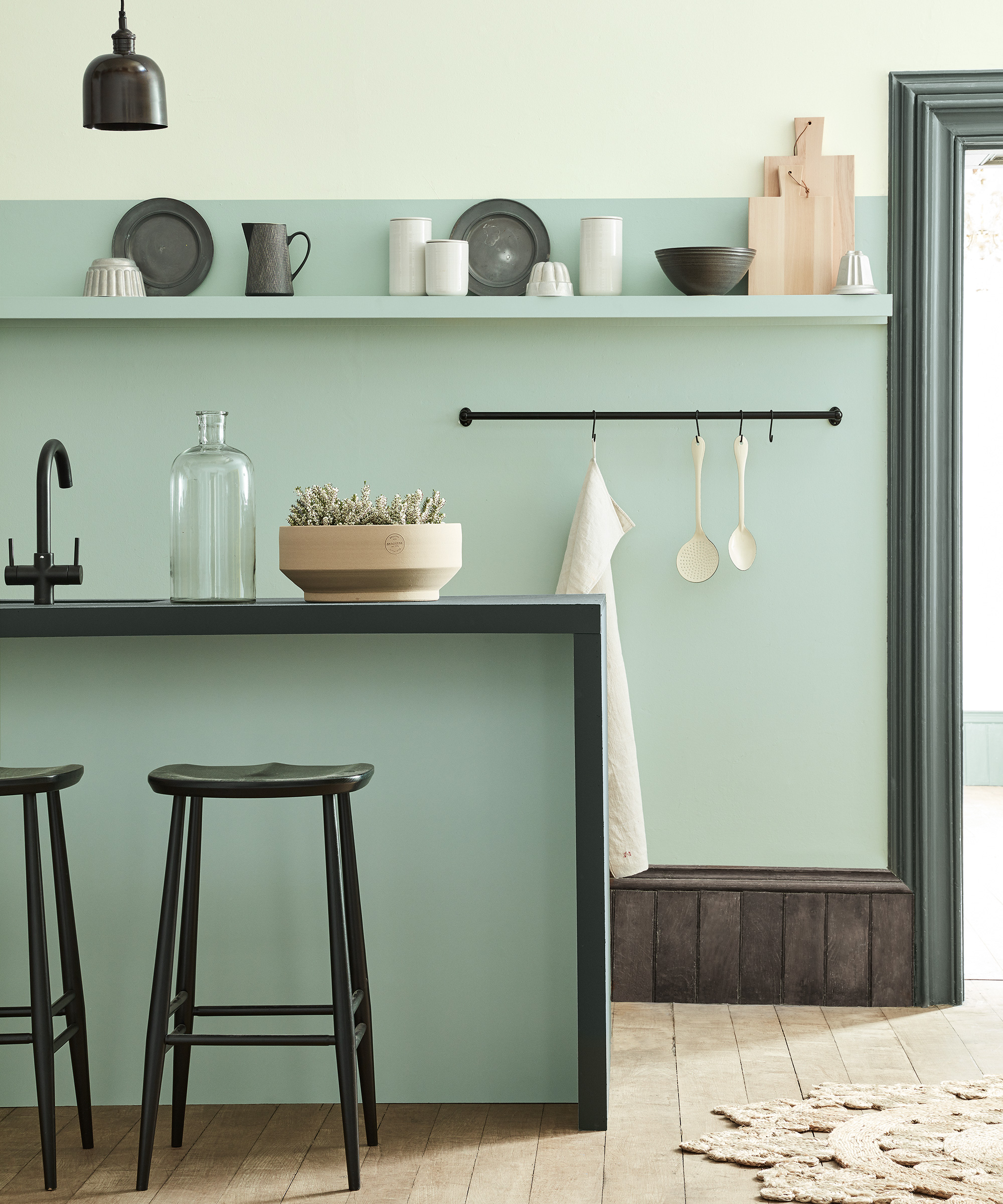
Decorating with green is very much the color of the moment, and we predict that it isn't going anywhere anytime soon.
In this kitchen by Little Greene, Aquamarine is used on the island and lower half of the wall, then the color is taken up a notch on the door frame and island trim, then down again for the upper wall, resulting in a harmonious effect.
When it comes to green kitchen ideas, look for paler, cool shades like this for sunny rooms that get plenty of natural daylight; north-facing rooms or those with poor daylight will benefit from warmer tones.
13. Add color with tiles
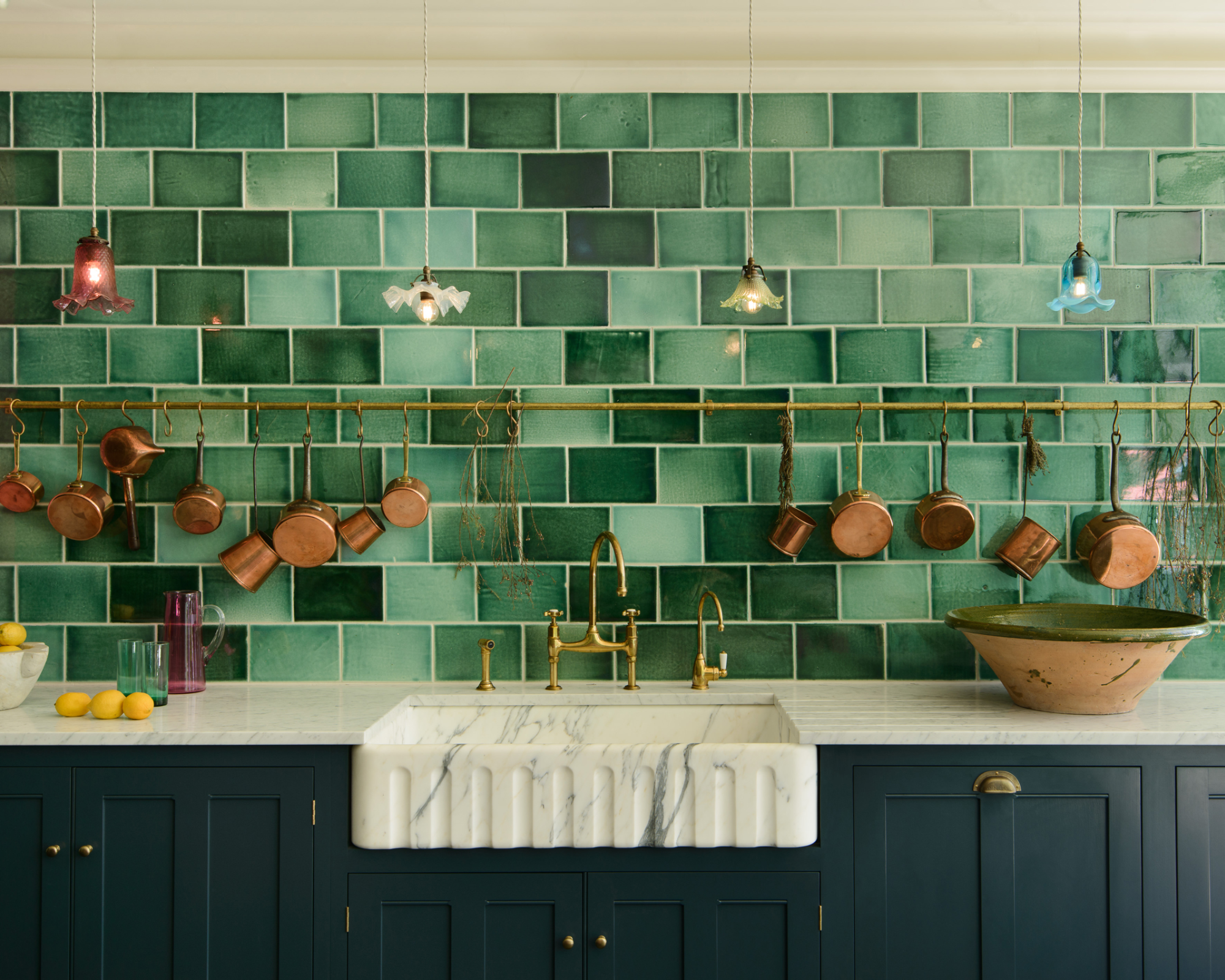
Handmade and artisan kitchen tile ideas will bring a unique mix of color, pattern, and texture to any kitchen scheme, adding instant character to walls and floors.
There’s something about tiles – their tactile quality, the potential for adding color, pattern, and personality – that few other surfaces can match. Decorative tiles fell out of favor for a while, but they are most definitely back and with a huge choice of forms and finishes.
Here, the mid-green kitchen backsplash tiles add interest to the space while pairing seamlessly with the darker green kitchen cabinets.
14. Paint in a pink palette
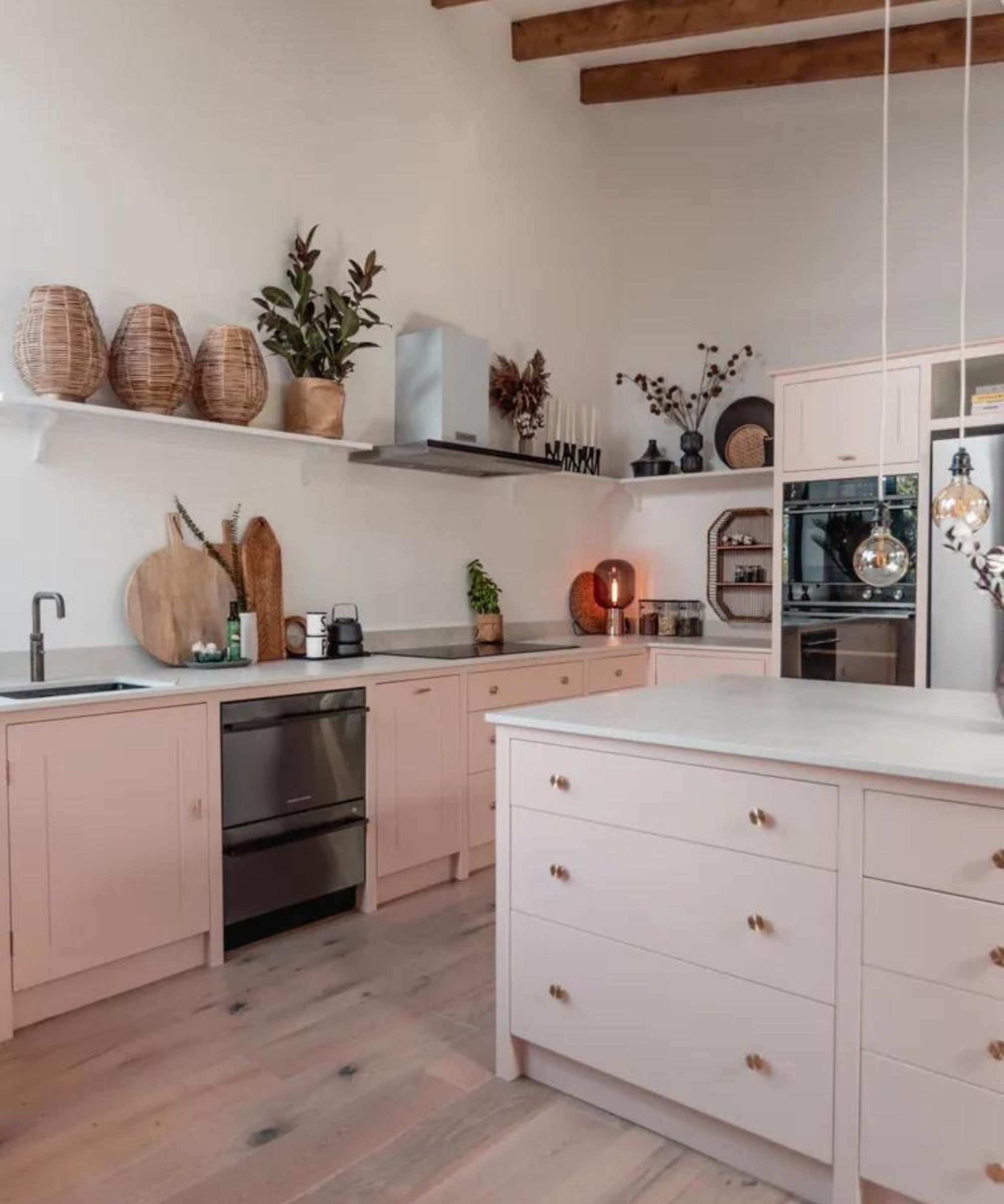
This muted color combination has given pink a whole new identity. No longer super-girly, the murkier tones of blush pink present an alternative way to decorate with neutrals.
Here, the kitchen cabinets and kitchen island reflect two different shades of pink, both light and pared-back – a great way to add warmth to the kitchen without going too bright.
15. Create contrast with color
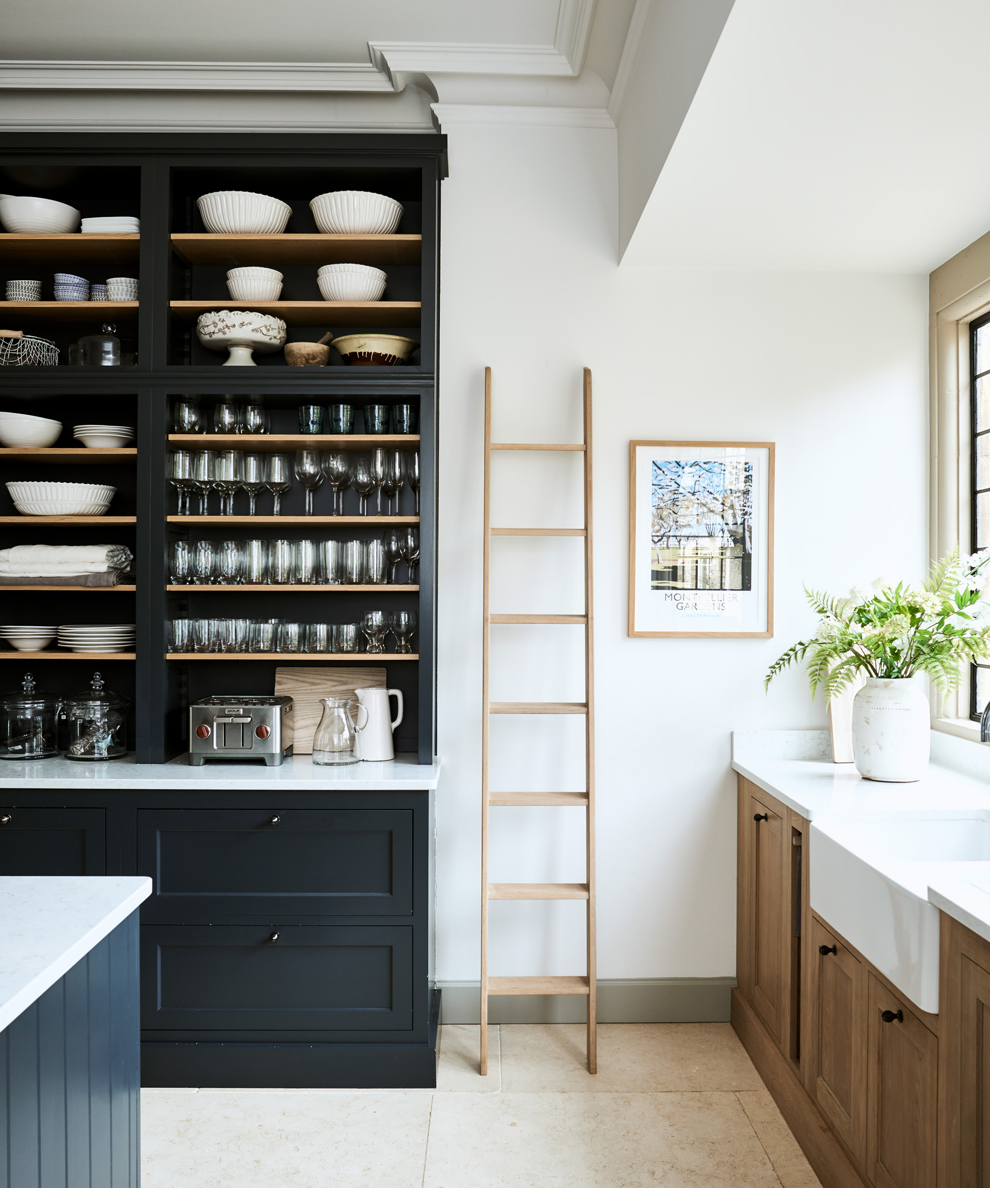
Contrasting black or deep gray with white is the most effective way to create impact in a predominantly white kitchen, but the key is to vary the proportions.
A 50/50 black and white kitchen split could feel cold; instead, pair dark cabinets with marble and another vital ingredient: texture. Grain-rich timber doors and accessories will break up the space beautifully, as shown in this Henley kitchen by Neptune.
16. Be brave with a daring color scheme
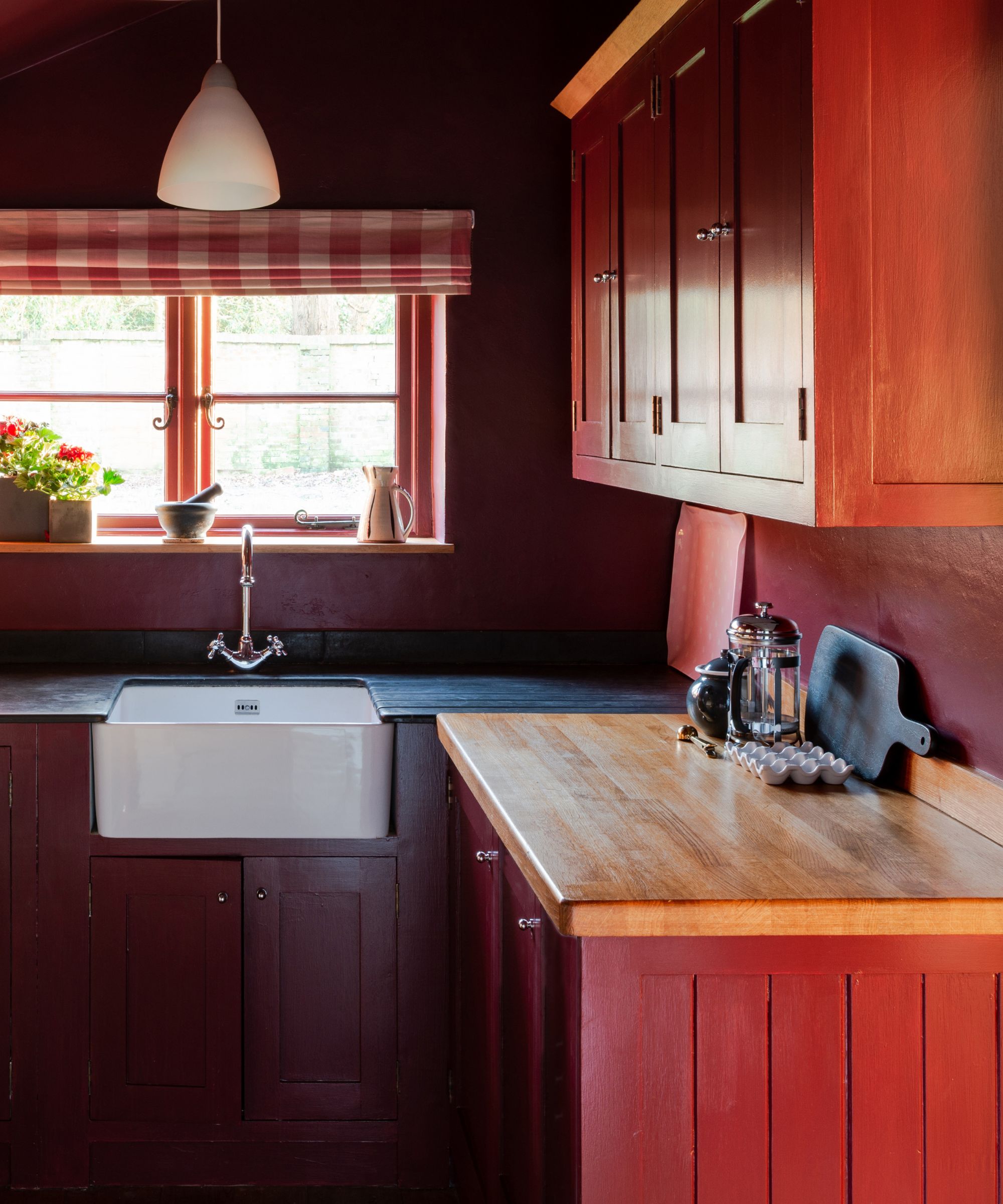
A bold red kitchen idea is often considered a daring choice for interiors, but when used creatively it can introduce a welcome burst of energy and excitement.
A poppy-red kitchen cupboard is ideal for lifting a dark green-gray scheme, while accessories sporting the same shade create a sense of cohesion. If you're looking for ideas for how to choose a kitchen color scheme that uses bold shades subtly, this is a great option.
17. Be cocooned in an emerald green kitchen
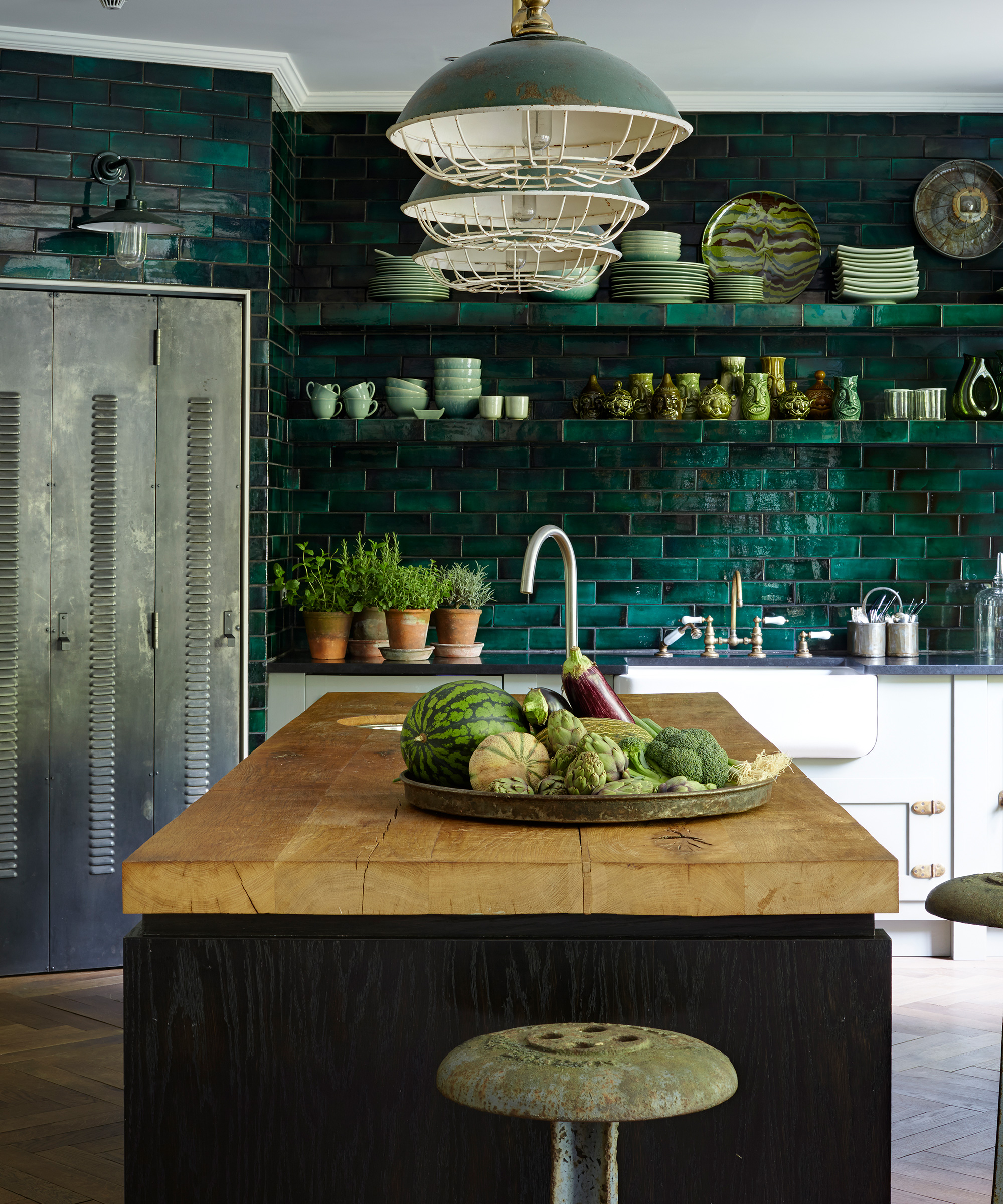
Green is having something of a resurgence in the kitchen design space. 'Shades of green are an increasingly popular choice for kitchens,' says Helen Shaw, Marketing Manager at Benjamin Moore. 'At the center point of the color wheel, green can adapt to both cool and warm schemes, working to tie varying hues together.'
‘The brief for this kitchen was to bring the greens of the garden indoors,’ says designer Hubert Zandberg. The glazed kitchen wall tiles set off the industrial notes, and natural wood provides a richly textured look.
A well-lit room with clever kitchen lighting ideas will also help the color scheme stand out – take inspiration from the vintage-style pendant lights in this space.
18. Introduce shimmer and shine
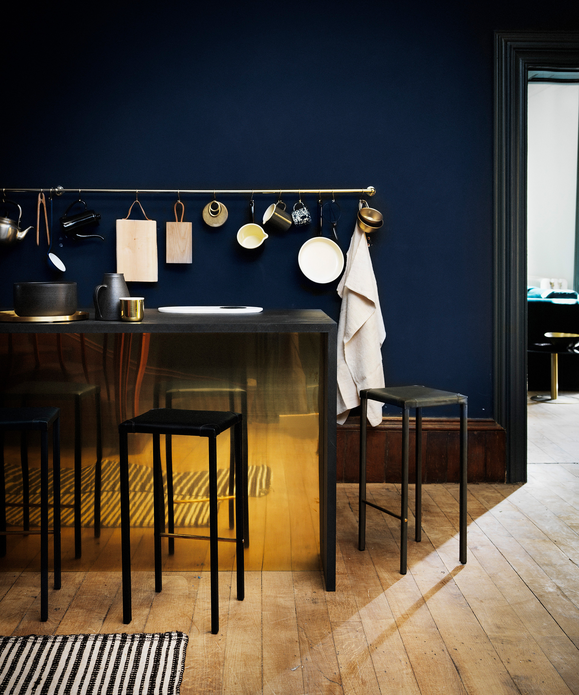
With its warm, burnished luster, brass is once again in the ascendant, lending a polished edge to interiors.
A dark background is ideal for showing off the gleaming beauty of brass. Here, it forms a counterpoint to a statement mirror-like panel that adds a glamorous note to a modern kitchen island.
19. Blend bold with cozy with a wine red
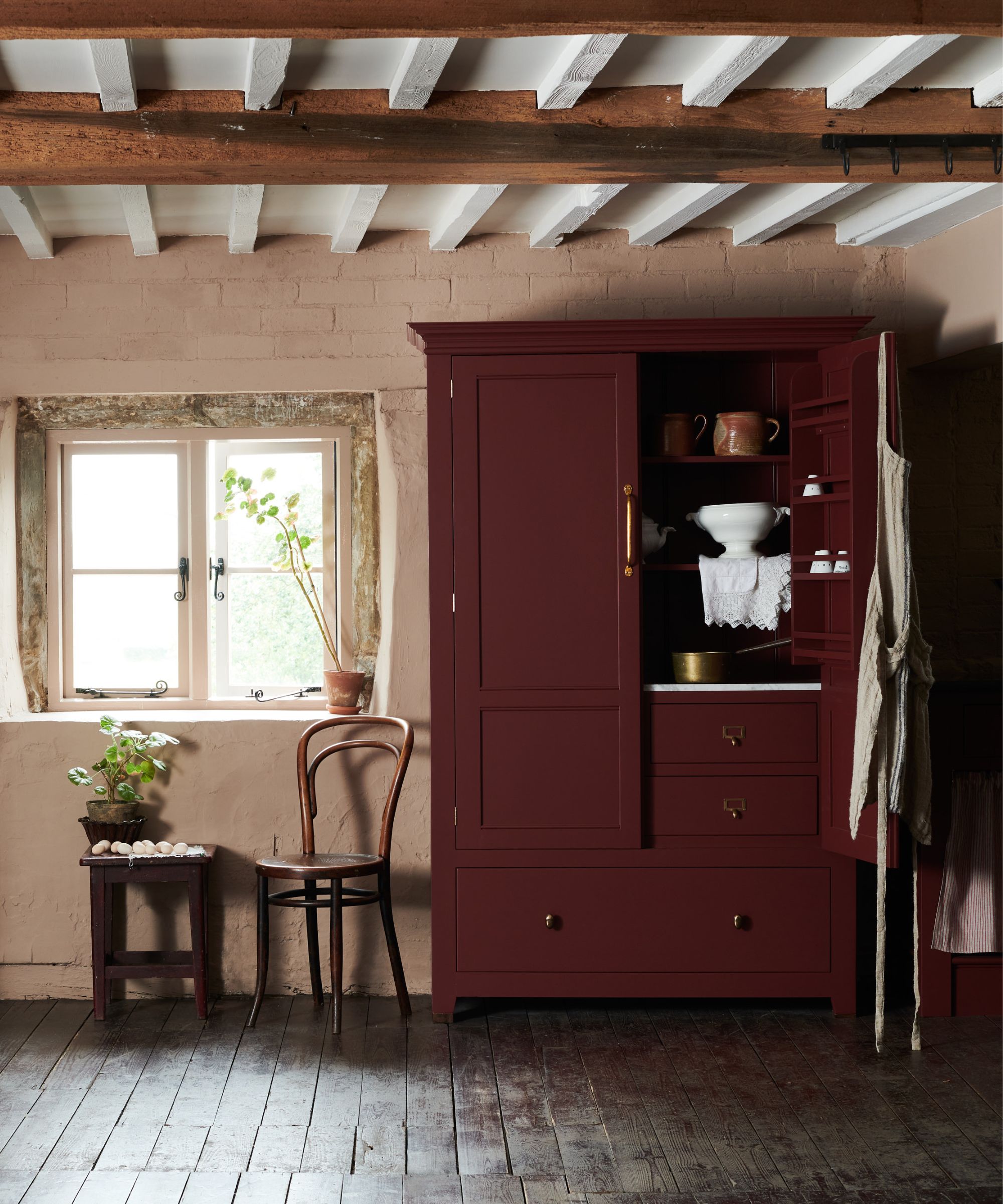
Red kitchens are back in fashion – but they're far from brassy. Instead, toned-down reds that edge towards terracotta or deep reds such as cherry are having a moment.
That doesn't mean that lipstick red can't be on your list – but this bold shade works best for flat-fronted, contemporary kitchens, while the earthier and berry shades are more suited to traditional spaces.
20. Stick to a pure white scheme
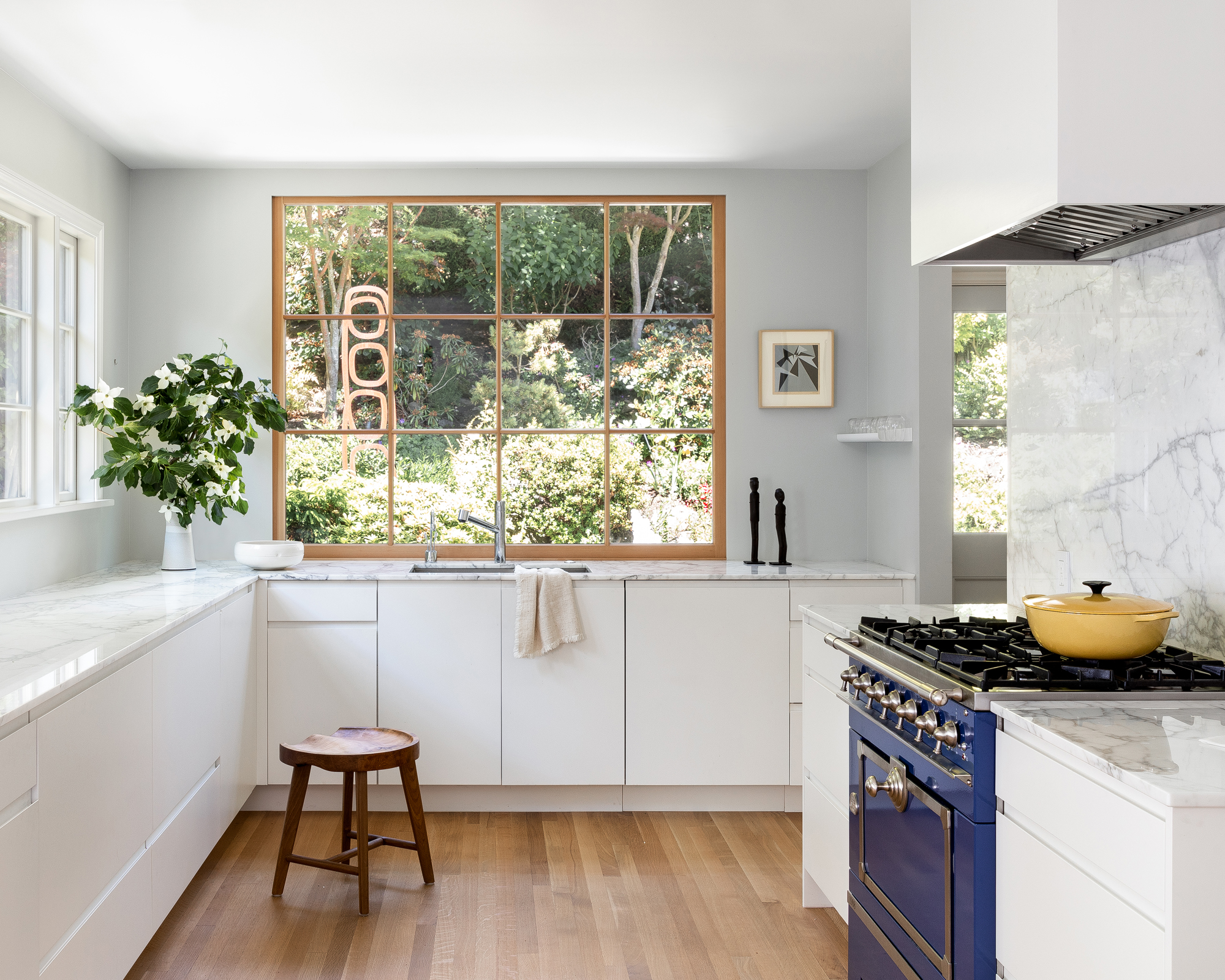
White kitchen ideas are still the biggest selling 'color' in the kitchen marketplace, and there's no denying that choosing white cabinets does make it considerably easier to adapt and tweak color schemes at a later date. Avoid the 'clinical' look by making sure that there are some elements of natural materials in the room – perhaps wooden flooring, or a timber table top and chairs.
21. Channel two colors for a playful look
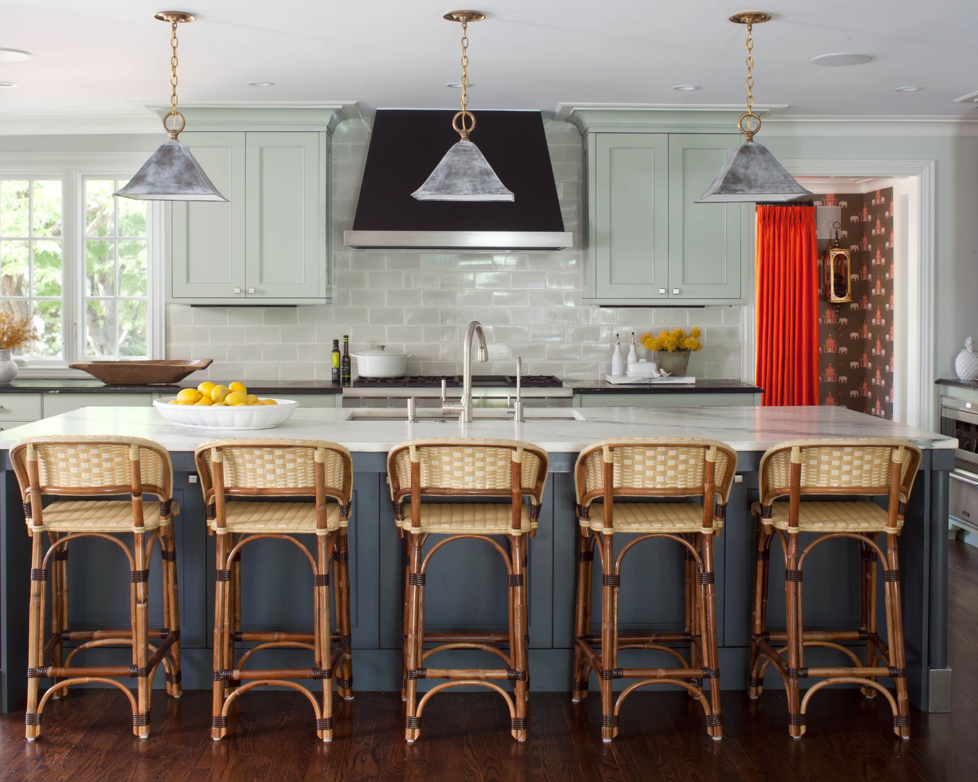
Can't decide on one color choice for your kitchen? Consider going for two colors for a playful look. The key to doing so effectively is to ensure both colors complement each other and don't create too much contrast.
'Using multiple colors in the kitchen provides a pop of surprise and mixes things up a bit,' says interior designer Nadia Watts. 'It creates drama and depth. Choose colors in the same color family for a cohesive combo, such as light-washed blue and pale green.'
22. Go for on-trend light blue
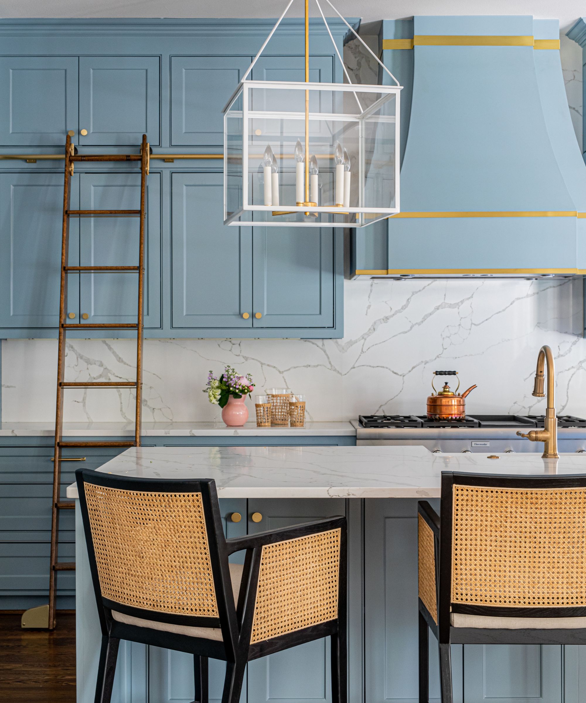
Blue kitchens are popular right now for good reason: it's often the perfect color for bridging the gap between colorful and neutral. Depending on the shade you choose, decorating with blue can maintain the calming appeal of neutrals while providing a pop of color to the heart of the home.
'Blues have the unique ability to excite, stand out, and satisfy a craving for color while still serving as a semi-neutral that you won't tire of thanks to their presence in nature,' says Sarah Hargrave, owner and principal designer at Dallas-based The Collective.
23. Choose dark cabinets and neutral walls
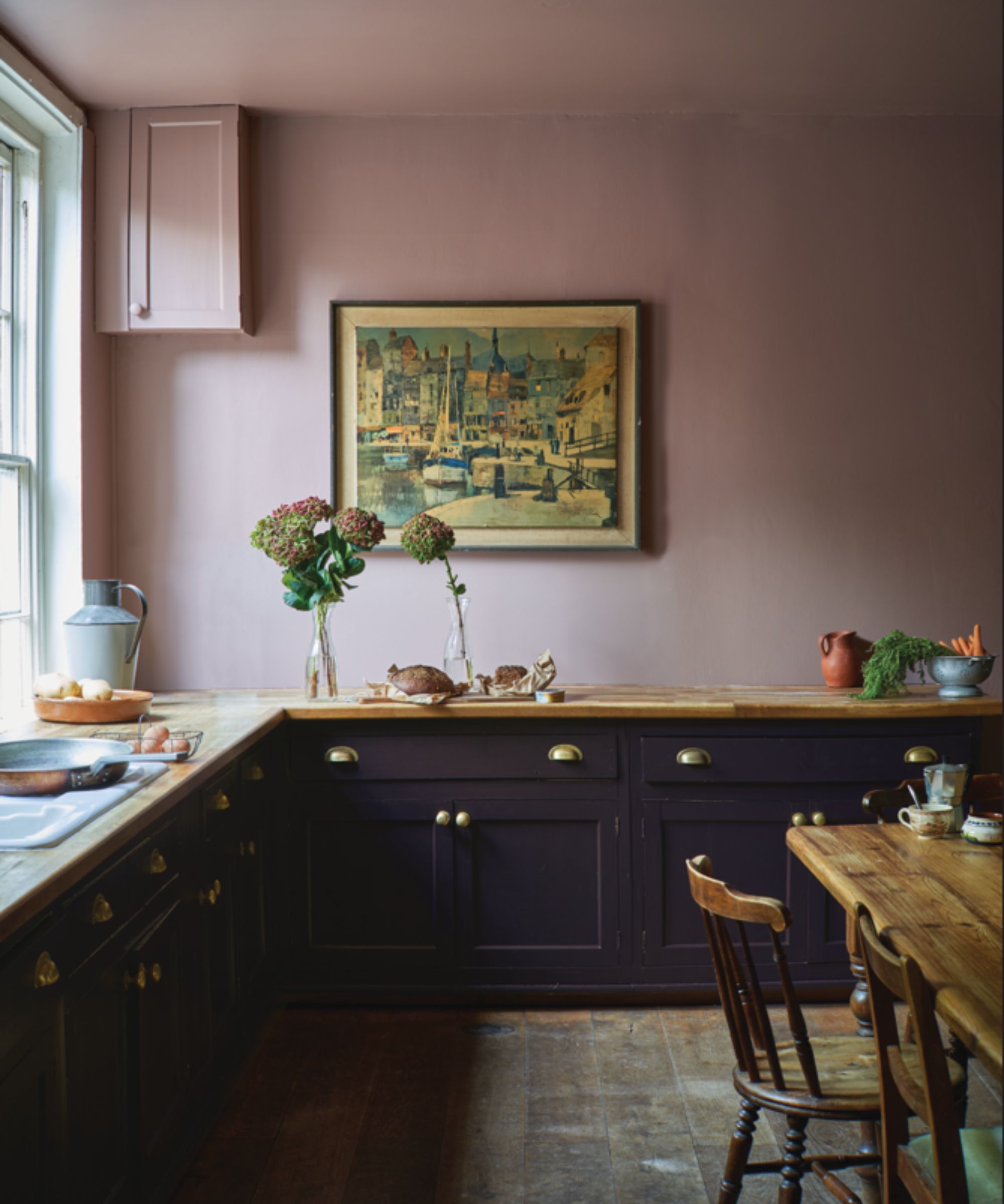
'Don’t be afraid to go dark on your cabinetry, especially when paired with a good mid-neutral on the walls,' advises Patrick O'Donnell, brand ambassador at Farrow & Ball.
'Dark kitchens are striking yet timeless and are especially good at giving presence to a small room, even more so if your cabinets are the lower units as this will provide ‘structure’ to your room. Think something elegant like our blackest blue, Railings.'
24. Set a welcoming look with warm white
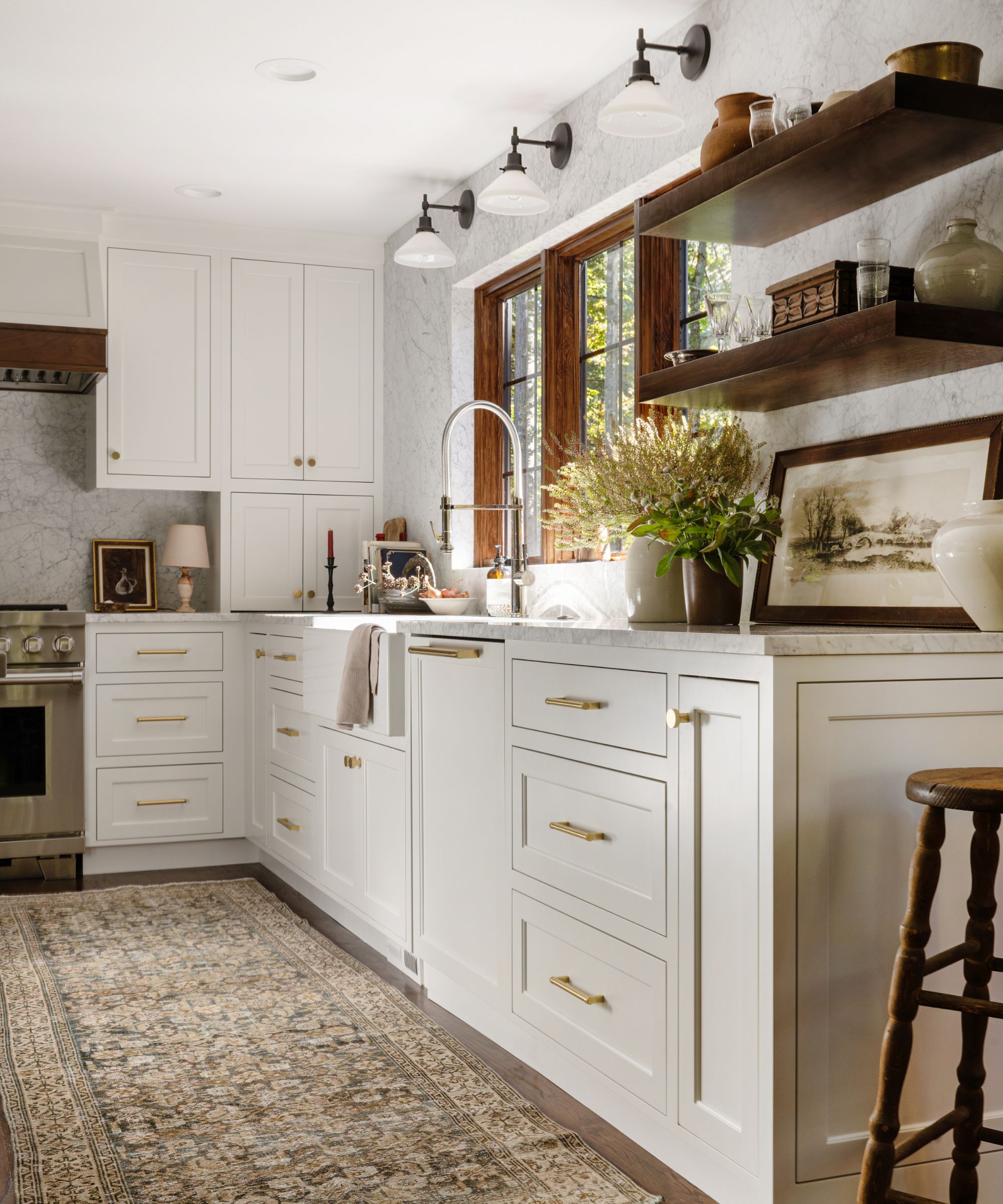
Want to maintain a light and airy look in your kitchen without it feeling stark or sterile? The key to doing so is to opt for a warm white paint, much like Benjamin Moore's Harwood Putty that was used here, giving slightly more warmth and depth than a true white.
'The key to making a white kitchen feel warm and not stark is selecting a white paint color that has a warm creamy undertone, but not yellow,' says Emily Ruff, owner and principal designer at Cohesively Curated.
'We also like to use a brighter white on the walls like Benjamin Moore's Chantilly Lace or Simply White to create a slight contrast between the walls, ceilings, and cabinets. With this kitchen, we also brought in a lot of warmth with the wood accents on the hood, window trim, and shelves. We also love to incorporate vintage elements like the rug, artwork, and accessories to add some character.'
25. Create a natural look with wood tones
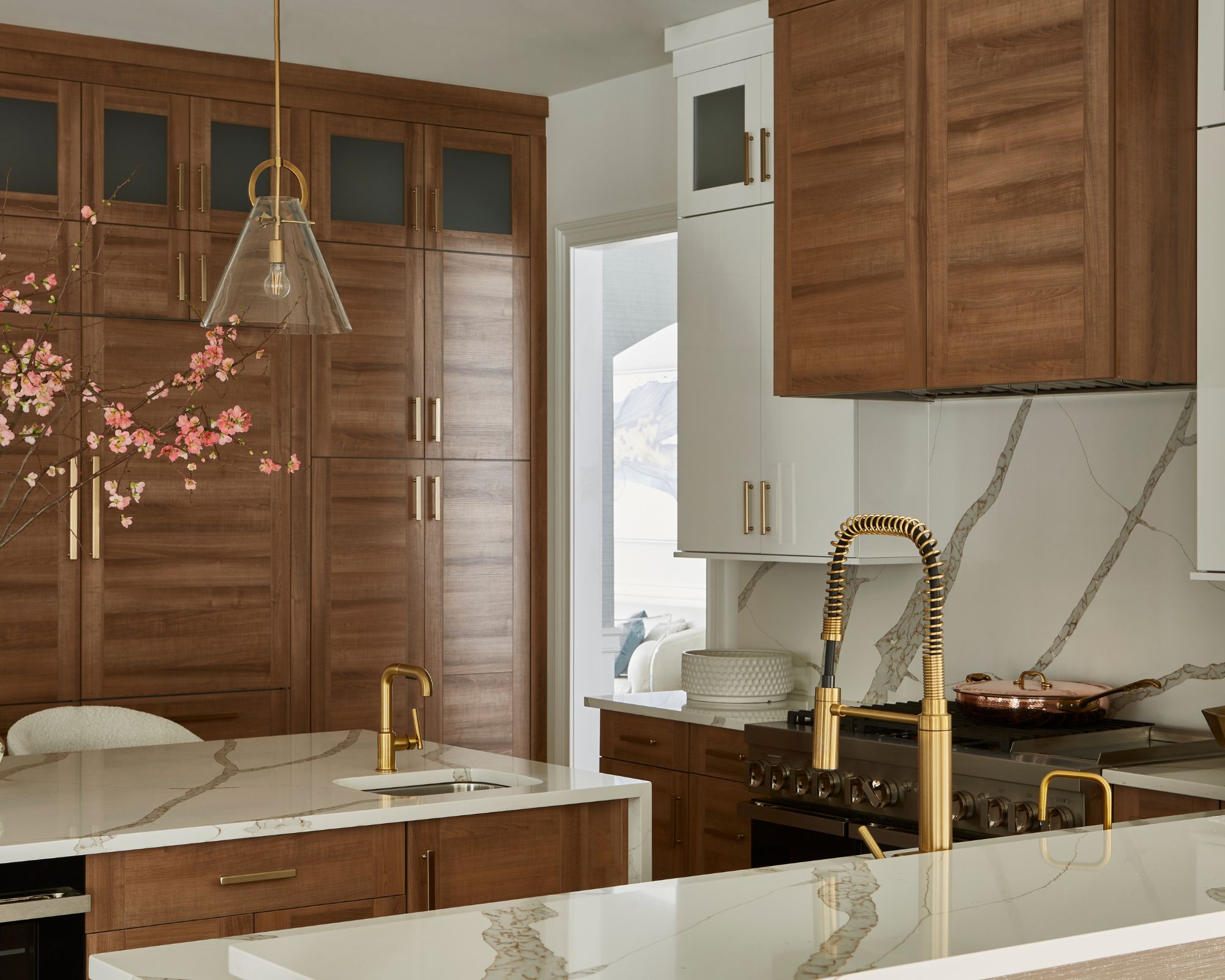
For a timeless color scheme, you can't go wrong with letting the natural tones of wooden kitchen cabinets dictate your kitchen color scheme.
'We chose these rich in wood tone cabinets for a luxe, transitional kitchen,' says interior designer Karen Wolf of K+Co. Living.
'The high contrast between the wood cabinets, countertop, and white cabinetry creates a focal element in the room and a wow factor to the space. When working with wood cabinetry, either the wood needs to match the floor or pull a tone from the floor, light or dark. In this case, we pulled the darker knot color from the wood for the cabinetry.'
26. Use color to create a cozy kitchen
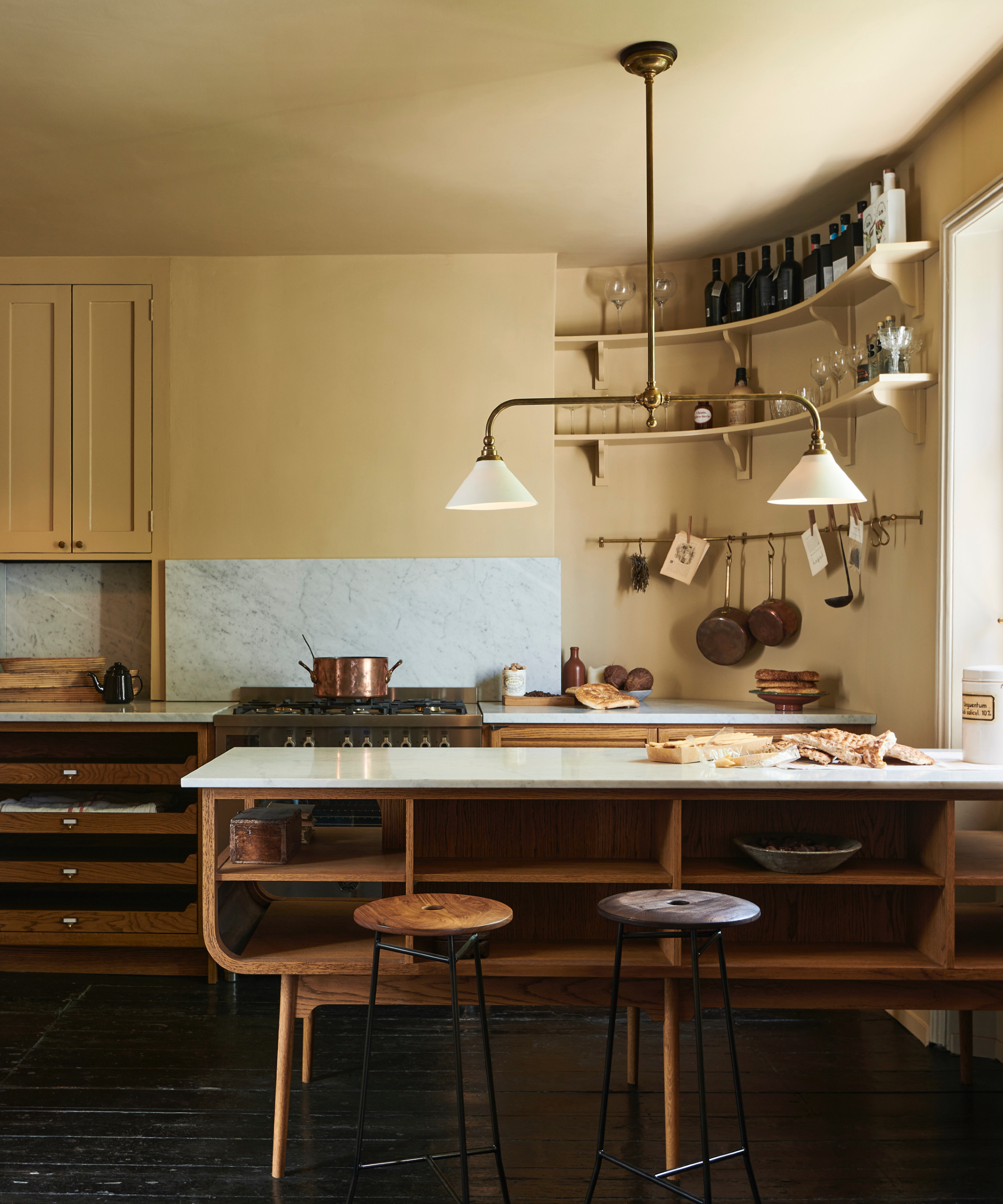
In the kitchen, a social and highly frequented room in the home, you should think about using colors that you are personally drawn to, as well as colors that feel co,zy to encourage a relaxing atmosphere.
'Light, warm neutrals in shades of beige, cream, and greige create a cozy, comfortable environment that is perfect for the kitchen,' says color expert at Behr Paints, Erika Woelfel.
Warm neutrals and moody hues are popular choices for an inviting and cozy kitchen, but there are a few less expected colors you can try, such as yellow. Ashley McCollum, color expert at PPG's Glidden, says 'Brass Mesh is a bright, cheerful yellow that can instantly add a sense of warmth and happiness to a kitchen.'
Opting for a dark green kitchen is another way to create a cozy and cocooning feel. 'Earthy green tones, like olive, connect your kitchen to nature and promote a sense of calm and well-being,' says Jacky Chou, principal at Archute.
From pared-back neutrals to bold colors, these kitchen color ideas are timeless and will maintain appeal for many years to come. Whether you want your kitchen to make a loud statement or harmonize with the rest of your home, first and foremost, your kitchen color scheme should align with the colors you love the most.

Jennifer is the Digital Editor at Homes & Gardens, bringing years of interiors experience across the US and UK. She has worked with leading publications, blending expertise in PR, marketing, social media, commercial strategy, and e-commerce. Jennifer has covered every corner of the home – curating projects from top interior designers, sourcing celebrity properties, reviewing appliances, and delivering timely news. Now, she channels her digital skills into shaping the world’s leading interiors website.
- Emily MoormanContributing Writer