Design expertise in your inbox – from inspiring decorating ideas and beautiful celebrity homes to practical gardening advice and shopping round-ups.
You are now subscribed
Your newsletter sign-up was successful
Want to add more newsletters?
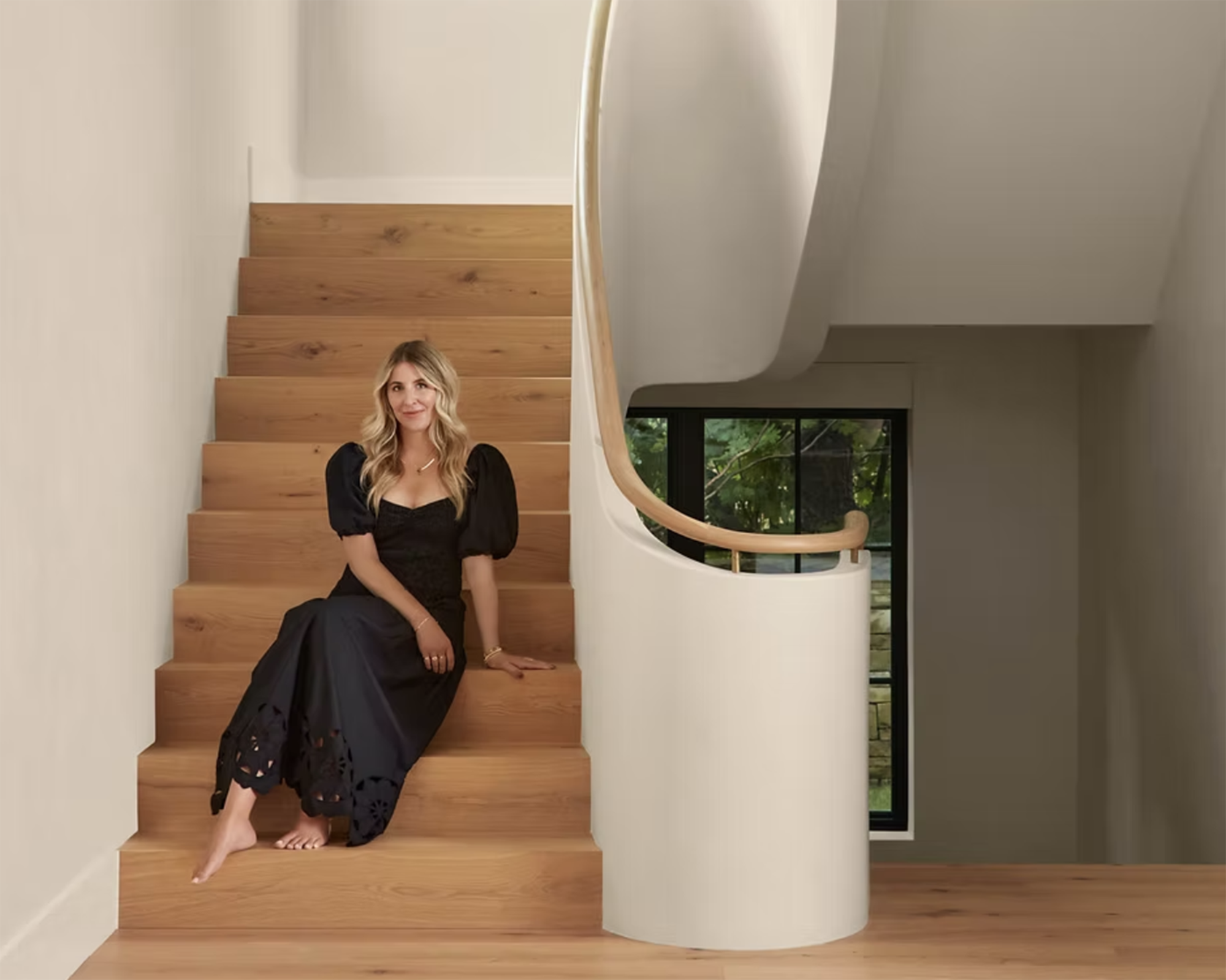
Ashley Montgomery is the founder of Ashley Montgomery Design, a Toronto-based interior design studio renowned for creating homes that are as warm and inviting as they are beautiful. Known for her signature 'quiet luxury' aesthetic, Ashley combines natural textures, timeless colors, and vintage finds to craft spaces that feel both deeply personal and effortlessly livable.
Her work is celebrated for striking a balance between refined detailing and relaxed charm. In this conversation, Ashley shares her philosophy on designing homes that envelop you in comfort, her favorite palettes and materials, and why imperfection can be one of the most beautiful elements in a space. From crafting kitchens that truly feel like the heart of the home to using paint in unexpected ways, she reveals how thoughtful design choices can create a home that feels timeless, personal, and uniquely yours.

Your rooms feel both grounded and deeply personal. When beginning a new design, what’s the first element you focus on – mood, function, or something else entirely?
Article continues belowAt the heart of the homes I design is the idea that they’re meant to be lived in. I aim to create a cozy, warm, almost hug-like feeling. Each design is tailored to the specific project, so when we begin, we focus on how the homeowners will actually live in their space. Some people love to cook, others love to sit and read – we personalize each home so that it feels truly comfortable and welcoming for the people who live there.
In that case, what does ‘comfortable’ mean to you?
Comfortable feels approachable. I don’t want anyone wondering whether they should take their shoes off or if they can move a pillow. I want people to feel free to kick up their feet, while still experiencing a sense of quiet luxury.
And how would you define quiet luxury?
Design expertise in your inbox – from inspiring decorating ideas and beautiful celebrity homes to practical gardening advice and shopping round-ups.
It’s all about layers, and through layering, you achieve a sense of luxury without anything feeling overtly 'luxe.' There are elements of raw textures and woven pieces; it’s relaxed, not stuffy. The space isn’t crowded with overstuffed sofas – instead, everything feels carefully considered and beautifully tailored.

What colors belong in your palette of quiet luxury?
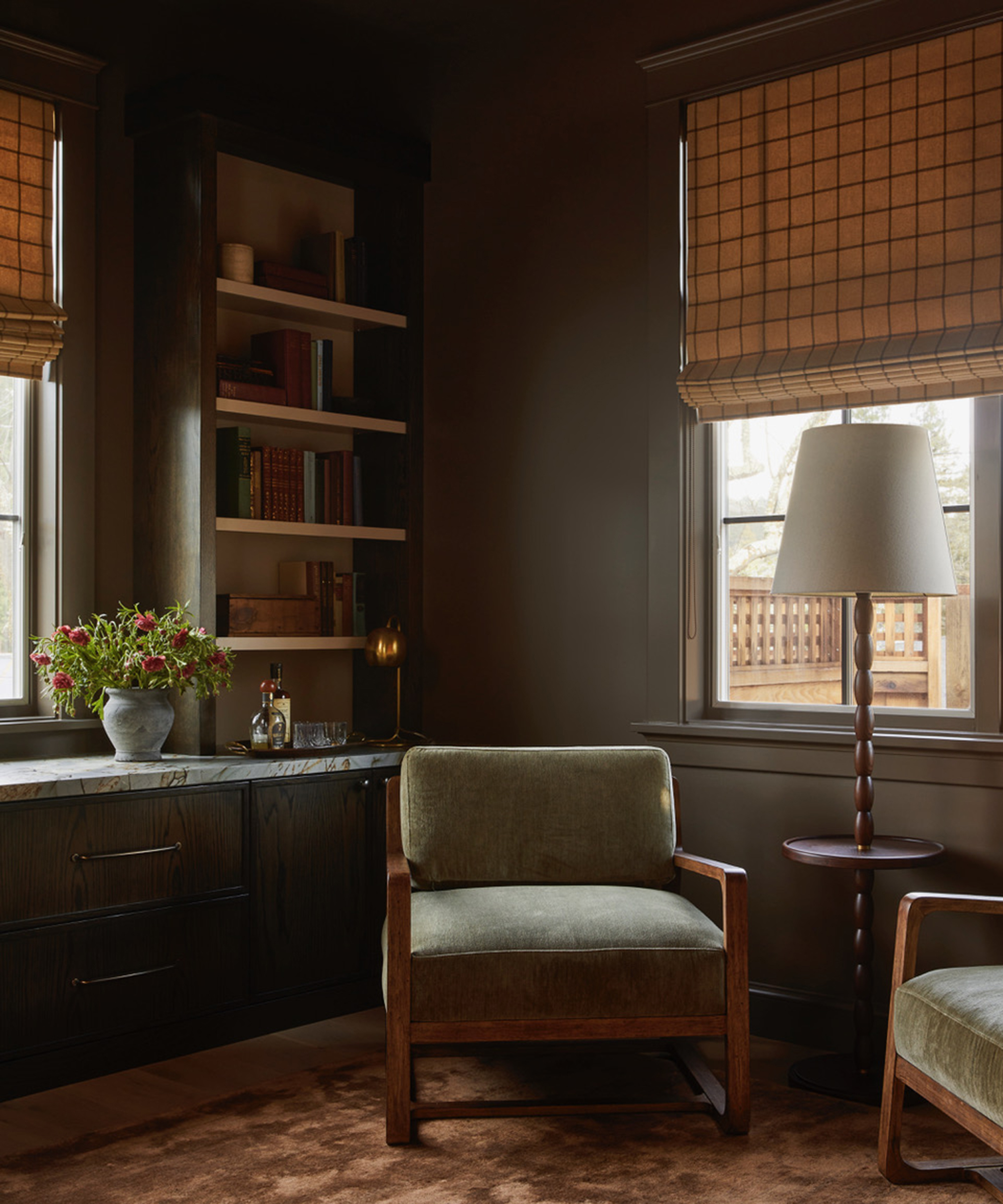
I consider earth tones to be neutral – blues, greens, browns, even clay reds and mustard yellows. These are the colors you see in autumn leaves, all drawn from nature. I work with the Farrow & Ball color deck constantly; their paints carry a sense of heritage, and introducing these 'old world' hues brings a timeless quality. Somehow, they all just work beautifully together.
Which Farrow & Ball colors have become your go-to?
We use Mouse’s Back all the time. Stony Ground is a favorite for kitchens, and Farrow’s Cream is a buttery, perfect yellow. If you want a brown with just a hint of red, Cola is a great choice.
Many of your projects feature vintage and antique finds. What role does timeworn character play in your overall design philosophy?
A vintage piece brings a soul into a space, and I love that no two are ever alike. It adds something truly special. When you look at a piece of vintage furniture, you see its character, the warmth of the wood, and the story it carries.
What do you look for when you’re sourcing? How do you find those gems among everything else?
Patience is key. I’ll wander through an antique store once, then again, and even a third time – sometimes items are ringing through at checkout before I even notice all the little treasures. I’m drawn to pieces that make my heart feel good: a unique color, or something you rarely see. I recently found some vintage crocks in a dusty pink – they’ll be perfect on a nightstand with flowers or on a kitchen shelf holding spoons. Sure, you can buy reproductions, but they’re usually beige and lack the chips, glazing, and character of a vintage piece. There’s a real beauty in imperfection.
How do you guide clients who want a timeless home but are nervous about mixing old and new?
It usually comes down to functionality. A client might say, 'I love the idea of the vintage dresser, but can I actually open the drawers?' Some clients are hesitant about fully embracing authenticity, so in those cases, we either make new pieces feel aged or introduce vintage through accessories and display items.

You often bring in visual softness through aged wood, traditional fabrics, and antique lighting. Are there materials or finishes you reach for again and again?
I love decorating with patterns, especially on fabrics with a warm, oatmeal-colored background – on stark white, it just doesn’t have the same depth. I also enjoy mixing the scale of patterns, like pairing checks with stripes, in rich materials such as velvet and boucle.
Where do you source those oatmeal-tinged fabrics?
I love Jasper – everything they do makes my heart sing. But it’s not just fabrics that bring softness, going back to your earlier question. Painted tiles can have the same effect – you only need a few, as they can be pricey, but mixing them with plain tiles makes a big impact. I also love living finishes, like unlacquered brass from Perrin & Rowe, which ages and patinas beautifully, as if it were vintage from the start.
In many of your spaces, the kitchens feel like extensions of the living areas, with vintage rugs, custom cabinetry, and furniture-like islands. What makes a kitchen successful in your eyes?
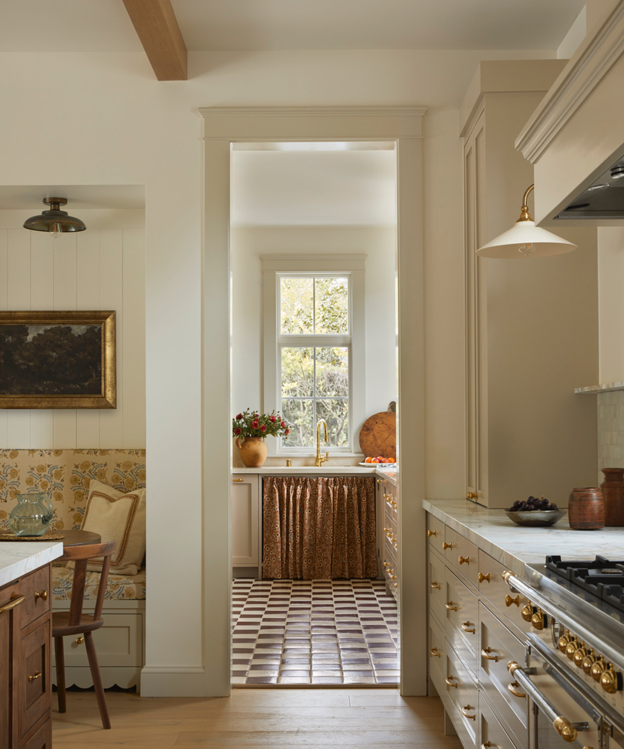
I always start with the kitchen, because it’s the heart of the home. It needs to be a workhorse, but also beautiful. I focus on details others might overlook – like the feet of the island – and think about how to give them the character of an old shop counter. I recently designed a paneled fridge with vent holes so it reads like an old hut rather than a modern appliance. I love when a kitchen has an eclectic, layered feel.
Do you approach bathrooms in the same way?
Bathrooms are similar – we make sure they’re functional, but we also ask: what’s our wow moment going to be? Is it a tub framed with dramatic drapery, a striking floor tile, or a marble shower? You can have fun with tile patterns, floor finishes, and details like the vanity’s feet, and even incorporate vintage furniture, like a stool next to the bath. Not everything has to be shiny, white, and purely utilitarian.
And finally, what’s inspiring you creatively right now?
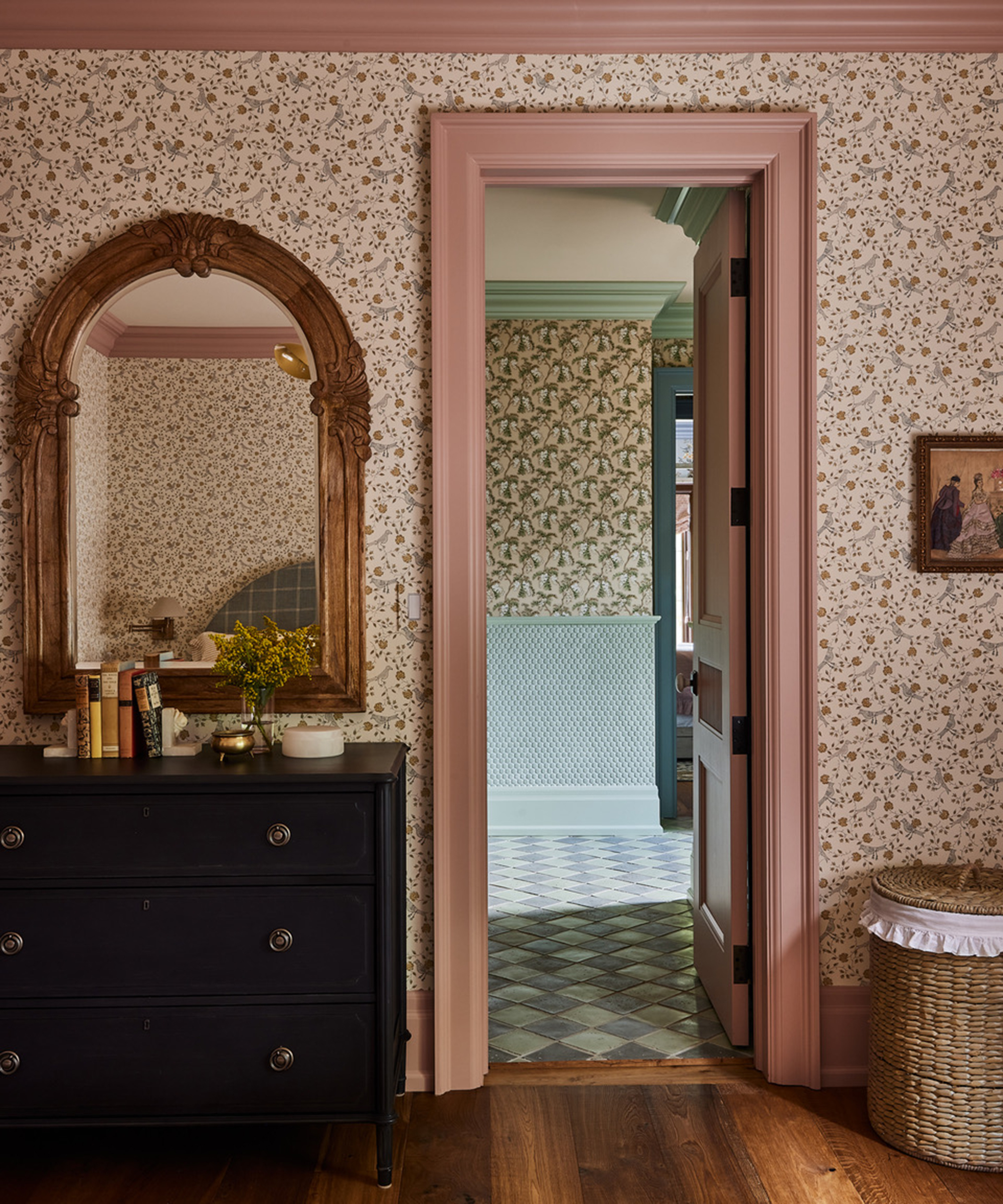
It’s paint ideas – it has the power to completely transform a space. People often forget the ceiling, but whether you add wallpaper, a wood treatment, or simply paint it a stunning color, it’s just as important as the rest of the room. Back in the 1990s, trim was almost always painted white, and we still see that a lot today – but I love painting trim in a contrasting color. Paint is what truly brings soul into a home. If it feels and looks right to you, that feeling will last forever.
See more of Ashley's work at Ashley Montgomery Design
Pip Rich is an interiors journalist and editor with 20 years' experience, having written for all of the UK's biggest titles. Most recently, he was the Global Editor in Chief of our sister brand, Livingetc, where he now continues in a consulting role as Executive Editor. Before that, he was acting editor of Homes & Gardens, and has held staff positions at Sunday Times Style, ELLE Decoration, Red and Grazia. He has written three books – his most recent, A New Leaf, looked at the homes of architects who had decorated with house plants. Over his career, he has interviewed pretty much every interior designer working today, soaking up their knowledge and wisdom so as to become an expert himself.

