Homes & Gardens’ Best Kitchens of 2025 – The Designs You Loved Most This Year
We’ve looked through our most popular kitchens of 2025 and found that Homes & Gardens readers all fall for characterful, layered spaces that feel lived-in

- 1. A Sunny Yellow Kitchen in a Tiny Toronto Apartment
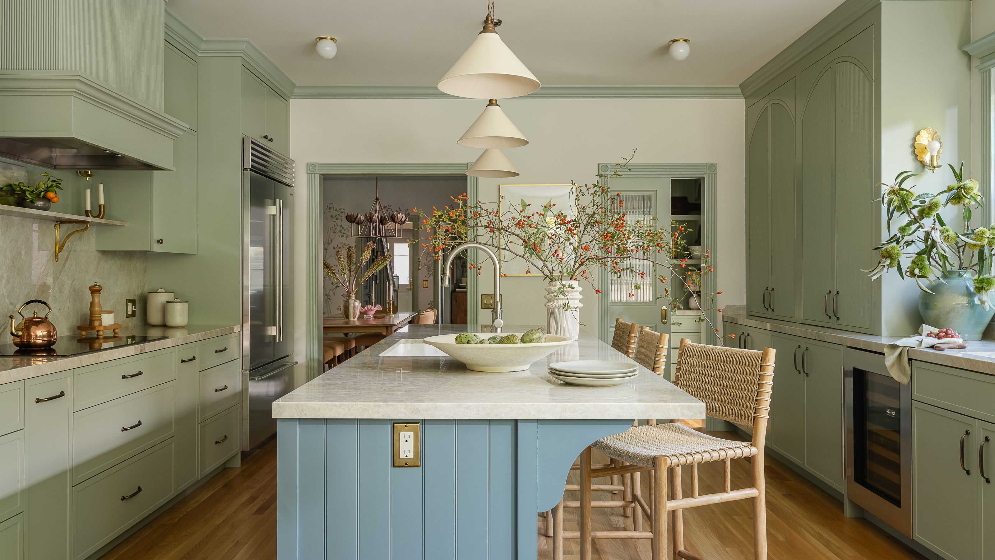
- 2. A Calming Kitchen in a 100 Year Old San Francisco Home
- 4. A Tactile Texas Kitchen Inspired by European Designs
- 5. A Parisian Kitchen with an English Country Feel
- 6. A Newly Laid Out Open Plan Kitchen Perfect for Family Life
- 7. A Charming Pink Kitchen-Diner in a Victorian London Home
That strange time that falls between Christmas and New Year is often one of contemplation. Looking back at the year we’ve had in between just one more leftover turkey sandwich, just one more holiday film, just one more midday nap – because no one is sure what time of day or week it actually is right now anyways. At Homes & Gardens, we are feeling contemplative too, looking back at all the wonderful houses we have toured in 2025.
Here, we are focusing on kitchens – the very best kitchens of 2025. These are the kitchens you, our readers and followers, have loved the most in the past year. They are our most viewed and most liked spaces. Each is unique, each has its own interesting story – but there is also one clear thread running through all of our most popular kitchens: they are all filled with character, colors, textures, and personality.
1. A Sunny Yellow Kitchen in a Tiny Toronto Apartment
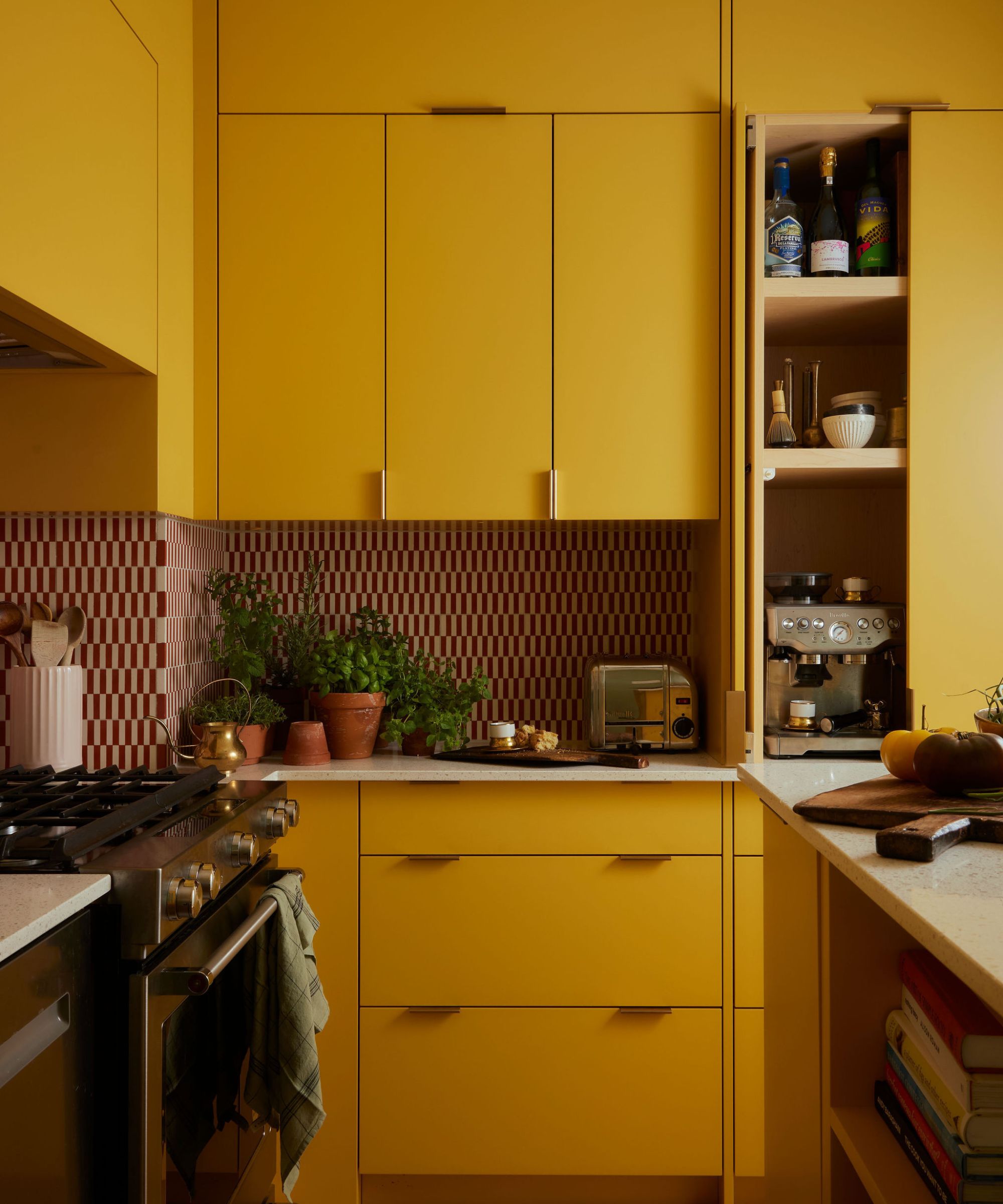
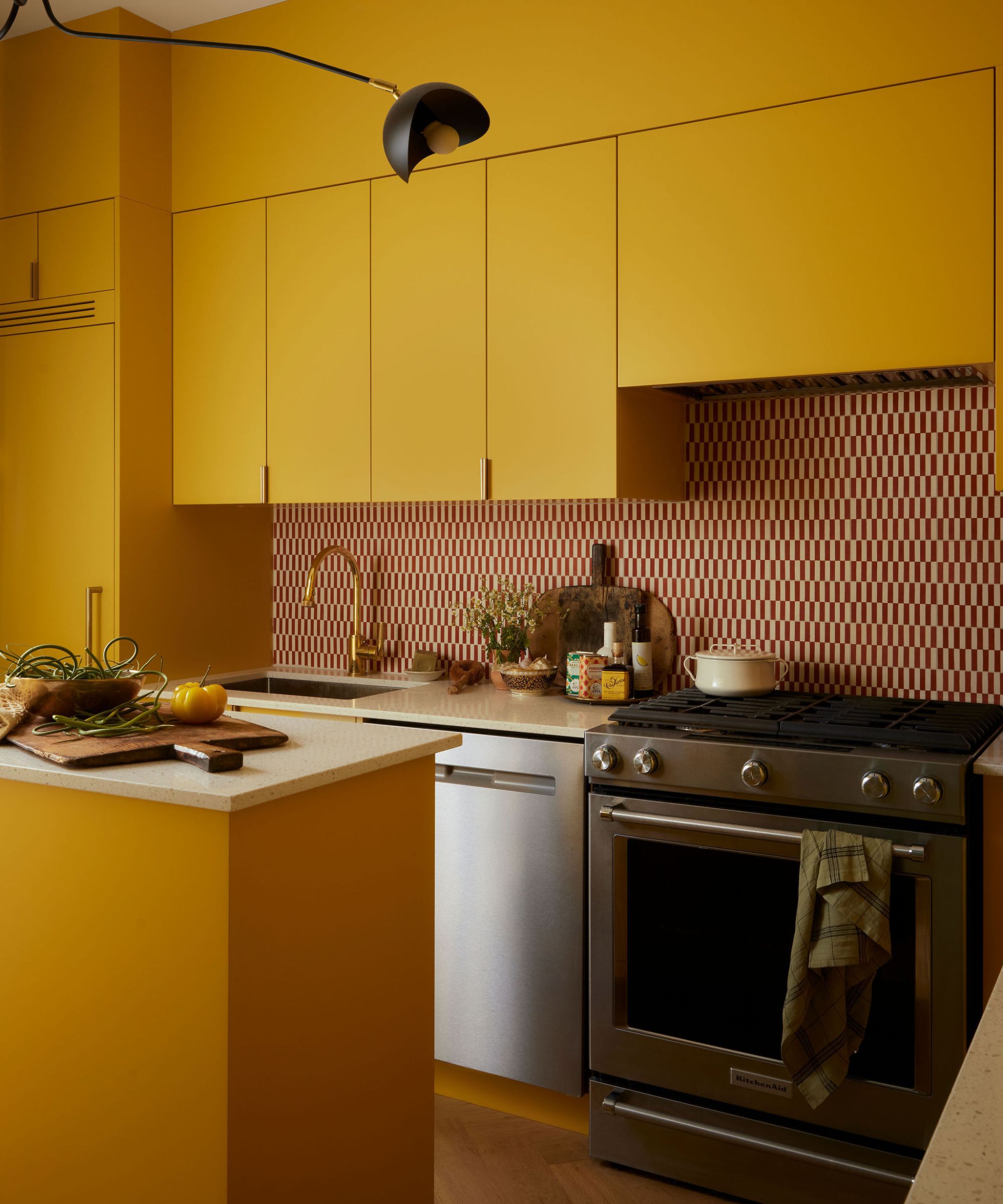
The limited square footage of this small kitchen didn’t hold back designer Cynthia Ferguson when she took on the remodel of this tiny 750-square-foot apartment remodel. In addition to the compact floor plan, there was only one window in the entire space, so every decision had to focus on maximizing natural light. The kitchen was also originally tucked out of the way, behind a staircase, and received zero natural light.
Cynthia drenched the kitchen in a wash of warm ochre – Stuart Gold by Benjamin Moore – a color that both she and her clients were instantly drawn to. Bronze knobs and Caesarstone countertops further help to subtly illuminate the space. The striped red-and-white tiles add a playful feel, as Cynthia notes, ‘a solid backsplash would’ve been a missed opportunity for whimsy’.
‘Every inch had to count,’ says the designer, so she went bespoke with a slimline custom island on casters that can be moved around the space as needed.
2. A Calming Kitchen in a 100 Year Old San Francisco Home
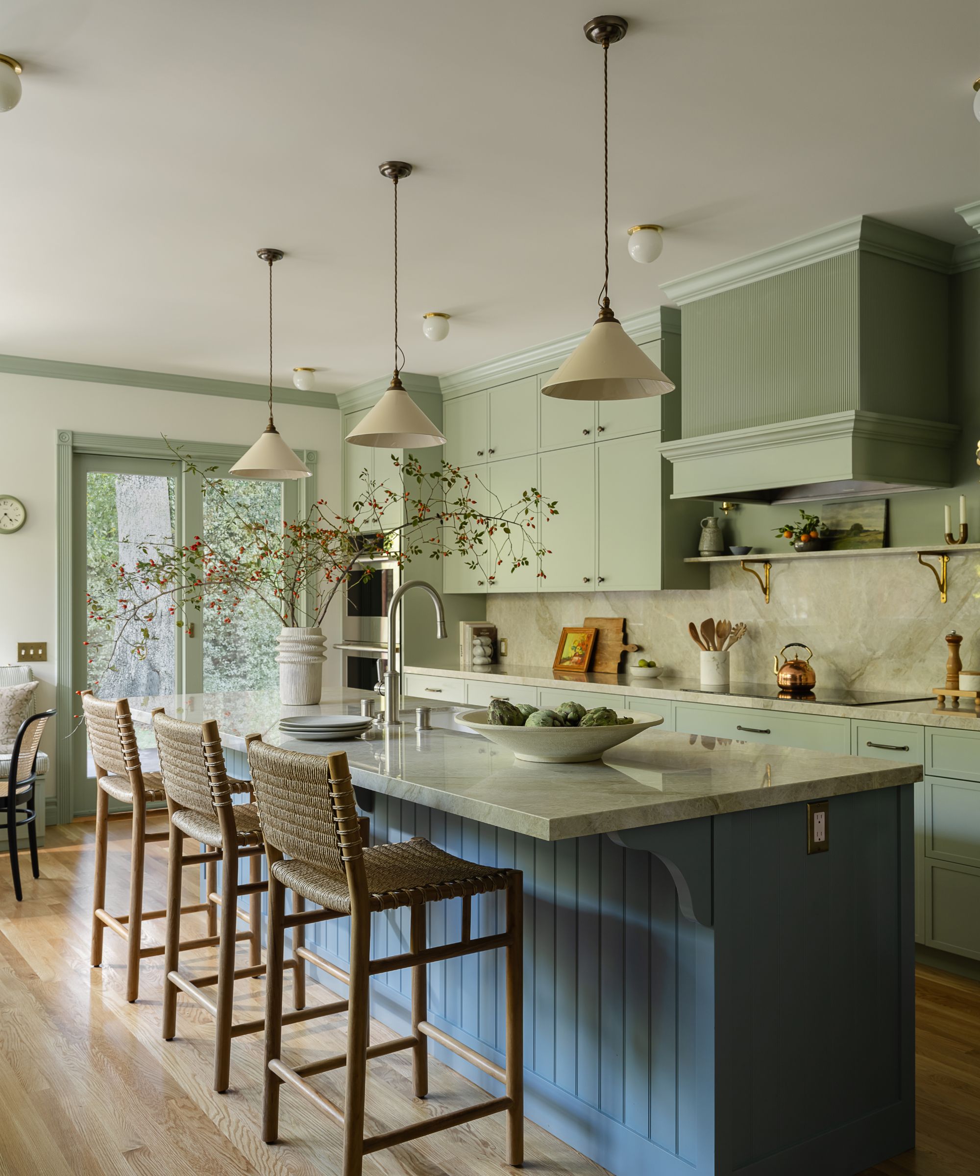
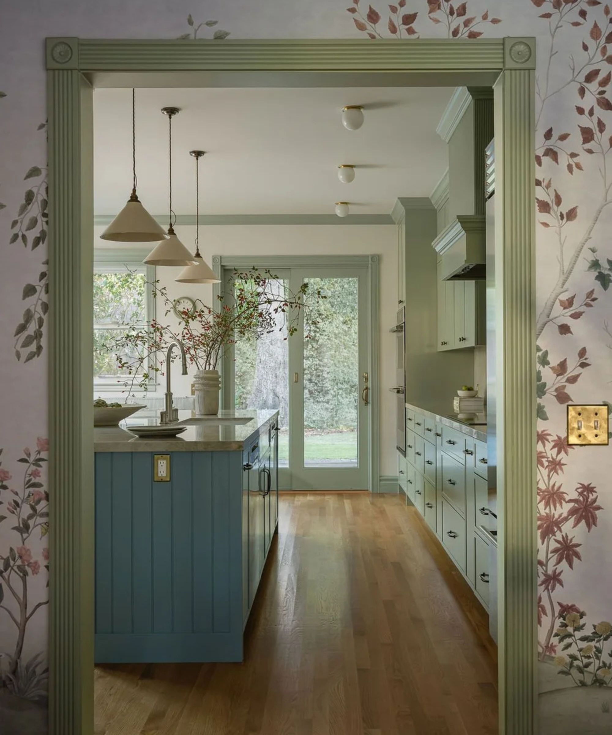
When designer Melanie Love took on this 100 year old Edwardian home in Cole Valley, San Francisco, it wasn't so much about restoring the room's original features, but finding them again. After decades of renovation, after renovation that had stripped away the home's character, the good bones of the home needing digging up and the homeowner's wanted a more functional space that still honored the history.
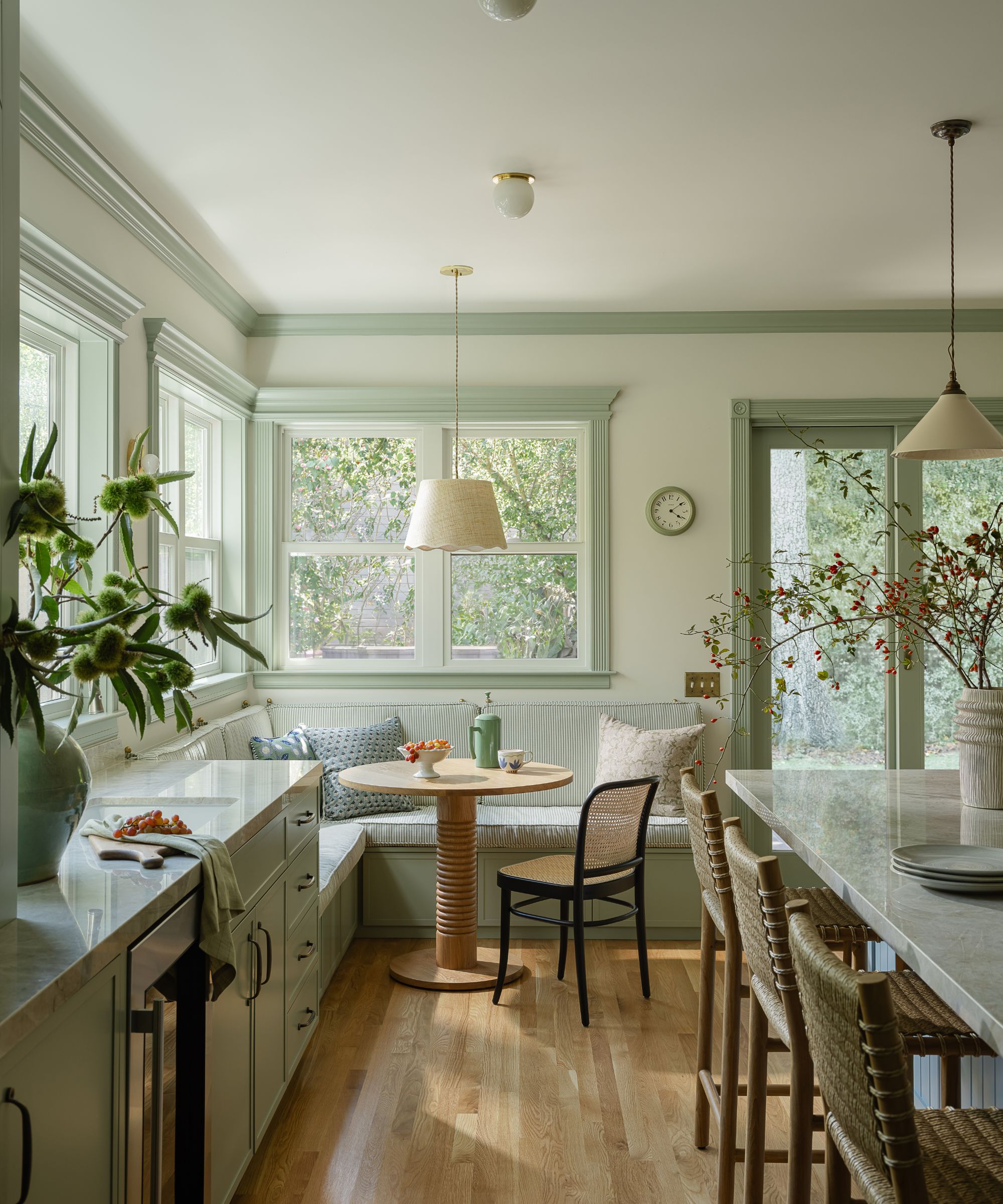
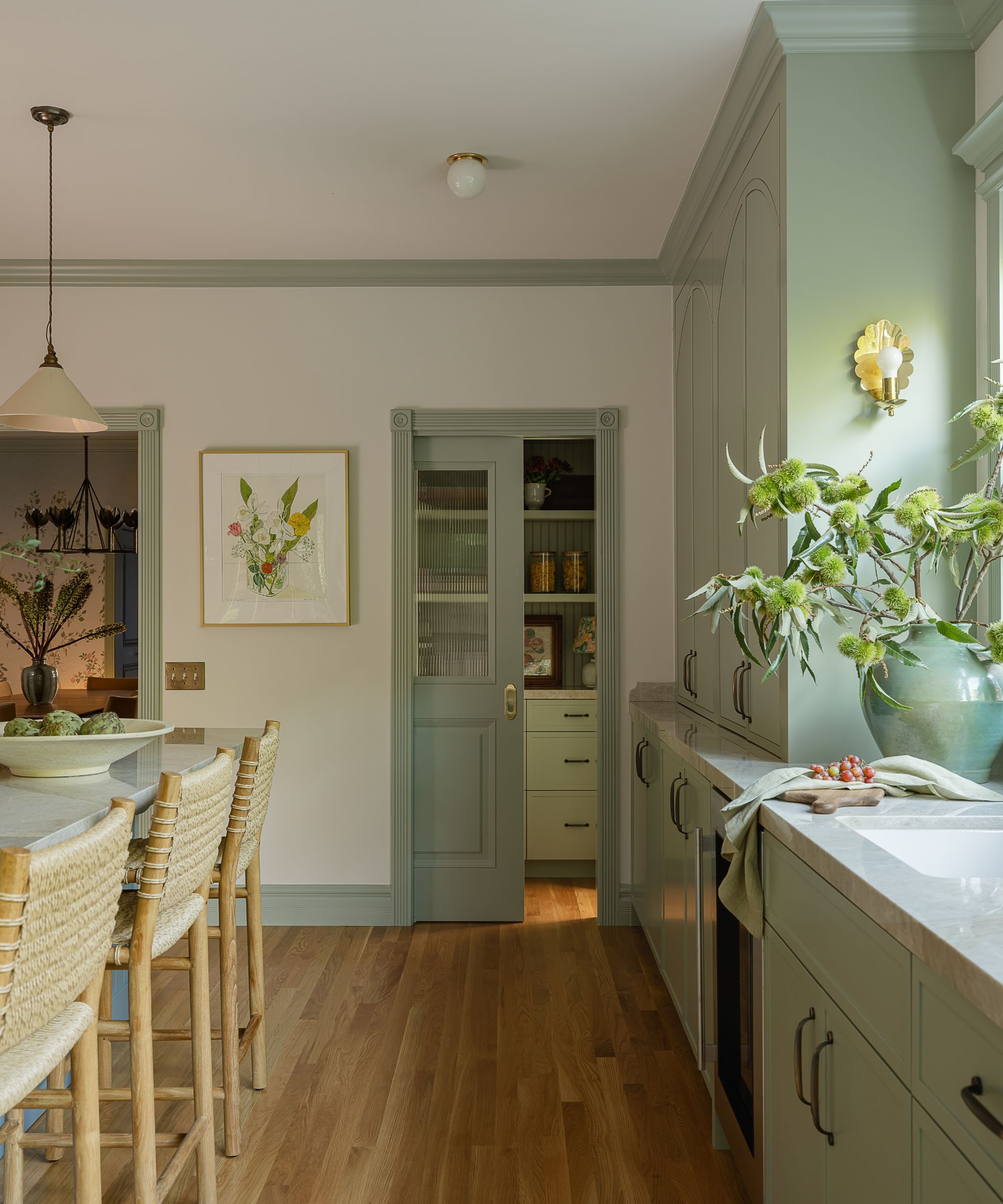
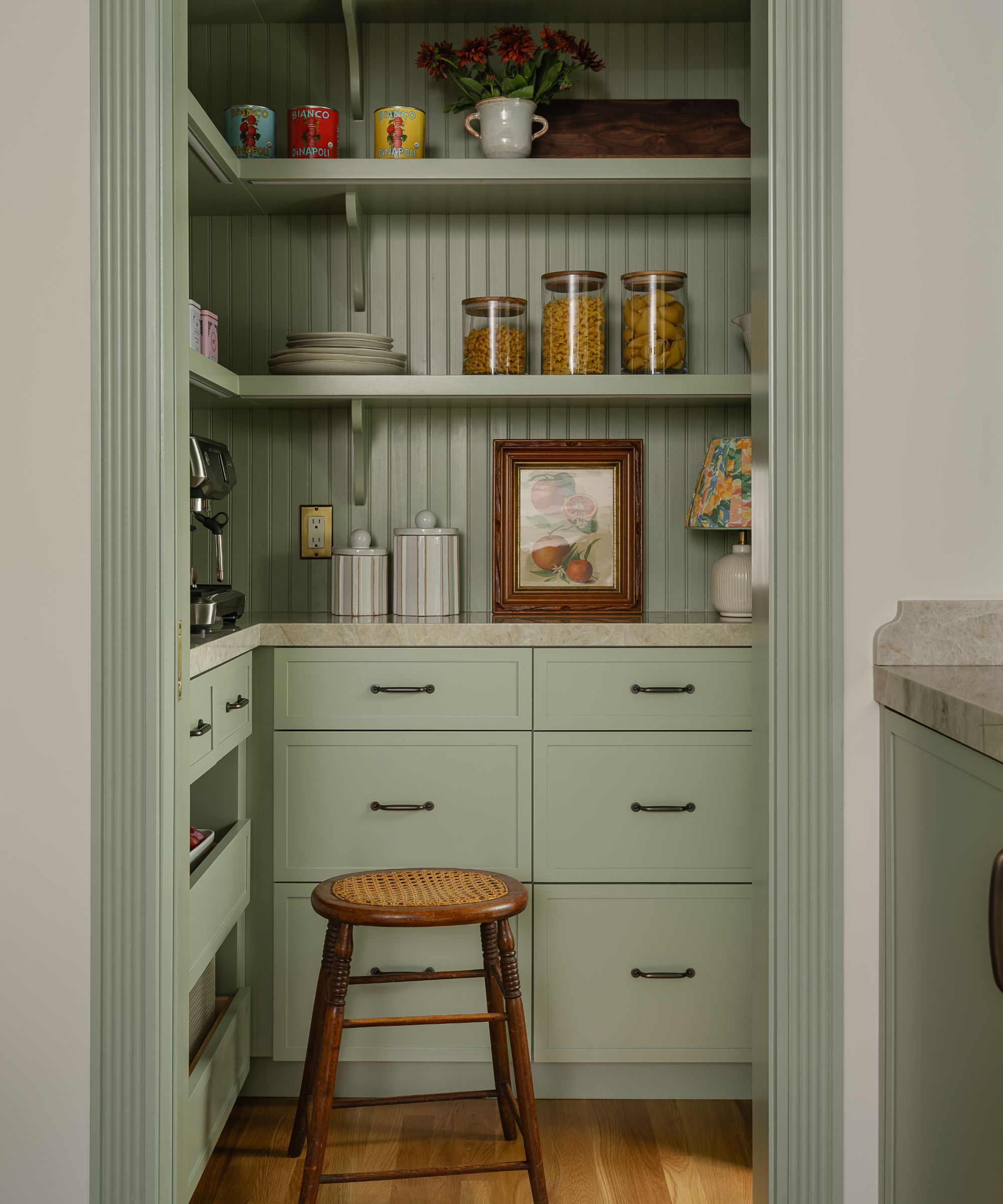
'The design of the kitchen began with a focus on layout and flow,' explains Melanie. 'A large island surrounded by bar stools from Hati Home anchors the space, flanked by cabinetry running the full length of the room on both sides. A secondary prep area, complete with a sink, provides a dedicated spot for tea and cocktail preparation, while nearby pocket doors cleverly conceal small appliances and supplies.'
Design expertise in your inbox – from inspiring decorating ideas and beautiful celebrity homes to practical gardening advice and shopping round-ups.
'To maximize the space, we relocated the sliding doors and created a cozy banquette in the corner, featuring windows that flood the area with natural light. The banquette seating also offers additional storage as well as a cubby conveniently located for shoe storage near the back door.'
'The kitchen color scheme was inspired by a soft sage green for the cabinetry (Benjamin Moore's Nature Lover), which sets a calm, yet fresh tone throughout the kitchen. To complement this, we chose a vibrant yet serene blue (Benjamin Moore's Van Courtland Blue) for the kitchen island, creating a striking contrast. The shade of blue is repeated on the living room and family room paneling. A lighter shade can be found on the dining room and pantry ceilings and in the ombre sky of the dining room wall mural.'
'Madre Perla quartzite countertops and backsplash add a stunning finish to the space. The lighting was carefully curated to include a mix of styles: deVOL ceramic pendants above the island, delicate scalloped brass sconces, and a larger scalloped pendant over the breakfast table. In lieu of recessed lighting, we opted for simple surface-mount fixtures from Peared Creation to maintain a cohesive, clean look that didn’t feel too modern. For a bespoke touch, we incorporated fluted, arched details on the custom cabinet doors and attached the banquette cushion with brass hardware.'
3. A Modern Rustic Kitchen a Designer Kept for Her Own
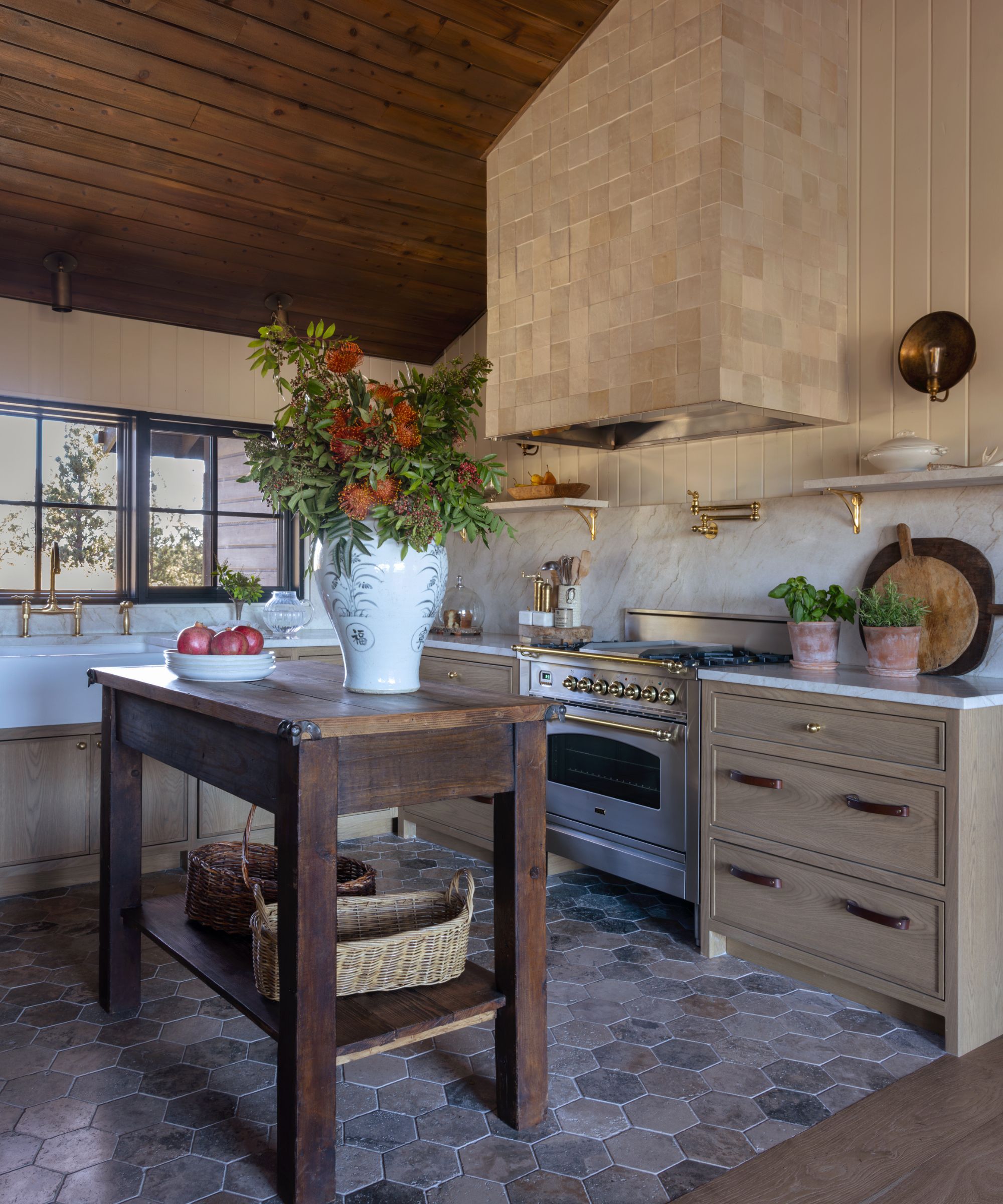
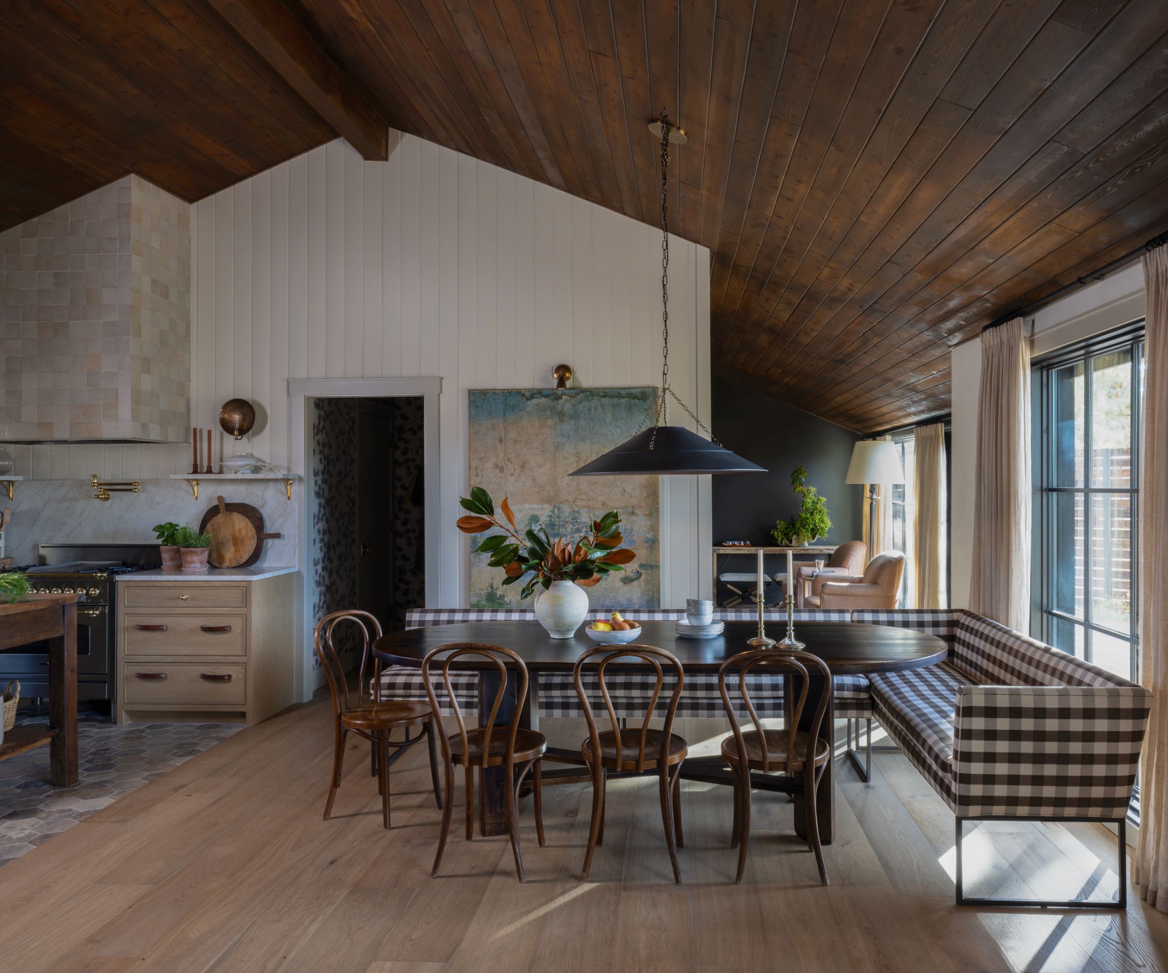
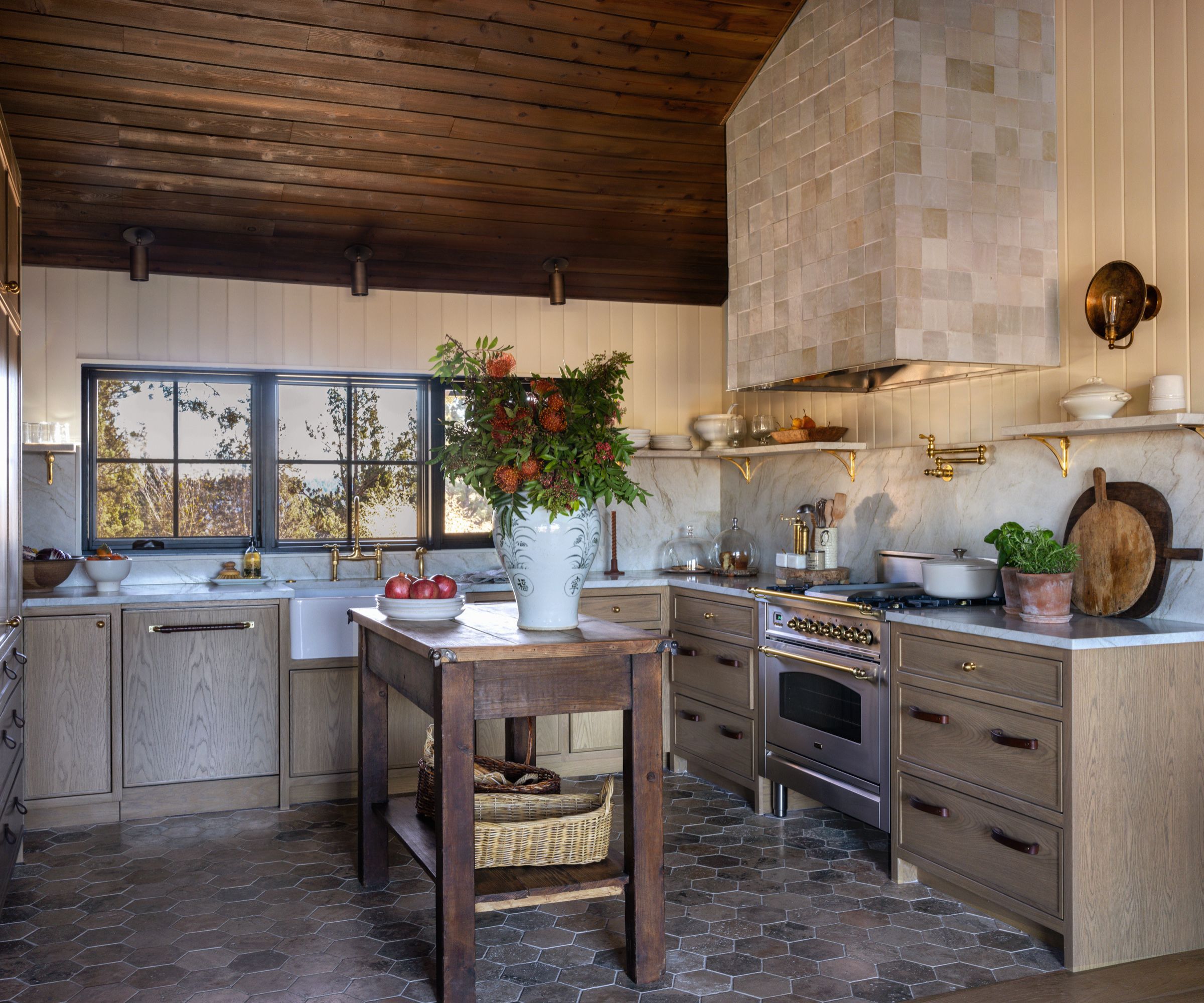
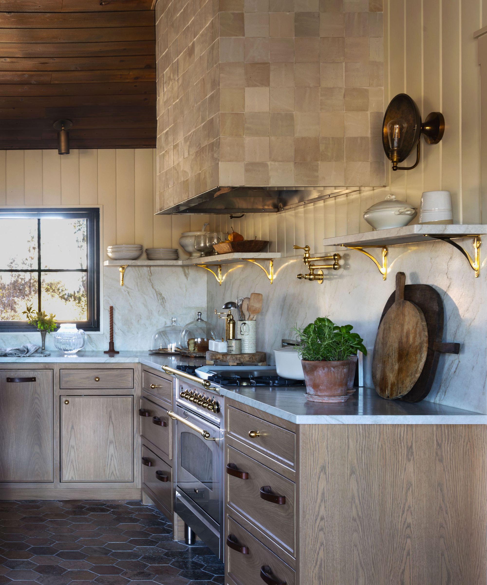
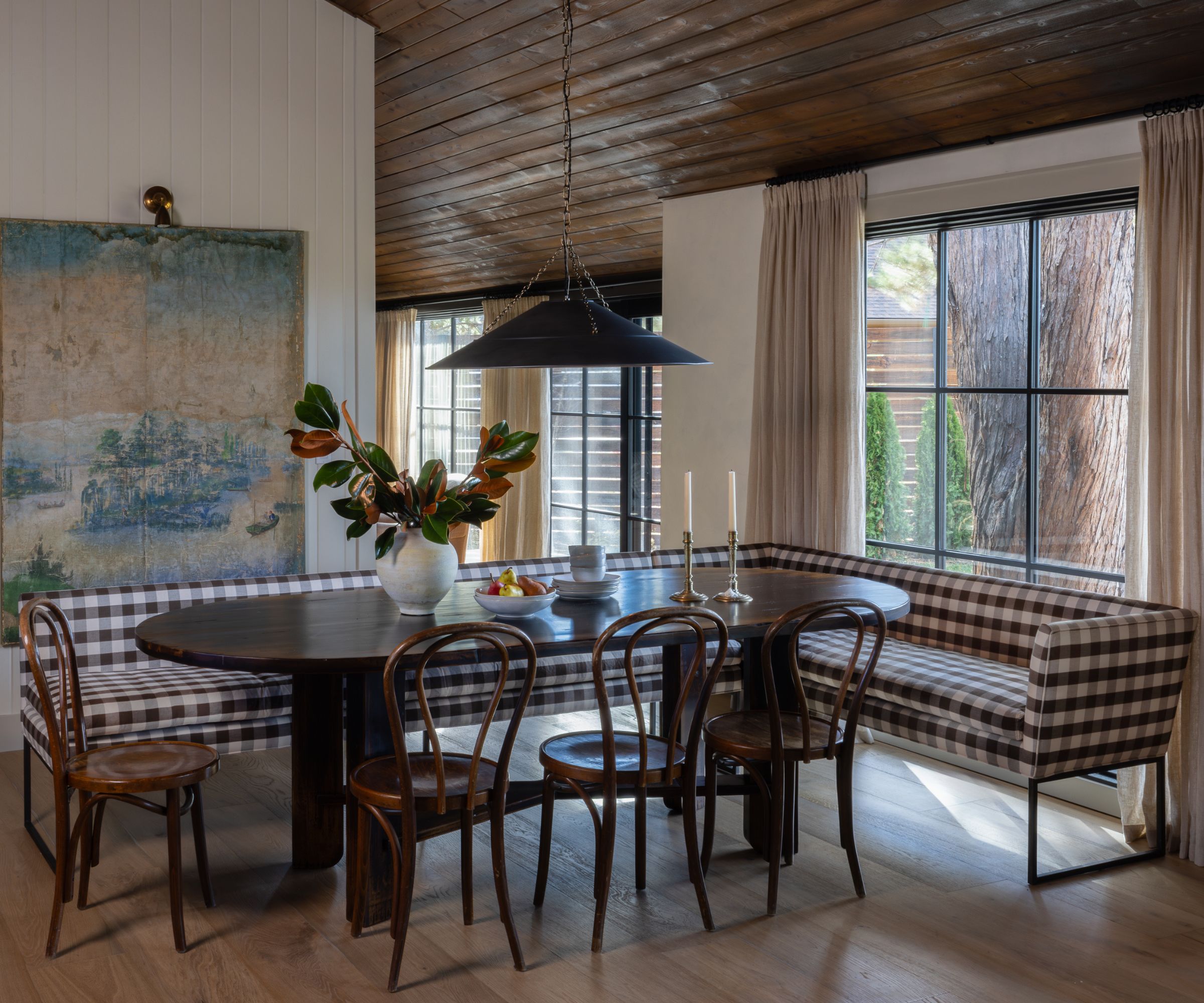
Designer Allison Clouser bought this 1980s ranch-style home to flip it – renovate it and restore it and then move on. But as the project unfolded, she came to the realization this home was in fact meant to me hers.
'The home originally began as an investment project; our intention was to restore and refresh it for resale, but once we set foot on the property, everything shifted,' explains Allison. 'It was one of those rare places that immediately sparked something. We saw its potential and felt the pull to take our time and do it right.'
'The kitchen was one of the biggest challenges – it felt dark, closed off, and disconnected from the rest of the home. Reworking the layout to open it up and connect it to the surrounding living spaces became a top priority. We knew we needed to bring some drama and charm to that space. The decision to go with a zellige-tiled hood instead of a traditional stainless steel one completely transformed the mood. It adds softness and texture, and it instantly becomes the focal point. People always ask about it – it’s one of those “so glad we did it” moments. Cooking here doesn’t feel like a chore; it’s super energizing.'
'Cle Tile’s pantry pavers give it this lived-in texture that contrasts beautifully with the sleek marble countertops. The Riad tile hood was a detail that brought in a little Old World soul, paired with brass accents and Mullan sconces for that collected feel.'
'We tucked in a locally made wood kitchen island (I couldn’t find anything off the shelf that felt right), and sourced glassware locally from Tumalo Home. Appliances include a black Ilve Range and Forte’s panel-ready fridge/freezer to keep things seamless. There also wasn’t a true dining room in the original layout, so we got creative. We custom-built a corner banquette with Cisco Brothers and upholstered it in Schumacher’s ‘Camden’ Check for a little bit of charm and structure. This became a defining architectural element that visually separates the kitchen and living space without closing anything off. It’s warm, communal, and highly functional. Whether we’re having a cozy dinner or hosting guests, everyone ends up here.'
'The Fourhands dining table brings in that weighty, timeless presence, and we mixed in vintage bistro chairs for a worn-in feel. Above the table, the Lauren Liess x Troy Lighting ‘Arcane’ pendant gives just enough drama without overpowering the space. Everything opens up to the view, which always takes center stage.'
4. A Tactile Texas Kitchen Inspired by European Designs
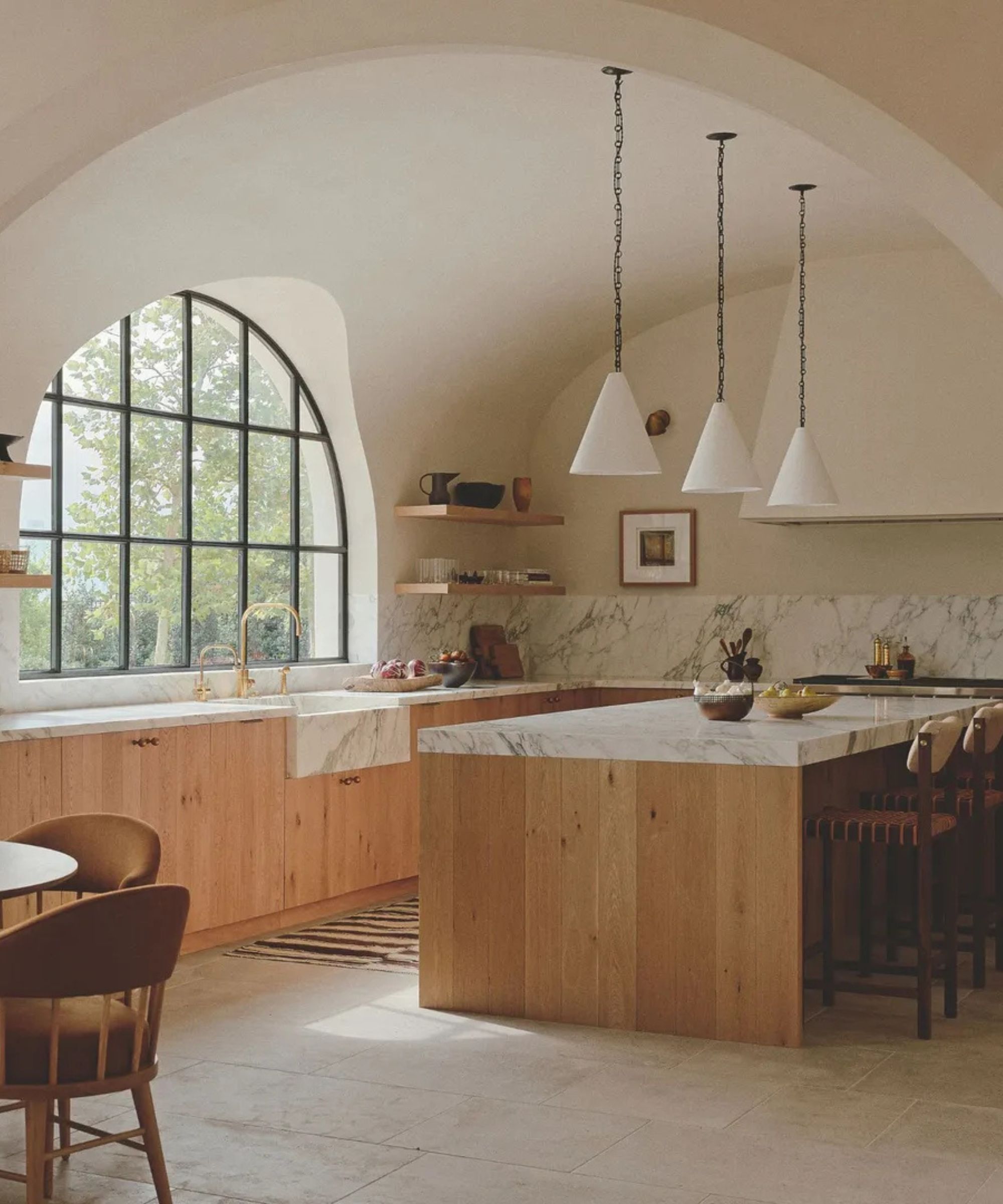
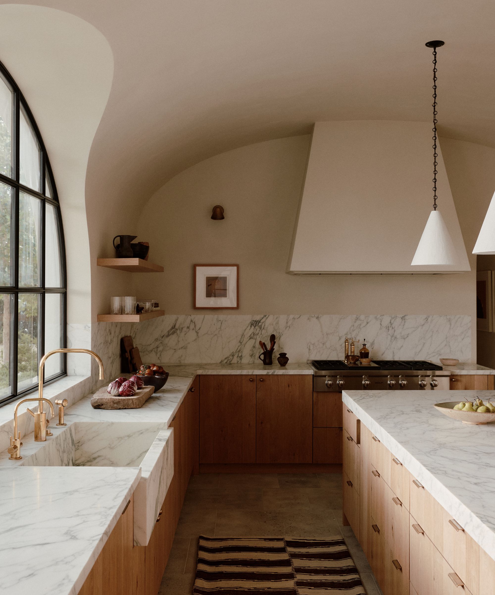
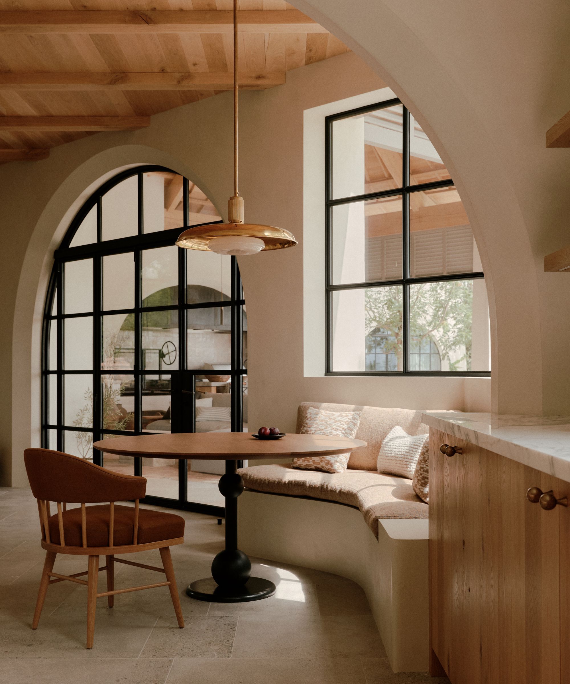
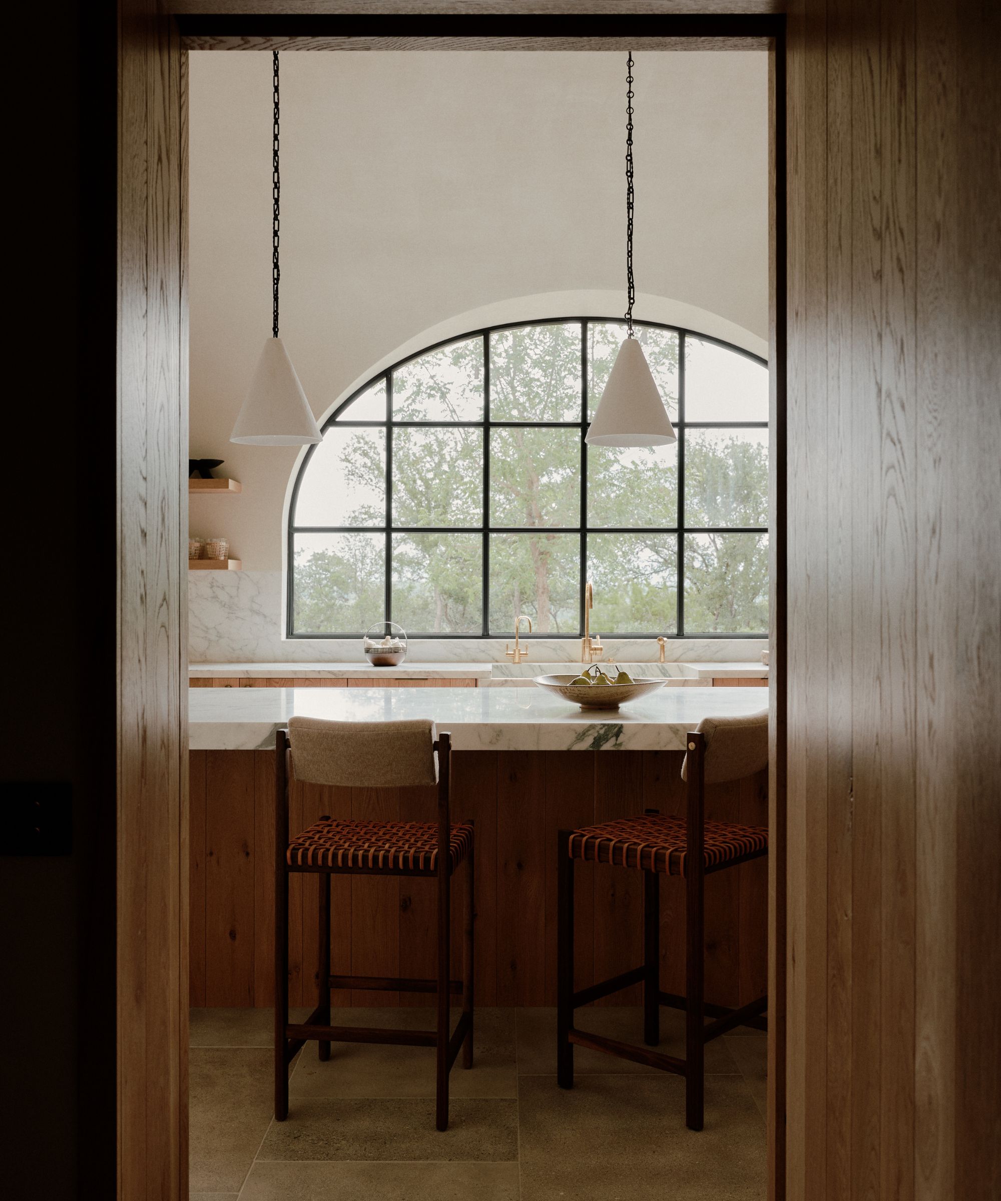
Despite being a new home, this Spanish Revival property needed to feel timeless and original. Vanessa Alexander of Alexander Design took on the project, working alongside architect Michael G Imber to create both a building and interiors that felt relaxed, warm and authentic.
Vanessa referenced the historic masseria and farmhouses of Puglia for her inspiration. 'They are simple in so many ways, yet they are so hearty and full of detail,' she explains. Arches are a recurring feature in this style of property, and are mirrored throughout the whole home, connecting open plan spaces softly and subtlety.
As well as the soft, flowing shapes, soft colors and fluid, tactile materials were used in the kitchen too. The plaster work flows throughout every room, and create the perfect backdrop for the natural materials of the kitchen. The light sheen of the Calacatta Monet marble contrasts with the rawness of the reclaimed oak cabinetry.
'We wanted to let the character of these materials shine through and create a natural rhythm,' says Vanessa. 'If something had a crack or hole, we didn't fill it, we left it in its true, authentic sense. We pared back the design to its very essence and then picked a small number of materials focusing on them being natural and beautifully made, really paying attention to the details.'
5. A Parisian Kitchen with an English Country Feel
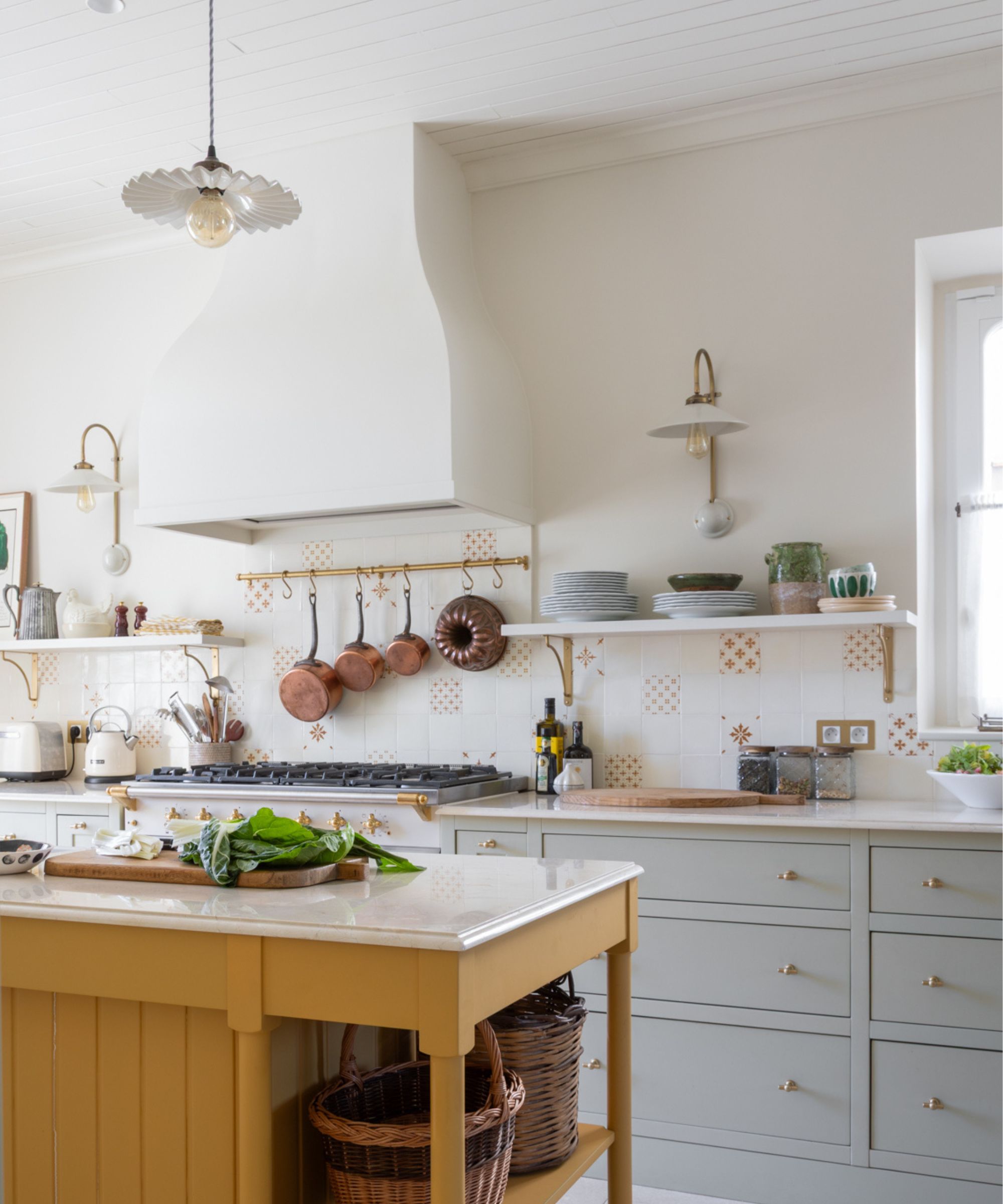
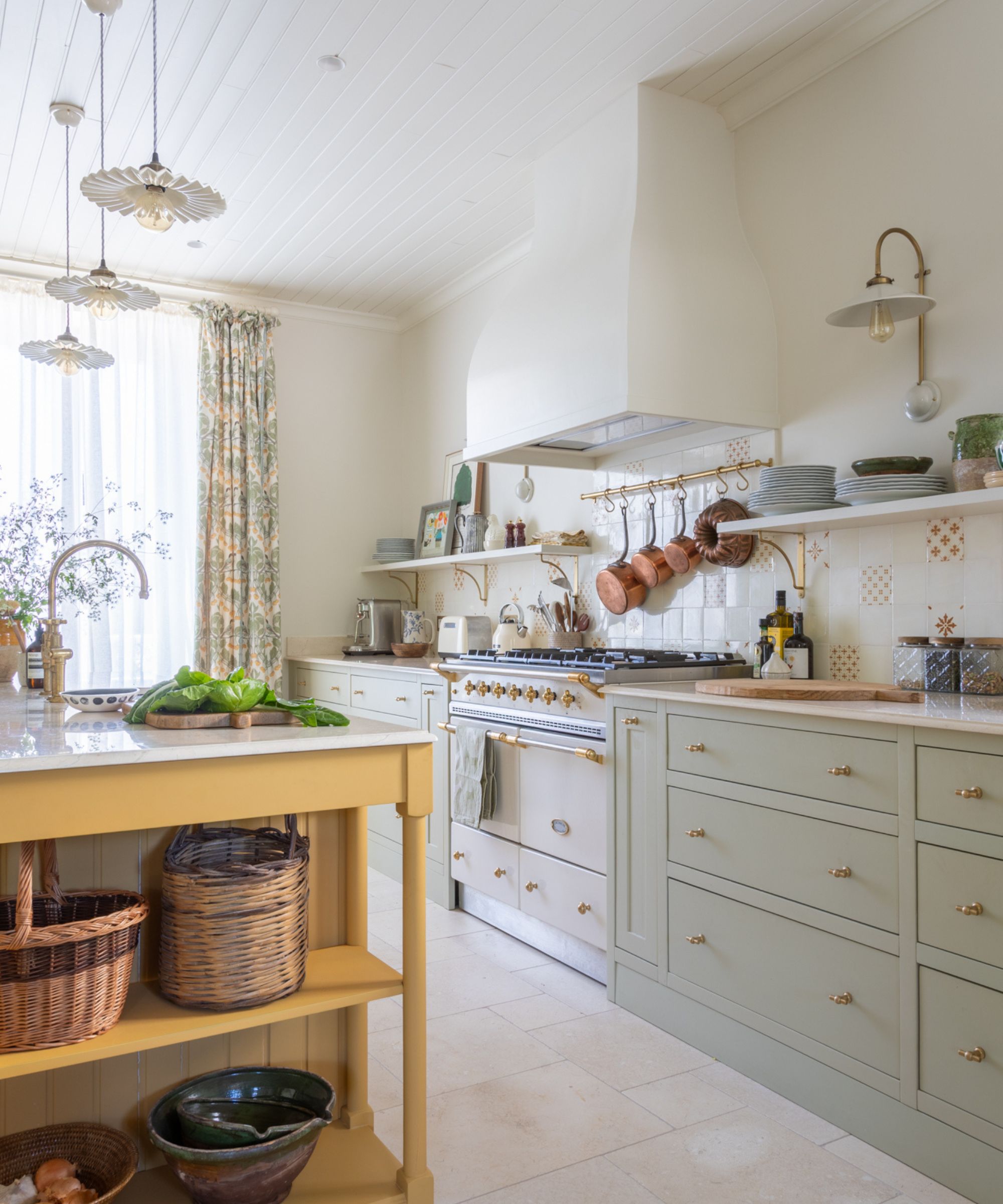
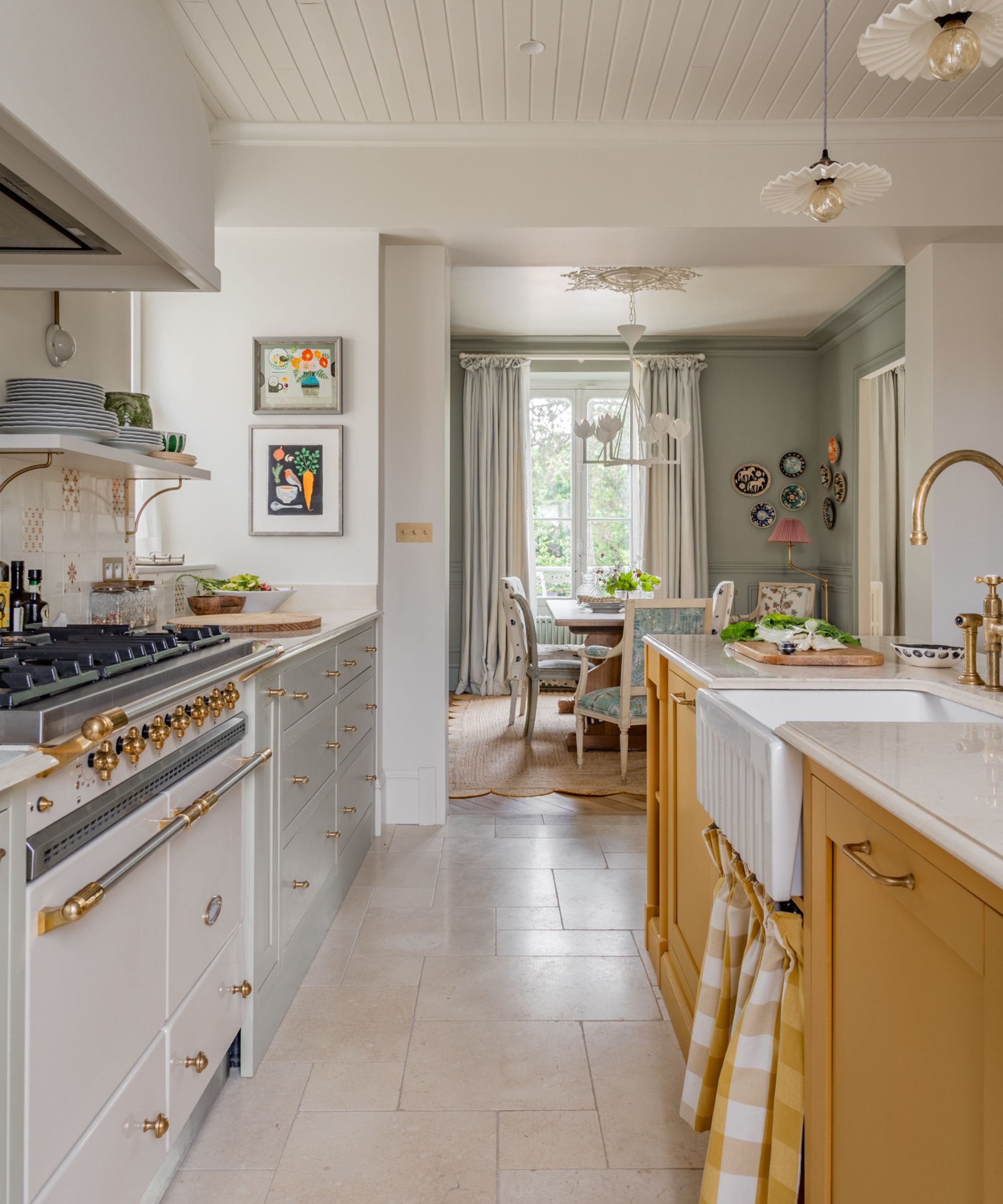
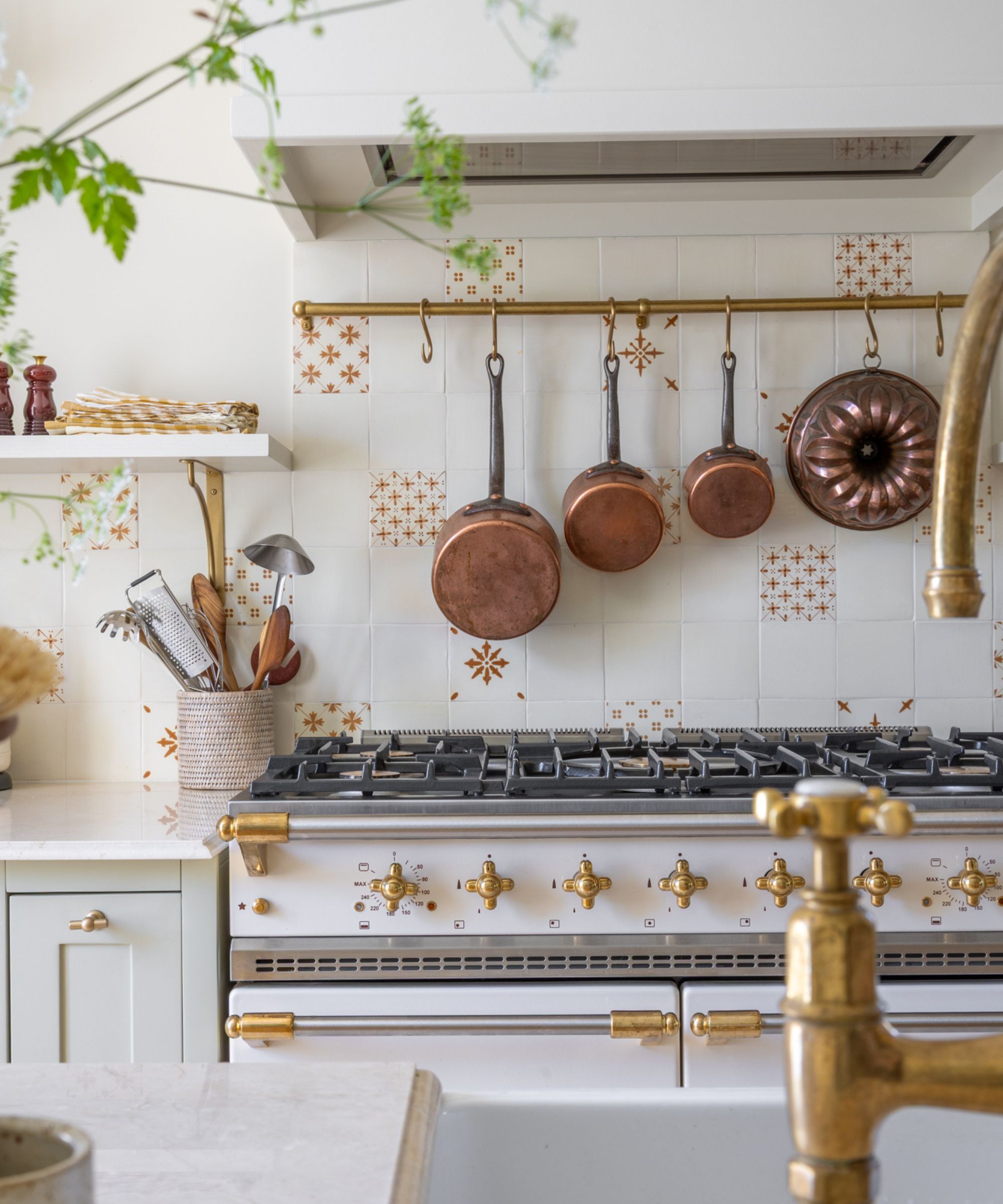
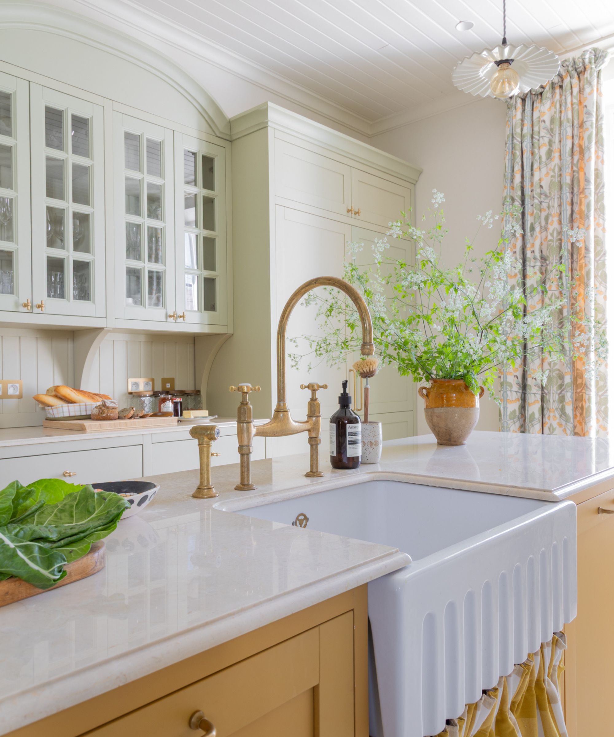
Despite this charming French house being located just outside Paris, the English clients’ initial brief for designer Sean Symington was to create a home that could be found in the English countryside. However, as the clients got to know the spaces, things evolved. ‘The brief changed as we started off with what the client thought she should do as opposed to what she actually liked,’ notes Sean.
‘Her wish was for it to feel like a family home that was collected and layered and incorporated pieces that had a sense of history and told a story, rather than everything being perfect, which is where it all started. Originally, we had matching wallpaper and curtains – it was quintessentially preppy and curated – but that changed over time, and it became much more eclectic.’
More French, you could say. You can feel this layered warmth in the kitchen, which somehow manages to feel both English country and French. The handmade tiles, which were sourced in Paris, give the classic cabinetry a more eclectic feel, and the yellow tones echo the color (Farrow & Ball's India Yellow) of the island to create cohesion. The ceramic pendant and ceramic wall lights (both from The French House) add more whimsy and mirror the lighting of a traditional French bistro. The open shelving, filled with mismatched crockery, gives the room extra character – that ‘collected and layered’ feel the homeowners were after from the beginning.
6. A Newly Laid Out Open Plan Kitchen Perfect for Family Life
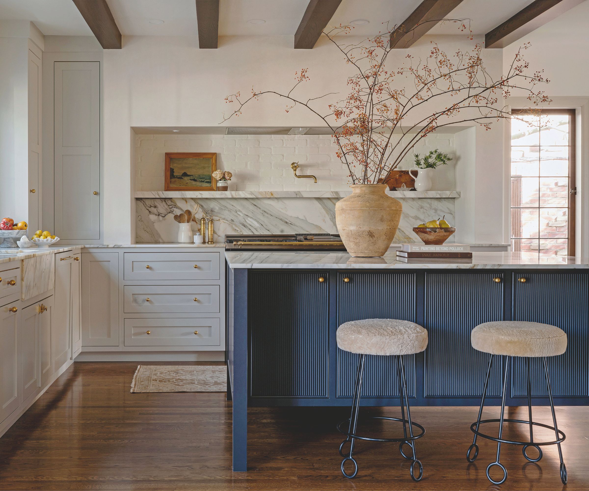
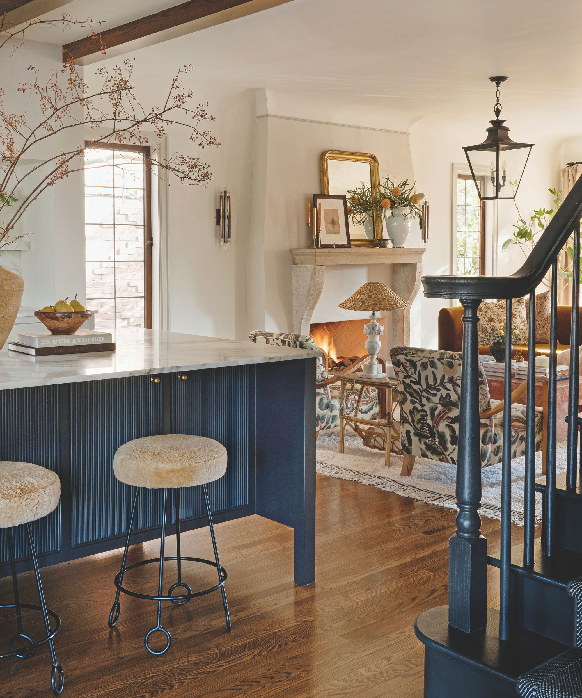
Built in the Tudor Revival Style in 1929, designer Jessica Nelson's home had not been touched in over 50 year before her and her husband Scott bought it. ‘We were really looking for something that was almost untouched because I wanted to put my stamp on it,' explains Jessica, founder of Jessica Nelson Design. 'The house had received a fresh coat of white paint on the walls but it was otherwise very plain. There was no stain on the floorboards and we didn’t even have outlets in the bathrooms. But it was in great condition.'
But the layout was never going to work. ‘It had a tiny kitchen on the side of the house and at the bottom of the stairs were five doors, making for a chaotic floor plan,' Jessica explains. A wall was totally removed to create the open plan kitchen and living space, creating a more functional layout that's more suited to their young family.
New timber beams were added to the kitchen to nod to the home's Tudor style architecture and the walls have been painted in Benjamin Moore's best selling Swiss Coffee which create a lovely light, warm glow. The bar stools, originally from Etsy have been re-covered in a resilient shearling fabric to add some extra texture to the space.
7. A Charming Pink Kitchen-Diner in a Victorian London Home
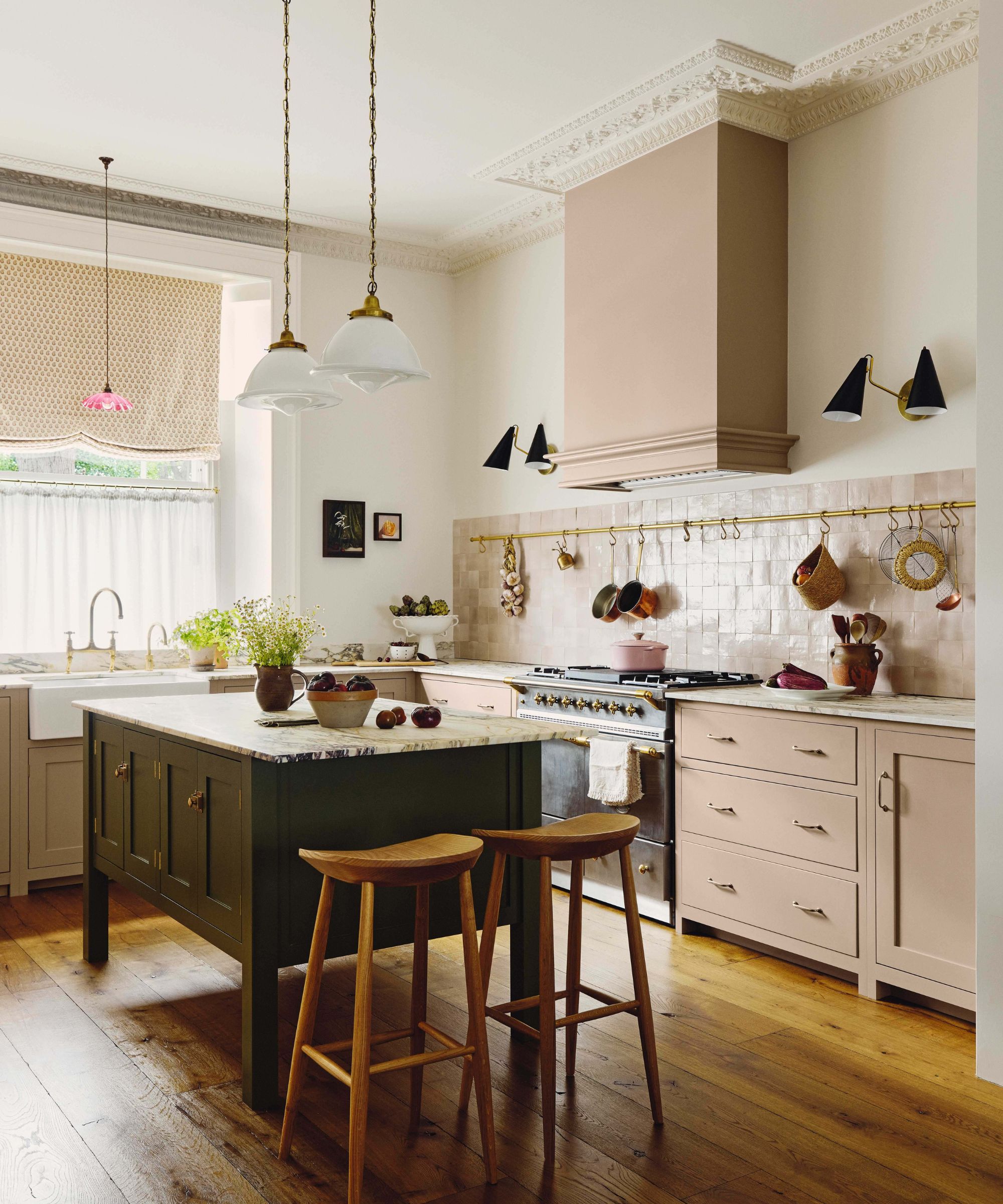
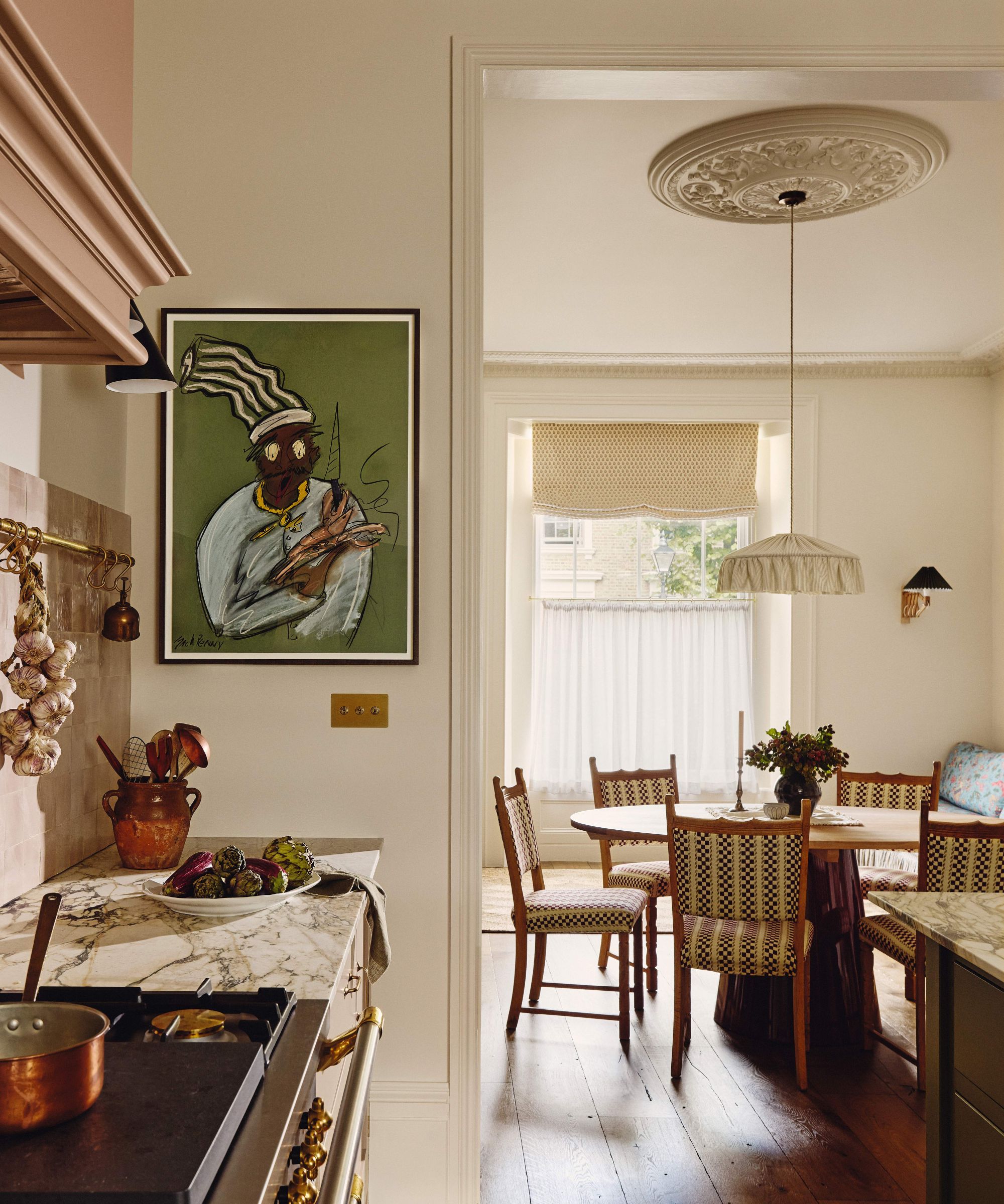
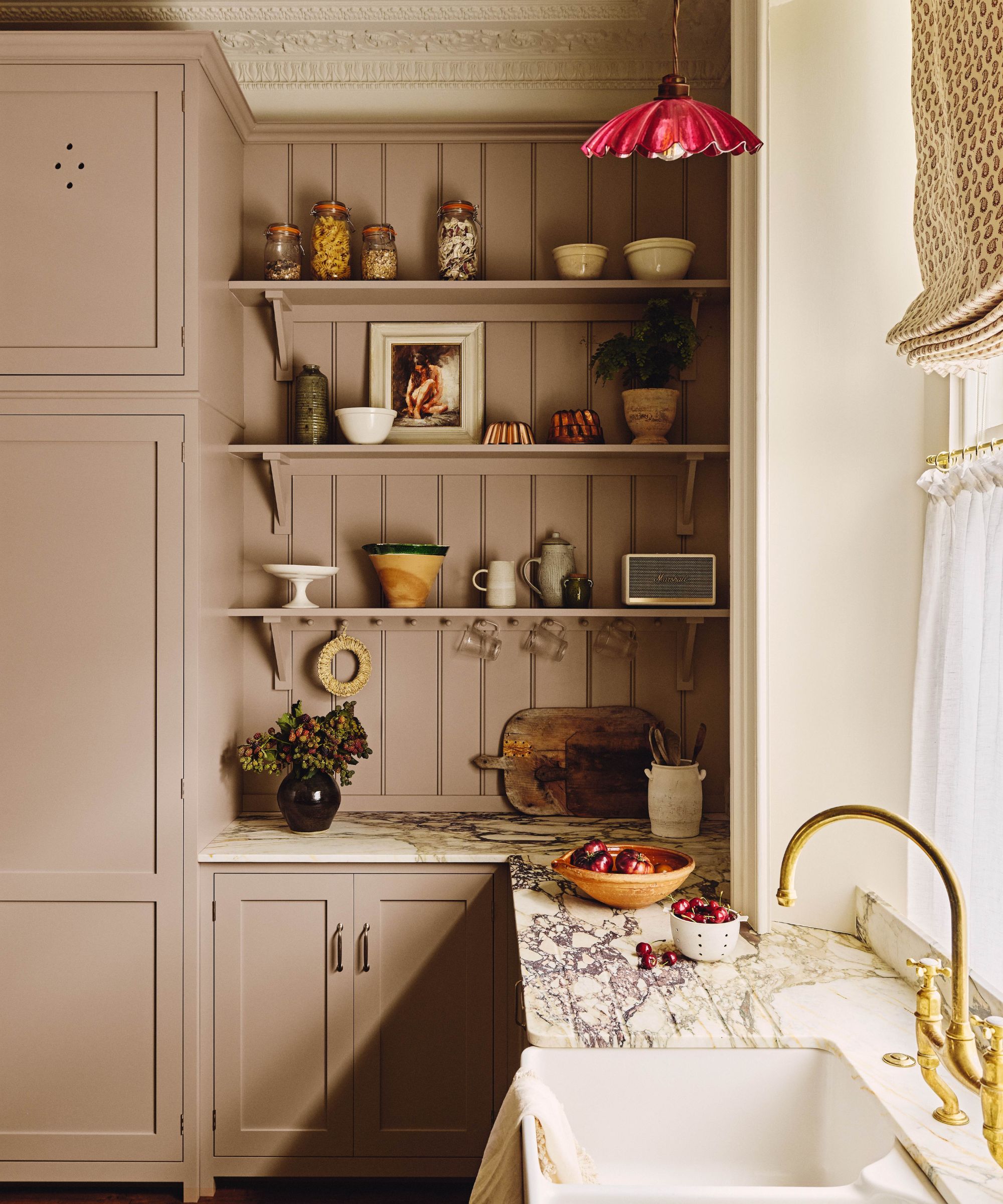
When renovating this Victorian London home, the homeowners wanted to avoid any of the design tropes that often come with this style of home – a.k.a. the typical ground-floor kitchen extension. Instead, they wanted to do something more unexpected and adventurous. ‘We live fairly casually,’ says Charly, the owner, ‘but we also enjoy a balance of beauty and utility. We wanted that to be reflected in the design of this house.’
So with the help of Smith Brooke Architects and interior designer Emma Ainscough, the kitchen was not housed in a typical ground-floor extension, but was instead relocated upstairs to the first floor, and a wall was knocked through to create an open-plan kitchen-diner.
‘Function came first, but we also thought about how we wanted each room to feel,’ Emma explains. ‘That meant we could have fun with material choices, rather than sticking to purely utilitarian finishes.’ Charly adds, ‘We wanted to retain a sense of playfulness, creating spaces that were visually cohesive while exploring possibilities with pattern and color.’
The lack of wall cabinets gives the kitchen an open, airy feel – it doesn’t look overly kitchen-y or ‘utilitarian,’ as Emma points out. The soft pink of the cabinets is grounded by the dark green island, and the gauzy café curtains, combined with the fabric Roman blinds, add to the layered look.
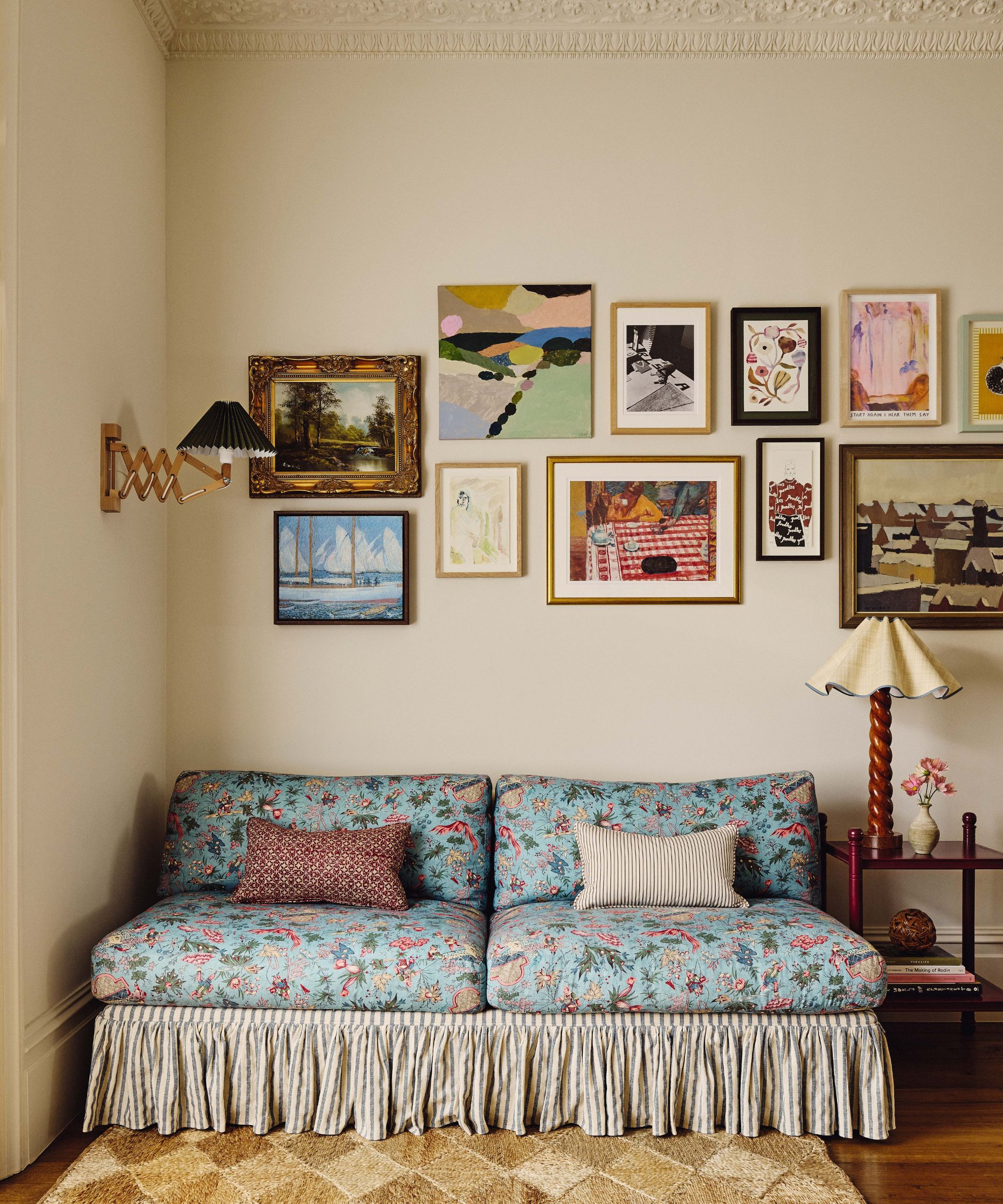
As far as adding the ‘playfulness,’ there is an armless couch in the corner of the dining area that combines florals and stripes, durable enough, says Emma, to ‘withstand the rigors of jam sandwiches in front of the TV.’
One thing that all of our best kitchens of 2025 have in common is that they all have plenty of character. The styles, sizes, layouts, and locations may vary, but each feels layered and lived in. 2025 was the year of the 'soft kitchen,' the ever-growing kitchen trend for spaces that feel more like living rooms than cooking spaces, and it looks like this timeless look is going nowhere in 2026.

I am the Head of Interiors at Homes & Gardens. I started off in the world of journalism in fashion and luxury travel and then landed my first interiors role at Real Homes and have been in the world of interior design ever since. Prior to my role at H&G I was the digital editor at Livingetc, from which I took a sabbatical to travel in my self-converted van (not as glamorous as decorating a home, but very satisfying). A year later, and with lots of technical DIY lessons learned I am back to writing and editing, sometimes even from the comfort of my home on wheels.
