What are the most timeless colors in interior design? 6 ways to create a color scheme that never dates
Designers share the most timeless colors, from navy blue to classic white

Design expertise in your inbox – from inspiring decorating ideas and beautiful celebrity homes to practical gardening advice and shopping round-ups.
You are now subscribed
Your newsletter sign-up was successful
Want to add more newsletters?
A timeless color scheme sees beyond the latest trends, favoring the most classic colors that seemingly never go out of style. Bound to give your home interior scheme longevity, creating a timeless color scheme is a fundamental step in crafting classic and elevated spaces.
But what are the most timeless colors, and what's the best way to go about creating a color scheme that transcends the latest color trends? We enlisted the expertise of interior designers, who reveal all below.
'Timeless colors are those that have enduring appeal and versatility across various design styles and eras,' explains Cinzia Moretti, creative director at Moretti Interior Design. 'These colors remain popular and relevant over time, transcending fleeting trends.'
Article continues below6 ways to create a timeless color scheme
Crafting a timeless color scheme allows decor to evolve, while your home's room color ideas withstand the test of time.
'The most successful backdrop colors support a scheme by uniting its elements,' says interior designer Shalini Misra, founder of Shalini Misra Design. 'A backdrop color’s timelessness comes from its ability to remain consistent and complimentary no matter how a room evolves or changes.'
1. Reference nature with blues and greens
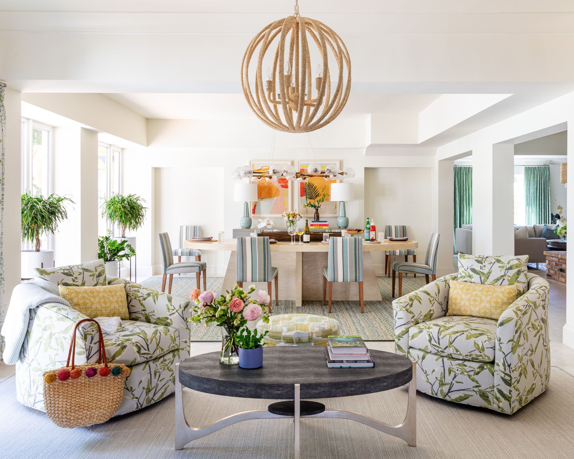
'Neutrals, blues, and greens seem to be the most timeless colors as they tend to be calming and enduring,' says designer Alex Yeske of Alex Yeske Interiors. 'To choose a timeless color scheme, I like to look at colors and tones from nature and the surrounding environment and avoid any colors that are having a moment as that's a quick way to date a space.'
Blue and green are often the colors we associate most with nature and interior designer Betsy Wentz also believes these to be some of the most timeless hues: 'Blue and green are the most timeless colors. Incorporating one or both of these colors with others is a great way to create a timeless feel, as they will never go out of style.'
Design expertise in your inbox – from inspiring decorating ideas and beautiful celebrity homes to practical gardening advice and shopping round-ups.
Turn to light sky blues and rich shades of forest green to create a calming feel throughout the home that instantly nods to the natural world. In this living room designed by Betsy Wentz, green is used across various soft furnishings as an accent color and evokes a calming feel that withstands trends.
2. Create a timeless base with warm neutrals
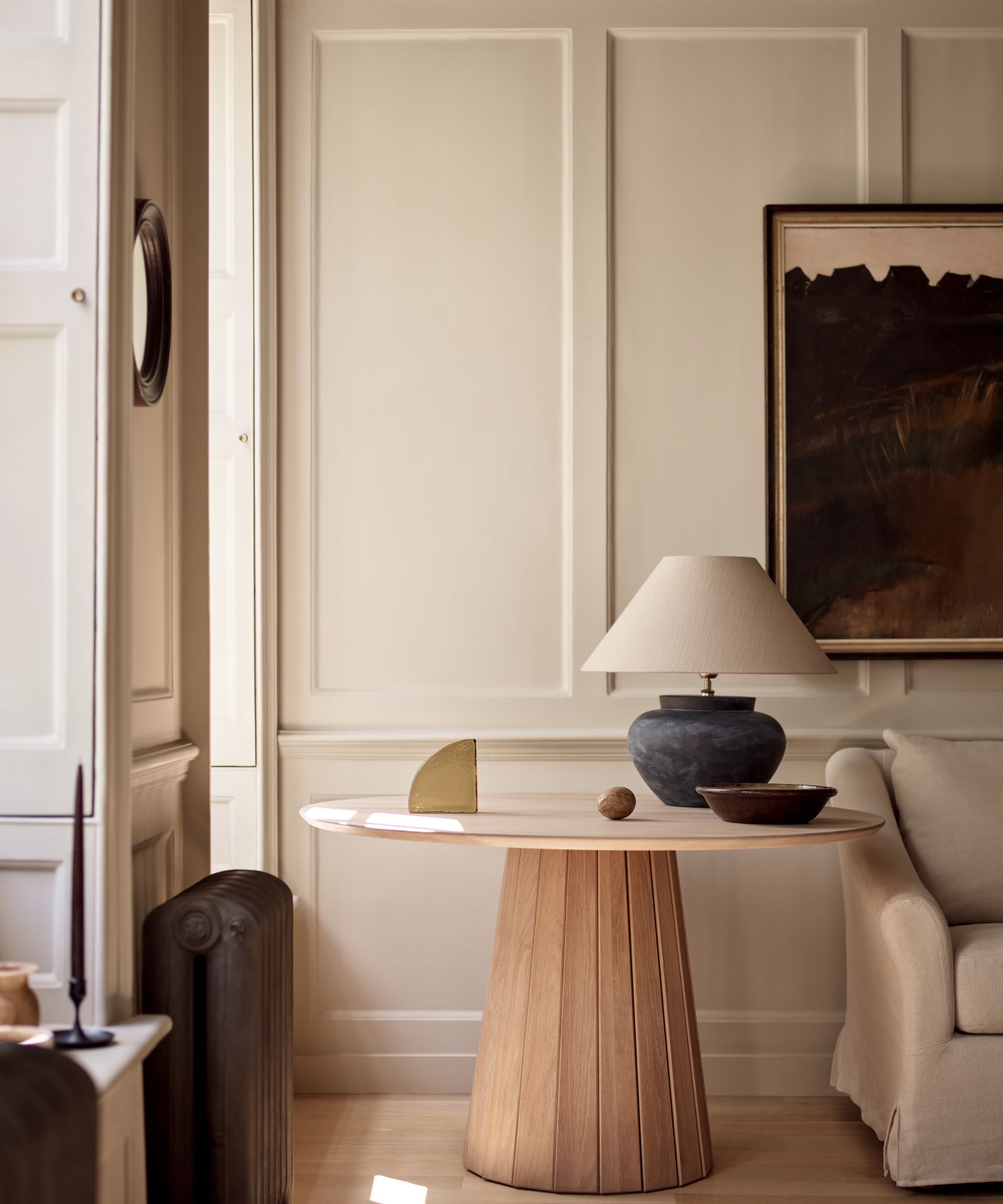
'I would lean towards a warm neutral if you want a timeless color, as they are suitable in every space and work with almost every color palette,' explains Melissa Read, creative director at Studio Burntwood. 'I would move away from cool neutrals that may feel too gray, often this can feel cold and doesn't complement warmer wood tones. A paint color such as Skimming Stone or Elephant's Breath from Farrow and Ball are timeless colors that are warm and inviting.'
Interior designer Kathy Kuo also recommends decorating with neutrals as a timeless color choice, adding: 'There's something about warm neutrals that just always feels timeless. Shades like sand, terracotta, cream, and beige all pair beautifully with a variety of design styles – from coastal decor to French country decor – and they're the perfect canvases for mixing in pops of colors, from earth tones to jewel tones.'
There are so many highly recommended warm neutral paints, but Sherwin-Williams' Alabaster is a go-to hue for Luis Carmona, founder of VERDE Interior Design: 'Once on the wall, it gives the slightest shade of taupe, almost cream, without appearing too stark white. It has proven time after time that it can be used without appearing out of date.'
3. Decorate with navy blue
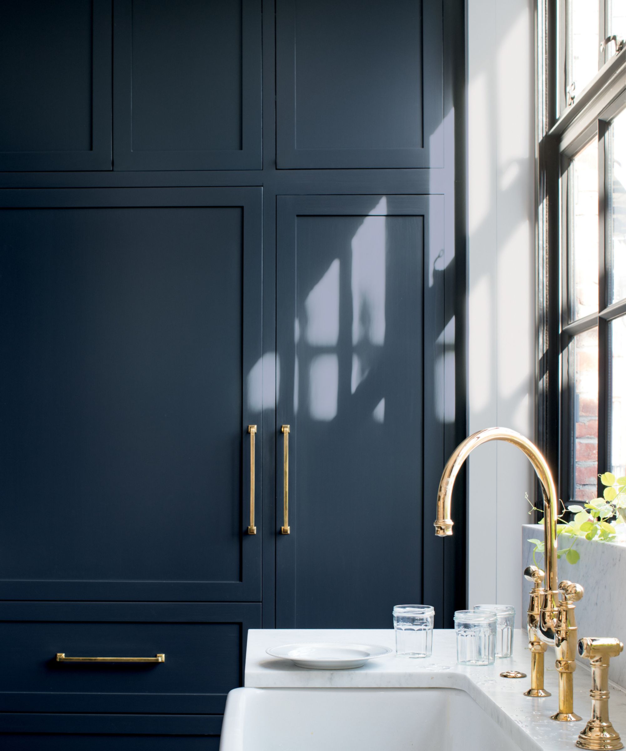
If you're looking for a darker color idea that feels timeless, navy blue is recommended by designers. 'A favorite of mine is navy blue, which is a color that can be both formal and relaxed,' explains Cinzia Moretti. 'It pairs well with a wide range of colors and materials.'
'Blues are popular amongst my design clients because of their restful, calming quality,' adds Olivia Westbrooks, founder and principal designer at Olivia Westbrooks Interiors. 'You can’t get more classic than navy blue. Colors like Benjamin Moore's Hale Navy or Sherwin-Williams' Naval are great options to incorporate into a classic design. Use it on cabinetry, paint, and in fabrics for ultimate impact.'
Interior designer Tina Ramchandani, part of The New York Design Center's Access to Design program, adds another navy blue paint suggestion for a timeless scheme: Benjamin Moore's Hudson Bay, adding that 'it's a true blue, looks great in any sheen and can appear contemporary or traditional based on the room design.'
4. Embrace the enduring appeal of white
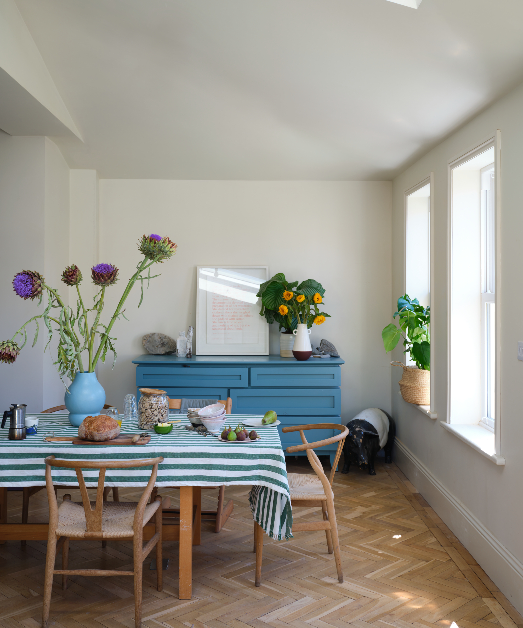
White is a classic color choice that pairs well with every interior design style. Decorating with white can provide a fresh and timeless backdrop throughout the home, and the key to ensuring it looks timeless is choosing the right shade of white paint.
'I would have to say that white is one of the most timeless colors,' says Olivia Westbrooks. 'I’ve seen browns, greens, and grays come and go, but white has stood the test of time. It has shifted in tone throughout the years. In the early 2000s, creamy white with warm undertones like Sherwin Williams Navajo White was popular. Then the crispness of bright whites like Sherwin Williams Pure White took over with the advent of the modern farmhouse trend.'
'But whites like Benjamin Moore's White Dove have been around forever and continue to be a staple in the designer paint arsenal. White is a color that automatically brings sophistication to a room.'
5. Don't write off bold colors in small doses
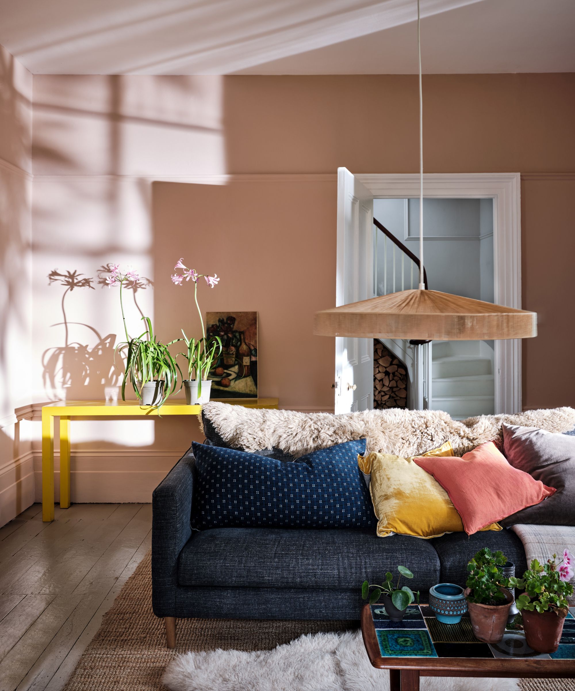
'Bold colors, if done well, can have a timeless quality,' explains Shalini Misra. 'When considering a bold tone, avoid trends and opt for colors that have an enduring presence in art, culture, or our daily lives. Yves Kline Blue is a good example of this. It is rooted in a historical context many of us relate to, even subconsciously, which contributes to its timeless sense of place and relevance.'
However, to ensure your color scheme retains a timeless quality, use bold colors sparingly. 'While bright and bold colors can add excitement and personality, they can also quickly become dated,' explains Cinzia Moretti. 'If you want to incorporate vibrant colors, consider using them as accents rather than main colors to ensure longevity.'
'A timeless color scheme often follows the 60-30-10 rule, where 60% of the room is dominated by a primary color, usually a neutral; 30% by a secondary color, complementary to the primary; and 10% by an accent color, a vibrant or contrasting hue,' explains Cinzia.
6. Ensure your color choices are personal
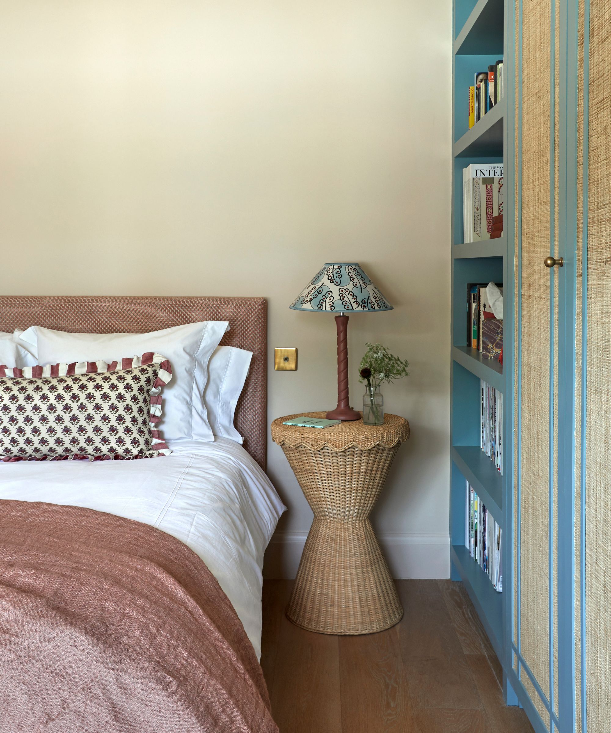
While certain colors tend to feel more timeless than others, creating a timeless color scheme should ultimately come down to the colors you resonate with the most.
'Your home should reflect your personality and preferences, so don't be afraid to incorporate colors that you love, even if they're not traditionally considered timeless,' advises Cinzia. 'Remember, the key to a timeless color scheme is to choose colors that you won't tire of easily and that can adapt to different styles and trends over time.'
'Trust your instincts, do some research, and don't be afraid to experiment until you find the perfect color palette for your space!'
Creating a timeless color scheme should take inspiration from pared-back neutrals that outlive design trends, and the enduring sophistication of blues and greens. As the designers explain, bold and personality-led colors can be incorporated too, just do so sparingly to ensure longevity.
Emily is a freelance interior design writer based in Scotland. Prior to going freelance in the spring of 2025, Emily was Homes & Gardens’ Paint & Color Editor, covering all things color across interiors and home decor for the Homes & Gardens website. Having gained specific expertise in this area, Emily is well-versed in writing about the latest color trends and is passionate about helping homeowners understand the importance of color psychology in home design. Her own interior design style reflects the simplicity of mid-century design and she loves sourcing vintage furniture finds for her tenement flat.