The 60-30-10 rule – how to use it to create a balanced color palette
The 60-30-10 rule is a classic interior design trick to ensure perfect color scheming every time

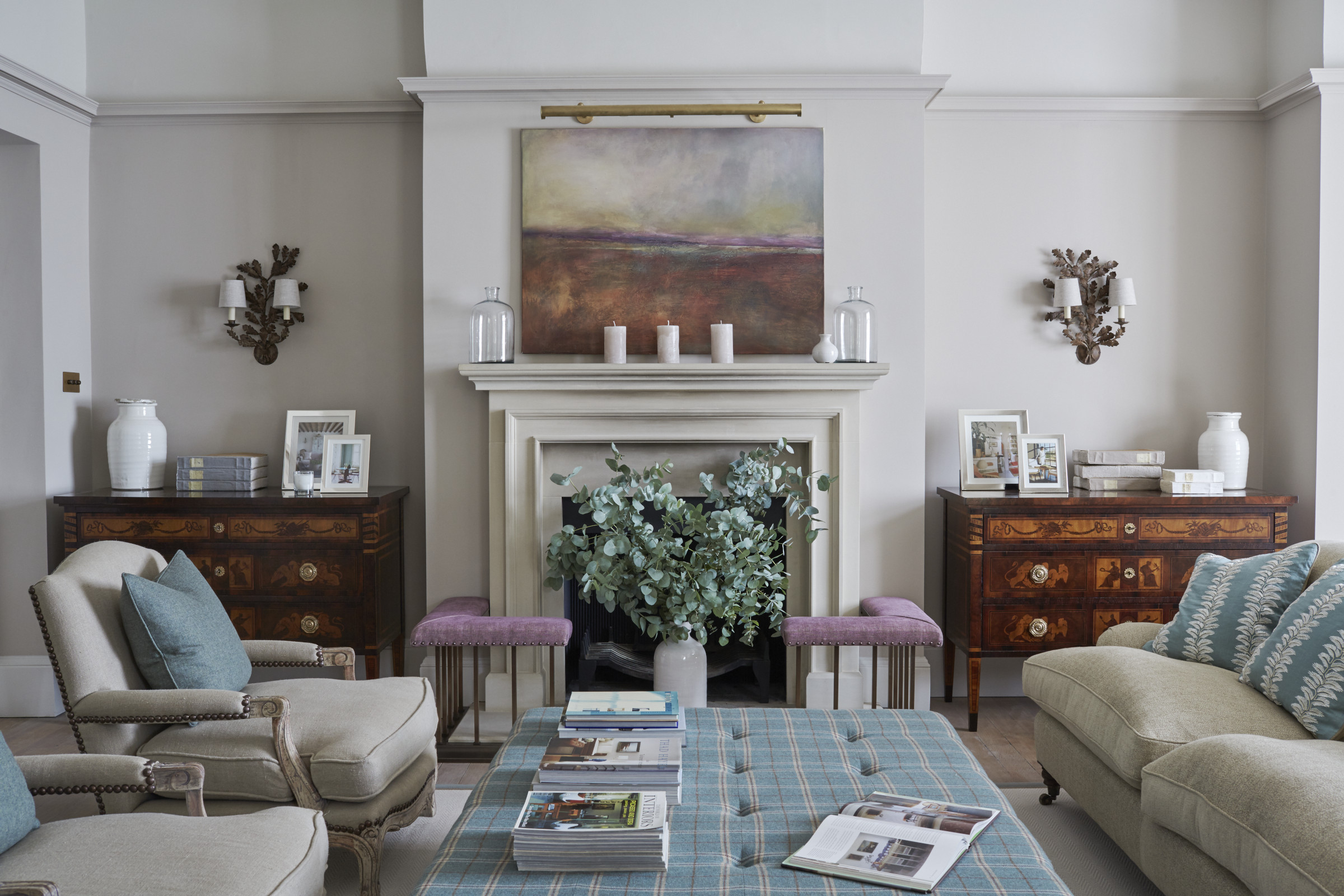
The 60-30-10 rule is a simple interior design technique for getting color schemes to balance perfectly. It's a little niche – but then we at H&G are, by our own admission and quite contentedly, design nerds.
So, if you are planning a new room, and lack a little confidence with your color scheming, let us introduce you to the 60-30-10 rule – use it in interior design and you can't go wrong.
What is the 60-30-10 rule?
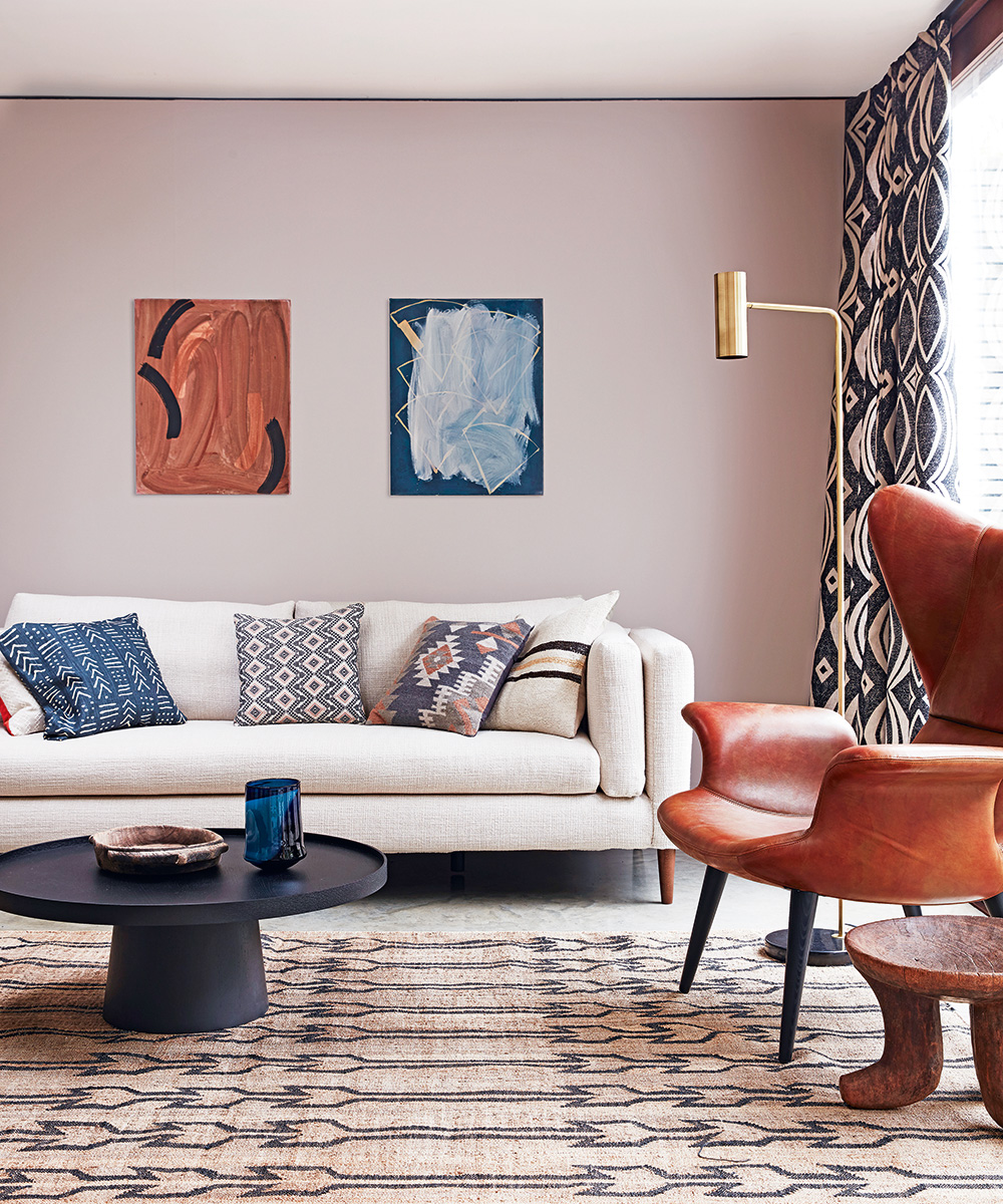
Simply put, the 60-30-10 rule a decorating trick that allows you to put a balanced color scheme together more easily.
Article continues below60 represents 60% and is the main color you are using in the room, and is usually seen on the largest space: the walls. This shade will anchor the room and be the backdrop for your 30 color, which you should use half as much as the 60 hue. This is likely to be seen on accent chairs, curtains, or even a feature wall. The 10 is your accent color, which will be represented at in about 10% of your furnishings, perhaps showcased on cushions, decorative objects, lamps or artwork.
You can use the 60-30-10 rule alongside a color wheel to choose complementing shades and tones for living room color schemes and beyond.
How to use the 60-30-10 rule in color scheming
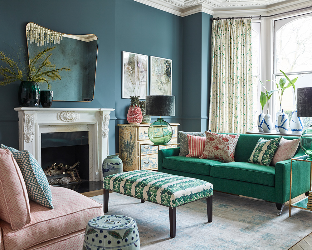
The 60-30-10 rule is simply a guideline to help you create the perfect color combinations.
David Harris, Design Director at Andrew Martin, shares his top tips on applying the design rule.
Design expertise in your inbox – from inspiring decorating ideas and beautiful celebrity homes to practical gardening advice and shopping round-ups.
'The first element of considering the 60-30-10 rule and any design scheme is to approach the walls – there is more wall than anything else in any scheme, so adding interest here is key.
'Contrasting interior elements such as plain painted walls with vibrant patterned wallpaper or bright shades produce harmonious diversity and pace in a room. Selecting a dominant color acts as the foundation of your room so it’s key to get this right.'
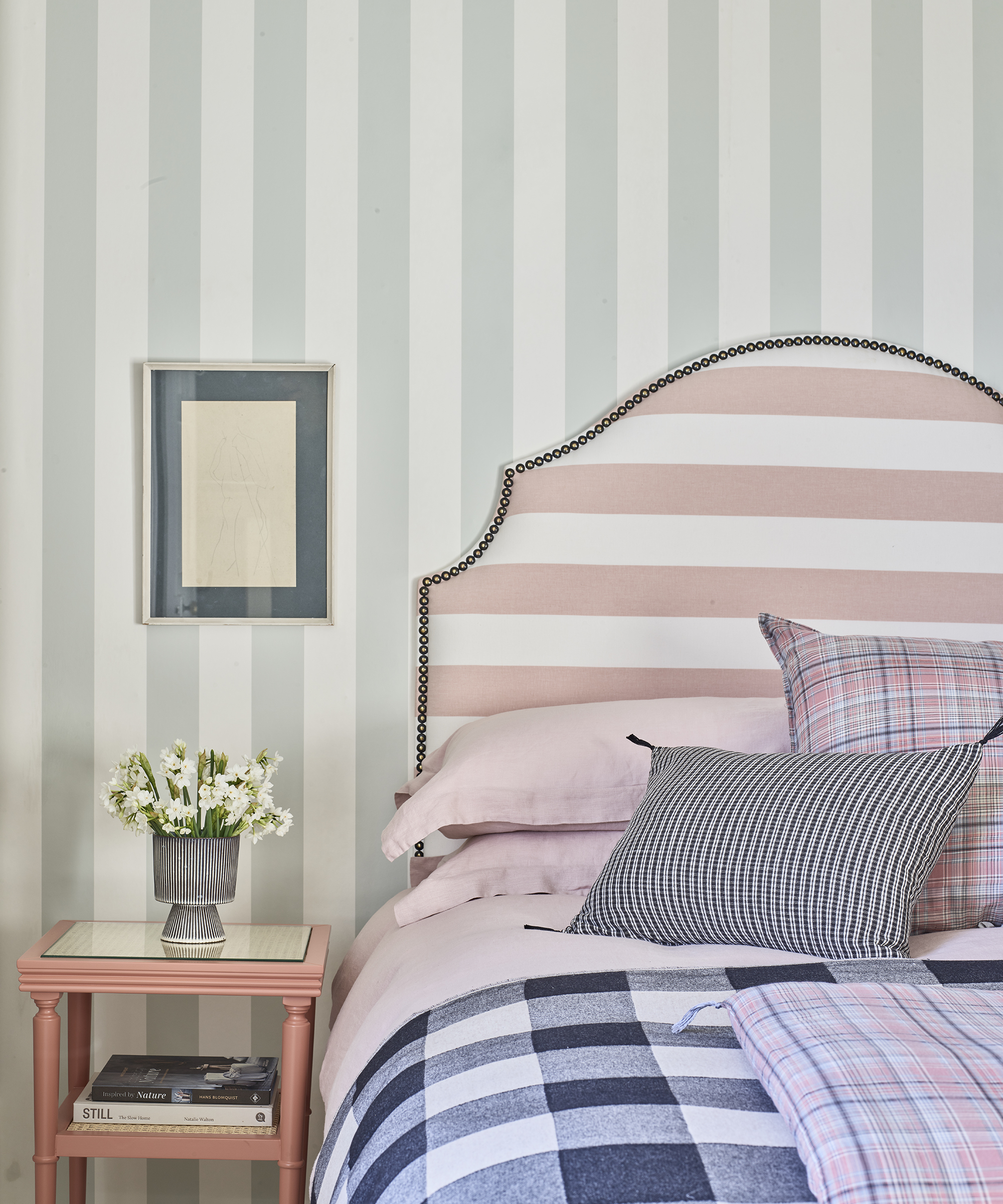
'The secondary (30%) color adds contrast to the room. Take one piece – whether it be your favorite cushion or singular flick of color in a painting on your wall – and play around with materials and color, exploring the possibilities of clashing and coordinating to let the piece tell its story.
'This color can be used in furniture, curtains, area rugs, bedding or an accent wall. Choose accessories that complement the dominant color palette of a room. This will help pull a room together and create a sense of cohesiveness.'
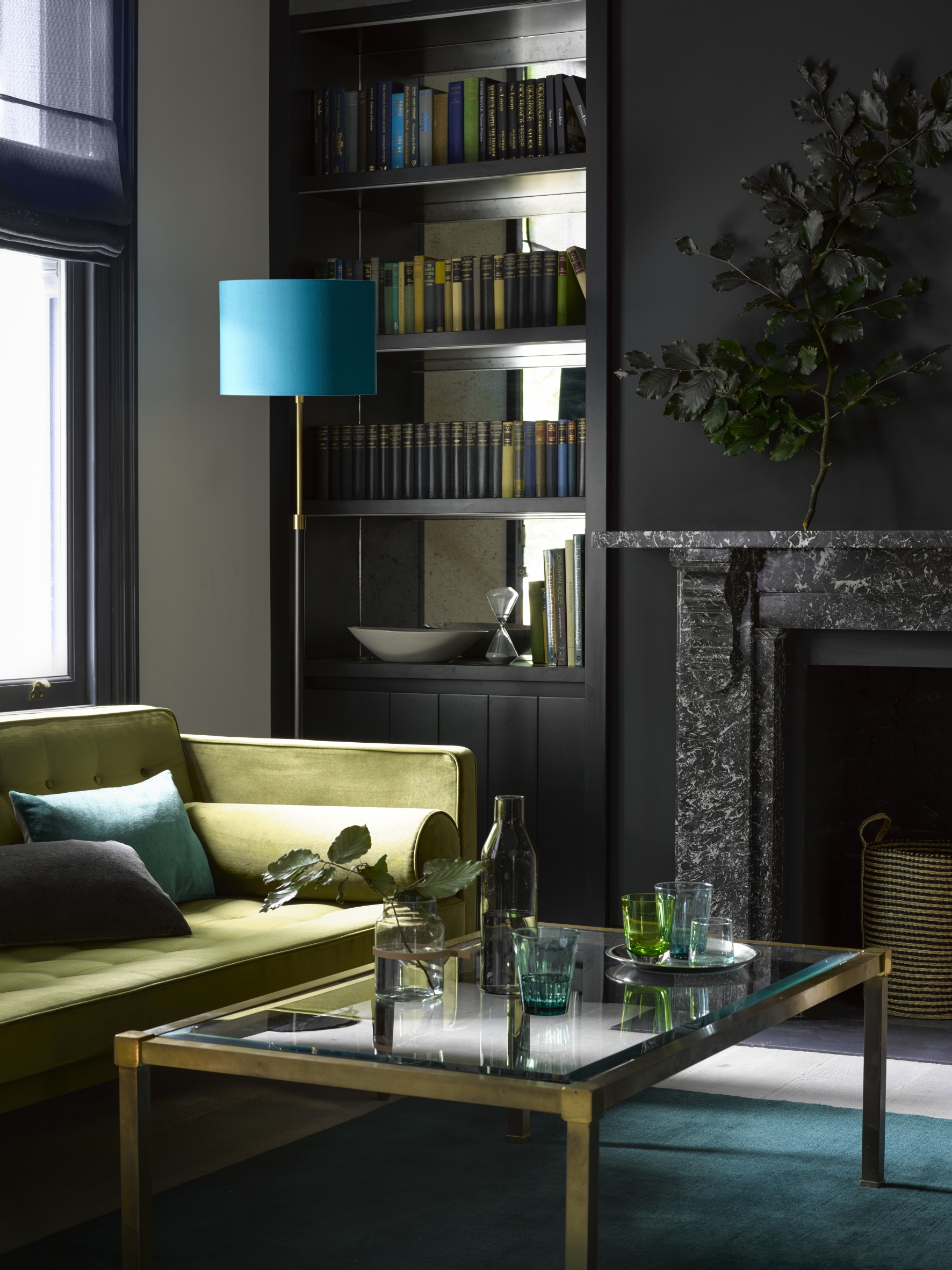
'Lastly, the 10% accent color is used to contrast and complement your décor scheme. Typical accent pieces such as throws, lampshades and artwork are great for bringing a room together.'
How many colors should you use in a room?
According to the 60-30-10 rule, you should only use three colors in any room – although you can successfully incorporate many different tones of these three colors.
This three-color rule will allow you to create a balanced, restful-looking color scheme that's difficult to go wrong with – particularly if you are creating kitchen color schemes and dining room color schemes in one open-plan space that is likely to be busy and perhaps more cluttered than other rooms in your home.
Using the 60-30-10 rule without color
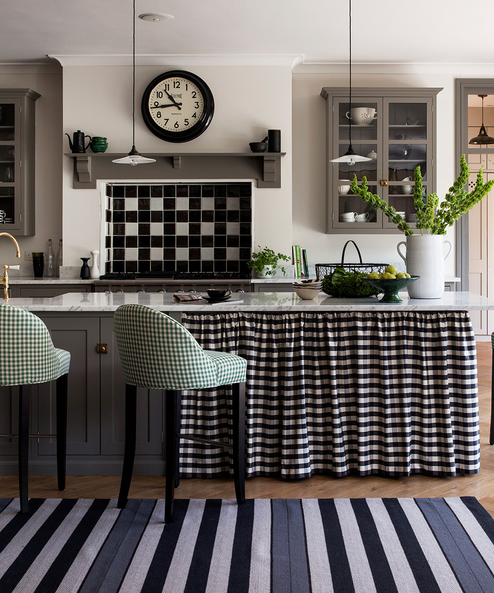
You can use the 60-30-10 rule with a monochromatic color scheme – as shown in the room above, where the 60 is the white of the walls; the 30 is the grey of the cabinetry; and the 10 is the black in the check fabrics. You may notice the rule has been broken with the addition of a 5 – in the green of the bar stool ideas. See more on breaking the 60-30-10 rule below.
How to break the 60-30-10 rule

Breaking the 60-30-10 rule is all about experimentation and, of course, once you have decorated many rooms, you will be more confident about introducing more accent colors – perhaps tried and tested favorites.
Our advice? Until then, adopt the 60-30-10 rule to create a balanced scheme, then introduce either one extra '10' element at a time. So, you may have a living room with neutral walls, a deep brown sofa and a yellow armchair – introducing a cushion or two with complementing colors, such as a burnt orange will add more color, without upsetting the balance.
In the room above, the 60 is found on the white walls, the 30 is on the neutral furnishings, and the 10 is the blue of the footstool and cushions – but there's a cheeky 5 in the pink of the fender, which adds a welcome touch of warmth and contrast to the space.

Ruth Doherty is an experienced digital writer and editor specializing in interiors, travel and lifestyle. With 20 years of writing for national sites under her belt, she’s worked for the likes of Livingetc.com, Standard, Ideal Home, Stylist and Marie Claire as well as Homes & Gardens.