What the unexpected fashion trick, the 'Sandwich Method', taught me about decorating with color in my home
I took a cue from my wardrobe and matched my ceiling to my skirtings – here's why it's my new favorite color trick

As someone who previously worked in fashion, I like to keep my ear to the ground on the latest style trends that span both fashion and interiors. One clever trick I've recently borrowed from my wardrobe is the 'sandwich method', a fashion formula that is now changing the way I dress my home too.
This hack is supposed to make creating a harmonious, well-balanced outfit a breeze – and the same principles apply to your home, too. Personally, I think this new color trend is the key to creating a space that feels curated and intentional. In fact, I loved it so much I've used it in my own home.
So, if you're interested in experimenting with your room color ideas, this is one of my favorite formulas for creating a successfully layered color palette. Here's how.
What is the Sandwich Method?
While it sounds a bit quirky, the sandwich method is actually a pretty straightforward concept. Simply put, in fashion, it refers to matching the color of something on your top half (e.g, your jacket) with something on the bottom (e.g, your shoes). These coordinating pieces act as the 'bread' in the outfit, and you then sandwich a contrasting item or pieces in between.
This then helps to create a sense of harmony, symmetry, and proportion in your outfit. The same principles can also be applied to your color combinations for rooms.
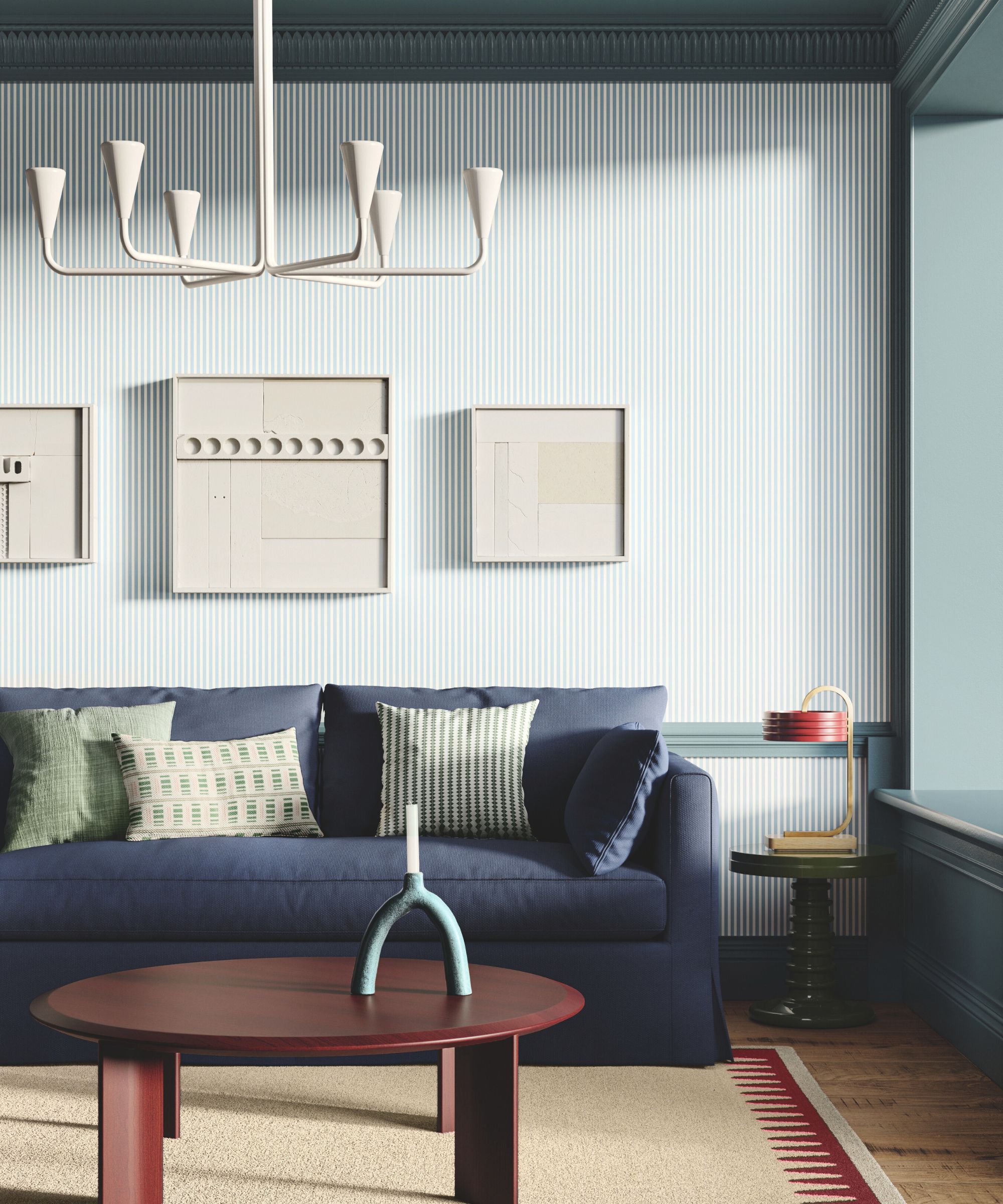
For example, the living room seen above has been wallpapered in a subtle stripe that has been sandwiched between dark, gray-green paint on the living room ceiling and matching colorful woodwork below. This helps to unify the contrasting molding and woodwork by giving it purpose with the same color up above. The effect is cozy and cocooning.
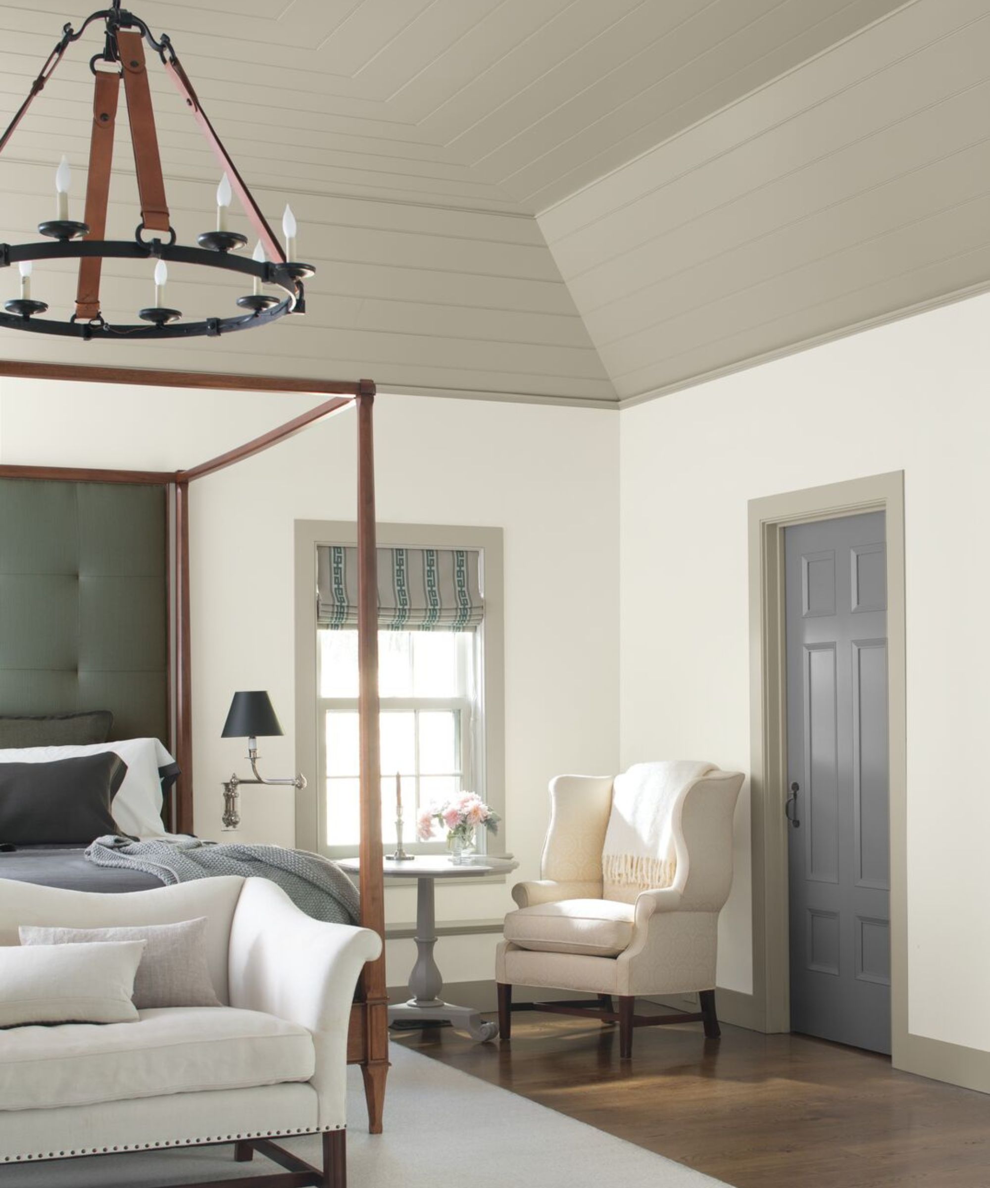
'When it comes to designing a paint scheme that feels polished and unified, the ‘sandwich method', taken from the world of fashion, is a great methodology to use,' explains Helen Shaw, director of marketing (international) at Benjamin Moore. 'The concept is that the color used on top – in the case of interiors, the ceiling – matches that on the bottom, i.e., the skirting boards, to ‘sandwich’ the main wall color, akin to matching your jacket to your shoes.'
Design expertise in your inbox – from inspiring decorating ideas and beautiful celebrity homes to practical gardening advice and shopping round-ups.
As in the bedroom above, this airy space has been double drenched in a mix of Benjamin Moore's Harwood Putty on the ceiling and skirtings, while Bruton White is used on the walls as the sandwich filling. The result is much cozier and less oppressive than if the entire bottom half of the room was painted white with a heavy gray ceiling.
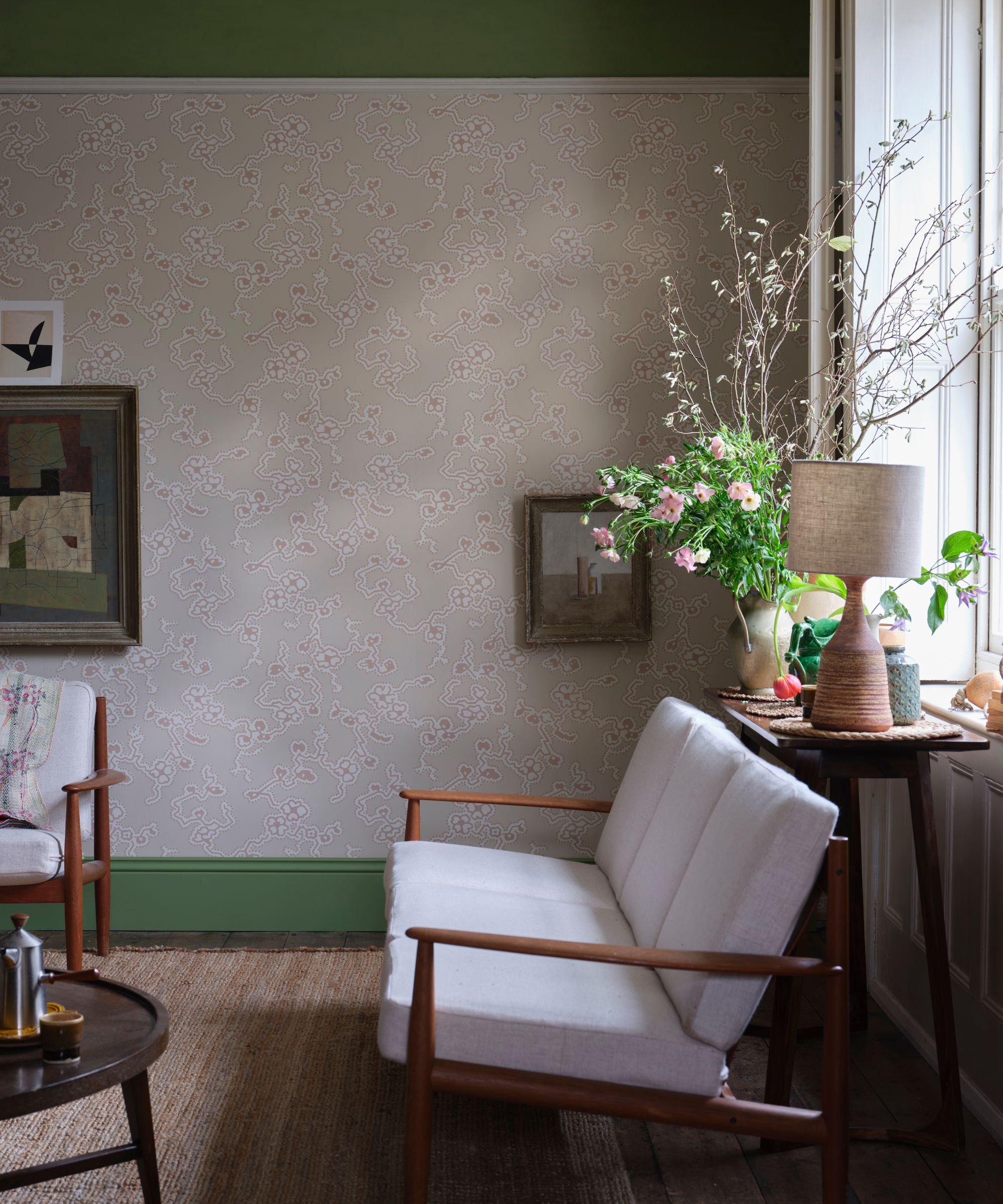
'Like in fashion, this method works well in interior design, as it creates a balance between the two colors used and ensures the look feels considered and put together,' adds Helen. 'This is particularly beneficial in older properties where the ceiling and skirting boards have beautiful details and charm that are often overlooked when painted the same colors as the walls.'
'Opting for a neutral hue on the skirtings and ceiling is a great place to start, as these colors are much more dynamic than something bold, meaning you can easily change the wall color as your style evolves,' while always ensuring the scheme works, thanks to the coordinating above and below shade.
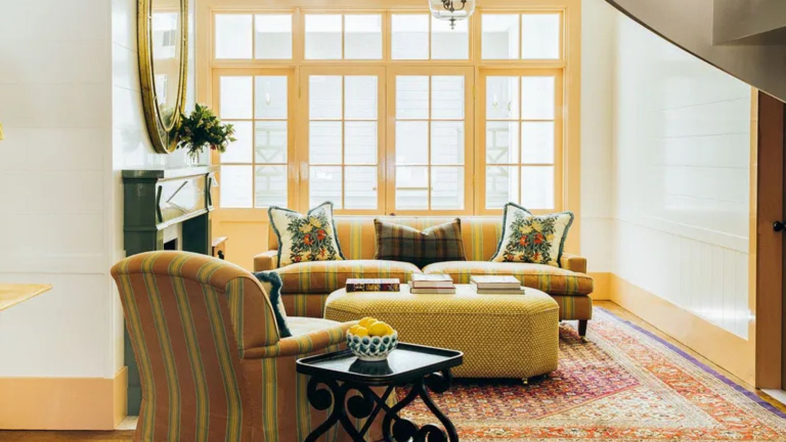
In my own dining room, I’ve paired a butter yellow ceiling with matching skirtings in the same yellow paint. The result is a space that feels cohesive without being overly matchy – and it’s far more considered (and less overwhelming) than simply throwing the same shade on all four walls.
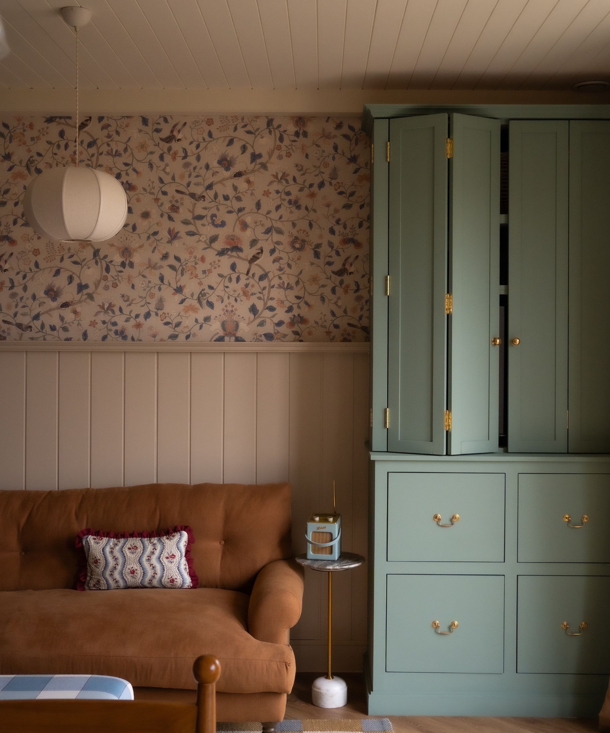
Of course, it isn't all about the ceiling and baseboards. In this snug room, seen above by designer Alice Grace, she has matched her soft beige wall panelling with a panelled ceiling in the same warm hue. This trick gives the eye visually restful moments to focus on which then allows the busy details, like the floral wallpaper or pops of blue and caramel tones, to sing.
By repeating a color at the top and bottom levels, you create a bookended effect that feels grounded. It’s a way of layering color that feels modern and dynamic without overwhelming the room. Just like in fashion, where accessories can make an outfit feel intentional, this technique in interiors brings a curated quality to a space – even if the palette is subtle.
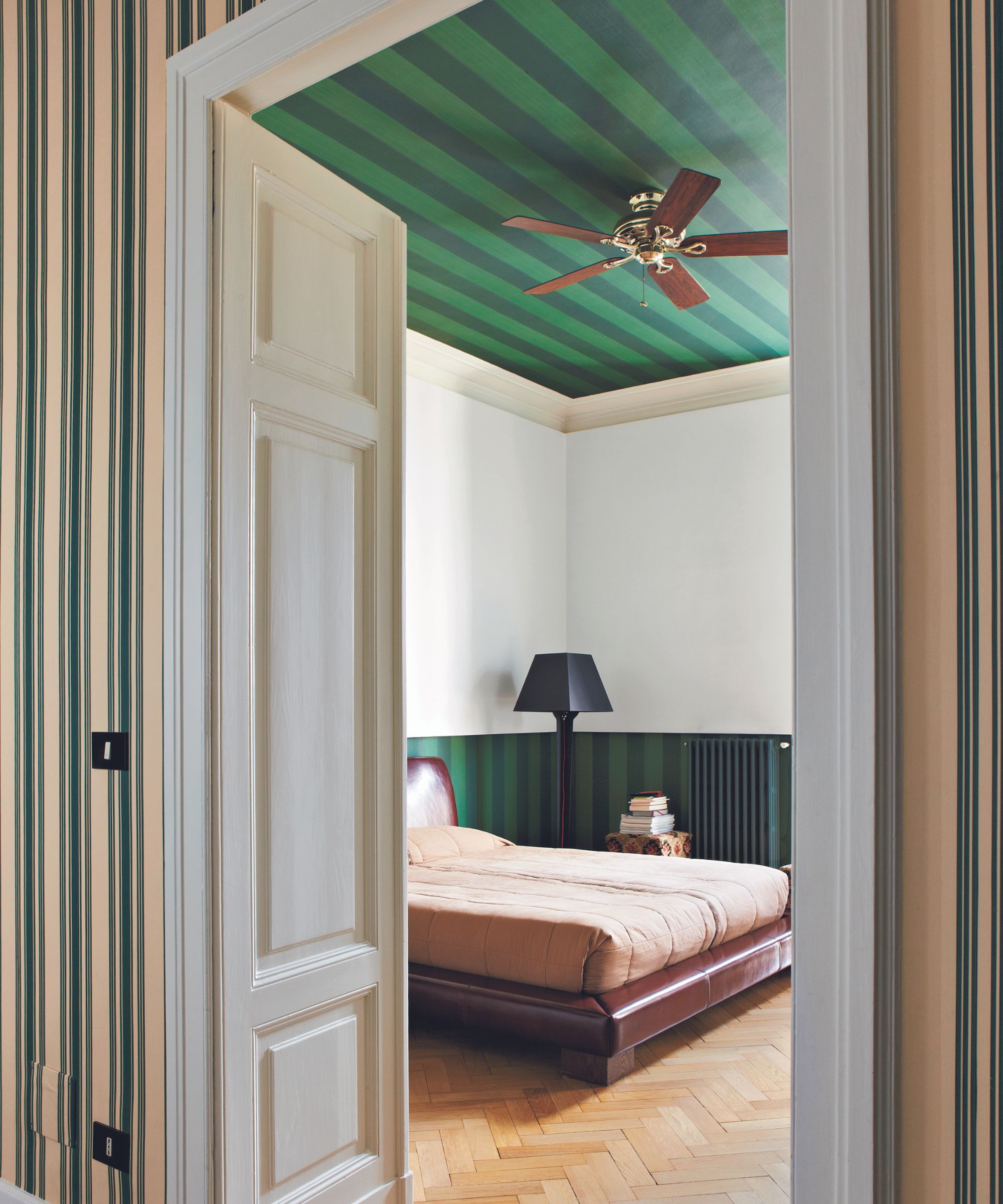
Beyond aesthetics, the 'sandwich method' is also a clever way to bring unexpected color into your home. An accent ceiling is already a design-forward move, but when you echo that color again at the floor or lower level, it gives the color more of a 'reason' to exist in the space by tying the room together and making the decision look deliberate.
And if you're feeling really brave, you can also apply the same technique to a pattern as seen in this stripy bedroom.
'Make a bold statement on your ceiling by adding a splash of whimsical fun with a bright contrast,' says Patrick O'Donnell, brand ambassador and expert at Farrow & Ball. 'This can work especially well if using a strong color or bold print on your walls. It will make the room feel more cohesive, especially if you use the same color as on your skirting on the lower part of the wall,' he adds.
Additionally, this concept can be applied to smaller, more focused areas like bookshelf styling or vignettes, where you can attempt to echo the same palette throughout the decor in your chosen zone to create a sense of cohesion. Sometimes, it really is the smallest details that help to create the biggest impact.
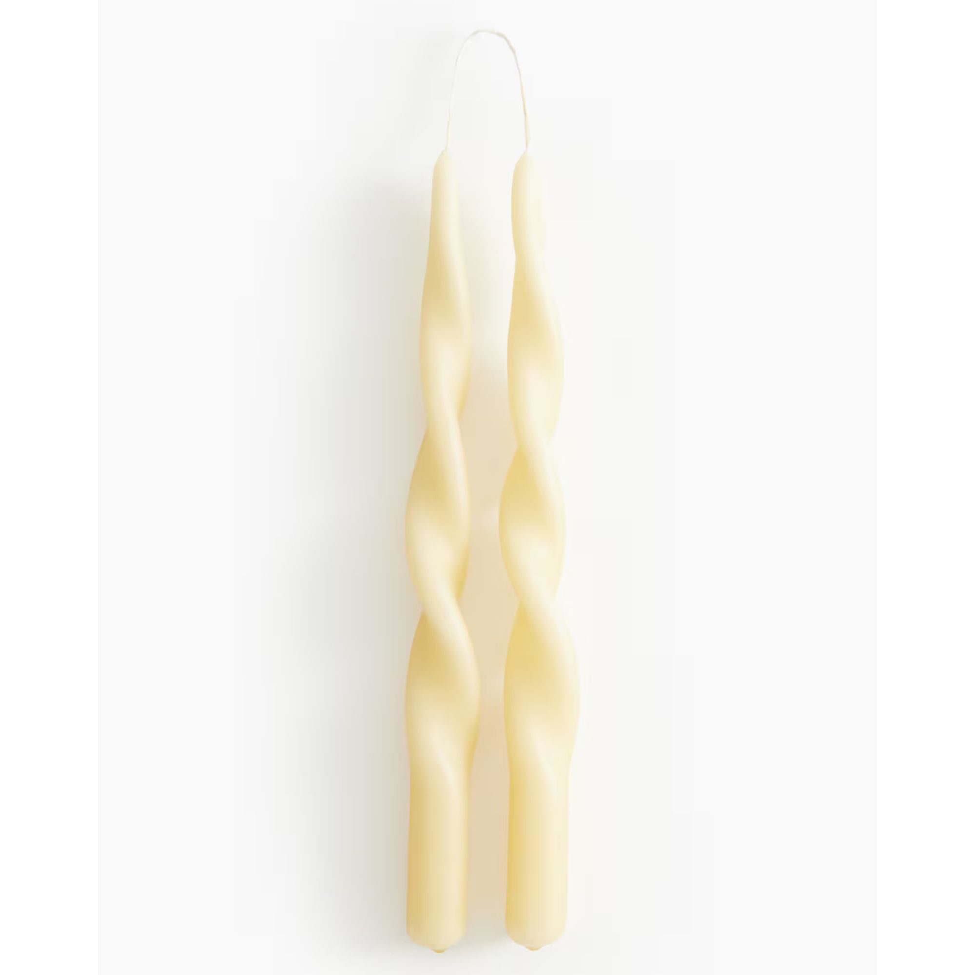
I've already done a round-up of my favorite butter yellow decor finds, but I missed out on adding these lovely new spiral taper candles from H&M. At just $6.99, they're a budget-friendly way to dip into the on-trend hue.
Bringing a fashion styling trick into my dining room might sound a little unexpected, but it’s exactly the kind of creative crossover that makes design feel fun and personal. I had already well and truly exhausted the color drenching trend in other rooms of my home, so I knew I wanted to try something a little more dynamic in this space – especially as it leads directly from the entryway, and I wanted to make a good first impression.
Matching the ceiling and skirting in a soft butter yellow hasn’t just made the room feel more curated; it’s also a gentle reminder that color rules don’t have to be complicated to be impactful. Sometimes, all it takes is a little symmetry and a willingness to look at color with fresh eyes.

Charlotte is the style and trends editor at Homes and Gardens and has been with the team since Christmas 2023. Following a 5 year career in Fashion, she has worked at many women's glossy magazines including Grazia, Stylist, and Hello!, and as Interiors Editor for British heritage department store Liberty. Her role at H&G fuses her love of style with her passion for interior design, and she is currently undergoing her second home renovation - you can follow her journey over on @olbyhome

