The biggest color trends of 2025 – 10 colors designers say will lead the way next year
From rich and warm reds to grounding neutrals, these are the hottest interior color trends for 2025

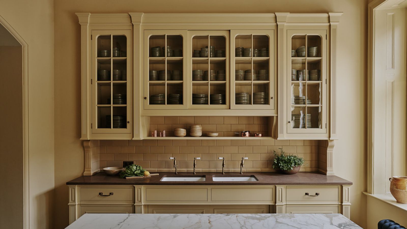
We're always looking ahead to the biggest color trends across interior design, not just for the rest of 2025, but beyond. Largely responsible for setting the mood of a room, color holds transformative power within our homes, and so landing on the right shade for a redecoration project is key.
2025 was all about, rich, warming shades – think burgundy and verdant green – alongside grounding earth tones for minimalist schemes. Of course, there's still room for brighter shades, from cheerful yellow to calming shades of blue. But the interior color trends of 2025 all have one thing in common – timelessness.
Here, we take a deep dive into the biggest interior color trends for 2025, turning to the expertise of interior designers and color specialists. Read on to gain some on-trend inspiration for your room color ideas, from timeless neutrals to deep and dark hues.
Article continues belowAnd if you are looking for the key color trends of 2026, we have covered all the biggest shades for the year ahead in our new roundup.
What are the biggest color trends of 2025?
'In 2025, we’re seeing clients embrace a palette of moody and sultry hues that evoke depth and sophistication,' explain Autumn Oser and Andre Golsorkhi, founders of design firm Haldon House.
'Expect dark tones like deep chocolatey browns, vibrant burgundies, and shadowy olive greens to create an ambiance of opulence and refined elegance. Saturated materials like walnut wood, soapstone, and rich plasters will further enhance these immersive, dramatic spaces, making them feel both luxurious and intimate.'
1. Warm and sophisticated reds
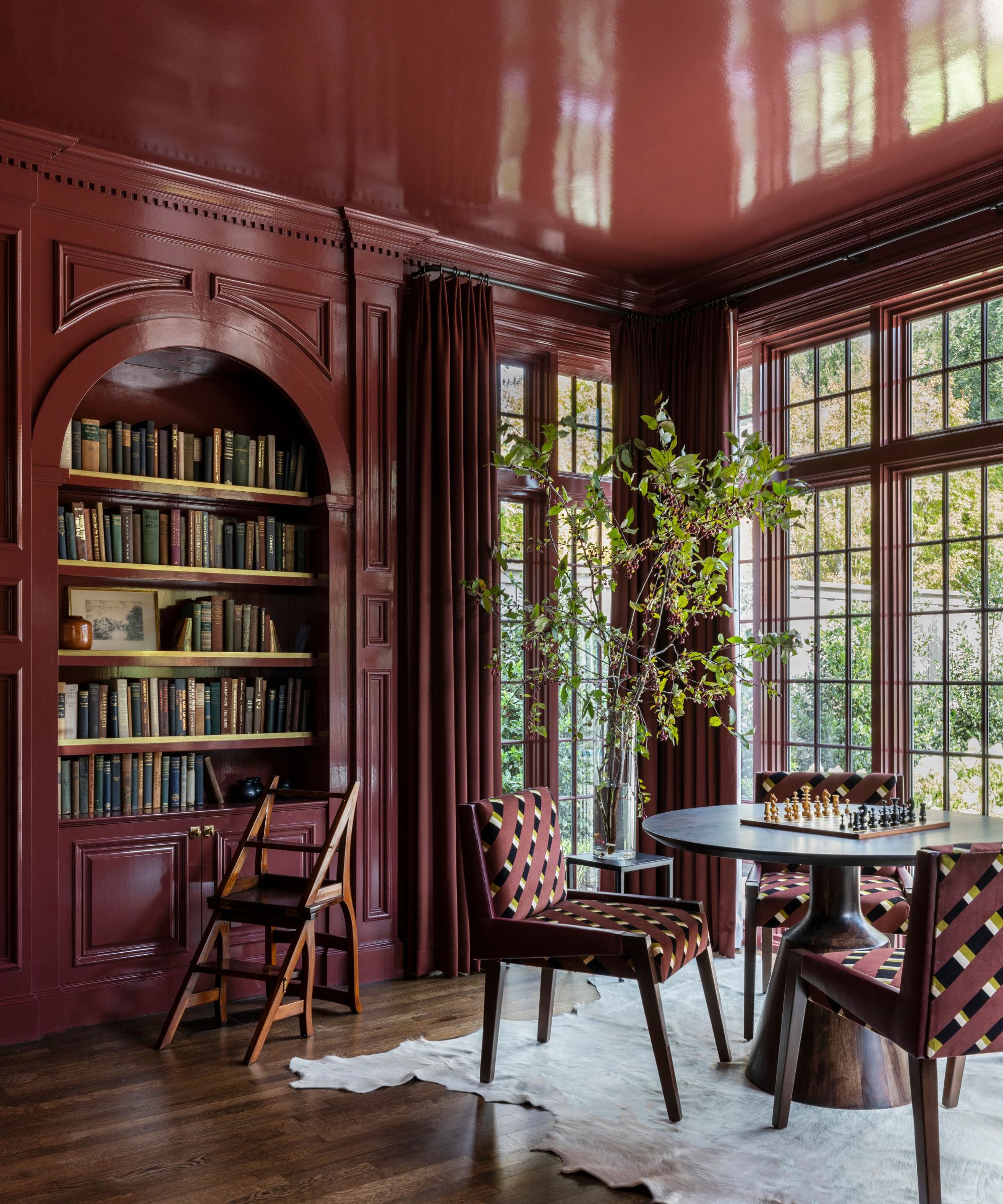
Decorating with red gained plenty of traction in 2024 thanks to the unexpected red theory, but this interior color trend is shifting away from saturated tomato reds toward rich and warming wine reds, such as burgundy and oxblood. Since Behr named Rumors its 2025 Color of the Year, we've seen increasing appeal for these sophisticated tones, and designers are predicting dark, warm red room ideas to endure throughout 2025 and beyond.
Design expertise in your inbox – from inspiring decorating ideas and beautiful celebrity homes to practical gardening advice and shopping round-ups.
'Whether you prefer the rich burgundy or masculine rose, red is coming in a major way,' says interior designer Sarah Storms. 'Forget the notion of reds from the 2000s, I'm talking about the rich tones that almost feel a little bit moody or a little bit dusty. There is a classical, almost historical appeal to these colors and how they invoke a level of sophistication of bygone eras. My favorite masculine pink is Tea Room AF-270 by Benjamin Moore.'
'For 2025, we've seen a rise in the use of oxbloods and saturated, moody reds,' agrees designer Marie Flanigan, who opted for Sherwin-Williams' Carriage Door in this dining room. 'These rich, deep hues bring a sense of warmth and sophistication to interiors, creating spaces that feel both dramatic and inviting.'
'Oxblood, in particular, has a timeless quality that adds depth and richness, making it a perfect choice for those looking to create a bold yet classic atmosphere. I love using these colors in intimate spaces like dining rooms or libraries, where they can really make a statement. These shades offer a beautiful way to infuse interiors with character and elegance, and I’m excited to see them embraced even more this year.'
2. Chocolate brown
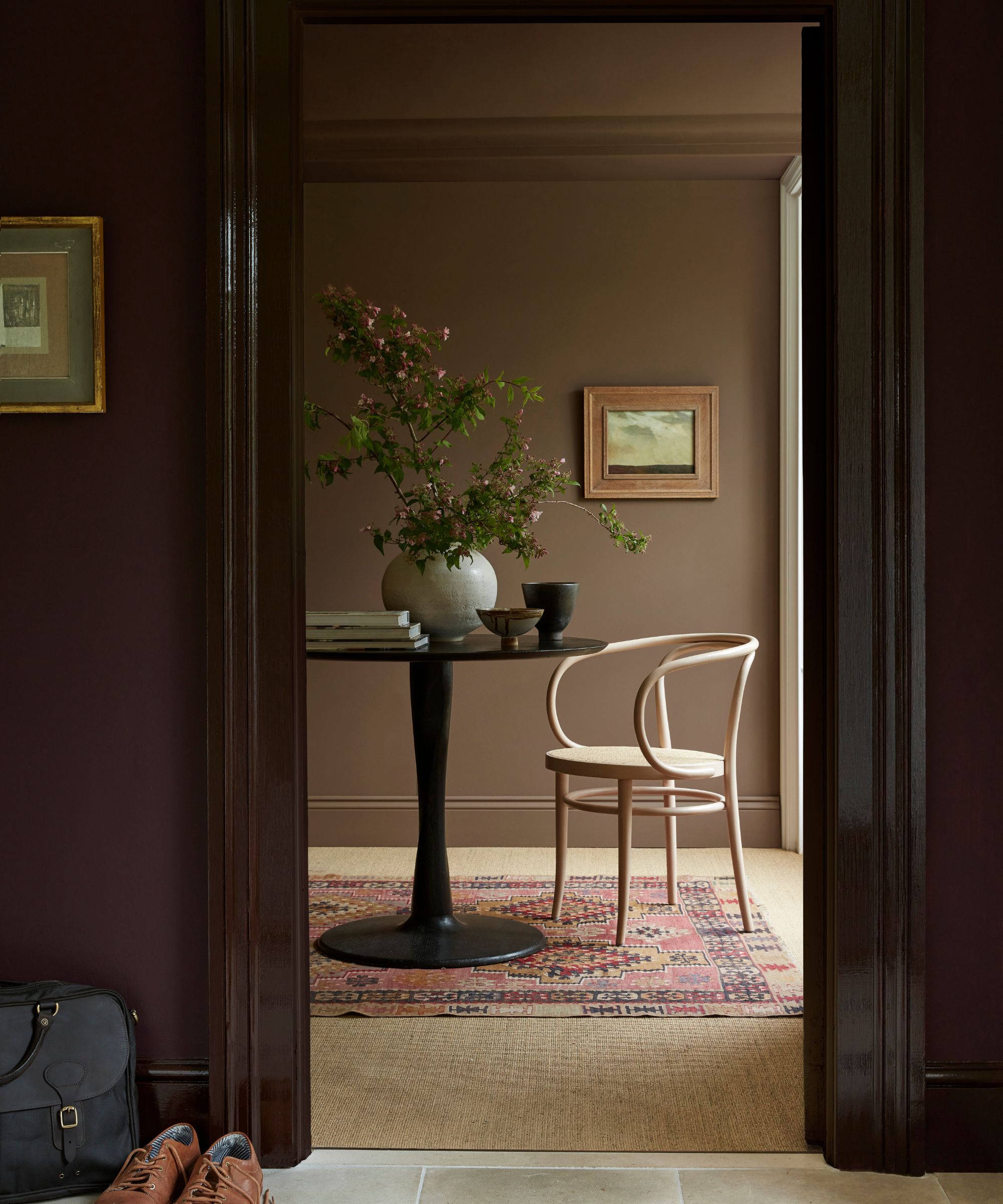
When it comes to decorating with dark and moody paint colors in 2025, brown room ideas are expected to reign supreme. Rich, chocolate tones fill rooms with warmth and coziness while appearing more inviting than shades such as black.
'Rich, warm brown is poised to be a standout color trend in interiors,' says interior designer Swati Goorha. 'This hue offers a deep, earthy quality that brings warmth and coziness to any space. As people increasingly seek comfort and a connection with nature, brown's natural, grounding presence provides a soothing and inviting atmosphere. Its versatility allows it to complement a range of colors, from neutral creams and soft grays to vibrant accents.'
Although decorating with brown works especially well for fall color schemes, this color's warmth helps us to create spaces that feel reassuring and relaxed year-long. 'For 2025, I think people are putting an emphasis on relaxing spaces,' explains Ethan Greenfeld of Los Angeles-based Ethan Charles Design. 'I believe that will translate to us seeing more earth tones. Specifically, truffle brown tones will be major in 2025.'
'They have the ability to make a space feel like you're being enveloped by a cuddly bear, which evokes a feeling of warmth and comfort. I also think it pairs well with natural wood tones like walnut and oak.'
3. Timeless warm neutrals
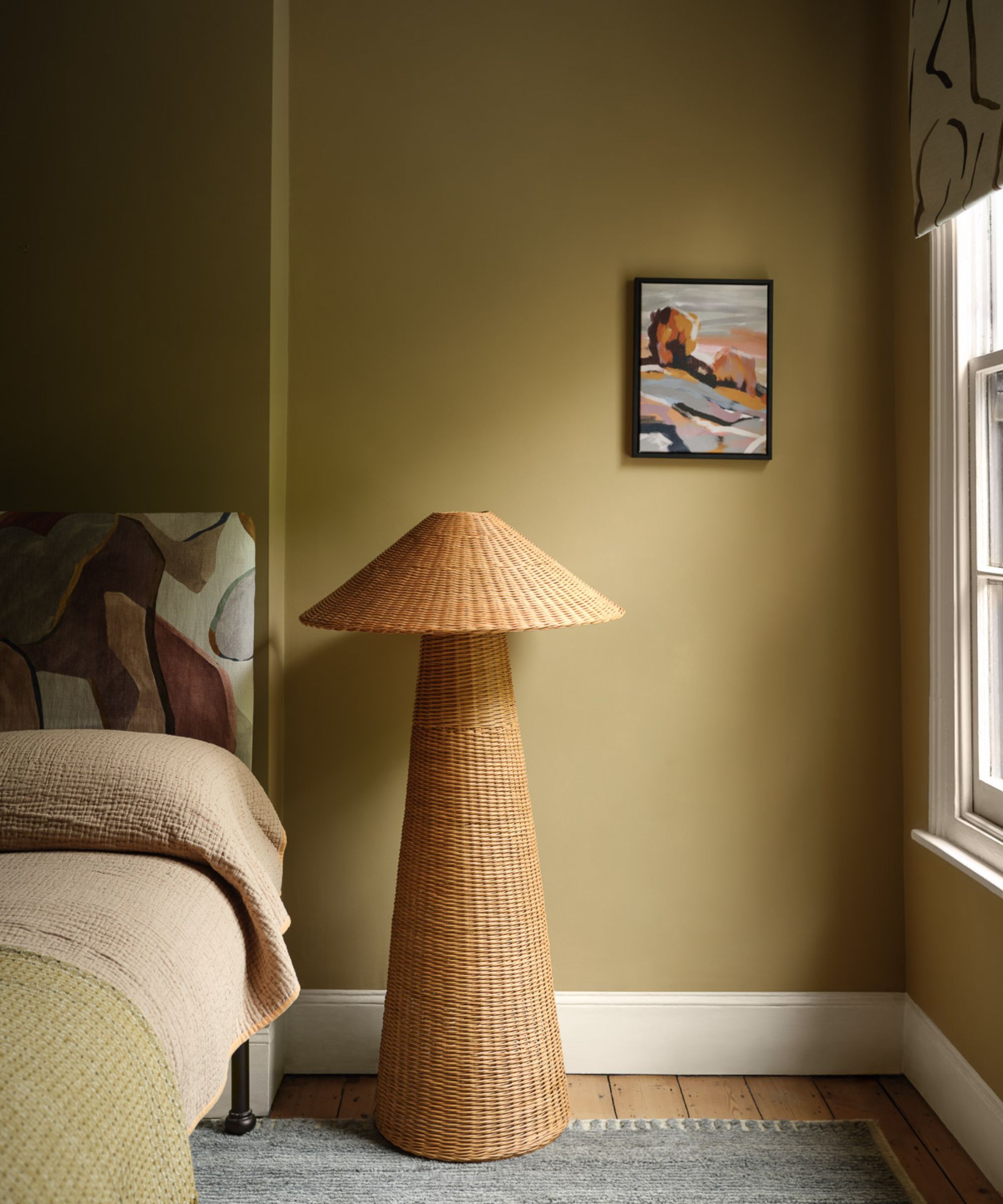
Decorating with neutrals in 2025 is all about warming, earth-inspired shades in place of cool-toned neutrals like gray.
'I see the shift from light, airy neutral colors to earthy, grounding hues that wrap us in warmth and comfort, like a reassuring hug,' says Susan Jamieson, principal at Bridget Beari Designs. 'Amongst them, mustard will surely spread in 2025.'
'The color mustard is yellow, muted with brown undertones that allow it to act as a neutral. In color psychology, yellow represents happiness and hope while brown symbolizes security and safety, which will be a meaningful combination for our mindsets and interiors throughout 2025. Mustard pairs deliciously with other warm, down-to-earth shades like cognac, burnt orange, and olive green as well as with cool colors such as navy, teal, and aubergine.'
Neutrals in 2025 can also take on a more subtle tone, with warm beiges predicted to maintain their appeal. 'My top picks in this color family are Benjamin Moore’s Rocky Road CC-470 and Sherwin Williams’ Studio Beige SW 9602,' shares Kerry Jacobs, founder and principal designer at Manor & Woods. 'These hues are both warm and inviting, while also adding a touch of moodiness that’s currently in vogue. It complements both tone-on-tone contemporary designs and traditional, grand-millennial layered and patterned palettes.'
4. Seafoam green
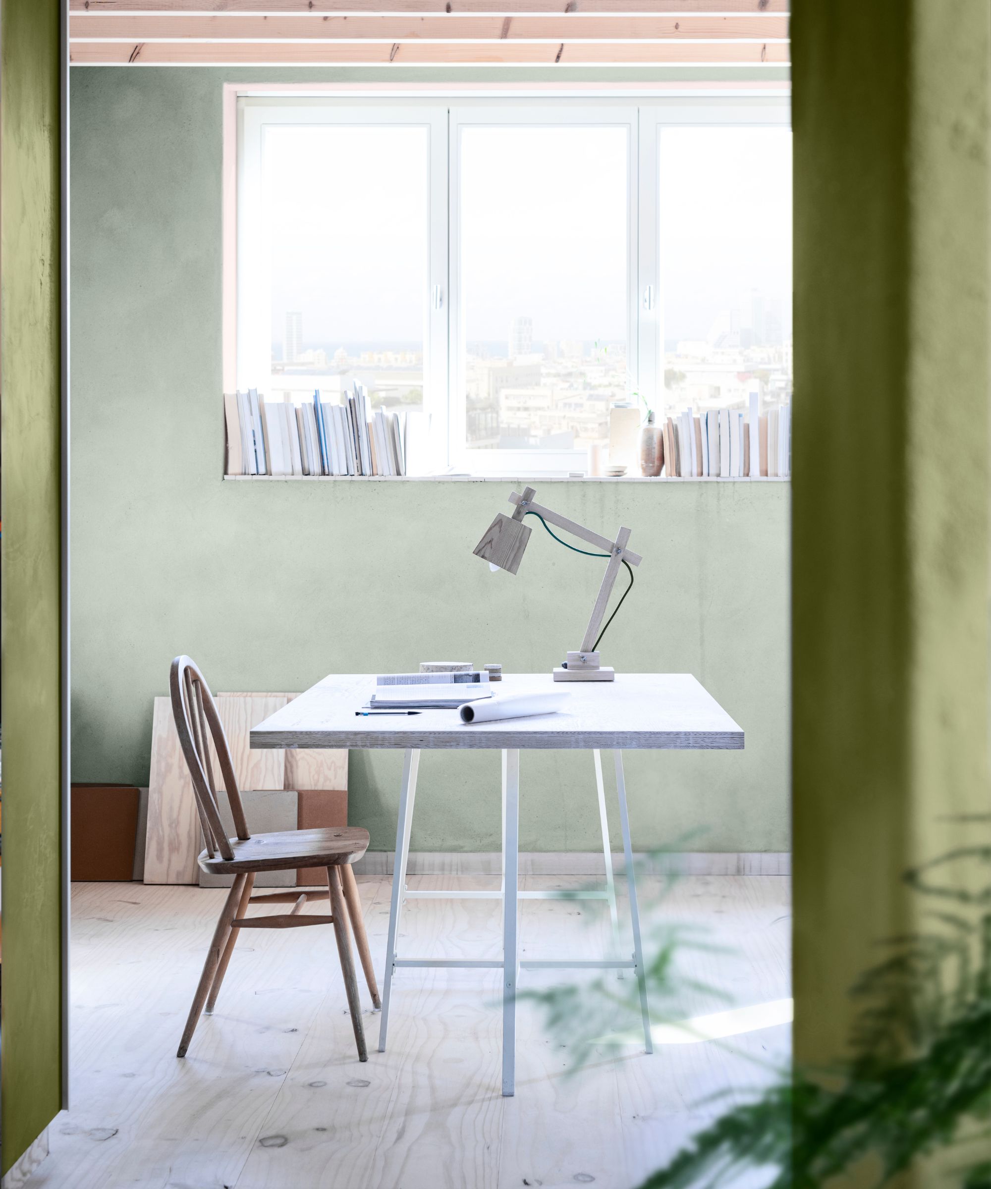
Another interior color trend expected to gain more momentum in 2025 and beyond is seafoam green. A light, blue-green hybrid, seafoam green feels restful, lending itself well to calming home offices and bathrooms, much like Dutch Boy's 2025 Color of the Year, Mapped Blue.
Shades of seafoam green feel reminiscent of the natural world, conjuring images of the sea. Creative director at Dulux, Marianne Shillingford, explains why these types of natural world-inspired hues bode well in our homes: ‘It’s in the great outdoors where we feel at our most tranquil and by bringing these colors into our homes, we benefit from the same calming effects of being in nature.'
‘These are also receding colors with shorter visual wavelengths, so they appear further away and make rooms appear bigger and more spacious than they really are, which is perfect if you want to feel less hemmed in at home.’
If you want to take on this color trend in a darker form, decorating with teal is also predicted to gain popularity throughout 2025. 'In 2025, I anticipate teal to emerge as a prominent interior color trend,' predicts interior designer Jennifer Davis of Davis Interiors.
'It is a rich, saturated hue with the perfect blend of timeless blue and green, with a depth that resonates with the ongoing moody trend. Teal's versatility and sophisticated appeal make it a natural choice for creating spaces that are inviting, cozy, and boldly elegant.'
5. Dark verdant green

If you're looking to decorate with dark paints in 2025, verdant green is the way to go. While previous years have favored dark navy blue, the darkest of greens are expected to lead the way in interior color trends. Guaranteed to add a sophisticated look to the home, dark green paints add drama and depth, while their warmth employs a cozy feel.
'For 2025, we are feeling deep, rich, verdant green,' says Christine Carney, Director of Design for Blackberry Farm Design. 'It is sophisticated and a bit mysterious, incredibly chic and a little inscrutable too. We want to use it everywhere – walls, ceilings, floors, indoors and outdoors. It really adds such an unusual visual depth and sense of warmth to a space.'
In this timeless kitchen by deVOL Kitchens, the dark green walls and kitchen cabinets are teamed with marble kitchen countertops and brass hardware, showing just how elegant this rich and alluring shade is.
6. Earthy terracotta
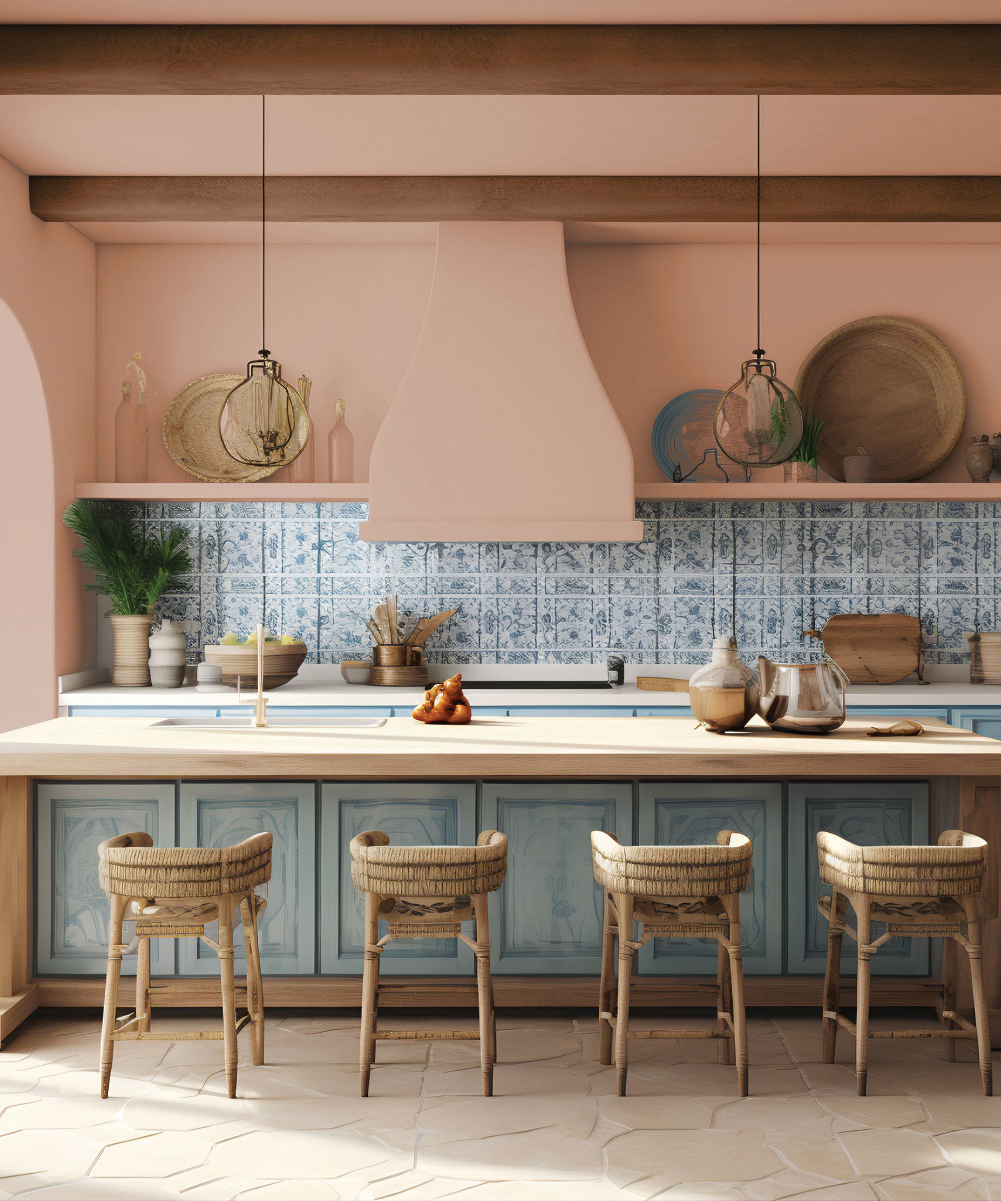
Another 2025 color trend expected to gain popularity is earthy shades of terracotta. Used increasingly as a paint color in our homes, this interior color trend is derived from natural terracotta clay. With its warmth and plaster tones, shades of terracotta have a grounding, natural feel that works well as an elevated take on decorating with neutrals. If your interior design style leans slightly rustic, it's worth incorporating terracotta decor in your home in 2025.
There are lots of tried and tested terracotta paints to decorate with, but some of our favorites are Red Earth by Farrow & Ball and Kalahari Sunset by Behr. Beyond paint colors, terracotta lends itself perfectly to wall tiles and floor tiles, paying homage to tiles commonly found in Europe.
'This summer, many of our clients have shared stories of traveling to the coast of Portugal, Southern France, and Northern Italian cities,' shares Patrick Fox of Crafted Interiors. 'The common thread in all these areas is the rich, vibrant terracotta tiles and paint colors. We see the beautiful, rich orange and red tones making an appearance again in 2025 as a reminder of European adventures.'
7. Captivating caramel tones
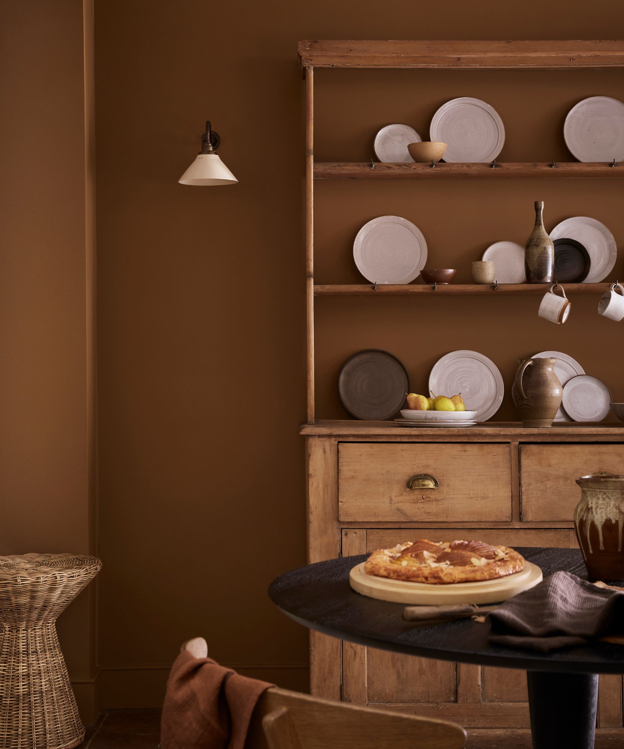
Just as chocolate browns are making a return, so too are irresistible caramel tones. Once shunned for being dated, these golden hues are proving irresistible with interior designers and we’re seeing them paired with richer browns, warm white paints, soft pinks, and blues.
‘Richer neutrals are overtaking whites in popularity, bringing with them a cozy and inviting atmosphere. These earthy yet refined shades make them the perfect backdrop to the natural materials currently being incorporated in contemporary interiors, including wicker, rattan, warm woods, and stone finishes,' says Ruth Mottershead, creative director at Little Greene.
8. Blissful blues
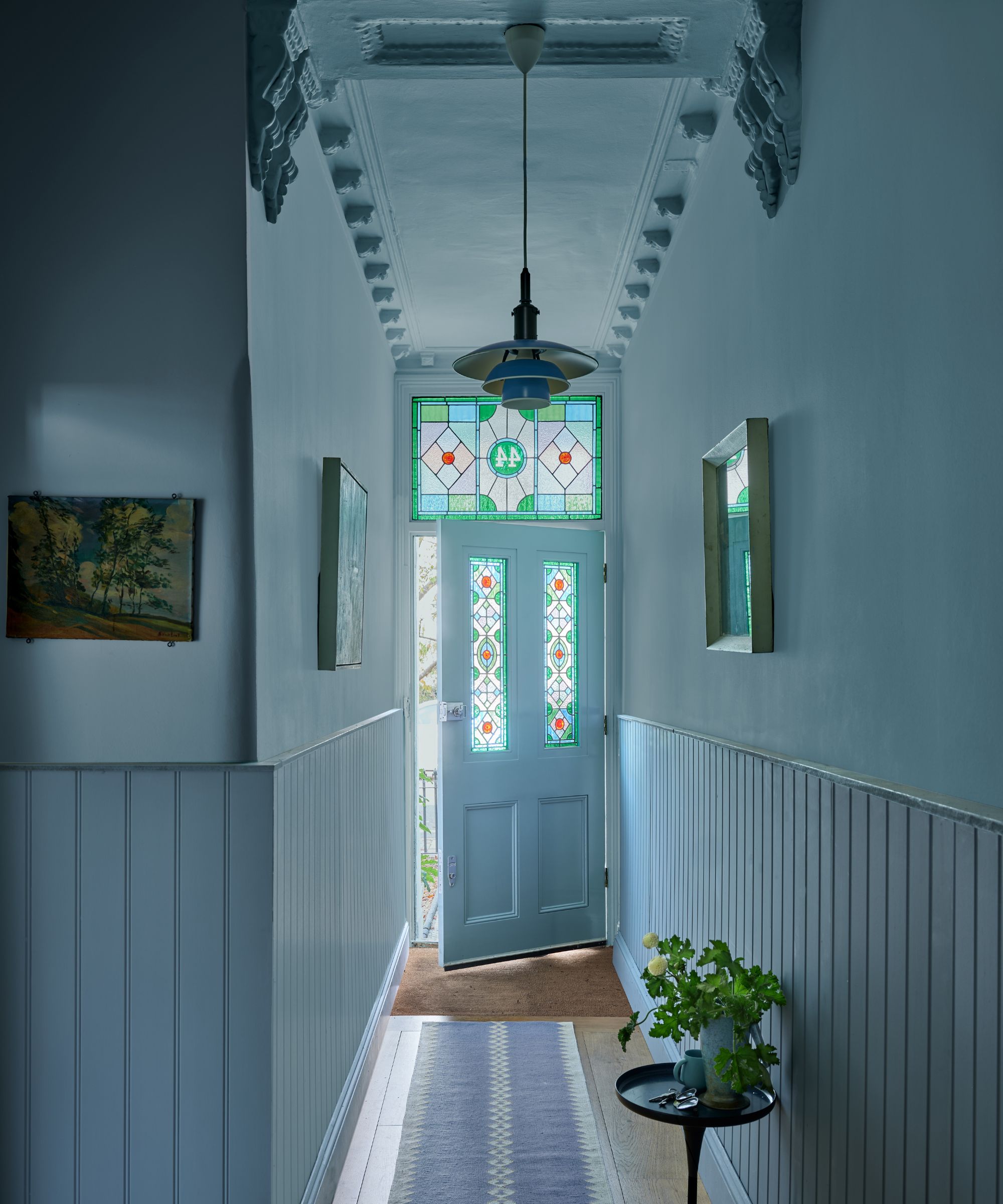
When it comes to decorating with blue in 2025, here at Homes & Gardens, we're noticing a departure from once-popular navy blue toward mid-tones that feel much warmer. Expect to see colors like cerulean blue, sky blue, and cornflower blue in the coming year, serving up a bold yet tranquil dose of color. As seen in this hallway, using blue for color-drenching ideas is a great way to lean into this color and experience its calming effect.
'There are endless shades that pair beautifully with blue but punchy colors, such as orange, pop against rich blues,' says Helen Shaw, director of marketing (International) at Benjamin Moore. 'Choose shades with warm undertones to create impact and harmony. Alternatively, a monochromatic scheme using one color will offer a smart tailored finish. Layering in multiple shades of the same hue with varying undertones softens this look, imbuing relaxing energy.'
9. Plaster pinks
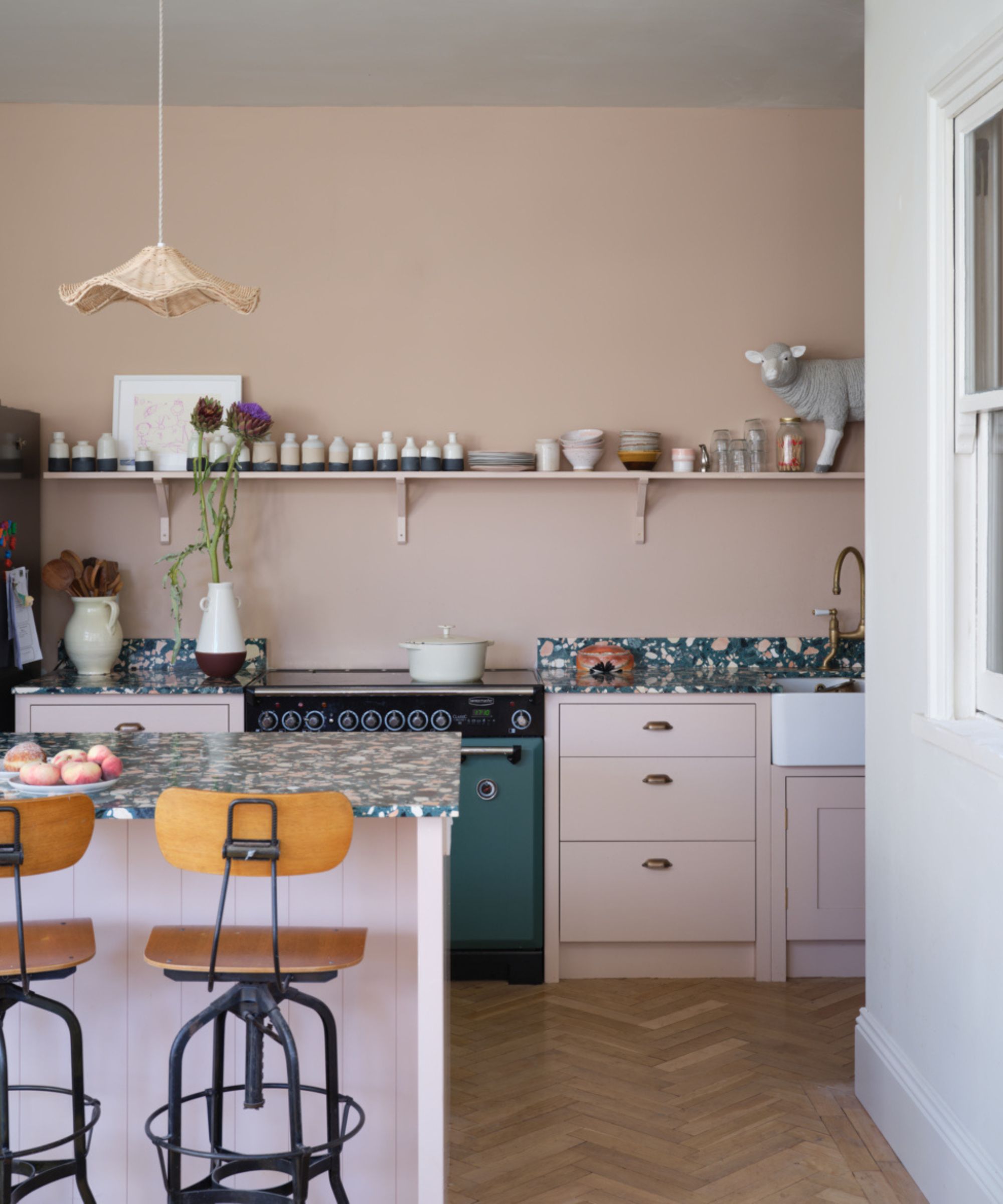
Plaster pinks see no sign of abating; warm, feminine, and versatile, they bring subtle color and softness while keeping spaces feeling bright. Perfect for kitchens to bedrooms, they pair beautifully with olive greens, browns and charcoal grey, or try creating a fun contrast with pops of zesty yellow or red.
'Earthy pinks, such as Pink Ground and Setting Plaster, have been doing the rounds for a few years now and for good reason,' says Patrick O'Donnell, brand ambassador at Farrow & Ball. 'Consider them as neutral and they will layer with almost any color and will work in any room in your home. They make the most flattering wall color for your bathroom as well as a calming choice for a kitchen scheme. These colors are your best friends.'
10. Happy sunshine shades
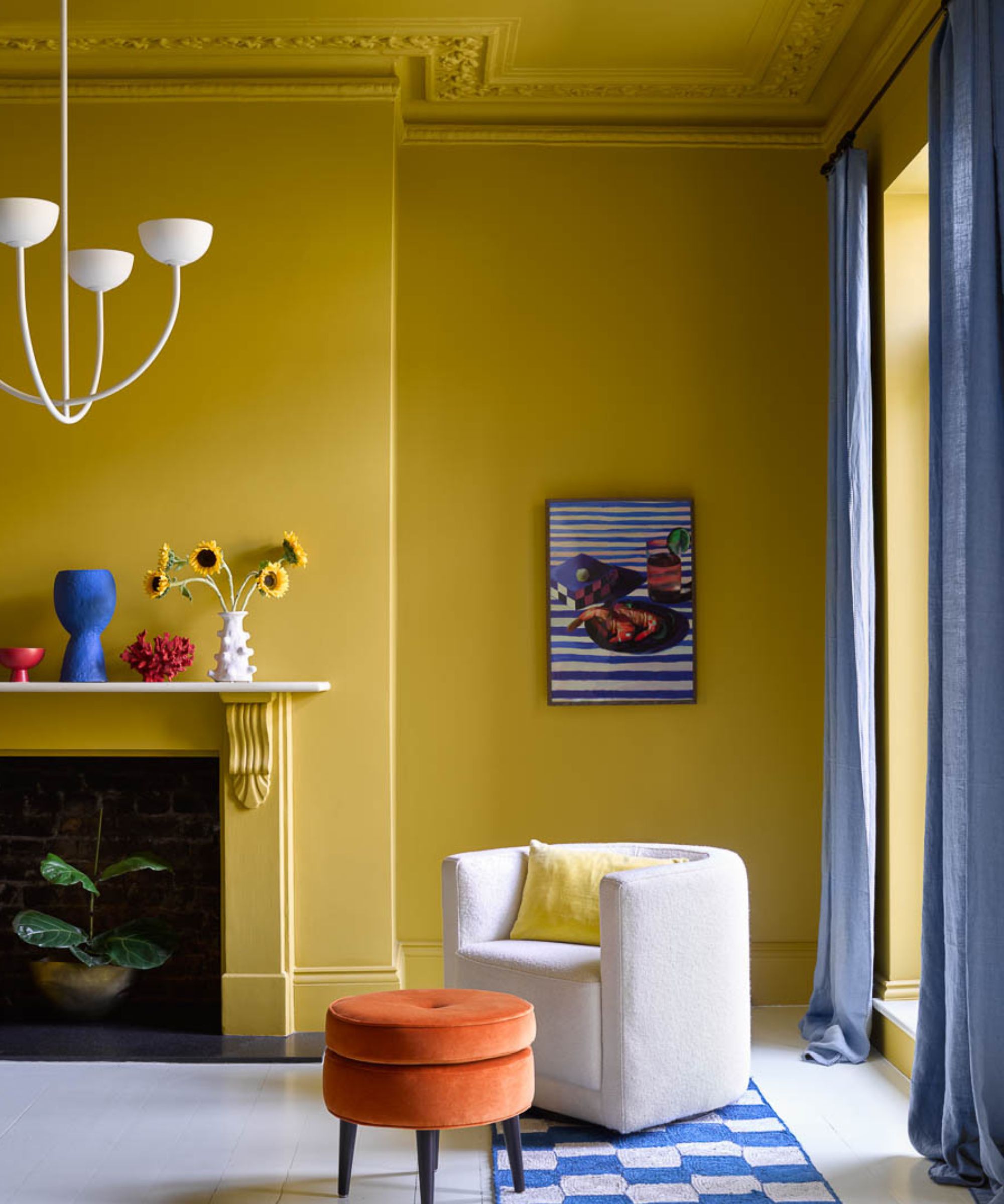
Among all the dark reds and browns and soft neutrals, vibrant yellows are a big interior color trend for 2025. Whether color-drenched or used as an accent in a neutral scheme, decorating with yellow is guaranteed to put a spring in your step.
‘As the brightest color of the visible spectrum, yellow is the most uplifting and refreshing of them all – for the ultimate endorphin boost, embrace all yellow walls and woodwork in a full-on color drench look that envelopes you in a sunshine glow,’ says Helen Shaw. ‘Opt for an accent color that sits opposite on the color wheel to add instant invigoration, this is called a complementary scheme. This combination of yellow and blue is a really pleasing aesthetic. The juxtaposition between the calming cobalt and cheery Sun Valley yellow creates a balanced yet dramatic scheme.'
There's much inspiration to take from the latest interior color trends, whether your style is colorful or understated. If you're wondering how best to incorporate these shades, take a look at our roundup of paint ideas, filled with creative suggestions.

Pippa is a contributor to Homes & Gardens. A graduate of Art History and formerly Style Editor at Period Living, she is passionate about architecture, creating decorating content, interior styling and writing about craft and historic homes. She enjoys searching out beautiful images and the latest trends to share with the Homes & Gardens audience. A keen gardener, when she’s not writing, you’ll find her growing flowers on her yard for styling projects.
- Emily MoormanContributing Writer
- Jennifer EbertEditor
