6 best terracotta paints that are interior designers' go-tos for creating an earthy and warm scheme
These are six of the most loved terracotta paints


With so much appeal surrounding warm schemes in the world of interior design, we're continuing to see homeowners embrace warm colors in place of previously popular cool tones. While there are endless warm hues to choose from, terracotta has been a standout this year.
Terracotta can be classed as a neutral but with more depth to it than traditional hues in this color family. Derived from earthy tones, terracotta has notes of pink, brown, and orange and brings instant warmth to the home whilst nodding to warmer climates.
With so many variations of terracotta to choose from, we spoke to interior designers to learn more about this color, as well as rounding up their favorite paint ideas to help you bring this vibrant color trend into your home decor ideas.

What is terracotta and why is it so popular?
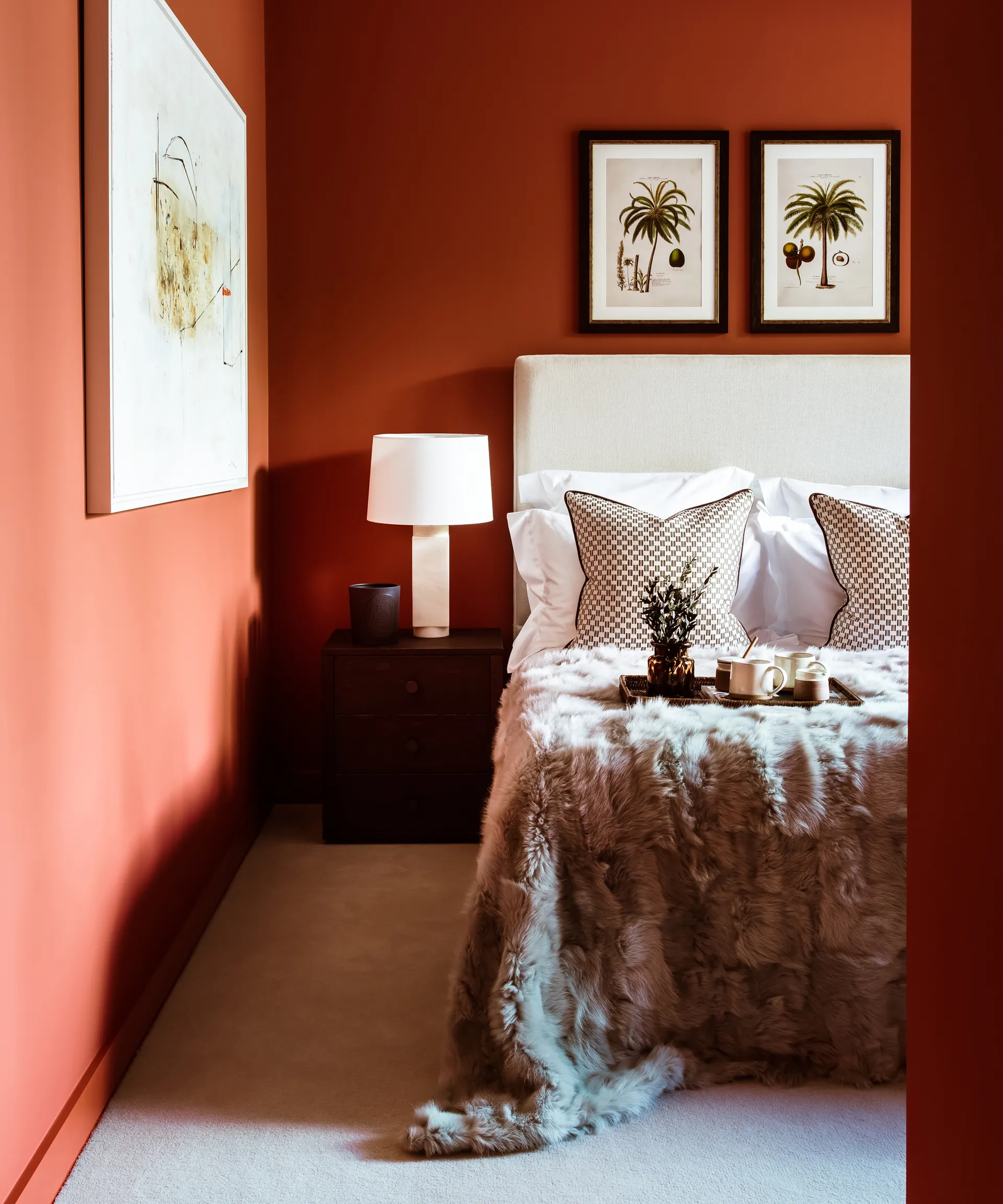
'Terracotta is so on trend for 2024 because it has a wonderful, earthy feel that pairs beautifully with soft, warm neutral colors,' says interior designer Nicole Cullum, founder of Color Caravan. 'Terracotta is a blend of red and orange that mixes to form a beautiful deep, ruddy brown.'
'These robust desert colors can lean more orange or red depending on the mix. I prefer terracottas that fall more into the deep brown and red spectrum, rather than the fiery oranges for interiors because they feel more grounded in the space,' continues Nicole.

Nicole Cullum is an interior designer in Taos, New Mexico, and founder of Color Caravan, a charming hand-painted line of wallpaper, textiles, bedding, and home decor.
Interior designer Tyson Ness, founder of Studio Ness adds that terracotta hues work well with lots of interior design styles: 'Terracotta tones are a great way to introduce a warm tone to the space that works well with almost all color palettes. This earthy hue is very balancing for a space and can be blended in with many colors and styles.'

Tyson Ness is the founder and director of Studio Ness, a NYC-based full-service interior design studio. Studio Ness is known for its collaborative approach to residential and select commercial and workspace projects across the US and abroad, crafting spaces that are unique to the client. Tyson has over a decade of experience in the NYC design sector and has worked on a number of projects that have been featured in publications both in print and online.

When it comes to decorating the rest of the room around a standout terracotta shade, Nicole advises opting for warm white paints: 'When pairing a strong color like terracotta, make sure to balance it with a light, warm white that doesn’t read too yellow, pink or gray. Your wall color needs to have a very minimal touch of warmth to it because terracotta will enhance any oranges, yellows, or pinks in your wall color and also clash with cool grays.'
6 of the best terracotta paints

Ranging from muted versions to much richer and darker hues, below, we've rounded up six of the best terracotta paints used by interior designers to create an energetic and on-trend look for 2024.
1. Byzantine, Benjamin Moore
For interior designer Kathy Kuo, her go-to terracotta paint choices are Benjamin Moore's Byzantine and Persimmon. 'Byzantine is a more traditional warm terracotta color with rustic brown undertones; it reads as a true earth tone and is easy to pair with other warm neutrals, as well as wabi sabi-inspired decor and an organic modern style.'

Opt for Benjamin Moore's Byzantine for a terracotta that's far more brown than pink, perfect for pairing with other soft, warm neutrals.

Kathy Kuo is a celebrated interior designer and international guru within the home and lifestyle space. She has 20+ years of experience in the design industry.
2. Persimmon, Benjamin Moore
'Persimmon, on the other hand, has lovely rose-colored undertones that give it a distinctively feminine vibe,' continues Kathy. 'I like to think of this color as a more earthy and understated response to the popularity of the color pink in the past year. Pair this one with blush or taupe upholstery, rose gold decorative accents, and plenty of luxe textures, like velvet and linen.'

Benjamin Moore's Persimmon is a pink terracotta that will create an instantly warming and feminine look.
3. Red Earth, Farrow & Ball
'For that classic tone, you can’t go wrong with Red Earth from Farrow & Ball,' suggests Tyson Ness. If you're more drawn to muted colors, Red Earth is a good choice for a terracotta scheme as it can feel slightly less daunting than more saturated variations of this color trend.

More of a true terracotta, Farrow & Ball's Red Earth works particularly well in small rooms.
4. Kalahari Sunset, Behr
'Behr offers a diverse range of terracotta paints, catering to a spectrum of hues. On the darker, more rustic side, Kalahari Sunset stands out as a favorite,' says Erika Woelfel, VP of color and creative services at Behr.
'Decorating with terracottas can bring warmth, earthiness, and a touch of nature to your space. I recommend pairing Kalahari Sunset with complementary colors like muted greens such as Park Bench or neutrals like Even Better Beige. These combinations can enhance that warm, inviting feel of terracotta while creating a balanced, cohesive look.'

For a darker take on this color trend, Kalahari Sunset by Behr is intense and perfect for creating a cozy space.
5. Georgian Leather, Glidden
Ashley McCollum, color expert at Glidden recommends using Georgian Leather for your terracotta decor. 'This saturated, earthy hue is a great choice for a gathering space like the living room. Balance the boldness of this shade with a mix of muted teals and neutral elements to achieve a cohesive and visually appealing design.'

Georgian Leather by Glidden is a light terracotta with golden tones it it. Use this as a standout shade alongside soft whites for a balanced look.

Ashley McCollum is a Marketing Manager and color expert for PPG’s Architectural Coatings business in the U.S. and Canada. Prior to joining PPG in 2017, Ashley's career was heavily focused on color and visual merchandising for retail environments. Ashley earned her MBA in Marketing/Management from Slippery Rock University of Pennsylvania.
6. Fired Brick, Sherwin-Williams
'My favorite Sherwin-Williams terracotta color is Fired Brick,' says Nicole Cullum. 'It has a beautiful mix of brown and red, with a slight hint of orange for a bold, earthy saturated feel with a touch of fire to it. These adobe colors look amazing on cabinetry with barely-there linen white wall colors like Sherwin-Williams' Downy, or Benjamin Moore’s Navajo White.'

Fired Brick by Sherwin-Williams is a rich red-terracotta that feels sophisticated and timeless.
In 2024, we expect to see colors like terracotta continue to be embraced. It's the perfect hue to create warmth in the home, and with so many variations to choose from, you can adapt this trend to best suit your decor style.
