The 6 must-have colors to bring into your home this June
Delicious summer colors are ripe for adding to interiors this June

Design expertise in your inbox – from inspiring decorating ideas and beautiful celebrity homes to practical gardening advice and shopping round-ups.
You are now subscribed
Your newsletter sign-up was successful
Want to add more newsletters?
June is a riot of color. Summer is in full swing; the days are long and light, and color has arrived in the natural world like a carnival. If, like me, your home is brimming with cut roses from the garden, windows thrown open both day and night, and the balmy weather is feeling like a much-needed tonic, then you may also feel like it's an opportune moment to refresh your living spaces, and bring the energy and lushness of the outdoors, in.
The colors to decorate with in June are, of course, so much inspired by nature, this month reminds us to embrace the verdant energy of the season and dare to be a little more experimental with our color choices.
We asked designers and color experts what color trends are in this month, and these six summer-inspired shades have made the list. Some perennial favorites and some unexpected and adventurous hues, all worth considering bringing into your home in June.
Article continues below1. Turquoise
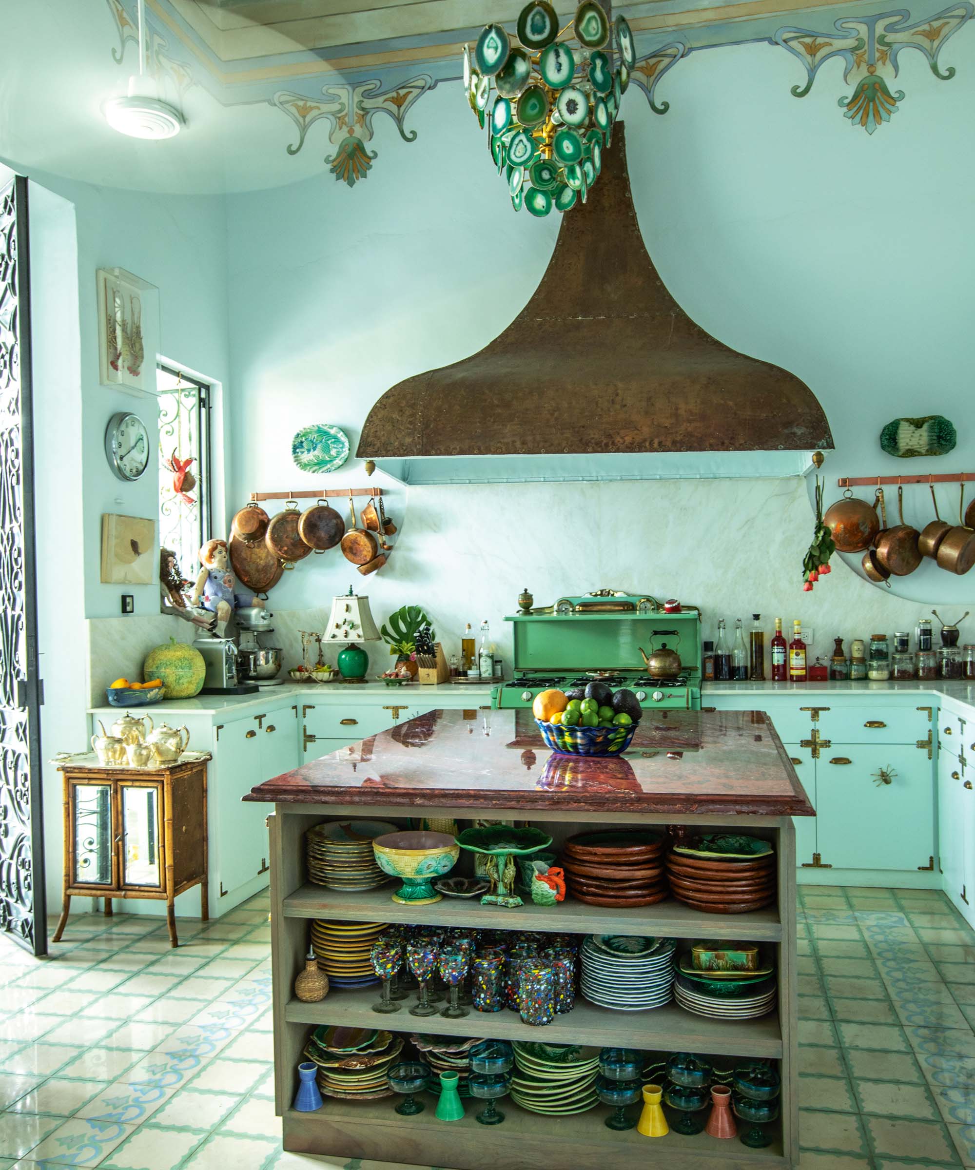
If you had to create the perfect recipe for a mood-boosting room, one to be sure to set people smiling, everyone‘s stipulations would vary wildly. However, if we look to color psychology, certain energizing mood boosting color schemes are particularly skilled at making a room feel like a happier place to be.
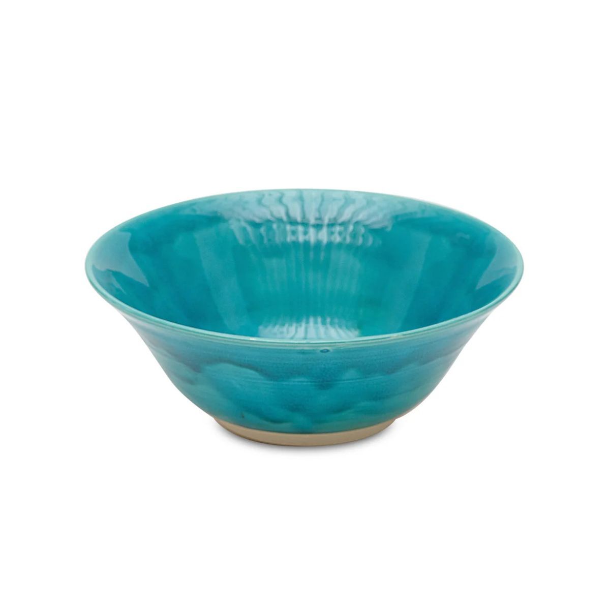
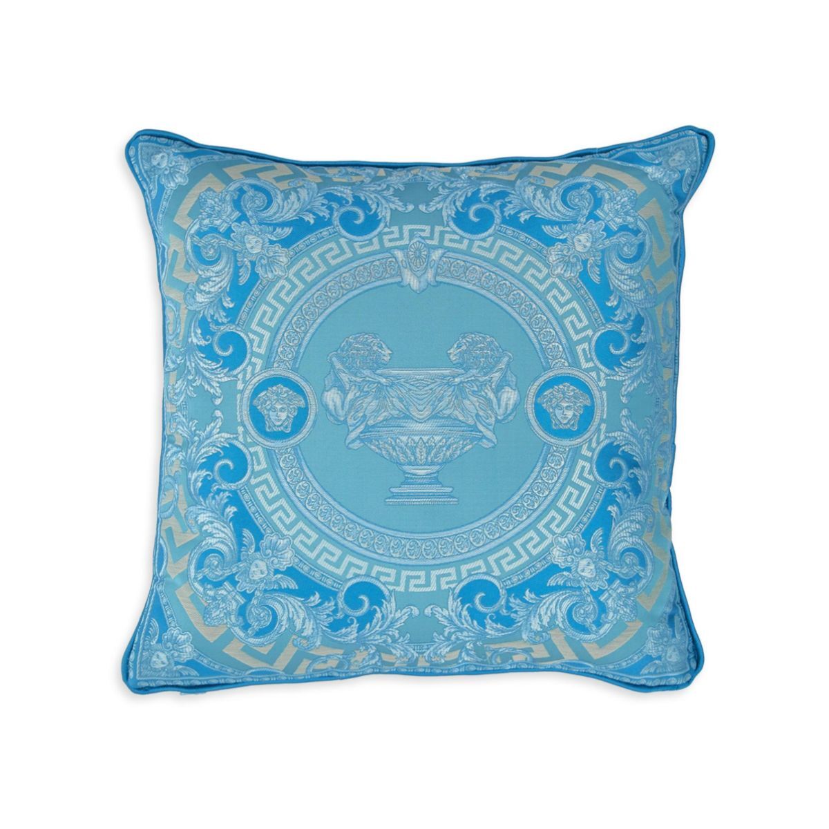
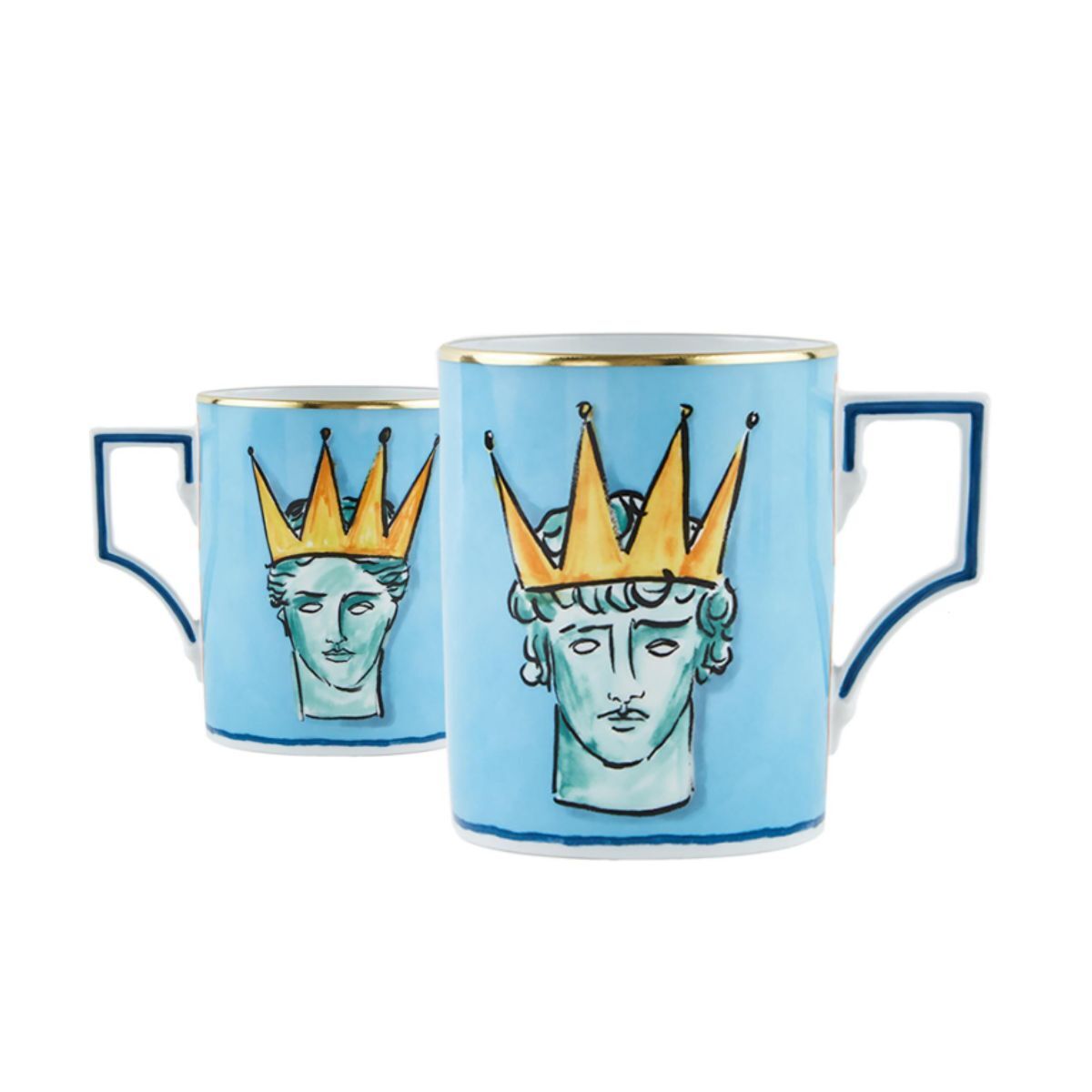
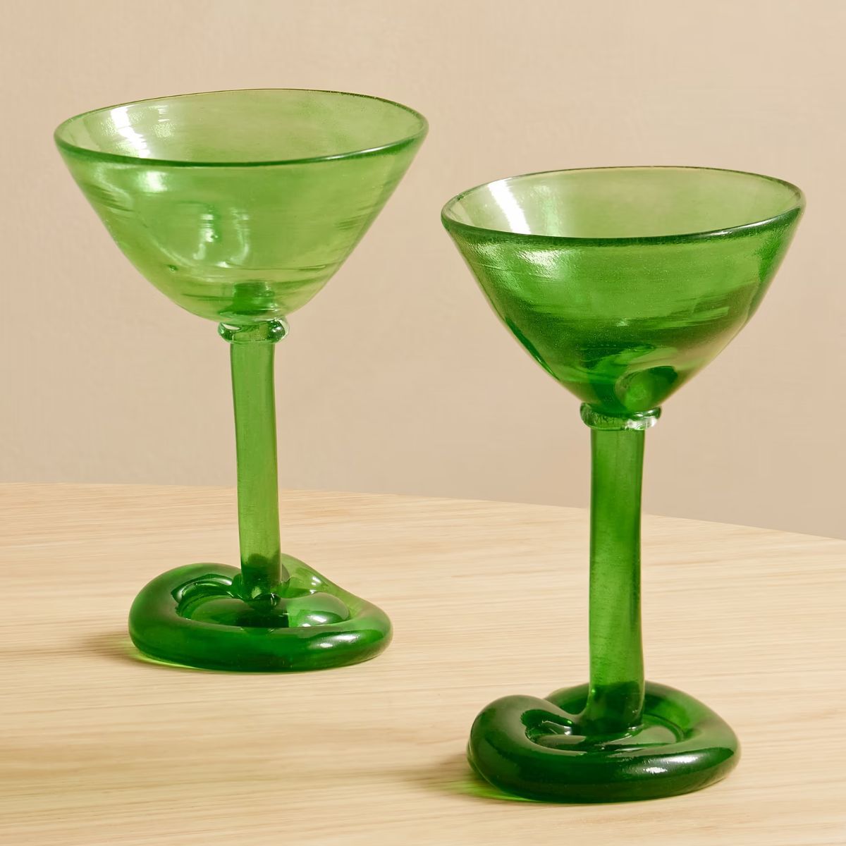
Turquoise is an unmistakable Cerulean greenish-blue that evokes images of warm tropical waters, fresh forests, and equatorial natural landscapes. Few other colors feel quite as summery as this intense Azure blue, and whilst I am inclined to love it, some may find it too intense, but at the very least, it doesn't inspire indifference.
If you love the smile-inducing qualities of turquoise, some paint companies have incredible variations of this hue, using the most exquisite pigments. Jack-in-a-box by Little Greene is, as its name suggests, a joyful jolt of playful and vibrant color, with verdant green undertones.
Other spirit-lifting turquoise paints worth considering are Slipper by Little Greene or Deep Green by Mylands. All of these bold paint colors may look close to identical from the tin, but bear in mind the color’s reaction to the mercurial play of light in a particular room may make them appear dramatically different in situ.
Design expertise in your inbox – from inspiring decorating ideas and beautiful celebrity homes to practical gardening advice and shopping round-ups.
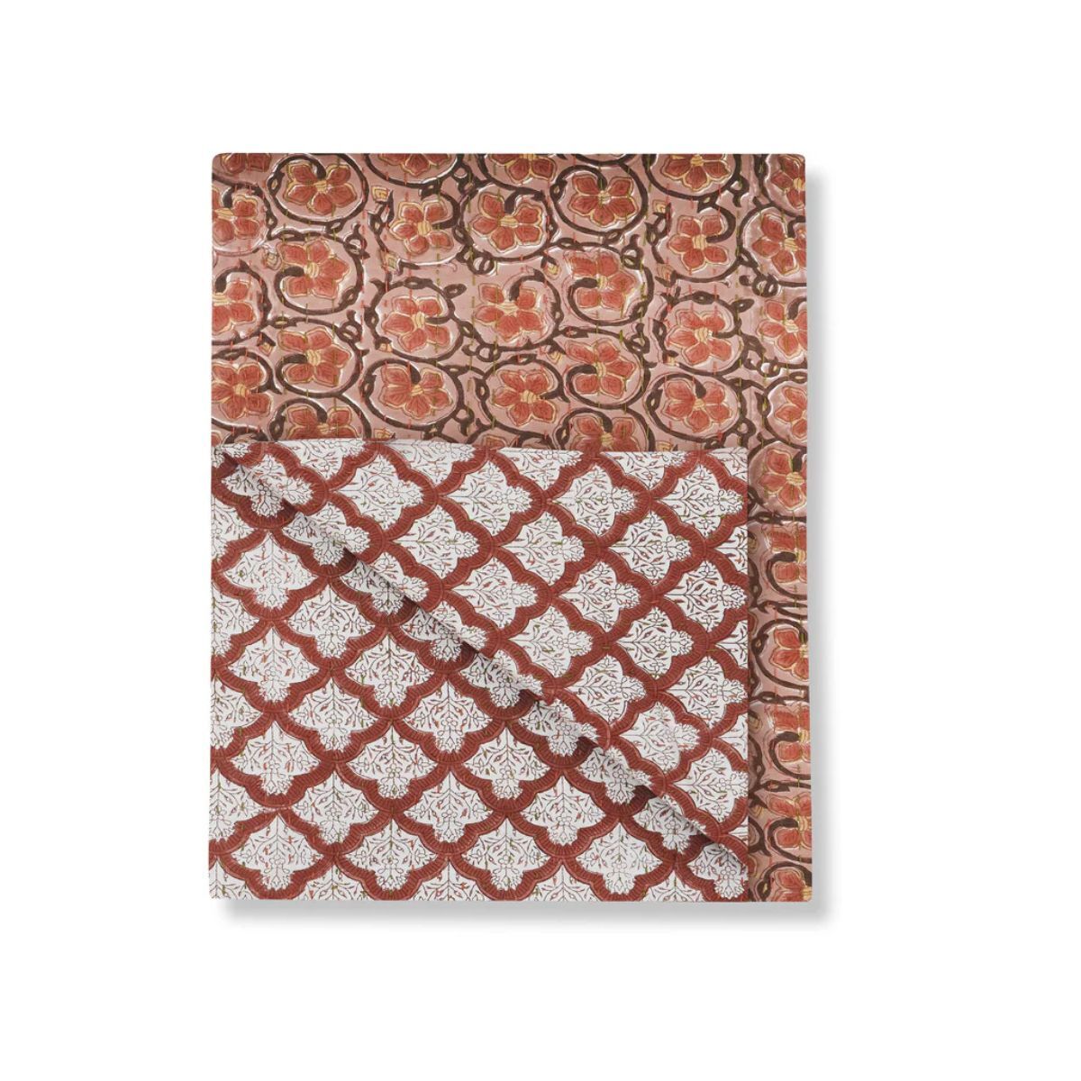
2. Terracotta
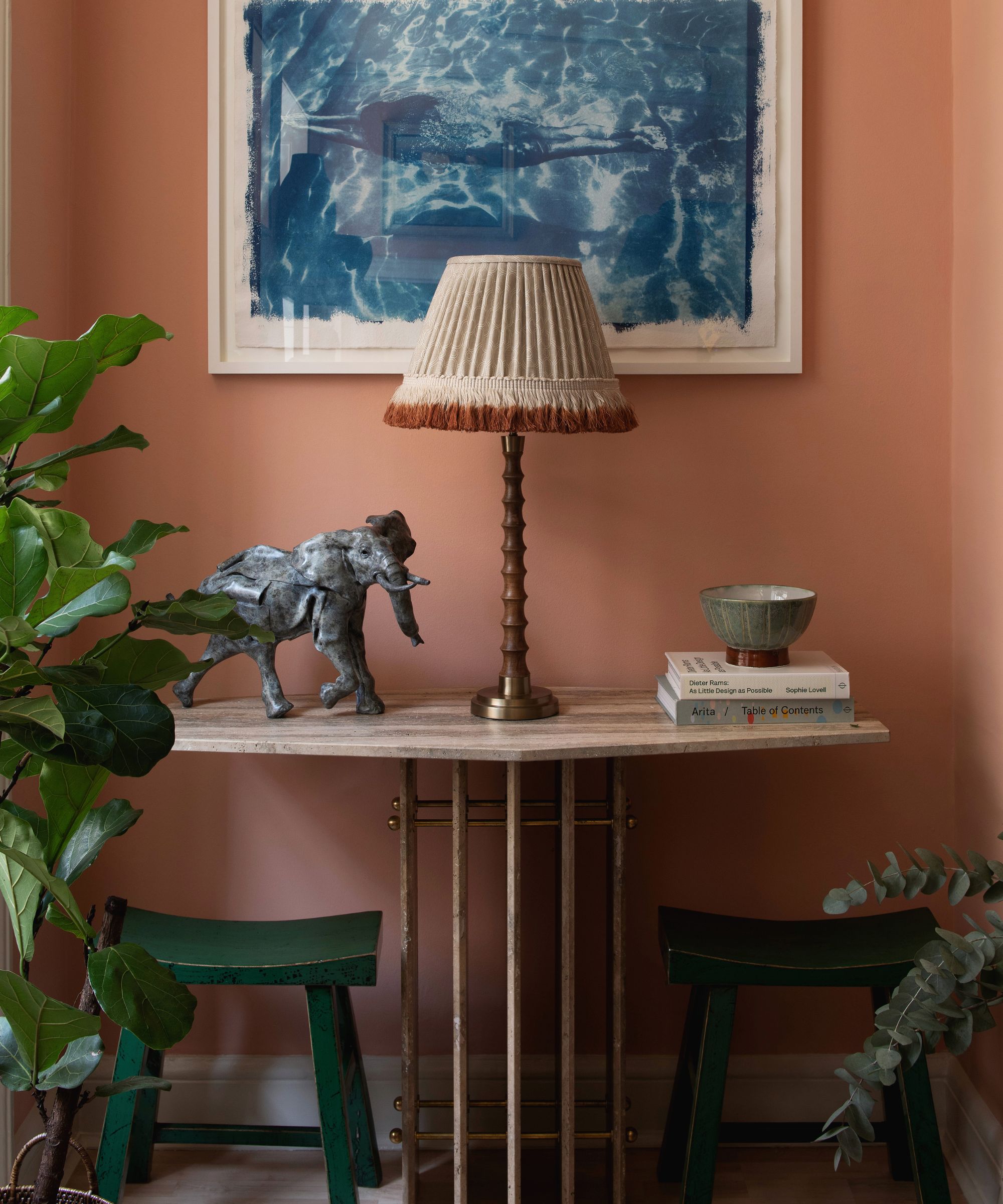
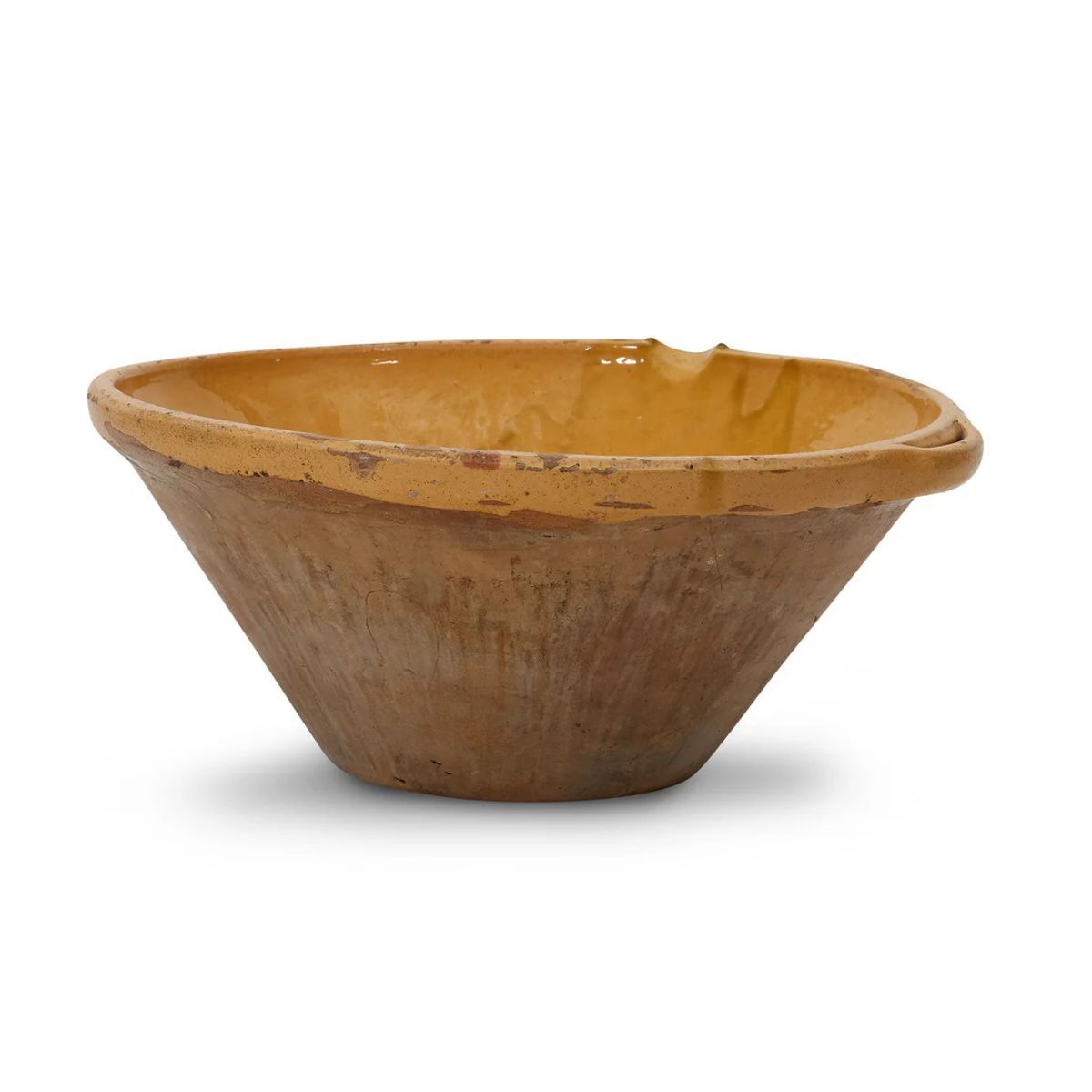
What better time of year to bring the warmth and patina of terracotta tiles and the feeling of their Mediterranean native climates into the home?
Jaime Zhener, California-based interior designer renowned for her natural, organic-inspired interiors with a sense of ease and informality, thinks a terracotta paint is a must-have for any home where the desired aesthetic feels warm, welcoming, and easygoing.
‘Teracotta tones have such a beautiful, grounding quality, bringing a quiet warmth that feels both modern and timeless,’ she notes. ‘I love how they echo the natural world; sunbaked earth, terracotta tiles, aged plaster. One of my favorite shades is Farrow & Ball’s Jitney as it has this soft, sun-kissed depth that works beautifully in both contemporary and traditional spaces.'
‘Of course, the most iconic is Farrow & Ball Red Earth. It pairs effortlessly with natural materials like linen, stone, and wood, creating a layered, lived-in warmth. Whether on walls, cabinetry, or even trim, these hues envelop a space in an inviting, organic softness that feels incredibly calming.’
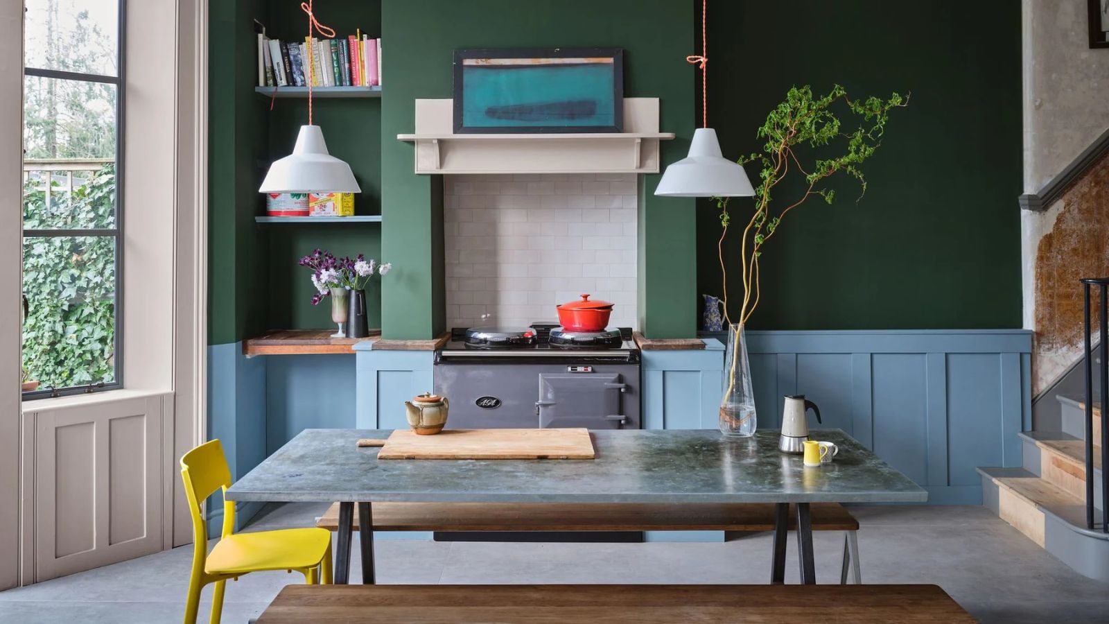
3. Bottle green
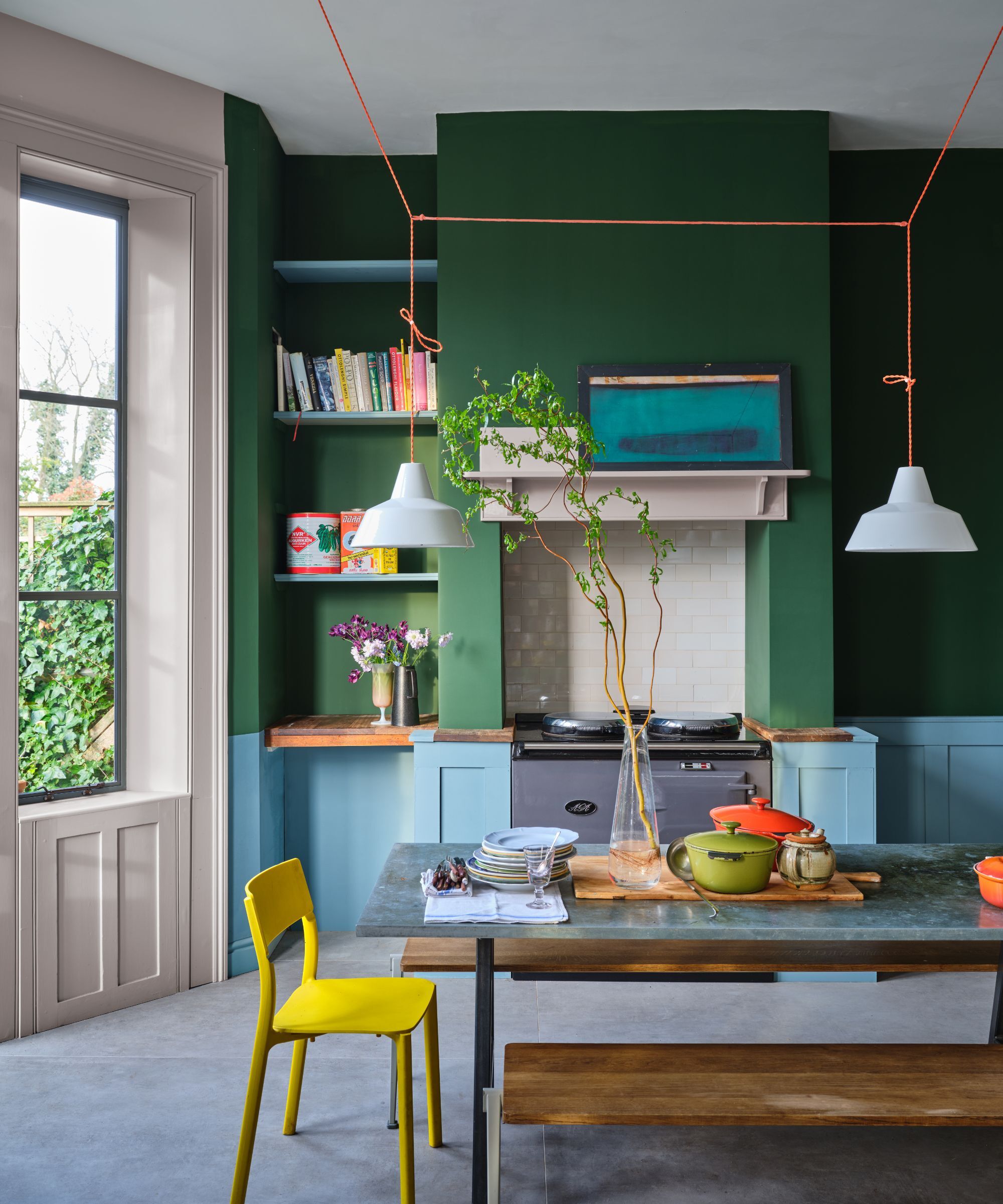
Walls painted in Beverly by Farrow & Ball
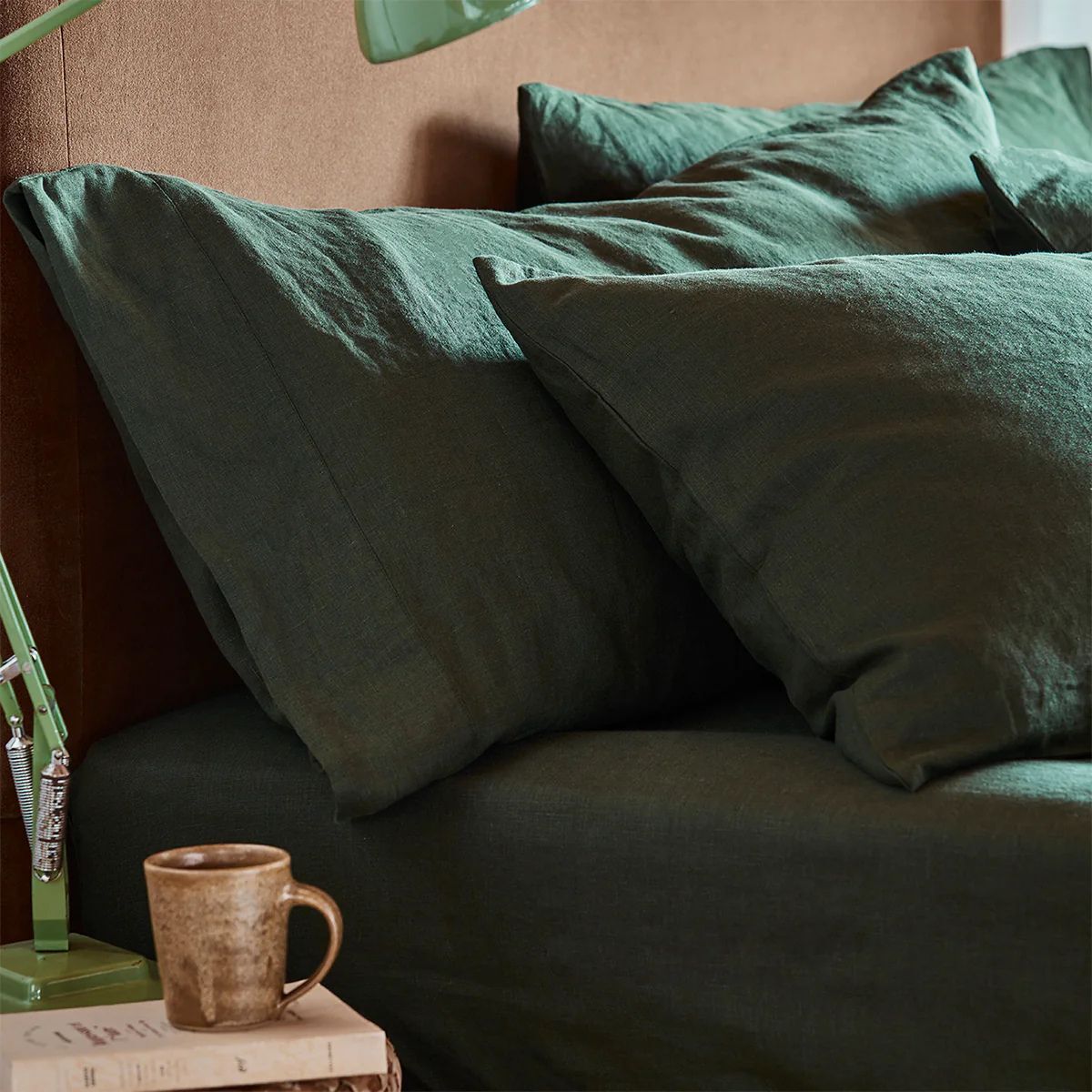
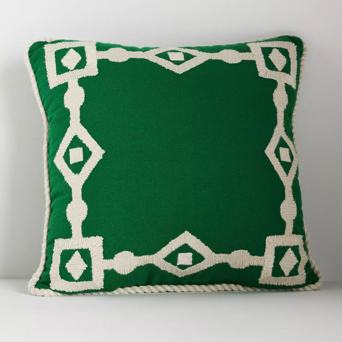
Bottle green is a distinctive color described as a 'dark bright shade of green' which somehow sounds both like a contradiction, and a perfect description of this unique color. In June, the intense verdancy and lushness of the natural world mean the season's palette is dominated by an intense, dark, organic, chlorophyll-rich green, everywhere you look.
Alex Keith, co-founder of the UK-based interior design firm Otta Design, says 'The bright greens of early spring soften and deepen as we move into summer. Color drenching the walls, curtains, and bedside tables with deep bottle green creates a feeling of calmness and tranquillity.'
'It's a hue that you'll find at the bottom of a really deep lake. Inky, intense, complex, and deeply saturated' says Abigail Ahern, a London-based interior designer and aesthetist known for her expert use of moody color. 'I am so drawn to the notion of surrounding yourself with colors that reflect the landscape.'
Bottle green lends itself particularly well to traditional interiors. Great shades include Hunter Green by Benjamin Moore and Glasshouse by Graham & Brown.
4. Lavender
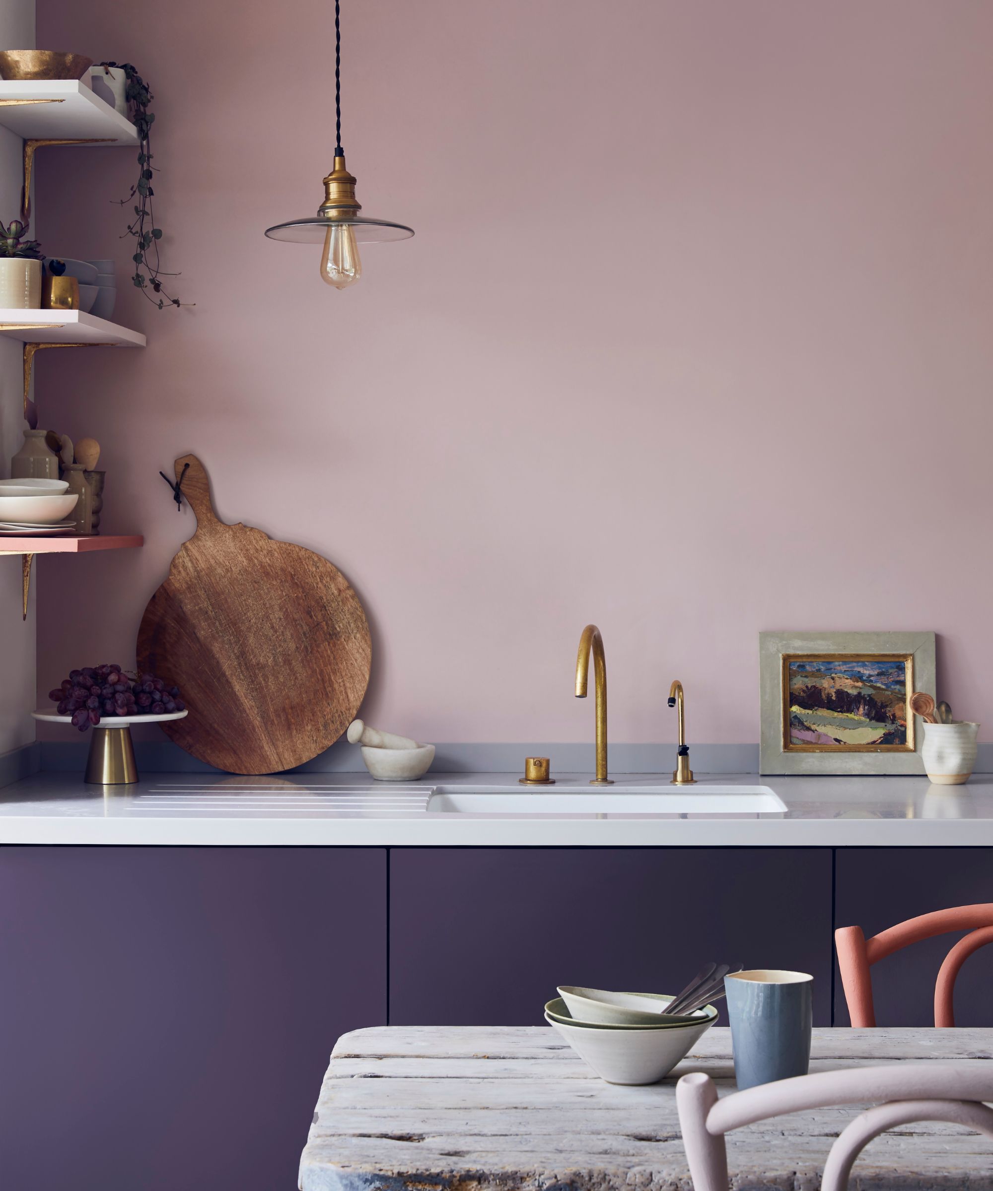
The thought of decorating with purple may send you running, as its limitations may strike you far more than its possibilities. Lavender paint, in particular, may feel like an all-too-familiar ‘90s throwback.
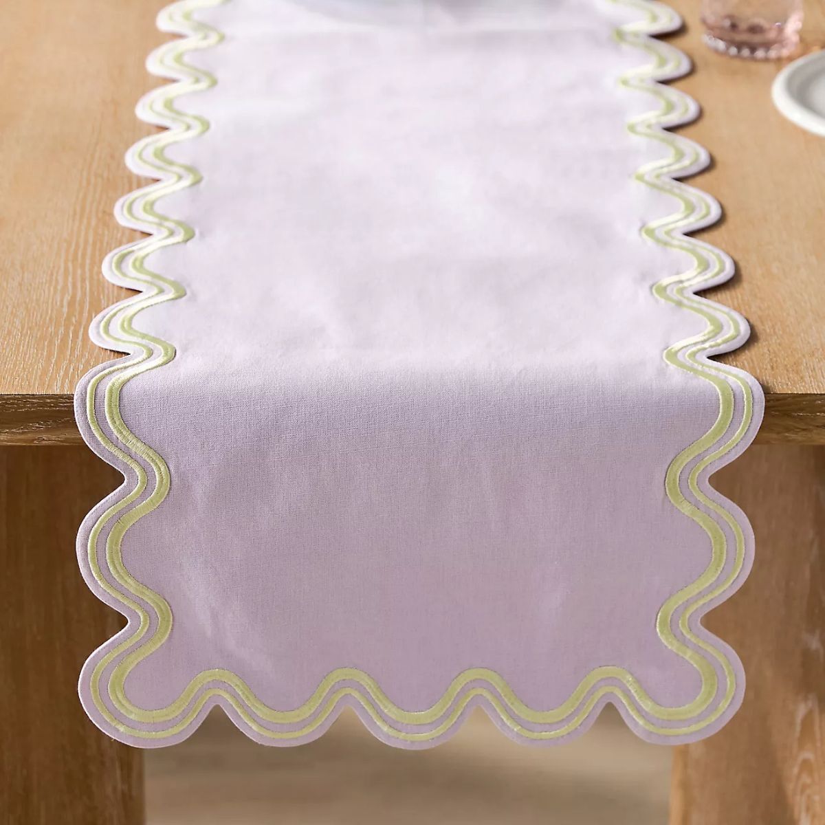
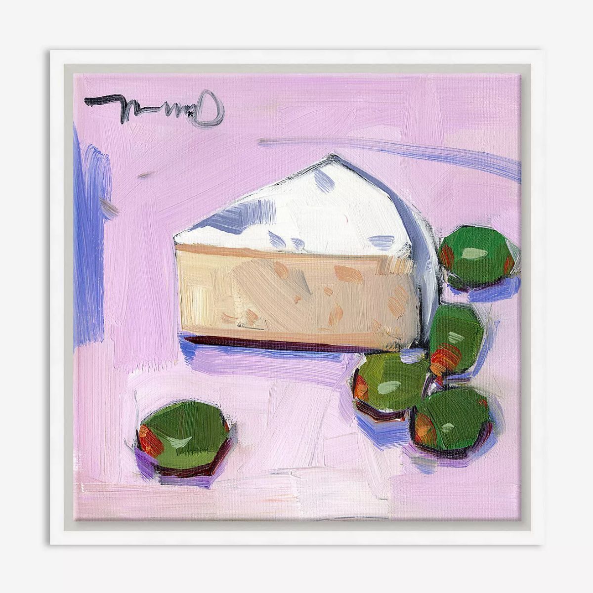
As with so many interior design trends, though, colors that we once snubbed undergo a personality transformation and quickly become the most coveted hue of the season. Consider muted, gentle lavender tones for June – those with a mere suggestion of purple, a barely there whisper of lavender make a room feel cool, breezy, soft, and beautifully elegant.
‘People often have strong opinions on lavender, and often shy away from using it in interiors and opt for more modern colors such as green or blue,’ explains Chloe Vince, Senior Decorating Consultant at House of Hackney, an interiors brand known for being a magus of the modish. ‘As with any color, finding the perfect hue for your scheme will avoid any decorating mishaps. Lilacs and lavenders can create a wonderful sense of nostalgia. For a fail-safe approach to using the color lavender, I would opt for grounding the scheme in dusky pinks,’ she advises.
5. Straw yellow
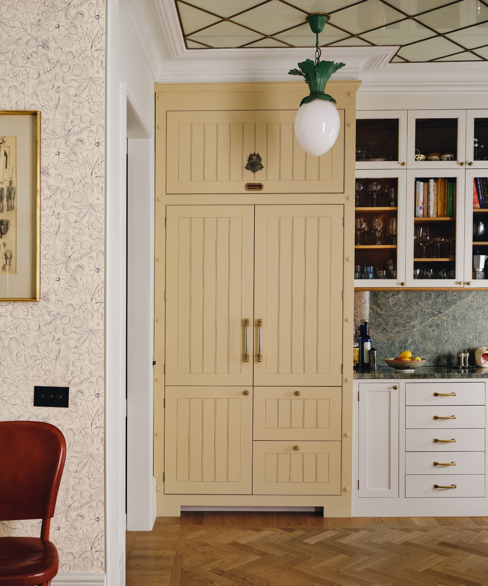
Interior design by Beata Heuman. Yellow paint is No.23 Wheatsheaf by Mylands
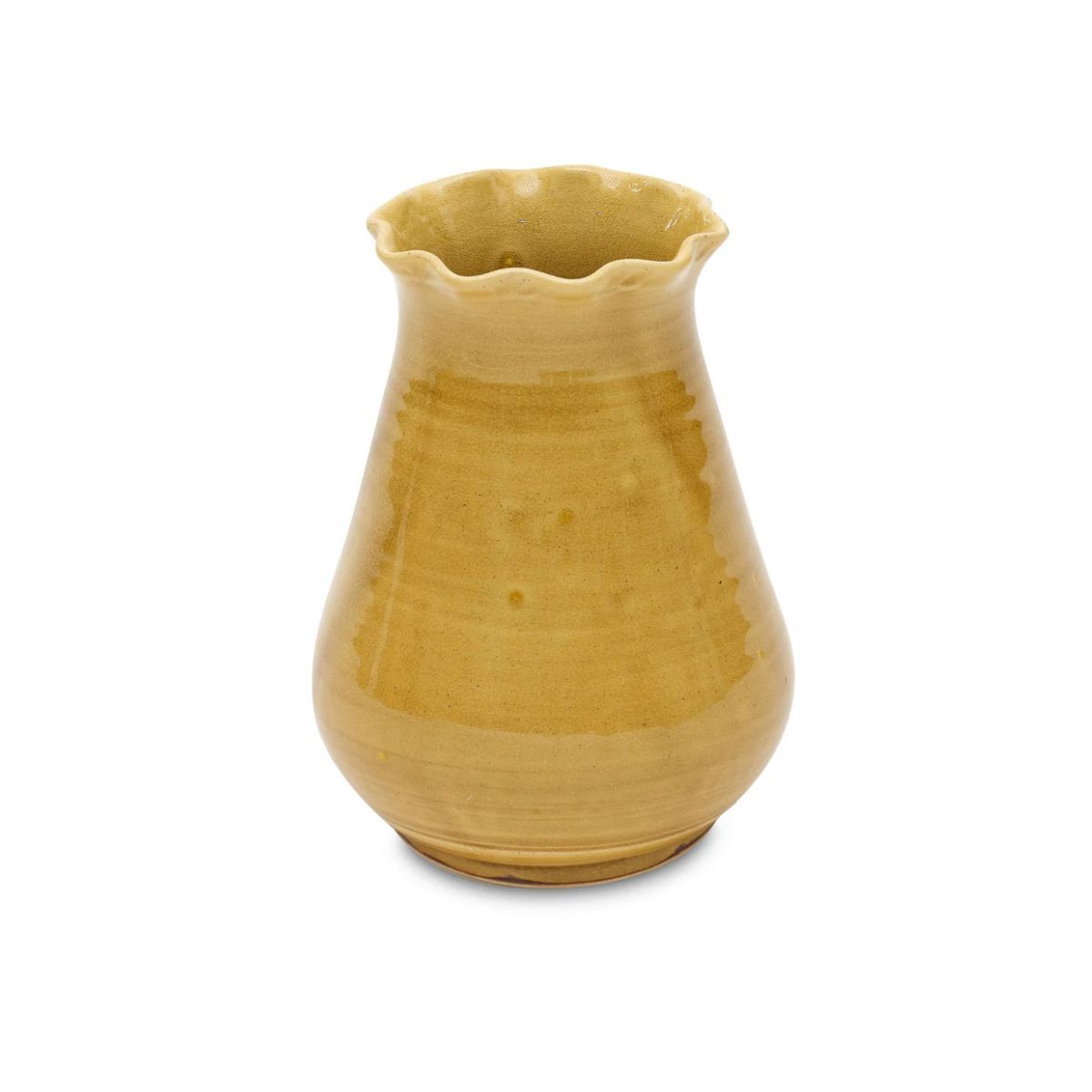
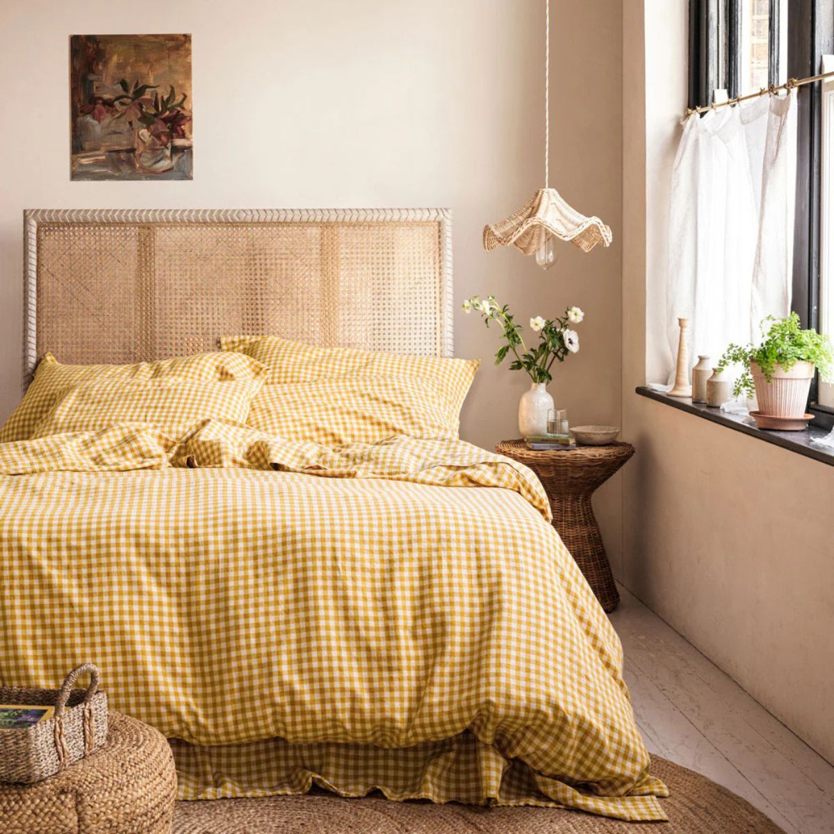
Yellow has long been misunderstood. For a long time, it was thought to be a jolly but juvenile color. Now, though, yellow is having a moment in the limelight. Warm and rich butter yellow has been the it girl this year, and now many of us are loving pale yellow interiors. A great hue to consider bringing into your home for June is the pale, hushed, golden imbued straw yellow that is so often spotted in the natural world throughout summer.
The celebrated interior designer Beata Heuman used a soft straw yellow paint in her London home, and was keen to find a muted shade without the deep pigment many pollen yellows possess.
'I am personally very into soft yellows and faded yellow buttery tones, which I think is a lovely atmospheric alternative to white,' she says.
Here she uses Wheatsheaf by Mylands, a color inspired by 'pregnant wheat fields in summer', but other shades such as String by Farrow & Ball and Weston Flax by Benjamin Moore have a similar laidback appeal.
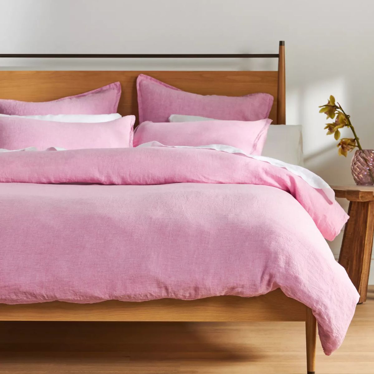
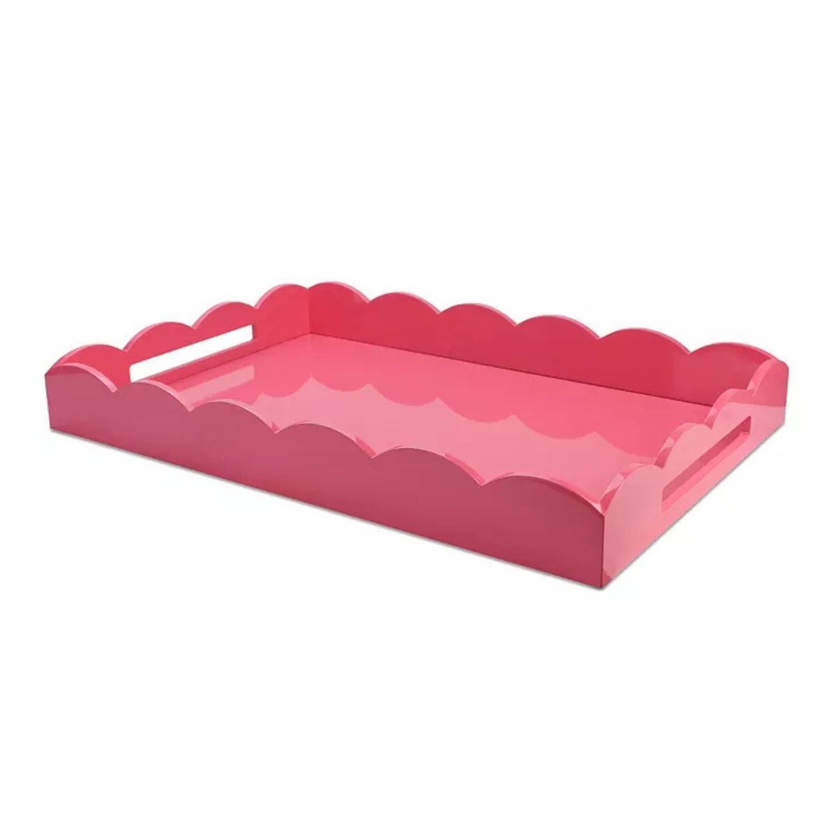
6. Barbie pink
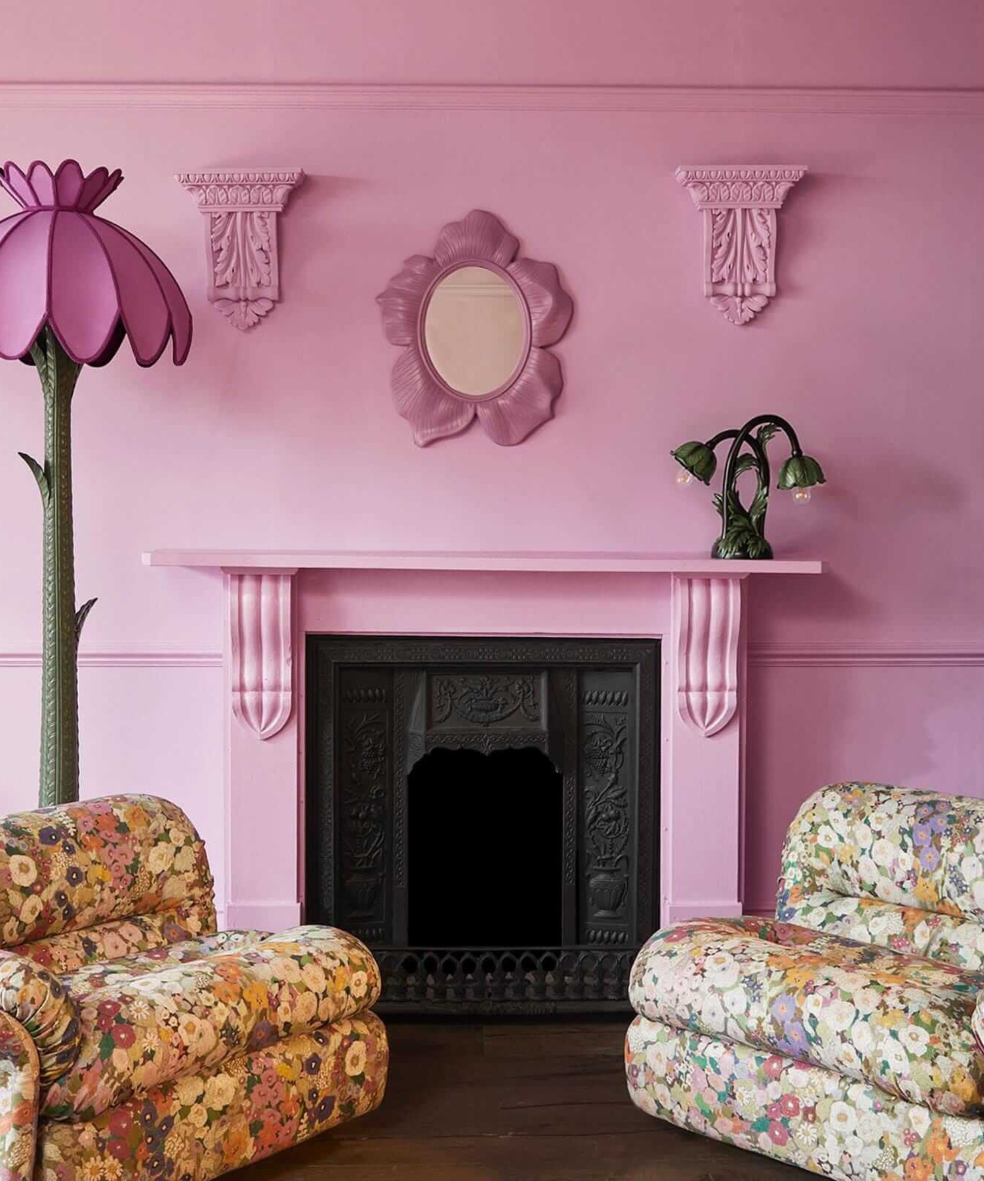
Walls are painted in Mallow by House of Hackney
True 'Barbie Pink' is defined by the Pantone shade Pantone 219C, a particularly heady shade of fuchsia. It is a highly saturated and intensely pigmented, piping hot magenta pink that would make even the biggest fans of bright, bombastic color feel a little bit shy.
However, 'Barbie Pink' can be applied to a myriad of bright, unembarrassed, saccharine pink shades, and it has become the outrageous and bang-on-trend shade that's perfect for high summer. Forget the gendered associations with girly pink, it is less a flirty, pretty color and more a powerful, energetic, and fierce color to be used with wild abandon.
'Use the color with intention, don't hold back and be brave!' is the advice of Caroline Aston, Interior Design Executive for House of Hackney. 'It's unapologetic and effervescent, it can't help but make you smile. It has punch and vibrancy, and when fully embraced, has a real wow factor.'
'Bright pink paint is an instant mood lifter, so use it in entryways as the ultimate welcome – and don't forget the ceiling. Alternatively, it's a lovely option for social spaces like kitchens. It works beautifully when used with contrasting colors. Try chocolate browns or dark forest green paints to bring a mature look, or soften with warm neutrals.' Caroline explains. 'For spaces that require calm and quiet, use it as an accent; an upcycled piece of furniture or accessory – make it secondary and not the dominant color within the room.'
June, in all its vivid color and radiance, brings along with it the opportunity to rewild our interiors and blur the lines between home and garden.
A summer palette of high contrast, playful colors should not be feared, but embraced, even if they're used in small accents throughout the scheme. If you want your home to feel artistic, curated, and dynamic, consider one of these six colors.

Sophia Pouget de St Victor is the UK Content Editor at Homes & Gardens, bringing readers the latest trends, expert insights, and timeless design inspiration tailored to a UK audience. With a background in luxury interiors and a qualification in Garden Design from London, she has a passion for creating spaces with character and emotional depth. Sophia gravitates toward interiors that defy definition, valuing individuality and effortless elegance. She lives in West London with her partner, two mischievous terriers, and a plump cat named Lettuce.
