Sherwin-Williams' Color of the Year is totally dividing decorators – but I think this controversial nostalgic trend is actually long overdue for a return
Universal Khaki is a reminder that when trends feel overwhelming, a return to something warm and familiar always makes sense

There's no denying that in 2025, decorating with bolder colors has been the trend. Neutrals have taken a backseat to deep reds, butter yellows, and vivid sky blues. I now see more color-drenched blue living rooms and burgundy kitchens come across my desk than I do spaces that use white, beige, or gray.
And that's exciting, it is. But for those of us who get decision fatigue, like something familiar, and want to decorate with colors you know are going to last decades, Sherwin-Williams' Color of the Year 2026 makes total sense.
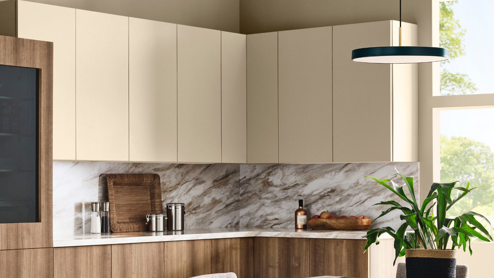
Universal Khaki is a neutral. More specifically, it's a 'mid-tone tan'. And the whole point in choosing the shade is to counterbalance the ever-changing world of color trends, a return to something that feels essential, usable, and timeless. This choice might feel like a safe one, but sad-beige interiors it is not – it's nostalgic and cozy and comforting.
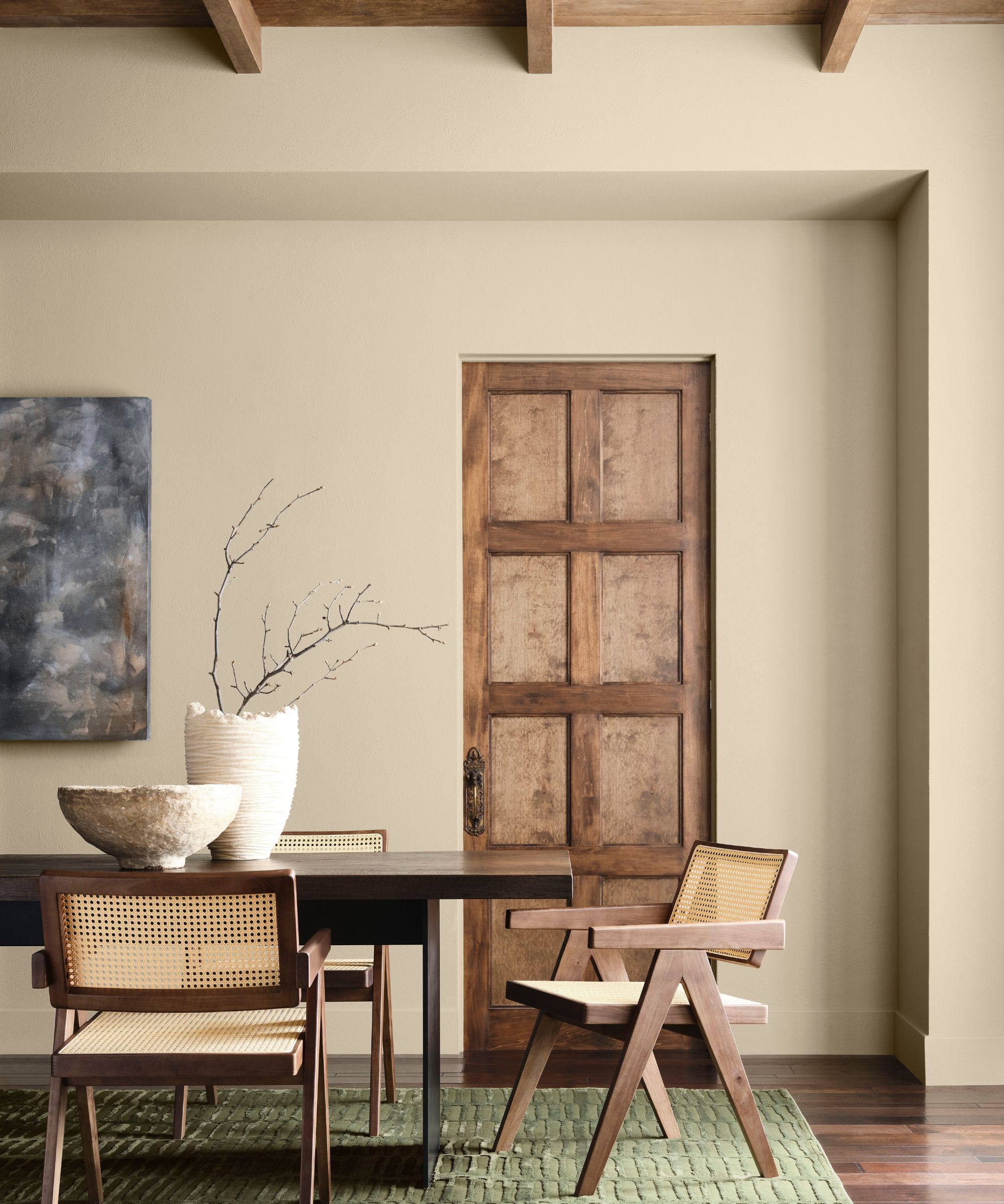
'Khaki is more than just a neutral – it’s a timeless, go-anywhere shade that brings a sense of grounded elegance to any space,' shares Sue Wadden, director of color marketing at Sherwin-Williams. 'With its warm, earthy undertones, Universal Khaki SW 6150 effortlessly complements a wide range of colors, creating a rich, inviting backdrop that can transform an entire design with quiet confidence.'
'We chose Universal Khaki because it captures the essence of what homeowners and designers are craving right now: simplicity, usability, and timeless elegance. It’s dependable and approachable, yet it has a quiet sophistication that makes it feel elevated. At its core, Universal Khaki is about getting back to the beauty of the essentials – creating spaces that feel purposeful, comforting, and enduring.'
Ashley Banbury, color marketing manager of HGTV Home by Sherwin-Williams, adds, 'We’ve been watching the steady rise of sanded beiges and khakis in both design forecasting and consumer choices. Universal Khaki stood out as the natural next step – it’s approachable and timeless, but it also has depth, which makes it incredibly versatile. Choosing it as the 2026 Color of the Year allows us to highlight that ongoing shift away from cooler grays toward warmer, more restorative tones that feel aligned with how people want to live today.'
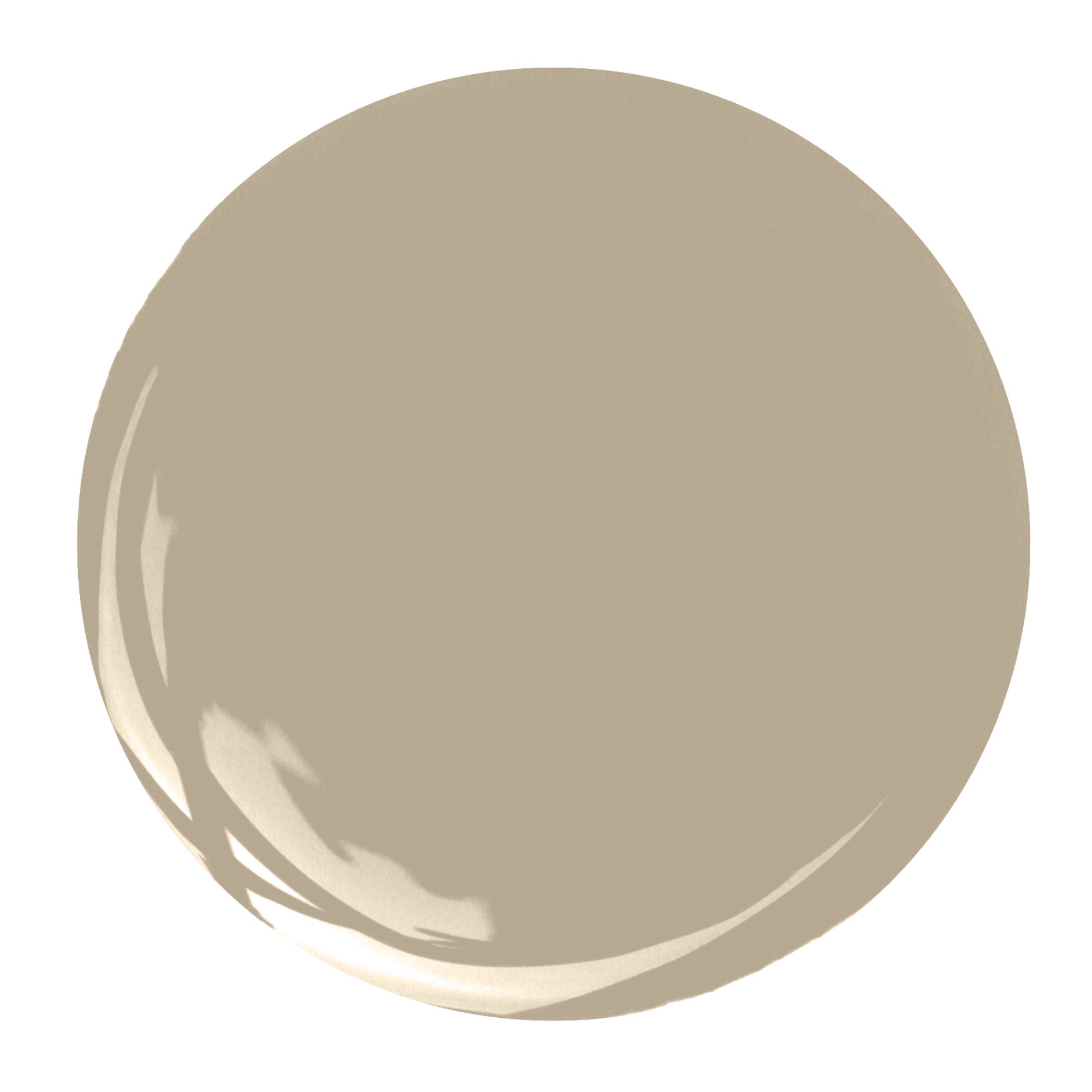
Described as a mid-tone tan, Universal Khaki sits somewhere between a beige and a light brown. It definitely has a '90s, early 2000s feel to it, but look around, so many trends both in interiors and fashion are returning to that era. There's a cozy nostalgia about this color, and while the shade might feel like it came from decades past, the way you use it and the colors you pair it with are what's going to bring it into 2026.
This choice, as with most Color of the Year announcements, is very much dividing decorators. Just look underneath the Instagram post on the color, and you'll instantly see a mix of commenters who love the versatility of the shade and those who are disappointed to see a neutral in the spotlight.
Design expertise in your inbox – from inspiring decorating ideas and beautiful celebrity homes to practical gardening advice and shopping round-ups.
'Does anyone get excited about…beige?!!!' reads one comment. 'Why do we have to go back to “Builder Beige”?' reads another. However, there are plenty of homeowners excited to get decorating with neutrals, or they have in fact already used it, and they love it.
'I’m obsessed with our dining room! It’s making me so happy. You’ve gotta see Universal Khaki IRL' says one homeowner. Color expert and designer Kylie M. Interiors left a comment saying, 'I’m here for it. More depth than the standard light color and interesting undertones. AND while no color is foolproof or suits EVERY home and EVERY person, it can be used in the average home!!'
And I think Kylie nails why this color feels unexpected among the other bolder Color of the Year announcements. I grew up in a '90s early '00s house, so I understand the instant backlash to a return to this kind of warm beige shade, but there's no denying this shade is usable. I cover all the Colors of the Year, and so far, while this one might not be the most exciting, it's the one I can imagine using in my own home.
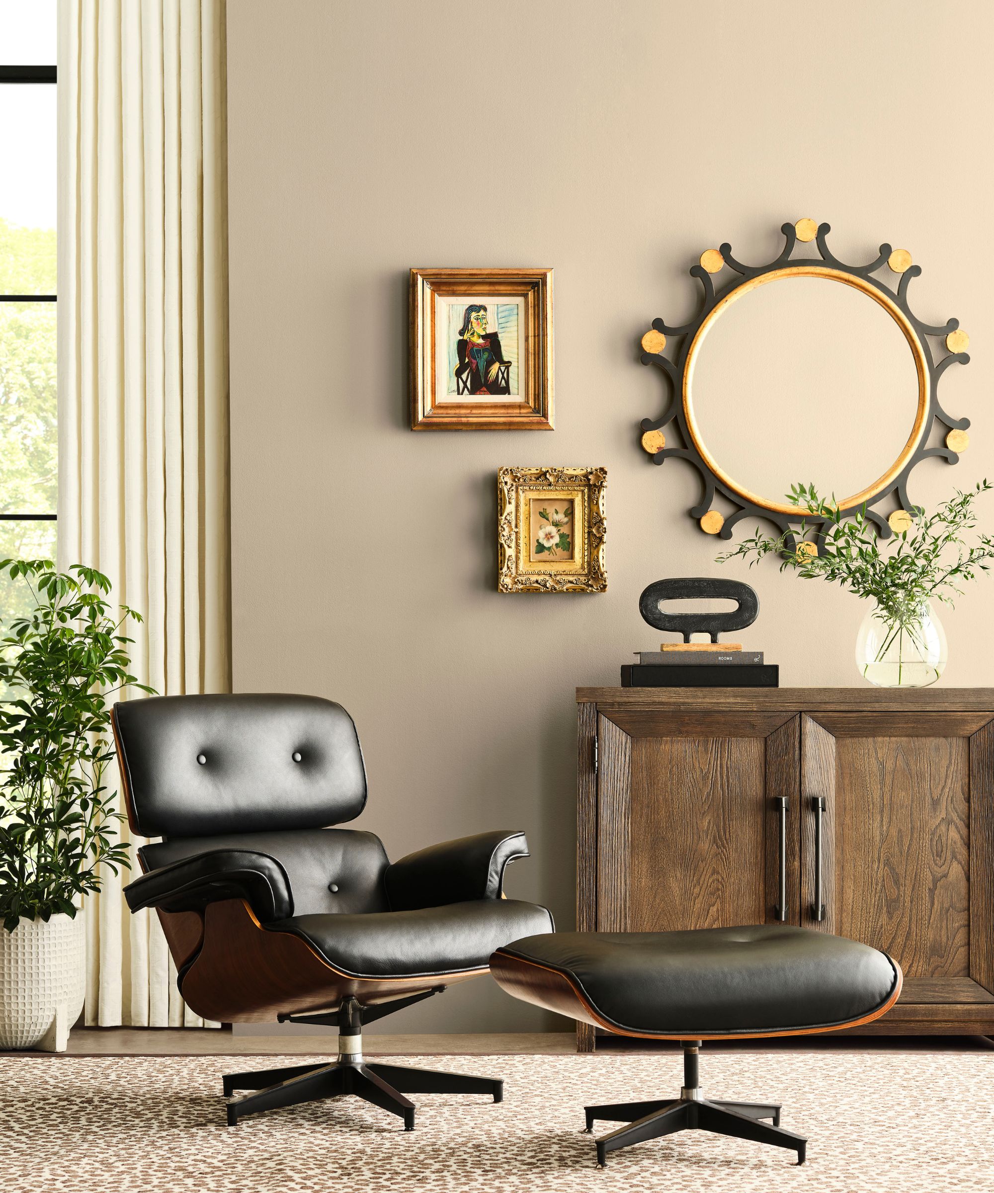
This might be a neutral, but being such a versatile shade does make it perfect for pairing with some of those bolder hues we have seen skyrocket in popularity this year.
Of course, layering this shade with other neutrals, like whites, warm grays, and then adding in some lovely textures like rattan, wicker, and linen is such a timeless look – tried and tested for decades. But I can also imagine how lovely this warm, slightly darker beige would look with those on-trend sky blues, dark reds, and buttery yellows.
Picture a bedroom color-drenched in Universal Khaki, with powdery blue linen on the sheets, a deep red nightstand, and some pale yellow accents with lighting or picture frames. All of a sudden, this timeless color feels incredibly trendy for 2025 and beyond.
'Universal Khaki is a beautiful foundational shade because it plays so well with others. If you want to keep things calm and serene, pair it with watery teals like Still Water or soft greens such as Hazel,' suggests Ashley.
'For a richer, more dramatic mood, burgundy tones like Cordovan bring in that sense of warmth and sophistication. For homeowners who prefer a light and airy palette, layering it with neutrals like Neutral Ground or adding a pop of Lemon Chiffon to create beautiful brightness and balance.'
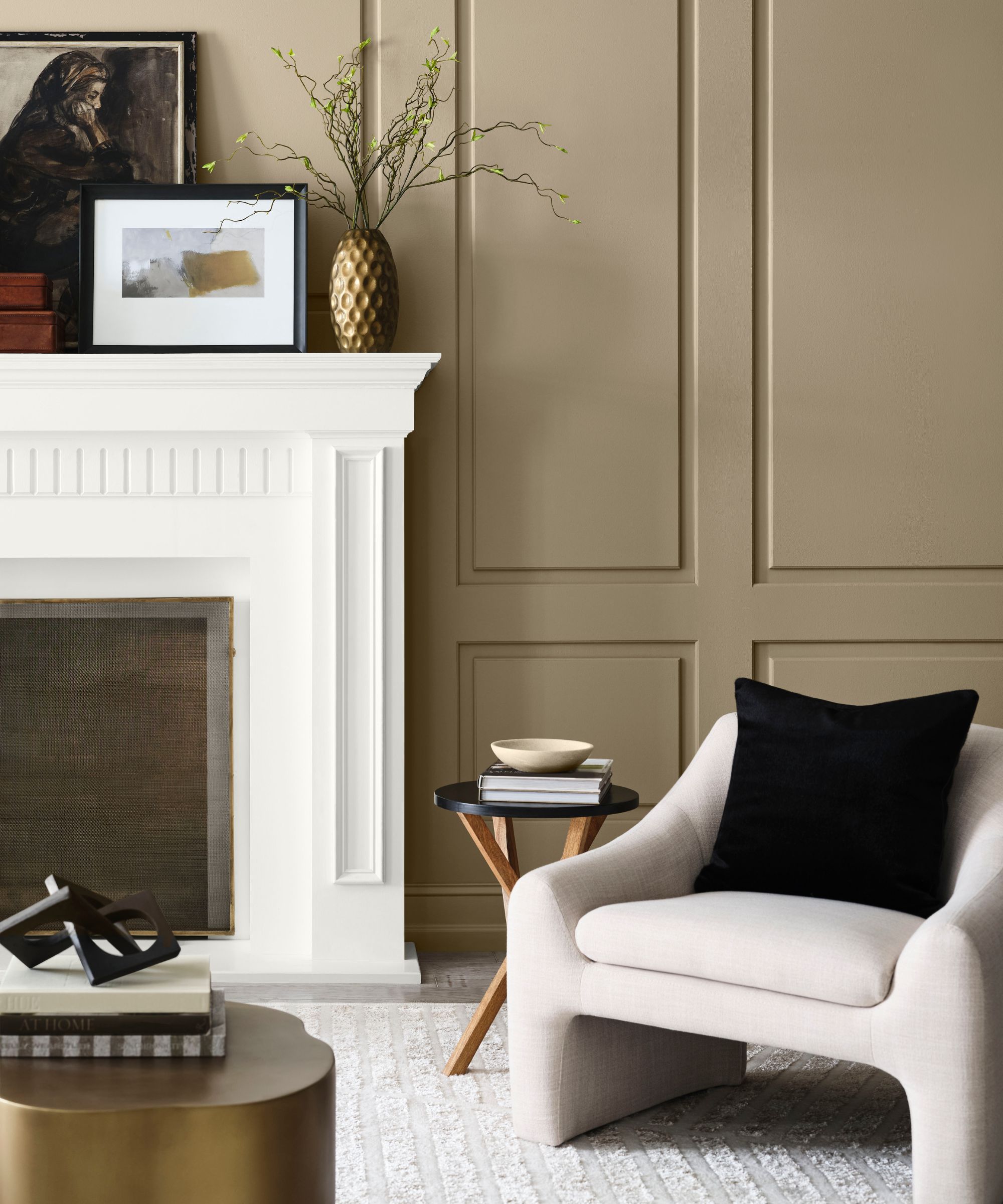
'Universal Khaki SW 6150 sets the tone for a year of decorating that prioritizes balance and intentionality. We expect to see a continued move toward spaces that are designed to last. Homes that feel timeless but can adapt as lifestyles evolve,' adds Sue.
'This color signals a shift away from fleeting trends and toward versatile neutrals that encourage layering, texture, and personal expression. It suggests that 2026 will be about creating environments that feel both grounded and inviting.'
'It reflects a bigger story about design in 2026,' continues Ashley. 'Homeowners are looking for spaces that feel intentional, grounded, and connected to nature. This shade signals a move toward warmth and balance, and a desire for interiors that don’t just look stylish but also feel welcoming and restorative. It tells us that color is being used less as a quick trend statement and more as a tool to create homes that feel personal and enduring.'
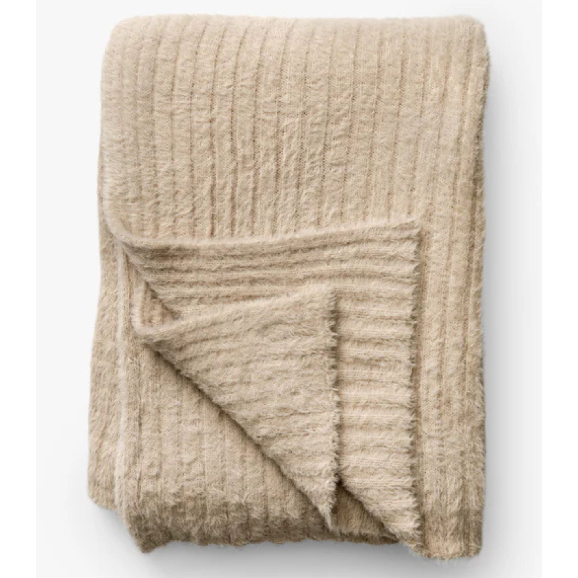
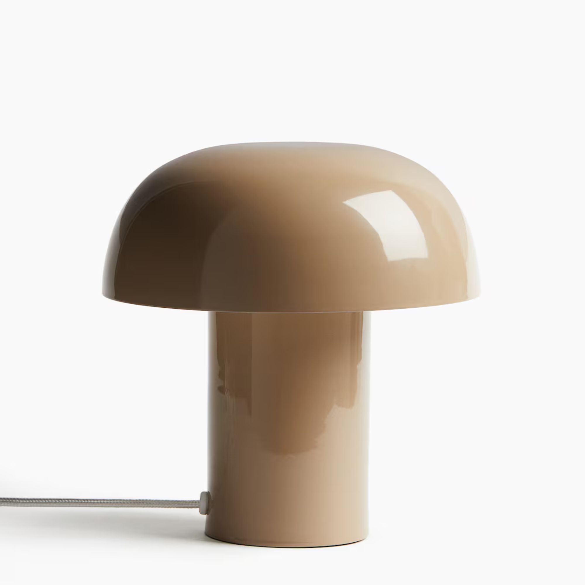
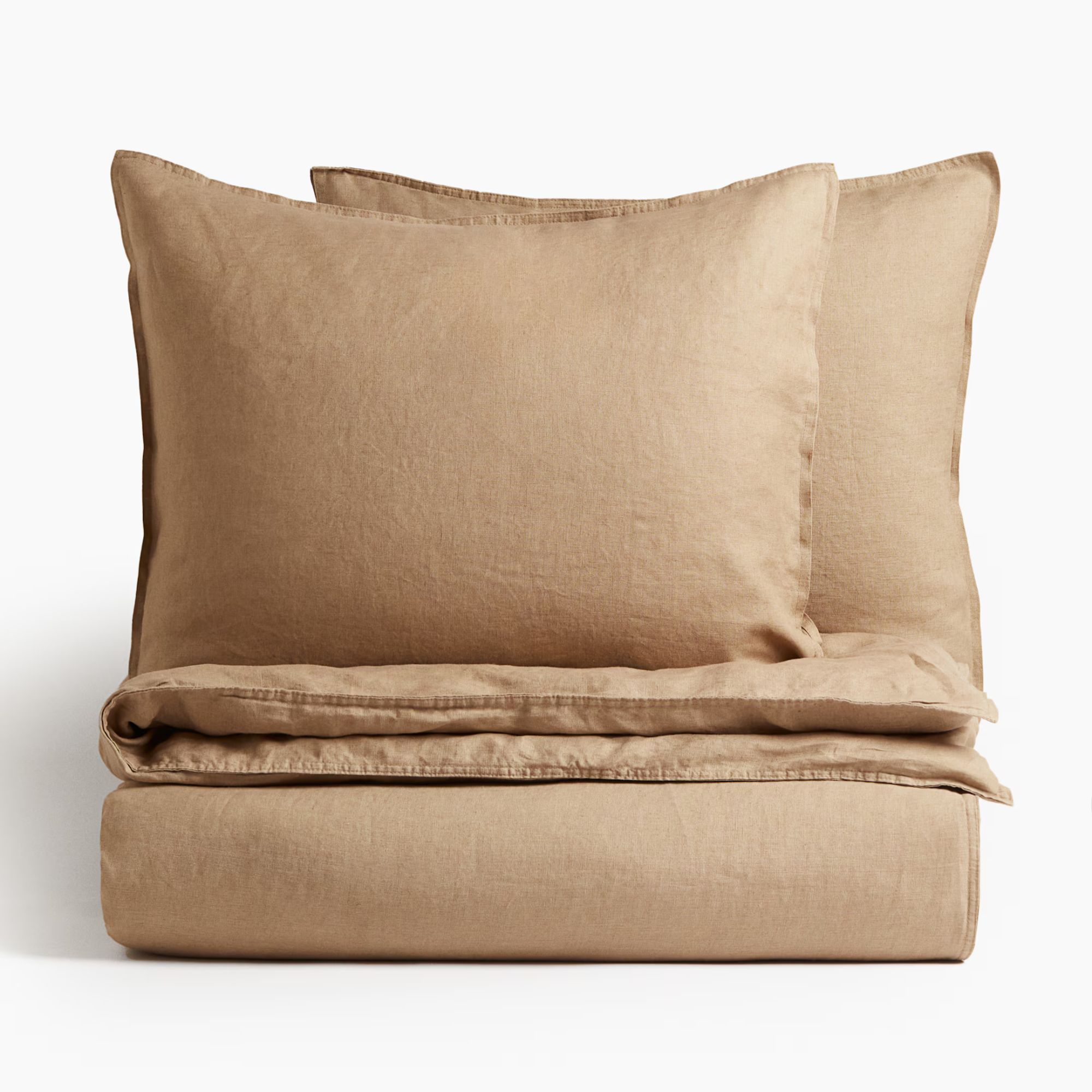
Love the shade Universal Khaki, but not looking to paint a whole room just yet? Here's an edit of decor inspired by this soft, warm shade so you can bring it into your home in an instant.
Sherwin-Williams' announcement of Universal Khaki as its Color of the Year 2026 is unexpected, mostly because it's such a safe shade. But while it's not groundbreaking, it's a reminder that while it's exciting to get caught up in bolder color trends, we can't guarantee those colors will stand the test of time, and returning to a warm, calming neutral is always going to create an enduring space.
I am the Head of Interiors at Homes & Gardens. I started off in the world of journalism in fashion and luxury travel and then landed my first interiors role at Real Homes and have been in the world of interior design ever since. Prior to my role at H&G I was the digital editor at Livingetc, from which I took a sabbatical to travel in my self-converted van (not as glamorous as decorating a home, but very satisfying). A year later, and with lots of technical DIY lessons learned I am back to writing and editing, sometimes even from the comfort of my home on wheels.

