Lick's Color Edit for 2026 is bringing back primary colors – but not as you know them
'Revisiting them now with a refined twist feels both nostalgic and exciting'

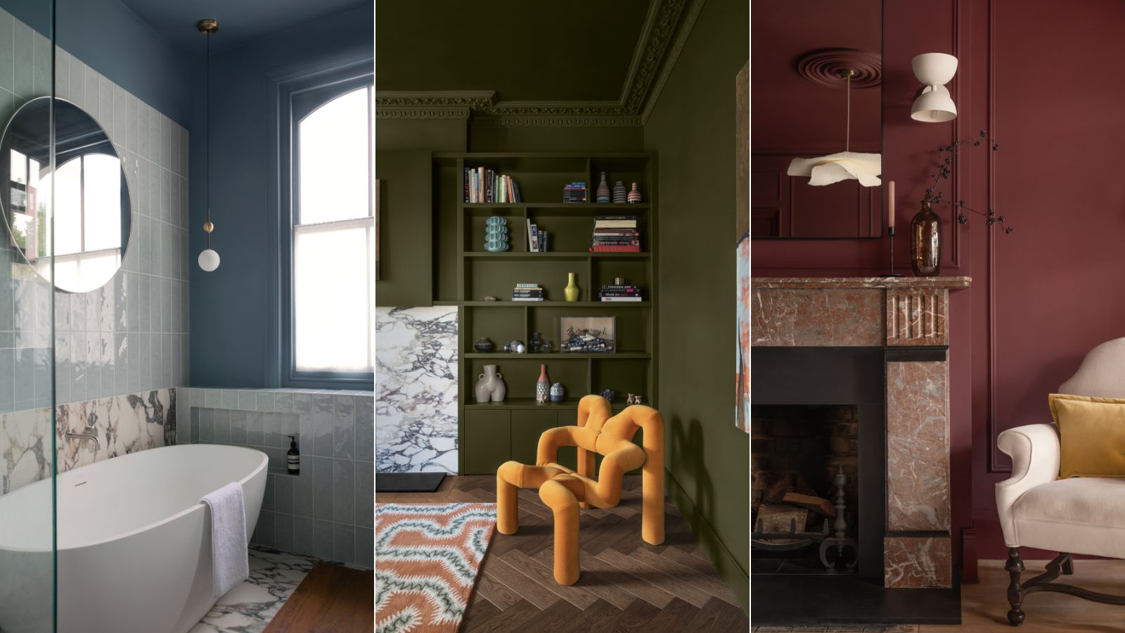
When you think of primary colors, I bet your mind wanders back to learning the basic colors at school. Bold reds, garish yellows, and a pretty basic bright blue. That's my first experience anyway, and when I think about it, it's probably tainted the way I approach decorating with primary colors in my own home now. But as we all get bolder with color and leave the sad, beige days behind, primary colors are making a quiet, far more sophisticated comeback.
Lick Home has always been one to advocate for being bolder with color, and whenever I speak with its Director of Interior Design, Tash Bradley, I always come away feeling inspired to ditch my white walls and try a soft blue or a buttery yellow instead. So I was hardly surprised when she revealed to me Lick's Color Edit for 2026, which is filled with 'grown-up' variations of primary colors.
'This year’s edit is about letting go of the rules and rediscovering the joy of play through color,' Tash explains. 'Primary shades were our very first introduction to color as children – the foundations of color theory and the simplest building blocks of creativity. Revisiting them now with a refined twist feels both nostalgic and exciting.'
Article continues below 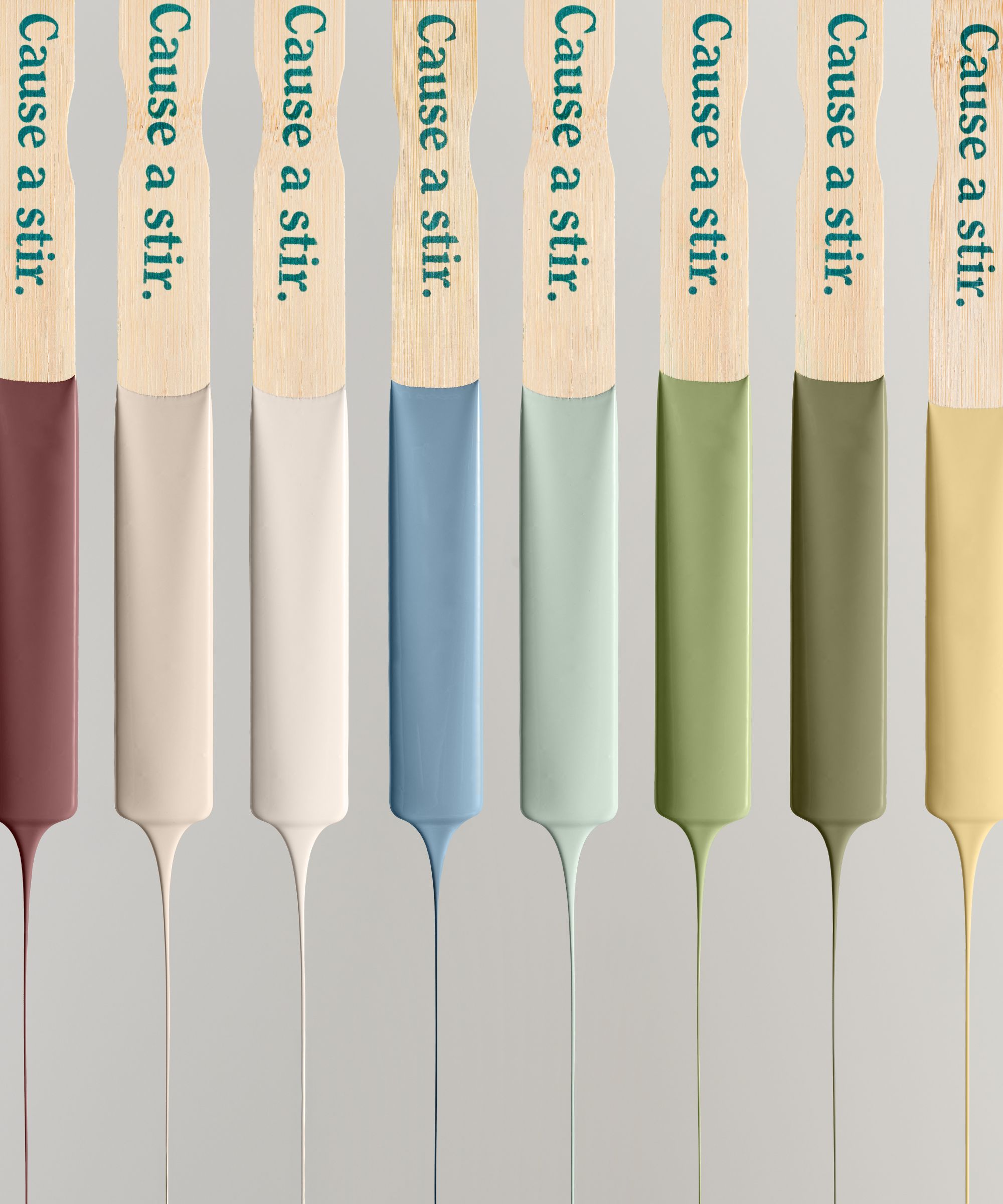
The Lick Color Edit 2026 has been aptly named Return To Play and is made up of eight nostalgic shades that, while mostly primary colors, are soft, timeless, and very usable. The edit taps into the key color trends we have seen rising throughout 2025, but it also feels very timeless – these are paint colors that are going to work in your home for decades to come.
The paints included are White 01, Yellow 07, Blue 03, Green 18, Taupe 03, Red 06, Blue 18, and Green 05. There are some neutrals in there, and if you look at the palette all together, you can see how these neutrals can work with the more primary shades to make them feel more livable and less of a bold choice.
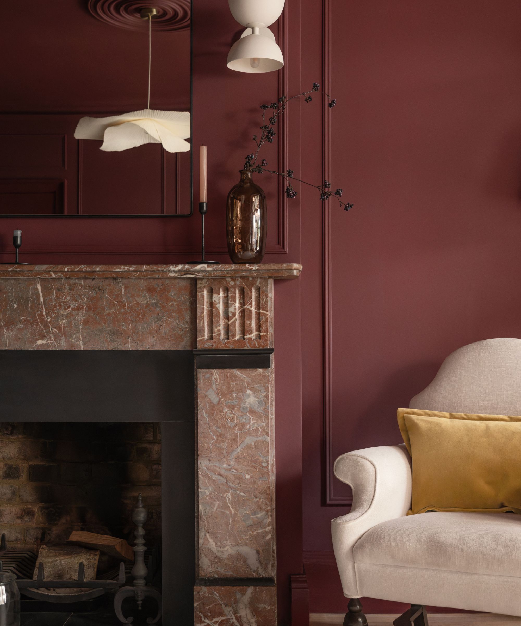
The edit is really reflective of the shift that's happening more broadly in interior design trends; the move away from minimal, neutral, pared-back interiors into a more characterful and braver way to decorate. The most stylish homes you see now aren't all-gray, tidy spaces; they have depth and personality and play with bolder colors and patterns to create rooms with real intrigue.
As Tash explains, 'More than a design trend, this palette represents a cultural shift: we’re moving away from decorating to impress, and instead embracing color that makes us feel. It’s about creating spaces that spark creativity, stir emotion, and remind us of the freedom of self-expression.'
Design expertise in your inbox – from inspiring decorating ideas and beautiful celebrity homes to practical gardening advice and shopping round-ups.
'I’ve seen firsthand how people’s attitudes to color are changing. Where once the question was ‘What color should I paint this room?’ it’s now becoming ‘How do I want to feel here?’ That’s the shift.'
'My favorite thing to ask clients is: if you decorated like no one was watching, what would you choose? The answers are always instinctive, joyful, and deeply personal. That’s the spirit behind the 2026 Edit – empowering people to connect with color on an emotional level, to embrace tones that bring them joy, and to celebrate individuality in their homes.'
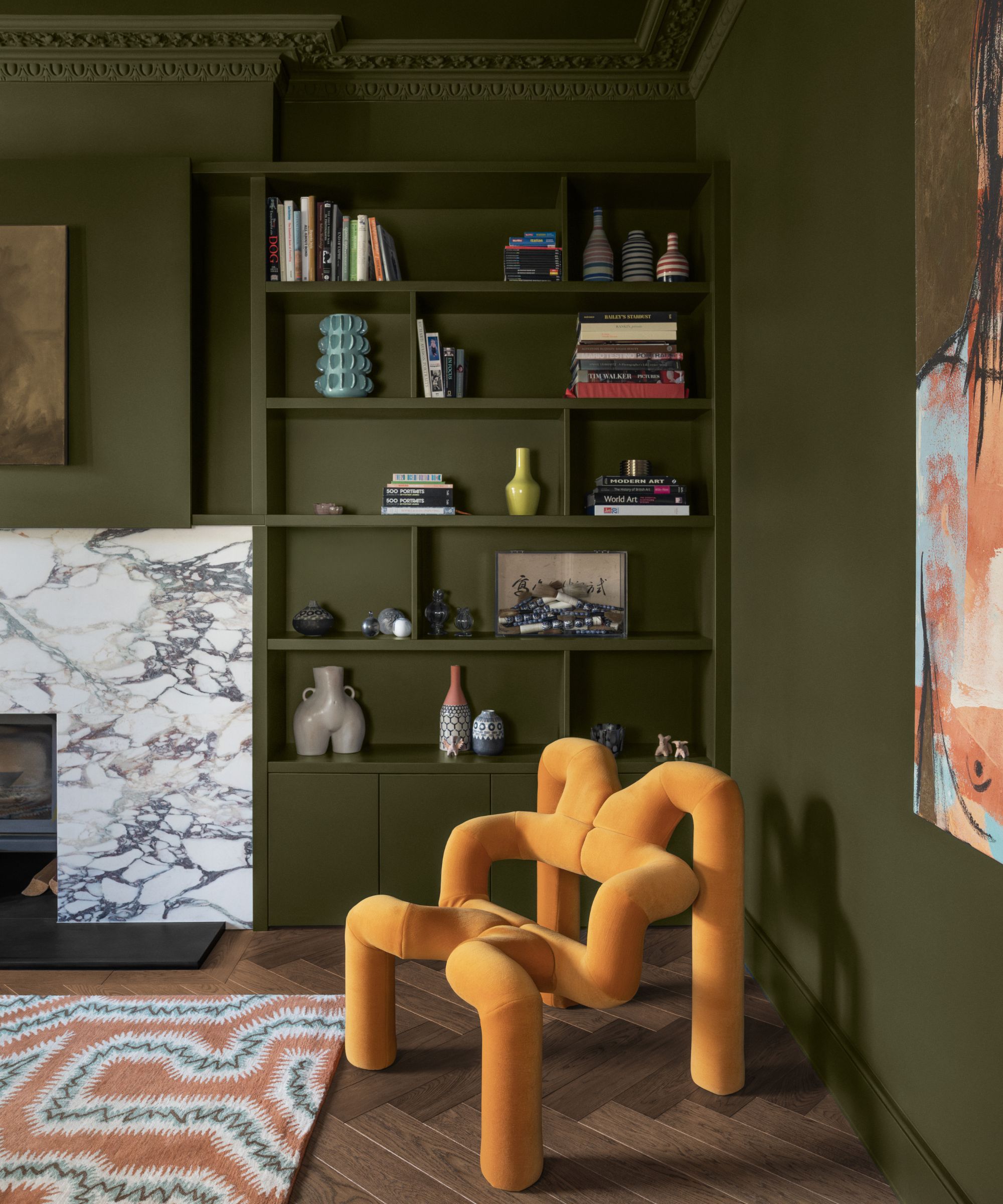
'Choosing our 2026 Color Edit of the Year takes over a year and is always a hugely collaborative process. I work closely with our brand team, listen to our community, travel to trade shows in Milan and Paris, and speak with design experts around the world to spot which colors are starting to surface,' continues Tash.
'For me, it’s about capturing the bigger cultural mood – the shades that reflect how people want to feel in their homes and lives. My role is to distill all of that noise into a palette that feels exciting yet accessible, giving people confidence that we’ve done the hard work for them.'
'The 2026 Color Edit is about letting go of rules and rediscovering the joy of play through color. These shades take the nostalgic primaries we all grew up with and give them a refined twist – colors that feel both joyful and deeply grounding.'
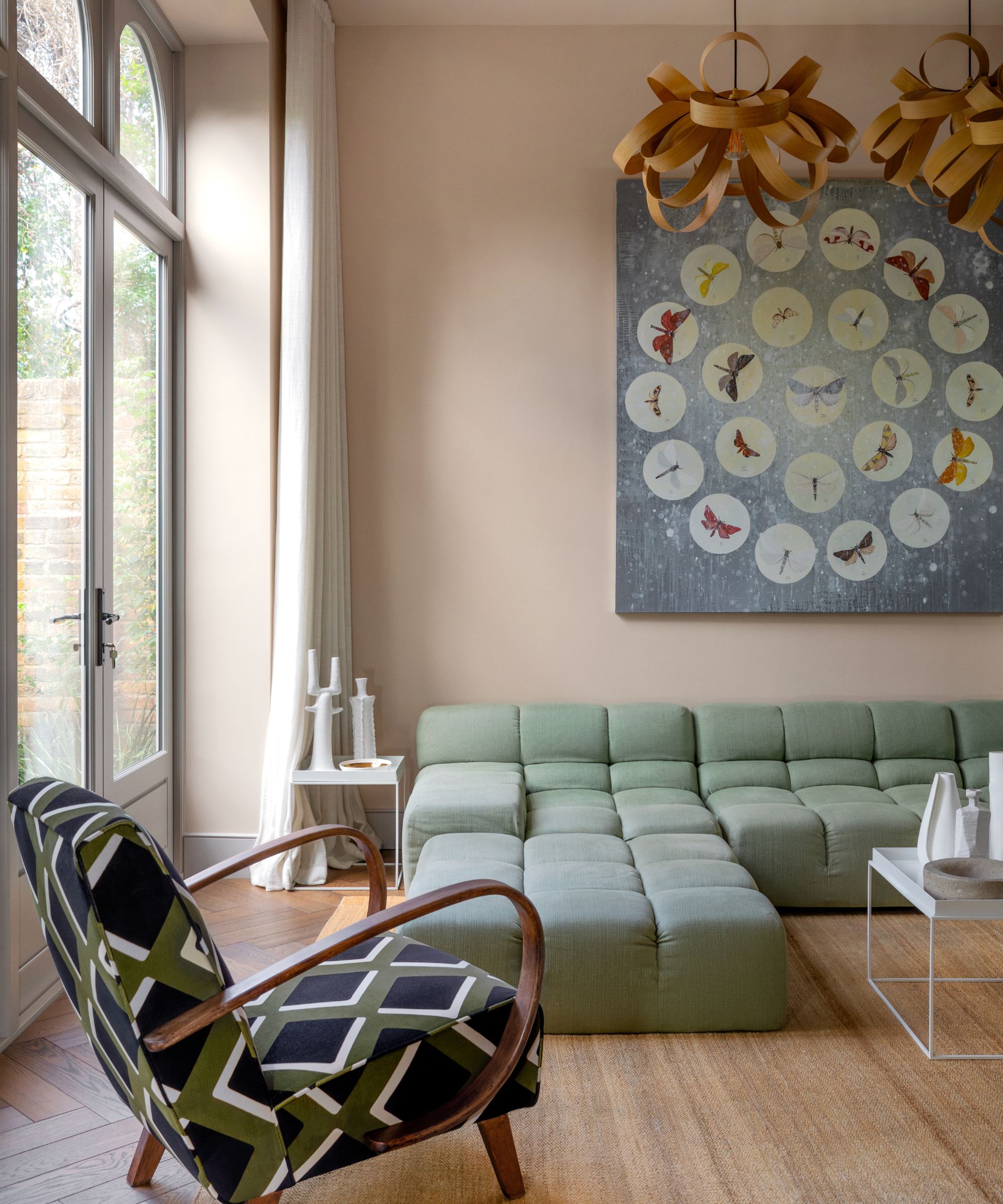
Inspired by this gorgeous palette but not up for a paint job just yet? I have created a shopping edit that will bring these soft primary shades into your home in an instant.
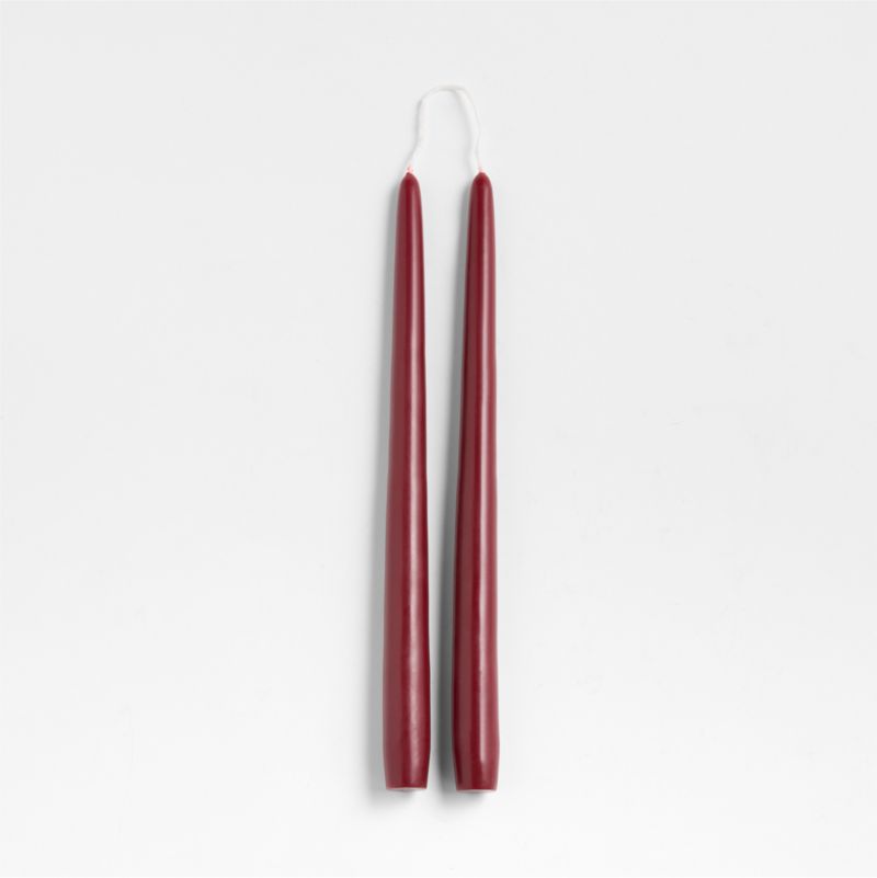
Red has been having such a moment this year, and it's deep, dramatic reds that are getting the most attention. If you want to bring a color like Lick's Red 06 into your home in a small, but noticeable way, add these taper candles to your shopping list.

I am the Head of Interiors at Homes & Gardens. I started off in the world of journalism in fashion and luxury travel and then landed my first interiors role at Real Homes and have been in the world of interior design ever since. Prior to my role at H&G I was the digital editor at Livingetc, from which I took a sabbatical to travel in my self-converted van (not as glamorous as decorating a home, but very satisfying). A year later, and with lots of technical DIY lessons learned I am back to writing and editing, sometimes even from the comfort of my home on wheels.
