Decorating with primary colors – 10 elegant ways to decorate with primaries
Using primary colors in interior design can be done subtly and elegantly to create bright – but understated – spaces


Decorating with primary colors has somewhat gone out of fashion in recent years in favor of paler, calmer color schemes, but adding bold brights can be done in a way that's sophisticated and subtle, if the primaries are added in pops rather than swathes.
Below, our expert tricks and tips take you through the basics of decorating with primary colors – all illustrated by beautiful room shots from a recent Homes & Gardens photo shot. You really are most welcome.
See: Interior design tips – decorating secrets for the world's top experts

1. What are primary colors?
The primary colors are red, yellow and blue. These colors are called primary colors because they cannot be created by combining any other colors. All other colors are secondary or tertiary (etc) colors, created by mixing primary colors, with black or white added to create darker hues (also known as shades) or lighter tones (also known as tints).
True primary colors aren't often used in interior design in large doses because they are very bold – instead you will see them as accent shades in accessories or within artwork. More commonly, you will see their shades and tints on walls, floors and furnishings.
See: Blue room ideas – wonderful room schemes to inspire you
2. What colors go with primary colors?

Whites, blacks and neutral colors go with primary colors – and these are usually easy to coordinate. You can also successfully coordinate primary colors with lighter tints and darker shades of that color. In both cases, primary colors are often best used as the smallest of accent colors within a room, rather than as the dominant color.
When choosing colors to go with primary colors, consider texture, too. If you are decorating with red, for example, and matching it with neutrals, picking neutral, natural textures such as wood will go some way to enriching the scheme and dampening the contrast between the two.
See: Yellow room ideas – guaranteed to turn up the heat
3. Using the color wheel for decorating with primaries

The color wheel can help you with coordinating primary colors with other colors, plus the tints and shades of each primary color. The color wheel separates primaries, tints and shades into warm and cool choices, with blue the only primary color on the cool side of the wheel – red and yellow being on the warm side.
When choosing primaries for decorating – and their derivations – bear in mind that cool colors recede meaning they are good choices for bright spaces that you want to feel calm and spacious; warmer colors advance, making them ideal for creating cozy, lively spaces.
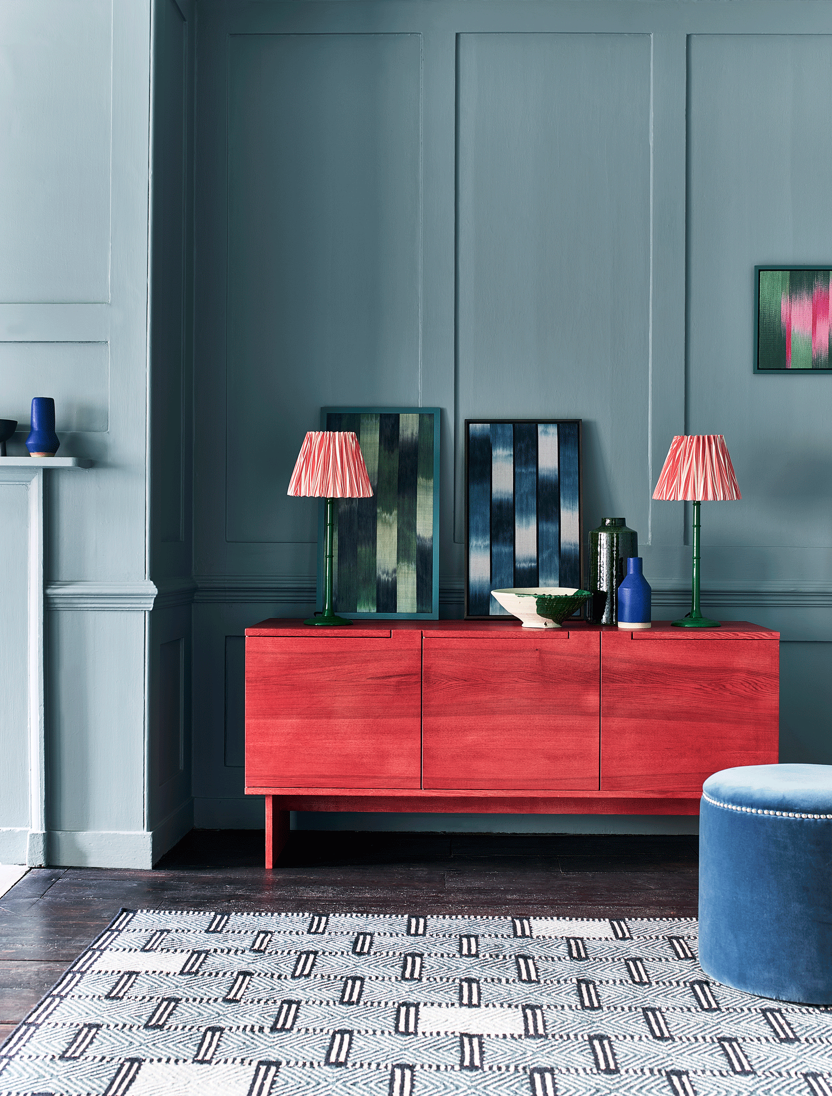
4. Introducing primary colors with accessories

Future / Emma Lee / Sally Denning
A simple and effective way of introducing color into the home is through accessories. It is a joyful way of adding to and altering the feel of a room without committing to redecorating whole spaces.
This calm, neutral space has been given an instant update with the addition of a vibrant glossy red lamp base. Based on an antique original, this playful lamp design takes its inspiration from the work of the mid 20th Century. Its bright pop of color makes it a wonderful, statement piece. The sculptural shapes of the lamp and vase add character and interest and the primary bold colors lift the scheme.
5. Decorating a living room with primaries
Future / Emma Lee / Sally Denning
A carefully selected array of colorful accessories and furniture add vibrant notes which bring a neutral scheme to life. The little pops of color sprinkled through the room create playful and uplifting finishing touches.
The warm neutrals used as the main structure for the scheme are very much in vogue right now. Earthy naturals, pale plaster pinks and natural weaves all set the scene elegantly and provide an ideal backdrop for the addition of a few joyful primary colours.
This yellow side table, though tucked unassumingly in the corner, really is one of the stars of the show here. Don't be afraid to mix and match colors, shapes and textures. The layered feel is what makes a living room such as this so inviting.
See: Living room color schemes –the best color ideas for living spaces
6. Inject primary colors into a cool, contemporary bathroom

Future / Emma Lee / Sally Denning
A bathing space wants to feel like a calm sanctuary, so it is only right that gentle, neutral bathroom color ideas be used to create the apace. A splash of red however is a modern and joyous touch to introduce in this serene wood-clad bathing space.
The very minimal palette of materials, from the wood panelled walls to the sleek white bath and smooth pale grey floor is complemented with the addition of a colourful, glossy side table, the perfect perch for your bathing accessories.
The sculptural shapes within the calm space; the square contemporary window opening, the silhouetted mirror on stand and the curves of the tub all sit happily with the shapely outline of the vibrant red table.
7. Bring primary colors into a natural dining space

Future / Emma Lee / Sally Denning
Wooden furniture and natural jute flooring is given a new lease of life with a sprinkling of bright primary colors. Create a statement with a single piece in a vivid hue.
Here, a brightly painted chair delivers drama and works as a wonderful focal point. The block of color in the yellow artwork and glossy finish of the red chair bring an unexpected extra dimension and vibrance to the calm, natural, country feel of this relaxed dining space.
The layering of textures adds depth to the room, with the natural woods of the table and chairs, juxtaposed with the glossy red finish of the chair paintwork and the natural weave of the jute rug and basket. Colorful accessories on the shelving add to the artfully curated feel.
See: Dining room ideas – inspiration for decorating and furnishing your space
8. Gather your favorite vessels together for an attractive display

Future / Emma Lee / Sally Denning
Open shelving offers the perfect opportunity to have a play and display your most treasured pieces for all to admire. The shelves, whilst practical as useful storage, also mean that all your shapely ceramics and tableware need not be hidden away in cupboards and can be on view to enjoy everyday.
Here the clever mix of textural natural materials sit happily with a few pops of primary colour. The colourful twist of the yellow pigment used to create the finish on the shelves is very contemporary take on a stained wood finish and elevates a simple set of wooden shelves into something more unique.
9. Inject primary colors into your home with unexpected combinations

A simple console painted in a bright yellow finish creates a striking perch for displaying a collection of much loved ceramics and vessels. The vibrant color draws your eye and attracts attention to the collection gathered above. A soft plaster pink wall color acts as a gentle contemporary neutral tone.
Not overpowering, but with more personality and warmth than a neutral off white or pale grey. Texture has been added here with a woven wallhanging. The sunshiny yellow adds a playful element to the mix when combined with the quieter natural textures and materials and the warm plaster pink.
10. Use an accent primary color in a pared-back neutral scheme for an easy update

Future / Emma Lee / Sally Denning
A vibrant primary color is a sure fire way to inject personality into a neutral, pared back scheme. Here the soft textures of the tactile upholstery and natural, textural floor rugs contrast beautifully with the smooth glossy red of the small side table and plate with blue line.
See: The monochromatic color scheme – ideas and expert advice for creating yours
There is no need to paint a whole wall or room in a bold color to enjoy living with brighter tones. Color can be brought into existing schemes easily through accessories and smaller pieces of furniture. It is the perfect way to contain the way you use colour so it doesn't feel too overwhelming.
