Marlon Brando used an unexpected color combination in his 1950s bedroom – its simultaneously 'grounding and energizing' appeal is on-trend for 2026
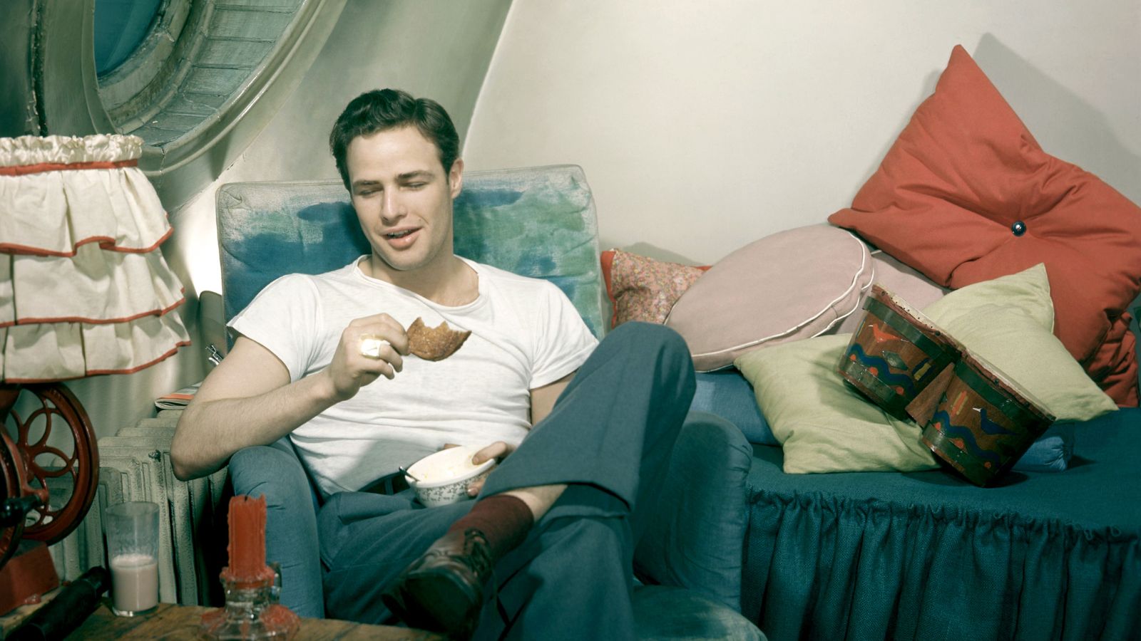
An archival image of The Godfather actor in his bedroom in 1955 shows that he was ahead of the curve on one of this year's biggest color trends

Design expertise in your inbox – from inspiring decorating ideas and beautiful celebrity homes to practical gardening advice and shopping round-ups.
You are now subscribed
Your newsletter sign-up was successful
Want to add more newsletters?
Decorating with primary colors is a classic combination, yet not many people gravitate towards them. They expect that a pairing of red, blue, and yellow might be too overwhelming or too juvenile; an archival image of Marlon Brando's bedroom proves them wrong.
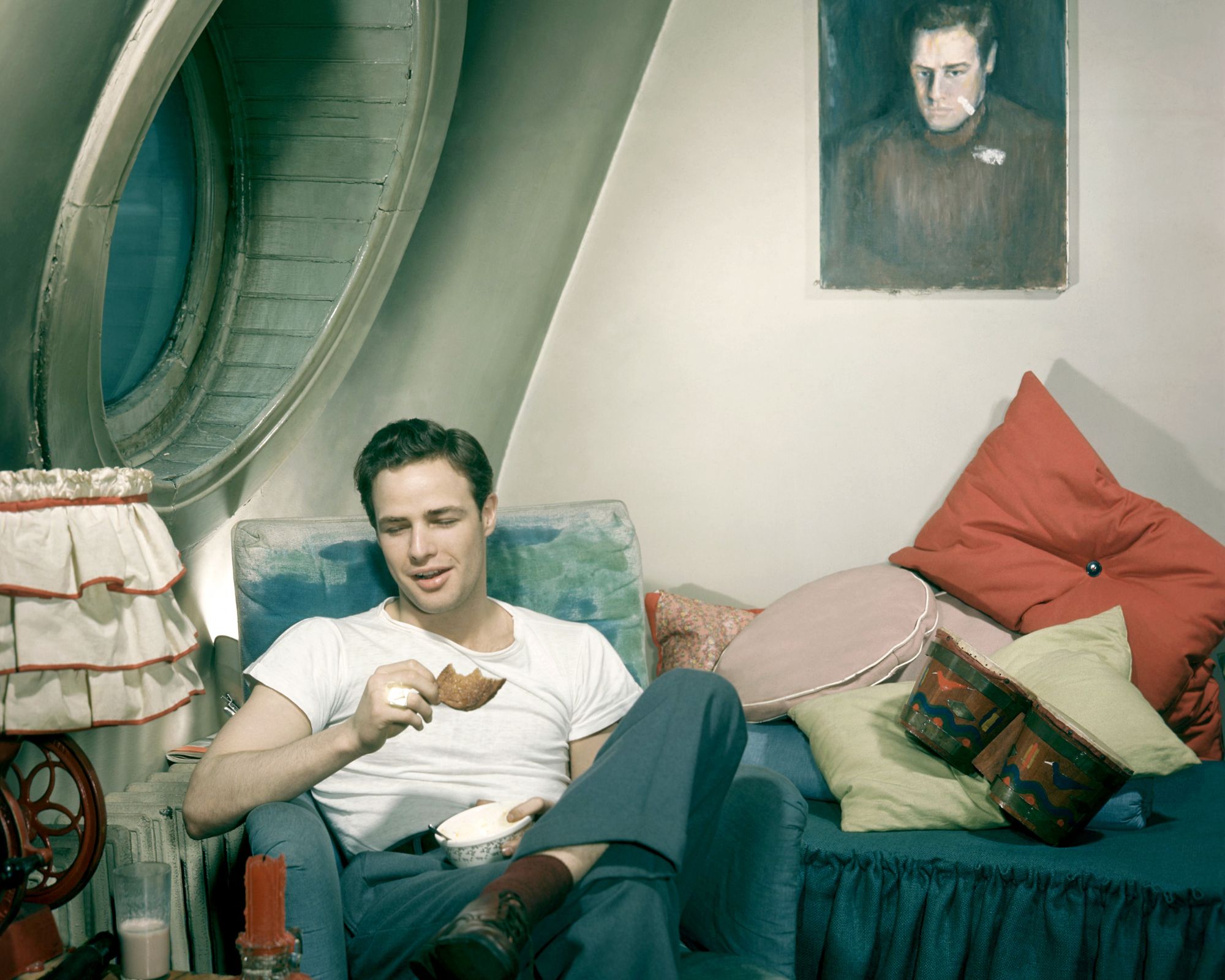
The photograph shows the A Streetcar Named Desire actor in 1955, perched on a blue armchair in his bedroom. It's a masterclass in decorating with primary colors. Behind the blue chair, he has layred his blue sofa bed high with red and yellow cushions. A blue painting looks down on him from behind the bed, and a ruffled red lamp adds a final pop of the romantic shade.
Though the image is from seven decades ago, the lessons in color are just as relevant to modern interior design trends.
Article continues belowWestchester-based interior designer Nina Lichtenstein explains: 'In 2026, we’re seeing red and blue come together in a more grown-up way: less stars-and-stripes, more Paris apartment meets Hudson Valley retreat. The rise of warm minimalism and moody maximalism has opened the door for deeper, richer colors to take center stage. Red is no longer just bold; it’s warm, grounding, and even romantic. Blue, depending on the shade, can be cool and cerebral or soft and serene.'
Shop the red and blue edit
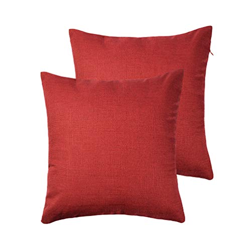
Bring a splash of red to your sofa with these stylish linen pillow covers. They are sold in a pack of two to create easy cohesion across your space.
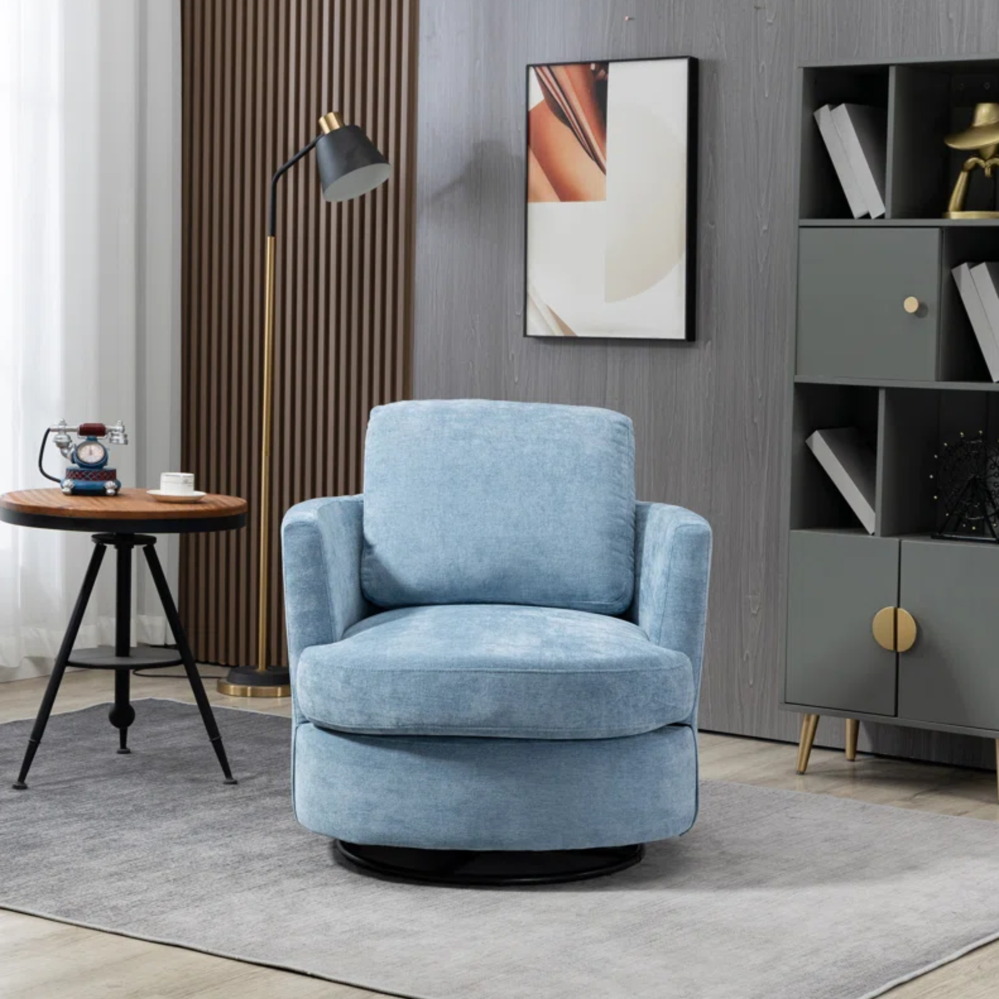
This robin's egg blue seat features plush cushions and a swivel base, perfect for a walk-in closet, living room, or even an office. It's the perfect way to get Beckham's closet look, minus the clothes (sadly).
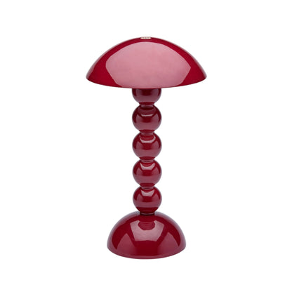
Have you ever seen something cuter than this bobbin lamp from Addison Ross home? It's the perfect size and rechargeable for unlimited styling possibilities.
She continues: 'Mixing red and blue is one of those bold design moves that can look timeless or totally of-the-moment depending on how it’s done, and right now, it’s both. Designers are rediscovering the emotional punch of these two primary powerhouses, using them not just in their purest forms, but in nuanced tones that speak to a more sophisticated color sensibility.'
Though the timeless color combination remains a constant as trends shift, its iterations are always changing. Nina advises: 'Popular combinations include oxblood and slate, terracotta and denim, and cherry and cobalt. In the right hands, red and blue are no longer opposites; they’re partners in design with a rich emotional range.'
If you hope to integrate this stylish combination of primary colors into your own home, expert use of patterns and textures is essential. Nina explains: 'Patterns are a great way to unite red and blue, especially when they include other hues like ivory, sage, or charcoal. Look for block prints, kilims, or classic stripes that bring both colors into conversation without overstimulating the room.'
Design expertise in your inbox – from inspiring decorating ideas and beautiful celebrity homes to practical gardening advice and shopping round-ups.
She adds: 'When using two strong colors, texture becomes essential. Pair a high-gloss red lacquer console with a matte indigo linen chair. Or combine a distressed blue-painted cabinet with a soft red velvet ottoman. Mixing finishes helps the eye move through the space without color fatigue.'
As evidenced by Marlon Brando's bedroom in 1955, red and blue have always been, and always will be, a perfect combination, whether it's on trend or not.

Sophie is a writer and News Editor on the Celebrity Style team at Homes & Gardens. She is fascinated by the intersection of design and popular culture and is particularly passionate about researching trends and interior history. She is an avid pop culture fan and has interviewed Martha Stewart and Hillary Duff.
In her free time, Sophie freelances on design news for Westport Magazine and Livingetc. She also has a newsletter, My Friend's Art, in which she covers music, culture, and fine art through a personal lens. Her fiction has appeared in Love & Squalor and The Isis Magazine.
Before joining Future, Sophie worked in editorial at Fig Linens and Home, a boutique luxury linens brand. She has an MSc from Oxford University and a BA in Creative Writing and Sociology from Sarah Lawrence College.