Johnny Galecki’s ‘quiet luxury’ kitchen palette is inspiring me to rethink color this fall 2025 – it features an unexpected, eye-catching twist
Unexpected color combinations are making a bold comeback – and here’s why they deserve your attention


Design expertise in your inbox – from inspiring decorating ideas and beautiful celebrity homes to practical gardening advice and shopping round-ups.
You are now subscribed
Your newsletter sign-up was successful
Want to add more newsletters?
There is no doubt that warm neutrals have reclaimed their status as the most sophisticated tones for home use, with the kitchen of actor Johnny Galecki serving as a perfect example of this refined style. While many people feel most comfortable when surrounded by carefully balanced colors that create an understated, cozy environment and make few demands on the eye, decorating with neutrals alone is not a fail-safe combination. It is all too easy to fall into the trap of using bland, depressing colors that are nothing like the complex, layered palettes featured in his home.
Designed by the interior design firm Pierce & Ward, Galecki's kitchen features a quiet luxury palette that beautifully blends grounding shades of warm beige, taupe, and ochre with an unexpected pale blue. This season, we are drawn to these 'quiet luxury' colors, but we are mixing them up with unusual color combinations for rooms for maximum impact.
A post shared by Pierce & Ward (@pierceandward)
A photo posted by on
We have decidedly steered away from Millennial favorite gray and tired magnolia palettes. These days, rich, tonal color schemes take center stage, often featuring underappreciated muddy hues. The interior design duo behind Pierce and Ward, Louisa Pierce and Emily Ward, frequently throw out the rulebook with their penchant for unexpected color combinations.
Article continues belowShades of beige, mustard, and brown are rarely the conventional paint and fabric colors of choice for the discerning decorator, but Pierce & Ward, who coined the term 'ugly colors,' say every house needs a dose of these underappreciated muddy tones to dial down the pretty and perfect.
Along with these grounding shades, pale blue, turquoise, and teal are the complementary color trend having a significant moment in the spotlight. It is easily the tone of choice for many, from amateur decorators to interior designers, as it's incredibly easy to live with and perfect for layering, believes Patrick O’Donnell of Farrow & Ball. ‘Lighter, sea-inspired blues also have positive attributes in color psychology, such as enthusiasm, sympathy, warmth, encouragement, spirituality, loyalty, and thoughtfulness.’ It is an uplifting and restorative color to have around the home.
Decorating with blue makes for a calming backdrop for a busy kitchen, and it can be instantly warmed up with those crucial contrasting neutrals like beige, ochre, oranges, and yellows. ‘We are very careful when picking blues for a room that doesn’t get too much natural light to make sure that the undertones are not too gray,’ says Liv Wallers and Cath Beckett, co-founders of Yellow London.
Calm, subtle, and surprisingly versatile, this gentle shade – which often carries a hint of steely gray – is the current underdog of the biggest, most sophisticated color stories dominating contemporary design.
Design expertise in your inbox – from inspiring decorating ideas and beautiful celebrity homes to practical gardening advice and shopping round-ups.
Shop the edit
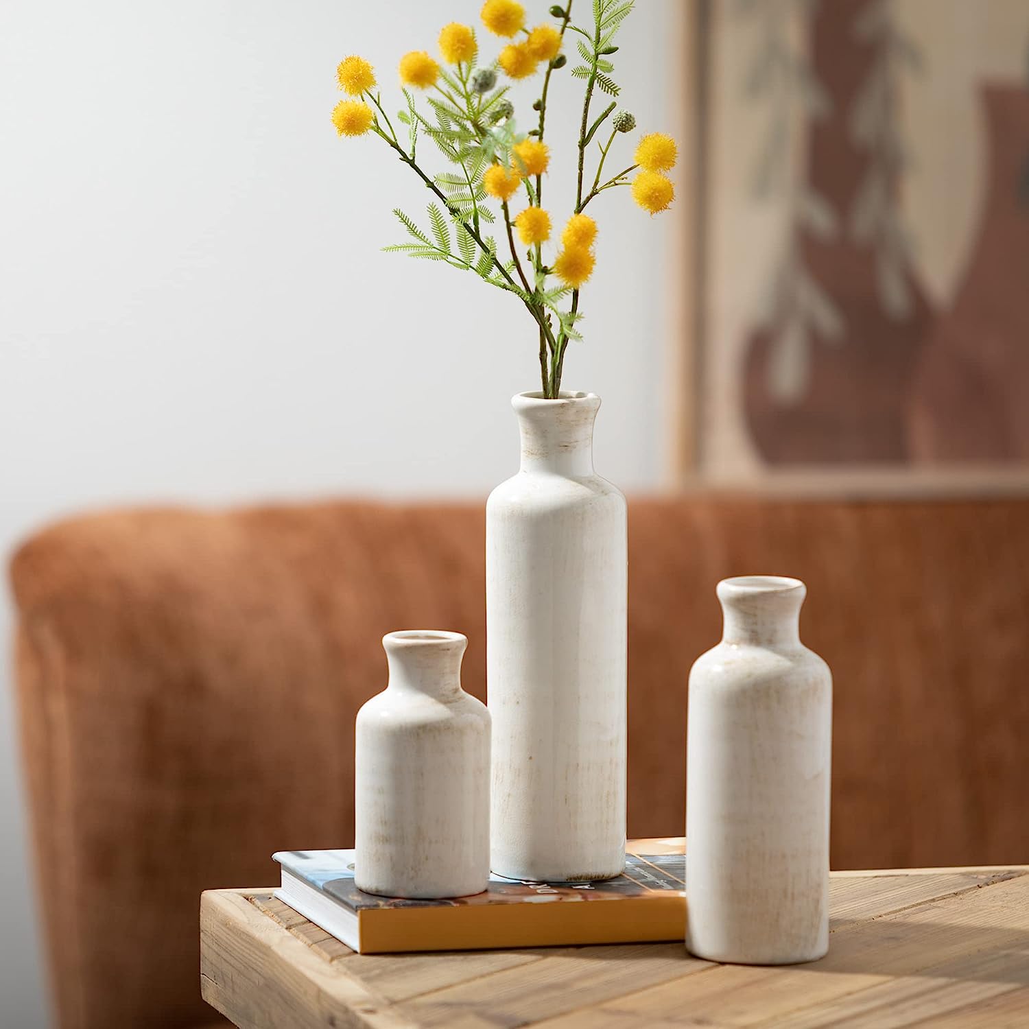
Bring rustic charm and modern farmhouse style to any room with this set of three white ceramic vases. Perfect for kitchens and dining areas, they make a stunning centerpiece or decorative accent on shelves, mantels, and entry tables. Crafted from 100% ceramic, these versatile vases suit boho, cottagecore, rustic, or modern farmhouse aesthetics and pair beautifully with faux flowers for a pop of color.
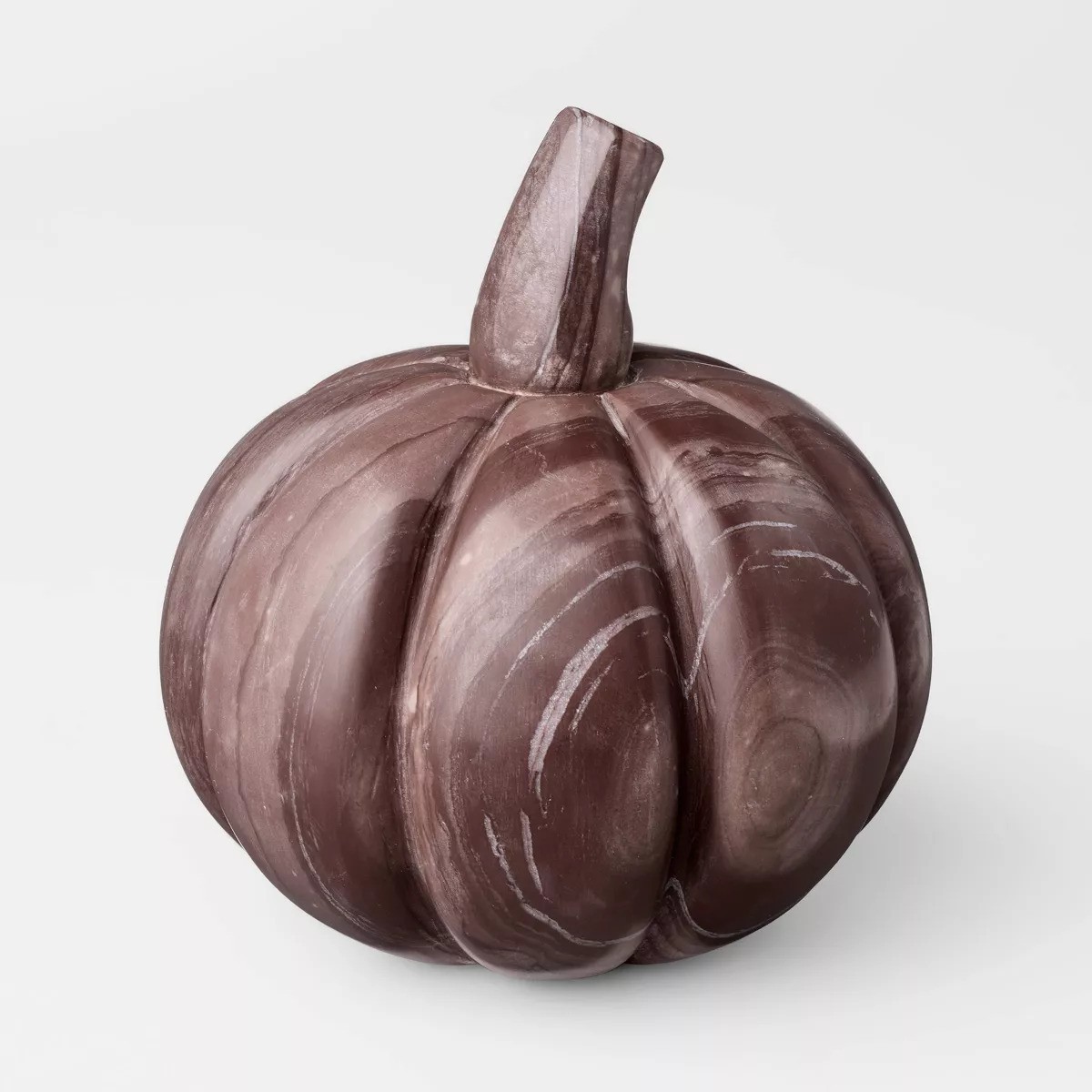
Add rustic elegance to your kitchen with this 5.5-inch marble pumpkin from Threshold™ designed by Studio McGee. Its warm red tones and natural stone finish make it a charming accent for shelves, countertops, or kitchen islands, and it pairs beautifully with other seasonal decor for a cohesive fall display.
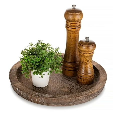
Crafted from premium paulownia wood, this lightweight yet sturdy tray combines function with rustic charm. Measuring 11.2" outer diameter and 9.4" inner, it’s perfect for serving breakfast, snacks, or drinks. The handcrafted distressed finish adds a stylish touch to any space, while curved edges keep contents secure. Ideal for kitchens, coffee tables, vanities, mantels, or entryway displays

Jennifer is the Digital Editor at Homes & Gardens, bringing years of interiors experience across the US and UK. She has worked with leading publications, blending expertise in PR, marketing, social media, commercial strategy, and e-commerce. Jennifer has covered every corner of the home – curating projects from top interior designers, sourcing celebrity properties, reviewing appliances, and delivering timely news. Now, she channels her digital skills into shaping the world’s leading interiors website.