What are the colors for quiet luxury? These 5 sophisticated colors are all you will ever need
Take a leaf from new-age minimalism and put the focus on colors that calm and soothe the soul

Design expertise in your inbox – from inspiring decorating ideas and beautiful celebrity homes to practical gardening advice and shopping round-ups.
You are now subscribed
Your newsletter sign-up was successful
Want to add more newsletters?
Quiet luxury has been abuzz in the fashion and design world for some time now, but achieving the quiet luxury look is so much more than just a concept, it is a lifestyle; one that I have been embracing wholeheartedly.
It is also not as unobtainable as it may at first appear. In fact, just one sophisticated room color idea can turn your home into a luxurious space that is perfectly composed and enriching. But why the sudden popularity?
In a world where everything at times feels so fast-paced and chaotic, more and more people are turning to quieter color palettes to create a sense of calm and stillness. However, while they may seem like a safe choice, decorating with quiet neutrals can be tricky to get right, but with some interior design know-how, gentle color palettes are the epitome of the quiet luxury trend.
Quiet luxury color schemes
Here, designers, decorators, and experts reveal how to approach choosing quiet luxury color schemes that evoke understated elegance, timeless appeal, and sophistication.
Farrow and Ball: Recipes for Decorating | $43.16 at Amazon
Farrow & Ball is a leading producer of high-end paint and luxury wallpaper, and their design experts share their wisdom for creating harmonious interiors and beautify home décor in this inspirational book.
1. Create calm with a Scandinavian palette of versatile off-whites
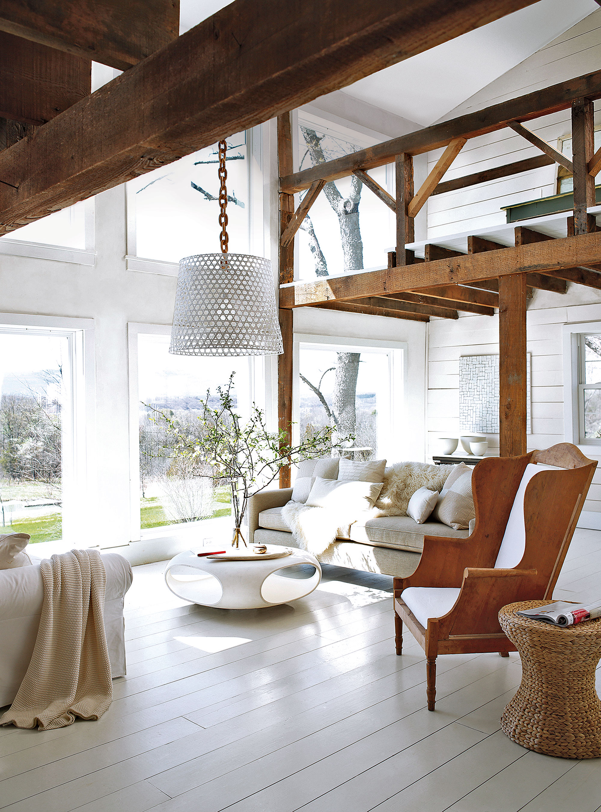
Embrace Scandinavian slow-living with a pared-back palette of off-whites through to oatmeal and the rustic tones of natural materials.
'Off-white is, of course, one of the most versatile shades in all of design,' says Jane Landino, creative head of studio at Taylor Howes. 'It instantly brightens while evoking a sense of calm and flawlessness.'
Typical of traditional Scandinavian homes, white-painted weatherboarding helps maximize light during those dark Nordic winters, but is also a brilliant way to let rustic period features shine. Decorated with Benjamin Moore’s Simply White on walls and Ice Mist on floors, the muted palette of this white living room really lets the rustic beams take the limelight while the space is kept cozy with plenty of natural materials.
Design expertise in your inbox – from inspiring decorating ideas and beautiful celebrity homes to practical gardening advice and shopping round-ups.
2. Be inspired by nature with new neutrals
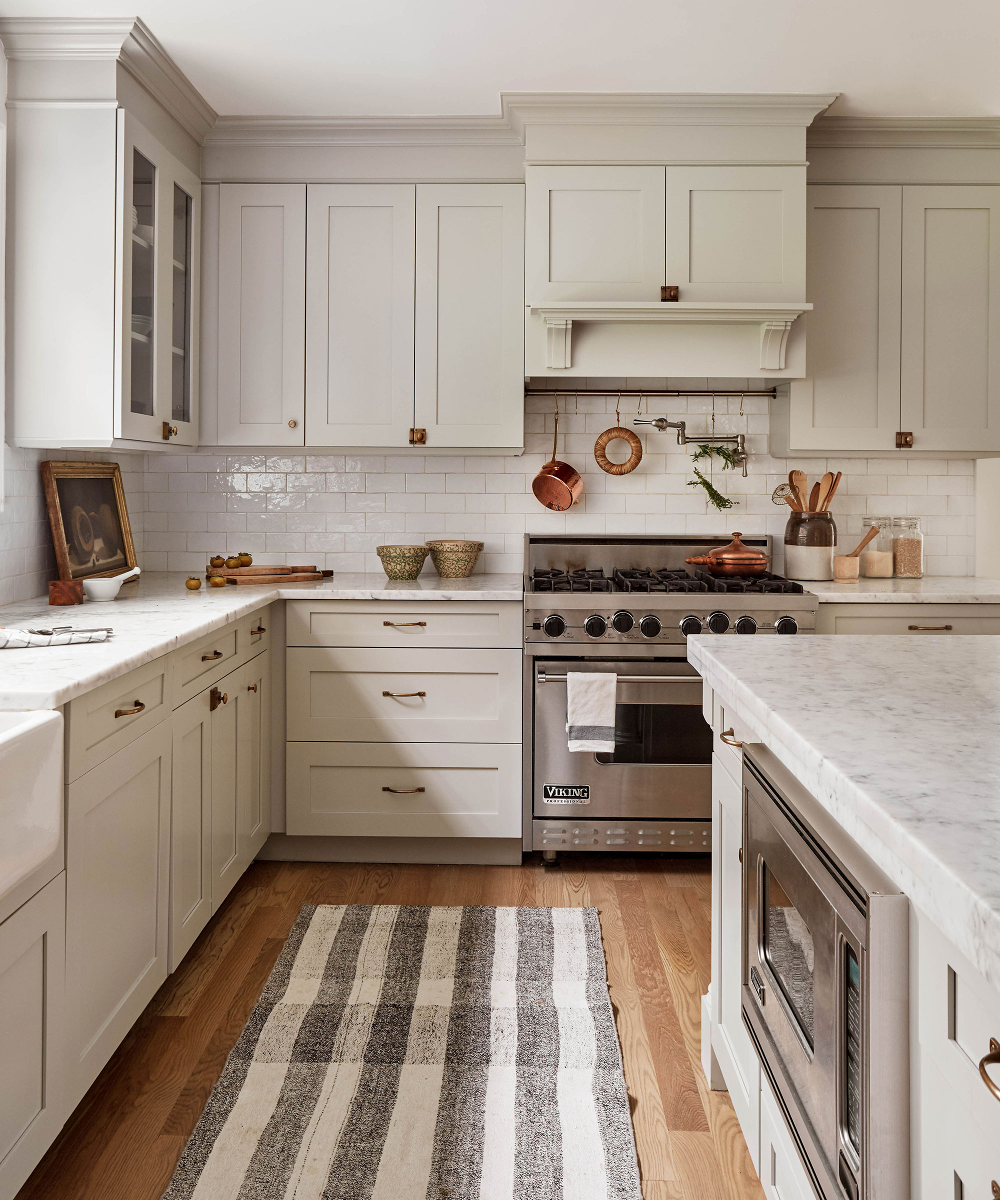
Decorating with new neutrals, inspired by colors from the natural world, adds a gentle and soothing touch to interiors that can be layered with textures and tones to ebb and flow with the seasons.
'I love the calmness that you create when you have a neutral palette in a room, especially if you wish to replicate the quiet luxury aesthetic', says interior designer Tamsin Johnson.' But this choice definitely doesn’t have to mean boring: you can create an interesting and exciting space by layering different tones, such as off-whites and beige, then introducing a range of caramels and even accents of black.'
The power of a neutral color palette to add warmth and elegance to a room should not be underestimated. When decorating with neutrals a key element is the importance of layering with textures and tonal shades.
‘Touch and comfort are key sensory triggers. When decorating with white and neutrals, it is crucial to add in natural elements and pile on texture; a soft rug underfoot, or a diaphanous drape at a window can truly transform a room. Natural materials, such as weathered wood, linen, or marbled slate, connect us back to nature and add interest,’ says founder and CEO of The White Company, Chrissie Rucker OBE.
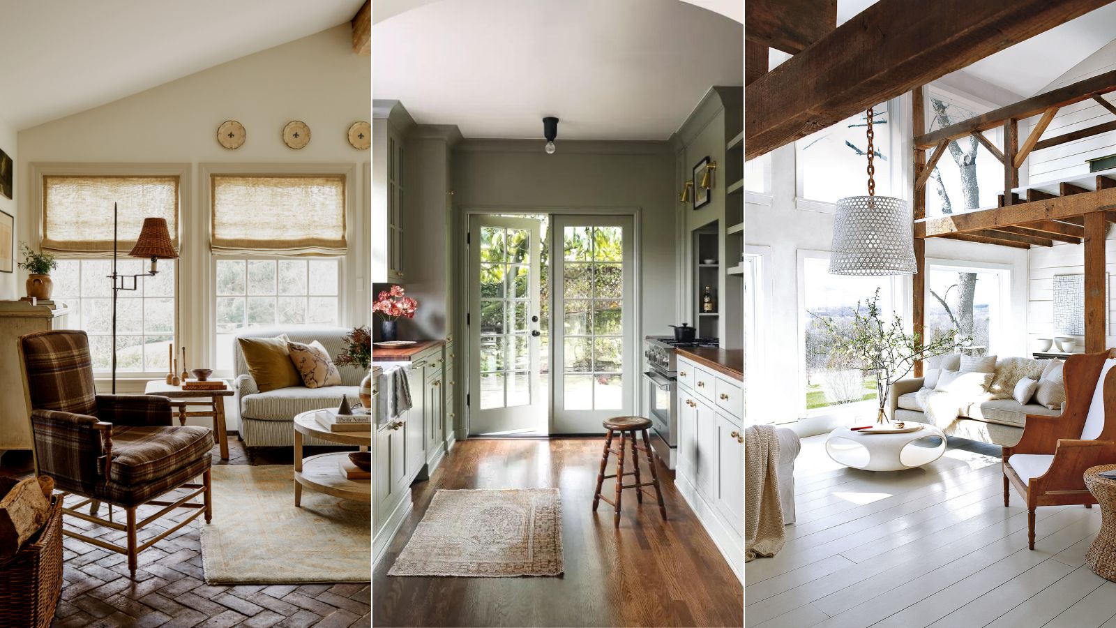
For harmony in the kitchen, dial down the heat with a color palette of neutrals. ‘Kitchens should be light, bright, and invigorating spaces,’ says Becca Casey, founder of Becca Interiors. Invest in Shaker kitchen cabinets that have a pared-back and timeless design aesthetic and paint in a color that chimes to the quiet luxury ethos.'
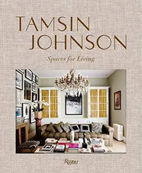
Spaces for Living, Tamsin Johnson| $48.30 at Amazon
The first book from Australian interior designer Tamsin Johnson, known for her fresh interiors that evoke luxury and elegance.
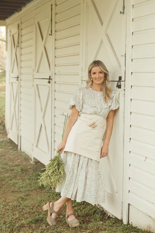
Owner and principal designer Becca Casey grew up in the English countryside, before eventually moving to the other side of the Atlantic and launching her design career in New York City. Currently based in Connecticut where she leads her interior design firm, Becca brings her style – rooted here in the UK – to homes across the US.
3. Soothe with a pale green

Classic, calming and synonymous with nature, pale green is a hue that keeps the peace. Decorating with green, especially in its paler variations, is in general a calming and relaxing color. Being the color that represents nature, it’s one that makes us feel good and positive.
‘The poet and philosopher Goethe used to describe green as a useful color, a good color to have around,’ explains Francesca Wezel, founder of Francesca’s Paints. While light green is stimulating and energetic, light green is a perfect tone for bedrooms, as it is calming and relaxing and helps us to sleep well.’
Patrick O’Donnell, brand ambassador for Farrow & Ball agrees: ‘Green is a joy to use: the primary color of nature. It is the perfect color to deliver calm and serenity and therefore has the flexibility to be applied in every room in the home but is especially great for bedrooms and sitting rooms. It symbolizes renewal and growth.'
‘Pale green can refresh any room while adding a hint of nature,' says Natalia Miyar, founder, of Natalia Miyar Atelier. 'In this bedroom, we took inspiration from the landscape of Miami to create a calm, cozy feel – the light green grasscloth wallpaper by Kenneth James works perfectly.’

Patrick O’Donnell is Farrow & Ball's color consultant & brand ambassador and has been with the brand since 2012. Patrick works with designers in the UK and North America, helping to bring their projects alive with the iconic, F&B color palette.

After years working as a colorist and manager of various Porter’s Paints shops throughout Sydney, Francesca Wezel returned to London and founded Francesca's Paints in 1996, an artisan paint studio based in Battersea.
4. Decorate with a tranquil gray-green

Timeless, elegant, calming – there is a lot to love about a serene gray-green. ‘An amalgamation of grey, green and bluey brown, this shade has a moody, sophisticated feel and adds great depth to interiors,' says Francesca Wezel, founder, of Francesca’s Paints. 'It is perfect for hallways and living rooms and would work well as a background color for artwork.’
‘Here, we used Farrow & Ball’s French Gray to paint the entrance hall of this 500-year-old home,' says Louise Wicksteed, design director, Sims Hilditch. 'The green undertones of this shade work well with the white door lintel, bringing a fresh and natural look to the space.’
As it has this mercurial quality, it works well with an array of colors in the quiet luxury color palette.

Director at UK-based interior design firm, Sims Hilditch, Louise Wicksteed has been with the brand since 2019, and has extensive experience working as an interior designer for many design firms in the UK.
5. Warm up with earthy brown
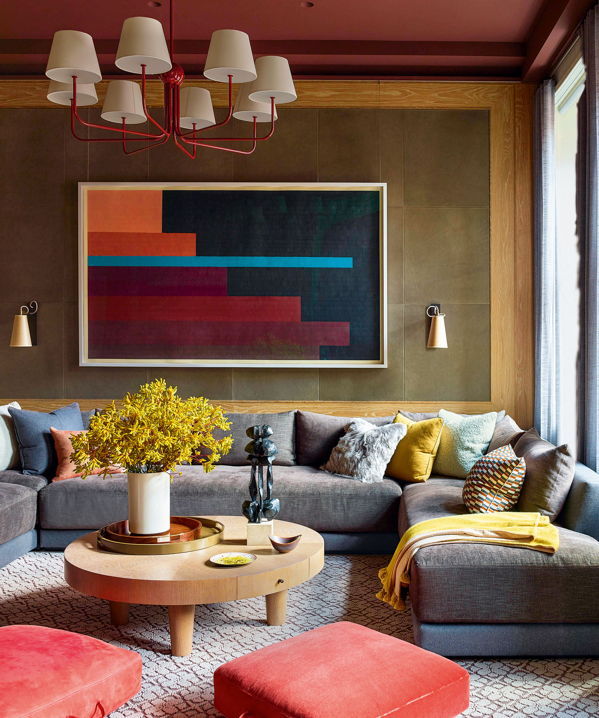
Before you recoil in horror at the thought of decorating with brown, throw out any preconceived notions of the brown rooms you may have seen in the past. This once-detested color is back, and better than ever.
This season's decorating is inspired by the global traveler's expeditions, with a rich palette of nutmeg, cinnamon, ginger and ochre adding warmth and depth to interiors.
Considered a dark neutral, earthy brown is grounding but also has an elegance that is truly sophisticated. Versatile, it can be striking on its own or allow other hues to stand proud.
In case you needed anymore convincing, brown is also surprisingly versatile and could act as the perfect foil to existing furnishings and accessories. Edward Bulmer, interior designer and founder of Edward Bulmer Natural Paint agrees: ‘Being polychromatic, brown goes with everything, but in deeper, very rich hues it is particularly good at flattering beautiful, well-drawn patterns.’
FAQs
What colors give a luxury feel?
The easiest way to give your home a luxurious look is to mimic the warm neutral colors found in nature.
There's plenty of debate as to how to define 'neutral' colors. We tend to think of them as tones such as white, beige, gray, ivory and khaki that don't appear on the color wheel. In general, neutrals are calming and easy to use – they work with almost every other color, but it's important to consider how pigments are affected by light.
'The light in a room is key to deciding whether to choose warm or cool tones,' says Ruth Mottershead of Little Greene. 'There is a difference between warm neutrals (with a green or yellow undertone), which work well for the quiet luxury trend, and cool ones (with a bit of pink, violet or blue).

Jennifer is the Digital Editor at Homes & Gardens, bringing years of interiors experience across the US and UK. She has worked with leading publications, blending expertise in PR, marketing, social media, commercial strategy, and e-commerce. Jennifer has covered every corner of the home – curating projects from top interior designers, sourcing celebrity properties, reviewing appliances, and delivering timely news. Now, she channels her digital skills into shaping the world’s leading interiors website.
