How to use a color wheel for interior design
Learn how to use a color wheel to pick the perfect palette for your rooms

Lucy Searle
Design expertise in your inbox – from inspiring decorating ideas and beautiful celebrity homes to practical gardening advice and shopping round-ups.
You are now subscribed
Your newsletter sign-up was successful
Want to add more newsletters?
Using a color wheel will help you get the perfect palette for a color scheme for your home. This is true for interior design and decorating, but it can be used to get color combinations right in clothing and art, too.
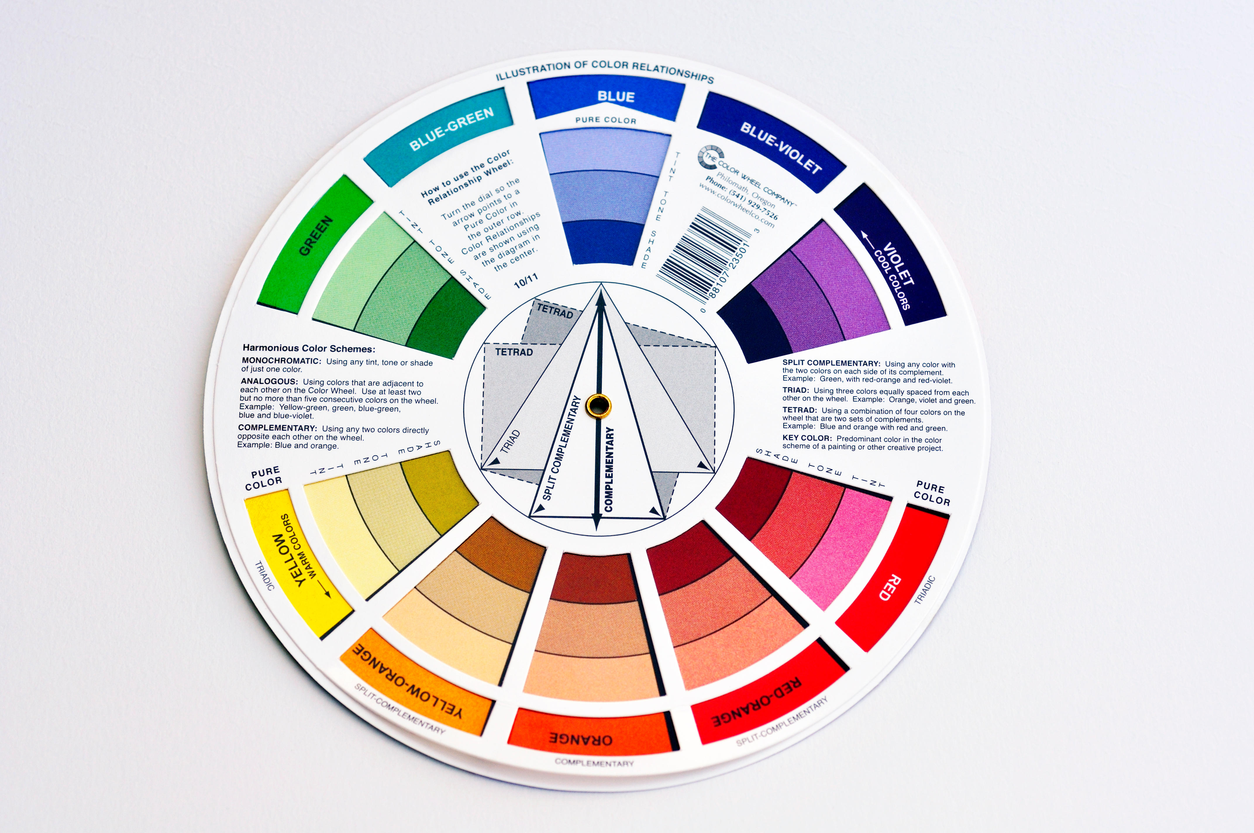
What is a color wheel? If you haven't heard of it before, the color wheel is a simple device that shows how primary, secondary and tertiary colors relate to each other. In other words, it helps you quickly see which colors go together.
From monochromatic and complementary palettes to split complementary, contrasting and triadic, it can be used in combination with color theory to help you create successful decorating schemes and guarantee decorating success.
Article continues belowConceived in 1666 by Sir Isaac Newton to map out the various relationships between colors in the spectrum, the color wheel is essentially a visual representation of 12 core colors in a circle, from primary hues to secondary colors and so on.
In interior design, it provides a clear and instant visual for exactly which hues contrast and coordinate, to help you to devise harmonious, tonal or contrasting room color ideas.
How to use a color wheel?
There are 12 segments on the color wheel, each one representing a color. The wheel shows how colors relate to each other, whether they’re side by side or diametrically opposite.
Structurally, the wheel includes the three primary colors of red, yellow and blue, alongside three secondary colors, green, orange and purple (where two primaries are mixed together to form another).
Design expertise in your inbox – from inspiring decorating ideas and beautiful celebrity homes to practical gardening advice and shopping round-ups.
Finally, there are six tertiary colors, a mix of a primary and secondary color. These are red-orange, yellow-orange, yellow-green, blue-green, blue-purple and red-purple.
The warm colors – the reds, yellows and pinks – feature on one side. You'll find the cooler hues – blues, greens and purples, on the other.
How to use a color wheel to create a color scheme?
Using a color wheel to build color schemes also needs an understanding of the different types of color schemes for your home decor ideas. These are the schemes you will need to consider on the color wheel in combination with color theory. We list them below and include interior design tips to make the guide more useful.
1. Monochromatic color schemes
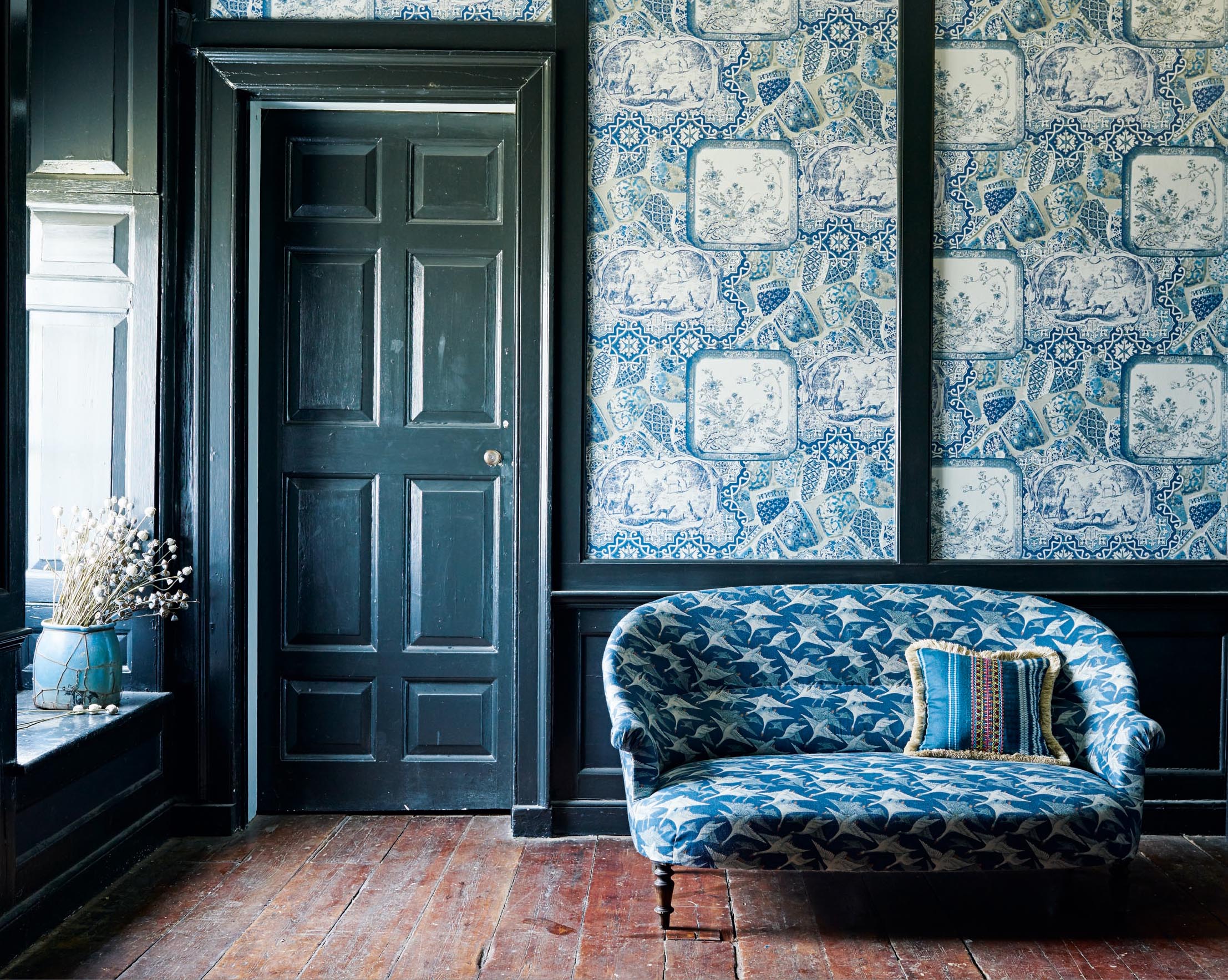
Monochromatic colors (also called analogous) are all within one color family. They create a scheme that is a combination of tones in a single color. Monochromatic color schemes create a harmonious, calm feel
This might be a combination of blue and indigo, for example. To use the color wheel to match analogous colors, follow these steps:
- Pick your hero color.
- Now pick two similar colors on either side of the directly complementing color.
- These will be your second and third colors.
2. Complementary color schemes
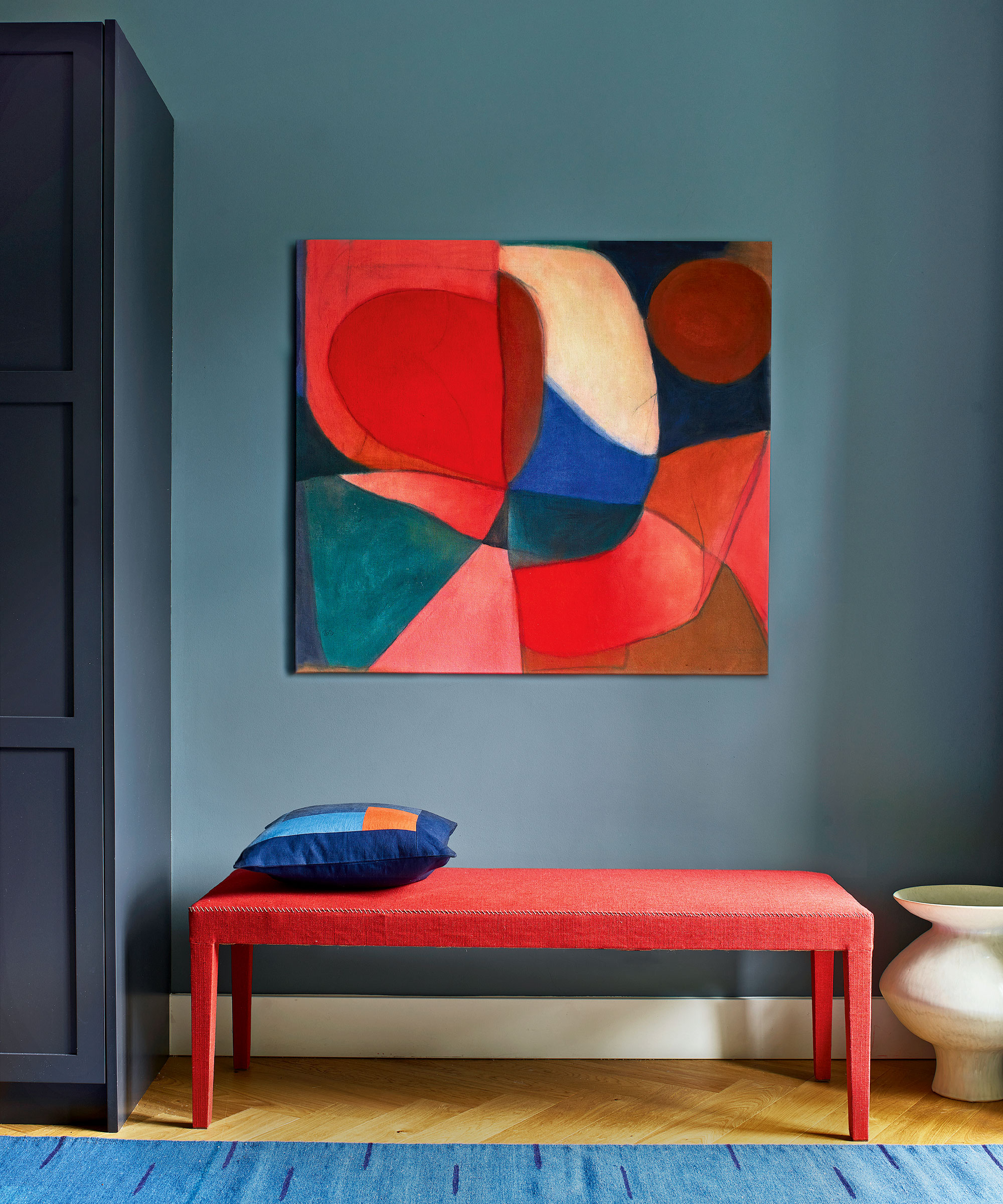
Complementary colors are opposites on the color wheel, for example red and blue. When placed next to each other they are pleasing to the eye. To use a color wheel to match complementary colors, for instance if you wondering what other colors to use when decorating with green walls, then follow these simple steps:
- Pick one color from the color wheel – this might be your main color choice.
- Look across the color wheel to the opposite side find your main color's direct complement.
3. Split complementary color schemes
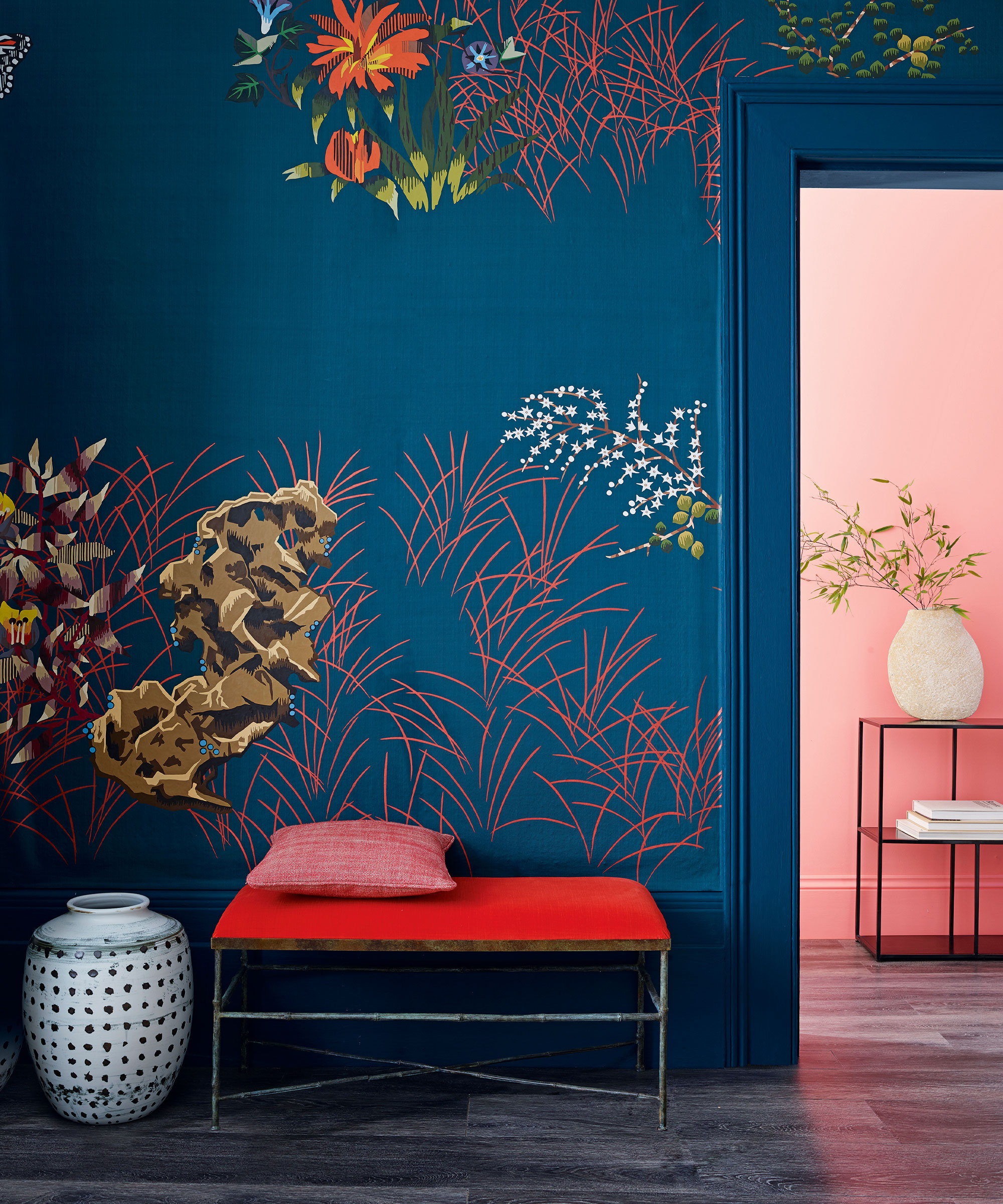
Split complementary color schemes uses one main color and two complementary ones. Split complementary rooms include the main color (above, blue), the complementary color (above, red) and a third color that's closely related to the second/complementary color (above, pink).
The contrast here is less stark than in a complementary room, so while it creates a bold look, it is tempered and calmer. To use the color scheme to create this scheme:
- Pick your main color.
- Look across the wheel to pick a complementary color
- Pick a third color adjacent to the complementary color.
4. Contrasting color schemes
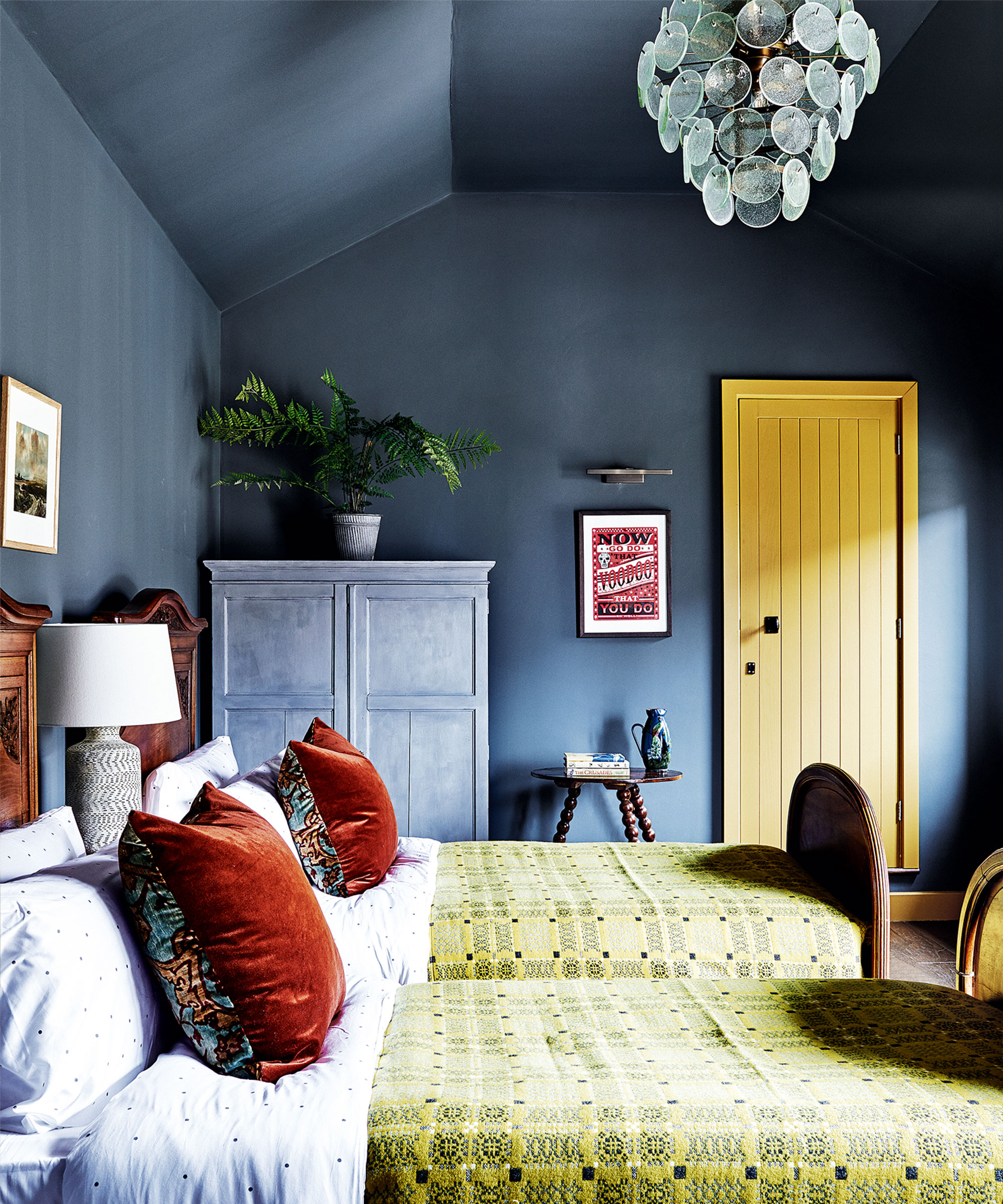
Contrasting color schemes use two colors from the opposite sides of the wheel, such as a bold color from one part of the color wheel (above, blue) and a lighter color from a different color family (above, yellow). These schemes can be used to create bold schemes. To use the color wheel to create this scheme:
- Choose a bold color from one part of the color wheel.
- Choose a lighter color from a different color family.
5. Triadic color schemes
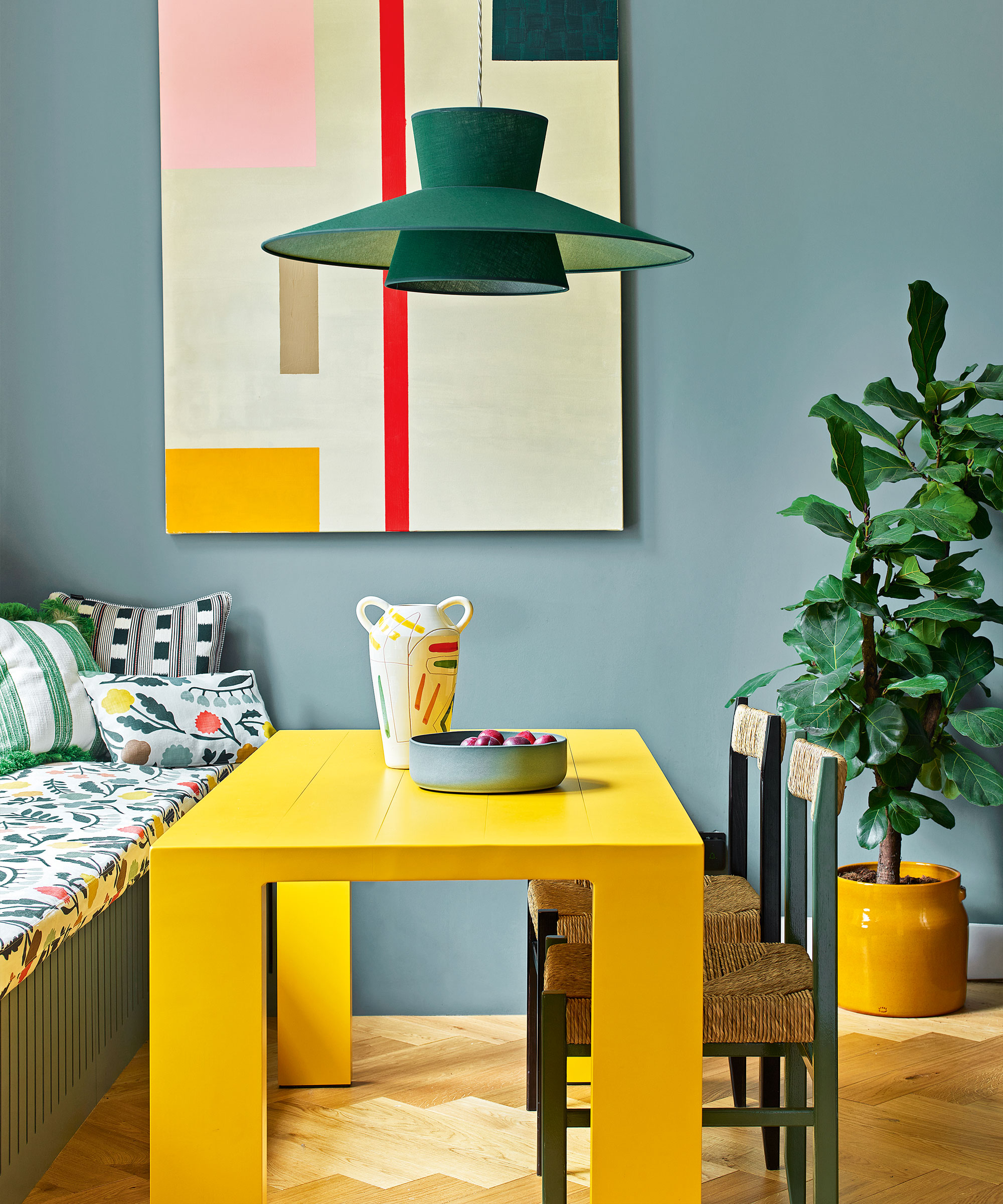
Triadic uses three colors from the color wheel, which might be contrasting, complementary or monochromatic. The finished scheme is bright and bold, but still harmonious. Here, you can see it in the blue, yellow and green:
What colors go well together in rooms?
If you follow the rules of the color wheel, you will discover a wide selection of palettes to choose from. Some of these combinations you will already be familiar with, while others you may not have come across before. These are just a few successful combinations:
- Yellow and green.
- Yellow and blue.
- Yellow and orange.
- Blue and red.
- Blue and green.
- Blue and orange.
- Blue and pink.
- Green and pink.
'Deciphering what colors go well together depends on where on the color wheel they sit', says Helen Shaw, of Benjamin Moore. 'Consider creating a monochromatic scheme which uses varying levels of saturation of one color. We would recommend using a paler shade of one and a darker hue of another.'
Below, we show you how the color wheel has been used to create some pleasing color combinations for rooms.
1. Pink and green
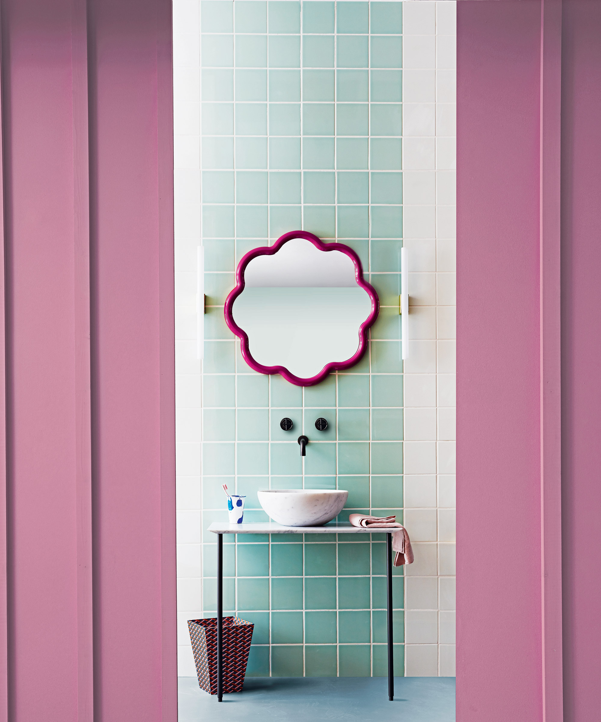
Decorating with pink? This contrasting scheme pits a pale aquamarine against a flamingo hued pink. Accessorized with a splash of rich fuschia pink on the mirror frame, the pale blue flooring gives it an air of a modern classic.
2. Monochromatic blues
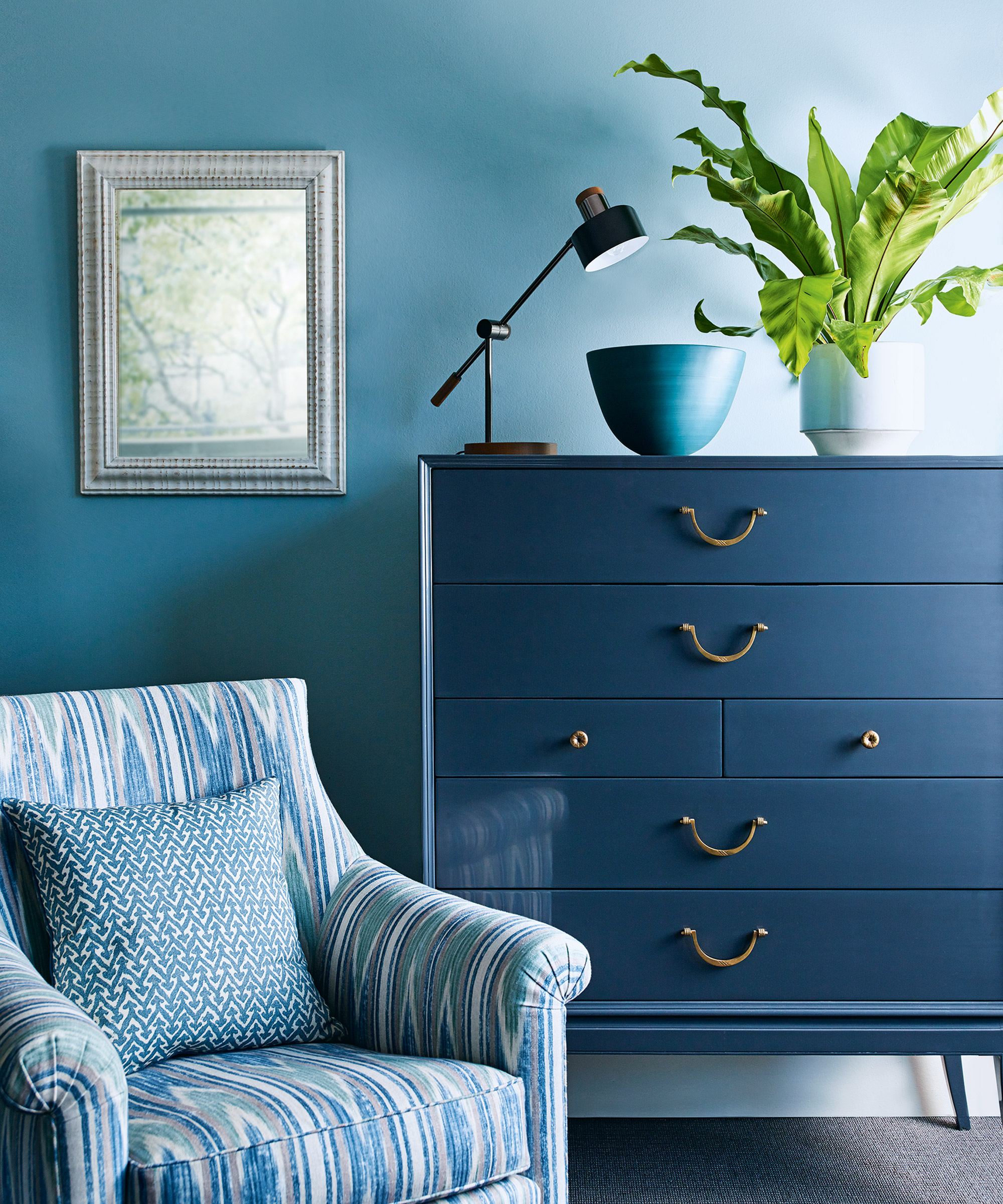
Using variations of one color is a calming approach. Here, decorating with blue on the chest of drawers makes a sophisticated backdrop to the lighter tinted powder blues of the upholstery, while the teal bowl adds an additional layer of color. This is a great combination for living room color ideas that you want to feel calming.
3. Monochromatic pinks
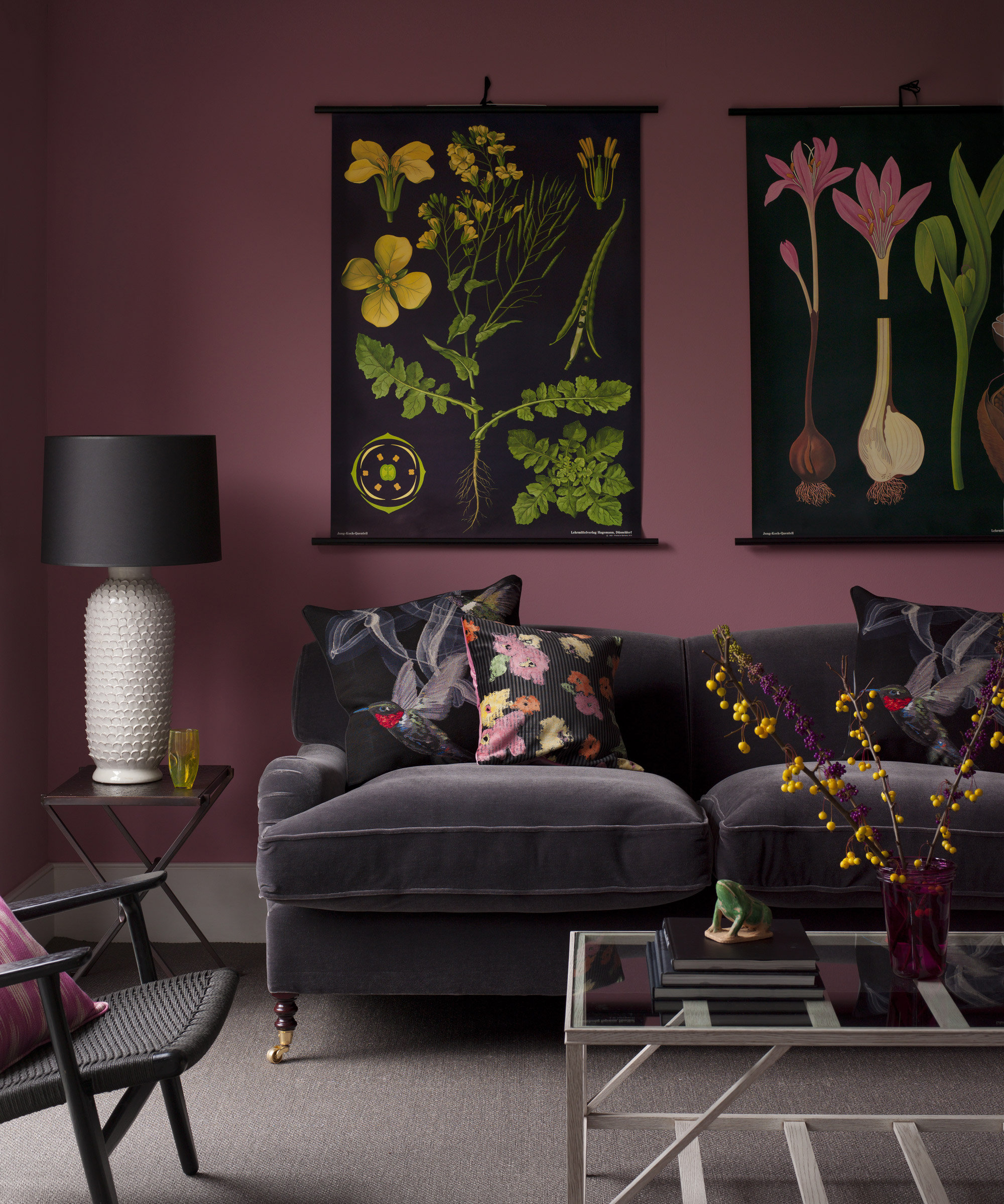
Purple room ideas are an unusual choice, but this harmonious living room color scheme utilizes a host of pink and purple shades to great effect. The rich aubergine color of the upholstery is echoed by the lampshade, while the plum walls wrap the scheme in warmth. Small splashes of pink and yellow lift the scheme from becoming too moody.
4. Green and blue
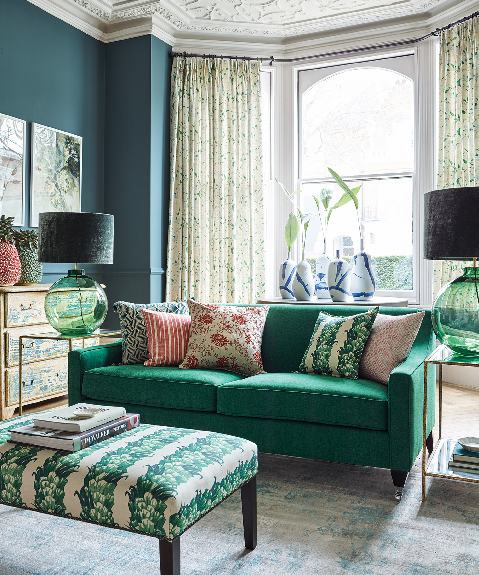
Decorating with green is fail-safe. ‘There there is no room where green doesn’t work’, says designer Suzy Hoodless. ‘One fallacy is about mixing blue and green – they can be seen together and I have paired these shades with great success in past projects.’
Green is on the cooler side of the color wheel, ranging from watery blues to deep forest greens, reflecting the world around us – sky, sea and earth. This palette can create a visually strong statement that is also warm and very easy to live with. A pleasing plain color paired with a welcoming pattern, is the perfect foundation for an inviting room scheme.
5. Green red and grey
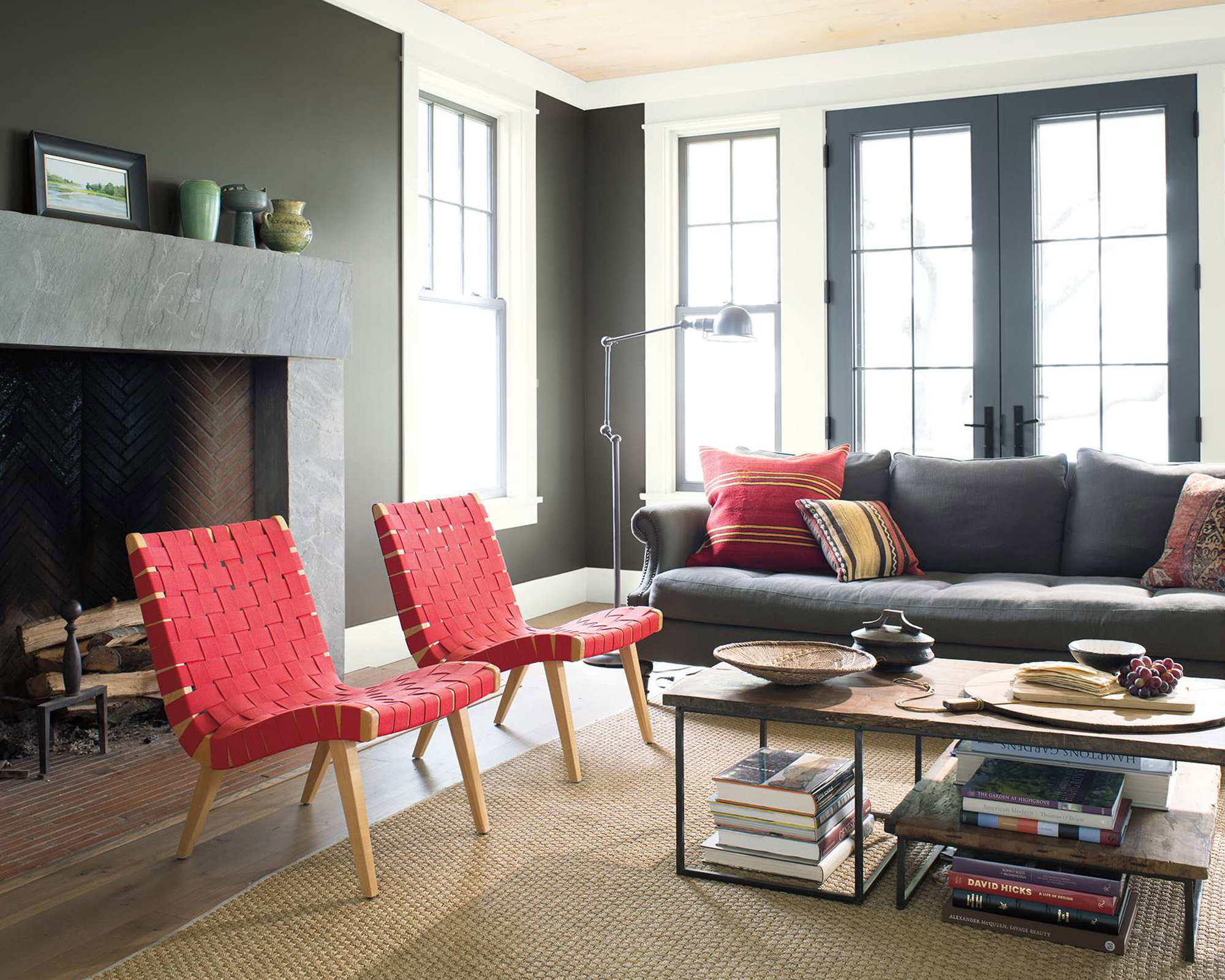
Decorating with grey is enduringly popular. A split complementary scheme, chosen from adjacent points on the color wheel. The deep green paint on the walls features deep gray undertones making a striking backdrop for a cast of vivid furnishings and accessories in appealing shades of red and coral.
6. Orange and blue
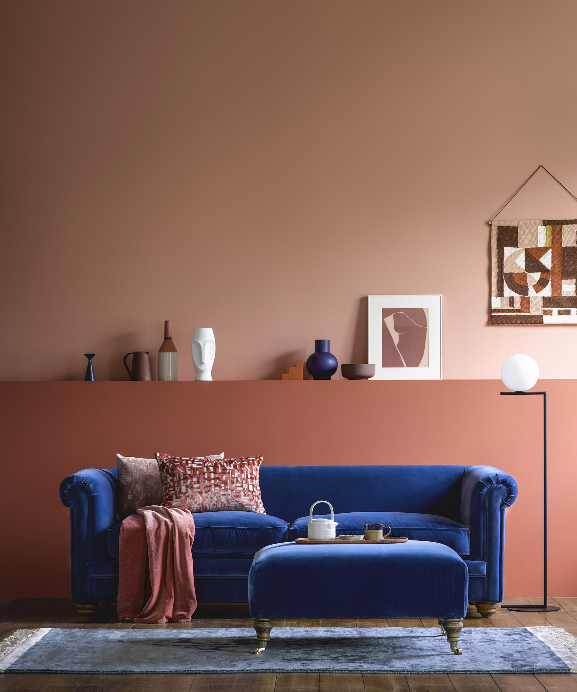
New neutral room ideas include spicy shades. In this living space, the tonal shade of terracotta on the wall provides a warm background for the bold royal blue sofa. Dashes of brown, terracotta and pink on cushions and artworks echo the wall colors, while the matching blue footstool and paler blue rug anchor the look.
7. Green, blue and white
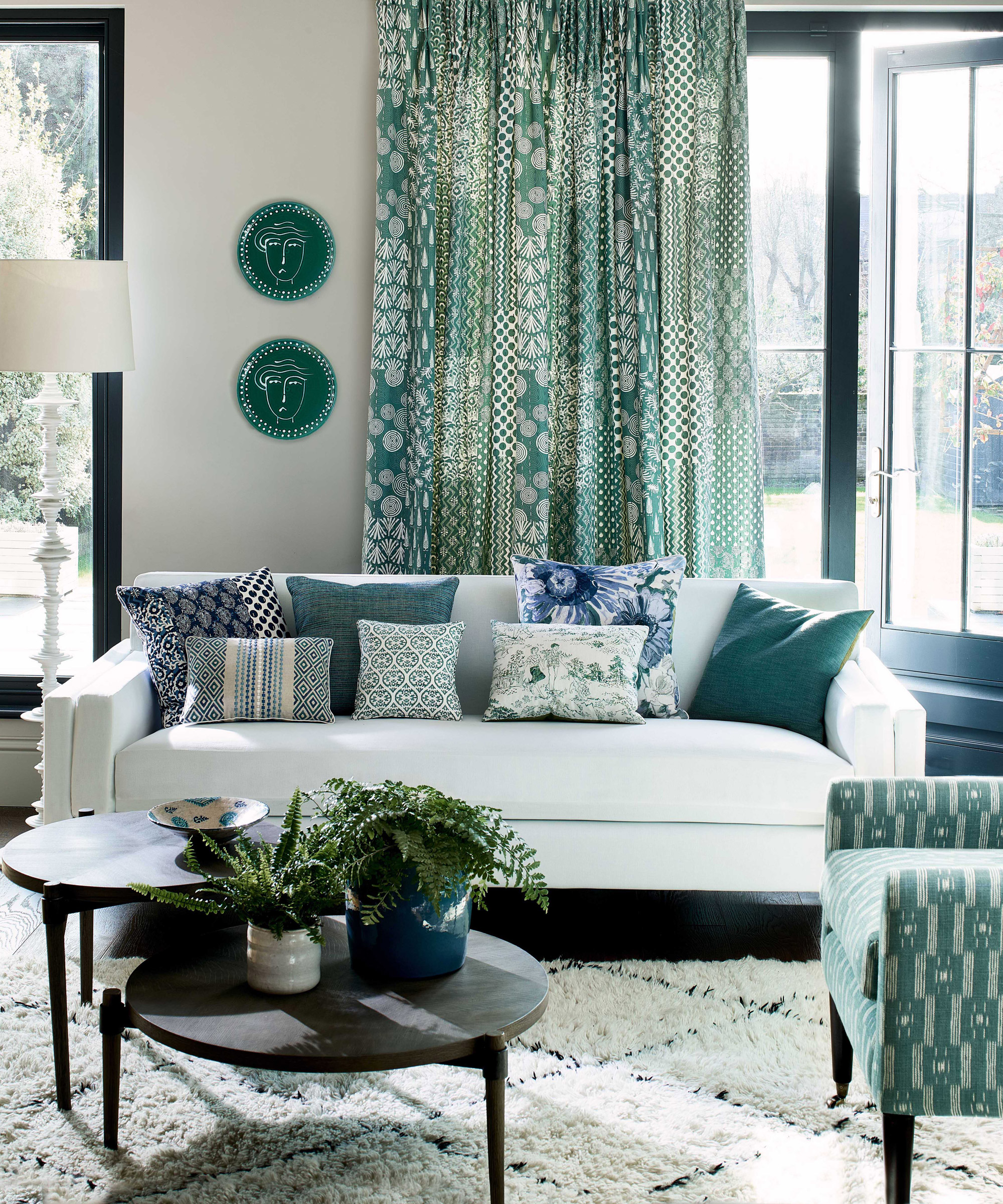
Green room ideas are always restful. Here, a clutch of green hues are combined in pattern, planting and upholstery, with a harmonious pop of blue. All are framed and grounded with strong black lines and pale cream walls.
8. Blue, green and pink
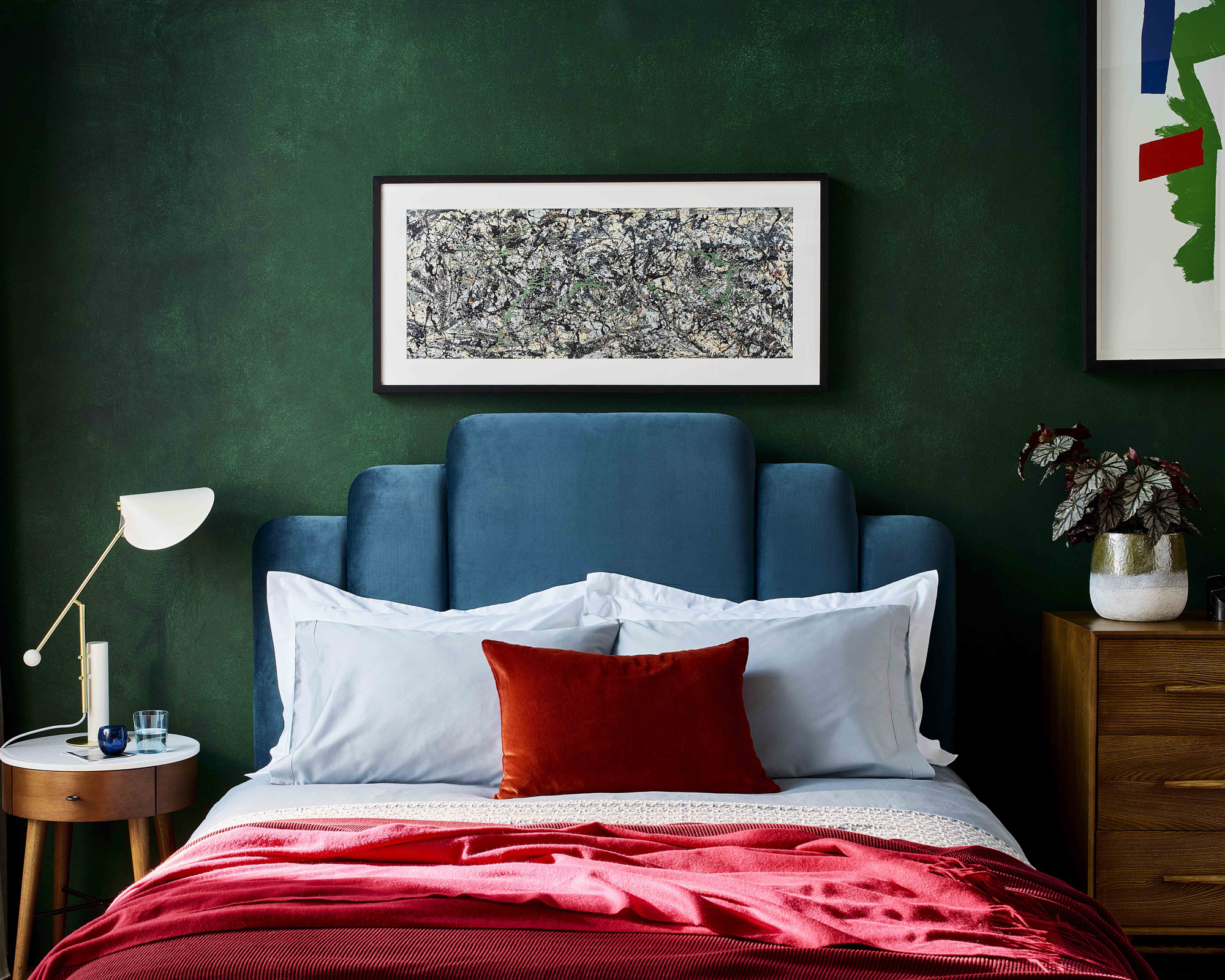
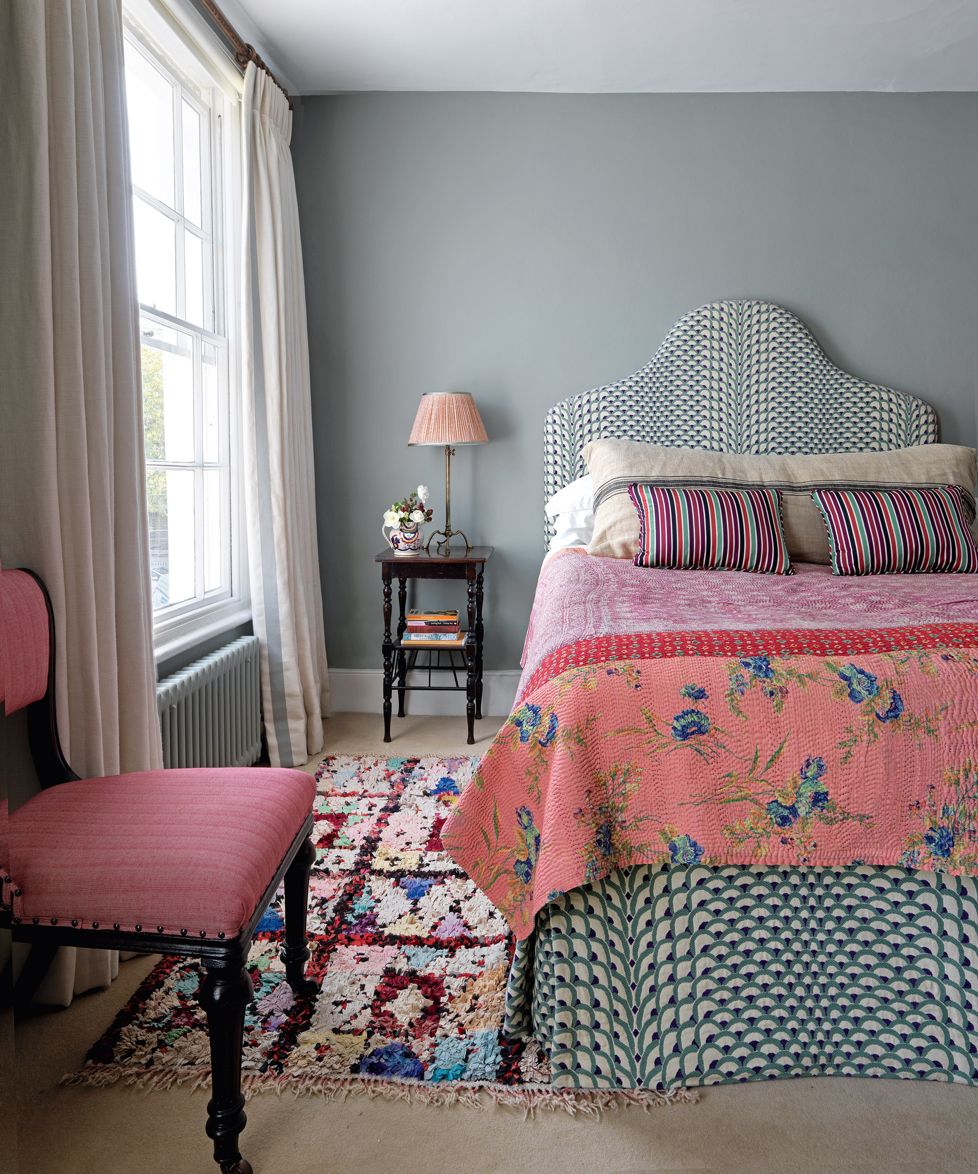
The rich, pink of the sumptuous bedspread is the dramatic focus of this bedroom. A classic split complementary scheme, the addition of the deep blue shade of the headboard and the forest green walls ensure a cohesive, cosy sophistication.
9. Blue and red
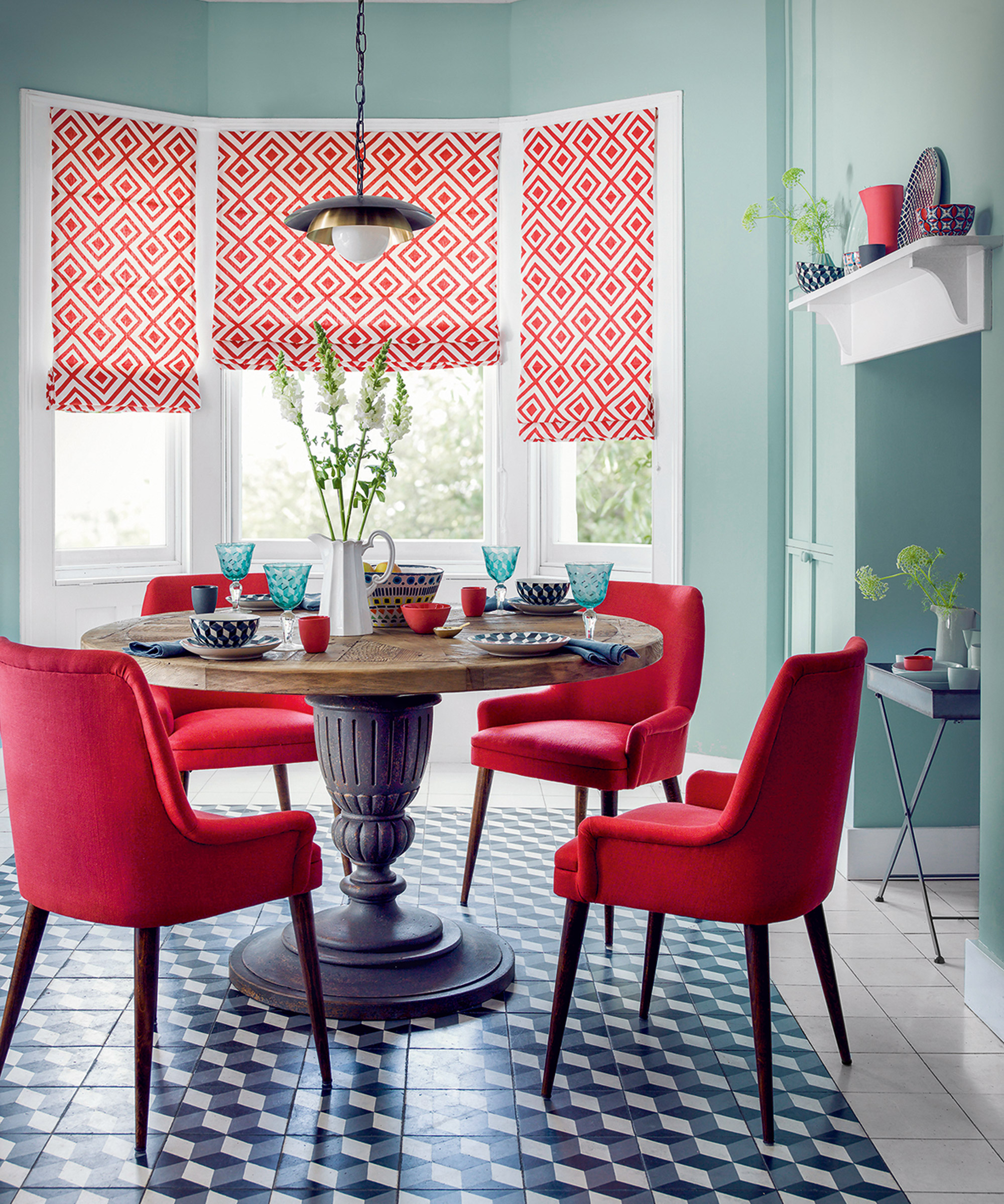
Decorating with red is tricky but complementary hues of vibrant red and cool duck egg prove a surprisingly fresh mix, against which geometric pattern in crisp monochrome lends a modern edge. The look is softened by the curves of the dining table and chairs.
10. Blue, green and yellow
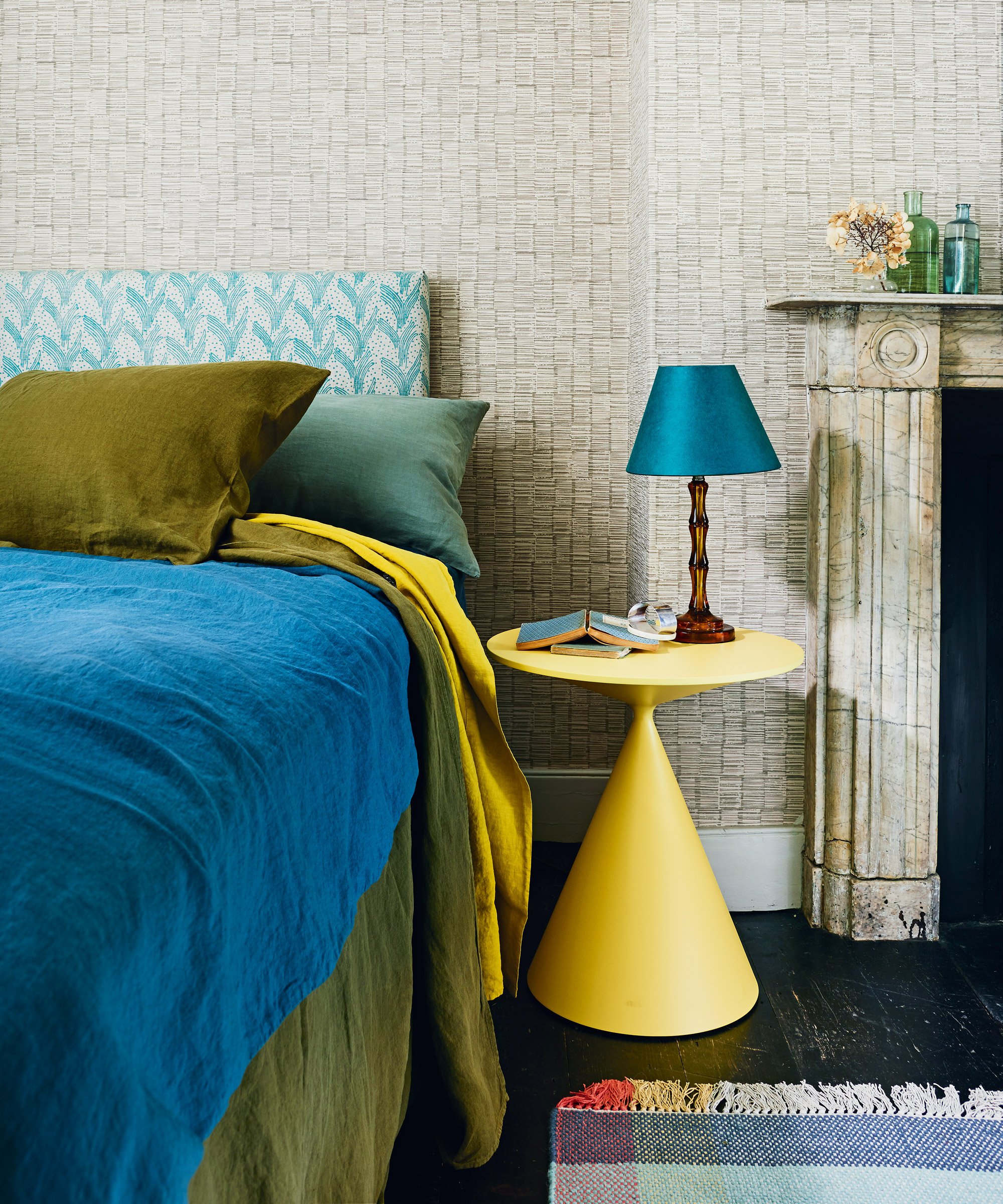
Yellow room ideas needn't be all-yellow. Utilizing colors from almost a third of the wheel, this harmonious scheme teams blocks of blue, yellow and olive green together for a calming effect. Patterned wallpaper in a neutral shade grounds the look, while the pale green pattern on the headboard gives it a fresh edge.
11. Pink and white
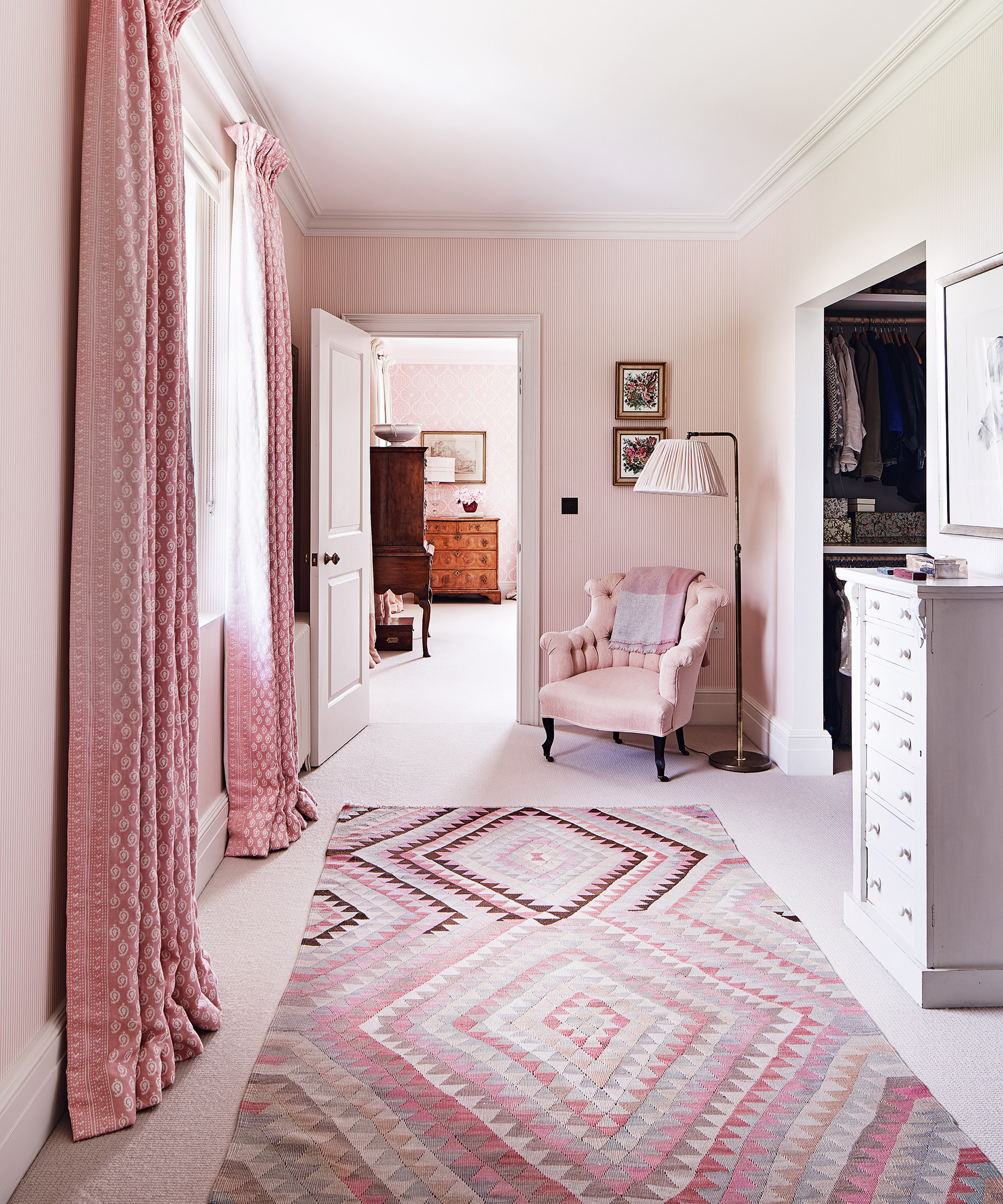
Powder pink walls and upholstery are given extra depth thanks to the accessories in this space. Rich pink curtains and a patterned rug in a plethora of pink hues, from pale pinks to almost red shades tie the tonal look together beautifully.
Now that you're armed with the knowledge of how to use the color wheel and how to mix colors, you'll be inspired to create your own perfect palettes.
What is color theory?
In essence, color theory is the application of art and science on decorating ideas. It uses the color wheel to explain how we see colors, the effects created by mixing colors, and how they match or contrast with each other, as well as how color can affect mood, generate emotions, soothe or aggravate. This is why using the color wheel to create different effects is important.
'Color undoubtedly has the power to make our homes look more beautiful,' says Dulux Creative Director, Marianne Shillingford. 'But it also has the power to change the way we feel about them and behave in them. It can connect spaces together as much as the people in them and it can make us rest better, work better and just feel better'.
While applying the theory of what color schemes combine well is pretty fail safe, it's important to consider what use the space has.
Ruth Mottershead, Creative Director at Little Greene agrees. 'For example, the kitchen is often the hub of the family home – usually a place of activity, the heart of family life and a place for entertaining friends. A kitchen therefore is an ideal place to make more adventurous color choices and certainly the space where you can really experiment with vibrant colors.'
'For more tranquil spaces like the bathroom, consider shades that exude serenity so you can create a haven within your home. For a scheme that provides you with a calm retreat, use colors with warm undertones that really bring comfort to a space.'
Color theory is also a great place to start when you are learning how to design a moodboard as it will help you to define the backbone of your design.
What's the difference between hue, tint and shade?
When discussing color, these three words are key. Frequently confused and used interchangeably, in reality they’re three distinctly different things.
A hue is the purest form of any color, whether it’s primary, secondary, tertiary or somewhere in between on the spectrum of colors on the wheel. Hues are very intense and are very dramatic, so they are usually lightened or darkened for the majority of decorating schemes to create a tint or a shade.
A tint or shade includes the addition of white or black to a color will create a tint or a shade. If you add some black to a hue, you create a shade and go darker. If you add white, you create a tint and go lighter.

Ginevra Benedetti is Associate Editor on the Homes Content Team at Future. She has been writing about interiors for the past 16 years on the majority of Britain’s monthly interiors titles, such as Ideal Home, Country Homes & Interiors and Style at Home, as well as Livingetc and of course, Homes & Gardens. This naturally lead her into writing for websites like HomesandGardens.com.
- Lucy SearleContent Director