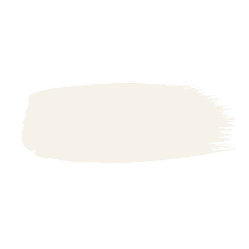
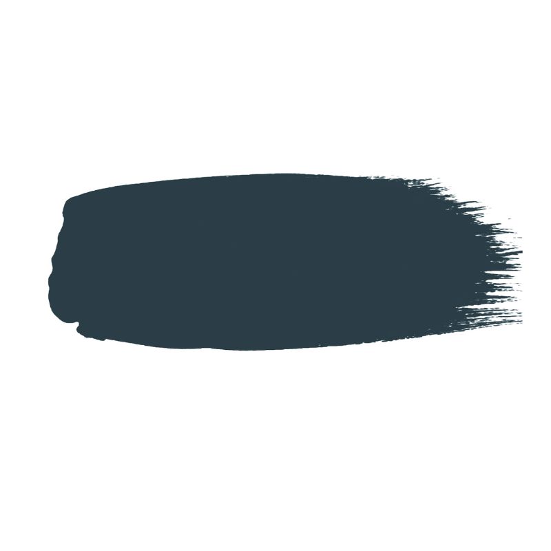
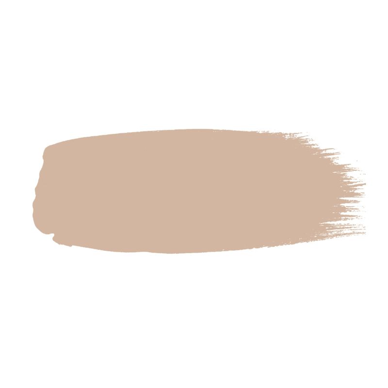
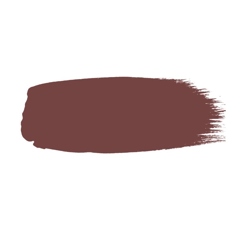
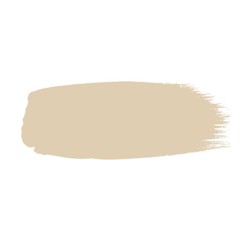
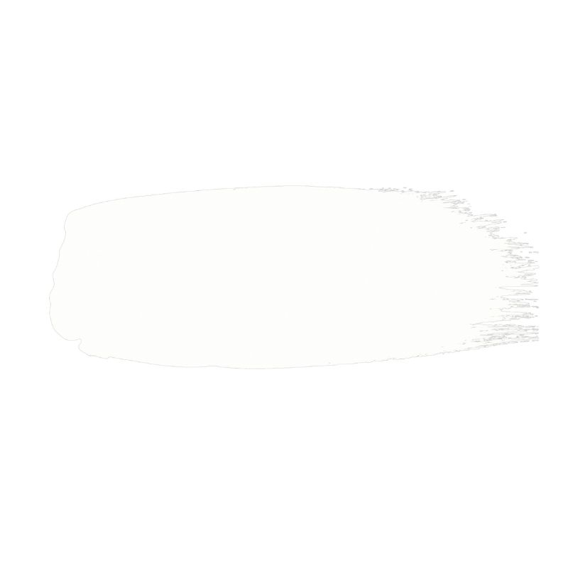
These are officially Little Greene's best-selling paint colors – 10 shades that range from delicate whites to rich and deep hues
Discover the most favored paint shades from the iconic British paint brand Little Greene

Design expertise in your inbox – from inspiring decorating ideas and beautiful celebrity homes to practical gardening advice and shopping round-ups.
You are now subscribed
Your newsletter sign-up was successful
Want to add more newsletters?
The iconic British paint brand Little Greene is one that's much-loved by interior designers and homeowners alike for its flattering range of paint colors, and its best-selling shades come as no surprise. It's made a quiet move from the U.K. to the States, so we are seeing more designers and homeowners using it in projects this side of the pond too.
Each of Little Greene's paint colors, which are often inspired by history and the brand's heritage – from the lightest of neutrals to colorful shades – have in common a liveability and a design-forward feel. An earthy quality also runs throughout its palette, allowing homes to embrace color in a way that feels sophisticated and timeless.
If you're on the hunt for fresh paint ideas for your home, Little Greene's best-selling paint colors will no doubt inspire, whether you prefer soft neutrals or richer colors. We spoke with Ruth Mottershead, Little Greene's creative director, to find out the top ten favorites to help you understand more about these shades and how to use them in your own room color ideas.
Article continues below1. Slaked Lime
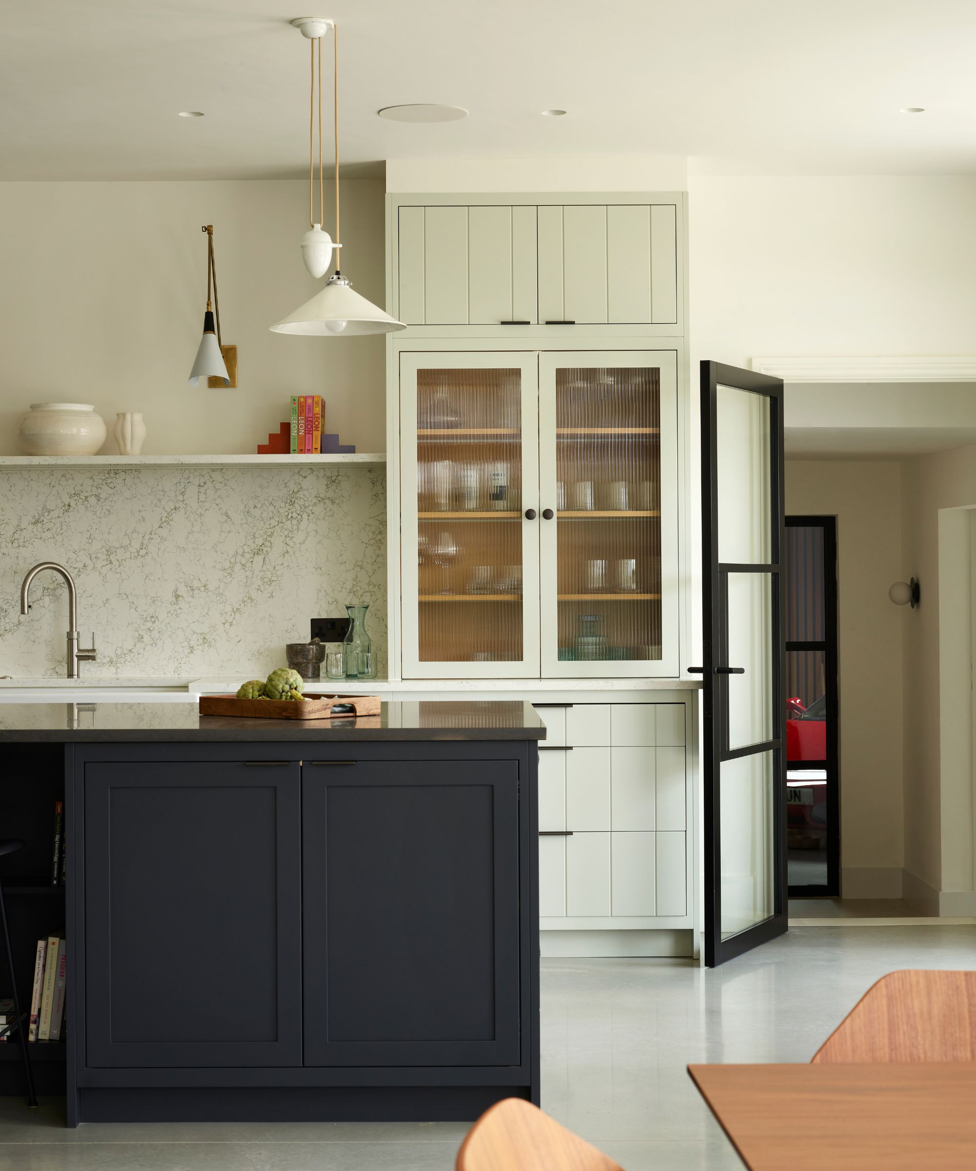
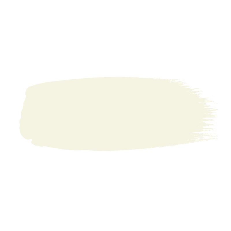
'Slaked Lime is a pure and neutral white paint made with a combination of minerals to give it a warm and soft appearance,' explains Ruth. This popular warm white paint was used on the walls in this kitchen designed by Owl Design, providing a pared-back yet warming backdrop for the richer kitchen cabinets and kitchen island.
'Slaked Lime pairs beautifully with its tonal variants: Slaked Lime – Mid and Slaked Lime – Deep,' Ruth adds – both of which will create a layered neutral scheme with depth. Alternatively, go bolder with your color pairings and team this popular white with darker hues, suggests Ruth: 'Pair Slaked Lime with the dark gray Scree for a contrasting finish. Or create a playful, fresh playroom using Slaked Lime alongside Pale Lime, Brighton, and Marigold.'
2. Hicks' Blue
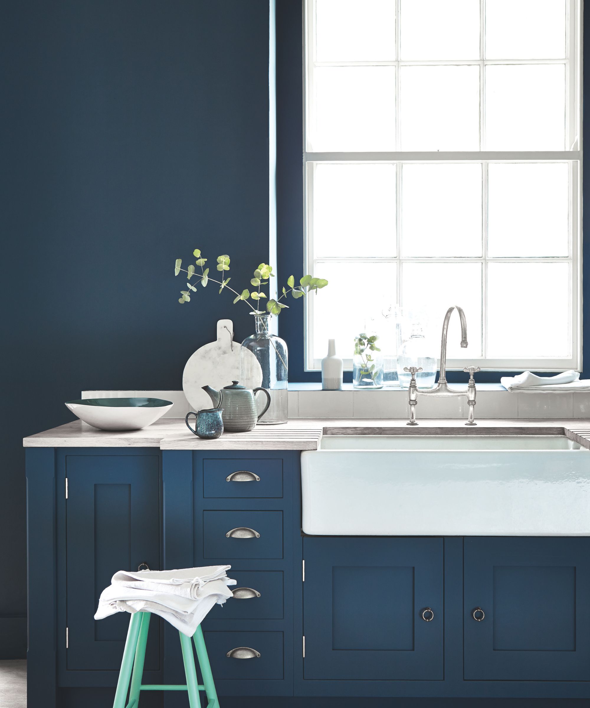
The deepest of Little Greene's most popular shades, Hicks' Blue is a dark blue paint that adds moodiness and sophistication to rooms. 'Hicks' Blue is a deep inky blue paint by prominent '60s and '70s designer, David Hicks,' says Ruth. 'Hicks was known for using powerful colors in combination to dramatic effect.'
While dark shades such as this one can feel vibrant when paired with playful hues, they can also come across as relaxing when used with color-drenching ideas. 'Inky blue tones like Hicks' Blue can be used in many different schemes, from bold and dramatic when paired with zesty greens or cherry reds, to serene and restful due to its receding quality which is great for living spaces, bedrooms, and hallways,' Ruth adds.
Design expertise in your inbox – from inspiring decorating ideas and beautiful celebrity homes to practical gardening advice and shopping round-ups.
3. Masquerade
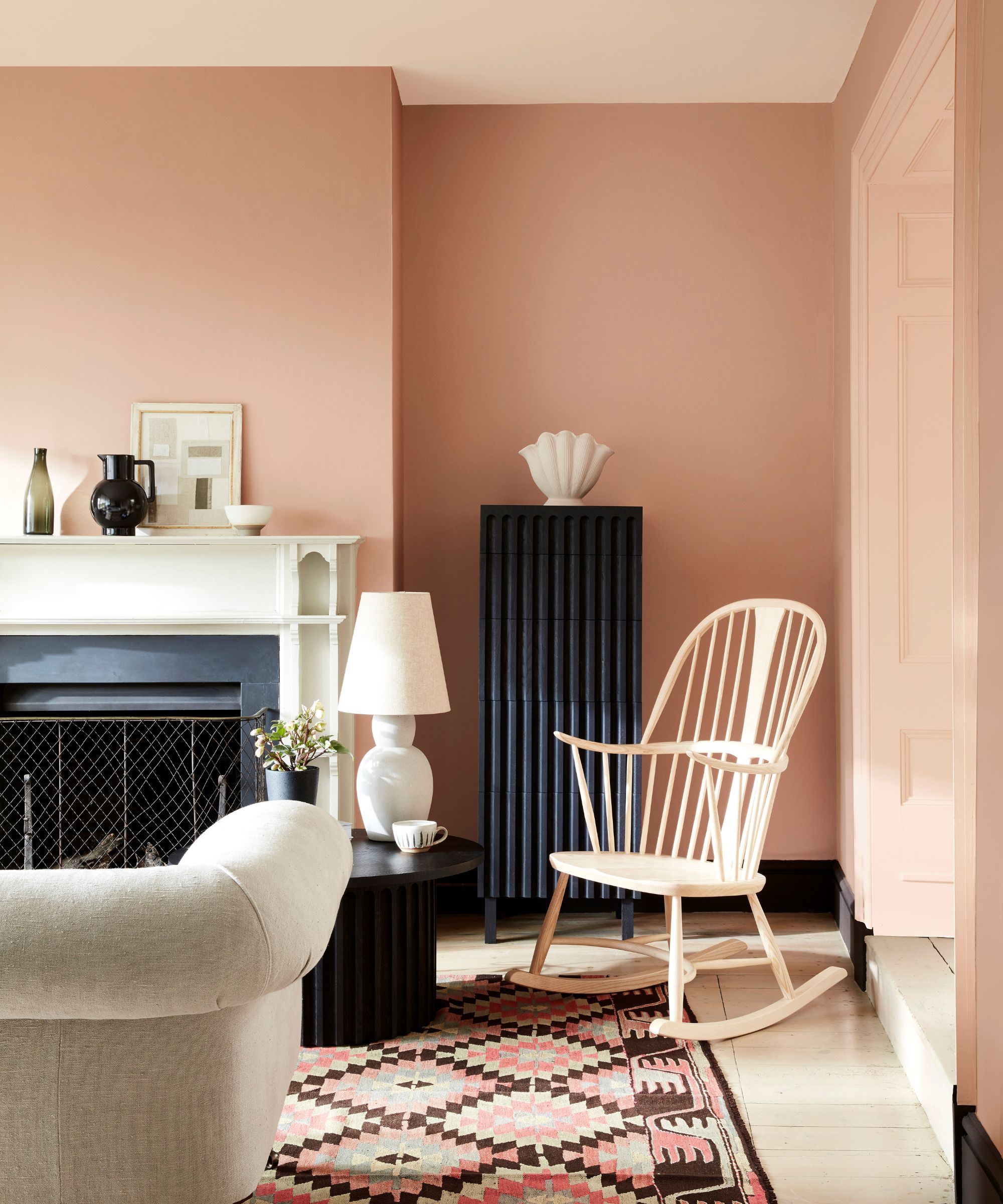
'Masquerade provides warmth to a space whilst remaining light and airy, making us feel uplifted and calm,' Ruth says of this popular plaster pink paint.
When decorating with this warming hue, creating a tonal look by using variations of it, Masquerade – Light and Masquerade – Mid, is recommended by Ruth: ‘These color scales of the earth-pink Masquerade offer graduated tones made using the same pigments, but in different strengths, allowing for the creation of a harmonious design scheme that provides movement within a space. They are easy to use in combination on walls, ceiling, and trim, as well as providing a seamless color journey from room to room.'
'For something bolder, you can highlight architectural features or areas of interest by using vibrant, contrasting colors,' Ruth continues. 'Tuscan Red or Bronze Red will work fantastically alongside Masquerade to add drama to a space, whilst delicate white Julie’s Dream would work beautifully in place of a pure white to bring a sense of harmony.'
4. Arras
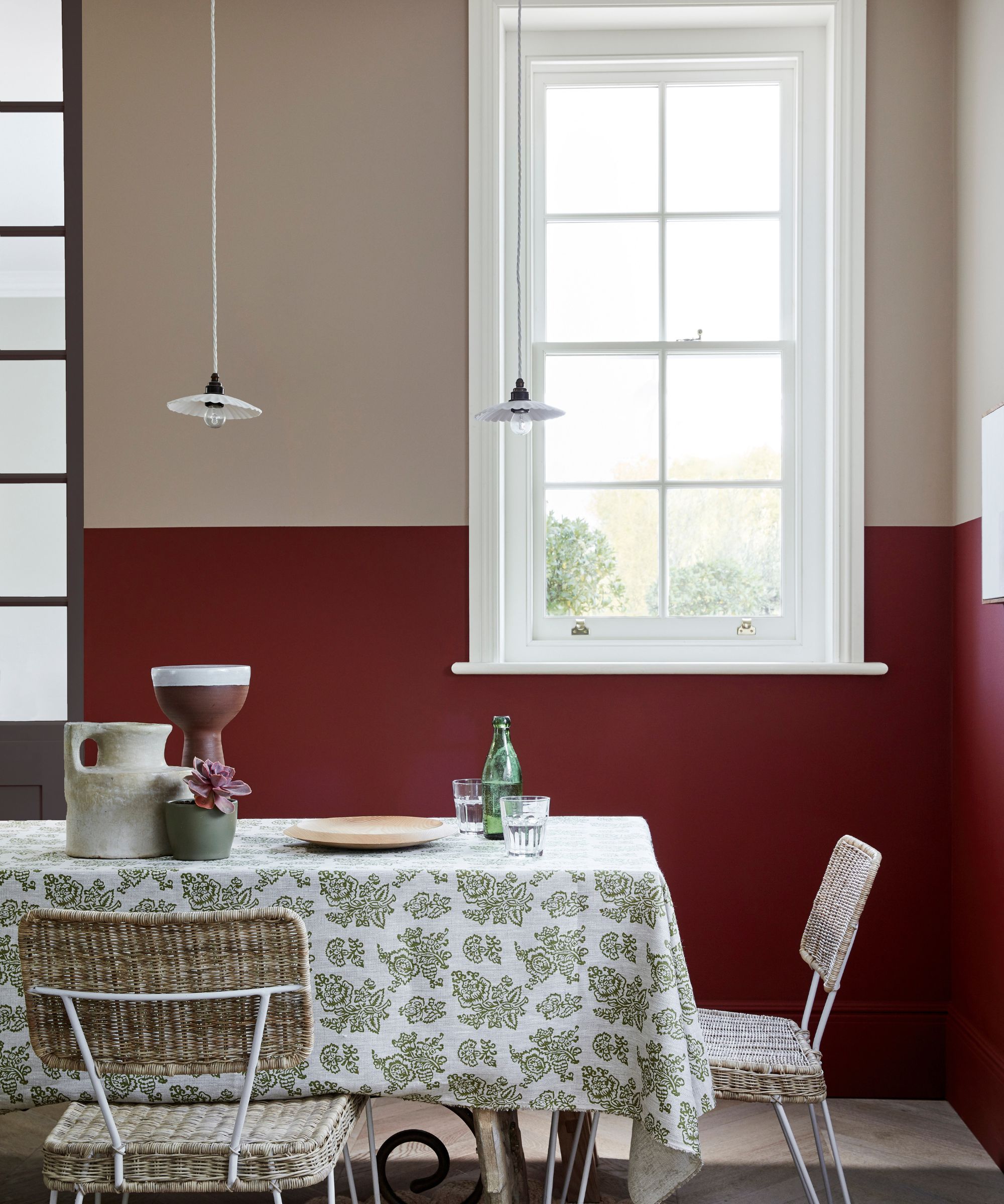
Decorating with red can be incredibly saturated and vibrant, but Arras, another of Little Greene's most popular paints, offers depth with a muted quality so it doesn't overwhelm rooms.
'For coziness, choose Arras, which is both comforting and soothing, helping you relax into your space,' Ruth says. To keep the scheme calming, take inspiration from this dining room and pair it with warm neutrals, or take this color all over to include the walls, ceiling, and woodwork for an all-encompassing, cocooning feel that's perfect for snug rooms.
5. Garden
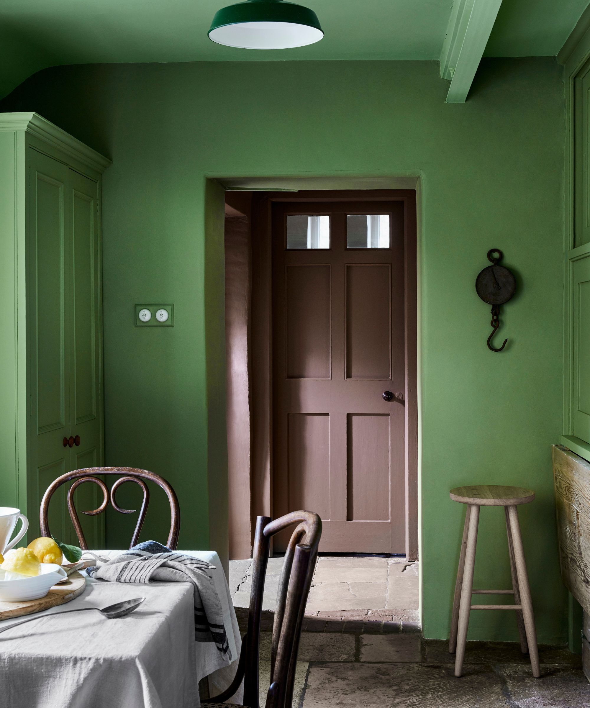
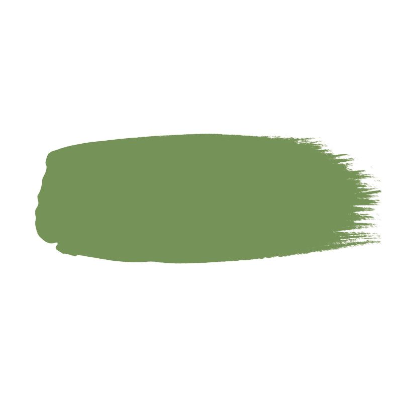
Green paints also feature within Little Greene's most favored shades, with Garden, an uplifting shade that feels both colorful and soothing. 'Garden sits comfortably in any interior scheme because of its relationship with the natural environment and our longing to bring the outdoors inside,' shares Ruth.
'We feel soothed by green and its neutral base – it is neither too warm, nor too cool. It is the perfect tone for living rooms, kitchens, and dining spaces, with enough strength to create an impact and provide energy to a space, but muted enough to provide a little peace within a room,' adds Ruth.
6. French Grey
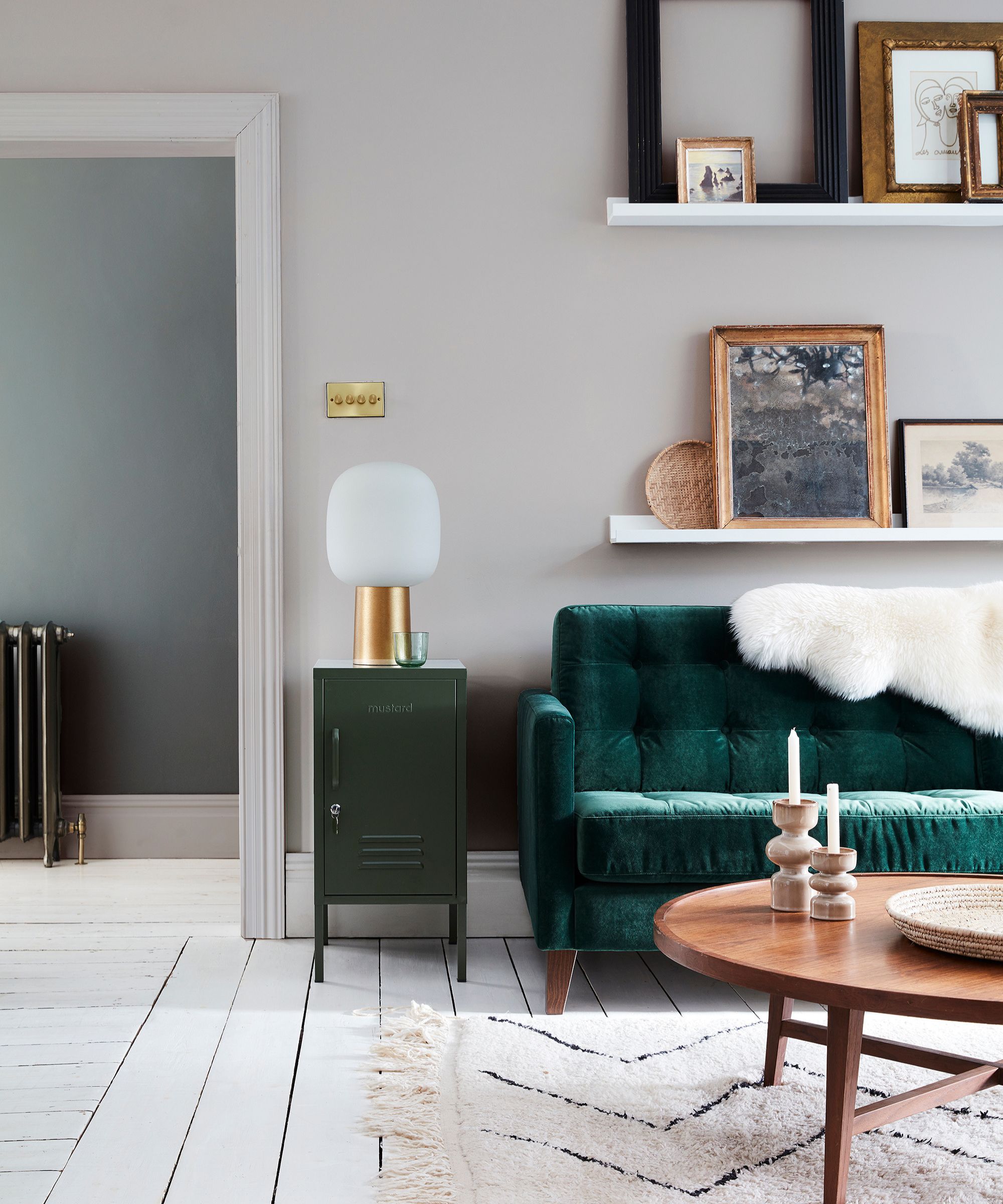
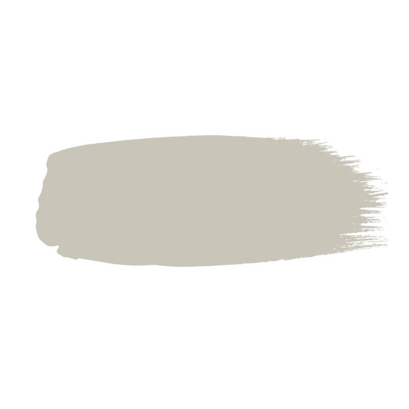
'Gray has been at the root of historical decoration for centuries, and it remains a timeless staple that people turn to for its ease of use,' says Ruth. 'Colors such as French Grey remain ever popular; this mid-tone is easy to scheme with a myriad of colors, and is a go-to color for many.'
A versatile and timeless neutral, French Gray is a soft and stylish way to decorate with gray, allowing the rest of a room's decor to shine. 'This cool white will work well in hallways or spaces where you might want more focus, such as a kitchen or a home office. If you want to add a bit of color and avoid the room looking too stark, cooler whites will pair well with blue and green accents for a contemporary and clean feel,' Ruth advises.
7. Middle Buff
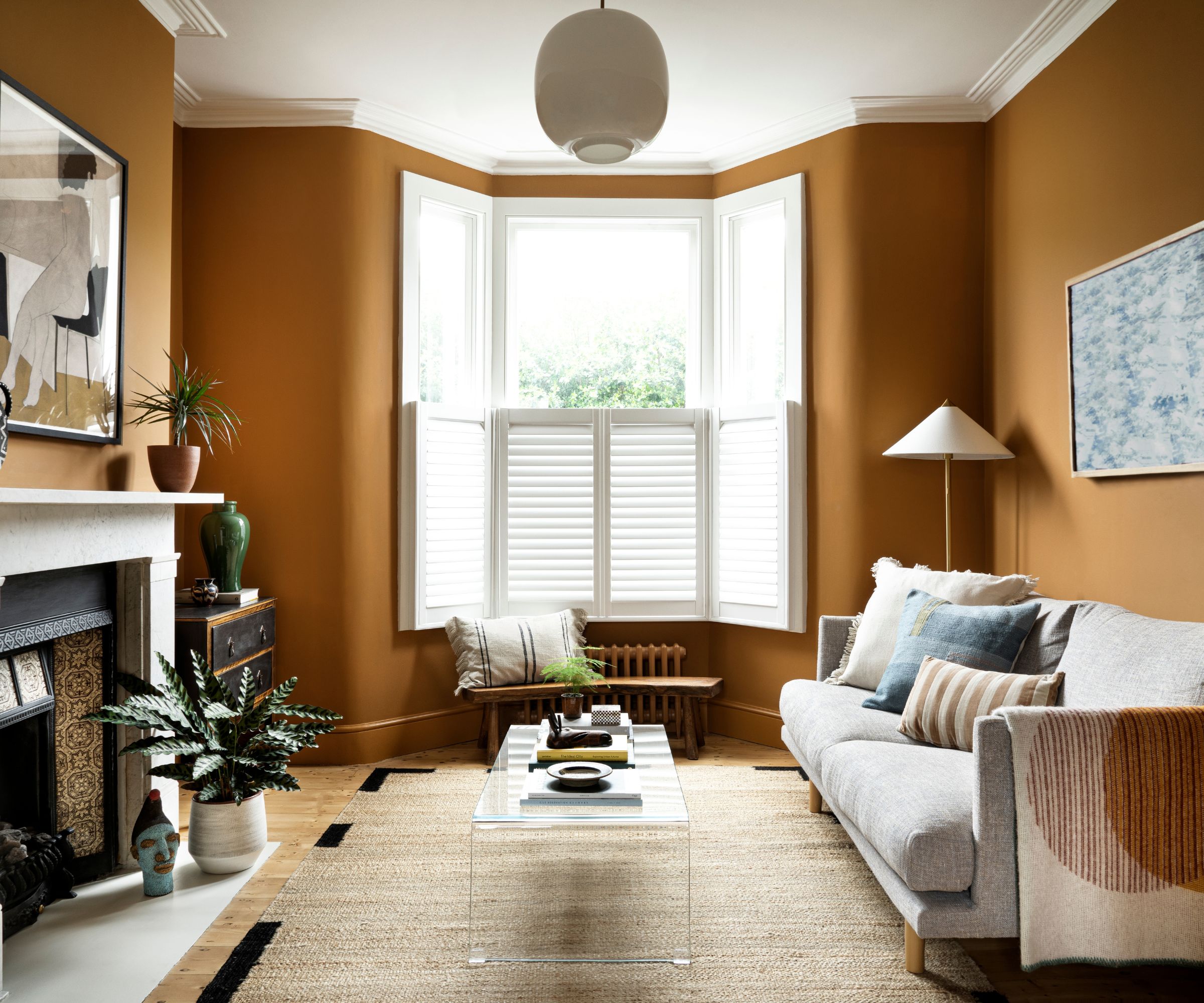
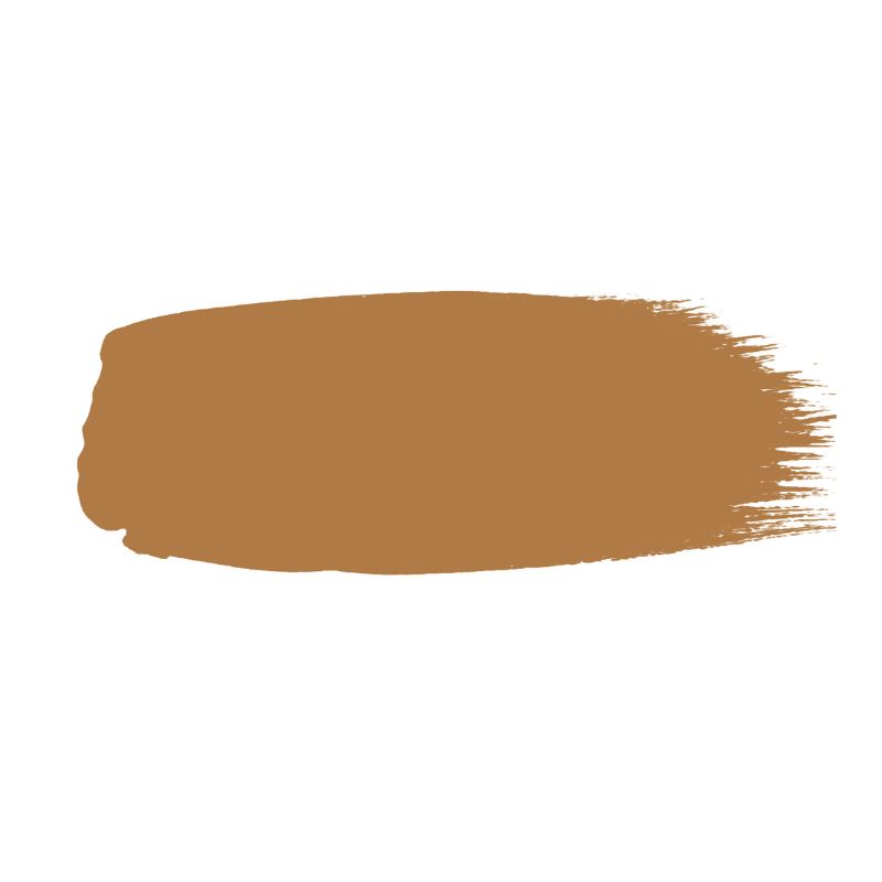
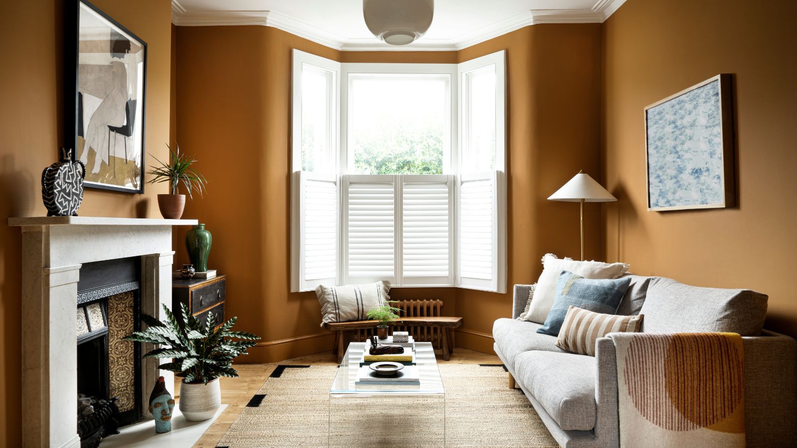
'The perfect shade for a hallway, kitchen, living space, or front door, yellow provides a warm invitation to any home. It creates a feeling of warmth and coziness,' explains Ruth. And while yellow paints can sometimes be jarring, Middle Buff is a rich and warming variation that offers sophistication.
In this living room, interior designer Leo Wood of Kinder Design achieved a soothing and refined interior by teaming Middle Buff with white, but Ruth adds that you could take this paint shade bolder with more daring color combinations:
'Middle Buff, an intriguing, deep neutral color, makes a surprising and grounding partner to stronger yellows. Use Middle Buff on the ceiling and Affogato on woodwork with the cheerful Yellow Pink on the walls to create a captivating scheme with depth and dimension.'
8. Silent White
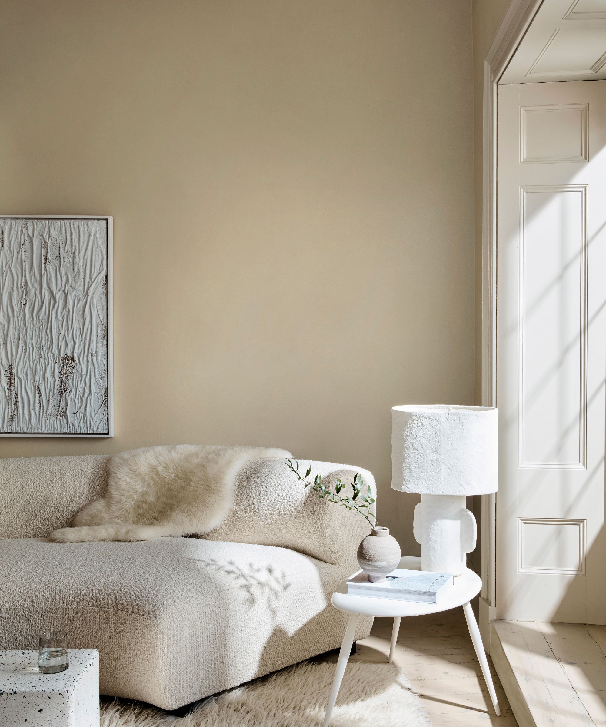
Another of Little Greene's most favored white paints is Silent White, a warming neutral that creates an inviting yet pared-back scheme. 'Formulated in the quest for the perfectly balanced, neutral-warm white for a calm interior, Silent White adds softly spoken depth to an interior,' Ruth explains. 'Used in partnership with its lighter and deeper versions – Silent White – Pale, Silent White – Mid, or Silent White – Deep – on other walls, ceiling, or trim, creates a serene, neutral, and inviting space.'
9. Travertine
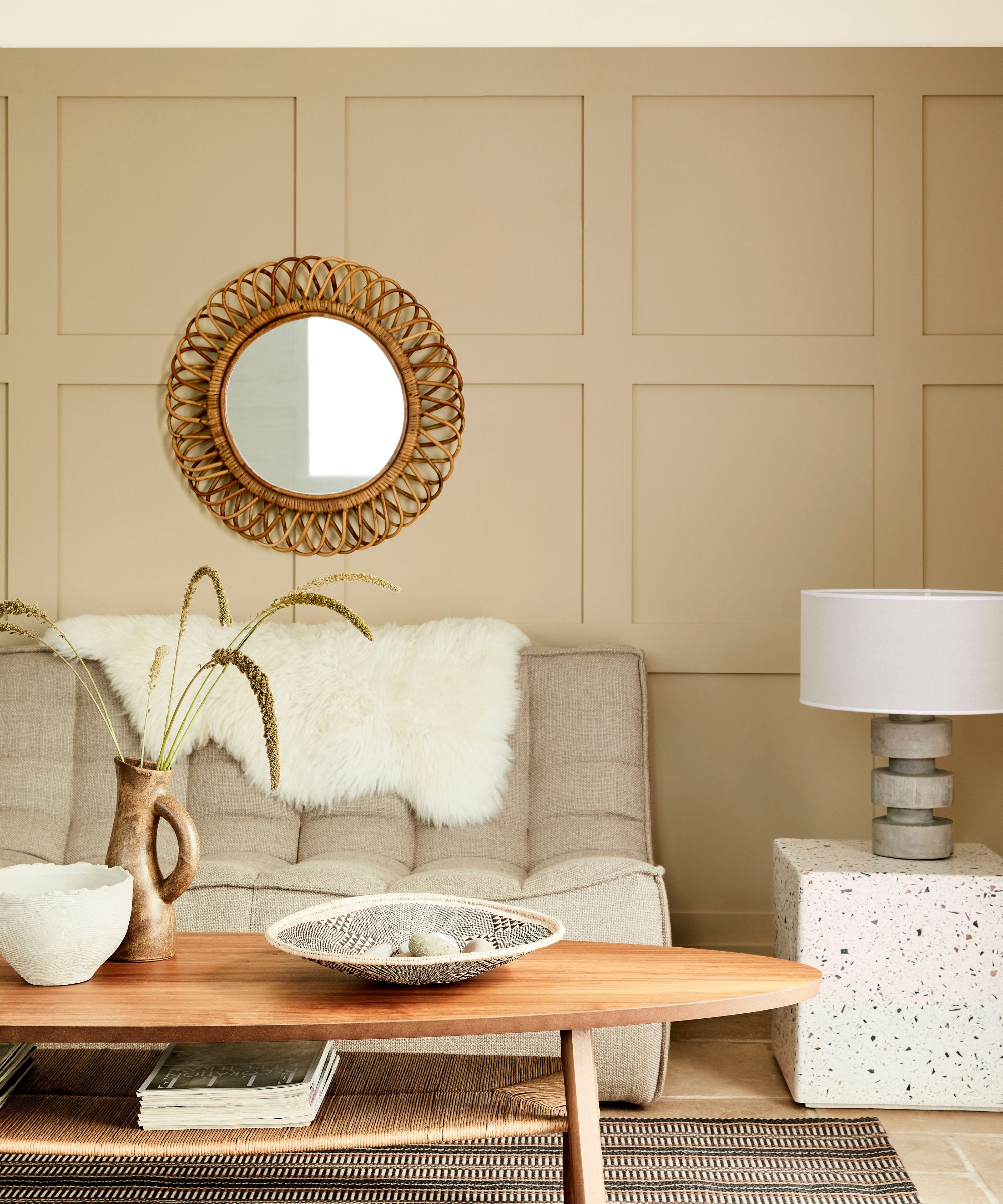
Little Greene's most popular neutral paints include Travertine, a warming and earthy neutral that offers a cozy feel, whether used in living rooms, hallways, or bedrooms.
'Natural neutrals in earthier tones that have an inherent warmth to them, such as Travertine, work beautifully alongside stone and marble hues,' says Ruth. 'Pair Travertine with a lighter tone that has the same base pigment, such as Travertine – Light. The slight tonal change will provide a gentle contrast whilst adding depth.'
10. Loft White
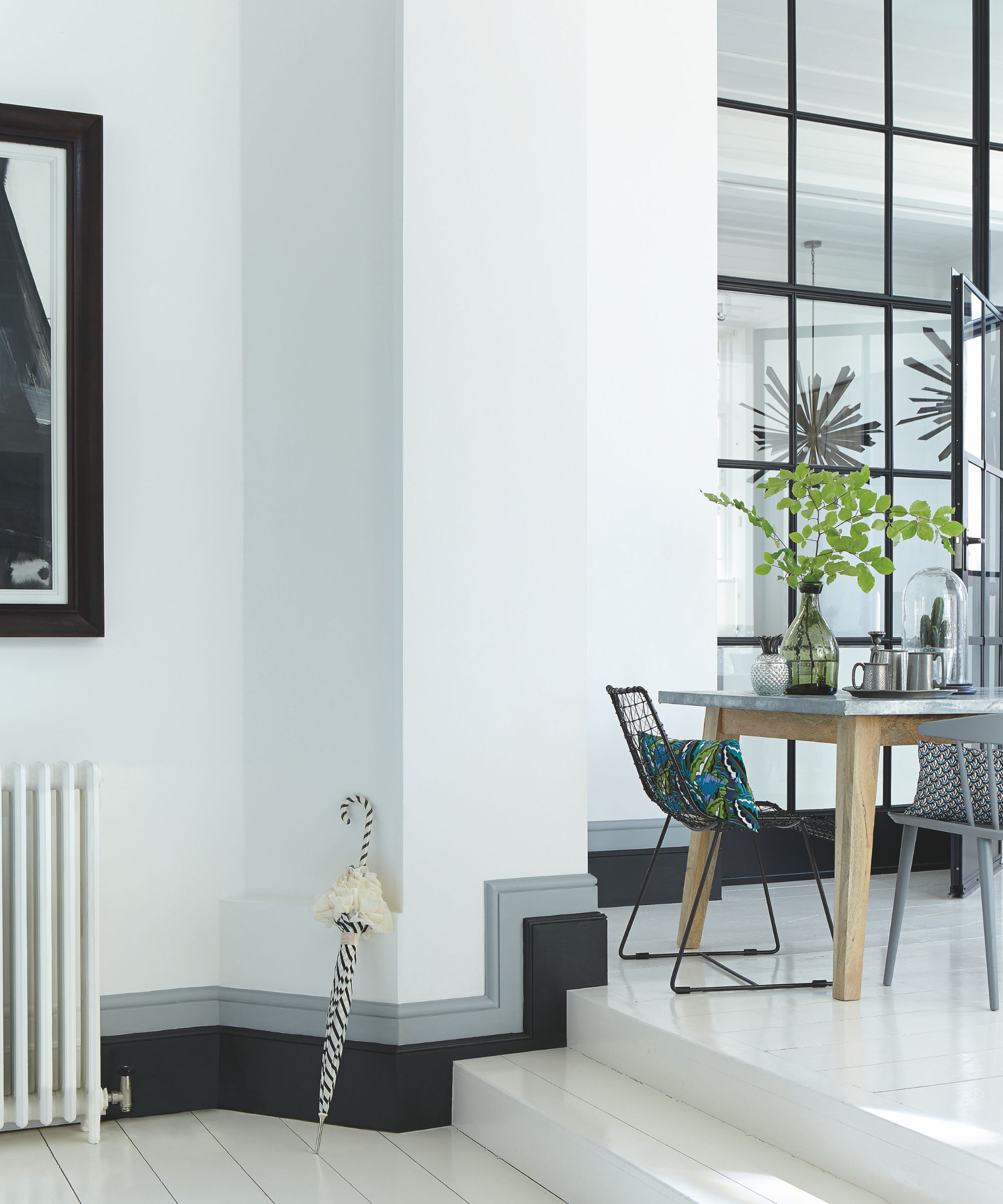
While warm whites and off-whites have in recent years become favorites for creating an inviting space, sometimes a more pure white is what's needed to achieve a light and airy look, especially in well-lit south-facing rooms.
'Almost pure white – Loft White can be used in place of brilliant white, which aggravates the eye,' Ruth says. 'Use this white paint shade indoors or outdoors to add a fresh look to your walls, woodwork, or furniture.'
While neutrals are clear favorites among Little Greene's best-selling paint colors, richer and darker hues such as Arras and Hicks' Blue are equally popular, proving that bolder hues can be just as liveable when you choose a well-balanced shade. For more inspiration, take a look at Little Greene paint colors in real homes to see certain shades in situ.

Emily is a freelance interior design writer based in Scotland. Prior to going freelance in the spring of 2025, Emily was Homes & Gardens’ Paint & Color Editor, covering all things color across interiors and home decor for the Homes & Gardens website. Having gained specific expertise in this area, Emily is well-versed in writing about the latest color trends and is passionate about helping homeowners understand the importance of color psychology in home design. Her own interior design style reflects the simplicity of mid-century design and she loves sourcing vintage furniture finds for her tenement flat.
