Sherwin-Williams Vs Benjamin Moore – which iconic paint brand is best for your project?
Both are giants in the paint world, but choosing between Benjamin Moore and Sherwin-Williams can feel like picking sides. Here, we explore what each brand does best, according to the designers who rely on them

Design expertise in your inbox – from inspiring decorating ideas and beautiful celebrity homes to practical gardening advice and shopping round-ups.
You are now subscribed
Your newsletter sign-up was successful
Want to add more newsletters?
Whether you're refreshing a single room or decorating an entire home, choosing the right paint brand can feel surprisingly high-stakes. With color, finish, and performance all playing a role, and thousands of shades to choose from, it’s no wonder that two names consistently rise to the top: Benjamin Moore and Sherwin-Williams.
Here, we speak to interior designers to understand how these best paint brands stack up. Their answers reveal that while both companies have loyal followings, they each offer something distinct in terms of color, usability, and finish, and that understanding these nuances is the key to making the right choice for your home.
Why do designers love Benjamin Moore paints?
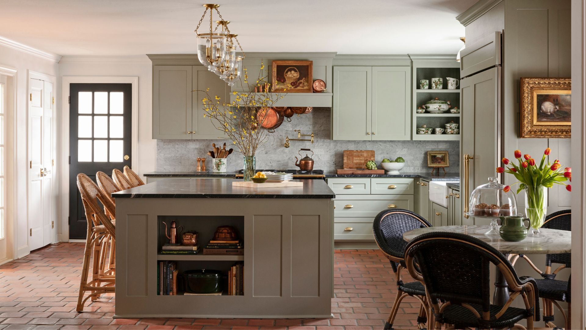
Kitchen painted in Newburg Green, Benjamin Moore
Benjamin Moore has built a reputation for color first. Designers often cite the brand's palette as one of the most refined and nuanced on the market. 'Benjamin Moore is synonymous with timeless elegance and quality,' says Arizona-based interior designer Stephanie Larsen. 'There’s a depth and sophistication to their palettes that feels elevated and intentional.' This idea of depth came up repeatedly when I spoke to designers about Benjamin Moore paints.
Article continues belowFor New York-based interior designer Russell Goldman of More Wow, it’s one of the key reasons he tends to reach for Benjamin Moore most often, particularly for rich earth tones, subtle neutral paints, and layered whites.
'Those colors have a softness that really shows up in a luxury space,' he says. Benjamin Moore’s popular Aura line is also consistently singled out for its high-end feel, praised for its velvety matte finish and excellent coverage – qualities that make it a favorite for home interiors with a sense of polish and intentionality.
What are the pros and cons of Benjamin Moore?
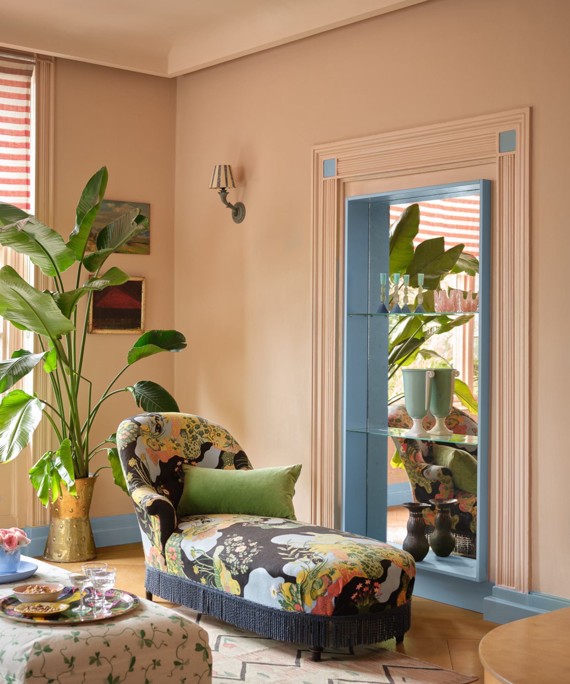
Walls painted in Desert View by Benjamin Moore
Another frequent point of praise is Benjamin Moore’s wide offering of historical, designer-curated, heritage-inspired collections, a perfect example of which is the Benjamin Historical collection. These palettes feel bespoke, often appealing to those designing period interiors and decorating homes with architectural pedigree.
However, Benjamin Moore isn’t without its drawbacks. Its availability can be inconsistent depending on location, since it’s sold through independent retailers rather than brand-owned stores. This can mean a longer lead time to get samples or touch-up gallons, particularly in more rural or fast-paced projects. 'Sometimes it just comes down to logistics,' Larsen notes. 'Benjamin Moore is beautiful, but Sherwin-Williams is often more available.'
Design expertise in your inbox – from inspiring decorating ideas and beautiful celebrity homes to practical gardening advice and shopping round-ups.
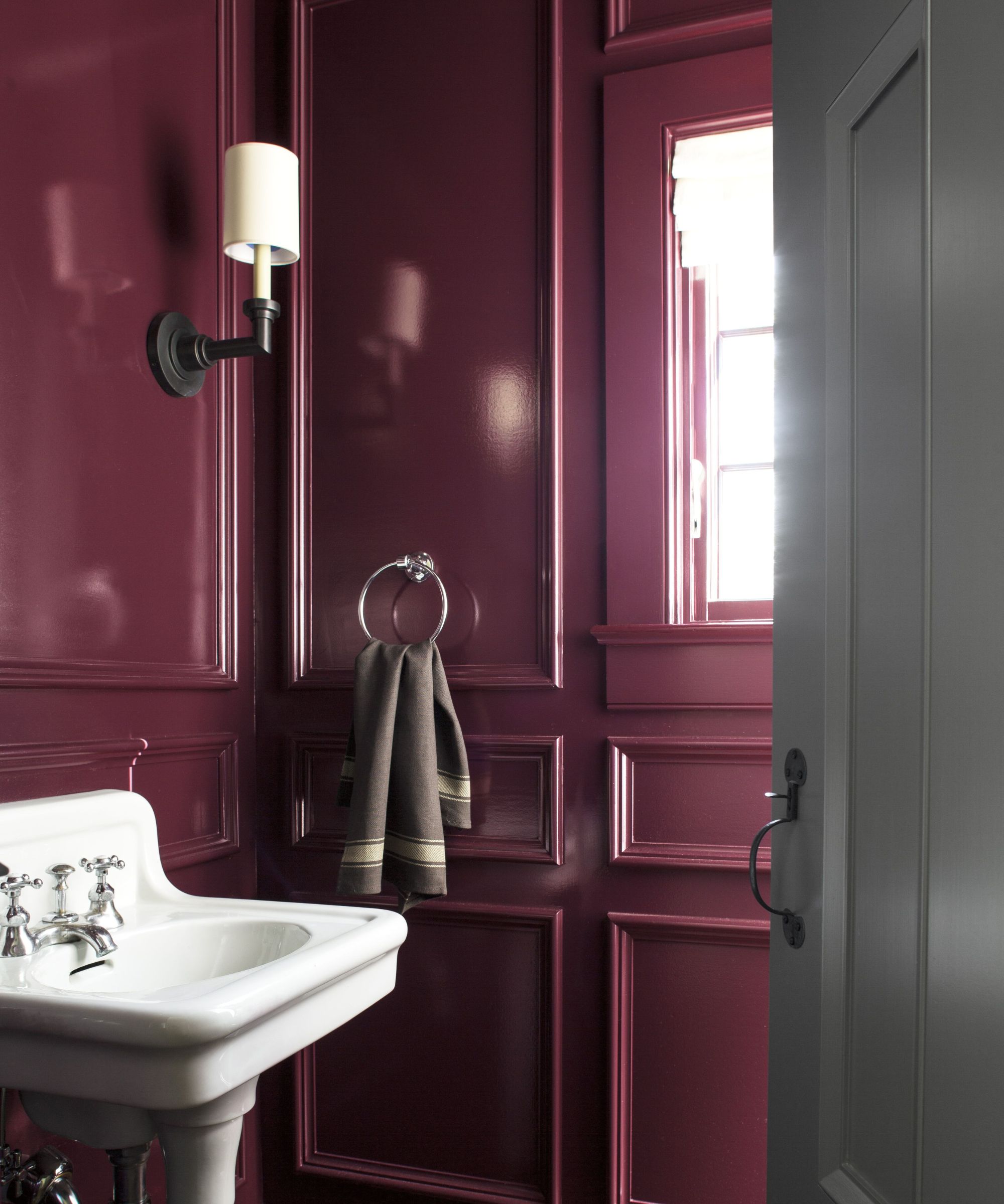
Walls painted in Carter Plum by Benjamin Moore
There’s also the question of formulation, because the paints are so carefully engineered, designers caution against cross-brand color matching. Karen Wolf, founder and Creative Principal at k+co LIVING, a firm specialising in luxury interior design, warns, 'Never try to replicate a Benjamin Moore color using a Sherwin-Williams base, or vice versa. Each line is formulated differently. For the truest, most reliable results, it’s best to swatch and specify within the original brand.'
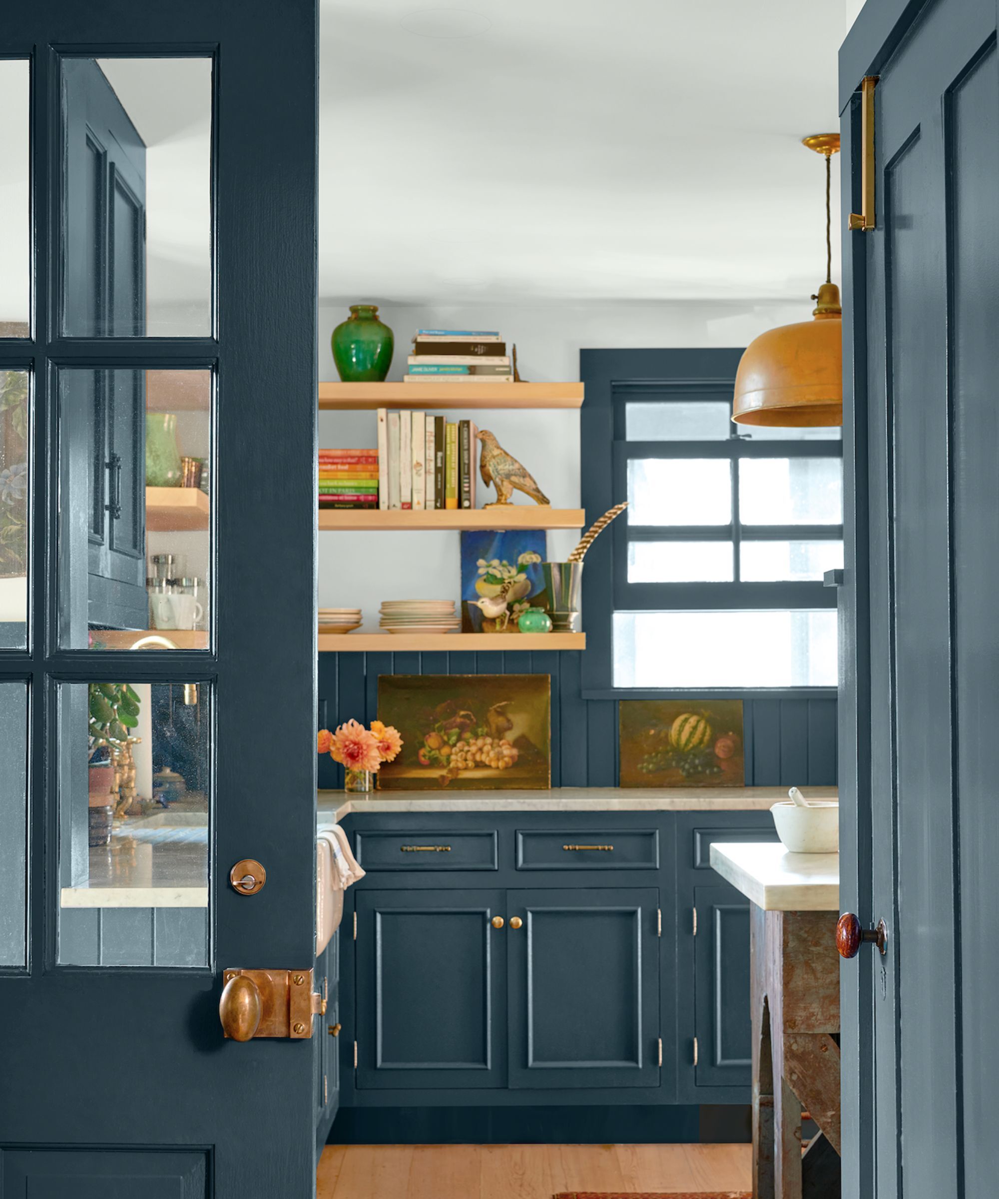
Still, when it comes to color chemistry and mood, Benjamin Moore is hard to beat. 'For rich, moody hues, I always look to Benjamin Moore, says award-winning interior designer Amy McCoy of McCoy Design Studio. 'Their blue paints are unmatched in depth and sophistication. Charcoal Blue, in particular, stands out as one of the most refined navy-inspired tones I’ve come across – elegant, bold, and endlessly versatile.'
Why do designers love Sherwin-Williams paints?
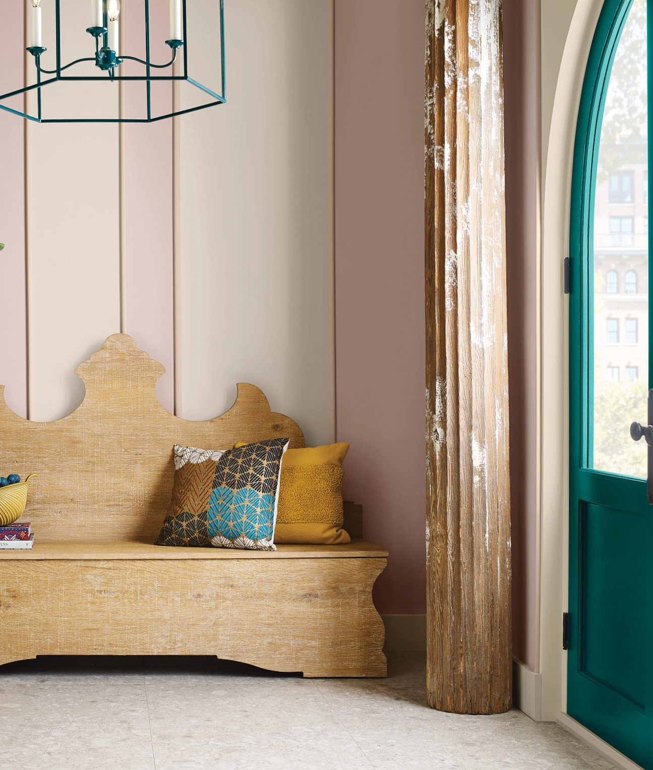
Walls painted in Mauve SW 0062, Pediment SW 7634, Dhurrie Beige SW 7524 Door painted in Blue Peacock SW 0064 all by Sherwin-Williams.
If Benjamin Moore wins on nuance and tone, Sherwin-Williams takes the lead on usability. With more than 4,000 freestanding locations across the U.S., it's the most accessible brand by far, whether you're a seasoned interior designer or a homeowner tackling a DIY renovation.
'I love how Sherwin-Williams has made even the novice a pro at paint selection,' says Autumn Pochiro of Autumn Dawn Design. 'With over 1,700 colors and tools like the Color Visualizer, it’s easy to explore options, choose a palette, and even book a consultation.'
Designers praise Sherwin-Williams not just for availability but for the ease of navigating its color collections. 'Their color decks are really intuitive,' says Karen Wolf. 'They’re organized by tinted value, from dark to light, so you can make quick comparisons.'
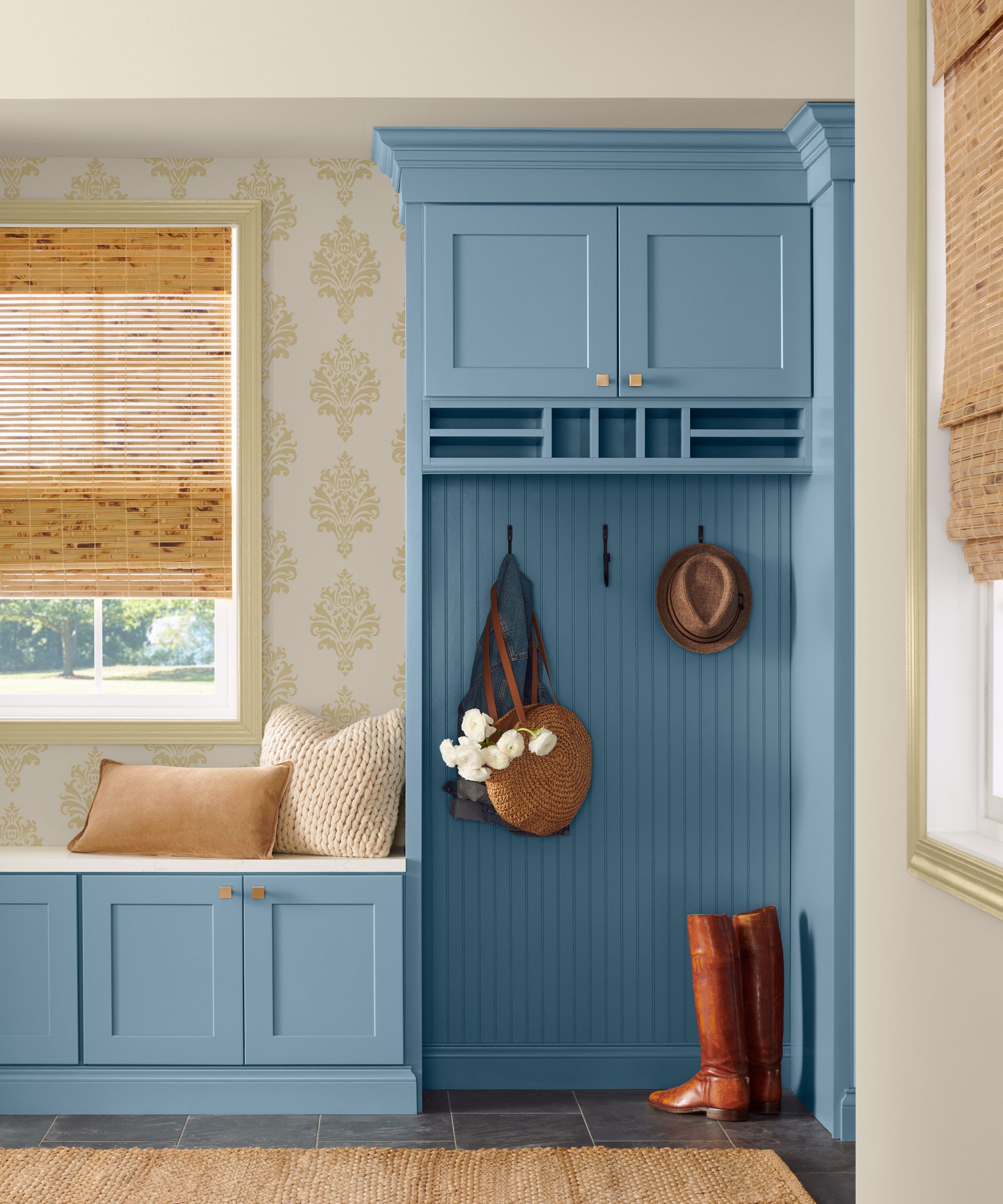
Woodwork painted in Smoky Azurite SW9148 by Sherwin-Williams
Sherwin-Williams is also appreciated for its range of high-performing finishes. Stephanie Larsen points to the Emerald line as a favorite, particularly when focusing on wellness in design, where low-VOC paints are a must. Amy McCoy, meanwhile, swears by Greek Villa, her failsafe, go-to warm white, for its versatility and reliability, noting 'it’s soft, inviting, and never pulls yellow. It’s a cozy white that just works.'
What are the pros and cons of Sherwin-Williams?
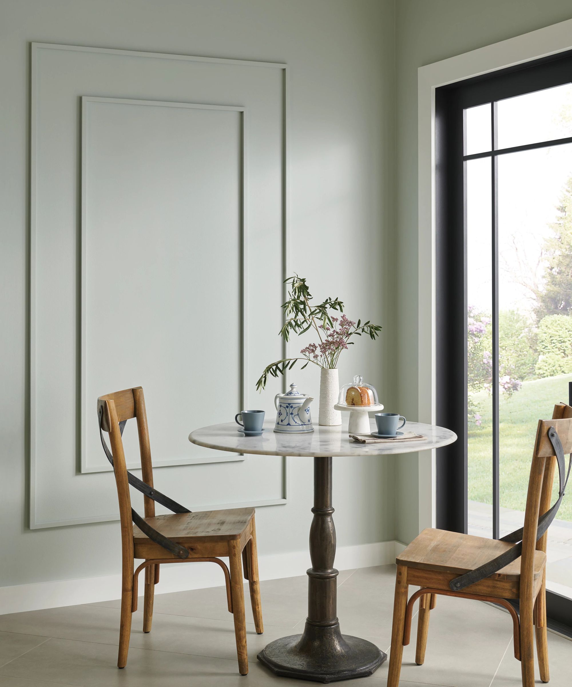
Walls painted in Silver Strand 7057 by Sherwin-Williams
For cabinetry and woodwork, Russell Goldman thinks that Sherwin-Williams often comes out ahead. 'Our painters seem to always opt for their Urethane Trim Enamel,' he says. 'It delivers a durable, professional finish that performs beautifully, especially in kitchens or high-touch spaces.'
That said, Sherwin-Williams can sometimes feel less bespoke than Benjamin Moore. Its broader palette may not offer the same level of subtlety or complexity, especially when it comes to whites and layered neutrals. 'I reach for Benjamin Moore when I need more nuanced white paints,' says Karen Wolf. 'Sherwin-Williams is great, but sometimes their shades feel a little flatter by comparison.'
There’s also a word of warning echoed by several professionals that, while it’s tempting to mix and match colors across brands, formulations do matter. Russeell Goldman’s studio even uses an internal tool to generate palettes that test each color in both Benjamin Moore and Sherwin-Williams before making the final call, standing by the notion that the right paint is the one that supports the vision — not just the label on the can.'
Which brand should you choose?
The truth is, both brands excel in different ways. If you’re creating a moody, layered space or want a curated palette with a heritage feel, Benjamin Moore might be your best bet. It excels in whites, earthy colors, and sophisticated hues that bring depth and richness to a space.
On the other hand, if you need strong technical performance and user-friendly color tools, Sherwin-Williams delivers. Its paints are easy to specify, easy to find, and often the most practical choice for cabinetry, trims, and high-traffic areas.
Most designers use both. As Larsen puts it: 'Each brand brings something different to the table, and I love pairing them depending on the personality of the space.'
While Benjamin Moore and Sherwin-Williams are two of the most widely used paint brands, they’re of course not the only options. British-born brands like Little Greene and Farrow & Ball have expanded to now serve the U.S and are frequently cited by designers for their rich pigments, artisan-like finishes, and slightly more unusual shades.
Ultimately, the right paint brand for you comes down to the specifics of your project: the mood you want to set, the light in your space, the surfaces you’re covering, and yes, sometimes just what your painter prefers. Either way, with brands this strong, you’re unlikely to go wrong.

Sophia Pouget de St Victor is the UK Content Editor at Homes & Gardens, bringing readers the latest trends, expert insights, and timeless design inspiration tailored to a UK audience. With a background in luxury interiors and a qualification in Garden Design from London, she has a passion for creating spaces with character and emotional depth. Sophia gravitates toward interiors that defy definition, valuing individuality and effortless elegance. She lives in West London with her partner, two mischievous terriers, and a plump cat named Lettuce.