Sherwin-Williams Repose Gray Vs Benjamin Moore Revere Pewter – both are best sellers but which should you pick?
Two of the most loved neutral paints go head-to-head – here’s how Sherwin-Williams Repose Gray and Benjamin Moore Revere Pewter compare, and which one might be the better fit for your home

Design expertise in your inbox – from inspiring decorating ideas and beautiful celebrity homes to practical gardening advice and shopping round-ups.
You are now subscribed
Your newsletter sign-up was successful
Want to add more newsletters?
Repose Gray by Sherwin-Williams and Revere Pewter by Benjamin Moore are two of the most popular neutral shades. They are best sellers from both brands and loved by designers and homeowners alike. But what exactly sets them apart, and how do you know which is right for your space?
When it comes to choosing the best neutral paint, it’s rarely a one-size-fits-all scenario. We look at the characteristics of both these easy-going hues, from how they behave in different rooms to what kinds of interiors they best suit.
Repose Gray and Revere Pewter are both staples in conversations amongst homeowners and interior designers about the best neutrals, and for good reason. They’re incredibly versatile, and both have a strong reputation.
Article continues belowBut while they might fall under the same general color family, their undertones and behavior in natural light vary greatly. And as with any classic color debate, it often comes down to personal preference, or simply the question of Sherwin-Williams vs Benjamin Moore and what each of these paint greats has to offer.
Repose Gray vs Revere Pewter: What’s the difference?
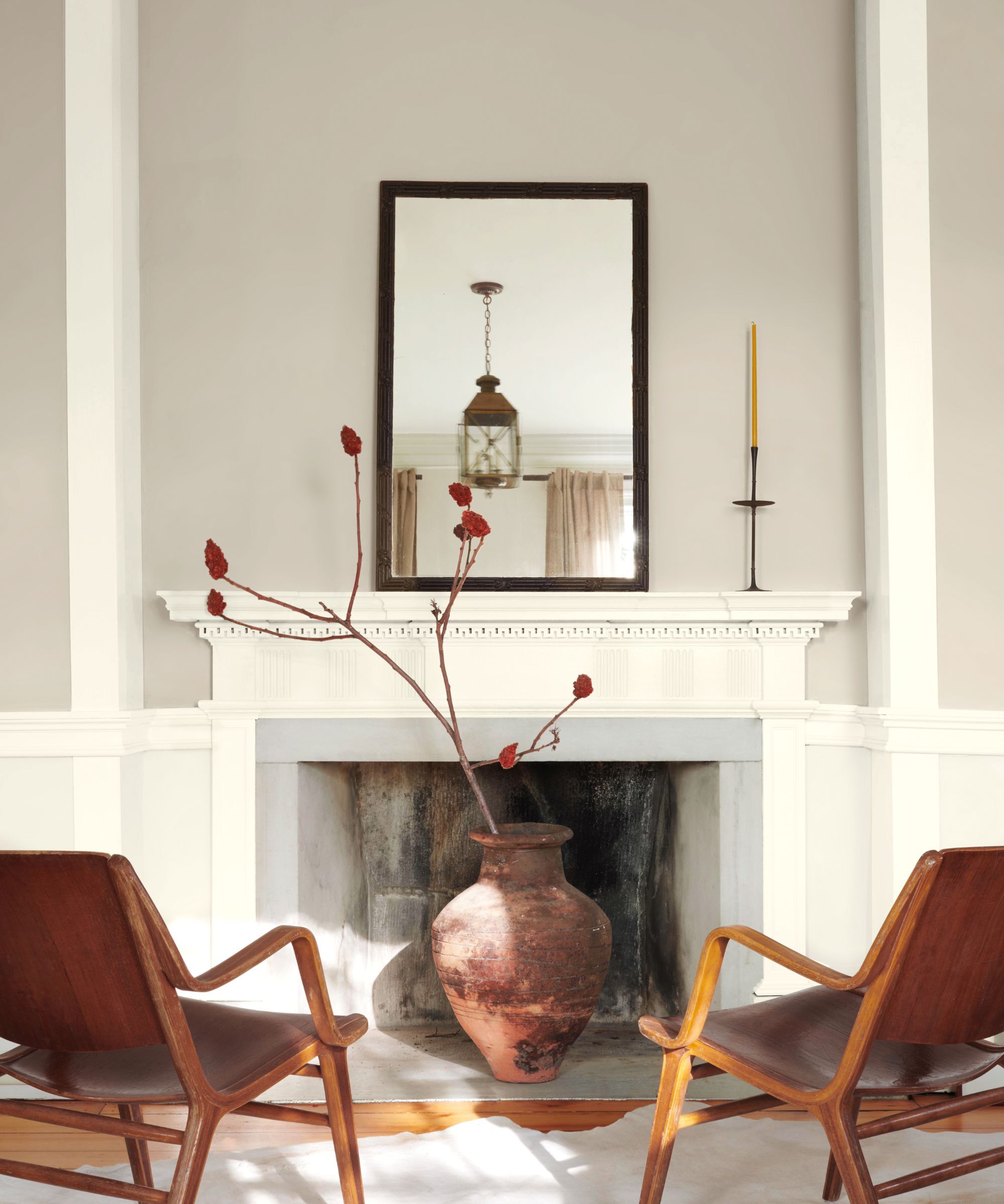
Benjamin Moore Revere Pewter HC-172 is a warm, earthy 'greige', a fusion of a relaxed, cool gray paint and a neutral. It's worth considering both parents of this hybridization to understand how it performs in certain contexts, and crucially, its interplay with light.
Its charm lies in its ability to feel timeless, calm, and receding without feeling cold. ‘Revere Pewter is one of our most popular colors and has topped the Benjamin Moore best sellers list for years,' says Arianna Barone, Color Marketing Manager at Benjamin Moore. ‘With unrivaled versatility, it effortlessly bridges warm and cool as a beautiful neutral hue. It is a true chameleon color that can work in any space and with any design style.'
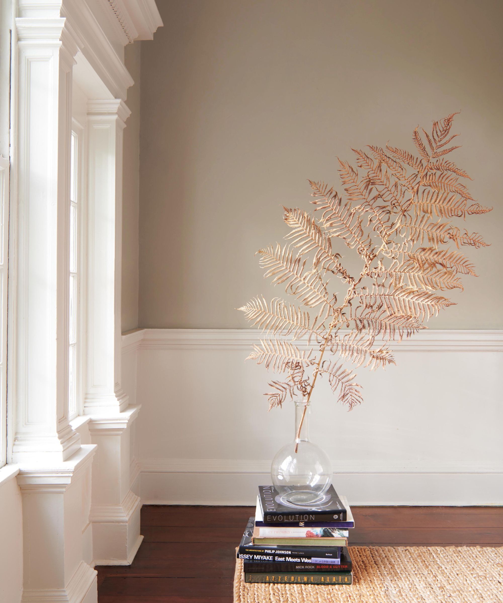
Benjamin Moore Revere Pewter HC-172
Revere Pewter's has a smidgen of a chilly gray undertone, ensuring it never feels too toasty, but instead it keeps it feeling restrained and hushed. If you are developing a neutral scheme and want to find a color that whispers, rather than shouts, Revere Pewter will deliver on the desired effect.
Design expertise in your inbox – from inspiring decorating ideas and beautiful celebrity homes to practical gardening advice and shopping round-ups.
Perfectly balanced with its tawny, earthier neutral base, so it works beautifully in rooms that are in need of softening.
Ideally suited to north-facing rooms, which are naturally deprived of light, and what light they do receive is often cold and harsh.‘I personally love to use it in common spaces like living rooms, kitchens, and dining rooms,’ adds Ariana, ‘for a laidback, welcoming wall color. ’
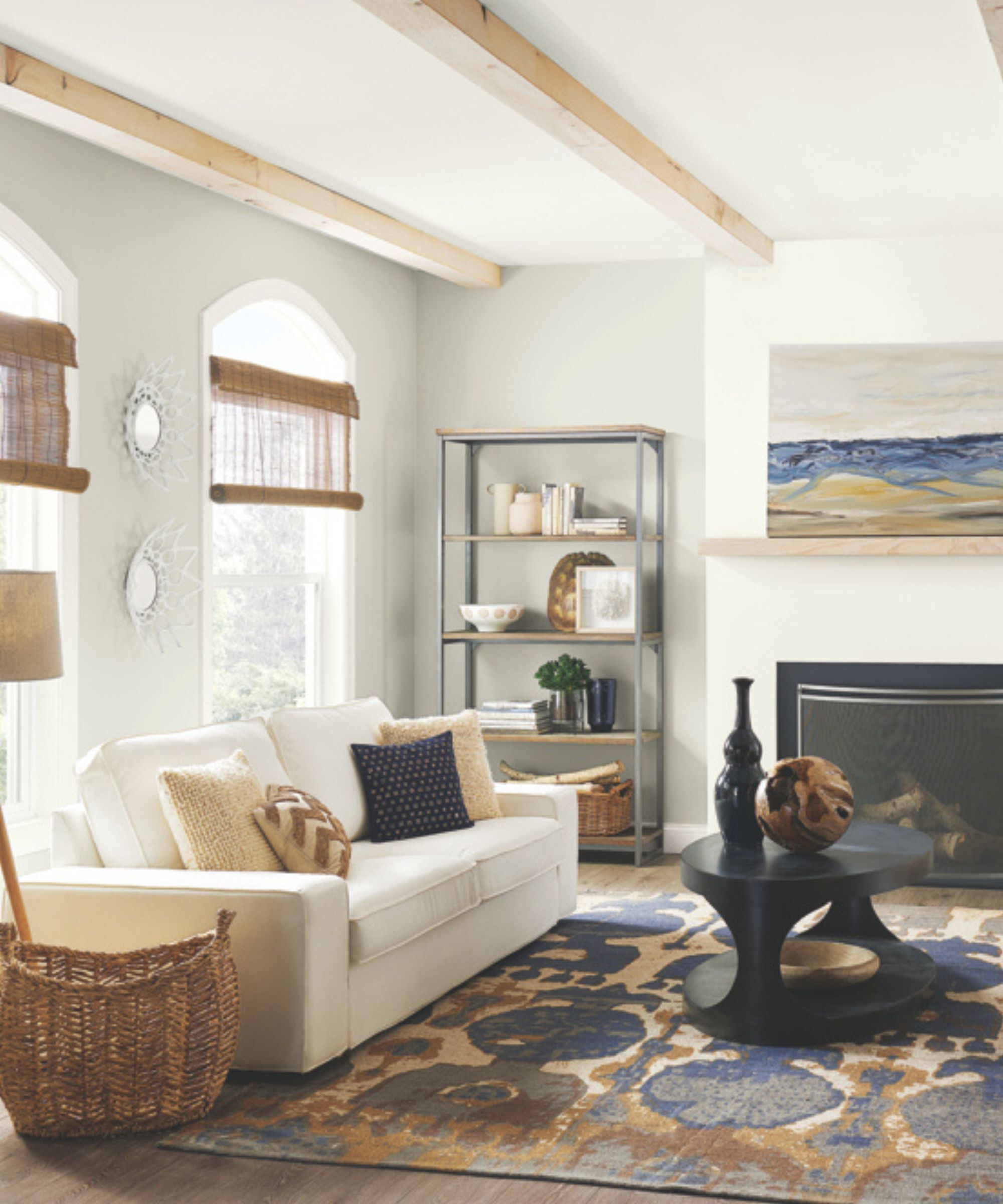
Repose Gray by Sherwin Williams
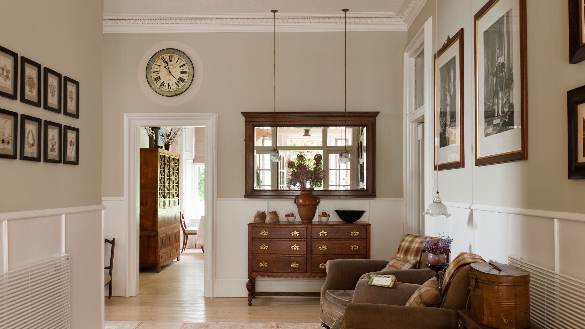
Sherwin-Williams Repose Gray SW 7015, by contrast, leans much cooler. Whereas Revere Pewter appears more of a beige with gray undertones, Repose Gray, as befits its name, is much more of a gray with a smidgen of beige undertone.
In short: Repose Gray has the slightest hint of taupe and a whisper of warmth, but it still reads as a true gray in most lights.
While not ice cold, it does lend a more modern look than the softer Revere Pewter, which is much more muted and delicate. In rooms that have minimal natural light levels, Repose Gray can appear cooler – and even a little drab if paired with the wrong undertones elsewhere in the room. It shines best in well-lit spaces where its neutral clarity can fully come through.
Which is better for your home?
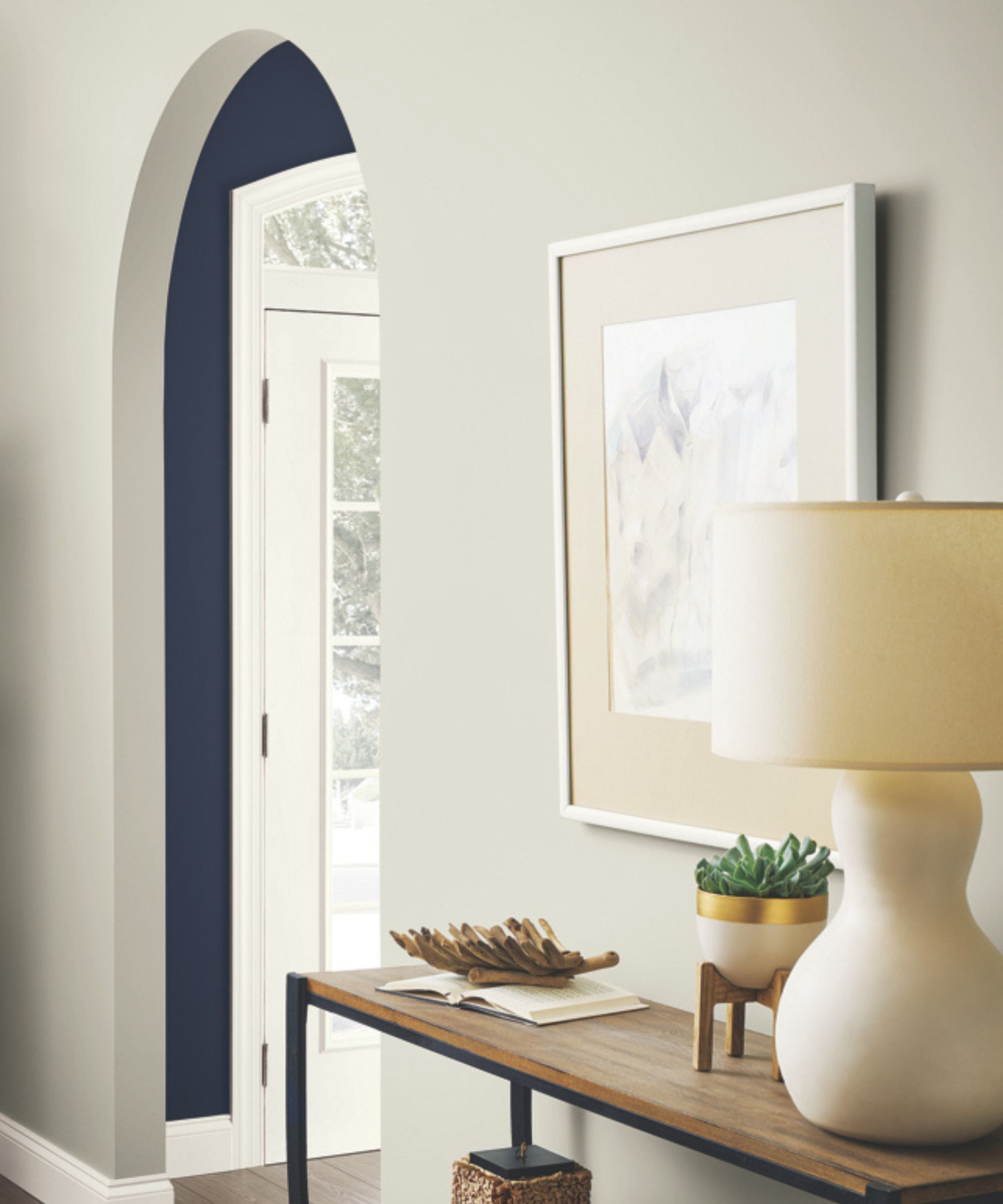
The truth is, both of these shades are highly dependable neutrals, but your choice will depend on the light, style, and purpose of the space you’re decorating.
If the room you're working with feels stark or jarring or doesn’t get much natural light, Revere Pewter would be the better choice. Its warmth will help prevent the space from feeling sullen or flat. It also complements traditional and transitional interiors particularly well.
If your room is not particularly deprived of daylight or you lean toward a more contemporary, even minimalistic aesthetic, Repose Gray would be perfectly suited for a polished, sleek look. It has a subtle sophistication and crispness that pairs beautifully with clean lines and minimal palettes. Of course, if you’re drawn to either of these, it’s also worth considering similar alternatives.
Fans of Revere Pewter may want to try Little Greene’s Portland Stone for a comparable warm greige paint, which many of the top interior designers swear by also. If you're eyeing Repose Gray, you might consider Farrow and Ball Dropcloth or Sherwin-Williams’ Agreeable Gray as close cousins.
Introduce these shades into your home in smaller accents
While decorating with bold color can be a joyful way to express personality, there’s something enduring about a well-chosen neutral. And even the most kaleidoscopic of homes often call for the pared-back punctuation of neutral zones somewhere.
If you’re painting large surfaces or looking to create flow through your space, the nuances between Repose Gray and Revere Pewter will become more noticeable – and more important. Whether you opt for the warmth of Revere Pewter or the clarity of Repose Gray, both are trusted choices that are sure to stand the test of time.

Sophia Pouget de St Victor is the UK Content Editor at Homes & Gardens, bringing readers the latest trends, expert insights, and timeless design inspiration tailored to a UK audience. With a background in luxury interiors and a qualification in Garden Design from London, she has a passion for creating spaces with character and emotional depth. Sophia gravitates toward interiors that defy definition, valuing individuality and effortless elegance. She lives in West London with her partner, two mischievous terriers, and a plump cat named Lettuce.
