Martha Stewart’s Farmhouse Palette Reveals Why This ‘Deeply Unfashionable’ Gray Is Returning as a Timeless Choice for Cozy Interiors
Martha reimagines classic hues across her farmhouse, turning overlooked shades into a masterclass in comfort and refined design sensibility


Design expertise in your inbox – from inspiring decorating ideas and beautiful celebrity homes to practical gardening advice and shopping round-ups.
You are now subscribed
Your newsletter sign-up was successful
Want to add more newsletters?
Martha Stewart's farm in Bedford, New York, is more than just a home; it's a constant source of inspiration. From this influential estate, the founder of the eponymous media empire shares her signature lifestyle tips, often in the form of hearty recipes or green-thumbed advice.
As the fall air begins to crisp and thoughts turn to cozy interiors, we've noticed Martha is (perhaps unintentionally) setting new color trends, culminating in the adoption of what we might call Martha Stewart's farmhouse color scheme.
Following her embrace of a golden retro revival, she's now championing 2025's most controversial hue: gray. It's widely known that 'decorating with gray in interiors is currently subject to debate, largely due to its perceived coldness, which is making it deeply unfashionable with some,' says Lucy Searle, the Content Director at Homes & Gardens.
Article continues belowA post shared by Martha Stewart (@marthastewart48)
A photo posted by on
Shop the gray edit
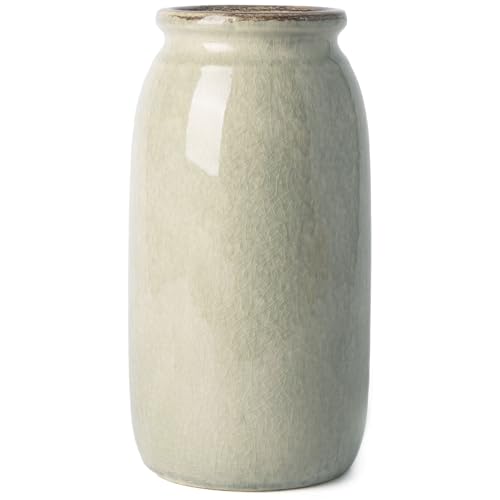
This gray-green crackle-glaze ceramic vase combines timeless charm with contemporary elegance. Expertly handcrafted with artisanal detail, it’s fully watertight for fresh arrangements and fitted with anti-slip pads for stability, making it both a functional piece and a stylish accent piece.
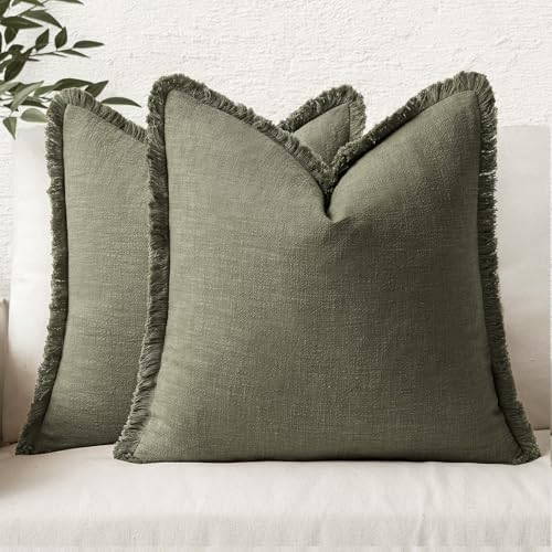
This decorative pillow, crafted from high-quality stone-washed linen, brings effortless rustic charm to any space. Its naturally textured wrinkles add depth and character, making it a perfect accent for your favorite chair, sofa, or bed. The linen fabric offers a soft, lived-in feel that works beautifully in every season, but especially fall.
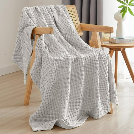
This throw is an easy way to bring the season’s color trend into your bedroom or living room, adding instant texture, warmth, and visual interest. It drapes beautifully across a sofa, chair, perfect for channeling Martha’s cozy, layered look for fall, where comfort meets timeless style.
However, as the seasons change and we seek a more grounded palette, professional designers are favoring twists on the classic cool gray, predominantly a stronger gray-green.
'A glimpse around Martha Stewart's farm suggests she, too, is a fan of this color combination,' Lucy notes. This preference was recently captured by Kevin Sharkey, Martha's executive director of design: 'Kevin Sharkey paid us a visit yesterday at the farm. As is his habit, he took some charming and evocative photos, some of which I can share here. All farm scenes,' she says.
The snapshots reveal that the entire property embraces a gray-green palette. This ranges from the cool-painted walls to the subtle green furniture and the inevitable indoor plants visible in the living spaces and world-famous kitchen. Every photo exhibits gray or green – in one combination or another – and in some cases, such as the 9th photo, they are intentionally paired.
While experimenting with gray comes with reservations, Martha's home shows us that when combined with green, this color can still feel wonderfully homey, a perfect mood for the incoming cooler weather.
Design expertise in your inbox – from inspiring decorating ideas and beautiful celebrity homes to practical gardening advice and shopping round-ups.
Martha isn't alone in her admiration for this color pairing. Connecticut-based interior designer Carlin Van Noppen explains that 'Gray and green are both calming colors, but green especially signals to the brain that you are in a safe space and invites feelings of tranquility and peace.'
For these therapeutic reasons, she calls a gray and green palette an 'excellent choice ' for rooms where relaxation is key, like the bedroom, but notes it looks great throughout the home, as Martha demonstrates. You can find similar paint colors at Backdrop Home: samples of Italian Plaster, Road to Todos Santos, and Saged will give you a combination that's similar to Martha's.
But beyond their calming qualities, why do these colors work so well together? Carlin says their similar blue undertones create a seamless pairing.
'Blue is required to make green and is also used in most shades of gray, endowing the shades with a common energy,' she explains. 'Green and blue together are appealing to us because they mimic colors we see in the natural world (think pine trees against a stormy sky, tall grass in the sand dunes, or moss on a bed of stones). This combination is visually attractive and soothing to our brains.'
When decorating with green and gray, it's hard to go wrong. What matters is that they both exist somewhere in your home, whether you separate your grays and greens or combine them in the same room, both of which Martha has done across her estate.
If you choose to pair the colors together, Carlin advises focusing on choosing shades with matching undertones. 'I have already mentioned that green and gray share cool blue undertones, but some tones may be more brown or yellow,' she comments. 'Be sure to match these tones. Since gray is usually lighter than green, I recommend beginning with a gray base in your design scheme and adding green accents.'
This is a straightforward way to bring Martha's refined, natural look into your space this fall and winter ahead.

Megan is the Head of Celebrity Style News at Homes & Gardens, where she leads the celebrity/ news team. She has a history in interior design, travel, and news journalism, having lived and worked in New York, Paris, and, currently, London. Megan has bylines in Livingetc, The Telegraph, and IRK Magazine, and has interviewed the likes of Drew Barrymore, Ayesha Curry, Michelle Keegan, and Tan France, among others. She lives in a London apartment with her antique typewriter and an eclectic espresso cup collection, and dreams of a Kelly Wearstler-designed home.