A year later, Joanna Gaines's Castle kitchen color scheme is still the best way to do contemporary neutrals in 2025 and beyond
Choose an earthy, neutral kitchen for a timeless, versatile design that enhances light and makes your space feel open and inviting


Design expertise in your inbox – from inspiring decorating ideas and beautiful celebrity homes to practical gardening advice and shopping round-ups.
You are now subscribed
Your newsletter sign-up was successful
Want to add more newsletters?
Just a year ago, we were collectively declaring the death of bland beige and magnolia – those shades once beloved by property developers and simultaneously detested by 'discerning' interior designers. Today, however, those once-maligned neutrals have been expertly reinvented with a sophisticated sand, taupe, and coffee palette.
This shift towards the new neutral is not just a color trend; it's the foundation of the popular quiet luxury kitchen aesthetic, making the scheme distinctive, luxurious, and, quite frankly, anything but boring.
If there is only one person you take neutral style inspiration from, it remains Joanna Gaines. Her iconic castle kitchen in Waco, Texas – which we first admired a year ago – is still the ultimate masterclass in elevating decorating with neutrals.
Article continues belowA post shared by Joanna Stevens Gaines (@joannagaines)
A photo posted by on
The soft serenity of these contemporary neutrals, inspired by colors from the natural world, adds a gentle and soothing touch to interiors that can be effortlessly layered with textures and tones to ebb and flow with the seasons. Elegant and timeless in their simplicity, a calming neutral kitchen color scheme, like the one pictured here, is so much more than a social media fad; it is a forever trend that guarantees long-lasting, classic appeal.
It might come as a surprise, but the creamy, sand, and taupe tones seen in the cabinetry are some of the most versatile shades in all of design – they instantly brighten while evoking a sense of calm and flawlessness. The intrinsic beauty of a beige or cream kitchen, as shown with these elegant lower cabinets, is that it brings a certain timelessness and longevity to the design that is impossible to regret.
Go back to basics with a cool-toned beige, and it will allow the rest of the fixtures and furniture to truly sing. Alongside all the clamor of color, pattern, and shape in current interior design, there’s a crucial, quieter story of considered, understated forms and textures at their finest, perfectly exemplified by the serene balance here.
Furthermore, these light, warm neutrals are an exceptionally smart kitchen color choice if you are wondering how to make a small kitchen look bigger. Unlike stark white, it will feel more welcoming, and home buyers consistently adore cream kitchens, which is always a bonus.
Design expertise in your inbox – from inspiring decorating ideas and beautiful celebrity homes to practical gardening advice and shopping round-ups.
In Joanna Gaines’s kitchen, the beige cabinetry harmonizes beautifully with the warm richness of the dark wood wall panels, creating an inviting and timeless atmosphere. The subtle gray-brown veining of the marble countertops and backsplash adds organic depth and texture, completing the space with understated luxury.
Finally, minimal touches of greenery, like the fresh sprigs in the vase, along with the understated artwork and metallic accents (note the brass hardware and shelving brackets), add to the final flourish, creating a cohesive and inviting scene.

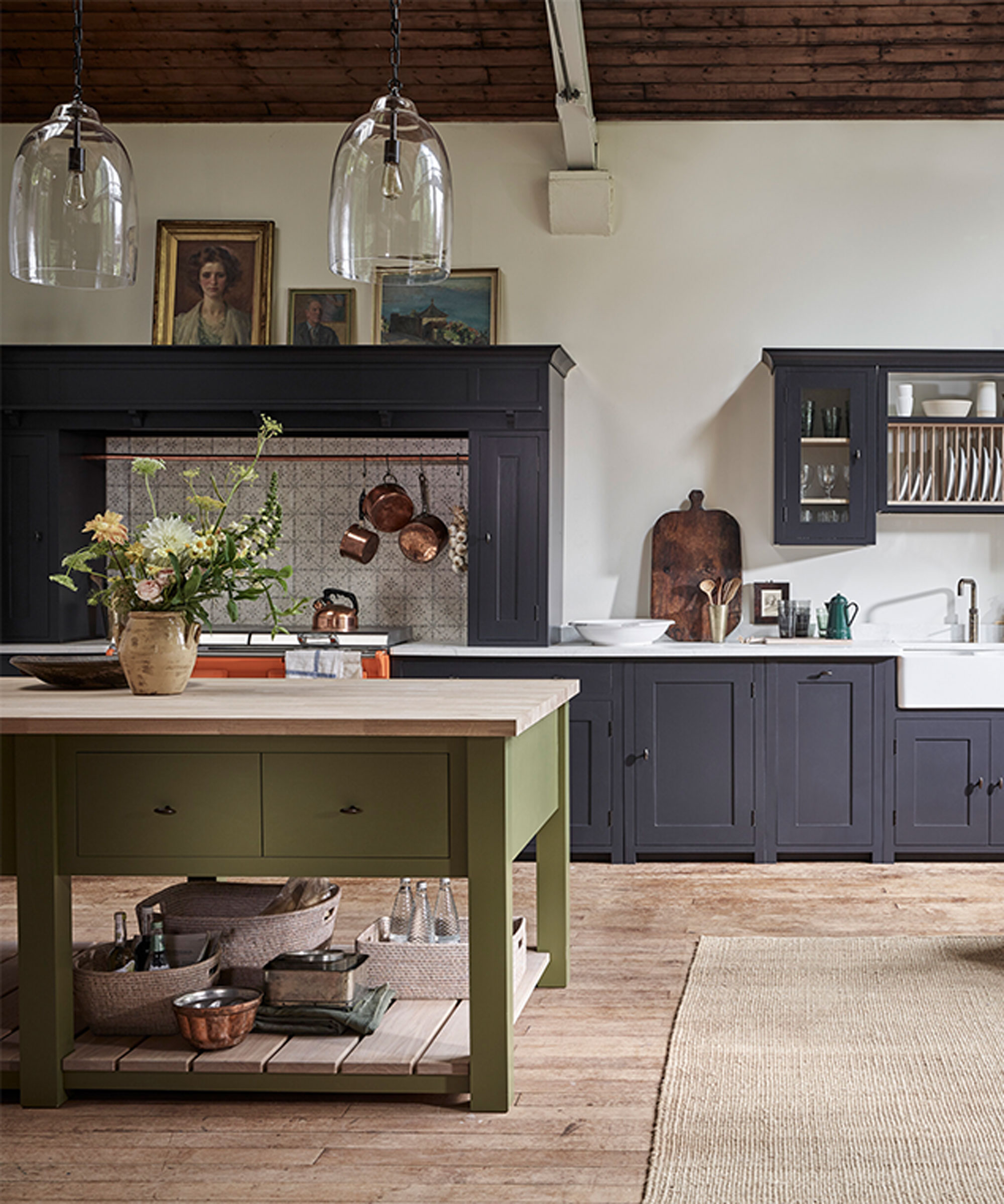
Similar soft neutral kitchen, designed by Neptune
‘Natural, organic textures – whether they are rough-hewn stone or rich wood or soft linen – are absolutely crucial to anchor a contemporary neutral color scheme,’ affirms interior designer Tamsin Johnson. ‘It ensures the overall look never feels contrived, uptight, or overly designed. They bring a fundamental, laid-back quality that simply always works in any room.’
Designing a transitional kitchen – one that embraces this elegant, old-new look – is easy because, in the right setting, it has a quality that won’t date. So, to replicate the serenity of Joanna Gaines's castle kitchen, as seen in this inspiring image, decorate it with an enduring quiet luxury color palette, and you will not go wrong. The result is comforting precisely because it feels reassuringly familiar.
Shop the neutral edit
For a kitchen that feels classic, timeless, and enduring, incorporating neutral tones like beige, cream, and greige creates an elegant, lasting aesthetic that remains stylish year after year.

Organize beautifully with the Martha Stewart Acacia Wood Magnetic Knife Strip. Featuring strong built-in magnets and a sleek, curved design, it securely holds knives while adding natural elegance to your kitchen. The 16-inch length offers ample space, and easy wall or adhesive mounting makes setup simple.

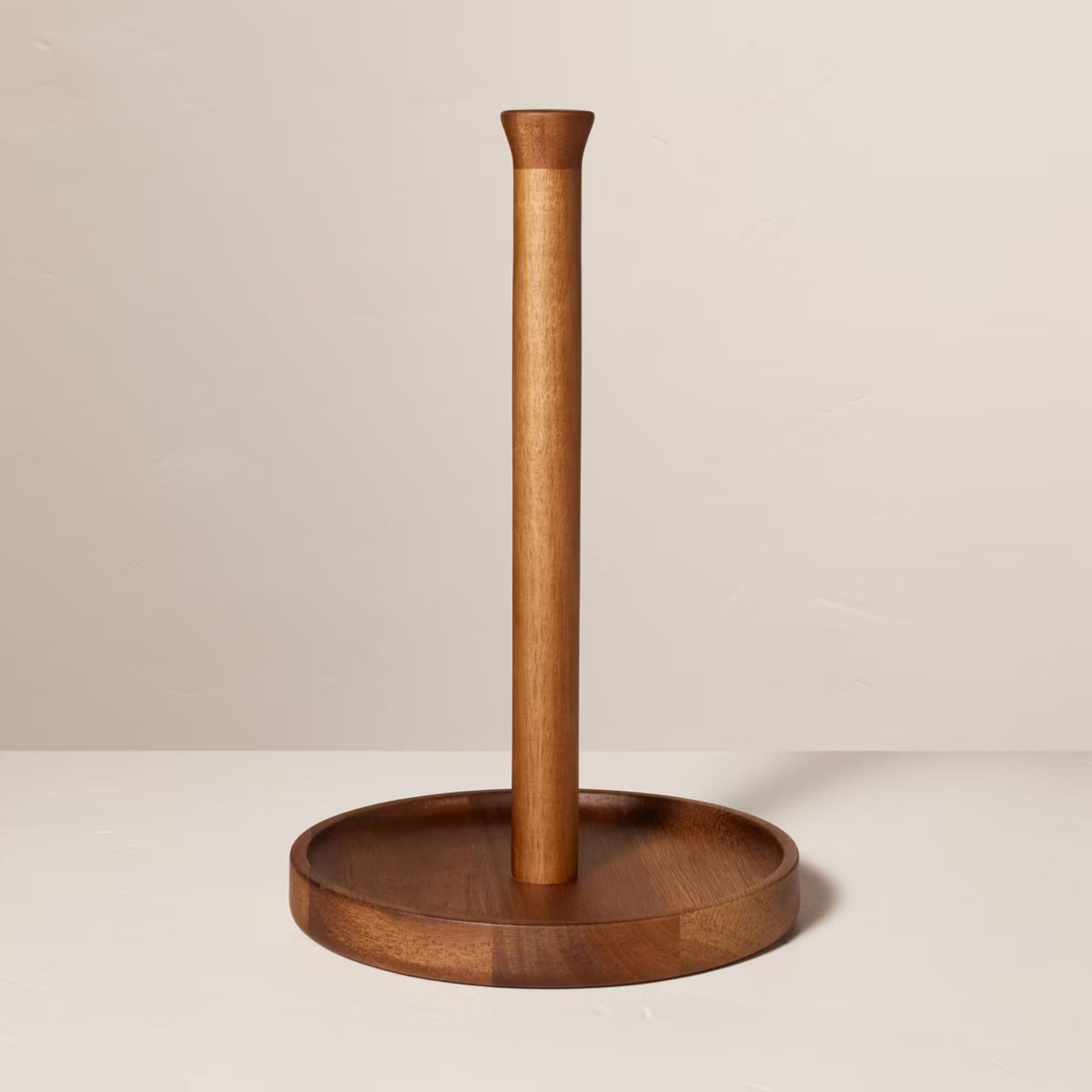
Keep your kitchen neat and stylish with the Martha Stewart Wooden Paper Towel Holder. Crafted from natural wood with a clean, minimalist design, it features a sturdy round base and tall center rod to securely hold paper towels. Perfect for countertops or tabletops, it offers easy access while adding a warm, timeless touch to your kitchen decor.

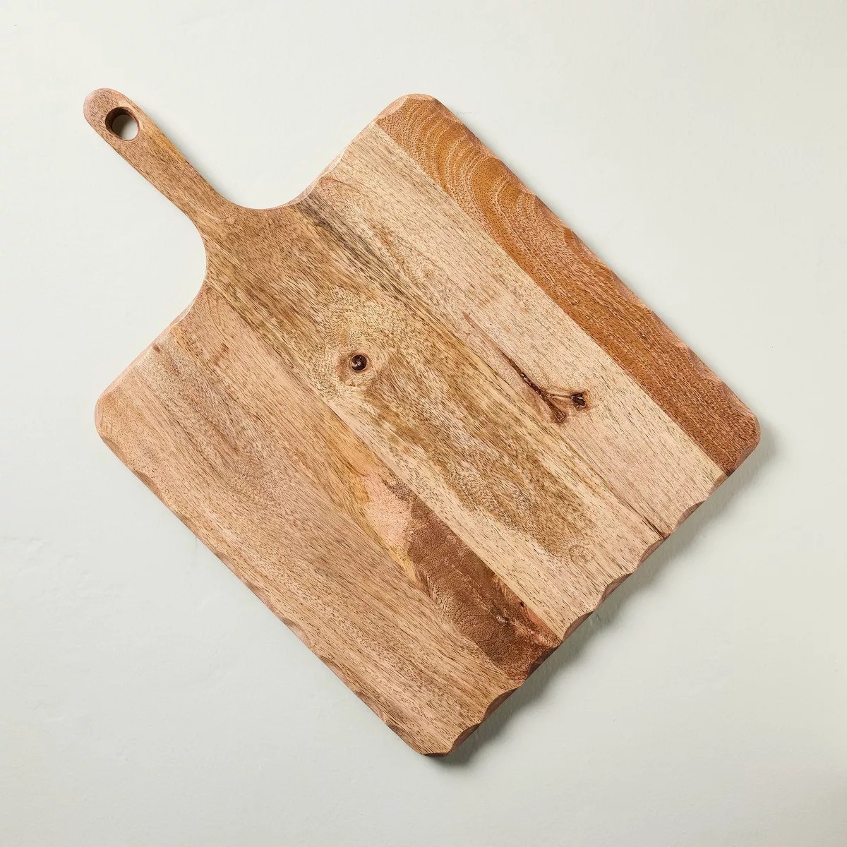
Serve and style with the Martha Stewart Square Wood Serving Board. Crafted from natural wood with scalloped edges for a touch of elegance, it’s perfect for presenting appetizers or charcuterie. The built-in handle offers easy portability, while the hanging hole allows for simple, space-saving storage.

Jennifer is the Digital Editor at Homes & Gardens, bringing years of interiors experience across the US and UK. She has worked with leading publications, blending expertise in PR, marketing, social media, commercial strategy, and e-commerce. Jennifer has covered every corner of the home – curating projects from top interior designers, sourcing celebrity properties, reviewing appliances, and delivering timely news. Now, she channels her digital skills into shaping the world’s leading interiors website.