Think Pale Pink Kitchens Are Out in 2026? This Characterful Space Proves This Warm Neutral Is Actually the Perfect Base for This Year’s Biggest Trends
Tour a characterful kitchen that takes the brief 'light, bright, and neutral' and adds warmth and age

Hebe Hatton

Design expertise in your inbox – from inspiring decorating ideas and beautiful celebrity homes to practical gardening advice and shopping round-ups.
You are now subscribed
Your newsletter sign-up was successful
Want to add more newsletters?
2025 was the year of being bolder, more colorful, and more characterful in the kitchen. All of the year’s biggest trends shared a common thread: spaces that felt warm, welcoming, lived-in, and layered. The most stylish kitchens should look like they have been at the heart of the home for decades – but how do you create that aged feeling in a brand-new space?
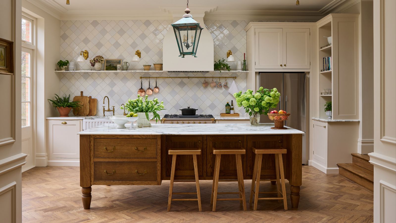
That’s the challenge designer Laura Stephens faced when designing this kitchen, positioned in a brand-new addition to a 19th-century historic home. The brief was to create a 'light, bright, and neutral space,' so Laura chose the palest pink kitchen cabinets, a shade that hasn’t seen much time in the spotlight among the dark reds that dominated kitchen color trends in 2025. However, the result proves that this soft, almost-neutral shade is as timeless as ever heading into 2026 and can be the perfect backdrop for the characterful trends continuing into the new year.

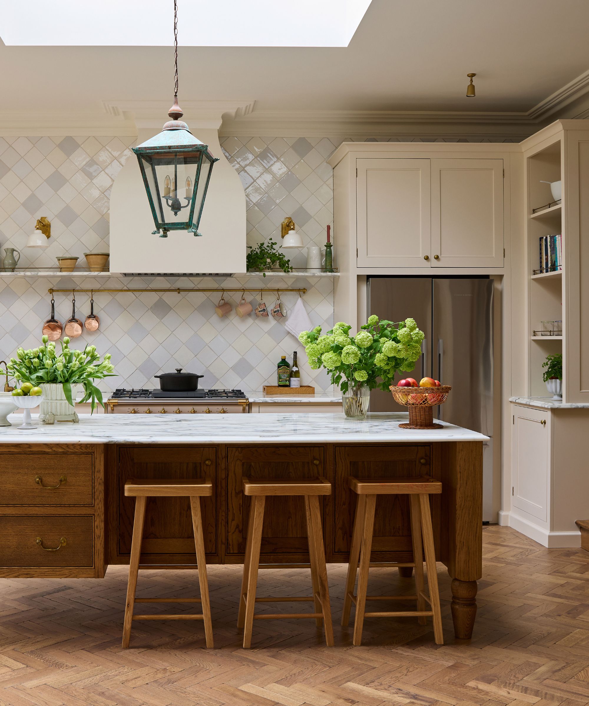
Unbelievably, despite the grand period detailing on the cornicing and the Victorian-era cues – from the antique pendant light to the antiqued island bench – this kitchen is entirely part of a new extension that Laura was involved with from the very start.
Article continues below‘The priority of this project was that it didn’t feel like a new box,’ Laura says. ‘It was important to take into consideration the flooring, finishes, ironmongery and cornicing, any details that could help make it seem a little more traditional while not remotely stuffy. It had to be modern, too – the family wanted conveniences such as a big American fridge and a hot tap.’
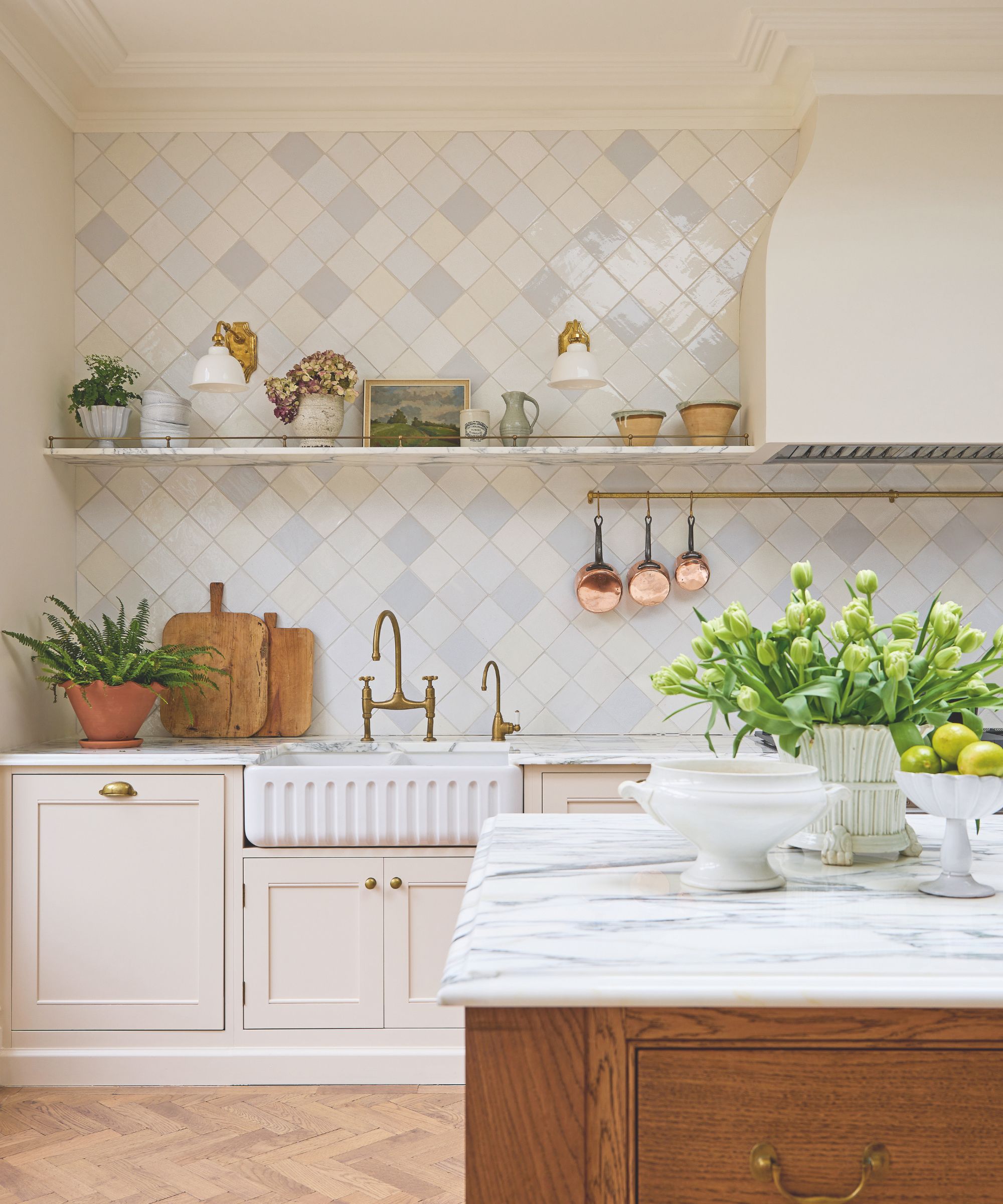
Laura took influence from the Victorian era of the rest of the house, drilling down into the detail such as the beading on the Shaker-style cabinets (look closely and you’ll see there is slightly more than on your typical Shaker kitchen) and the ornate curves of the plaster hood she created to hide the extractor fan. But the most effort went into the tiled wall. ‘That took so much time to get right,’ Laura says.

The tiles came from Francis Ceramics, a small Welsh company that handmakes every tile individually, so each one is different, with its own variations in color and glaze. ‘At first, I thought we could place them haphazardly, but I noticed that we started getting clumps of gray tiles or groups of cream ones. So I took them all down and spent two days painstakingly ordering them so that wouldn’t happen and it would seem like they were random.’
Originally the clients thought it would be overwhelming to take them to the ceiling, but Laura felt it was essential to fill the vast area, to create a sense of depth, their reflective surfaces enhancing the rest of the room.
Design expertise in your inbox – from inspiring decorating ideas and beautiful celebrity homes to practical gardening advice and shopping round-ups.
In fact, filling the space was Laura’s biggest concern. She designed the 3.5-meter kitchen island to evoke a piece of furniture with a steel beam running through it so it needed only four legs. ‘The proportions make it seem grand,’ Laura says. ‘But the ergonomics still give it a sense of air.’
Neutral kitchen colors may appear to have taken a backseat in the last few months, but there’s no denying these softer, easy-on-the-eye shades are timeless – arguably more so than the darker, bolder hues we’ve been seeing so much of recently. Light colors, like the soft pink used in this space, can still lend themselves to the layered look that’s so popular right now.
You can introduce charm and texture through tile, tactile worktop materials, and wooden accents. Decor and accessories can do much of the work here, too – adding artwork, cookbooks, crockery, and objects that hold meaning for those who use the space is always going to give a kitchen a more lived-in feel.
Pip Rich is an interiors journalist and editor with 20 years' experience, having written for all of the UK's biggest titles. Most recently, he was the Global Editor in Chief of our sister brand, Livingetc, where he now continues in a consulting role as Executive Editor. Before that, he was acting editor of Homes & Gardens, and has held staff positions at Sunday Times Style, ELLE Decoration, Red and Grazia. He has written three books – his most recent, A New Leaf, looked at the homes of architects who had decorated with house plants. Over his career, he has interviewed pretty much every interior designer working today, soaking up their knowledge and wisdom so as to become an expert himself.
- Hebe HattonHead of Interiors
