If You Are Looking for a More Interesting Alternative to White Paint, This Is the Subtle Benjamin Moore Shade Designers Always Recommend
Explore designers' favorite ways to decorate with Benjamin Moore's Classic Gray, from kitchen cabinets to bedroom walls

The prospect of decorating a room with a shade of gray paint can quickly conjure images of bland, drab spaces that most of us have, in recent years, put to bed in favor of warm color palettes.
But the right shade of gray paint can be an incredibly effective way of maintaining neutrality in a room, and Benjamin Moore's best seller Classic Gray does just that. Light enough that it can appear as an off-white rather than gray, but not so pale it's a washout, it's a favorite paint shade among designers who use it to ground a room with subtle warmth.
Here, you can learn all you need to know about decorating with this delicate and warm gray paint – from the best rooms to use it in to expertly-recommended paint color pairings.
What Color Is Classic Gray?
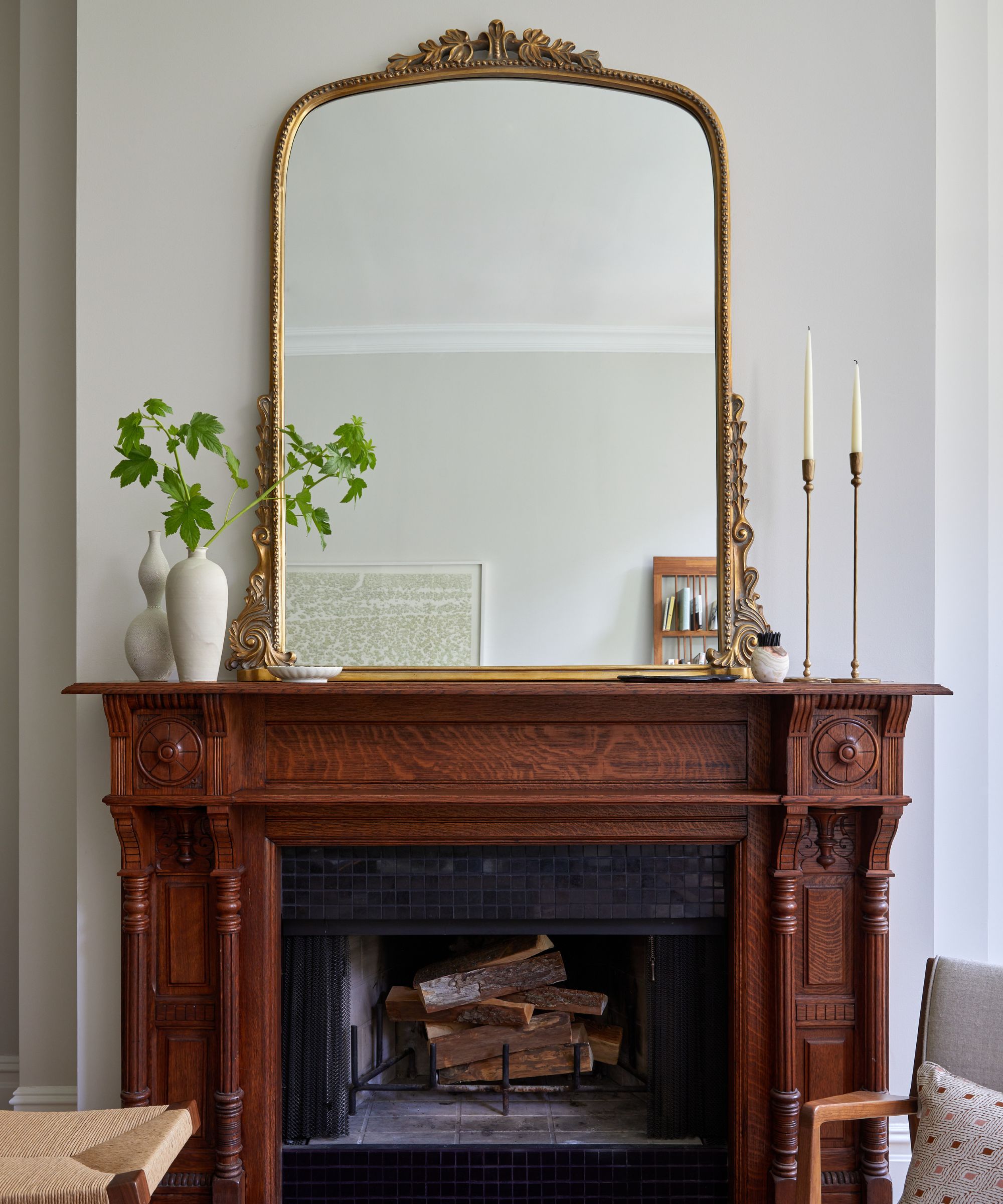
Unlike cool-toned gray paints, Classic Gray adds softness to rooms.
'With its soft, warm gray undertone, this versatile hue often reads closer to an off-white color than a gray,' explains Hannah Yeo, color specialist at Benjamin Moore. 'Whether it’s used as a gentle standalone shade or paired with others to create a subtle contrast, Classic Gray OC-23 brings a delicate layer of warmth, making it an inviting and elegant backdrop.'
'With an LRV of 74, the soothing undertone of Classic Gray is best appreciated in a room with medium light, where subtle depth truly shines,' says Hannah. 'In spaces with abundant natural light, such as south-facing rooms, Classic Gray serves as an excellent alternative to a white paint color, offering just enough warmth without feeling stark.'
'In rooms lit primarily by artificial light, pay attention to lightbulb temperature and surrounding elements,' Hannah advises. 'Warm lighting can amplify its undertones, sometimes making it read as a light taupe, while cool lighting will keep it looking neutral with minimal undertone. As always, testing the color in your space is essential, as lighting and context can significantly influence its appearance.'
Why Designers Love Using Classic Gray
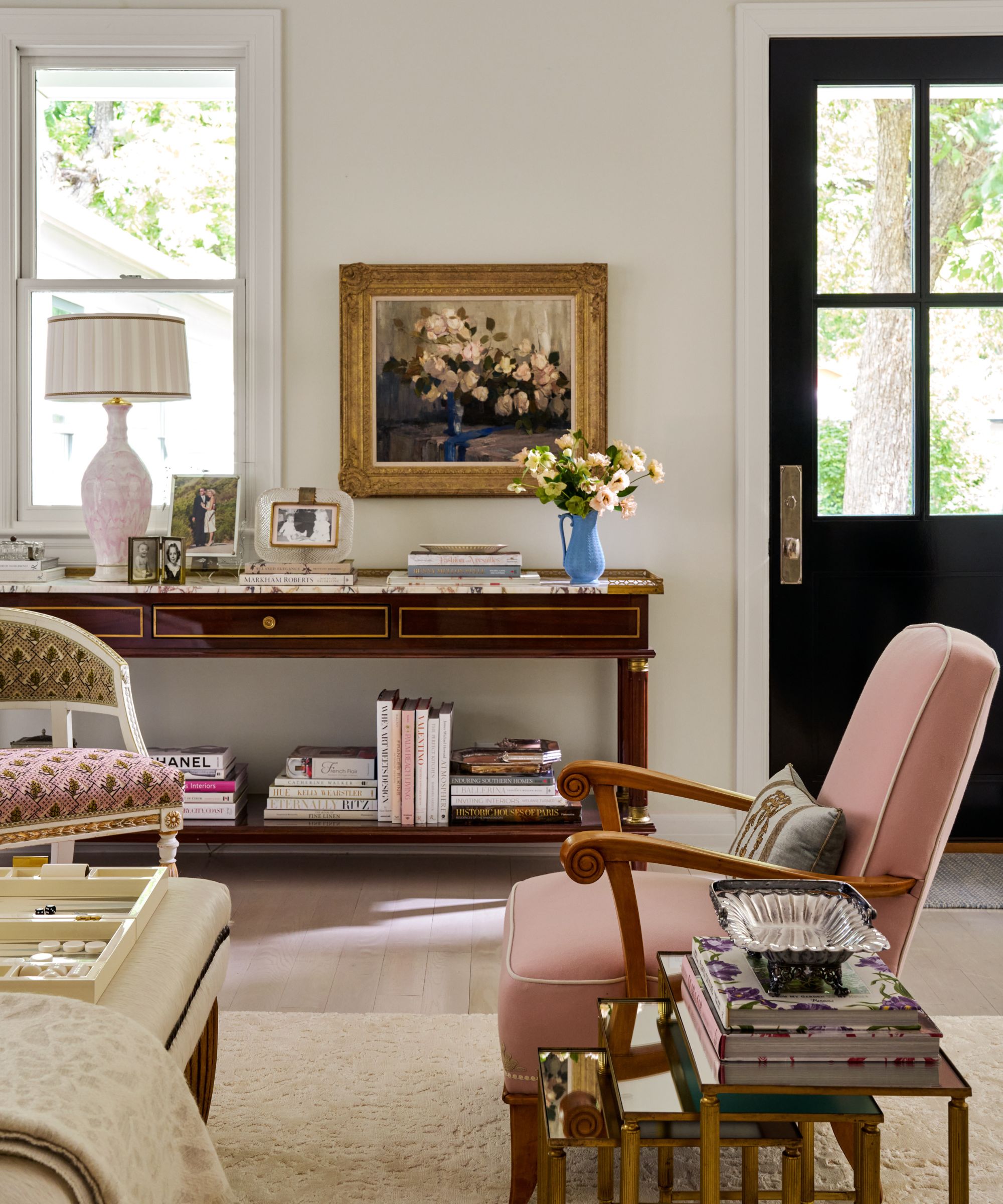
According to designers, Classic Gray works well in lots of different lighting conditions.
One reason why designers often turn to this light gray paint is that it works well throughout the day as the light changes. 'Classic Gray's versatility means it looks beautiful and balanced in any lighting condition – from bright morning to low evening light,' says the interior designer Bambi A'Lynn Bratton of Austin-based Bambi A’Lynn Interior Design.
Design expertise in your inbox – from inspiring decorating ideas and beautiful celebrity homes to practical gardening advice and shopping round-ups.
Interior designer Caroline Kopp agrees, adding: 'I love it because it works in all different types of light: when the evening sun hits it, it looks warm and beige (but never yellow), and at night it deepens to a wonderful putty color and yet somehow it’s not muddy. I love putting it with stronger colors, but it also looks fabulous in a neutral palette.'
Classic Gray also teams wonderfully with white trim and sets a calming backdrop for other decor elements to shine, according to the Charlotte-based designer Lauren Clement: 'I love the way that it can accentuate white trim as well as allow the fabrics in a room to either just melt away for a quiet neutral aesthetic or really highlight fabrics that are more bold in color, pattern, and texture.'
'If you are looking to neutralize a space with a cool tone, this is the perfect backdrop as you work to pull a space together,' Lauren adds. 'Let Classic Gray give you contrast with your trim and a bit of color interest without overpowering your other elements, and you will be on your way to a beautifully balanced space.'
How to Use Classic Gray in Your Home
It's clear that designers love Classic Gray for its versatility and subtle warmth, but how exactly do they use it in their projects? Below, we've rounded up the best rooms to use it in and designers' top tips for styling it.
What Rooms Does Classic Gray Work Best in?
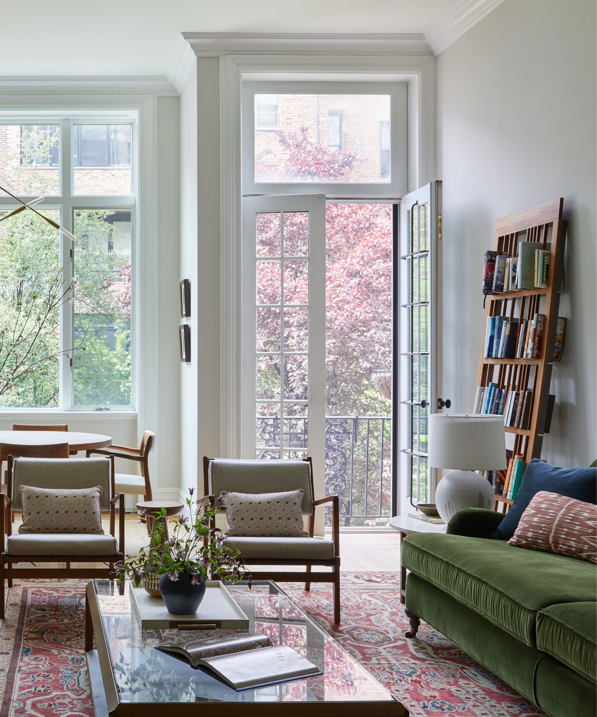
In living rooms, Classic Gray offers a calm look with just the right level of warmth.
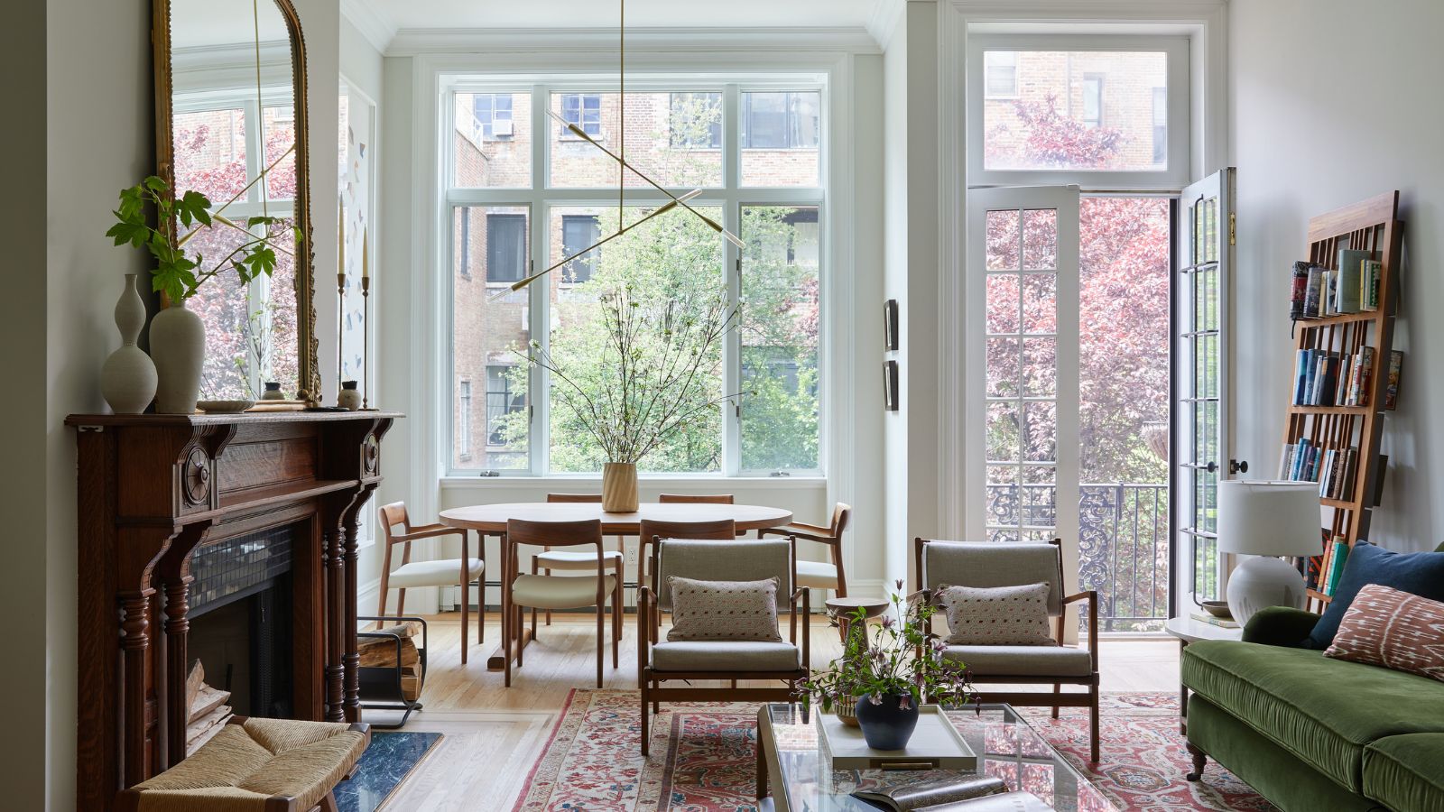
Classic Gray makes a wonderful living room paint color. 'It maintains a bright and airy feel while having just enough saturation to feel cozy and enveloping,' says the interior designer Hannah Blumenthal of New York City-based Studio Olivine, who opted for this neutral hue in this living room, paired with Benjamin Moore's Snowfall White on the ceiling and trim work.
'Unlike many cool gray shades, which were trendy and now feel dated, Classic Gray feels timeless due to its warm undertones,' says Hannah. 'This was very important to us when selecting a paint color for the living room of this nearly 100-year-old home in New York City.'
'This airy living room is south-facing and gets gorgeous light throughout the day, which brings out and heightens the warm tones found in Classic Gray,' Hannah adds. 'In a north-facing room, Classic Gray will feel softer but still neutral – more off-white than gray.'
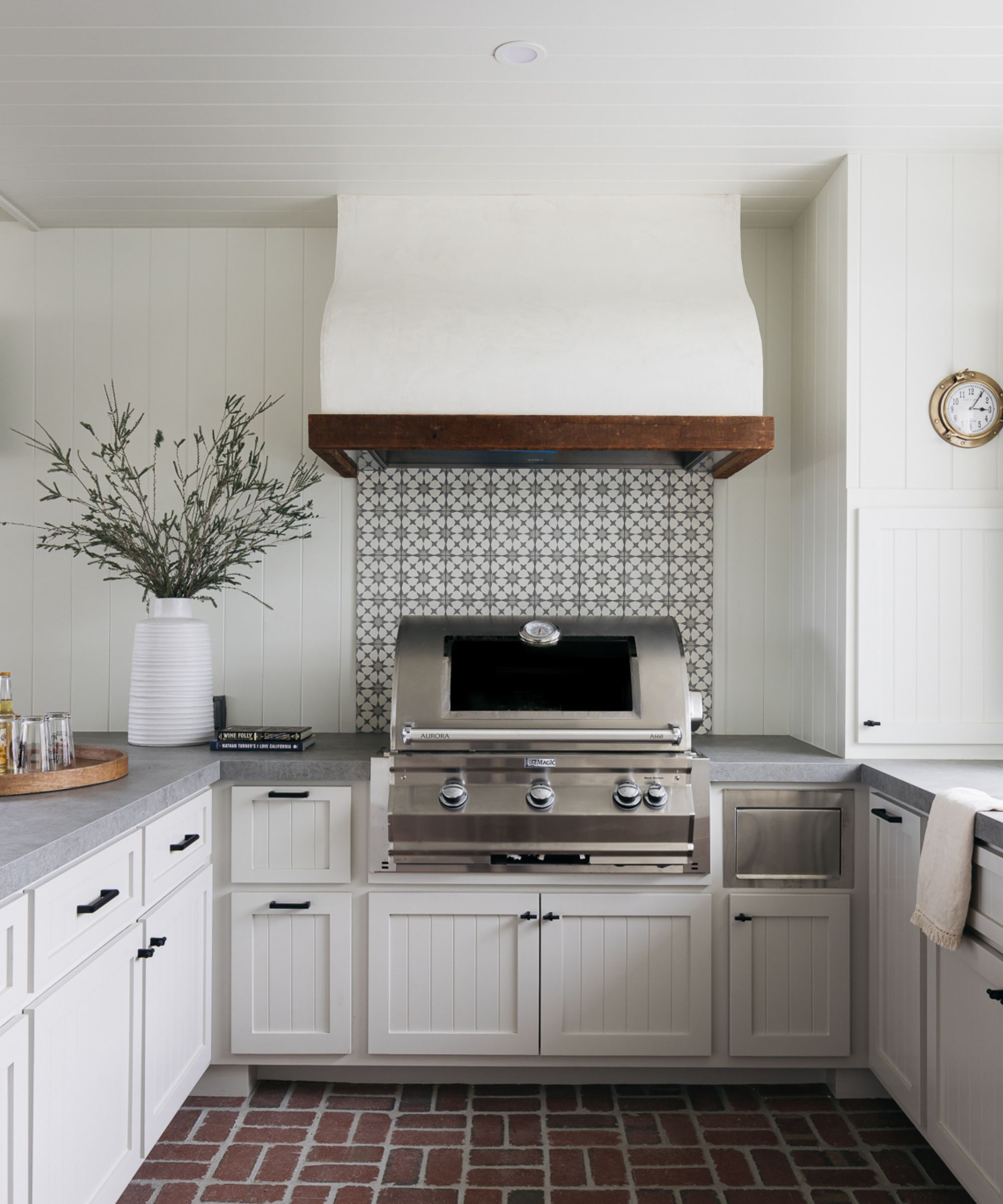
If you want to add warmth to your kitchen cabinets while maintaining a light and airy look, Classic Gray is a go-to choice.
Classic Gray also works wonderfully in kitchens, especially as a kitchen cabinet color. 'Classic Gray is a lovely, light, warm gray that works well in rooms where you want a slight shift from white while still feeling light and airy,' says the Los Angeles interior designer Christine Costa Zippert. 'We have used it several times on kitchen cabinets in spaces with white walls for this reason.'
Christine adds that Classic Gray allows you to add subtle warmth to kitchen cabinets, without reaching for richer alternatives such as beige paints. 'It is also one of the grays we've found that pairs really well with warmer stones, like brick and terracotta,' she says.
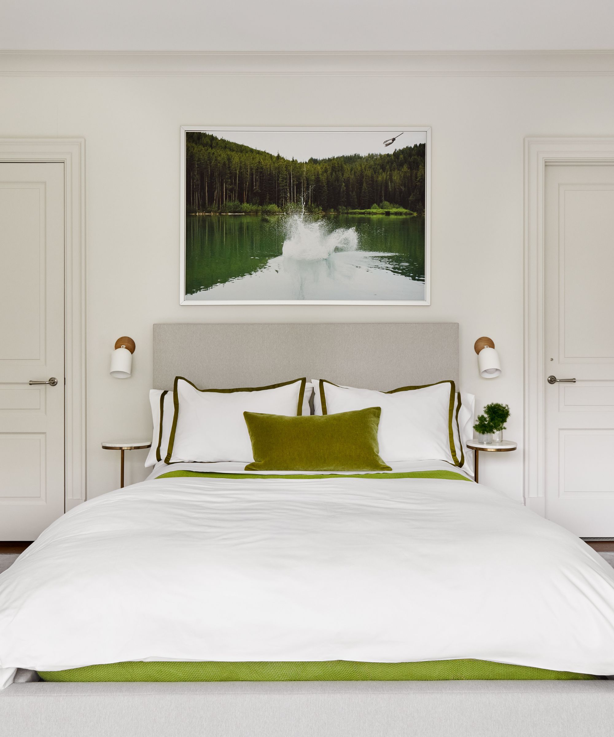
In bedrooms, Classic Gray is soft enough to create a soothing sleep space.
Classic Gray makes for a calming bedroom color idea. While you may favor decorating with white in your sleep space, designers assure that this soft gray is just as soothing. 'This color is not your dreaded millennial gray; it’s the good kind of gray, which means it is warm, soft, soothing, and elegant,' says Caroline Kopp. 'It is a pale color but pigmented enough that it never looks just white.'
'In this bedroom, I used Classic Gray across the walls, trim, and doors, and used moss green as an accent color on the bed, together with a pale slate blue carpet,' says Caroline. 'I love how this came out, and it proves the versatility of Classic Gray.'
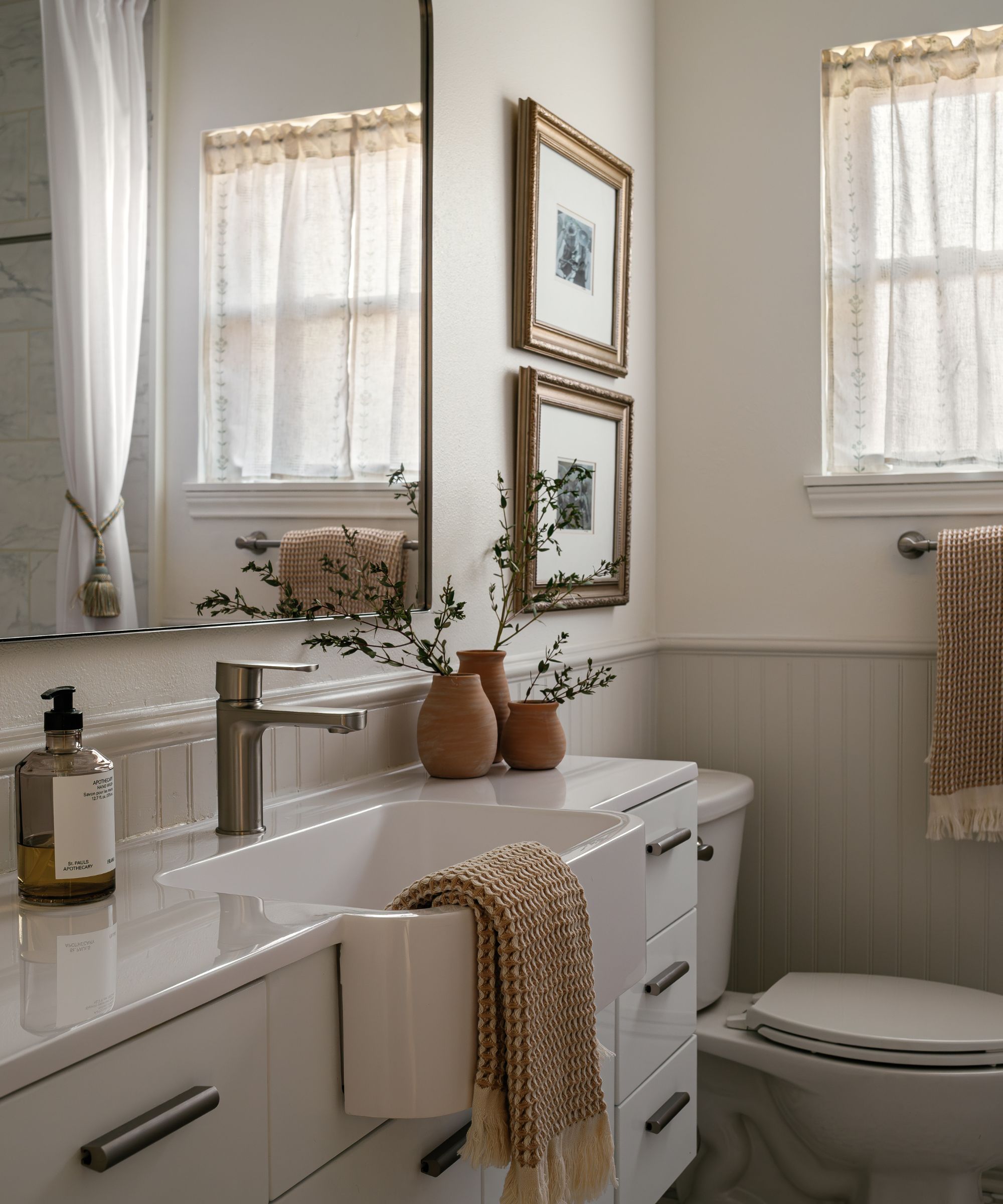
While cool grays can make bathrooms feel sterile, Classic Gray lends a soft and cozy feel.
Since bathrooms often inspire neutral color palettes, Classic Gray feels perfectly at home. 'It creates a soft warmth that complements natural light nicely, which is why it works well in small spaces like bathrooms,' says the interior designer Lauren Saab of Dallas-based Saab Studios.
'On beadboard and molding, it adds definition while making the space feel brighter, warmer, and more inviting,' she adds. 'It bridges cool and warm tones effortlessly, which makes it an ideal backdrop for mixed metals and natural textures.'
What Colors Pair Best With Classic Gray?
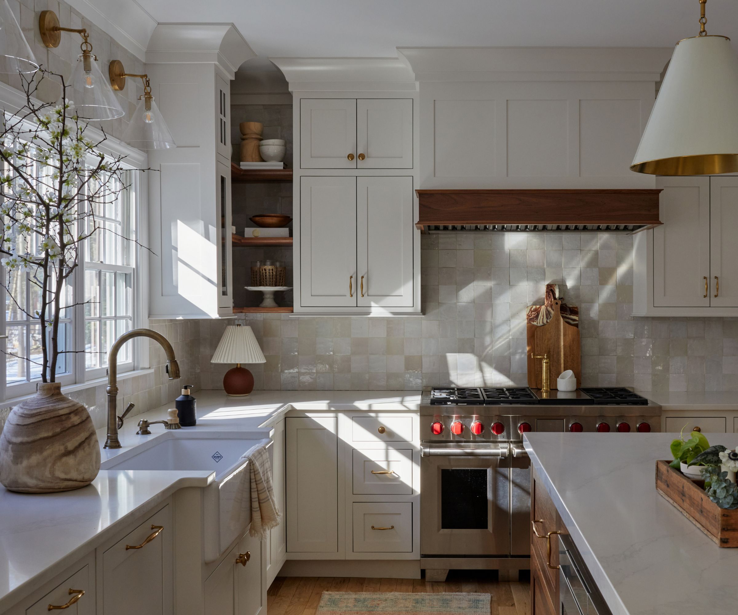
Warm and tactile materials such as wood and brass pair wonderfully with Classic Gray.
Because Classic Gray is a neutral color, it will work well with just about any color on the color wheel. That said, designers especially enjoy using it to create a timeless scheme, where it is paired with natural tones and textures. 'Pair it with crisp white trim and let natural materials, such as woods and linens, bring texture and warmth,' advises Trish Lynn of Colette Interiors.
It also works well with the colors of nature, such as blues and greens, if you want to introduce more contrast into your scheme. 'Because of its green undertones, you can also use Classic Gray as a transitional neutral in homes with greens, grays, and blues throughout,' says Trish.
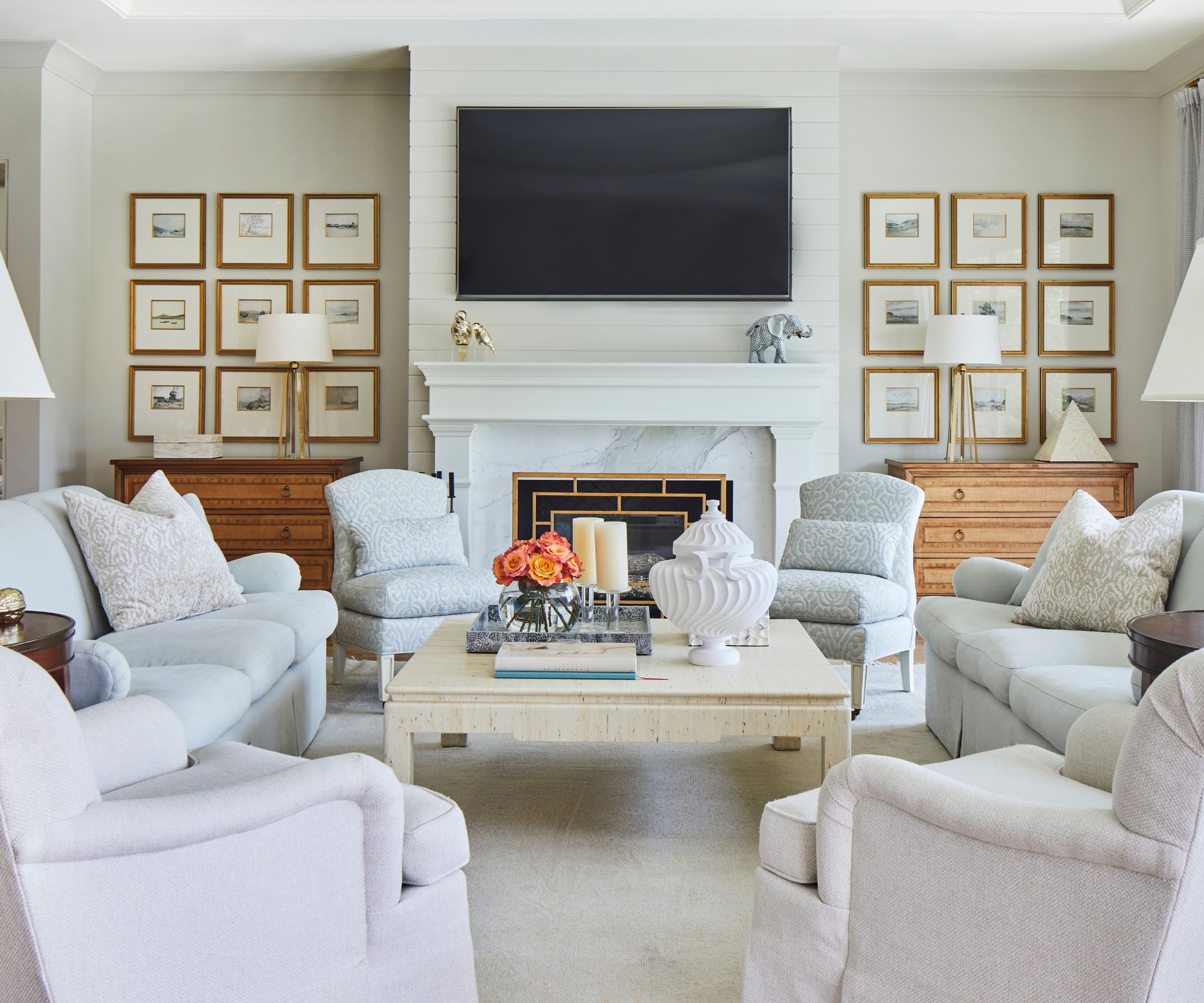
Designers say that Classic Gray pairs best with other soft neutrals and soothing colors such as blue and green.
The Alabama-based interior designer Mark Kennamer, who used Classic Gray in this traditional living room, follows a similar approach when creating color pairings. 'It works especially well with creamy whites, soft blues, and warm, natural materials like cane, oak, and rattan,' he says. 'Because the undertone is subtle rather than assertive, it pairs easily with antiques and layered fabrics – it supports the room instead of competing with it.'
If you're looking for paint pairings, there are plenty of ways to go, according to Benjamin Moore's Hannah Yeo: 'Create a serene white-on-white story by layering Classic Gray with lighter off-whites, like White Dove OC-17, in entryways or bedrooms. This pairing evokes quiet sophistication, while subtle tonal shifts add depth and visual interest.'
Alternatively, Hannah recommends October Mist 1495 or Water’s Edge 1635 if you want to add more color. 'These cooler shades balance Classic Gray’s warmth, creating a soothing environment ideal for living rooms or bathrooms,' she says.
For something more playful, Hannah suggests using Spiced Pumpkin 034 or Kurkuma AF-350 as accent colors. 'Against Classic Gray’s soft backdrop, vibrant colors and layered patterns bring character and energy to any space,' says Hannah.
Expert Tips for Using Classic Gray Successfully
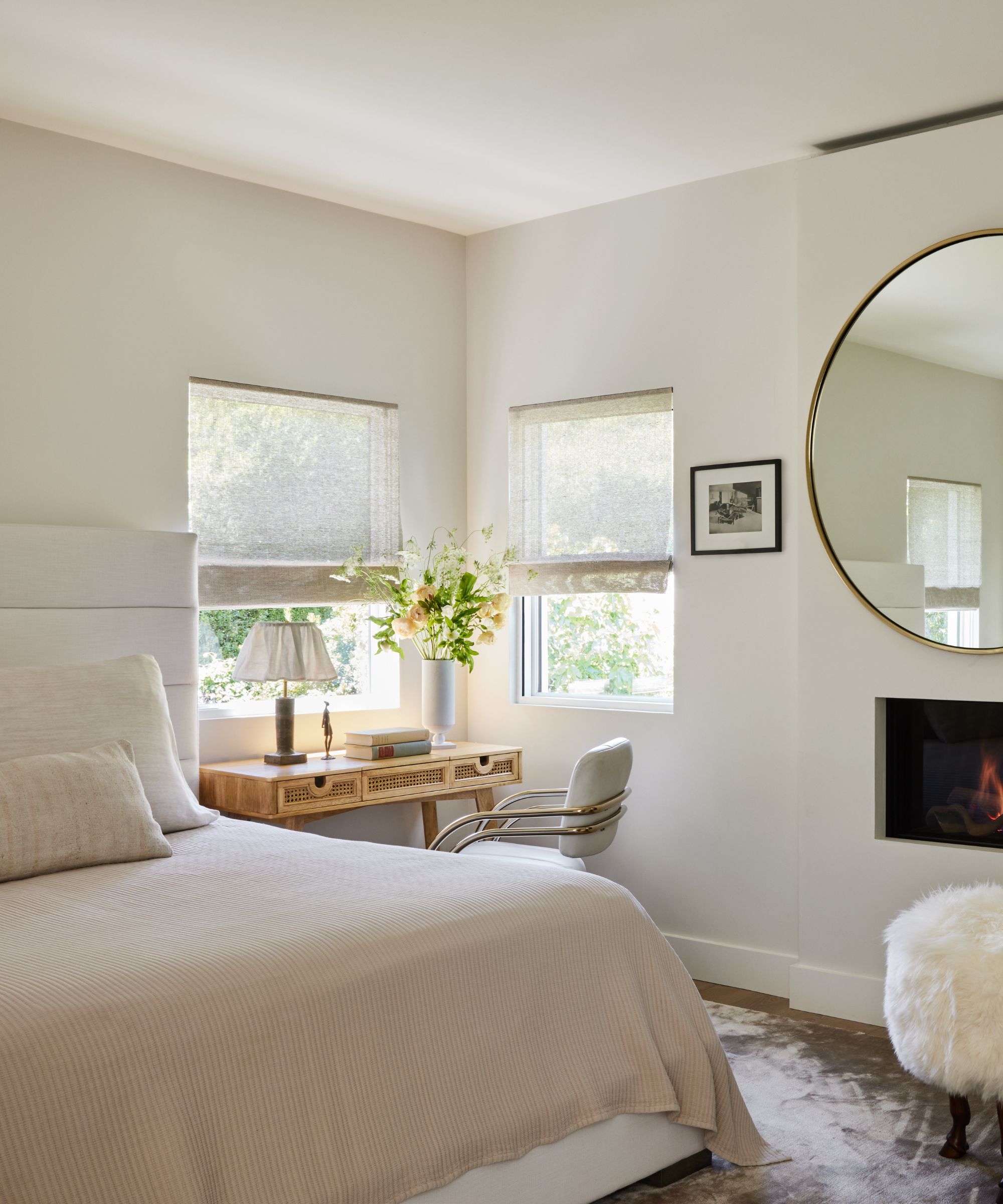
When choosing lighting for a room painted with Classic Gray, bright and white options will flatter.
You can't go too wrong with decorating with Classic Gray, but experts recommend using it as a base color, layered with accent colors and tactile materials for a stylish look. 'From soft linen window treatments to sleek stainless steel appliances, this versatile hue complements a wide range of finishes, offering endless design potential and adapting seamlessly to both traditional and contemporary styles,' says Hannah Yeo.
Lauren Clement adds that it's important to consider lighting when decorating with this hue: 'Because it is a cooler tone, Classic Gray looks best with a whiter and brighter light. I would aim for the 3500-4000 kelvin lighting scale in a room with this color.'
'As for fabrics or artwork, I love to pair a beautiful navy or even a plum tone with this color,' Lauren adds. 'For a bold contrast, a Kelly green or even a canary yellow would work nicely.'
And while Classic Gray is a versatile color that works well in many spaces, it's crucial to sample the shade before committing to it, warns Hannah Yeo: 'Like many nuanced hues, its appearance can shift depending on surrounding elements such as vibrant greenery outdoors or bold accent colors. Be sure to test the color in your space before committing to full gallons.'
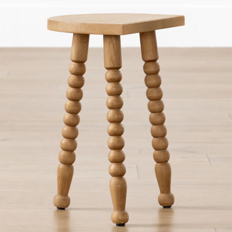
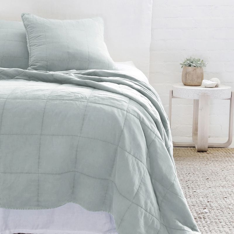
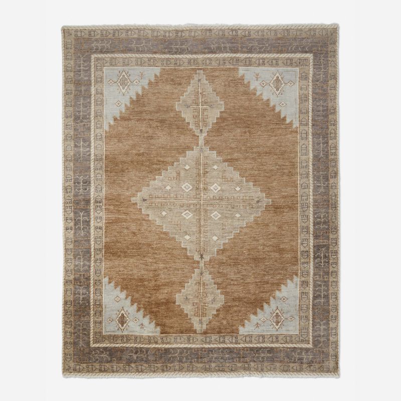
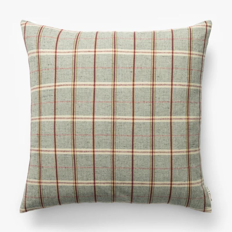
Shop Decor for a Classic Gray Scheme
Feeling inspired to paint your walls with this soft gray? Below, you can shop for decor that will complement it perfectly.
Whether you choose Classic Gray as a timeless kitchen color or a calming backdrop for living room walls, this light gray is a wonderful alternative to white. Wherever you use it, make sure to add depth to your space with tactile elements and layered materials.

Emily is a freelance interior design writer based in Scotland. Prior to going freelance in the spring of 2025, Emily was Homes & Gardens’ Paint & Color Editor, covering all things color across interiors and home decor for the Homes & Gardens website. Having gained specific expertise in this area, Emily is well-versed in writing about the latest color trends and is passionate about helping homeowners understand the importance of color psychology in home design. Her own interior design style reflects the simplicity of mid-century design and she loves sourcing vintage furniture finds for her tenement flat.

