5 of the best gray paints that interior designers love using
Gray is still very much embraced by interior designers

Design expertise in your inbox – from inspiring decorating ideas and beautiful celebrity homes to practical gardening advice and shopping round-ups.
You are now subscribed
Your newsletter sign-up was successful
Want to add more newsletters?
While gray has somewhat fallen out of favor in interior design over the past few years, being replaced by warmer hues, gray remains a versatile hue and shouldn't be written off. There are endless variations of gray tones to choose from, and designers say decorating with gray can still be an effective color choice to create a pared-back, sophisticated scheme.
'Between light grays and dark grays, warm grays and cool grays – and not forgetting all the grays in between – there’s more to this ultra-versatile neutral than you might think,' says Charlotte Cosby, creative director at Farrow & Ball. 'Equally beautiful in its own right or supporting brighter and bolder shades, gray paint has an unparalleled ability to create different moods depending on both the strength and warmth of the shade you choose. '
But what are the best gray paint ideas to embrace? Below, we've rounded up five of the most popular gray colors that interior designers love to use in their projects, ranging from light and warm grays to charcoals.
1. Benjamin Moore, Gray Huskie
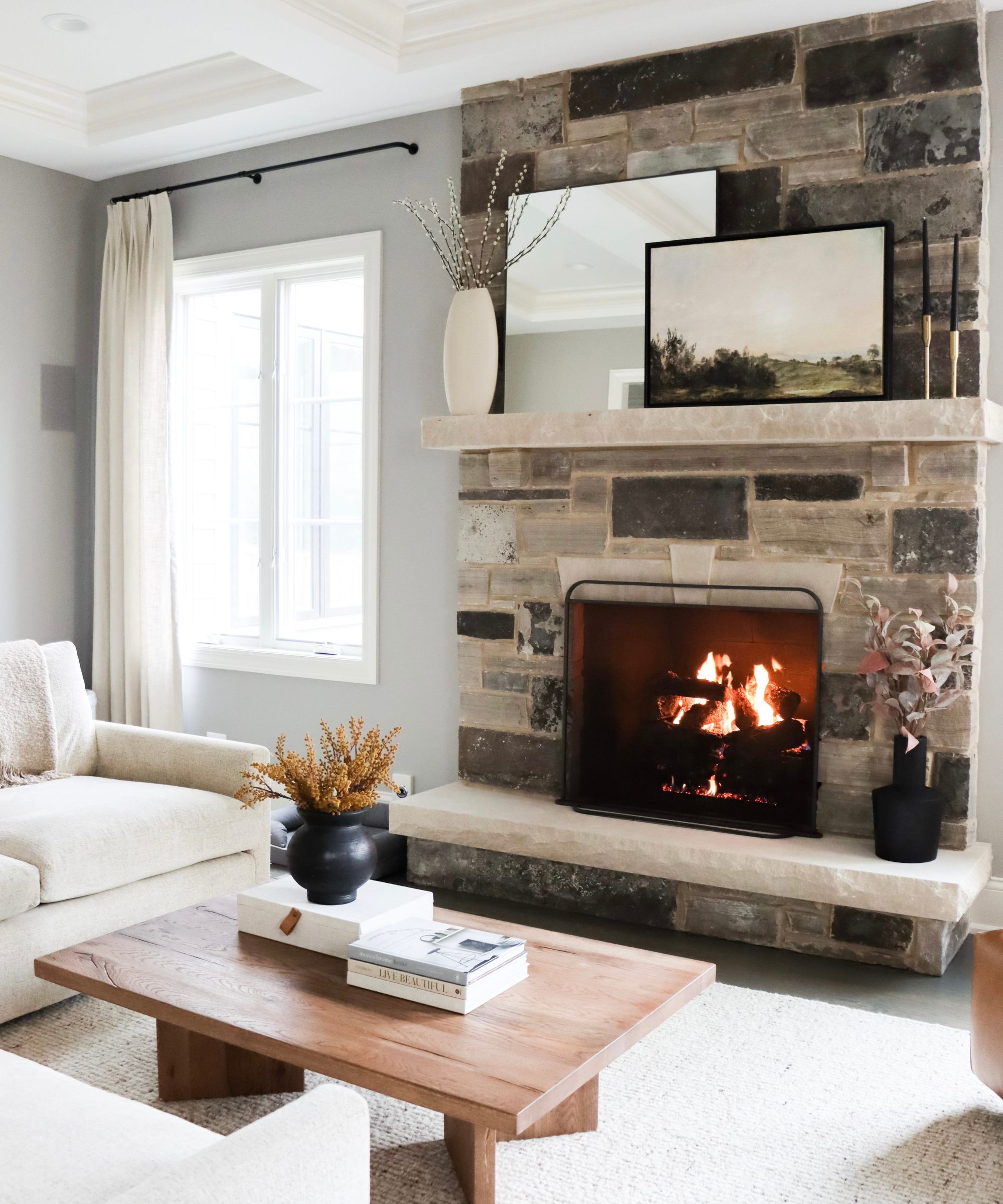
One gray paint that stands out for Laura Chappetto Flynn, owner and lead designer at Element Design Network, is Benjamin Moore's Gray Huskie. 'Greige is still a great way to incorporate gray into your home without it feeling too cold. Mixing in some warmer tones throughout the space through wood, fabrics, and stonework will also add warmth while complementing the greige beautifully.'
For a cohesive look when decorating with gray, Laura adds that including several variations of the color can help add depth: 'Mix up your grays by adding several various tones to incorporate dimension and depth to your space. This technique will instantly elevate your room and create a sophisticated palette.'
2. Farrow & Ball, Elephant's Breath
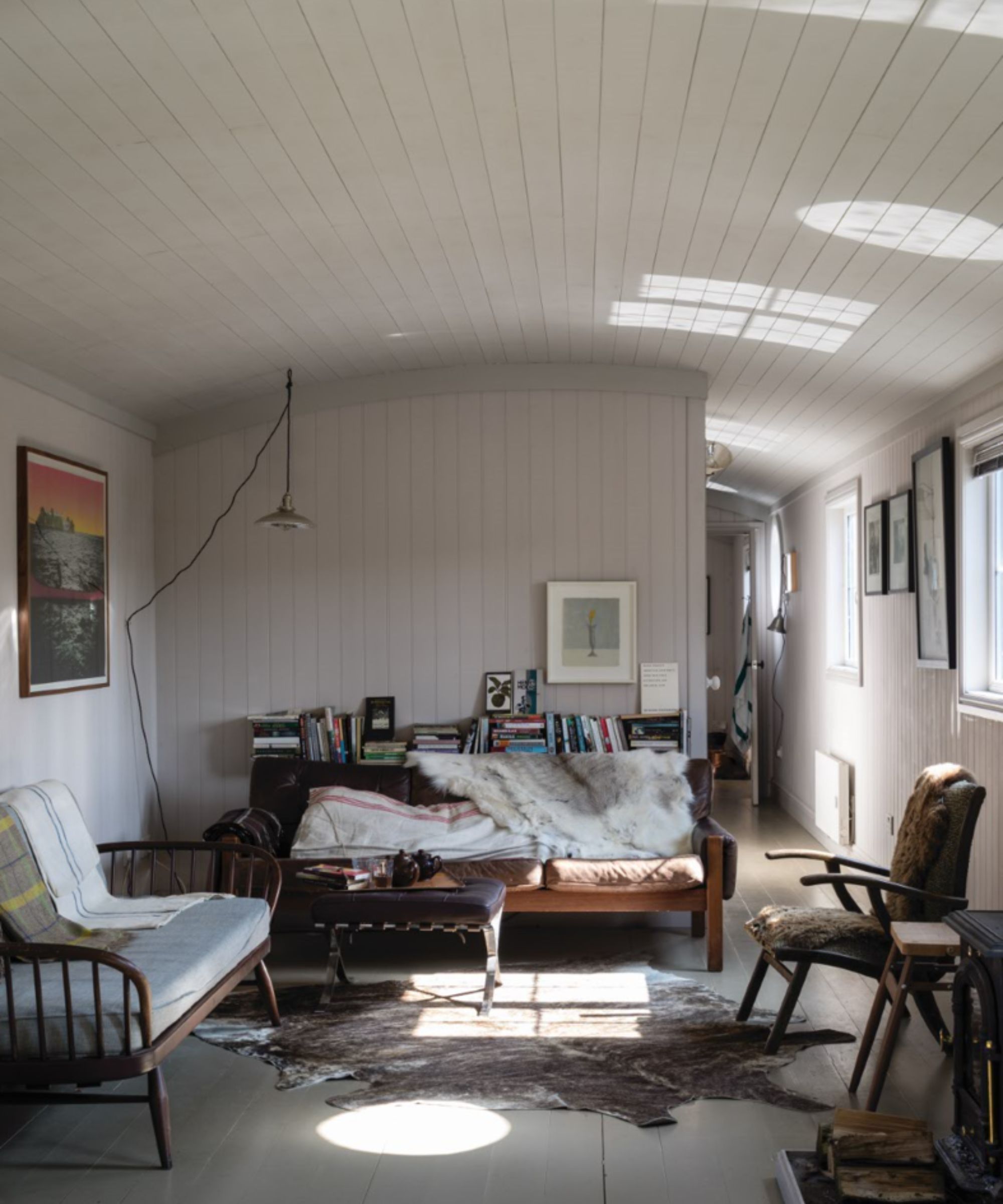
'We love using Farrow and Ball paints because the pigments in the hues and tones are deep and rich, no matter if you are working with a soft yellow, a taupe gray or inky blue. Our favorites from are Elephant's Breath, Dove Tale, and Worsted,' says Kristen Fiore, owner and principal designer at Kristen Elizabeth Design. There are many ways to embrace decorating with these light grays, but Kristen suggests using them on the kitchen cabinets: 'I recommend using them on cabinets as a nice deviation away from the solid black that you often see. It is a great way to bring depth into the cabinet color without feeling like you are surrounded by black. We also like to use the lighter color grays in trim and baseboard moldings.'
3. Sherwin-Williams, Repose Gray
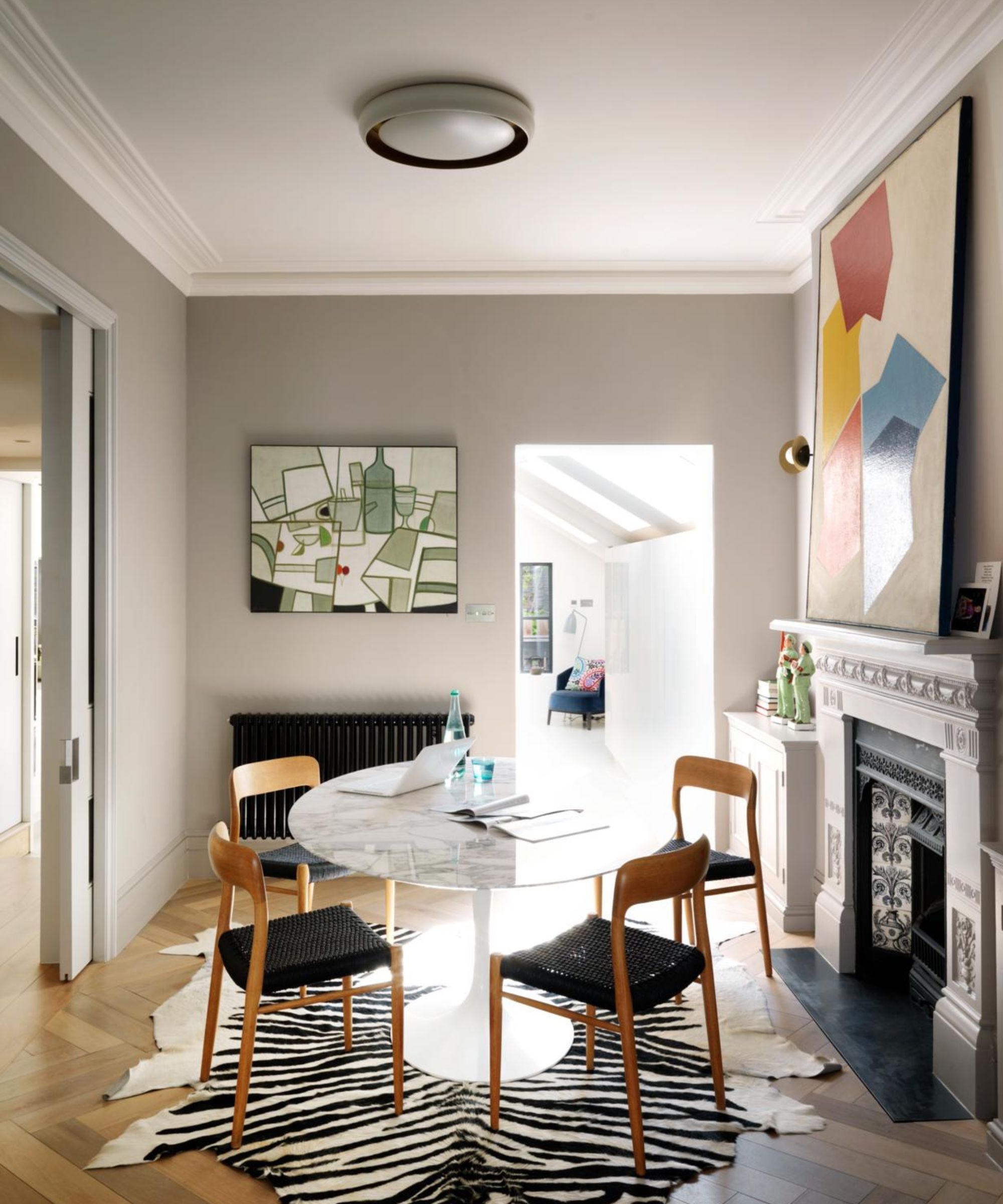
'I love Repose Gray by Sherwin Williams,' says Katharine Rhudy, founder of Reed & Acanthus. 'It's a true, neutral gray that can be used on the exterior or throughout the interior of an entire home. If your room has northern exposure, Repose Gray will lean a bit more blue with just a flash of violet in the shadows. But in a south or west-facing room, it will look much lighter with no noticeable undertones at all which makes it the perfect neutral gray paint.'
Design expertise in your inbox – from inspiring decorating ideas and beautiful celebrity homes to practical gardening advice and shopping round-ups.
4. Benjamin Moore, Kendall Charcoal
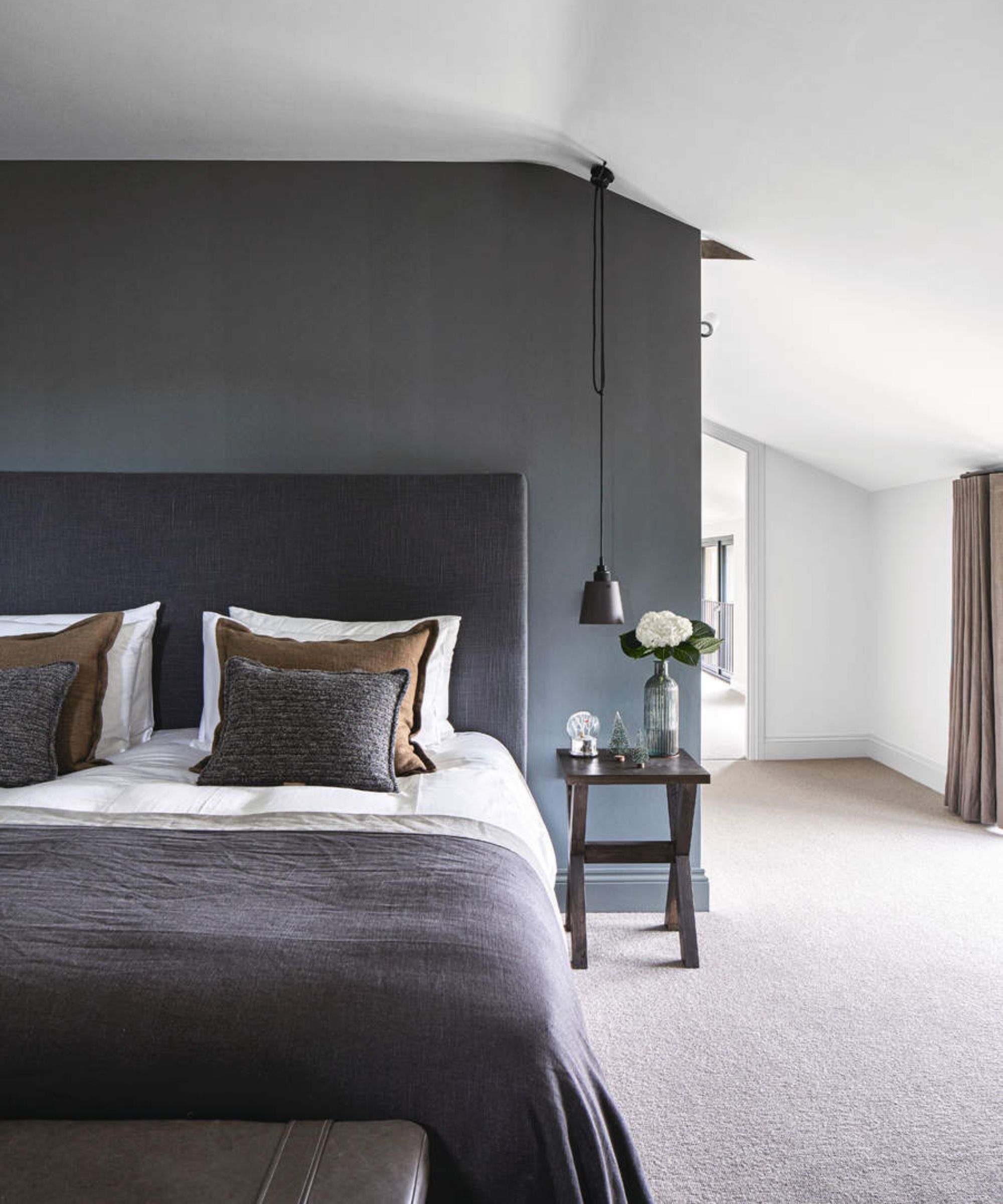
'My favorite grays include Benjamin Moore's Kendall Charcoal,' says Gaelle Dudley, founder of GLDESIGN. 'There is something about neutral tones that feel physically peaceful and mentally soothing. Using earthy tones as a base for designs allows us to have fun with color, texture, and sheen where necessary. Gray is one of those transition colors that is so versatile it can be used in a foyer, bedroom, bathroom, or even a front door. A dark gray that is almost black screams luxury. Don't be afraid to paint an office, walls, trim, and ceiling in this moody hue.'
6. Farrow & Ball, Ammonite
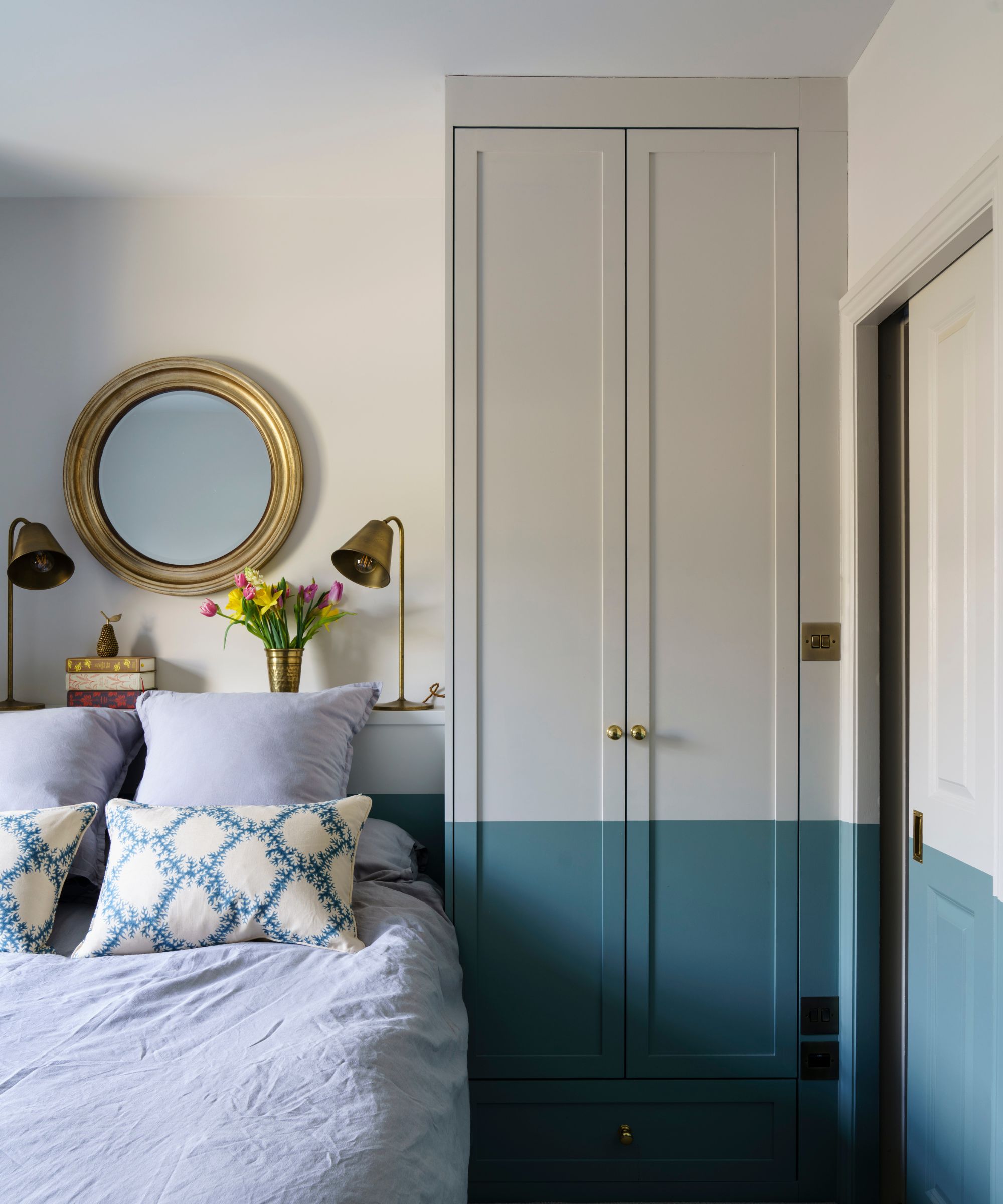
Lastly, Charlotte Cosby of Farrow & Ball recommends using Ammonite for your home decor ideas. 'Light gray can be used anywhere you’d consider white. Far from looking spartan, it can add character and depth to even the simplest of spaces. When introducing color accents to lighter greys, think about the undertones of the pairing first and then the contrast you wish to achieve. Ammonite a soft stony grey will team beautifully with blues and greens such as Inchyra Blue or Hague Blue as both have the gentle undertones of nature, such as the delicate brown note found in Ammonite and the green in Inchyra Blue.'
There's no doubt that gray is a versatile hue that can be used throughout the home to create a timeless look. Whether you prefer light variations of this color or darker tones, make sure you're aware of mistakes to avoid when decorating with gray for a cohesive end result.

Emily is a freelance interior design writer based in Scotland. Prior to going freelance in the spring of 2025, Emily was Homes & Gardens’ Paint & Color Editor, covering all things color across interiors and home decor for the Homes & Gardens website. Having gained specific expertise in this area, Emily is well-versed in writing about the latest color trends and is passionate about helping homeowners understand the importance of color psychology in home design. Her own interior design style reflects the simplicity of mid-century design and she loves sourcing vintage furniture finds for her tenement flat.


