Sherwin-Williams' Agreeable Gray is one of the country's favorite gray paints – but is it the right choice for you?
Agreeable gray is a favorite in homes across the country, but is it always as mildly mannered as its name suggests? We asked experts to break down this ever-popular shade

Design expertise in your inbox – from inspiring decorating ideas and beautiful celebrity homes to practical gardening advice and shopping round-ups.
You are now subscribed
Your newsletter sign-up was successful
Want to add more newsletters?
Agreeable Gray by Sheriwin-Williams has become one of the most popular choices when it comes to warm, neutral paint colors. Whilst it might not have the most poetic or enchanting name, perhaps that’s part of its appeal. It’s a paint color that yields the spotlight, allowing other design choices to shine. It’s often praised for its ability to complement just about anything.
But while this paint has become a go-to for many decorators and homeowners (it's one of Sherwin-Williams' all-time best sellers), there’s more to know than just the name on the swatch.
Agreeable Gray may be a safe choice, but understanding what it offers and where it might fall short is the key to using it well and maximizing its potential. It’s always good to have a list of the best gray paint options on hand when refreshing your interiors, and Sherwin-Williams has several worth considering. But whilst decorating with gray might seem foolproof, it demands just as much planning and testing as bold colors.
Article continues belowHere, we unpack what Agreeable Gray can offer and where its challenges lie. From how it compares to other neutrals like other colors, such as Sherwin-Williams’ Repose Gray, to the rooms and lighting conditions where it performs best.
What makes Agreeable Gray so popular?
Agreeable Gray is technically a greige paint, and while that might sound unexciting, it’s a category that many people gravitate toward for its flexibility as a complementary shade or backdrop. As befits its name, Agreeable Gray is a good-natured, easy-to-use hue, and what it lacks in charisma, it makes up for in versatility and adaptability.
As Emily Kantz, Color Marketing Manager at Sherwin-Williams, puts it: 'Agreeable Gray is a longtime favorite because it blends the cool elegance of gray with a hint of warmth. It’s perfect for those who want a neutral paint that feels soft and inviting without drifting into beige.'
That balance is exactly why it works so well across different homes and styles. It doesn’t dominate a space, but it doesn’t fall flat either – at least not under the right conditions. That said, decorating with greige can be more challenging than it sounds. Many greige tones can end up reading as cold, dull, or lifeless. What some might describe as the 'unwell' look: washed-out and lacklustre, especially in poor light.
Design expertise in your inbox – from inspiring decorating ideas and beautiful celebrity homes to practical gardening advice and shopping round-ups.
Agreeable Gray avoids some of these common greige pitfalls, but not all. If you’re searching for a neutral paint with more character or contrast, it may not offer the level of personality you're after.
Both Agreeable Gray and Repose Gray are top picks in Sherwin-Williams’ neutral lineup, but they don’t serve quite the same function.
'Agreeable Gray is more of a warm greige with subtle beige undertones,' says Emily. Whilst 'Repose Gray tends to lean a bit cooler, with more of a slight blue undertone'. In plain terms: Agreeable Gray is the warmer, more forgiving choice. It’s often described as a better fit for traditional, transitional, or family-friendly interiors where warmth is key.
Repose Gray, by contrast, has a cleaner, crisper edge, which is suited to more modern, minimal interiors or those aiming for a cooler finish. If you’re weighing your options about grays, particularly with a concern of your shade reading too steely, drab, or cold, Agreeable Gray may feel safer.
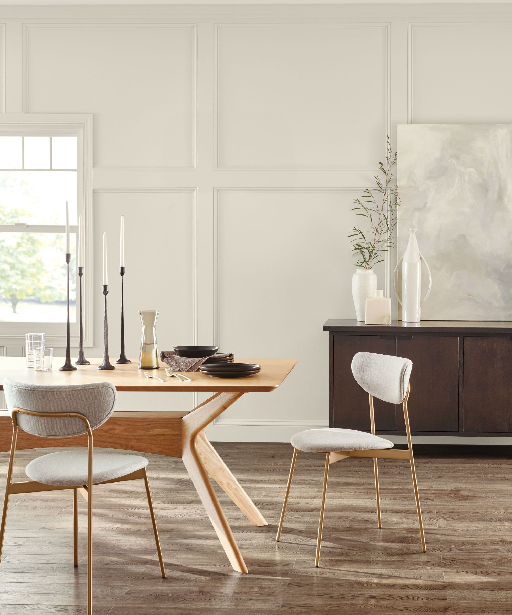
There’s a reason this shade finds its way into everything from show homes to open-plan apartments. According to Emily: 'Agreeable Gray is one of those rare colors that brings a subtle, inviting warmth to a space. It acts like the finishing touch that effortlessly ties a room together.'
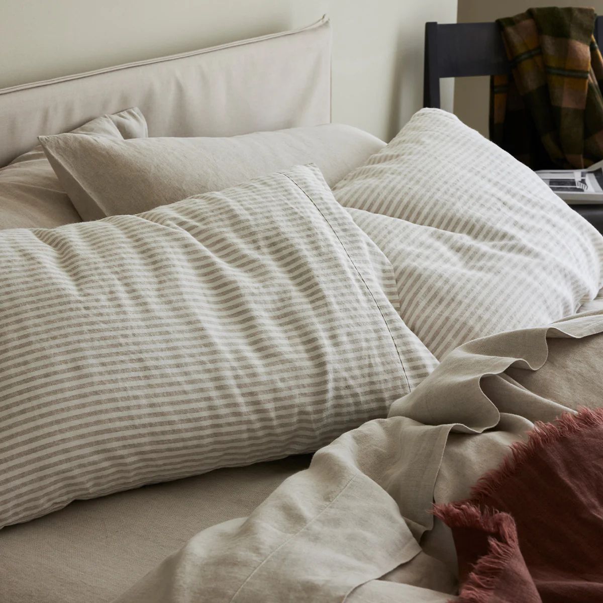
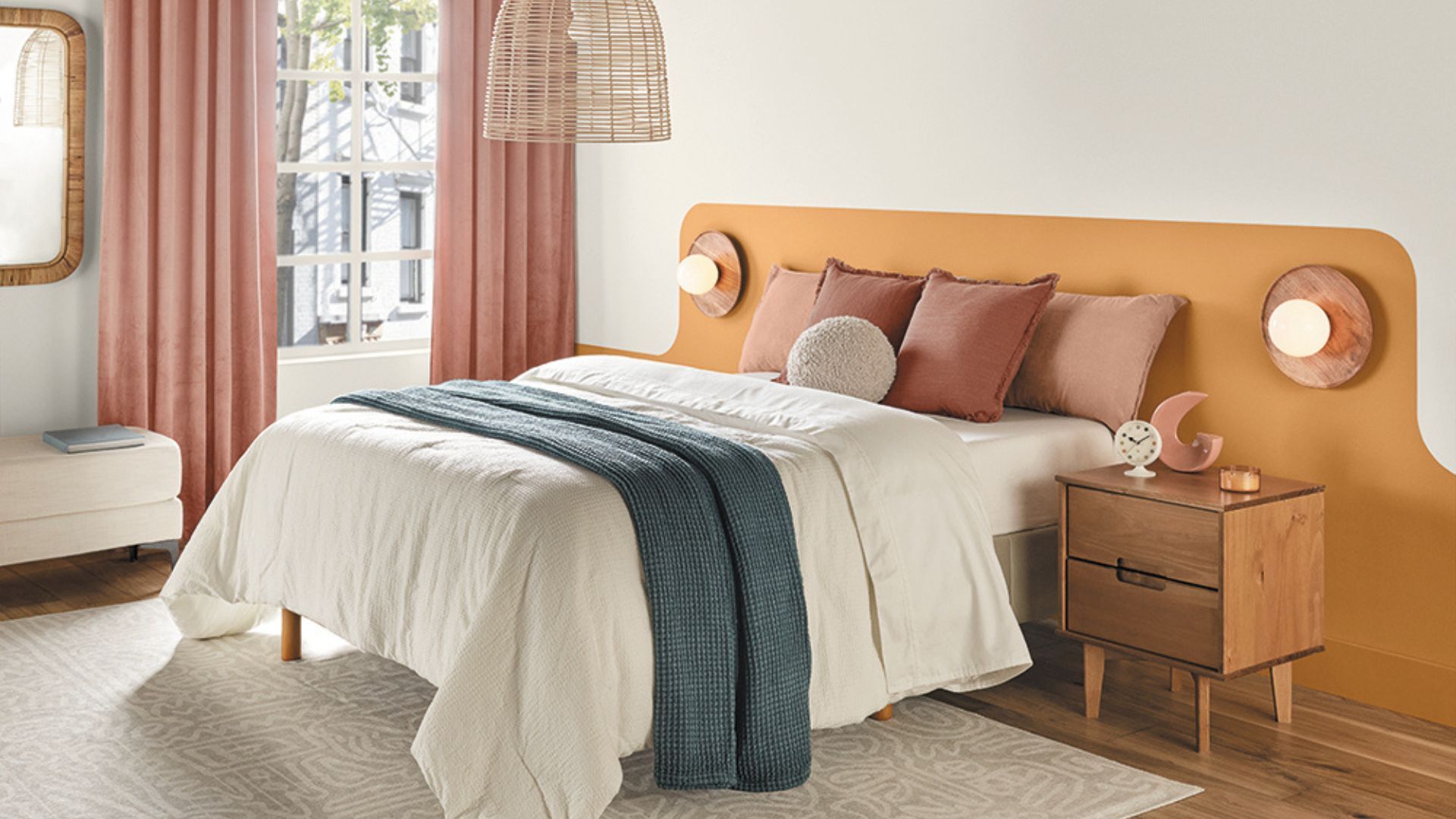
This ability to soften a room without muting it completely is what many designers appreciate. It doesn’t fight for attention, it recedes and lets the textures and finishes in the room do the talking, especially when layered with wood textures or tonal off white paints. It’s also a flexible backdrop for experimenting with accent colors on trims and edging, a characteristic not all neutrals can match.
What colors pair well with Agreeable Gray?
Agreeable Gray is compatible with a surprisingly broad palette, which makes it a useful foundation shade for layered or tonal schemes.
Emily advises, 'For a soft and serene look to pair Agreeable Gray with shades such as Sea Salt SW 6204, a soft muted green for that spa-like vibe or Rainwashed SW 6211, a muted aqua for a peaceful coastal color scheme.'
Or if you are aiming for a bolder look, Emily suggests to 'add a dose of drama with Urbane Bronze SW 7048, a deep moody brown-gray that would look stunning on cabinetry paired with Agreeable Gray walls. For a classic neutral palette try pairing with Shoji White, a soft off-white for a cozy vibe. These combinations allow the color to shift character depending on your scheme – cool coastal, warm transitional, or modern rustic.
Where it works, and where it doesn't
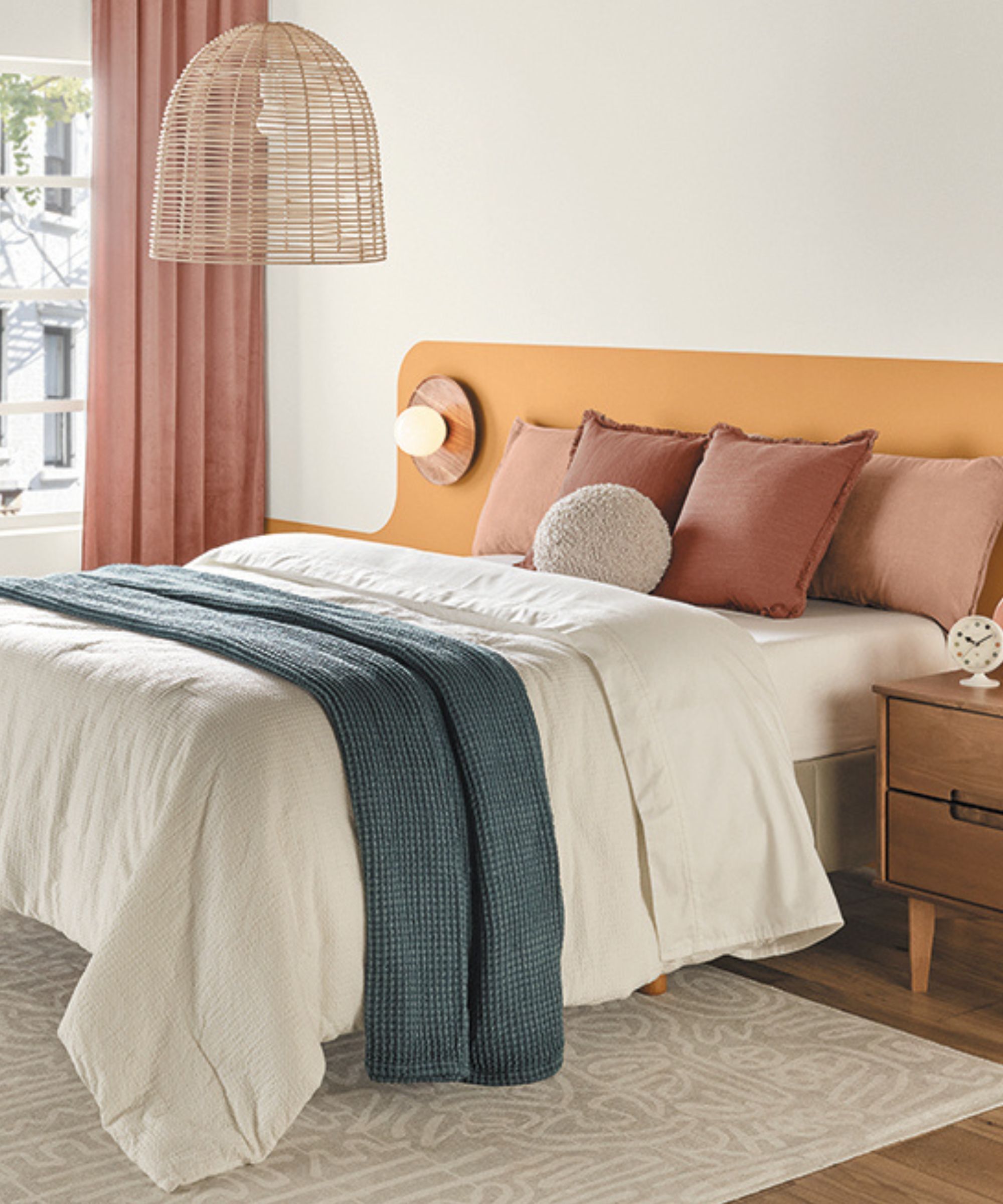
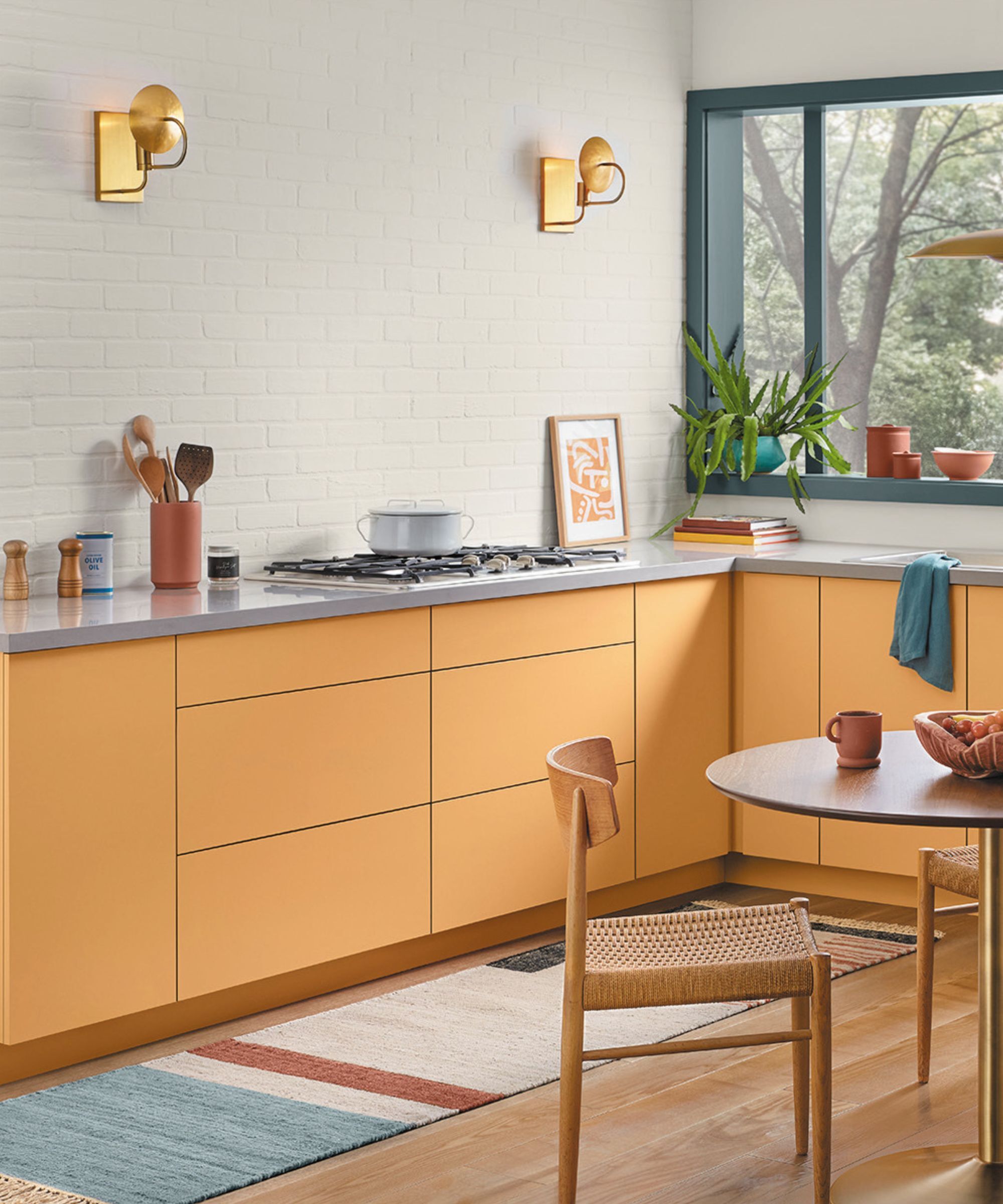
Like most greiges, Agreeable Gray thrives in rooms with balanced or warm lighting. It’s often used in living rooms, kitchens, and open-plan spaces, where its soft tone helps create cohesion without drawing too much attention.
Emily notes that it’s a particularly good fit for open concept homes: 'Its light value and balanced tone help unify large areas without overwhelming them.'
It also works well alongside classic white cabinetry and wood floors in dining and kitchen spaces. However, despite its renowned adaptability, it’s not a universal fix. In a north-facing room, Emily advises to 'be cautious about using Agreeable Gray in rooms that have very cool lighting'. In those conditions, its muted warmth can turn slightly dull and drab, especially if there’s not enough artificial lighting or warm accents to counterbalance.
In rooms with natural warmth and light, Agreeable Gray it can be an excellent, low-maintenance option. But it’s not the perfect fit for every situation. If you love the idea of Agreeable Gray but are working with north-facing or poorly lit spaces, Drop Cloth by Farrow & Ball is a great alternative with a softer, more forgiving tone.
Alternatively, if you are looking for a neutral that totally forgoes any ice-cold gray undertones, consider Slaked Lime Dark by Little Greene, a designer favorite known for its layered warmth and chalky elegance, or, the mushroom toned neutral, Sherwin-Williams’ Shiitake, taking on a slightly earthier presence. In the end, Agreeable Gray lives up to its name as a solid, accommodating base that plays well with others. Just make sure it’s playing in the right room.

Sophia Pouget de St Victor is the UK Content Editor at Homes & Gardens, bringing readers the latest trends, expert insights, and timeless design inspiration tailored to a UK audience. With a background in luxury interiors and a qualification in Garden Design from London, she has a passion for creating spaces with character and emotional depth. Sophia gravitates toward interiors that defy definition, valuing individuality and effortless elegance. She lives in West London with her partner, two mischievous terriers, and a plump cat named Lettuce.
