What are Sherwin-Williams' best-selling paints? And how interior designers put them to use
There are some familiar names in here for sure, Greek Villa, Accessible Beige, and Alabaster, but how do designers put these best-sellers to use in their own projects?


Design expertise in your inbox – from inspiring decorating ideas and beautiful celebrity homes to practical gardening advice and shopping round-ups.
You are now subscribed
Your newsletter sign-up was successful
Want to add more newsletters?
Sherwin-Williams' is a paint brand much loved by interior designers and homeowners, so their best-sellers list is a real zeitgeist for how we are decorating our homes. Color trends may predict what shades will be big in 2024, but in terms of what colors we are all actually using in our own home's best-sellers list says it all.
Perhaps then it's no surprise that this list is filled with much-loved neutral paints – whites, grays, beiges, and greiges all dominate here. A reflection that while color trends can be ideal for a playful refresh, when it comes down to designing lived-in homes that need to be timeless, neutrals still rule.
7 best selling Sherwin-Williams paints
There are some very familiar names here. Sherwin-Williams' best sellers come up time and time again when we speak with designers about their favorite paints. But how do they recommend using them and what is it about these shades that make them so popular?
Article continues below1. Pure White
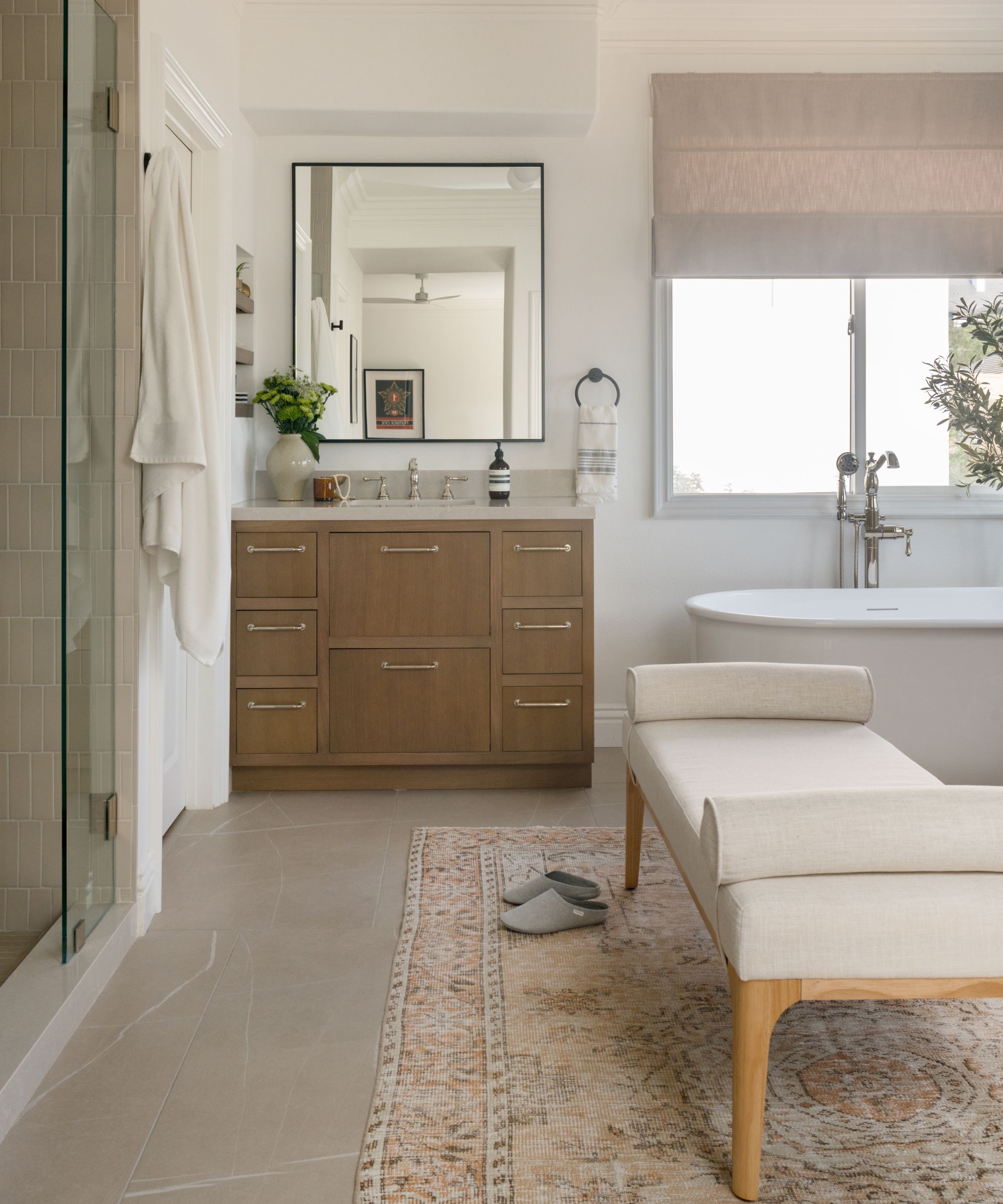
The top of the list is of course a white paint. For anyone who has ever tried to find the perfect white knows it's no easy task. But the reason Pure White SW 7005 is such a popular choice is because, despite its name it's not a true white, it's ever so slightly warmer. And it's important to note that when we asked for designers' favorite Sherwin-Williams paints, Pure White made the top of the list.
As Sue Wadden, Director of Color Marketing for Sherwin-Williams explains, 'This versatile, bright white has the slightest yellow undertone that keeps it from appearing too stark.'
Designer Shelagh Conway is a huge fan of Sherwin-Williams' neutrals and Pure white in imparticular, 'Love this color for our modern homes! We use it for ceilings, doors, cabinets, and sometimes walls! It's a beautiful bright white with warmer palette.' she explains.
Mollie Ranize, founder of Dmar Interiors used it in this neutral bathroom. 'Just like its name, Pure White is a pure and bright white which works well in many architectural styles. We have used this color in a number of homes, mainly when the whole home is getting a base coat of crisp, bright white. It looks so clean and bright in modern spaces, but also when used for walls, ceilings, doors and trim in more traditional architecture.'
Design expertise in your inbox – from inspiring decorating ideas and beautiful celebrity homes to practical gardening advice and shopping round-ups.

Mollie Ranize is the founder of Dmar Interiors, a nationally recognized design firm based in sunny Southern California. She has been known for her 3T Method for 20+ years: designing Tasteful, Tailored and Timeless interiors.
2. Agreeable Gray
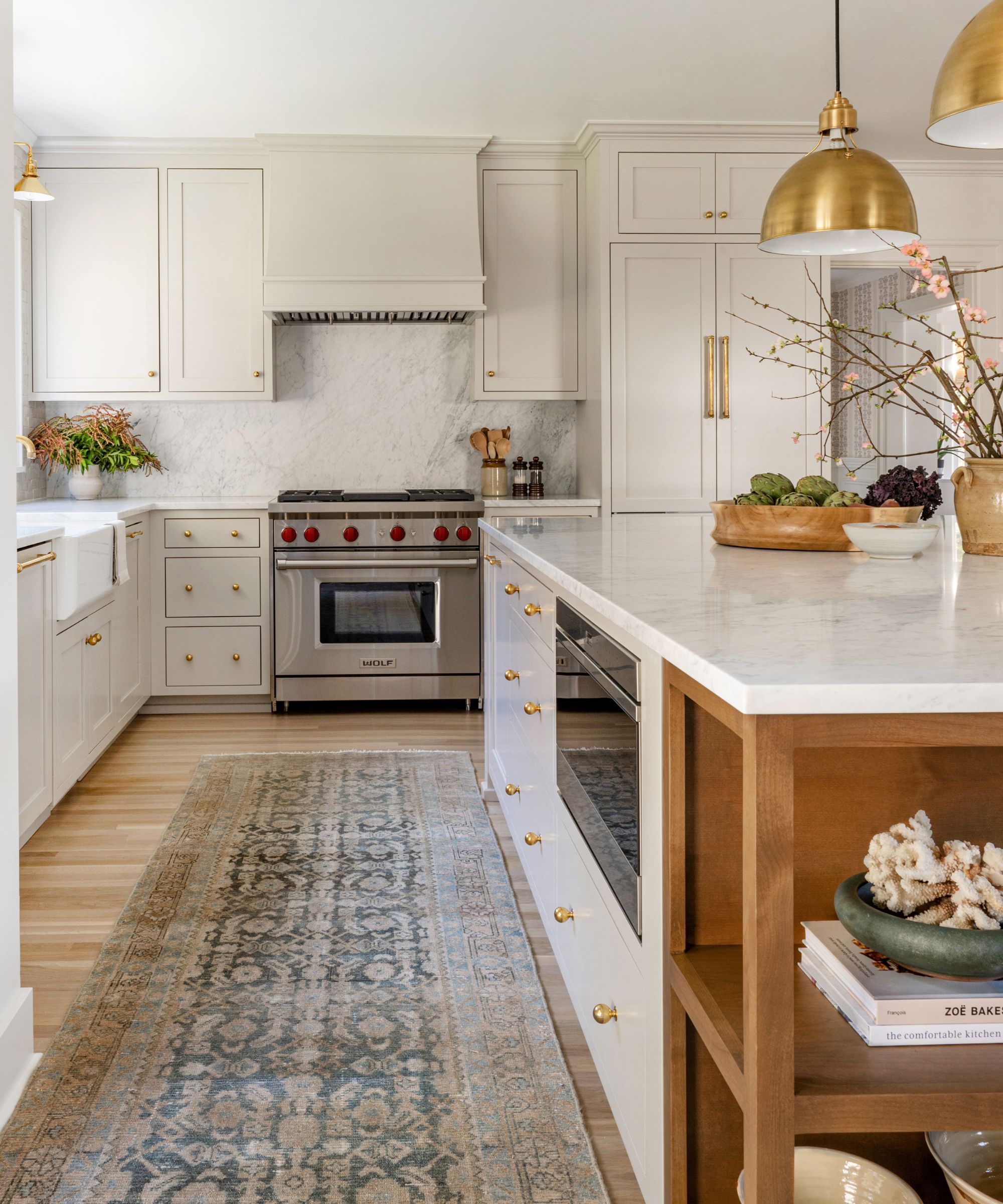
Agreeable Gray SW 7029 comes up time and time again when we ask designers for their best greige paints.
'This color is wonderful because it can feel very creamy or more gray depending on how much light hits it and what other colors are around it,' explains Mollie Ranize. 'The fact that it can appear slightly differently depending on lighting makes it interesting in many architectural styles from Craftsman to Tudors. It feels like it has historical relevance. It can also highlight trim brilliantly.'
Cohesively Curated choose the shade for this Tudor kitchen, 'Originally my client wanted creamy white kitchen cabinets based on many of the kitchens she saved photos of for inspiration. Her kitchen had a lot of natural light with large windows and french doors on 2 of the 4 walls. We felt that creamy white could look too stark so we sourced paint color options that would create more of a subtle contrast with the white walls, but still felt warm without being beige or yellow.' explains the studio's owner Emily Ruff.
'Agreeable Gray is a great neutral color that has some warm undertones compared to most grays, but doesn't lean too far so that it feels brown or beige. I have found that it is best used in a space with good natural light, otherwise it can lean purple. I always recommend paint colors are reviewed in the spaces they will live in and at different times of the day since the colors can change so much based on their environment.'
3. Snowbound
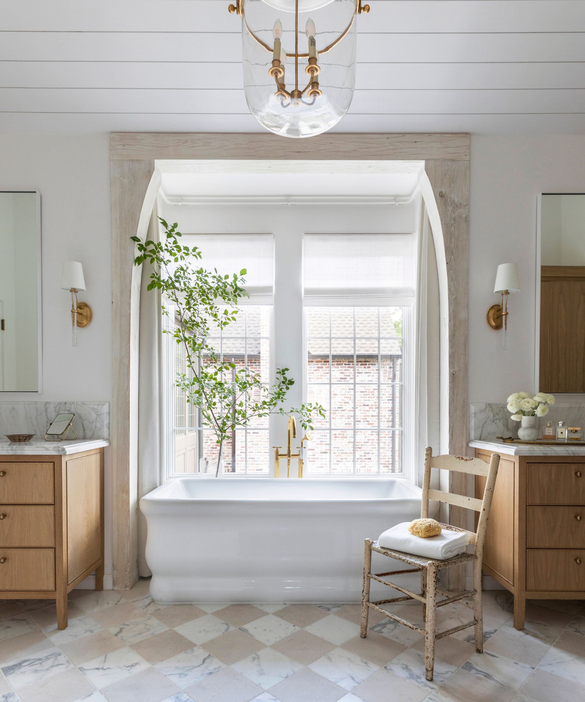
'Snowbound SW 7004, with its slight gray undertone, this versatile cool white pairs well with other gray-influenced colors,' explains Sue Wadden. The thing that makes Snowbound such as white paint is that, as Sue mentions, it does pair well with cooler tones, but also can work to balance and freshen warmer shades, as can be seen in this white bathroom designed by Marie Flanigan.
'The name Snowbound is perfect for this stunning, cooler white,' says Marie. Snowbound is a pure palette cleanser, offering a fresh canvas with slightly grey undertones. The undertones give this color lots of versatility as it can be warmed up easily with additional finishes.'
This cool white is endlessly versatile and can be used in many ways, but we've rounded up interior designers' favorite ideas on how to decorate with Sherwin-Williams' Snowbound.

Marie Flanigan is an award-winning interior designer whose passion and achievements in design have positioned her as one of the nation’s best. She is classically trained and practiced architect, and her trademark style is evident through the sophisticated use of color, texture, and light. Every home she designs receives her personal signature of timeless elegance and innovative simplicity.
4. Alabaster
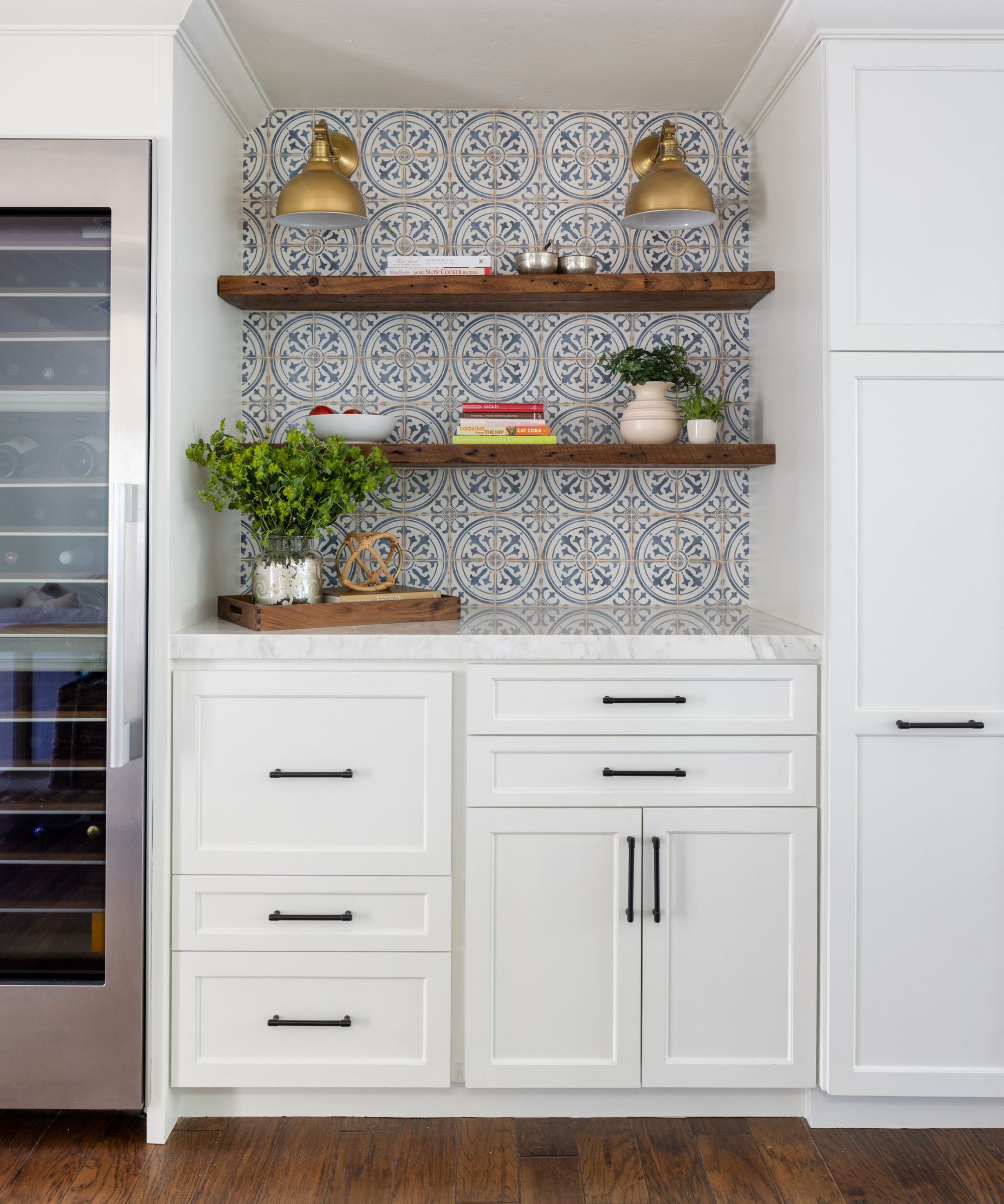
'This is an all-around PERFECT paint. I use this in 90% of my projects for ceilings, doors, and trim,' says Shelagh.
Alabaster SW 7008 is a much-loved paint and as Sue describes it's for 'When you want the brightness of a white without sacrificing a warm coziness, try this soft, warm but balanced white.' It's a white that teeters on the edge of being a cream – one of the best warm white paints out there.
Mollie of Dmar Interiors used Alabaster as a kitchen cabinet color, explaining 'We chose this soft, warm white for the kitchen cabinetry because it's a Spanish home, but the clients relocated after many years in Southern California beach towns, so we still wanted to maintain a cool coastal vibe. It's subtle but just crisp enough to keep it cool!'
5.Accessible beige
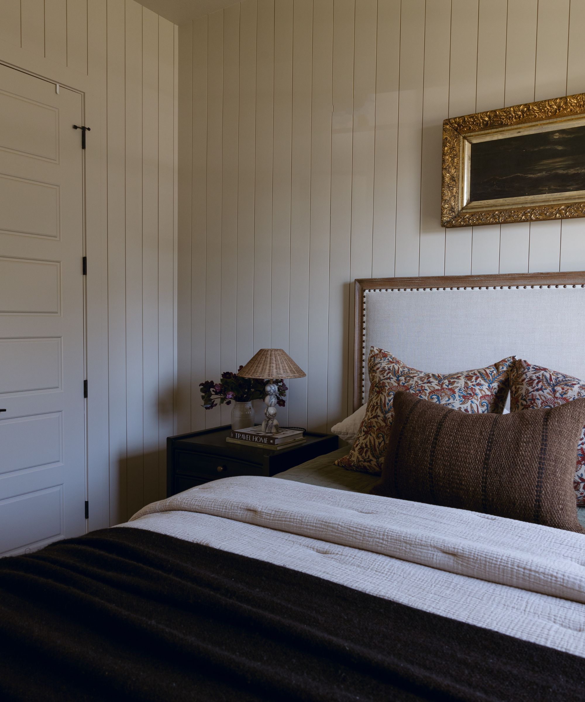
'Unlike many beiges, Accessible Beige SW 7036 has undertones of gray that can give your space a warm, snug feel,' explains Sue. The name of this paint explains it perfectly, it's so versatile and easy to use and more of a greige than a beige so you don't have to worry about it look too warm. It also means it works with both warm and cooler shades. It's a huge color trend for 2024 to be blending the two sides of the color while and this best-of-both-worlds paint makes for the perfect backdrop.
'Beige is both classic and complex, and is one of the most versatile colors that plays beautifully with any hue. I have many favorites, but if you’re looking for a classic beige color, Accessible Beige by Sherwin Williams is one of our go-tos, that has beautiful, warm gray undertones,' explains designer Audrey Scheck.

With more than a half-dozen years of experience in remodels and renovations, Audrey Scheck leads Audrey Scheck Design, a full-service interior design firm based in Austin, Texas.
6. Greek Villa
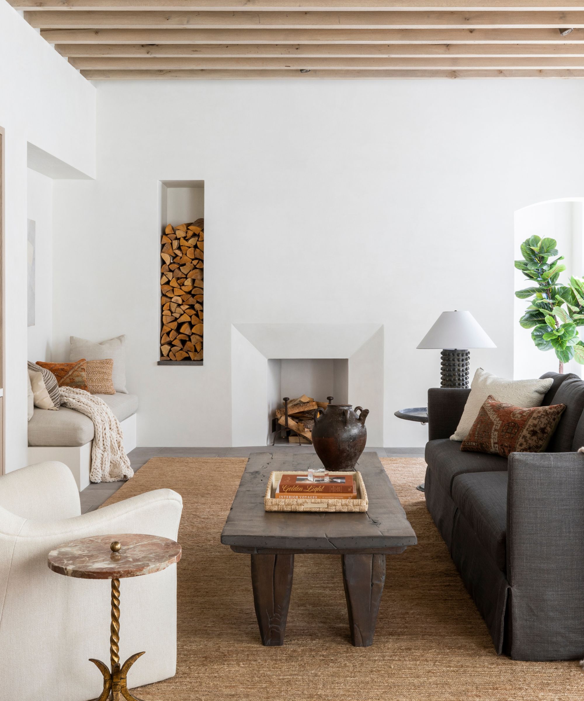
What a dreamy sounding paint. 'This sunny white comes to life in natural light, and its best used to brighten any space or try it on trim to make other colors pop,' explains Sue. Not too cool not too warm this shade is very close to a brilliant white with just a hint of yellow, which is something you should always look for.
'Greek Villa SW 7551is a beautiful and welcoming white,' says Marie Flanigan who used the paint in this white living room. 'When designing a space, I tend to lean toward a natural palette full of muted gem tones. Greek Villa has just enough warmth to support these saturated colors while stillremaining a neutral backdrop.'
'Aptly named – if a white paint could take me away, this is the one that would,' adds Christine Carney, Director of Design for Blackberry Farm Design. 'Cheerful and sunny, great for a kitchen or bathroom since bright light won’t make it stark or harsh.'
7. Drifts of Mist
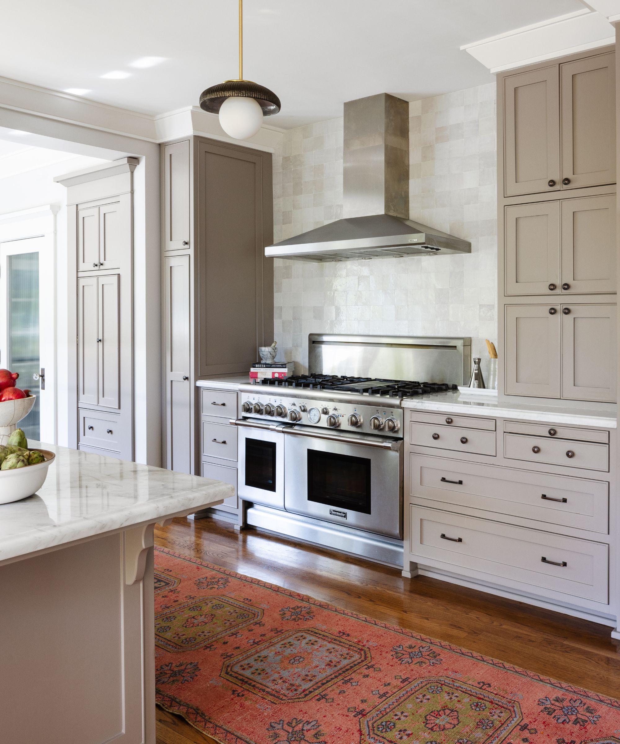
Drift of Mist SW 9166 is a very airy, yet inviting gray that can work in any space. It's as warm as grays come which makes it far more versitile than a cooler shade and yet it doe help balance out any very warm shades like orange-toned woods or very yellowy creams.
'Drift of Mist is a personal favorite,' say Mollie Ranize. ;It feels like a color that is reaching out for a hug. It's a light, subtle gray which instantly gives some depth without competing with the colors around it. It was perfect for these kitchen cabinets where we wanted to create a subtle sophistication. I also love it on walls where you need a color to harness both warm and cool tones around it or for just the perfect hint of warmth with bright white moulding.'
Shelagh adds, 'I love this one as well! It's very pretty for cabinets and walls! It is a chameleon, so make sure to check how it appears in your space. I love it paired as a wall color with Gossamer Veil cabinetry.'
No surprises here that all the best selling Sherwin-Williams' shades are neutrals. But I does say a lot about the way we actually decorate our homes. So many trends point towards more color, more pattern, but when it comes to it, the paint colors we are all most drawn to are neutrals – they are liveable and adaptable and work as the perfect backdrop for embracing bolder trends in ways that are more easily interchangeable than paint.

I am the Head of Interiors at Homes & Gardens. I started off in the world of journalism in fashion and luxury travel and then landed my first interiors role at Real Homes and have been in the world of interior design ever since. Prior to my role at H&G I was the digital editor at Livingetc, from which I took a sabbatical to travel in my self-converted van (not as glamorous as decorating a home, but very satisfying). A year later, and with lots of technical DIY lessons learned I am back to writing and editing, sometimes even from the comfort of my home on wheels.