'It is a shade we return to time and time again' – why designers love Farrow & Ball's quietly indulgent Pointing
Farrow & Ball's Pointing is the neutral paint color designers have fallen in love with, using it in multiple projects and multiple ways. Here's why it should be your new go-to shade
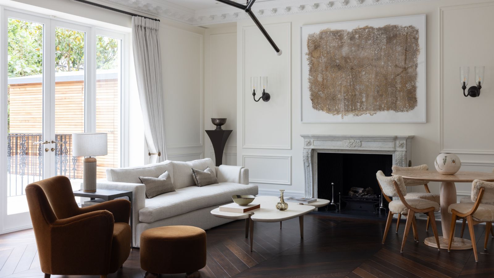
You'd be forgiven for not really noticing Farrow & Ball's Pointing, a subtle off-white paint nestled somewhere in the middle of its color card. Creamy, warm, and very neutral, it doesn't grab the headlines in the way of the brand's bolder colors like Hague Blue, Railings, or Jitney. But it's a quietly popular shade, one of Farrow & Ball's best selling paints in fact, and one that designers can't get enough.
Why? Because it's so versatile. Good for rooms with bright light, low light, calming schemes, or clashing patterns, this best neutral paint manages to work in them all. As a detail color, a ceiling, cabinets, or whole house, designers have embraced this unsung hero of a hue.
'Farrow & Ball Pointing’s restraint is its strength,' says the decorator Ashley Aspin. 'It brings warmth and freshness without competing for attention, so it’s perfect for homes where stronger color is in the art, furniture, tiles, or paneling. It works fantastically well in smaller because it brightens rooms where light can often be compromised – even south-facing spaces.' For more reasons designers love Farrow & Ball Pointing, read on.
Article continues belowWhat color is Farrow & Ball Pointing?
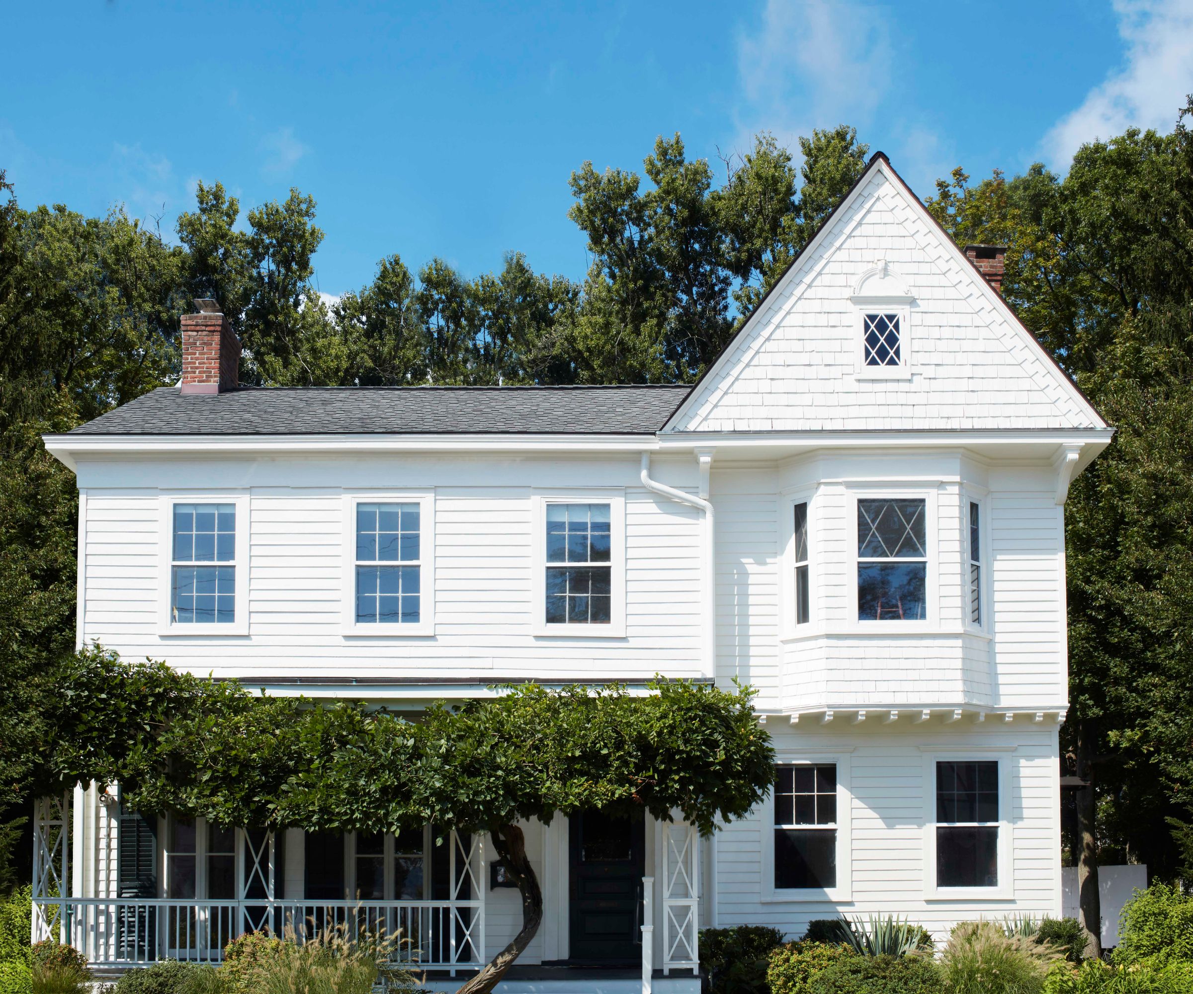
With so many colors on the color chart, it sometimes takes Farrow & Ball's own in-house brand ambassador, Patrick O'Donnell, to decode them.
'Pointing is the red-based sibling of Wimborne White – both perennially popular and effortlessly useable,' he says. 'There is a perfect softness to Pointing and a brilliant choice for ceilings and trim for a classic look, but without any harshness that a generic white often brings. Due to the very subtle, palest red note within Pointing, it’s an easy win color combination when teamed with delicate pink or warm neutrals, but super flexible with many other colors too.'
How do designers use Farrow & Ball Pointing?
1. To add coziness
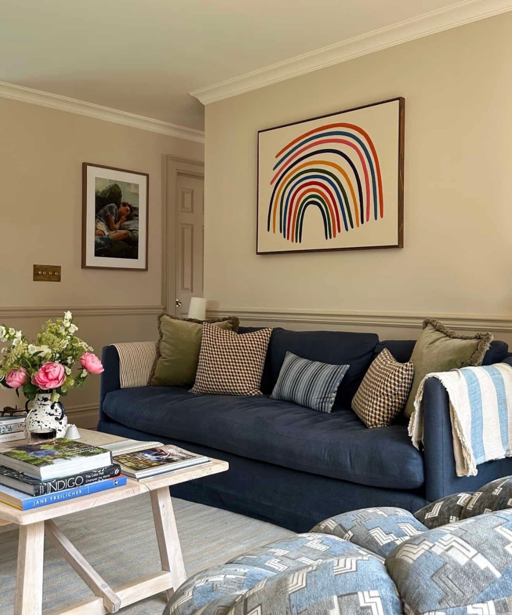
For the interiors author, TV presenter and content creator Will Taylor of the wildly popular @brightbazaar account, Farrow & Ball's Pointing is a starting point for many of his schemes. In his New York apartment, above, he chose it for everything at the top of his living room.
'Pointing is my go-to for ceilings and crown molding because it has a soft, warm undertone that makes a room feel cozier compared to a stark white,' Will explains. It allows a sense of crisp freshness above the sludgier wall color, but it isn't as stark as brilliant white paint would be.
Design expertise in your inbox – from inspiring decorating ideas and beautiful celebrity homes to practical gardening advice and shopping round-ups.
2. To bring warmth
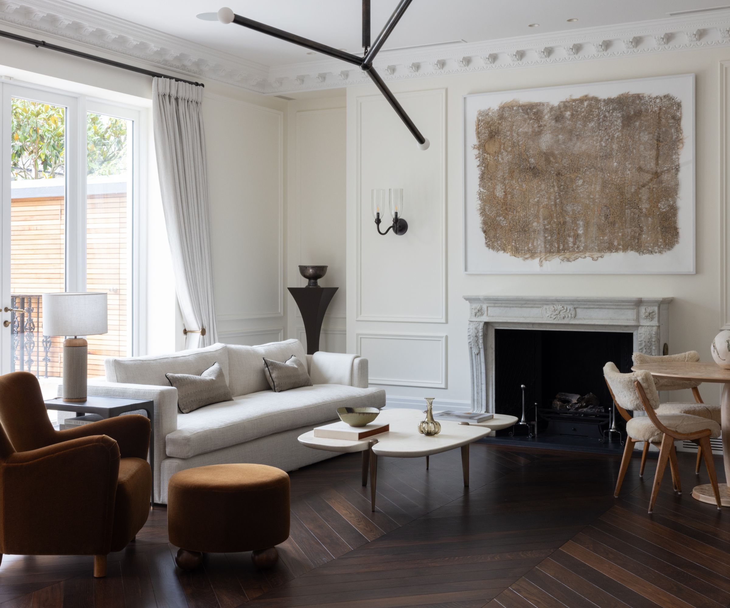
The interior designer Portia Fox is known for her luxe and calm schemes, and it's no surprise that Pointing has become somewhat of a favorite. 'We used Farrow & Ball’s Pointing on the walls of the living room, study, entryway, and staircase of this project,' Portia says.
She chose it from a vast number of different options, Pointing being the standout. 'We trialled a few different shades for these spaces before settling on Pointing, which brings a lovely, fresh warmth that pairs beautifully with a wide range of material palettes,' she adds.
3. To add comfort
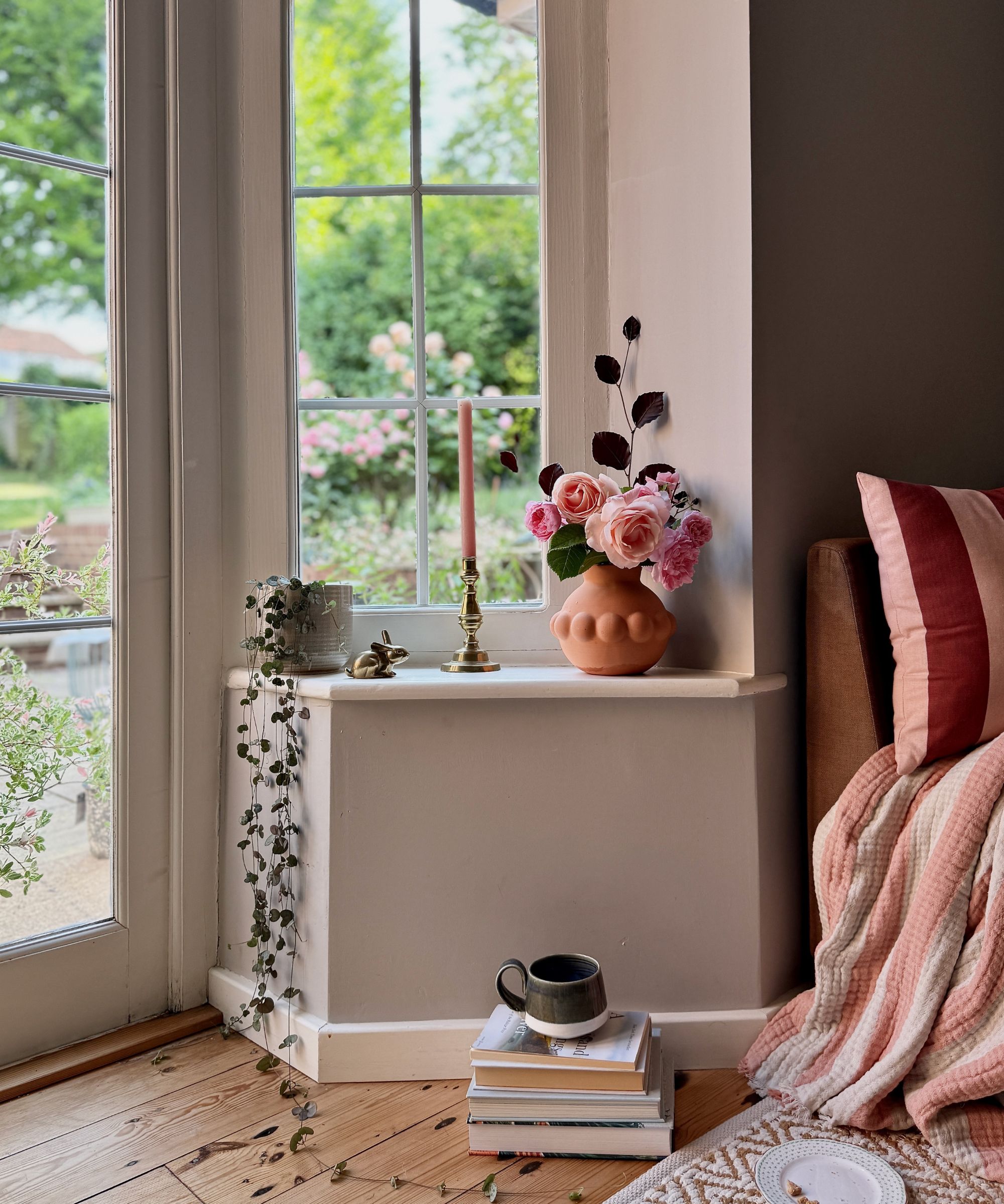
Rebecca Fisher, founder of the design studio Homeshaped, loves to use Farrow & Ball Pointing on a room's details, as she says it has a comforting effect.
'Pointing is an earthy of-the-land white, which gives it a beautifully unassuming and comforting quality,' Rebecca says. 'A favorite in my home and that of my clients, because it’s happiest as a support act. Although a warm neutral, used on the double doors and sills in my south-facing living room, it blurs the edges between outside and in, softening the cooler greige walls.'
4. For kitchen cabinetry
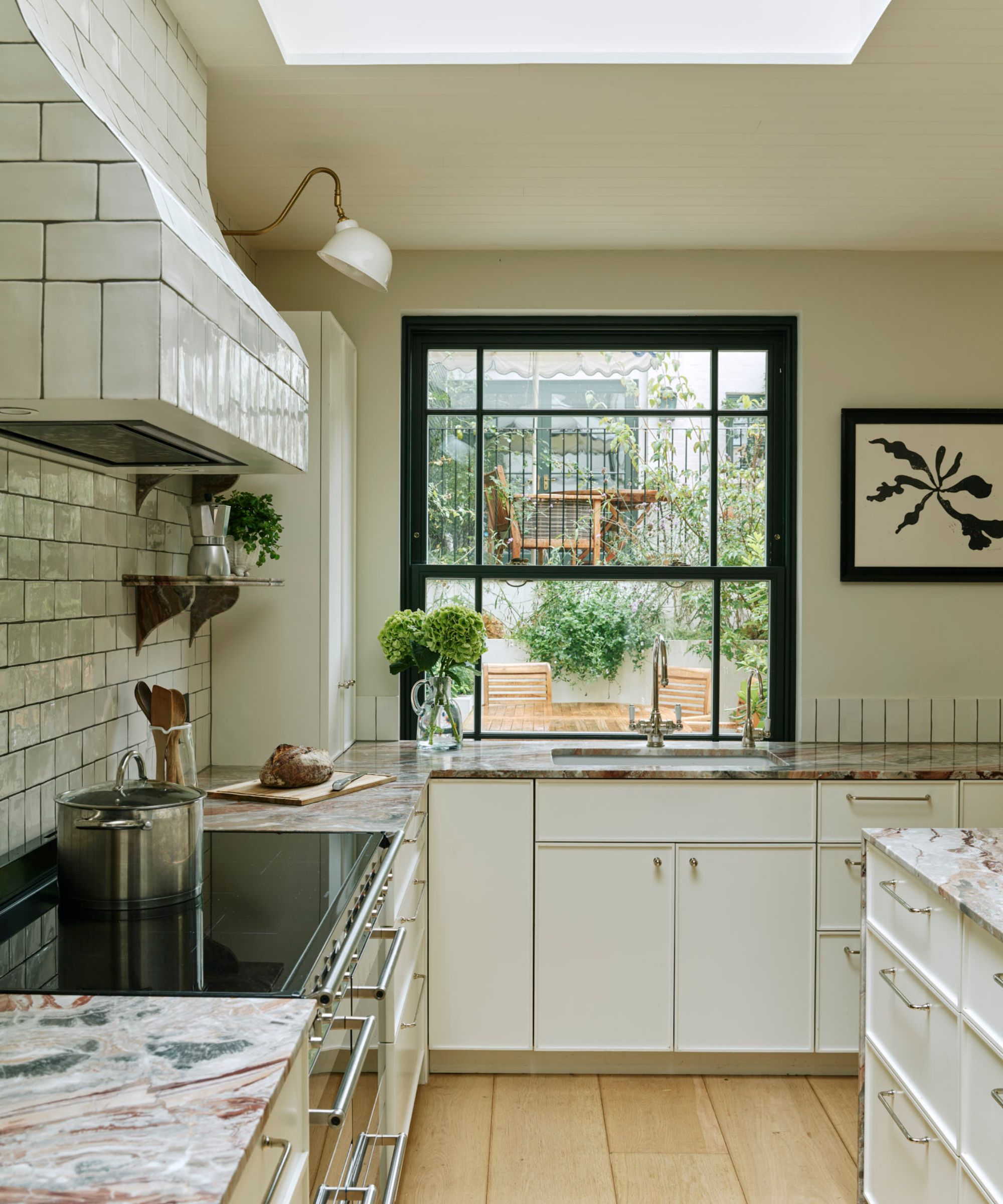
The beauty of Pointing is that it can add a contrast to sludgier tones without startling them completely.
'This kitchen we did the kitchen cabinetry painted in Pointing,' says Angelia Squire, founder of Studio Squire. 'We wanted a bright white shade for the cabinetry to offset our bold marble counter, and Pointing was exactly that. It is a shade we return to time and time again when we want a really sharp, crisp, clean white.'
5. To increase the feeling of luxury
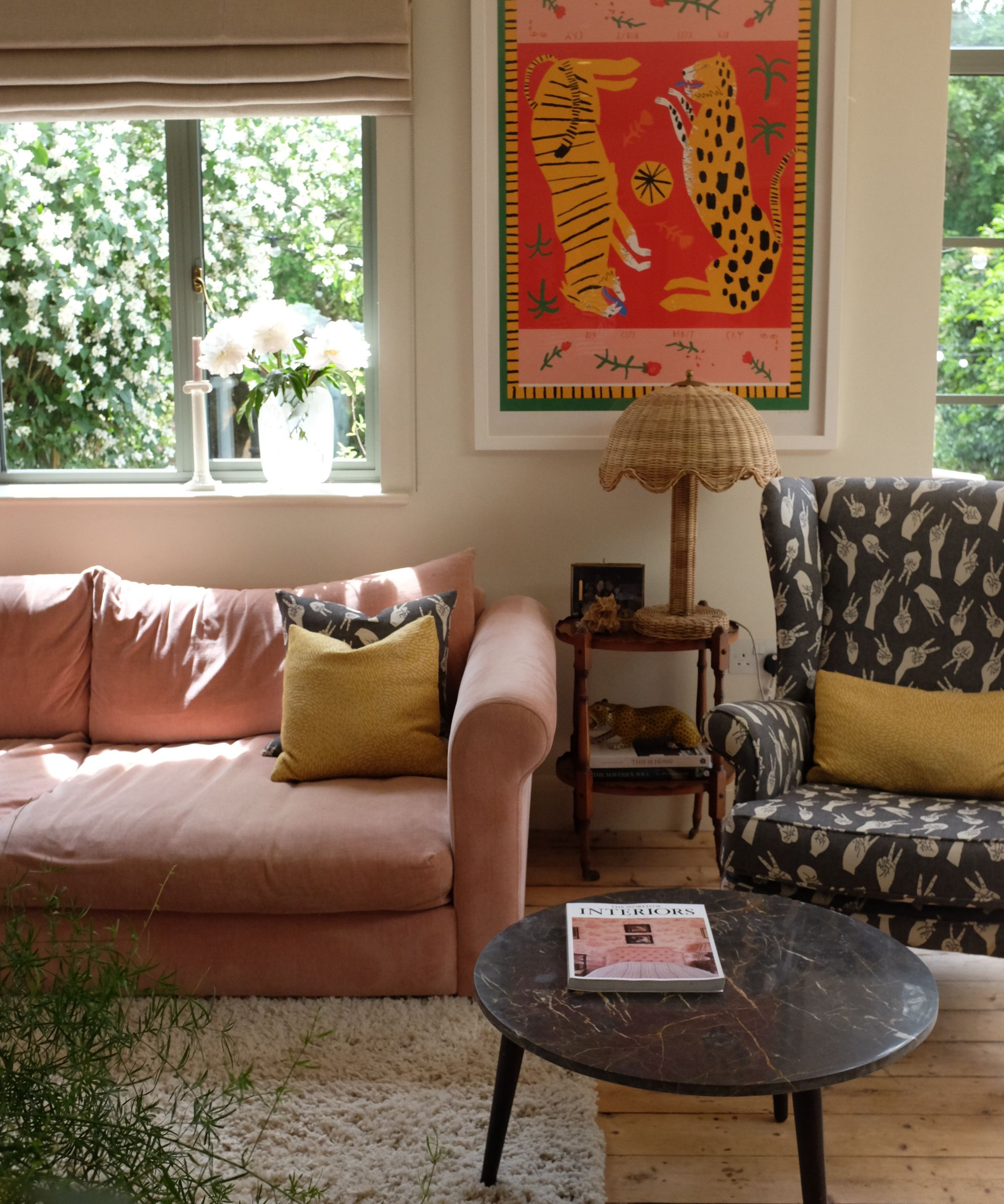
For the designer Danielle Edwards of Moths Interiors, Pointing is more than 'just' a neutral. It's an extra way to elevate an already elevated interior.
'There's an element of indulgence with Pointing that brings a sense of luxury and softness to a room,' Danielle says. 'In a living room, it pairs beautifully with velvets, throws, and candlelight, while also evoking the warmth of golden hour when sunlight streams in, creating a space that feels both warm and delicate.'
6. In light-filled spaces
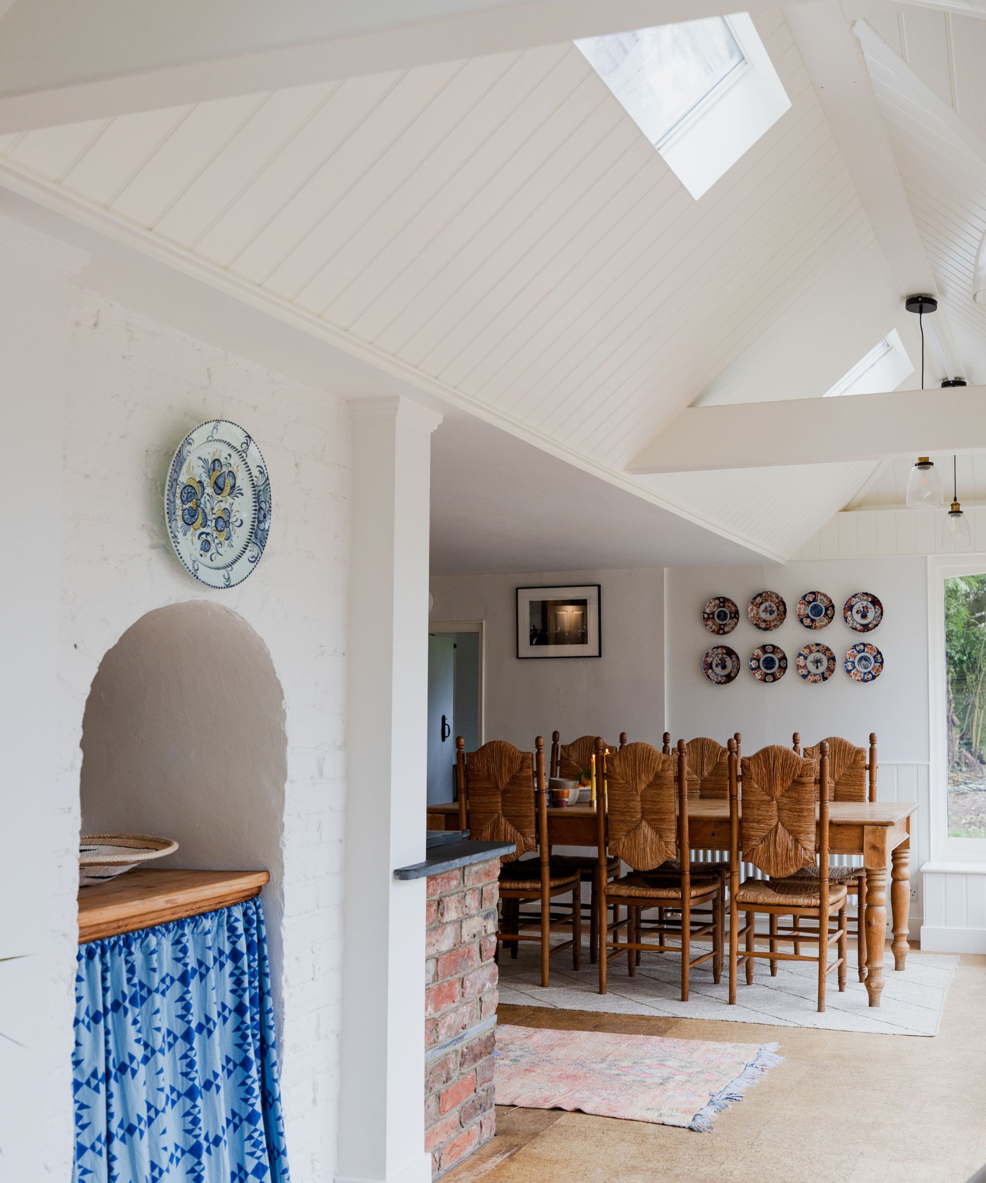
With its red undertone, Pointing comes alive in light-filled spaces, taking on a bit of the heat from the sunshine that pours in. This is why Rachael Curzons, co-founder of the studio Bailey Curzons, used it lavishly in this dining room with its large windows.
'We used Pointing on all of the joists, the paneling, kitchen cabinets, window frames - effectively all the woodwork here,' she says. 'With rich, warm undertones reminiscent of thick cream, Farrow & Ball’s Pointing gently grounds light-filled spaces, preventing them from feeling clinical or hollow.'
7. To counteract bold patterns
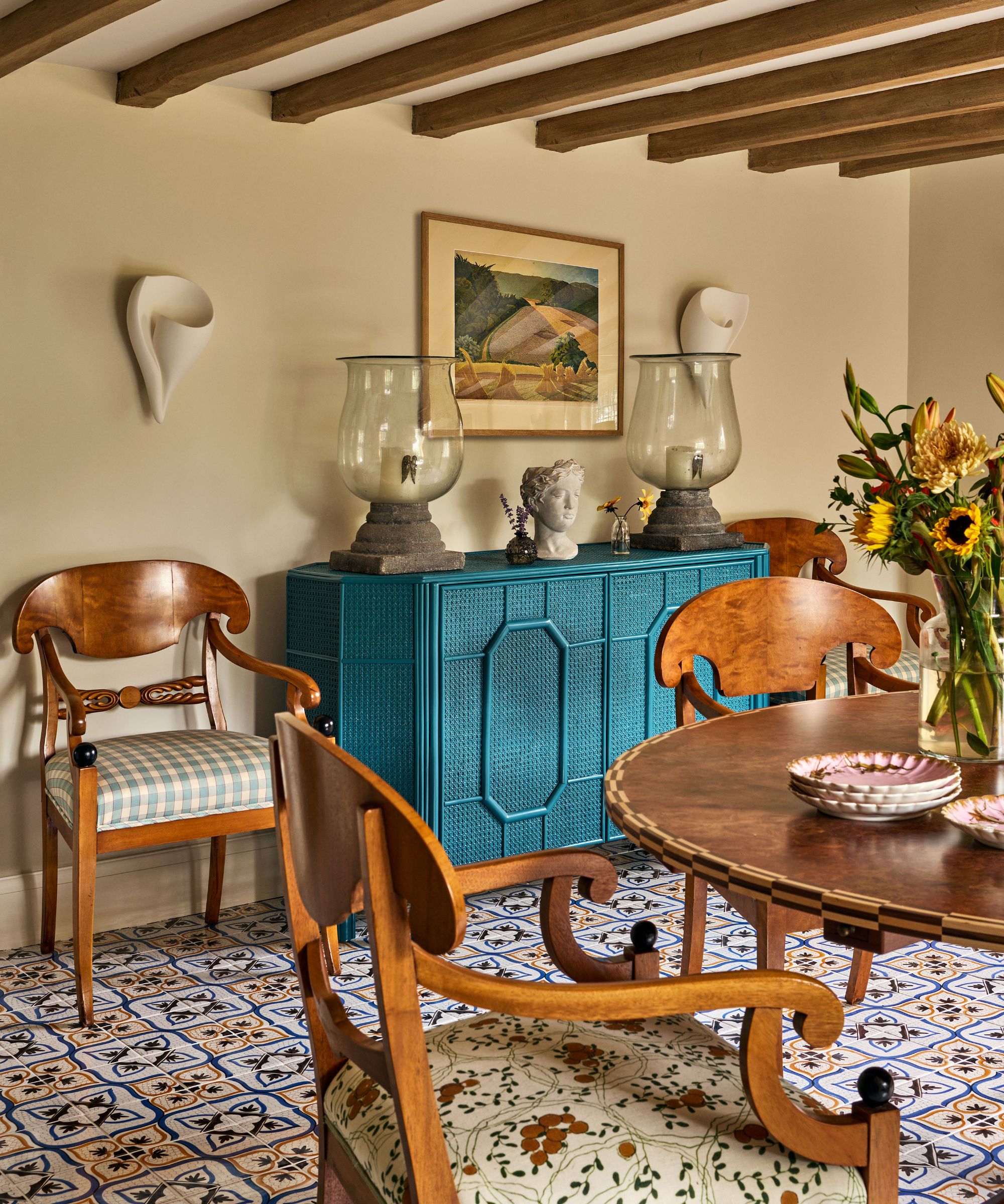
The versatility of Pointing means it also takes on a glow in north-facing rooms, where its darker pigments begin to show themselves. Pheobe Hollond, director of Studio Hollond, loves to use it in this way, against bold prints on furniture and floor.
'Pointing is one of those whites that does a lot for a room, it's a hard-working white,' she says. 'Not only is it fresh, it is very warm. So when a space is heavily patterned and also north facing, it is the perfect choice of white to bring that uplifting feeling to a space.'
8. To give a sense of depth and age
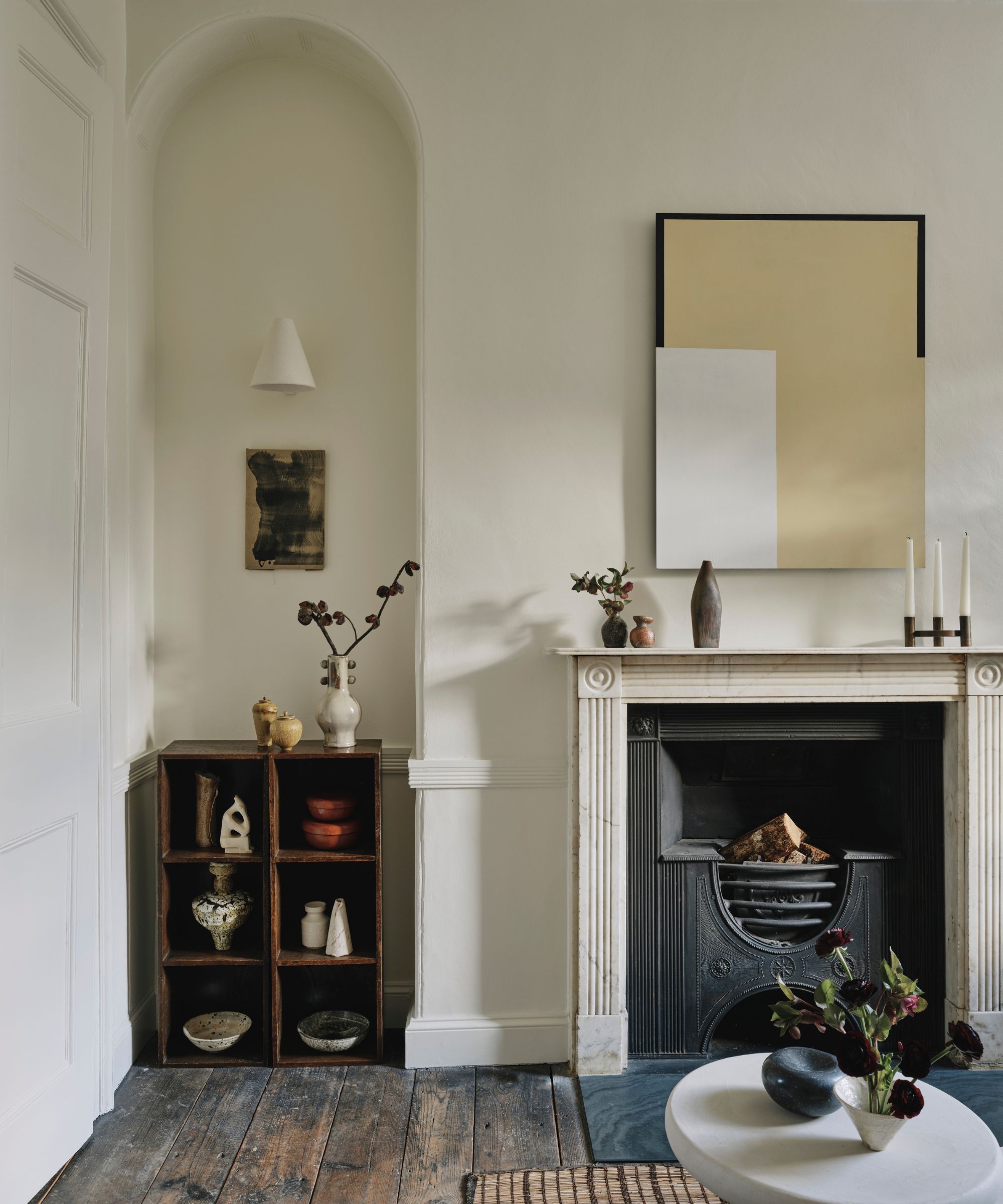
Another Pointing fan is the designer Rachel Gowdridge, who chose Pointing for the entirety of a recent project.
'It was all Pointing on the walls throughout,' she says. 'We wanted to keep the backdrop neutral and let the art/lighting/accessories do the talking, but I felt the spaces needed a level of warmth.'
'I'd used Pointing before in my own house, and think it's a good tone for achieving that neutrality/warmth balance. It also works well in both north and south-facing rooms, which was perfect for this dual-aspect house. I love it because it makes the spaces feel lived-in and timeless without being stark or sterile, and it has a subtle, chalky quality that gives a sense of depth and age.'
9. For extra elegance
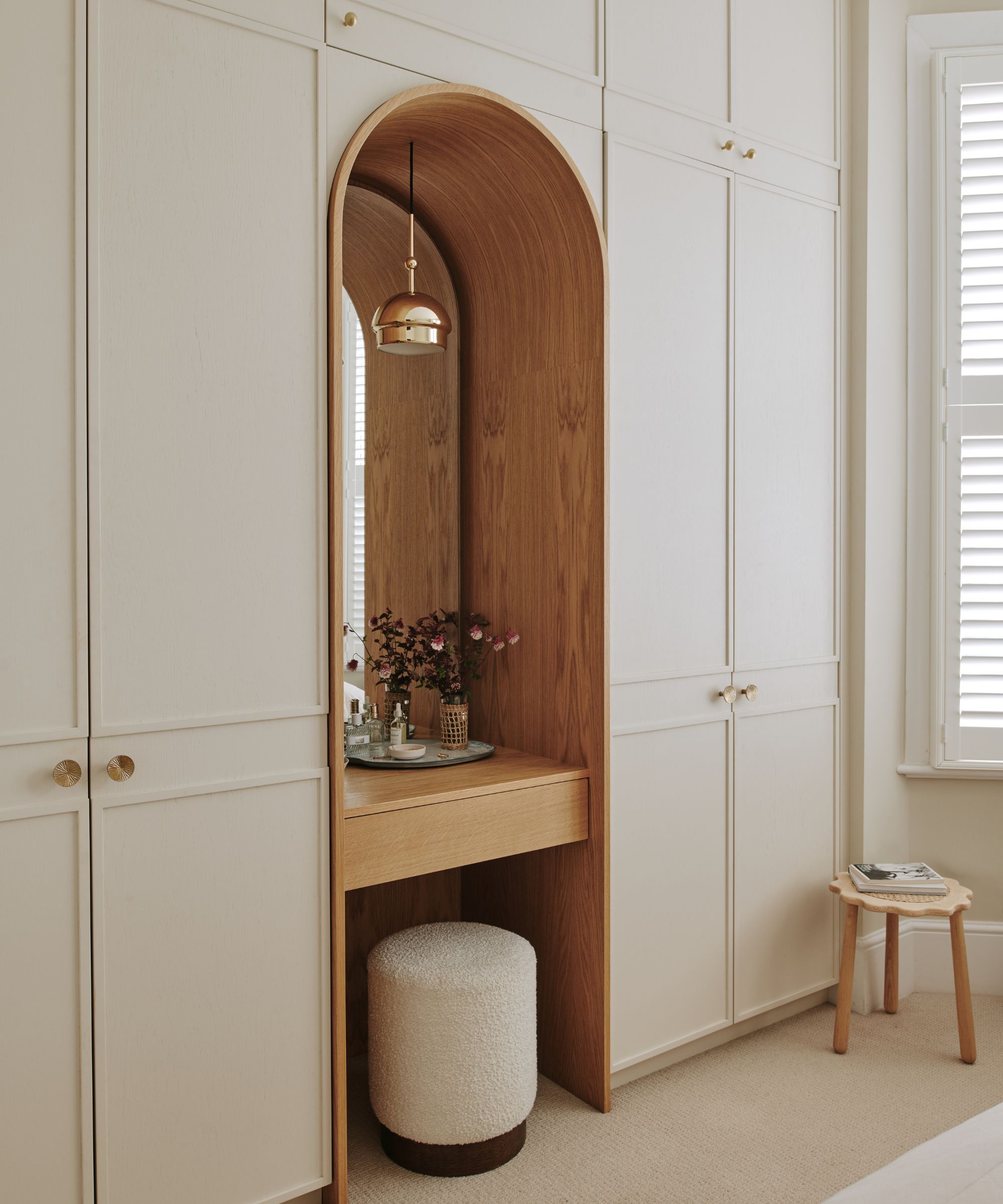
'I wanted a paint color that was versatile to fit any color scheme, classic and elegant for the space,' says designer Tasmin Love, who created this bedroom, above.
'Pointing was the perfect shade to cover all those bases and provide the warmth I wanted to portray on the interior. I also wanted something the client could easily buy again on the off chance that she needed to touch up a chip on the joinery.'
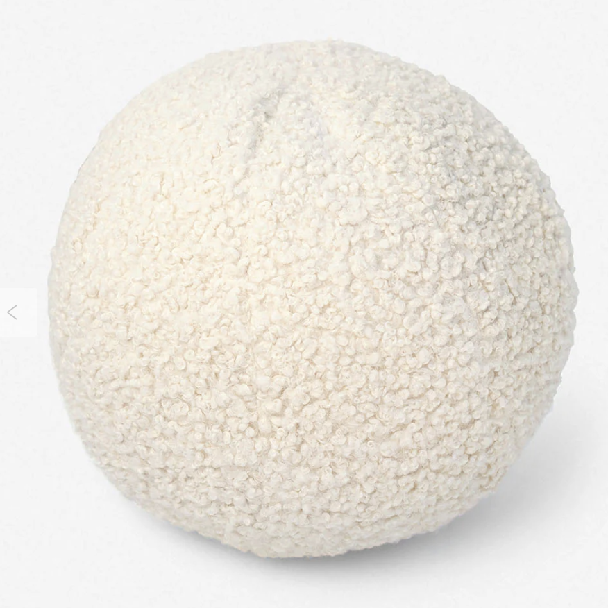
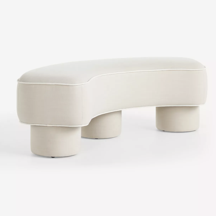
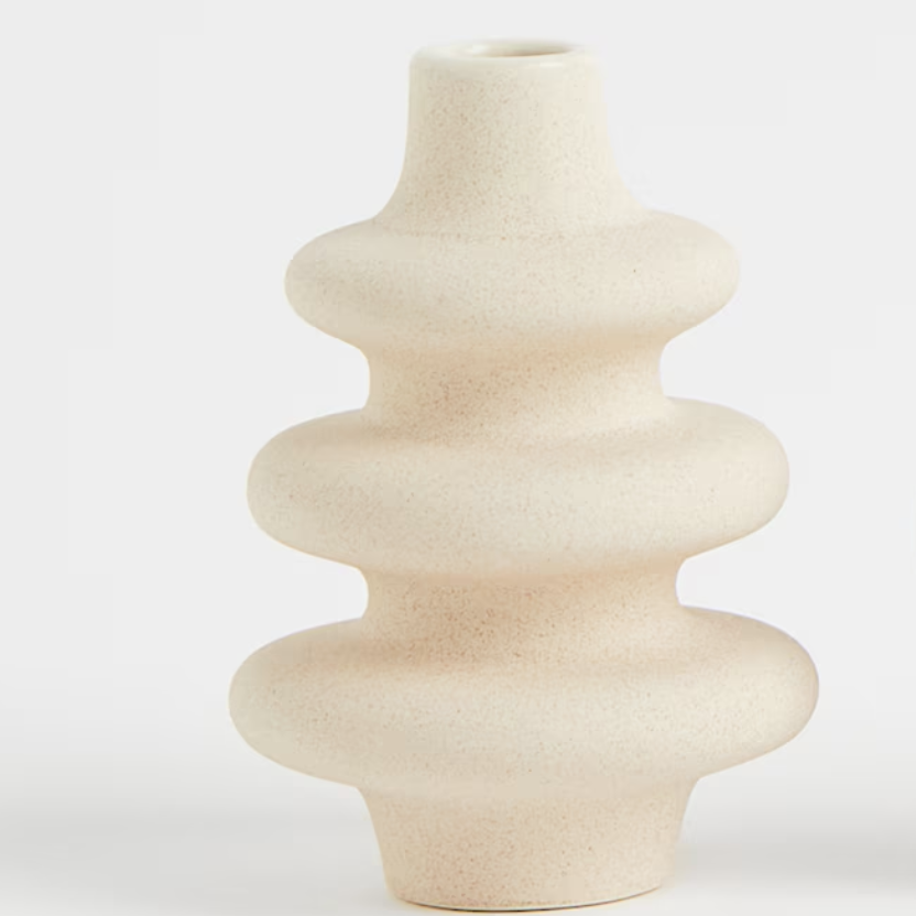
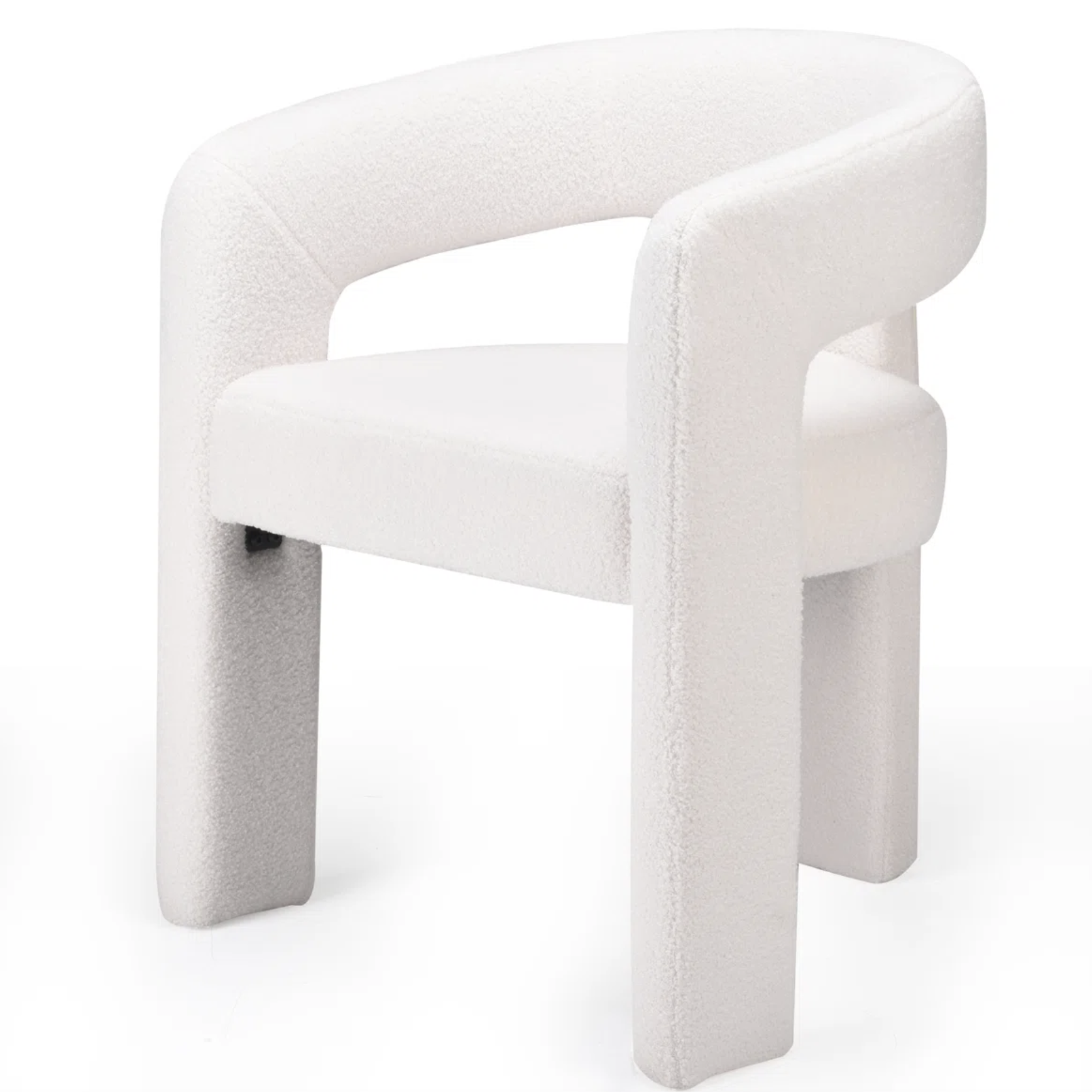
As the designers have explained, Farrow & Ball Pointing is a versatile shade that works in many ways. These buys, in Pointing-inspired colors, will work just as well to bring character and depth to your decor.
Pip Rich is an interiors journalist and editor with 20 years' experience, having written for all of the UK's biggest titles. Most recently, he was the Global Editor in Chief of our sister brand, Livingetc, where he now continues in a consulting role as Executive Editor. Before that, he was acting editor of Homes & Gardens, and has held staff positions at Sunday Times Style, ELLE Decoration, Red and Grazia. He has written three books – his most recent, A New Leaf, looked at the homes of architects who had decorated with house plants. Over his career, he has interviewed pretty much every interior designer working today, soaking up their knowledge and wisdom so as to become an expert himself.

