Is Benjamin Moore's Gentleman's Gray the perfect deep blue paint? It balances 'richness and restraint' and designers love its cocooning quality
This rich blue is an interior designer favorite – it's the perfect warm embrace that oozes luxury

Design expertise in your inbox – from inspiring decorating ideas and beautiful celebrity homes to practical gardening advice and shopping round-ups.
You are now subscribed
Your newsletter sign-up was successful
Want to add more newsletters?
Benjamin Moore's Gentleman's Gray isn't actually a gray at all, it's a deep rich navy blue that's a favorite among interior designers. It's a heritage-inspired color that oozes sophistication and luxury, but it's also surprisingly versatile, and despite being a dark paint it's one of Benjamin Moore's best sellers.
One of the best dark blue paints, Gentleman's Gray is a shade that fulfills its title, provoking a sense of grandeur and timeless elegance synonymous with historic architecture and traditional design.
Described by Helen Shaw, Director of Marketing at Benjamin Moore, as 'a blackened teal blue that balances richness and restraint. It is often a popular choice for those seeking a more dramatic hue for their homes, whether used across all four walls or as an accent color in a scheme.'
Article continues below 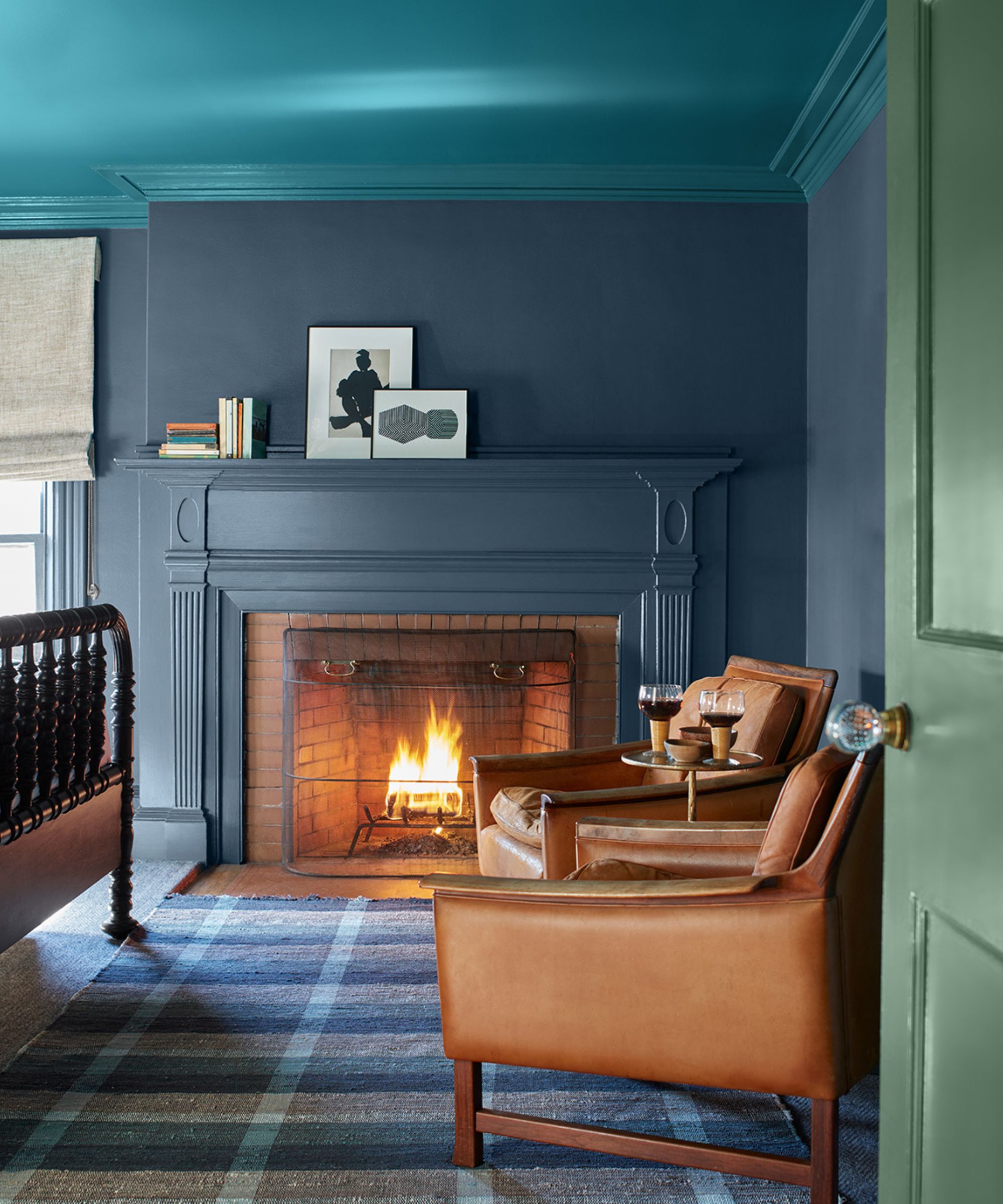
Helen suggests the shade would enhance any kitchen cabinet, bringing a sense of luxury and elegance. 'This rich hue looks great in the kitchen, on cabinetry in particular, across both industrial styles or more traditional shaker designs. Pair it with a clean, sleek white in accent areas to create a sharp contrast that feels both timeless and contemporary.'
While many colors go with blue, Helen suggests pairing a pale pink with Gentleman's Gray for a playful balance of light and dark. 'Alternatively, for a subtle play on a complementary color combination, match Gentleman’s Gray with a dusky rose. This warm pink balances beautifully with the cool anchored blue-black, creating a softness that makes this combination very approachable and sophisticated.'
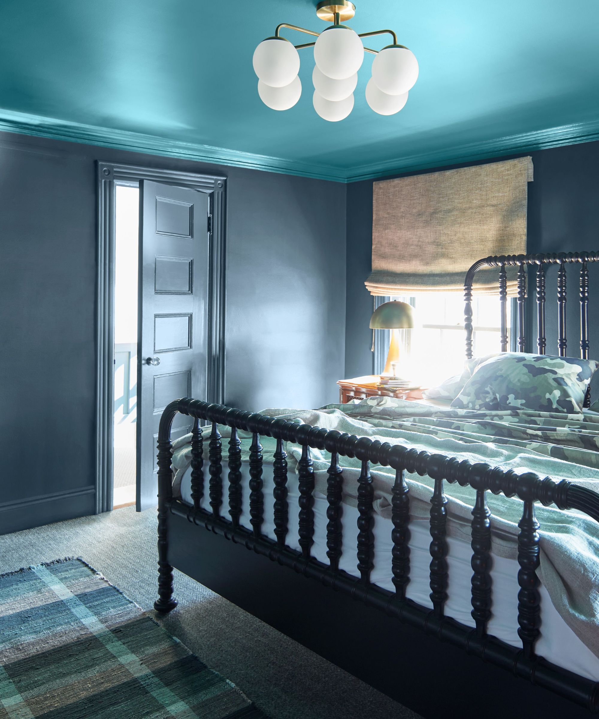
Arianna Barone, Color Marketing Manager at Benjamin Moore, says that Gentleman's Gray would look best as a bedroom color.
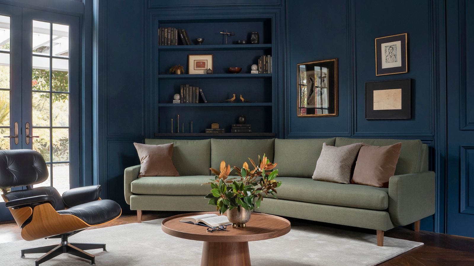
'It blends the easygoing notes of blues and greens with the alluring qualities of deeper hues to make a statement-making shade,' she explains. 'It can easily take the place of dark grays, browns, and black paint colors in any color palette. This hue works beautifully in a bedroom or home office, color-drenched on all four walls to create a moody atmosphere. Pair it with brass fixtures, velvet textiles, and wooden accents for a refined but welcoming look.'
Design expertise in your inbox – from inspiring decorating ideas and beautiful celebrity homes to practical gardening advice and shopping round-ups.
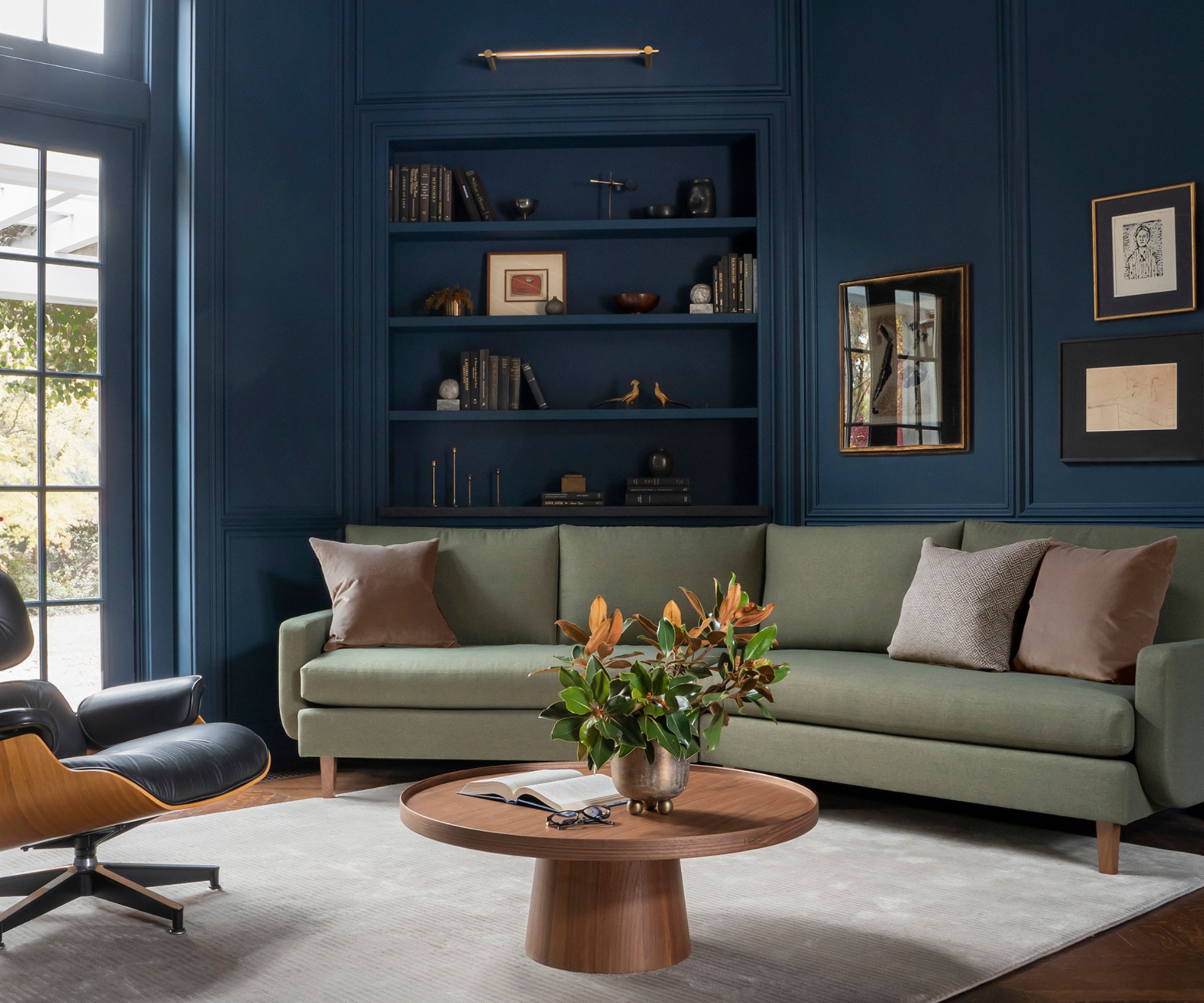
Nina Long, Principal Designer at Mathews Design Group, says 'I love Gentleman's Gray for its moody and rich tone. It's not quite navy, it's not teal, but a deep, dark blue with hints of green and black. It's such a great color, we love to use it in an office, a library, or even a bedroom.'
'Anywhere you want some drama while still looking sophisticated. It looks especially good in a color-drenched application and can really make trim and moulding pop! We like to pair it with mostly neutrals but also weave in chocolate brown, ochre, and forest green.'
Nina is not the only one who believes the shade works well with home office ideas. The space pictured below proves how well the paint works in this hard-working space, bringing a sense of coziness.
Jennifer Jones, Principal Designer at Niche Interiors, explains, 'We love using Gentleman’s Gray to create moody bedrooms, libraries, and home offices. This hue is the perfect mix of saturated blue with sophisticated grey undertones and pairs well with warm woods and brass finishes.'
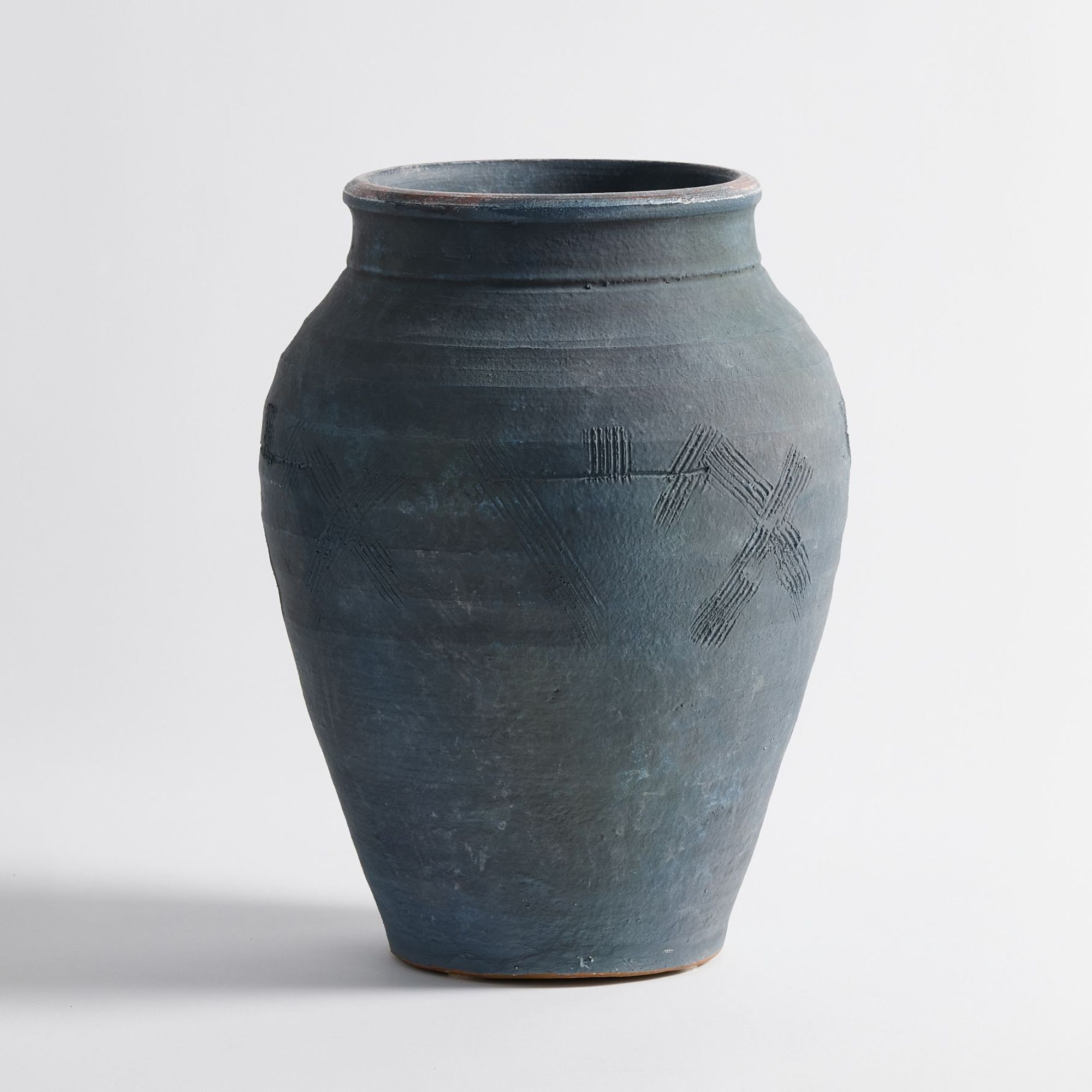
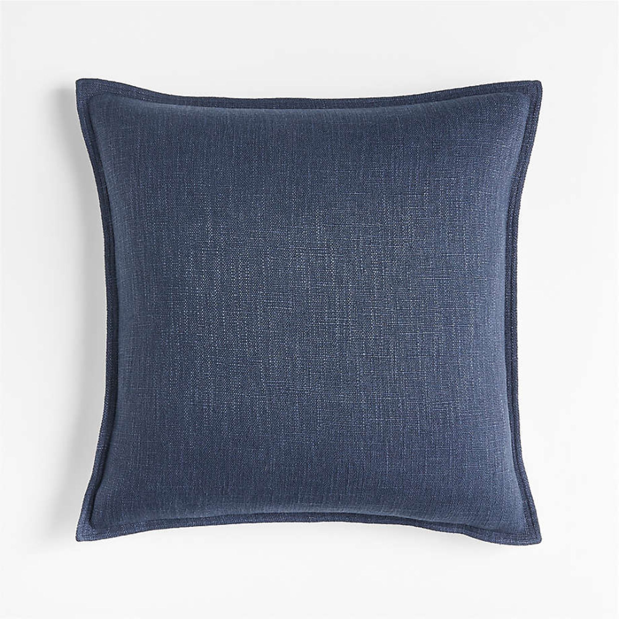
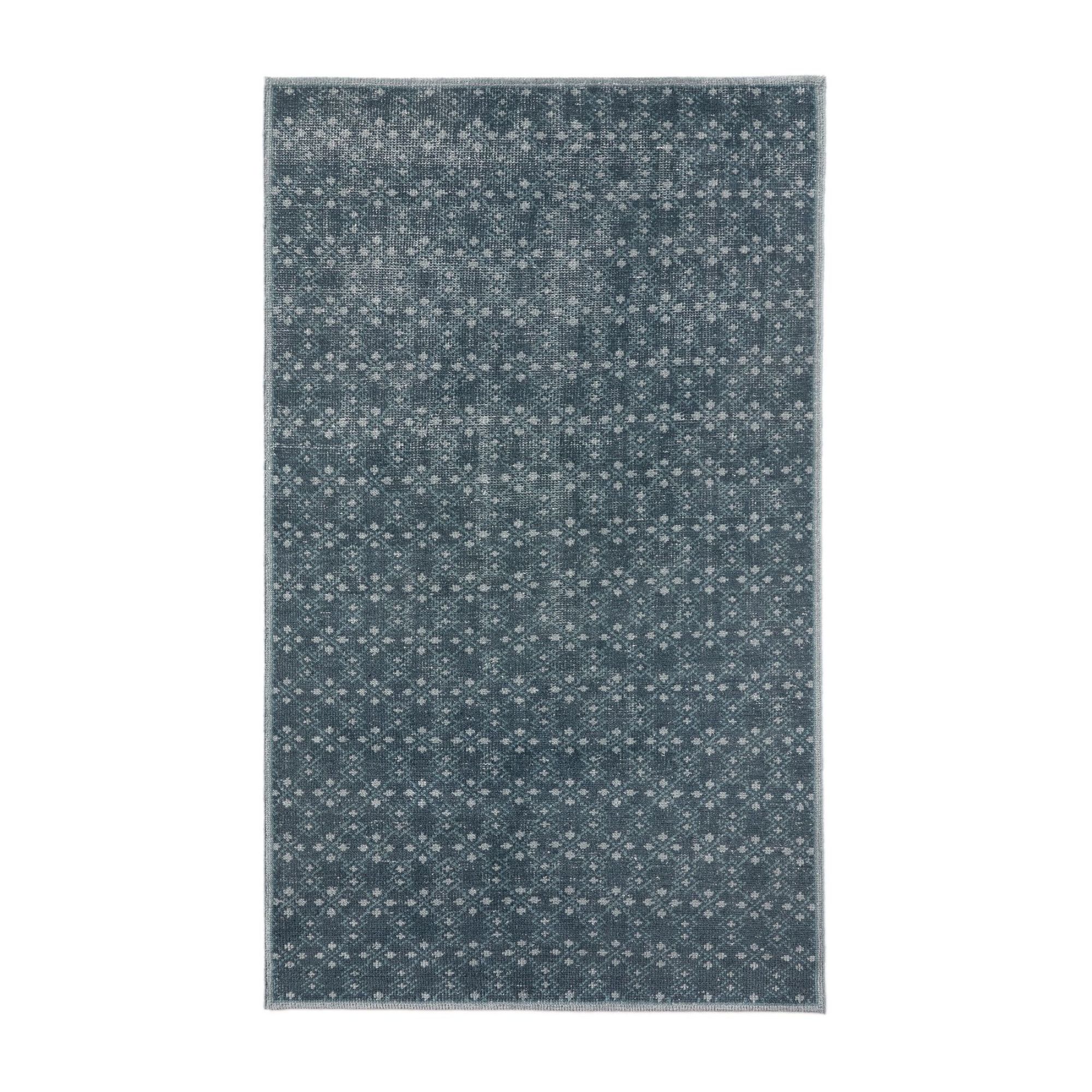
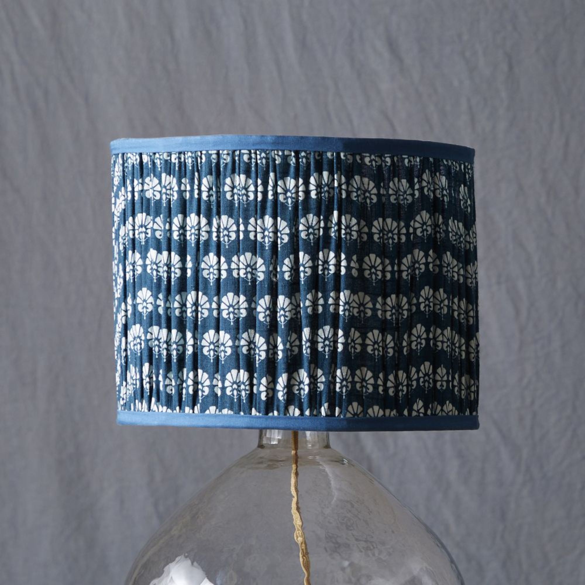
Love the sophisticated shade of Gentleman's Gray but not after a paint project just yet? These picks can bring this moody deep blue into your home in an instant:
Don't be put off by the dark undertones of Gentleman's Gray. It's a truly versatile shade that brings a sense of warmth and sophistication to any space, particularly home offices, snug, and bedrooms.
However, if you want to decorate with blue but prefer a lighter variety, Benjamin Moore's blue-gray paint colors are a refreshing and uplifting way to bring color into any scheme.
