5 'ugly colors' that I'll be decorating with in 2024 – these undesirable colors will trend this year
Under-appreciated colors are proving they shouldn’t be overlooked. Here's why...

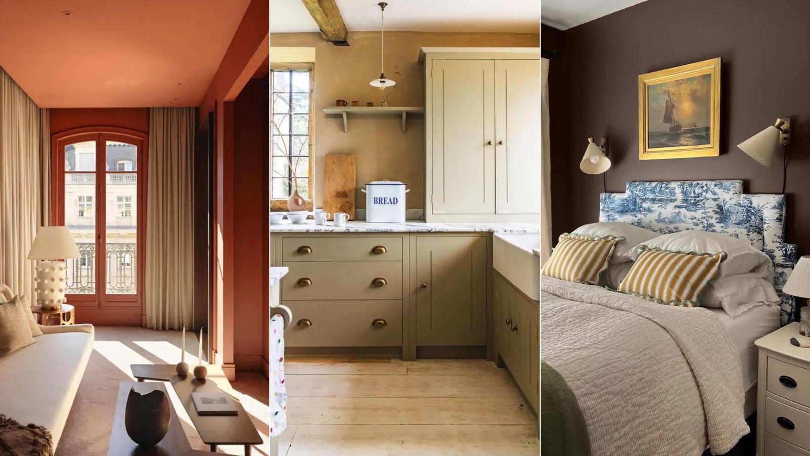
Shades of beige, mustard, and brown are rarely the go-to paint colors of choice for the discerning decorator, but interior design firm Pierce and Ward, who coined the term 'ugly colors', say every house needs a dose of underappreciated muddy tones to dial down the pretty and perfect.
Unappealing, ugly colors are often misunderstood in the interiors world; they’re the no-go hues of the spectrum we prefer to steer clear of while reaching for the paintbrush. But what are exactly ugly colors? They are the room color ideas that make you recoil in horror; think dirty, earthy, muddy shades, such as ochre, rust, lime green, dark brown, and arsenic.
These so-called 'ugly' colors are not new. In 2012 the Australian government set out to find the world's most ugly color for use on cigarette packaging – a bold attempt to dissuade smokers. The government, alongside research agency GfK Bluemoon, settled on Pantone's 448C (Opaque Couché), as the winner, or loser. Described as a 'drab dark brown', the shade is informally known as the 'ugliest color in the world'.
So why are ugly colors having a sudden surge in popularity? It's simple; they are comforting. We spend more time in our homes than ever before, and these dirty, rustic tones work well to create warm, cocooning spaces.
1. Dark brown
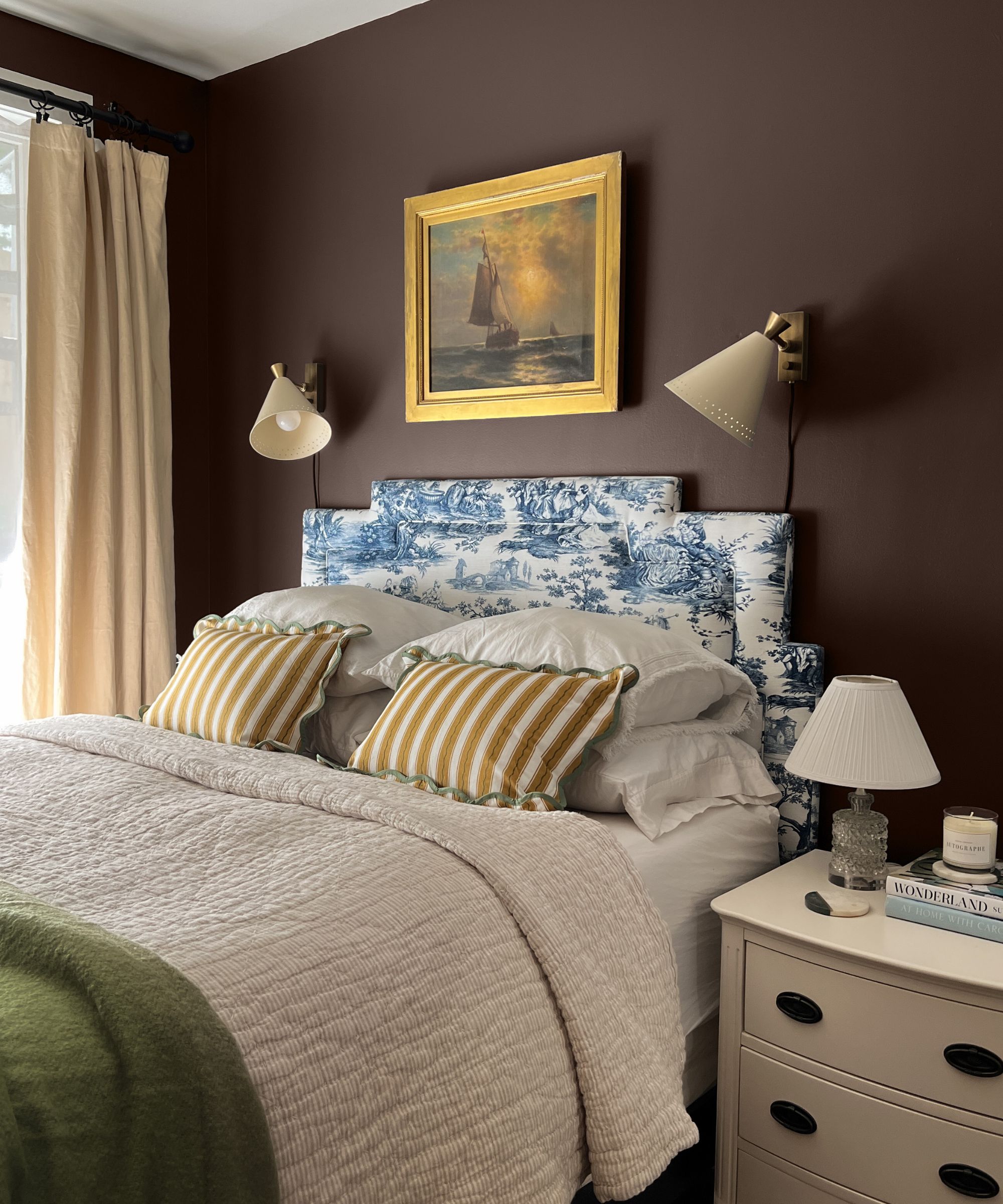
The nuances of brown are often underplayed, but one look at the many hues on offer shows how complex and interesting the shade can be. There is an unexpected richness to dark brown that reveals itself in different ways.
Considered a dark neutral, earthy brown is grounding but also has an elegance that is truly sophisticated. Versatile, it can be striking on its own or allow other hues to stand proud. This season's decorating is inspired by the global traveler's expeditions, with a rich palette of nutmeg, cinnamon, ginger and ochre adding warmth and depth to interiors.
‘A brilliant foil for pretty much every color, the darker the tone the sharper the contrast and that’s when I like it best,' says Nicola Harding, interior designer, Nicola Harding & Co. 'Farrow & Ball’s Tanner’s Brown is fab. Teaming brown with blue has a particularly electric effect.’
Design expertise in your inbox – from inspiring decorating ideas and beautiful celebrity homes to practical gardening advice and shopping round-ups.
2. Mustard
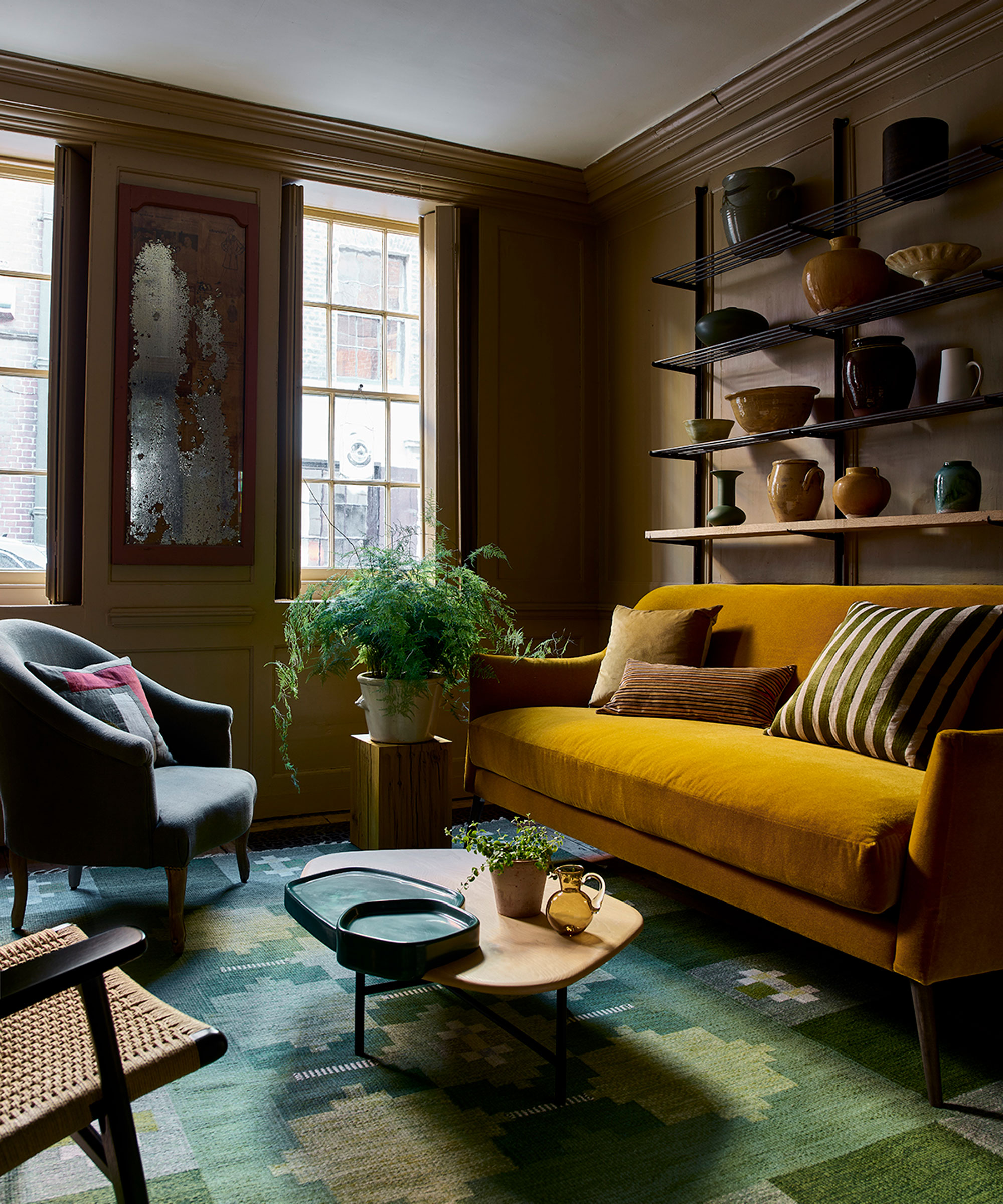
You will rarely ever hear anyone sing the praises of mustard color schemes, however, this ugly color is so much more than just a condiment in your pantry.
An earthy mustard yellow is a shade that shines, but it also creates rooms that are rich and enveloping – it's a hue that's like a warm embrace.
‘Mustard yellow (orange shares similar characteristics) is the color of energy, happiness and optimism and therefore brilliant for either a kitchen or an office but try and avoid in a bedroom as this is a space for rest,' explains Patrick O’Donnell, brand ambassador for Farrow & Ball.
‘Yellow is always a good accent color and using a mustard shade works well inside cupboards or pantries as an uplifting surprise as you open or enter,' says Sarah Brown, founder, of Sarah Brown Interiors. 'It’s easier to incorporate this shade into a scheme if you’re slightly put off by bright yellow paint in your home and it is particularly effective in darker, moodier spaces as it creates a feeling of warmth.’
Sometimes you need a deeper golden color with more clout as some yellows can be too gray, too flat, or just too primary. Earthy mustard shades will work in any room you want to feel warm and intriguing; it is a surprisingly serious color, elegant and sophisticated, which creates a fabulous backdrop to artwork and antiques and works in a variety of spaces. Make mustard a point of focus in your home, you won't be disappointed.
3. Lime green
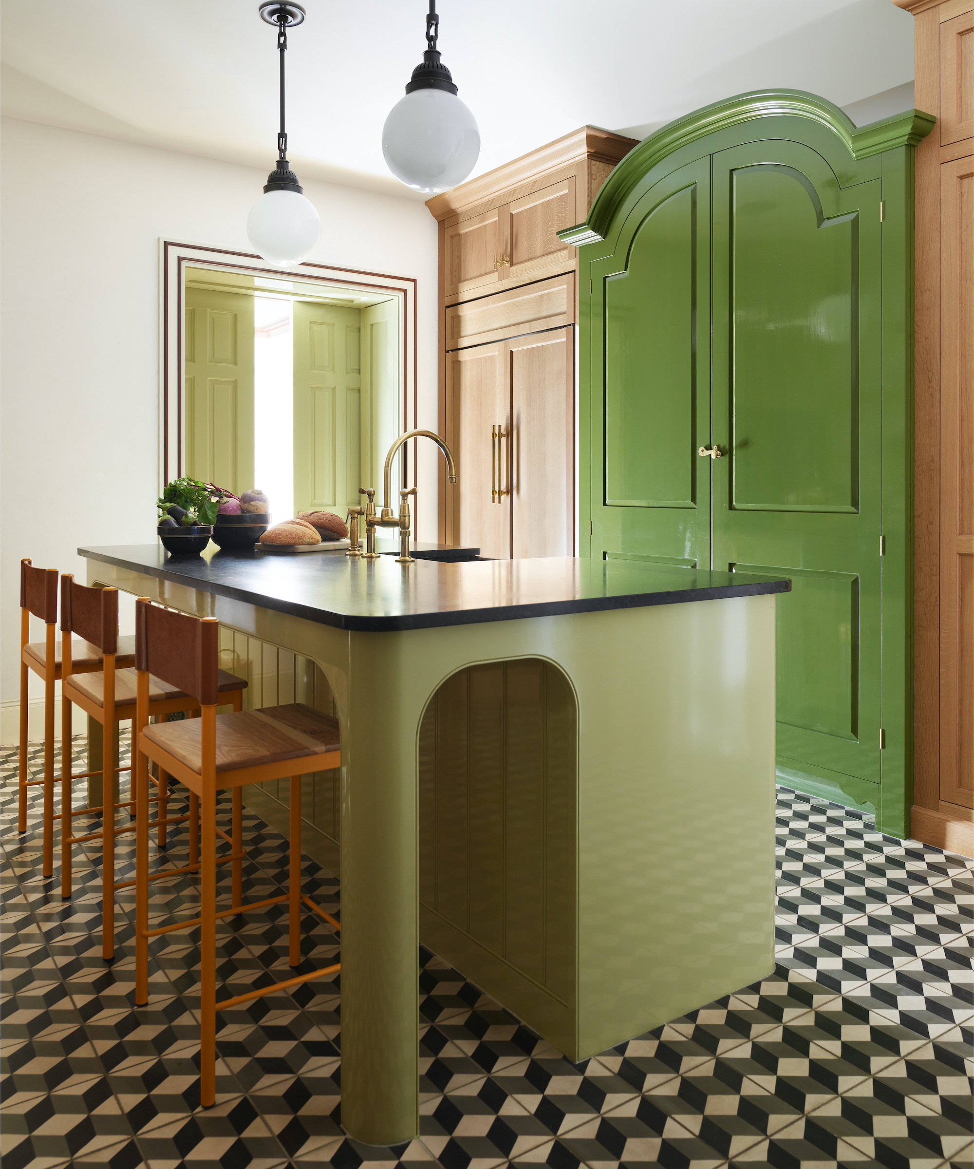
Green is a joy to use: the primary color of nature. It is the perfect color to deliver calm and serenity and therefore has the flexibility to be applied in every room in the home but if there is one green that constantly frequents ugly color lists it is lime green.
'I love using vibrant green piping – such as a sharp lime – to lighten the mood in an otherwise fairly restrained scheme,' says Henriette Von Stockhausen, co-founder of VSP Interiors. 'Little touches like this don't overpower but show attention to detail and a sense of humor.'
There is something joyful and buoyant about decorating with lime green. It has the power to energize and excite but also works beautifully when softened with white and pale blue. Using a more unusual color pairing in a room will alter the atmosphere in the space.
4. Beige
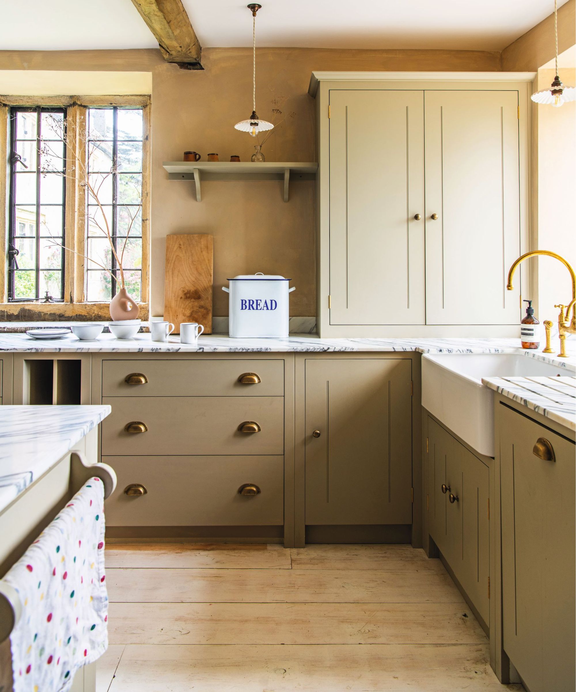
The butt of decorator's jokes in the '90s and early '00s, beige room ideas have an unfair reputation for being boring, and during this period it was replaced by another neutral; gray. However, the power of a neutral beige color palette to add warmth and elegance to a room should not be underestimated.
Decorating with beige, inspired by colors from the natural world, will add a gentle and soothing touch to interiors that can be layered with textures and tones to ebb and flow with the seasons.
I love the calmness that you create when you have a neutral palette in a room. But this choice definitely doesn’t have to mean boring: you can create an interesting and exciting space by layering different tones, such as off-whites and beige, then introducing a range of caramels and even accents of black.
5. Rust and terracotta
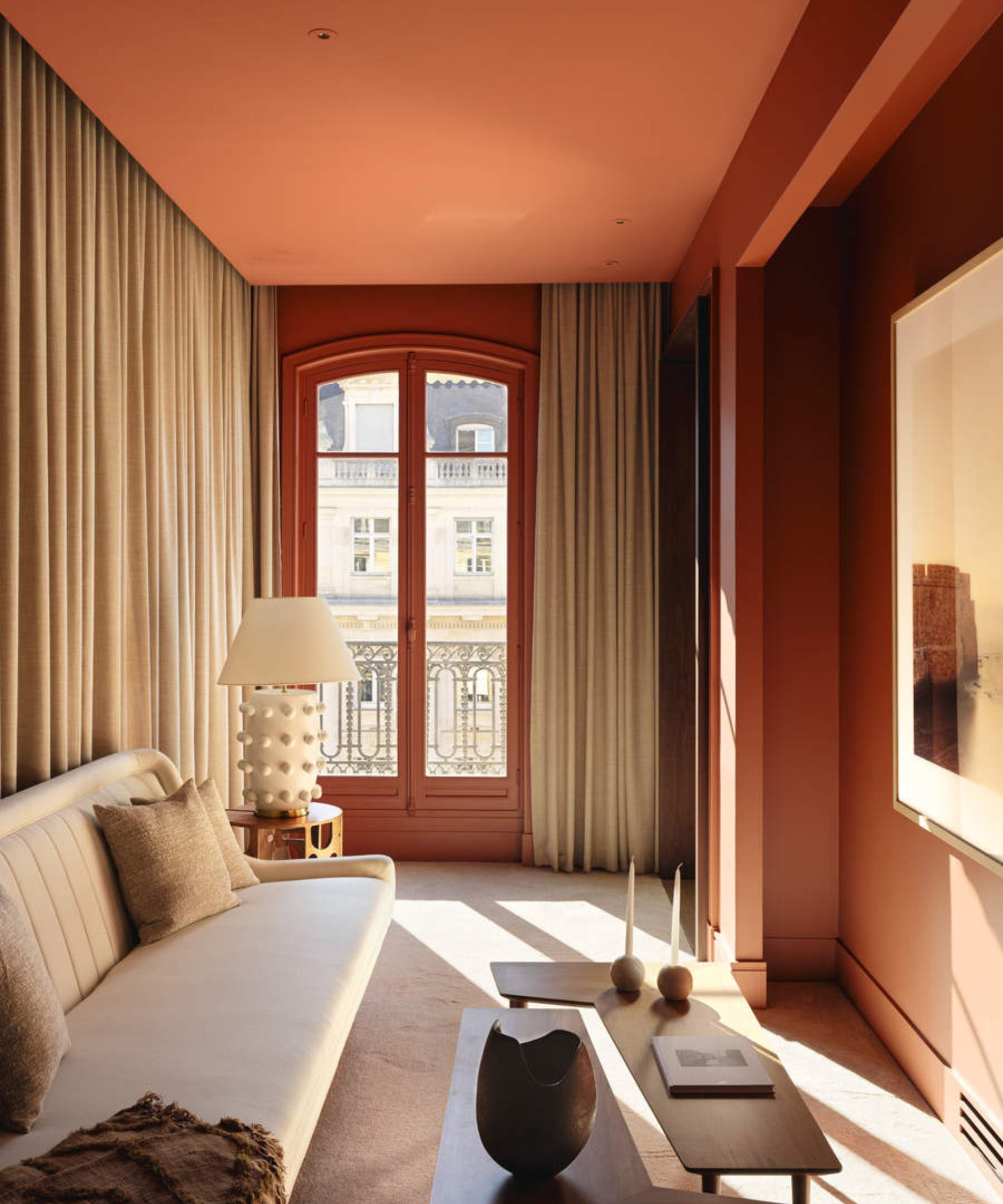
Rust and terracotta tones have long been considered unappealing, this is perhaps due to its association with decaying, aging, staining, and deterioration. However, earthy colors, from rich red to orange, can inject warmth and depth to your interiors, reminiscent of the sun-baked surfaces of warmer climes.
For a decorating scheme that conjures the sunbaked walls of ancient civilisations, take inspiration from the earth tones of terracotta. Evocative of North Africa to Italy and South-East Asia, this clay-inspired color is named from ‘terra cocta’, which in Latin means ‘baked earth’. Today, terracotta is a giving shade, either playing its part as an accent colour, or as the main backdrop in a decorating scheme. Its generosity of character means that terracotta has the ability to wrap its arms around your home with its all-year-round mood of warmth.
Conjuring the façades and roofs of Spanish and Italian buildings, rich terracotta, umber and orange shades will inject summer warmth into the home even on the gloomiest of days.

Jennifer is the Digital Editor at Homes & Gardens, bringing years of interiors experience across the US and UK. She has worked with leading publications, blending expertise in PR, marketing, social media, commercial strategy, and e-commerce. Jennifer has covered every corner of the home – curating projects from top interior designers, sourcing celebrity properties, reviewing appliances, and delivering timely news. Now, she channels her digital skills into shaping the world’s leading interiors website.

