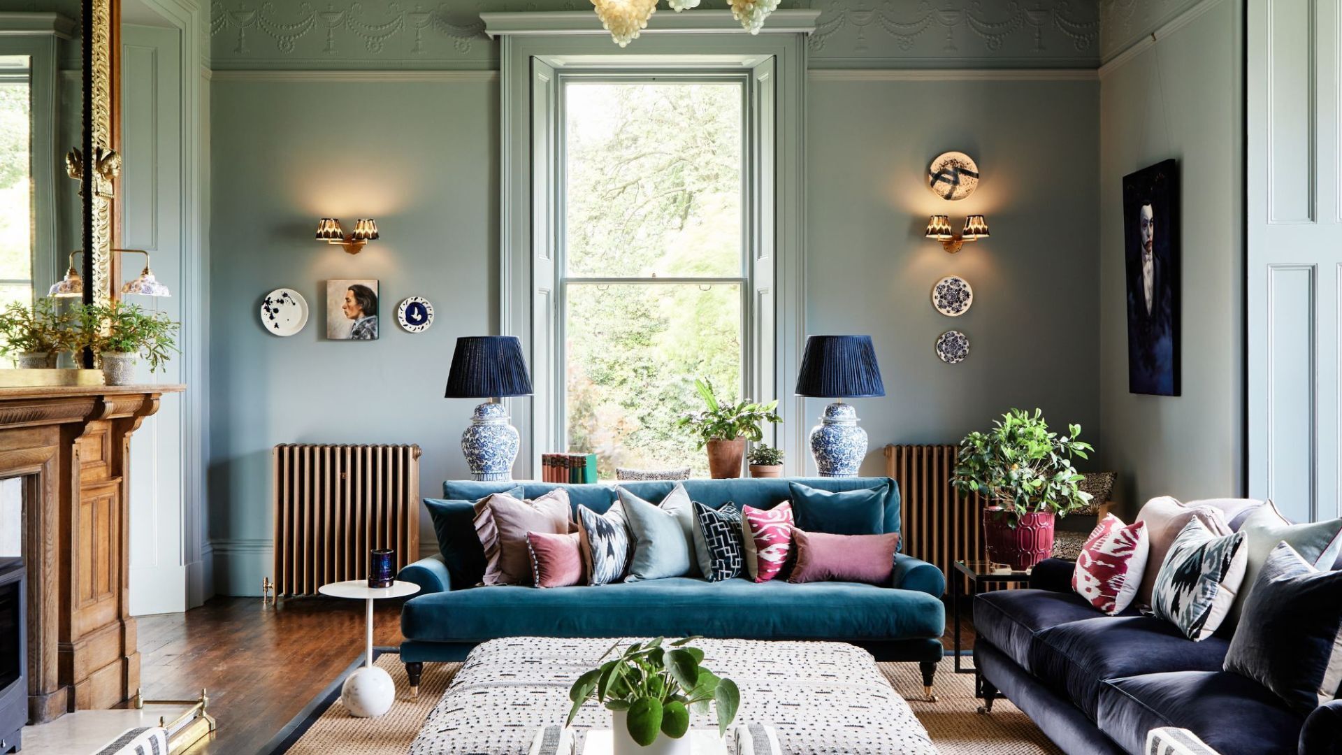
6 key colors to decorate with in May 2025, according to interior design and color experts in the know
Designers and color experts share the colors they are decorating with this month

Design expertise in your inbox – from inspiring decorating ideas and beautiful celebrity homes to practical gardening advice and shopping round-ups.
You are now subscribed
Your newsletter sign-up was successful
Want to add more newsletters?
To my mind, May is the most optimistic month. The sky has committed to maintaining its blueness, the buds of the roses are beginning to flower, and for many, this changing of the seasons welcomes a feeling of renewal, change, and the beginning of a glorious few months of alfresco living. It's a month of color.
If you are redecorating this month, whether that's a whole new color scheme or just looking for a seasonal refresh, it's worth embracing this month’s sunny disposition and starting to experiment with joy-sparking shades.
We asked designers and color experts what colors to decorate with in May, and here we shine a light on seven beautiful color trends that are just right for this time of year.
Article continues below7 colors to decorate with in May 2025
1. Tomato Red
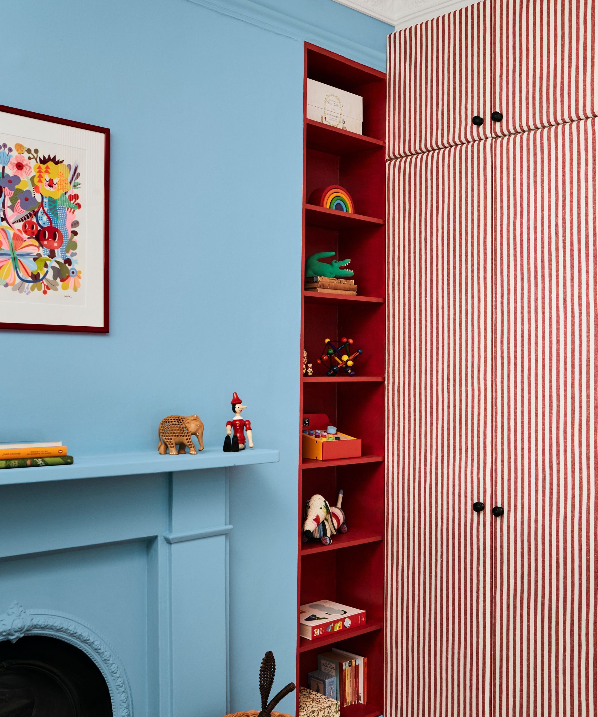
Walls in Enamel Blue, Mylands / Shelving in Red Post Hill, Mylands
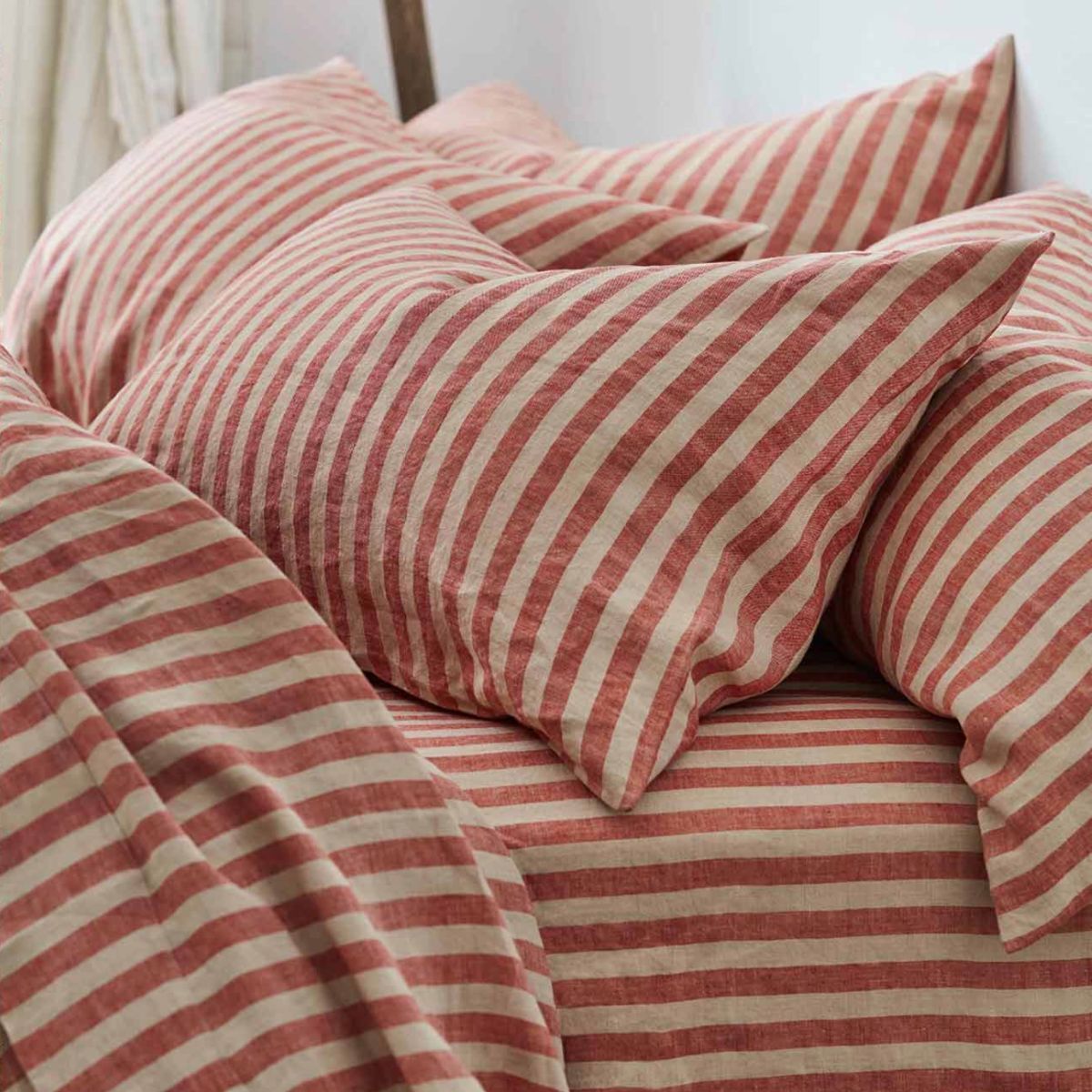
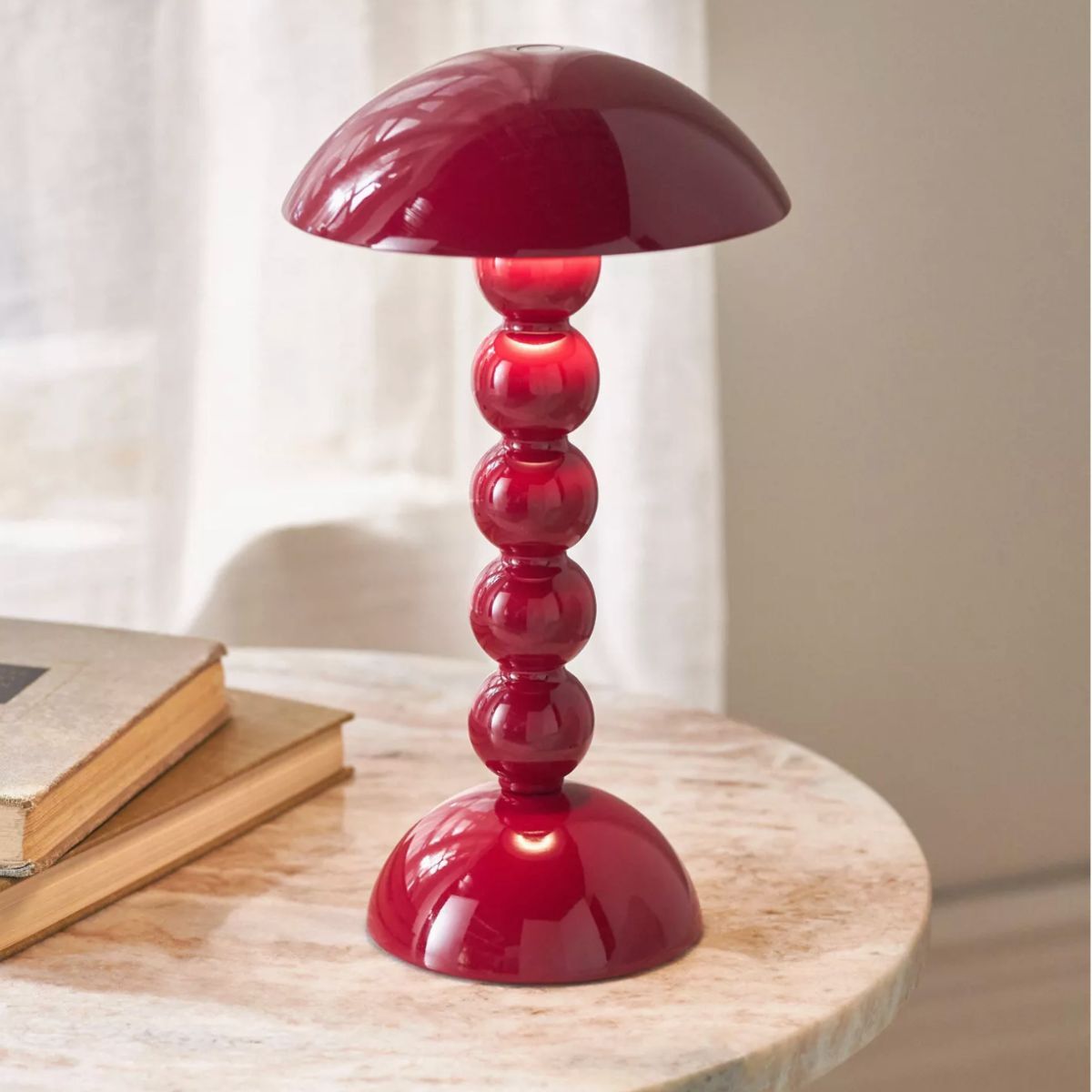
Unless you’ve been under a rock these past few years, its likely you are familiar with the unexpected red theory. It dominated the interior design narrative, and advocates for integrating red elements – be they bold or subtle – into spaces where they traditionally wouldnt belong, thereby creating unexpected focal points that elevate the overall design.
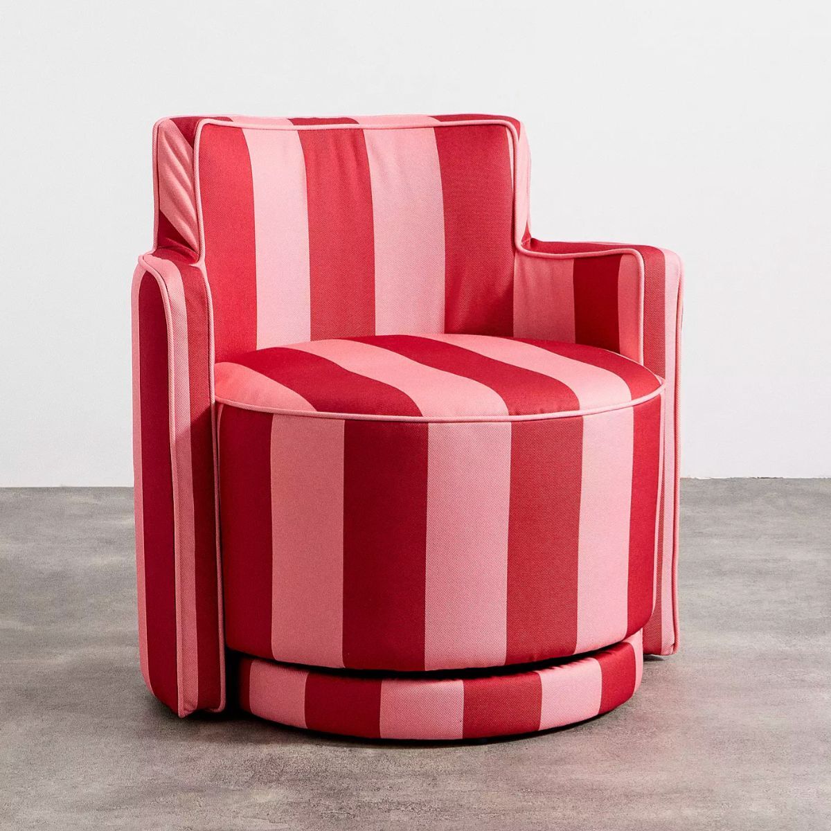
You needn’t drench a whole room in red paint to reap the benefits of red (although, admittedly, that idea thrills me). By introducing a bold red element, be it an accent wall, painted door frame or statement piece of furniture, red adds a layer of energy that many rooms, especially those where a sense of energy and movement is desired, could benefit from.
Dominic Myland, CEO of Mylands, suggests that red is the ideal color for May. ‘Sitting between spring and summer, May is a bright and energetic month, perfect for more exciting and optimistic shades such as red. From The Dependables collection with Beata Heuman, Crayfish Party BH. 19 is a softer, rusty red that brings warmth and character and is easy to incorporate into existing color palettes. It works especially well as a pop of color on window frames, bookshelves, and furniture.'
'Other shades like FTT-009 Bright Red or Red Post Hill No. 68 offer slightly stronger variations, providing options for those looking to introduce a richer, more striking red. Red does not need to be confined to interiors – why not try incorporating the shade into your outdoor living spaces to take advantage of the warming weather?'
Design expertise in your inbox – from inspiring decorating ideas and beautiful celebrity homes to practical gardening advice and shopping round-ups.
2. Duck egg blue
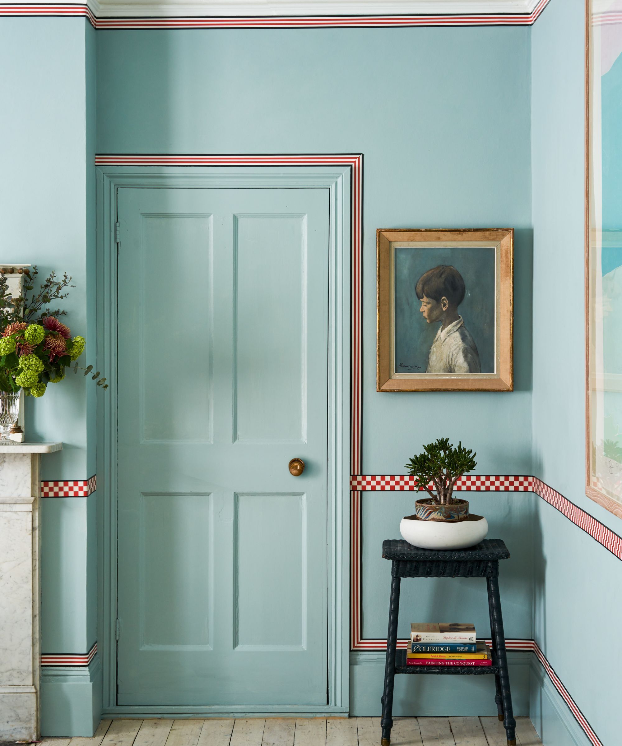
Design by Studio Atkinson, walls Dix Blue Farrow & Ball
Duck egg blue probably goes down in the interiors hall of fame for being one of the most adored and most flattering blue paint colors to use around the home. Sitting between green and blue on the color wheel, duck egg blue can vary tonally, but on the whole, it is unerringly fresh, breezy, and despite being a great choice for May, it is free of the seasons, working beautifully all year round.
The spectrum of duck egg blue paints is surprisingly varied. Some duck egg blues can appear very delicate and others rather punchy, leaning toward a vibrant turqiouse. To make matters more complicated, the same paint can have a chemelion like reaction to light, often looking cooler and bluer when flooded with natural light, and much greener in artificial light.
A great, failsafe option is Dix Blue by Farrow & Ball or for something even fresher, try Celestial Blue by Little Greene. If you're working with period features and love that Regency Bridgerton look, then Daisy Field by Graham & Brown would be a wonderful choice.
3. Salmon pink
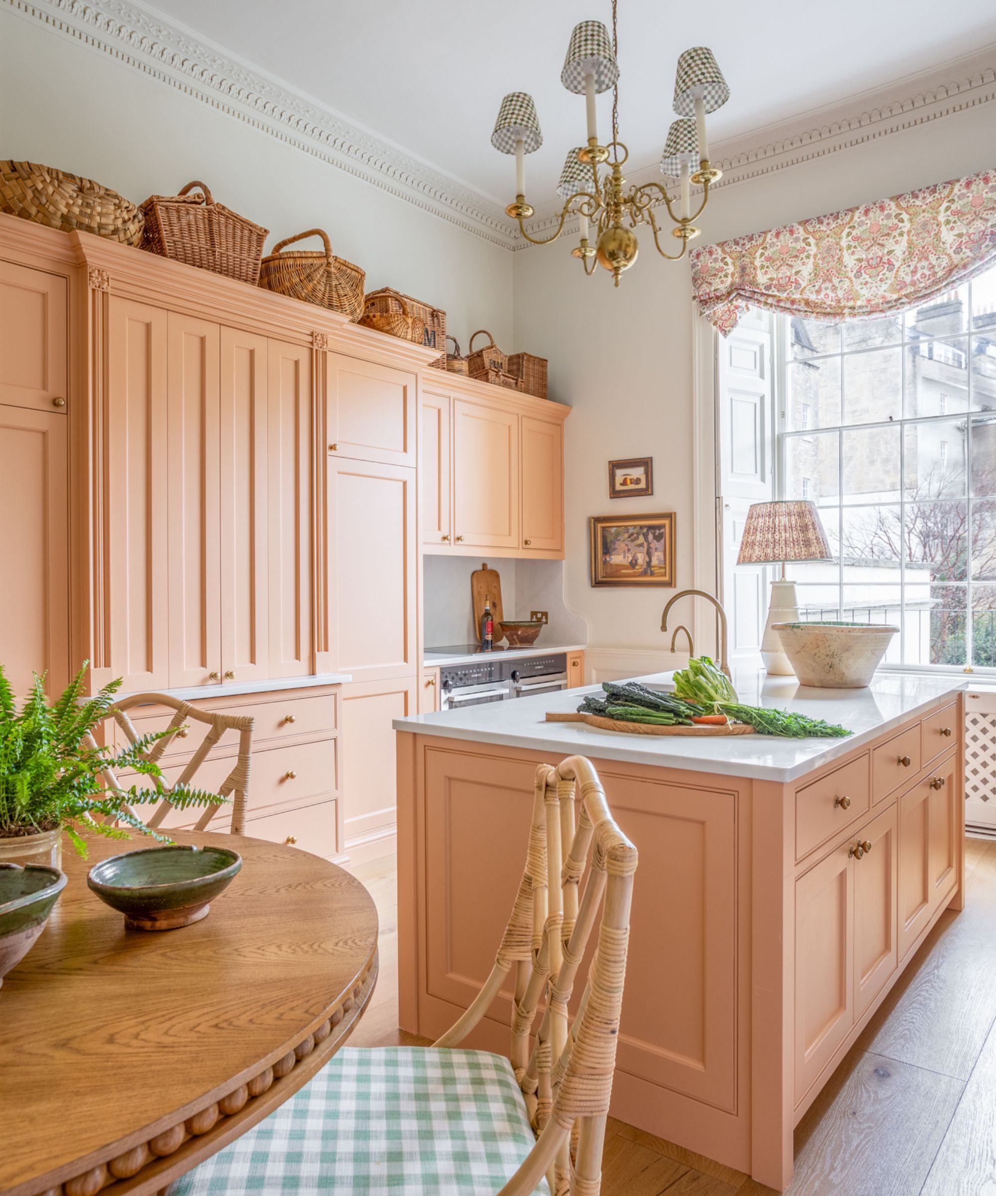
Kitchen units in Fowler Pink, Farrow & Ball
As summer unfolds in front of us, there’s perhaps no better time to embrace the warmth of salmon pink – a soft yet slightly warmer, friendlier version of the classic but ubiquitous blush pink.
There is something distinctly welcoming about salmon pink, with its tinge of orange in its undertone; it feels much toastier than other pink paints, which resonated with the season’s spirit.
‘Salmon is such a gentle, warm shade with a sophisticated undertone,’ explains UK-based interior designer Sean Symington, who designed this salmon pink kitchen. ‘It brings a lovely softness to the space and completely lifts this classic kitchen. It’s subtle, but just the right amount of contrast to make everything sing.’
Admittedly, salmon is a slightly unusual color you might not think to use on first thought, but for those looking to embrace the femininity of pink, but wish to avoid the saccharine or overly sugary pinks, a peachy, salmon pink with hints of a coral undertone is the perfect swap.
4. Moss green
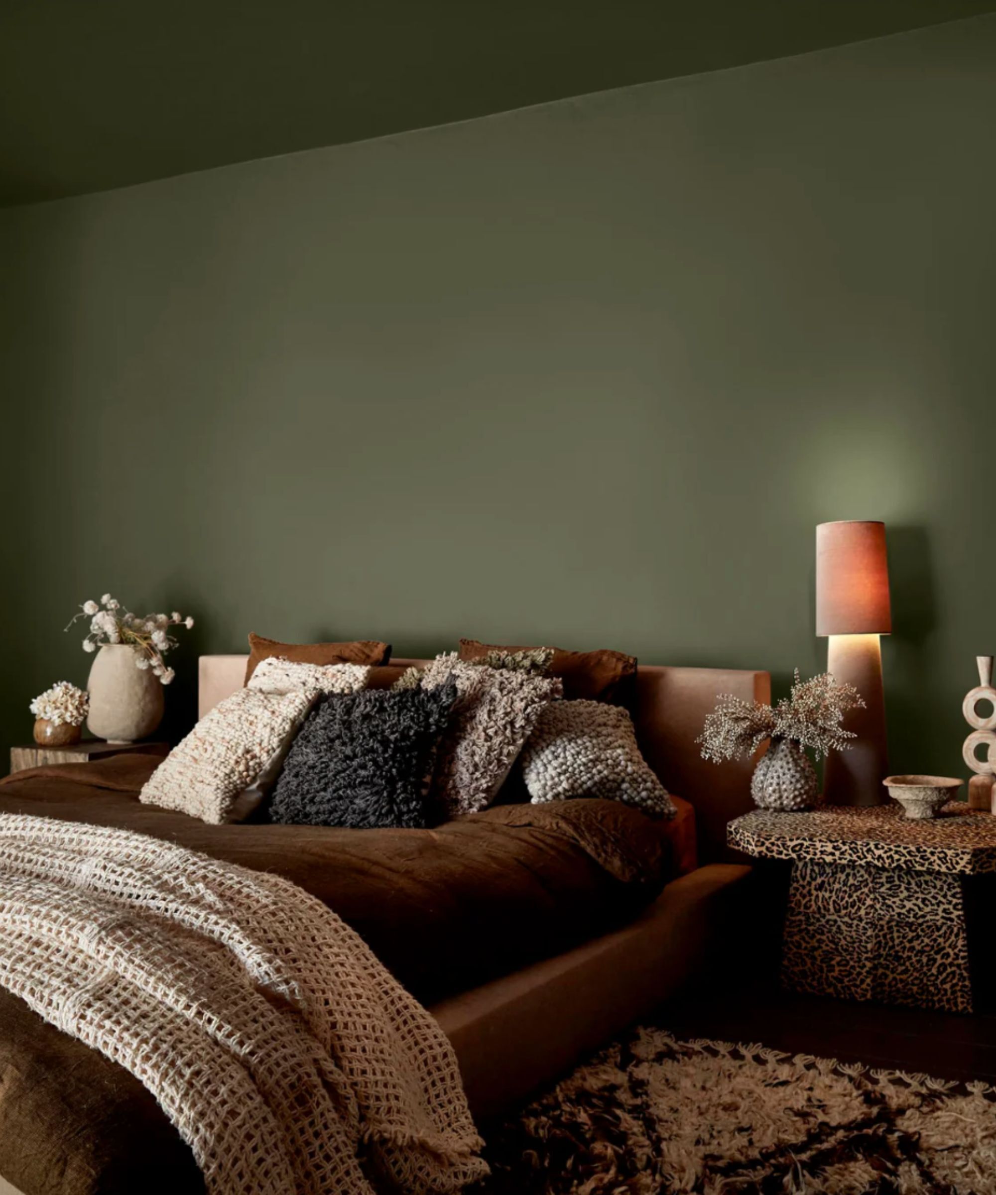
Walls in
Deep, inky and verdant – moss green might seem like an unusual color for sprightly May. But it's an outdated idea that spring is reserved only for pastels, in fact, there’s a new color palette on trend for spring; designers are embracing more vibrant or saturated hues instead.
‘Color is one of the most transformative game-changing tricks you can do to space,’ explains Abigail Ahern, a British interior designer known for her bold, maximalist style. ‘Get it right, it lifts your spirits and your overall sense of well-being. Get it wrong and it has you running for the hills.'
'I am so drawn to the notion of surrounding yourself with colors that reflect the landscape. Not necessarily on trend, hot or cool, but instead hues that resonate with the heart. Therefore, I would suggest a deep green paint, like Seagrass Meadow – it's a hue that you'll find hugging our coastlines or at the bottom of a really deep lake. Think inky, intense, complex, and deeply saturated, it adds such atmosphere to any room in the house. Not just that it's super timeless and sophisticated and works with so many other colors. It's also incredibly soothing.’
If you are keen on soothing decorating ideas to make your home more relaxing, an earthy, deep algae green feels both cooling and instantly grounding. ‘Magic happens when you paint out the ceilings and woodwork all in the same hue as well as the walls, of course. Extra kudos if you do that!’ Abigail adds.
The full color drenching approach would suit this color best, but if that feels a little overwhelming for your space, you may wish to consider color combinations that won’t clash.
Shauna Dennison-Taylor, the Creative Director at Penny Morrison, provides some insight on what colors might pair well. ‘Earthy greens paired with straw yellow blends traditional and contemporary elements with ease,' Shauna explains, 'These colors evoke the freshness of spring and the warmth of summer, ideal for May. Green brings in tones like moss, olive, sage, and emerald, while straw yellow adds a soft, sunlit contrast.’
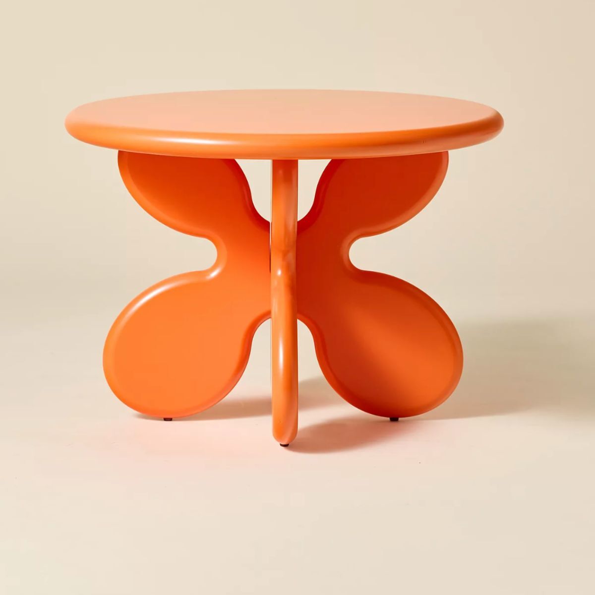
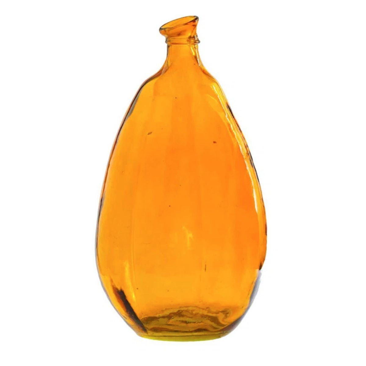
5. Tangerine orange
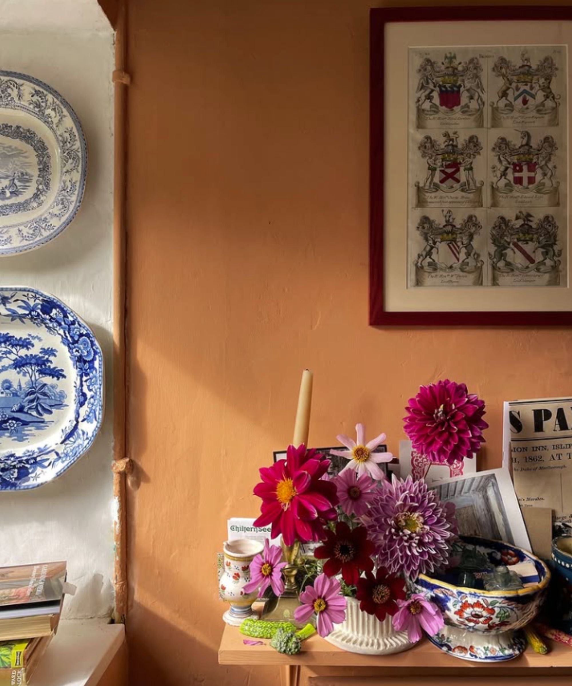
Walls painted in Dutch Orange by Edward Bulmer
Somehow, orange has earned a bad rep as a tricky-to-use, stressful color. In reality, though, decorating with orange often has the total opposite effect; brimming with optimism and zest, it can feel distinctly unstressful and frolicsome. Certain shades of orange were often used in 18th-century orangeries, bringing a sprightly warmth, rather than a heavy heat, so it isn't just reserved for uber contemporary interiors, either.
Sean Symington notes that joy-sparking orange needn't be jarring. 'In May, we often lean towards warmer and vibrant colors to celebrate the blossoming flowers and warmer weather, embracing a sense of freshness. During this month, orange is a delightful choice for decoration, it’s full of optimism and warmth. The right orange paint feels refreshing yet earthy, making it suitable for traditional interiors,' he explains.
The most flattering shades of orange are those with a muddy, slightly brown undertone to prevent them from feeling too potent. That said, there is most definitely a time and place for those peppy, electric shades, when used correctly.
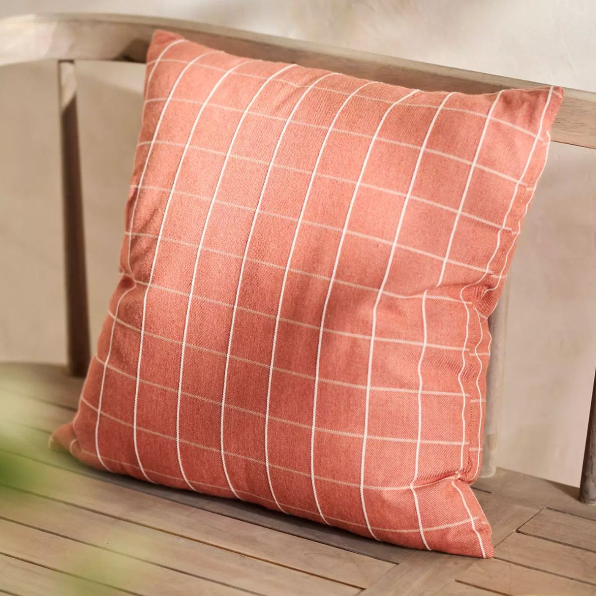
'Using bright citrus notes of pollen yellow and bright orange in interiors creates a vibrant energy, evoking joyous images of citrus groves and sunny days,' explains interior designer Fiona Duke. 'These bright, powerful, sprightly tones can inject cheer and are wonderful for smaller spaces like cloakrooms, or can be used as accent colors in larger, sociable spaces to prevent the bold colors from feeling too overpowering. If you are a little hesitant, consider using these tones in small ways such as cushions, throws, or artwork.'
6. Barely there baby blue
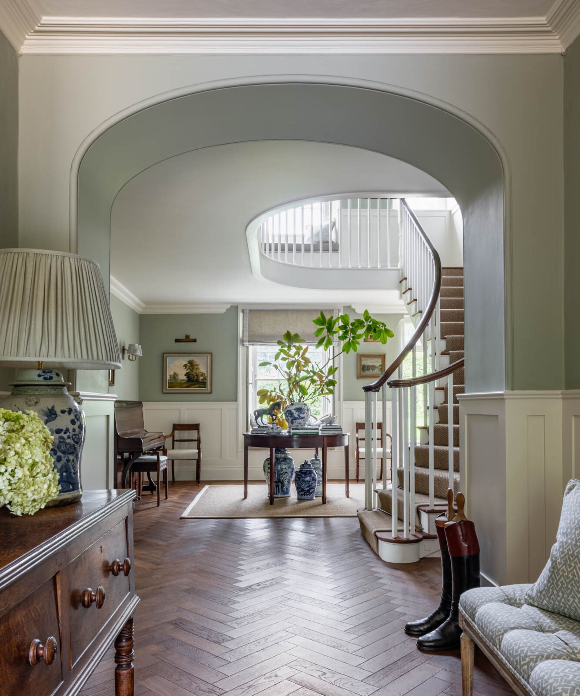
Walls in Blue Grey by Farrow & Ball
Just a brief flick through magazines and a short scroll through social media, and you will notice that blue room ideas are everywhere. Baby blue, in particular, the pale, unsaturated whisper of a blue, is a trend that doesn't seem to be budging. As such, many of us are planning on decorating with baby blue this spring.
‘Decorating with baby blue does not need to be solely confined to a baby's nursery. It is a soft, calming shade that is just at home in a serene bedroom set up or in a sophisticated drawing room,’ explains Alexandra Keith, Interior designer at Otta Design.
If you are well and truly over decorating with gray, which may well be making your home look dated, a barely there baby blue maintains the coolness and restraint of gray, without the steely, often dreary appearance.
So, if you're searching high and low for spring decor ideas, or just some fresh interiors inspiration, we say don't be shy about experimenting with bold colors now that the April showers are behind us, and summer is just about to begin.

Sophia Pouget de St Victor is the UK Content Editor at Homes & Gardens, bringing readers the latest trends, expert insights, and timeless design inspiration tailored to a UK audience. With a background in luxury interiors and a qualification in Garden Design from London, she has a passion for creating spaces with character and emotional depth. Sophia gravitates toward interiors that defy definition, valuing individuality and effortless elegance. She lives in West London with her partner, two mischievous terriers, and a plump cat named Lettuce.
